
A room can feel tired long before the paint ever shows it. The right textile pattern adds spark, comfort, and a little personality without needing major changes.
Let fabric do the heavy lifting for mood, texture, and visual rhythm. Here are patterns that look charming in real homes and work with common decorating budgets.
1. Whispery Florals for Soft, Everyday Charm
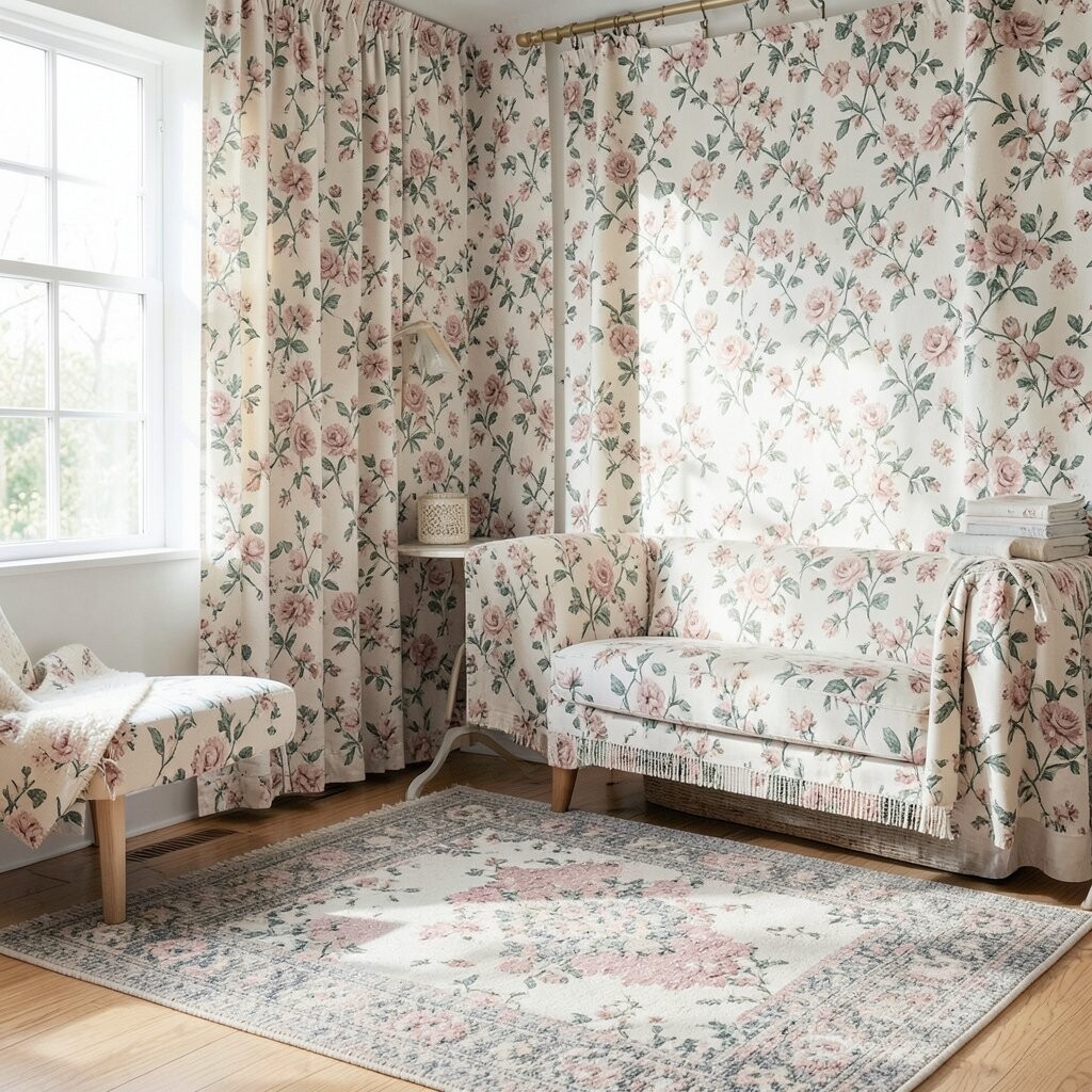
Light florals look like fresh air for a living room or bedroom. You can picture small blossoms scattered across a field of cream, blush, or pale blue, giving the space a gentle lift.
Choose a floral with fine details if your room has busy furniture, and go bolder if the rest of the decor stays simple. For curtains, look for fabrics that hang cleanly so the pattern stays crisp, not blurry. Pair the floral with plain solids in the same color family to keep the look calm and easy to live with.
2. Bold Stripes That Make Ceilings Feel Higher
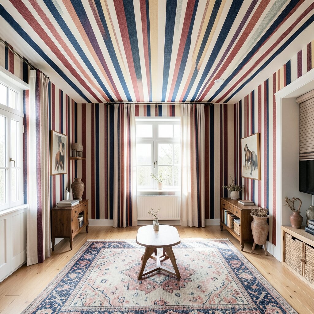
Stripes bring instant order and energy, especially in hallways and kitchens. Think of crisp lines that run vertically for height, or wide bands that add a sunny, modern rhythm when placed horizontally.
Vertical stripes work beautifully on tall curtains, duvet covers, and even lightweight throw blankets. Keep the stripe scale in mind, since thin stripes feel delicate while chunky stripes feel playful.
If you want personalization without overwhelm, pick one accent color from the stripe and repeat it in pillows, a rug, or a ceramic vase. For cost considerations, consider mixing one striped piece with several solid pieces instead of buying matching sets. This approach keeps the design looking intentional even when you spend on only a few items.
3. Classic Checks for Cozy, Grounded Style
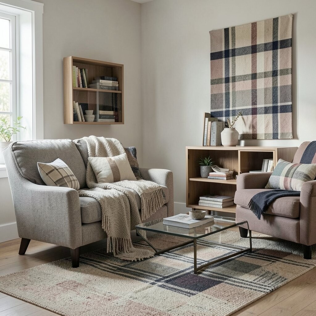
Checks feel warm and familiar, like a favorite sweater you reach for again and again. You might imagine red-and-cream gingham at breakfast, or a navy-and-oatmeal check on a chair that anchors the room.
This pattern adds visual structure and makes casual spaces feel more put together. Choose smaller checks for tight areas and larger checks for roomy spaces where the pattern can breathe.
To make it feel current, try modern color pairings such as sage with white or charcoal with tan. Use checks on throw pillows or a table runner before committing to bigger items like upholstery. When you do go larger, blend in neutrals so the design stays welcoming rather than busy.
For practicality, washable fabrics are your friend, especially in family rooms or near dining areas where spills happen. Checks also hide dust and minor wear better than very light, solid textiles. That means your pattern still looks fresh even after a season of everyday life.
4. Dainty Dots That Add Friendly Sparkle
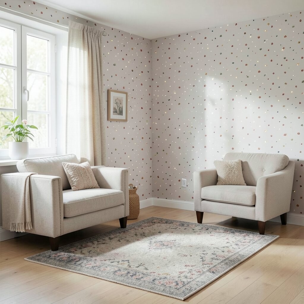
Polka dots can be sweet, but they can also feel sophisticated with the right colors. Picture tiny circles on a soft ground, or larger dots that pop like confetti against a calm wall color.
Use dot patterns to brighten small spaces, because repeating shapes create a cheerful rhythm. For a balanced look, mix dots with one other pattern that has a different scale, like a stripe or a subtle weave.
5. Woven Texture Patterns for Rich, Calm Depth
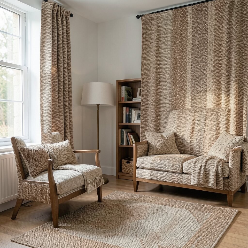
Woven textures look like they were made for cozy rooms, even when the design stays simple. You can almost feel the fabric when you imagine tight, even threads or a slightly raised weave catching light.
These patterns help hide imperfections and add depth without loud colors. They also work with almost any style, from modern to rustic to Scandinavian, because texture brings interest on its own.
Choose a textured fabric in a color you already love, then let the weave pattern do the rest. A practical trick is to use the texture on larger pieces like a blanket or slipcover, since it reads as intentional from far away. If you want personalization, pair a neutral weave with one small pop of color in your accessories to keep the room from feeling too quiet.
For cost considerations, you may find great options in cotton blends and budget-friendly home decor fabrics that still look substantial. Look for tighter weaves and heavier hand-feel for a more expensive look. Textures remain a current trend because many people want comfort that feels natural and lived-in.
6. Playful Chevron for Motion and Modern Energy
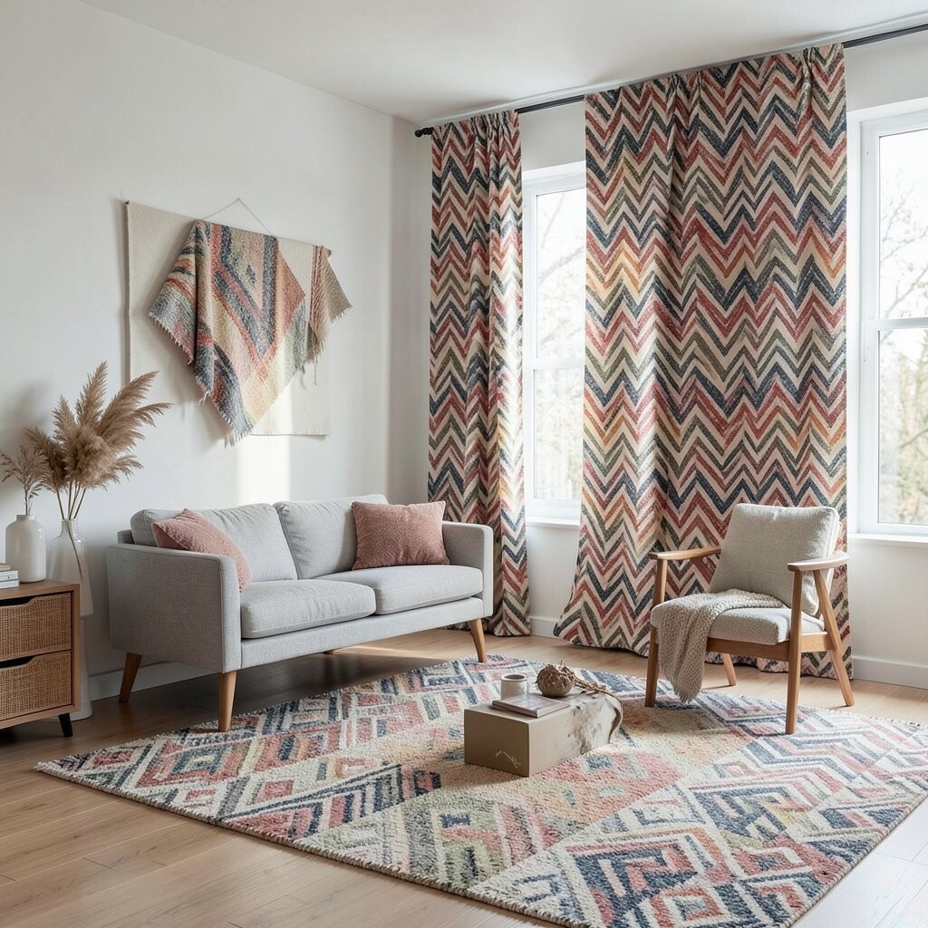
Cheron and chevron patterns feel like a visual bounce, even when the colors are calm. Imagine zigzag lines that angle across a pillow or rug, giving the room a sense of movement and optimism.
This pattern is especially helpful for rooms that need a little visual excitement, like a blank guest room corner. Use chevron on accessories when you want a clear statement without covering an entire room.
To keep it from feeling too bold, use chevron in muted shades such as gray and cream, or pair it with warm woods and soft lighting. A practical tip is to match the zigzag color to one element already present, such as a throw in the same tone as a sofa. This makes the pattern feel like part of your home, not something dropped in.
7. Elegant Damask for a Polished, Special-Occasion Feel
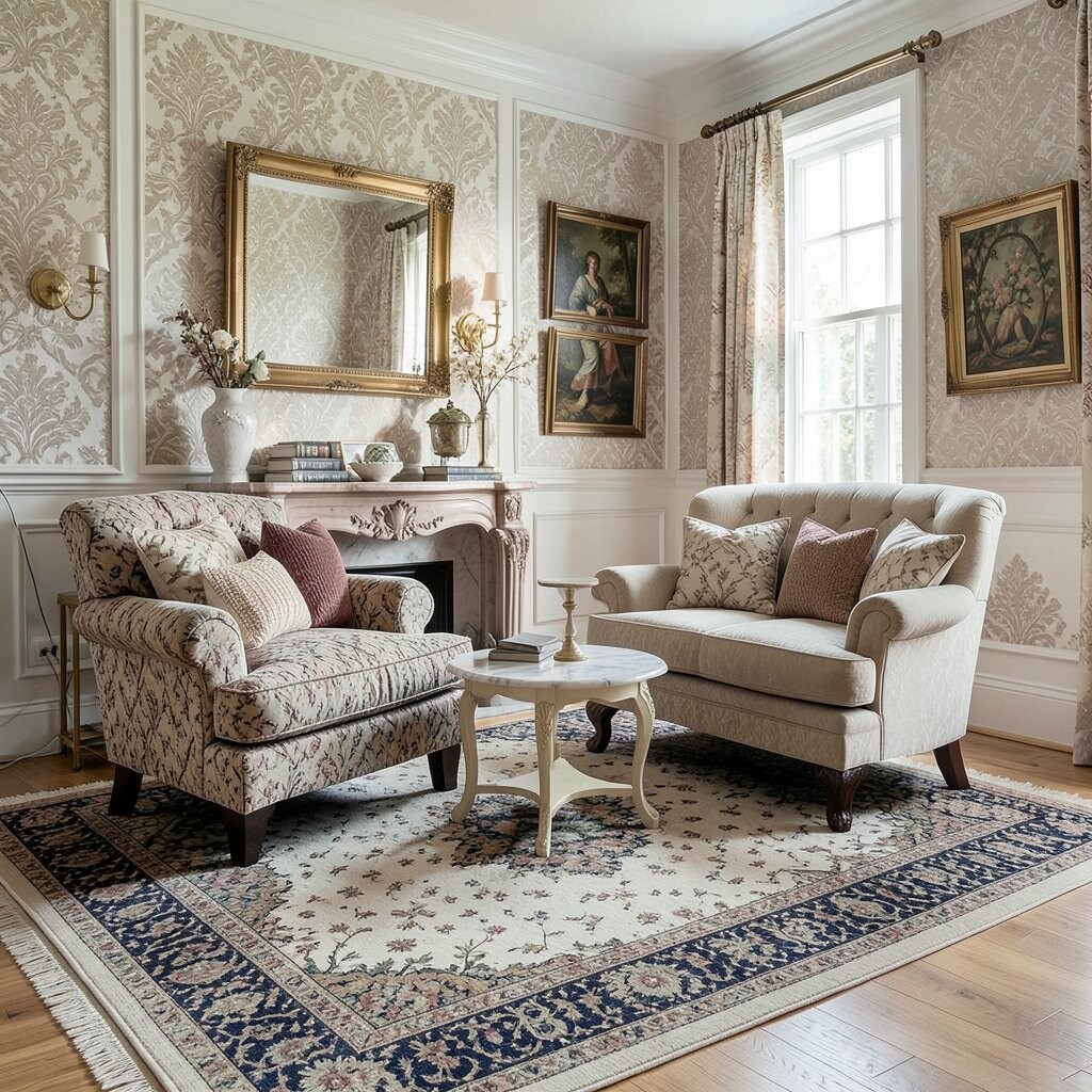
Damask adds drama in a quiet way, with repeating shapes that look almost like carved details. Picture swirling motifs in muted gold, soft gray, or deep navy, creating a refined look that still feels inviting.
It works beautifully in dining rooms, entryways, and bedrooms because the pattern reads as classic and complete. If your furniture is simple, damask textiles make it feel more dressed up without adding clutter.
For personalization, choose a damask that leans modern by using a subtle tone-on-tone color instead of high contrast. Mix damask with plain linens so the room stays balanced and easy to relax in. This pattern can be cost-effective when you buy one hero piece, like a curtain panel or a duvet cover, instead of reupholstering furniture.
To match current trends, many homeowners now pair damask with softer, casual textures like knits and boucle. That contrast keeps the look fresh and less formal. If you love the look but worry about maintenance, look for washable damask blends or dry-clean friendly fabrics for occasional use.
8. Botanical Leaves for a Fresh, Natural Mood
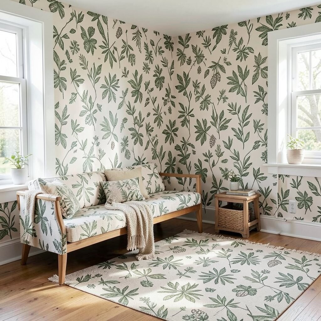
Leaf patterns bring an outdoor feeling into your home, no matter the season. You might see palm fronds, eucalyptus sprigs, or gentle greenery lines that look airy and bright.
This is a great choice for people who want calm energy rather than loud color. Use leafy textiles in rooms that need a little serenity, like a bathroom nook or a reading corner.
To keep it from feeling too themed, choose leaf patterns with neutral grounds and subtle colors. Pair them with natural materials such as jute, rattan, or light wood to make the whole room feel cohesive. If you want personalization, pick one leaf color and repeat it in small decor like framed art, a candle, or a ceramic tray.
9. Art Deco Geometry for Glam, Without Overdoing It
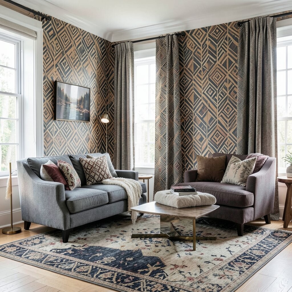
Geometric patterns can feel glamorous when they use clean shapes and bold spacing. Picture sunburst motifs, repeating arcs, or fan-like designs in black, cream, and a touch of metallic gold.
This style shines in entryways, powder rooms, and statement seating, where a little sparkle goes a long way. A practical tip is to choose one piece with strong geometry and keep the rest of the textiles simpler to avoid visual overload.
If you want to stay budget-friendly, look for pillow covers, table runners, and small curtains in geometric prints rather than full upholstery. You can also layer a solid throw blanket on top so the pattern stays framed and polished.
For current trends, many homes now mix art deco shapes with softer neutrals and warm lighting. That pairing makes geometry feel welcoming, not harsh. Personalize the look by repeating one geometric color in your metal finishes, like brushed brass or matte black hardware.
10. Cozy Herringbone for Warm Sophistication
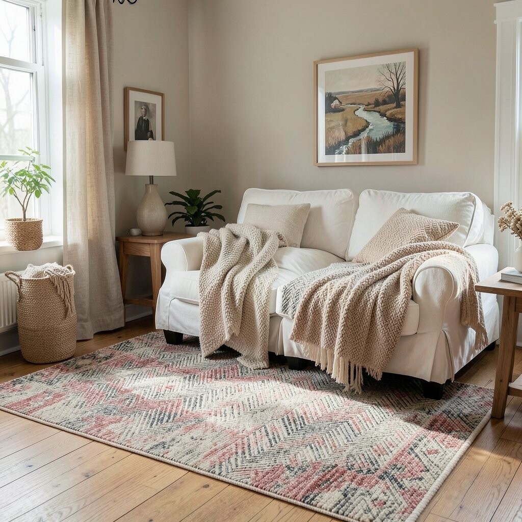
Herringbone patterns look like crisp tailoring for your furniture. Imagine a diagonal, V-shaped weave that catches light and adds subtle movement across a blanket or rug.
It’s a wonderful middle ground between plain and bold, because it feels special without shouting. Use herringbone in living rooms and bedrooms to make everyday seating feel more refined.
When choosing colors, consider warm neutrals like camel, oatmeal, or warm gray, since they play nicely with most decor. For practical tips, fabrics with a thicker weave tend to look better and last longer for daily use. If your room already has many textures, go for a smaller-scale herringbone to keep the pattern from competing.
11. Playful Tartan and Plaid for Comfort With Character
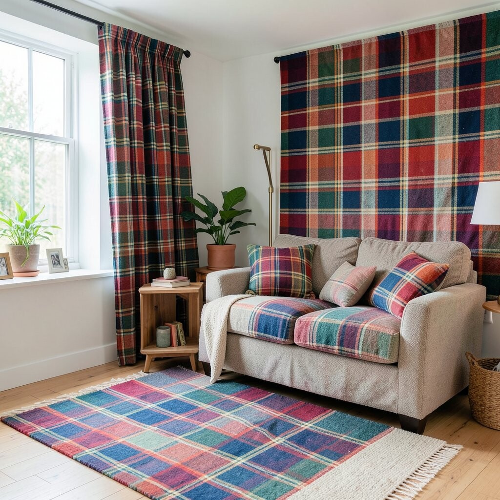
Plaid brings instant coziness, especially when the room needs warmth and personality. Think of classic tartan shades like deep green, muted red, and soft navy woven into familiar checks that feel timeless.
This pattern is perfect for seasonal decorating, but it also works year-round when you choose softened colors. Use it on throws, accent pillows, and upholstered footstools to create a relaxed, welcoming vibe.
To keep plaid from feeling old-fashioned, pair it with modern furniture lines and simple wall art. A practical trick is to mix plaid with stripes or solids in matching colors, since it helps the pattern feel coordinated. For cost considerations, start small with pillow covers and then grow the look if you love it.
12. Subtle Ikat for Bold Culture and Relaxed Style
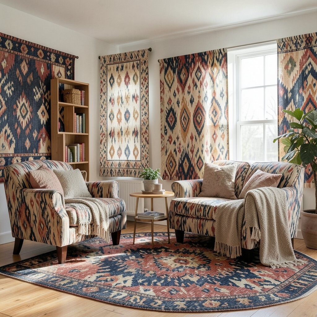
Ikat patterns have a dreamy, painterly look that feels artistic without being fussy. Picture blurred bands and irregular color placement that creates a hand-dyed feel across textiles.
This pattern adds uniqueness because no two pieces look exactly alike, which makes your home feel personal. It’s great for bedrooms and lounges where you want comfort with creativity.
To keep the look balanced, choose ikat textiles in one or two main colors and let the variation do the talking. Pair with solid bedding, plain curtains, and natural textures so the pattern stays the highlight. For personalization, repeat a color from the ikat in a small decorative item like a lamp base or framed print.
Current trends favor artisanal looks that feel lived-in, and ikat fits right in. If you’re mindful about budget, choose smaller accessories first because premium ikat textiles can cost more when made with richer fibers. Once you find a color you love, expand slowly with affordable layers like cushions and throws.
13. Serene Ombre for Soft Gradual Color
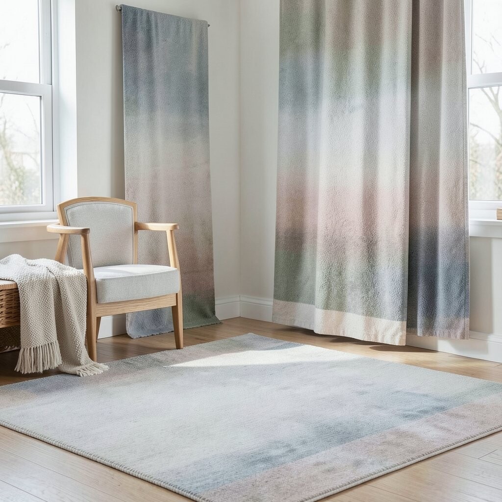
Ombre patterns fade from one shade to another, creating a calm gradient effect that feels soothing. Imagine a pillow that shifts from warm white to blush, or a curtain that moves from sea glass green to pale gray.
It brightens a room without the visual punch of a bold print, making it ideal for airy spaces. Use ombre on larger items like duvet covers or curtains to create a gentle, modern glow.
For practical styling, match the ombre to your room’s color palette by choosing end shades that already appear somewhere else. This keeps the pattern looking intentional and prevents it from feeling random. If you want personalization, combine ombre textiles with accessories in complementary tones like brass, linen, or soft black for contrast.
Cost-wise, ombre designs can be found in many mid-range fabrics, especially in curtain panels and bedding sets. If you’re building gradually, choose one ombre piece and add solids around it for a polished look. This style continues to trend because it feels fresh, calming, and easy to mix with many decorating themes.