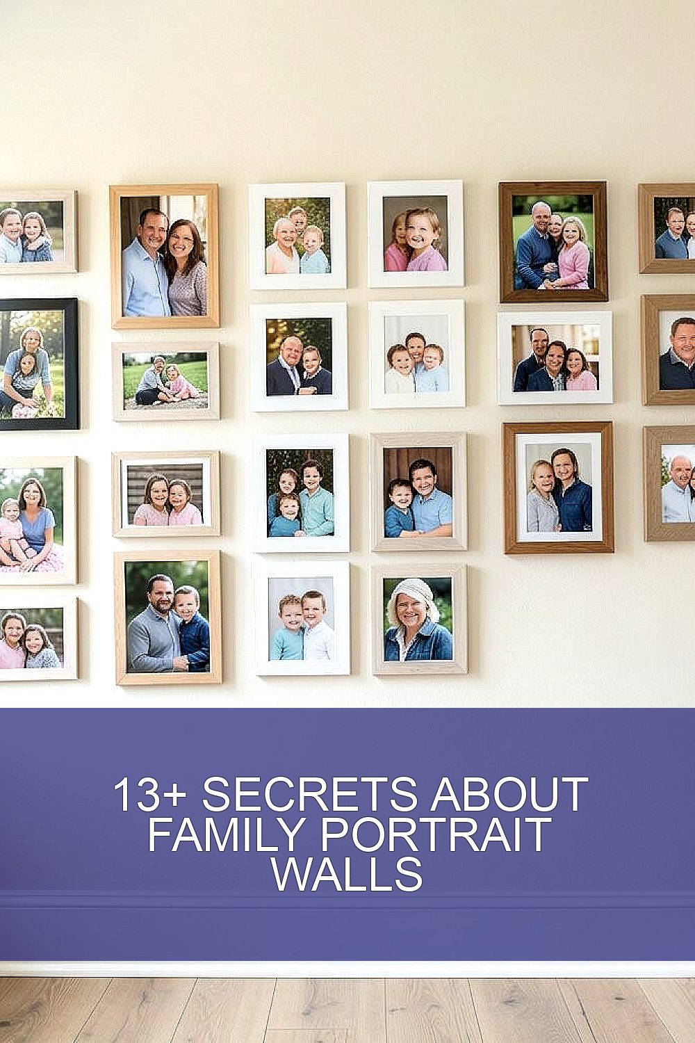
The moment you hang a family portrait, the room starts telling a new story. Small choices can make that story feel warm, personal, and alive.
1. Pick a Story Wall, Not a Random Spot
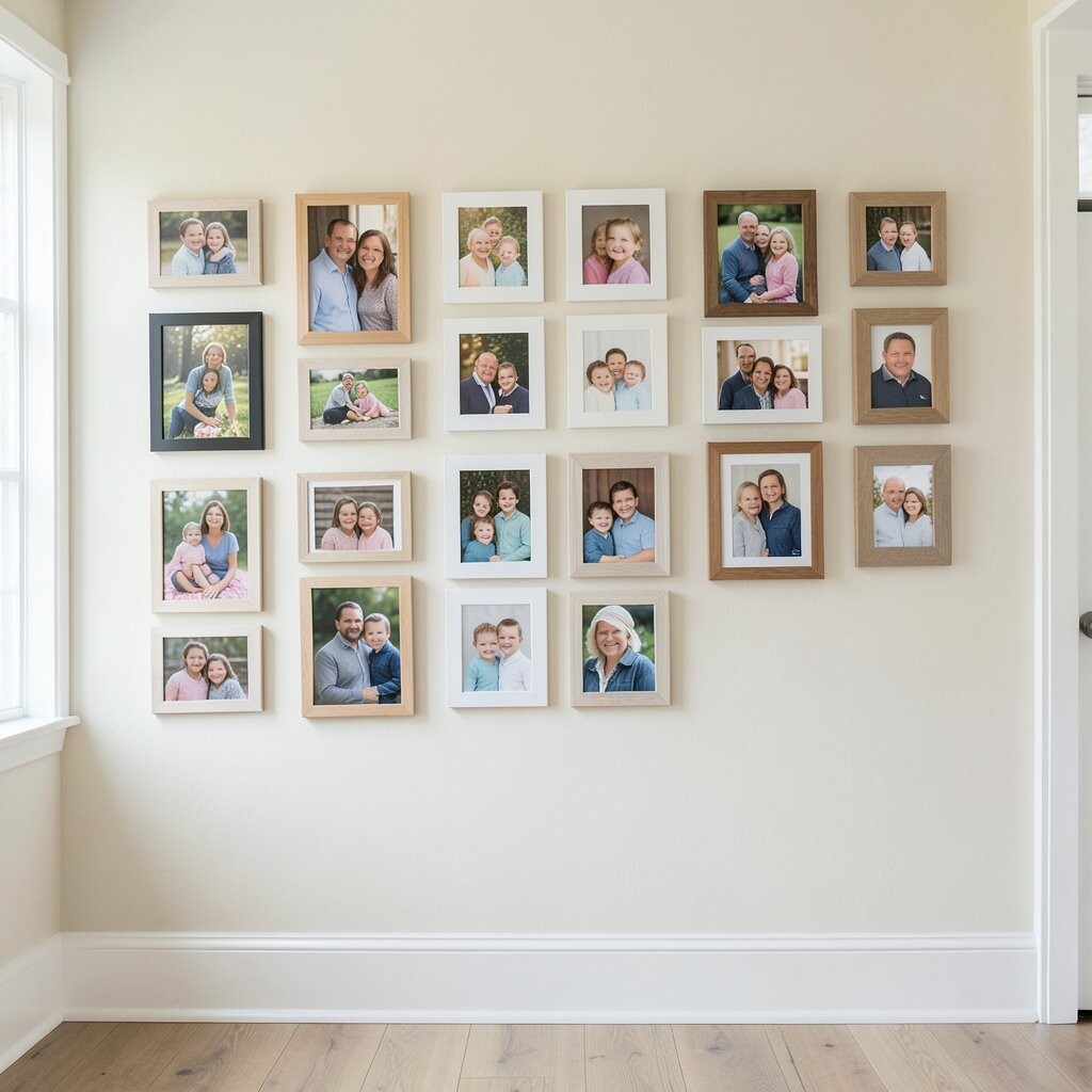
Start by choosing a wall that naturally pulls people in, like the hallway where you greet everyone. Look at how light moves through the day so your portraits don’t feel dull or shadowy.
When your layout matches your home’s daily rhythm, the wall becomes something you enjoy every time you pass by. A clear focal spot also helps visitors feel included, because the wall looks intentional instead of accidental. That simple focus can make the whole display feel more meaningful and calmer to the eye.
2. Use a Simple Size Plan That Still Feels Free
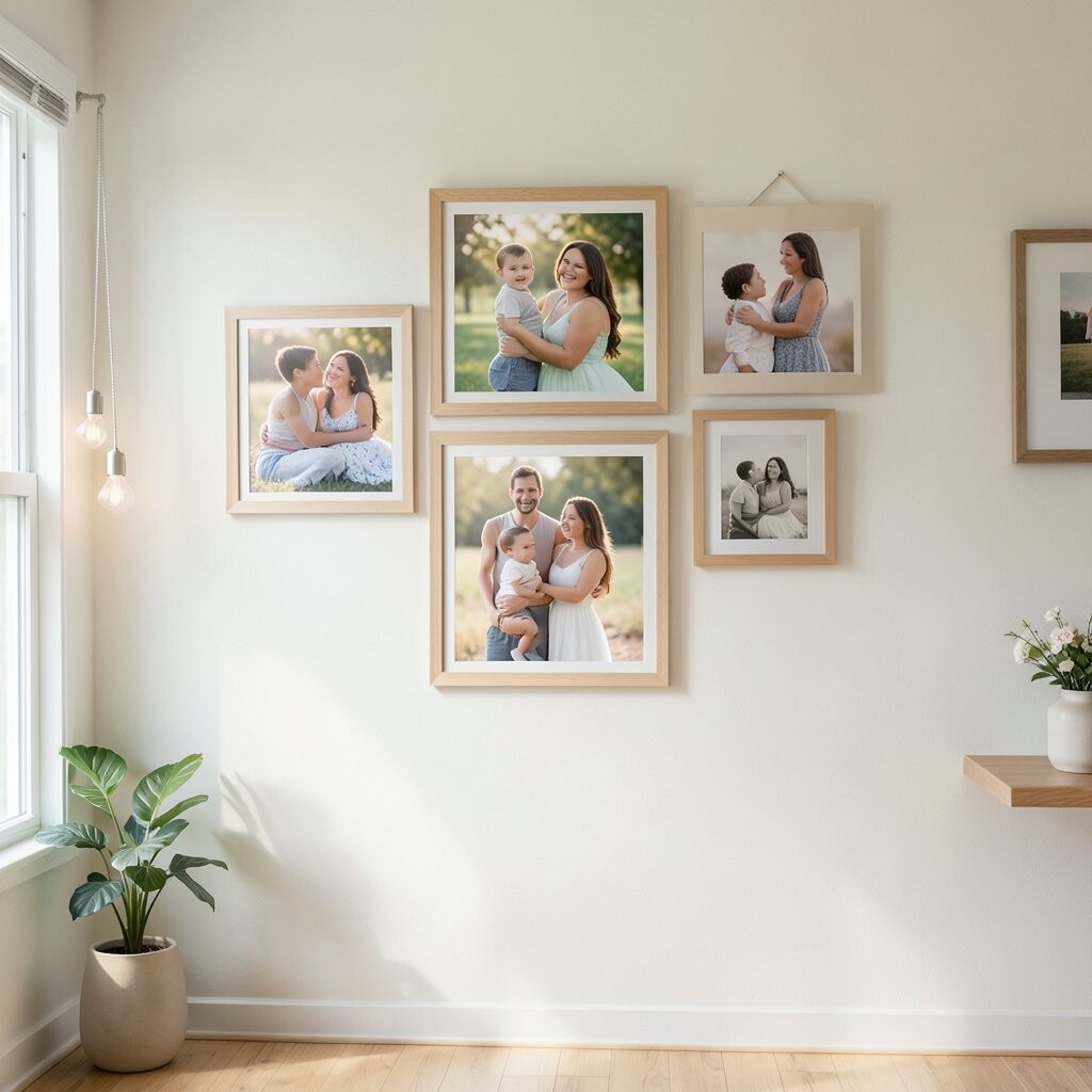
Instead of mixing frames with no plan, group portraits by size so the wall reads smoothly from a distance. You can keep it flexible by using one main frame size and a few matching variations for balance.
A consistent sizing trick makes spacing easier and gives you a clean look without needing perfect measuring. It also helps older photos look crisp beside newer ones, because everything shares a visual “home.” For many families, this is the easiest way to upgrade a wall without spending much.
Choose frames with similar thickness so the wall feels like one artwork. If you want a more casual vibe, allow slight differences in orientation, like some portraits standing taller and others stretching wider. The result still feels organized, just not stiff.
3. Let Color Do the Quiet Work
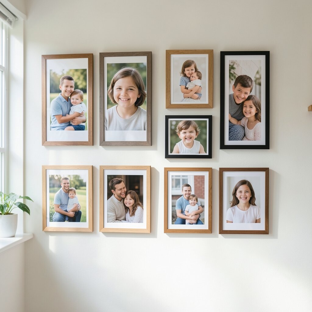
Pick a wall color that supports the portraits instead of competing with them. Warm whites and soft creams often make skin tones look natural and help colors feel inviting.
If your frames are wood, keep nearby colors warm too, like caramel, honey, or muted terracotta. Cooler rooms can still work, but choose frames and mats that echo the room’s tones so the wall looks connected.
Even if you can’t repaint, you can use mats and mat colors to guide the feel of the wall. A neutral mat can calm busy outfits, while a tinted mat can make seasonal photos pop. This small choice often gives the biggest “wow” with the least cost.
4. Mix Old and New With One Unifying Detail
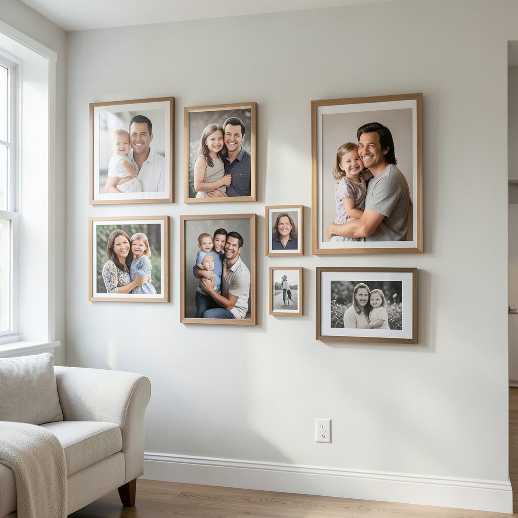
Family stories span years, and your wall should feel like a timeline of love. Place an older black-and-white portrait near a newer color one to create a conversation between eras.
The trick is to choose one detail that repeats across frames, like a matching mat style or the same frame finish. When everything shares that detail, the wall stays cohesive even when the photos are very different.
5. Choose Frames That Match Your Life, Not a Trend
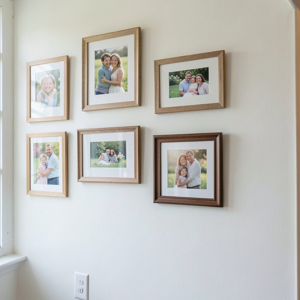
Trends come and go, but your family will look at this wall every day. Pick frames that fit your routine, like easy-to-wipe glass if you have kids or pets.
For a cozy home, use wood tones or simple black frames that feel steady and warm. For a modern look, clean lines and slim frames make portraits feel crisp and bright without heavy decoration.
If you want a budget-friendly approach, consider buying fewer frames with better quality and using print-ready borders for the rest. Thrift stores can be a treasure hunt too, as long as you refinish frames so they match in tone. The uniqueness comes from the story behind each frame, not from spending the most.
6. Create a Layout Grid You Can Actually Maintain
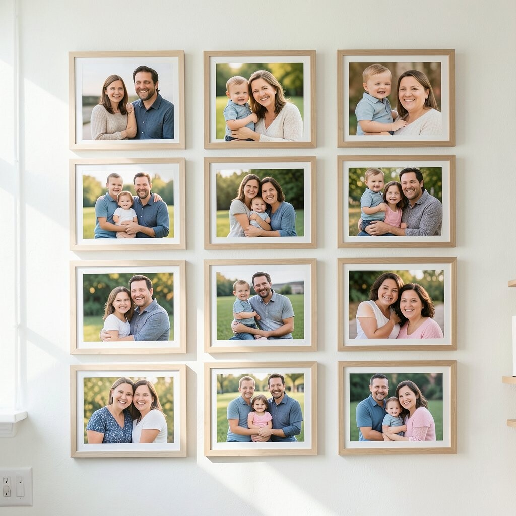
A wall grid doesn’t have to be strict, but it helps everything stay aligned when you switch photos later. Start by marking a center point and building outward so you don’t end up with lopsided spacing.
Use painter’s tape to mock up frame positions before you drill anything. That simple step helps you see how your portraits feel in the room and adjust before it’s too late.
When you keep alignment consistent, even candid photos look intentional. The benefit is real too, because you’ll waste less time fixing crooked frames and less money replacing mistakes. It also makes future updates easier, since you already know where each spot “belongs.”
7. Add One Piece That Feels Like the Family Signature
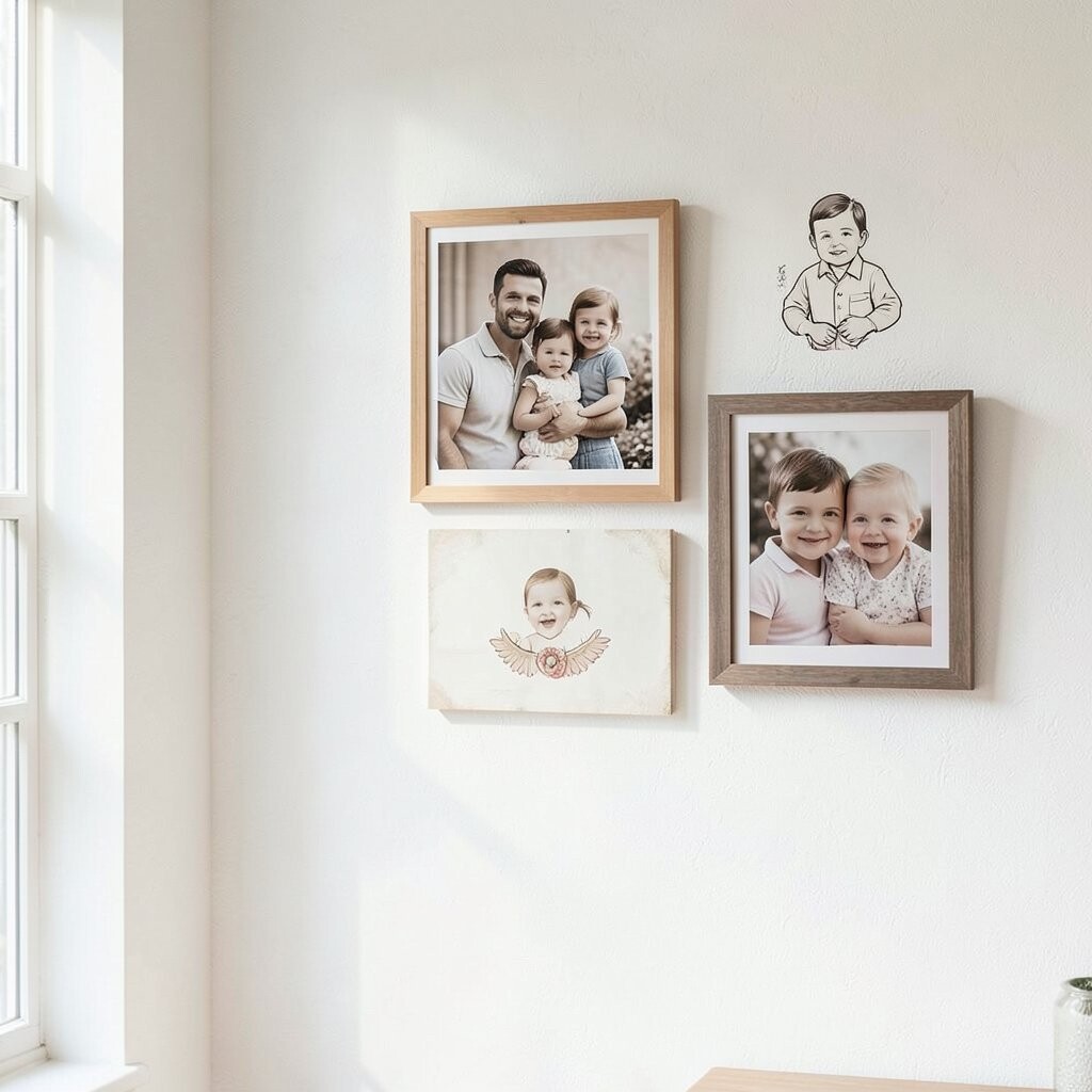
Choose something that makes your wall unmistakably yours, like a portrait of the same smiling spot where you always take pictures. It could be a grandparent photo, a pet portrait, or a yearly holiday shot that repeats.
A signature element creates familiarity, so the wall feels like a tradition, not a one-time event. When people see it, they understand the meaning quickly, which helps the whole display feel special.
8. Use Matting to Give Every Photo Room to Breathe
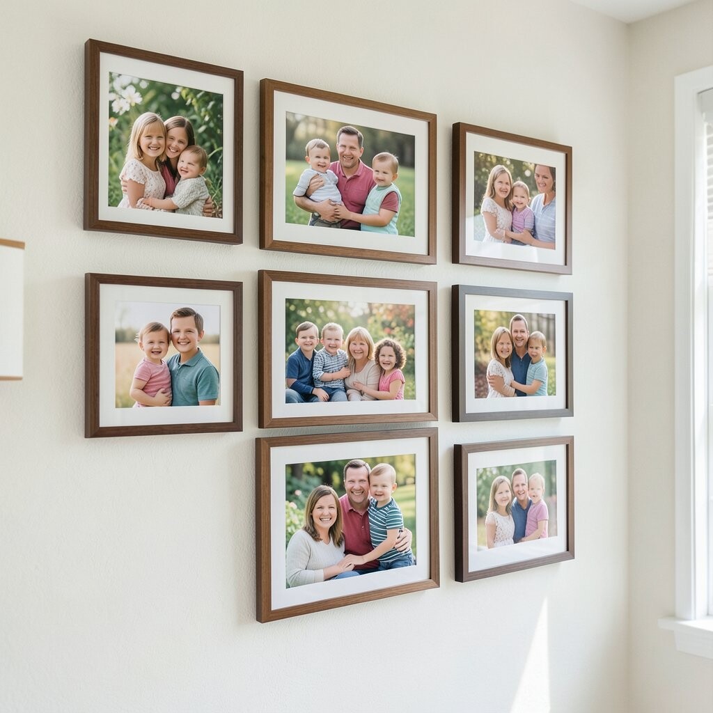
Matting can make a portrait look more “gallery ready” even if the photo is from a phone. It adds space around faces, which helps details stand out instead of blending into the frame.
For a cohesive look, try using one mat color across most portraits, like soft white or light gray. This keeps the wall calm and helps busy clothing patterns feel more balanced.
9. Play With Orientation and Depth for Visual Energy
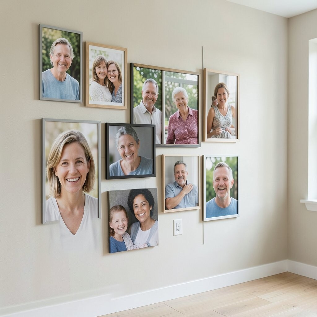
Don’t be afraid to mix vertical and horizontal portraits, because variety makes the wall more interesting. A taller frame can draw the eye upward, while a wide frame gives room for group poses.
Depth can also come from slight spacing differences, like pairing snug frames with one or two that have a little extra breathing space. When you do this thoughtfully, the wall feels dynamic but still neat.
Consider using different mat widths or frame depths too, as long as the colors stay related. This adds uniqueness without making the wall look messy. It’s also a great way to make your favorite photos stand out without buying a whole new set.
10. Pick a Theme That Matches Your Family’s Values
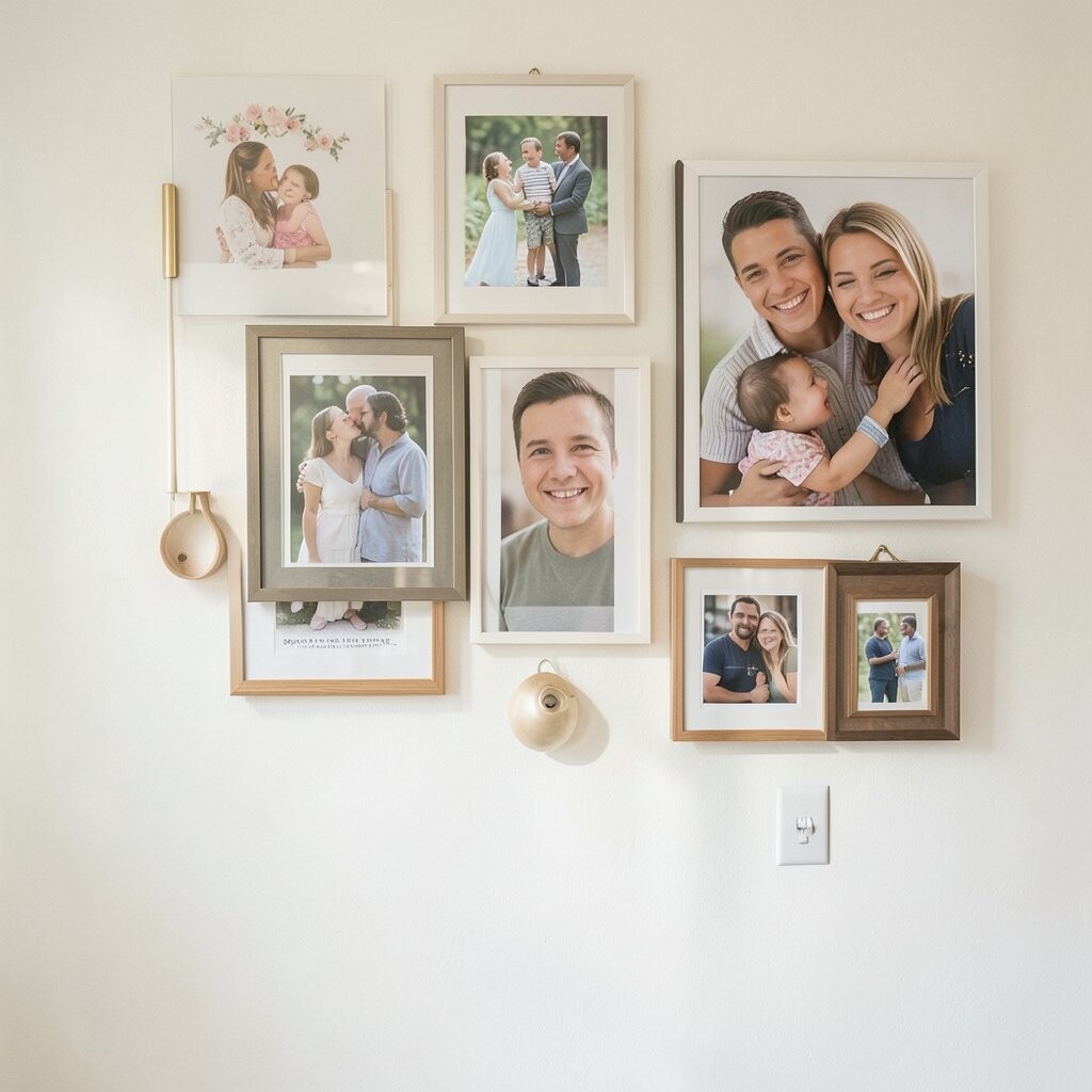
Some families cherish milestones, while others love everyday moments, and your wall can reflect that. You might lean toward school days, vacations, or family dinners, depending on what your home celebrates most.
Theme-based walls feel natural because the photos connect emotionally. When the wall tells a consistent story, visitors feel like they’re stepping into your world, not just looking at pictures.
If you want a practical way to start, choose photos you already love and arrange them by the theme first. Then unify the look with matching frames or mats so the wall still feels polished. This approach helps you avoid overspending on random prints you don’t really care about.
11. Create a Seasonal Swap Routine That Keeps the Wall Fresh
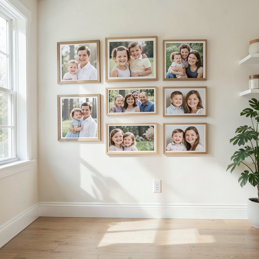
Families change, and portraits should change with them, even if only a little. Using frames with removable backing makes it simple to swap in new photos during holidays or at the start of a new season.
A seasonal routine keeps the wall feeling alive and gives you a reason to take new photos together. It also helps you keep older portraits safe, since you can rotate them instead of replacing them.
12. Pair Portraits With Small Textures or Meaningful Add-Ons
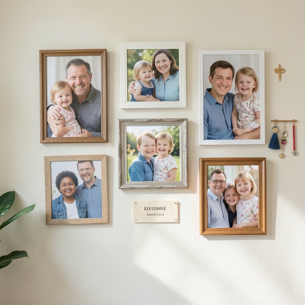
If your style leans cozy, consider adding a subtle backdrop like fabric or textured paper behind the photo frames. A light linen texture or warm craft paper can make the whole arrangement feel softer and more inviting.
Meaningful add-ons can be simple, like a small family crest, a stitched name detail, or a tiny memento that relates to a specific photo. When the add-on connects to the story, it turns the wall into a memory spot you’ll love.
13. Consider Modern Printing and Layout Tools for Better Results
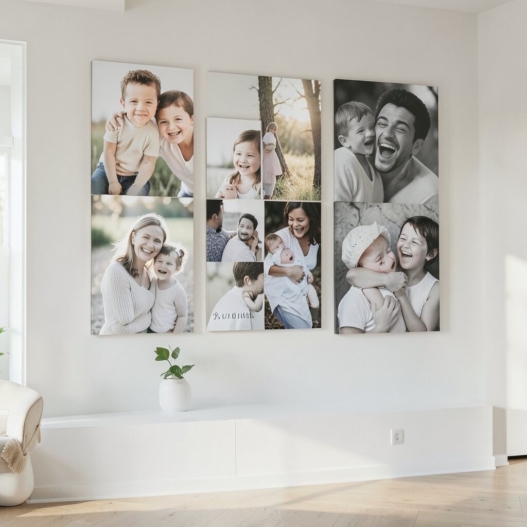
Today’s printing options make it easier to get sharp color and clean edges, even for older photos. Many online services can also help with sizing so your images fit frames without awkward cropping.
Current trends often include a mix of polished prints with one or two slightly candid images, because it feels real rather than staged. If you like that look, choose one or two “soft” moments and keep the rest crisp for contrast.
When cost matters, order prints in batches and use print credits when you can. You can also save money by printing only the photos you’re ready to frame now, then adding more as your collection grows. That way you stay within budget while still building a wall you’re proud of.
14. Finish With Lighting and Placement That Makes Faces Stand Out
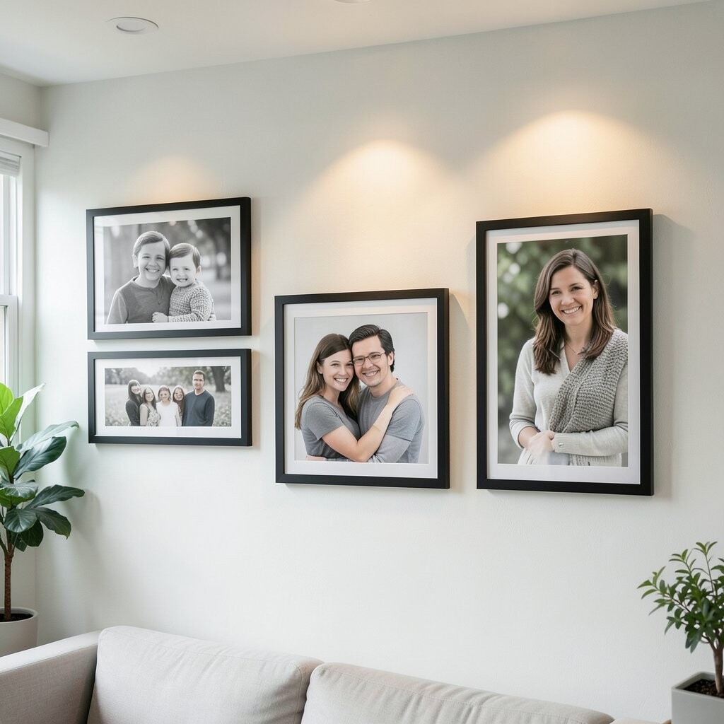
Even the best portraits can look flat without good lighting, so pay attention to where light lands on the wall. A small picture light or a nearby lamp can highlight faces and reduce glare.
Keep portraits at eye level for comfort, and leave enough space so the wall feels easy to read. If you have a lot of frames, lighting becomes extra important because shadows can hide smaller details.
When you take a few minutes to adjust placement and light direction, the wall feels more professional and more welcoming. It also makes day-to-day viewing feel special, since you catch smiles and details instead of just seeing frames. This finishing step is often the difference between “nice” and “wow.”