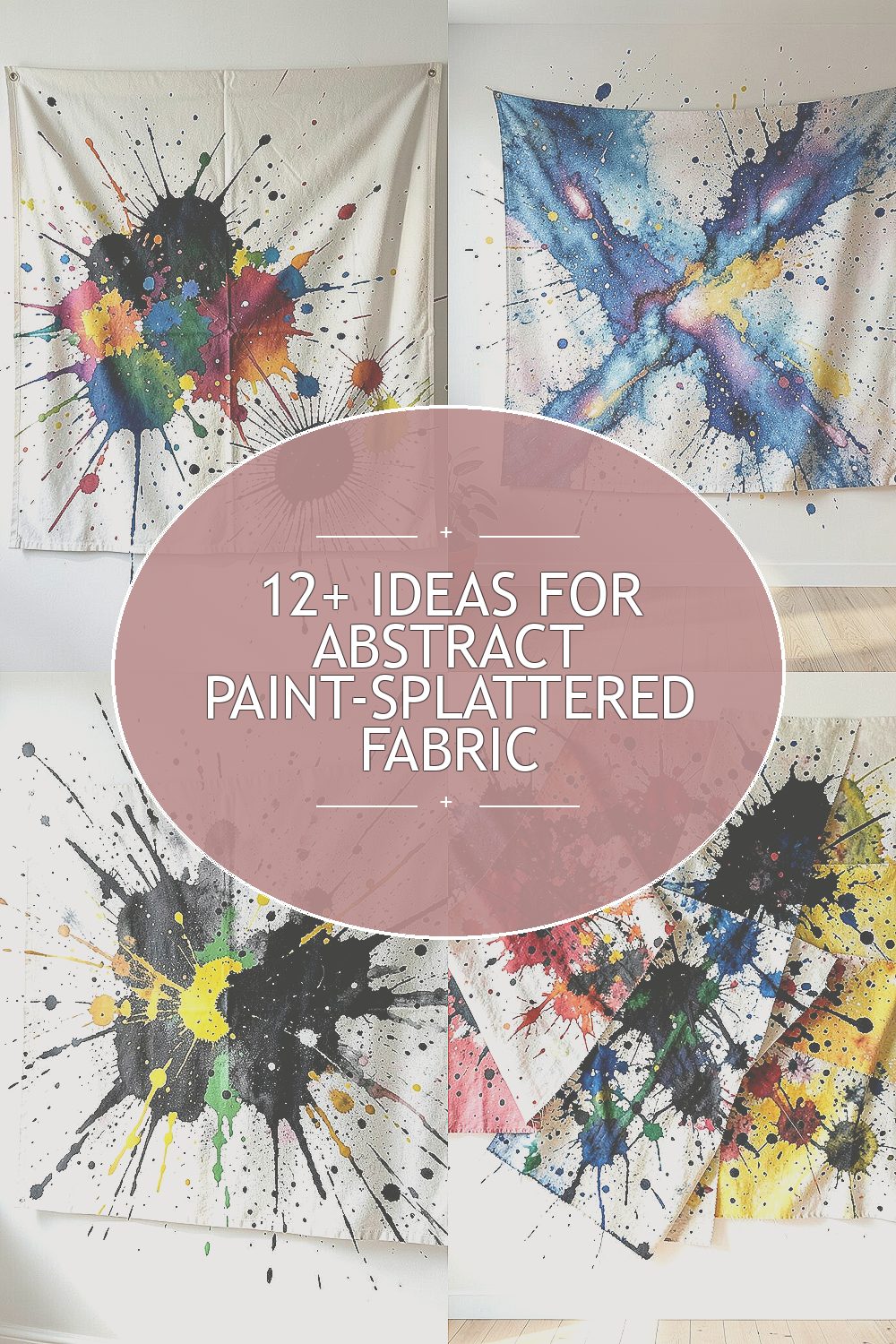
The wall behind your furniture can become the boldest part of the room. Abstract paint-splattered fabric brings color, texture, and a cozy handmade feeling all at once.
Even better, it works with many styles, from calm modern spaces to playful creative studios. With a few smart choices, you can make the look feel personal instead of random.
1. Layered Stencil Bursts With Soft Fabric

You can start by applying paint in crisp stencil shapes, then let the splatters blur outward like a gentle explosion. Choose a medium-weight fabric such as cotton canvas or linen so the paint sits on top and stays visible.
Use painter’s tape to mark areas where you want the bursts to land, then mist lightly with water before dabbing so the fabric holds the color without turning muddy. Layer more than one stencil position, but keep each layer thinner than you think so the texture stays readable. This gives you a clean pattern with organic splatter edges, which looks great at a distance and up close.
2. Denim Galaxy Splatter for a Casual Room

Picture a piece of distressed denim hanging on the wall with tiny paint stars scattered across it. The dark blue base makes bright splashes pop, especially reds, neon greens, and creamy whites.
For practicality, paint on a work surface first to test how your fabric reacts, since denim can take pigment differently than cotton. When it’s time to hang, stretch the fabric on a frame or use sturdy clips so the weave doesn’t sag over time.
To personalize, pick a color story that matches your pillows or a rug, then repeat two accent shades in the splatter for a “designed” feel. This trend of fabric murals and textile wall art is popular right now because it adds warmth compared to flat paint, and it can be achieved without expensive materials.
3. Monochrome Ink-Splatter With One Bright Accent

If you want a calm look, try near-black, charcoal, and warm gray splatters on the fabric. Then add just one unexpected bright color like sunny yellow or electric teal to make the whole wall feel alive.
Work in layers using watered acrylic or fabric paint, and keep a damp cloth nearby to soften edges where the splatter lands too hard. A monochrome base is a nice benefit because it pairs with almost any furniture color, and the accent keeps it from feeling plain.
You can also personalize by shaping the splatter to follow the outline of a large artwork area, such as concentrating color near the top corners. For cost, acrylic paint is usually cheaper than specialty fabric paint, and fabric-friendly matte mediums help it last longer.
4. Overlapping Fabric Panels Like a Giant Collage

Instead of one big piece, use several fabric panels and splash paint across the seams. When the panels overlap, the splatters appear to travel across the wall like a collage in motion.
Try using different textures, such as muslin, canvas, and a lighter weave for contrast, so the splatter looks varied even when you use the same paint colors. This creates uniqueness without needing complicated tools, and it also makes repairs easier if you ever want to swap one panel later.
5. Tape-Resist Lightning Lines With Drips

Start by sticking tape in jagged lines, then paint over and around it so the tape-resist area stays cleaner. After the paint dries slightly, pull the tape to reveal sharp lightning shapes surrounded by splatters and short drips.
You get the best of both worlds when you let a few drops run down naturally instead of wiping them away. This benefits your wall because it adds movement, and it looks especially good under side lighting that catches the uneven texture.
To personalize, curve the lightning into a swirl that points toward your sofa or bed, then add tiny dot splatters at the ends of each line. For budget planning, you can often use leftover craft paints for the background and reserve one “hero” color for the main splatter clusters.
6. Botanical Splatter: Leaves, Vines, and Paint Droplets
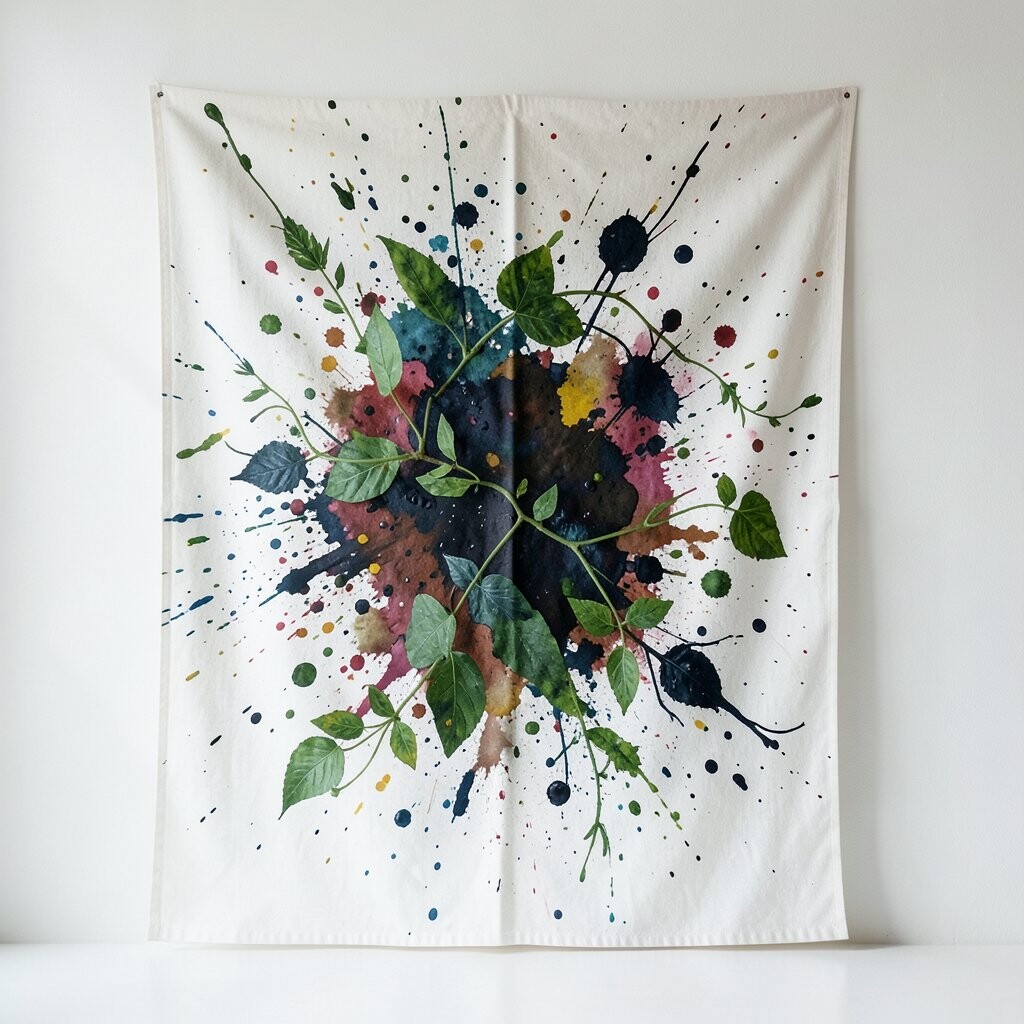
Paint splatters can look surprisingly botanical when you layer stenciled leaves with small color dots. Imagine a fabric feature wall where the splatter feels like falling pollen around stems.
Use a leaf stencil and then flick paint off a brush for the surrounding specks, keeping greens varied so it feels natural rather than flat. This approach is uniquely charming because the splatter adds life around the plants, and the fabric softens the sharpness of traditional mural painting.
For practical setup, lay down a drop cloth, and tape the stencil edges carefully so the leaf shapes stay crisp. Personalize by matching the leaf colors to your real plants, then repeat one splatter shade that shows up in your curtains or wall art.
7. Color-Blocked Splatter Framing a Center Shape
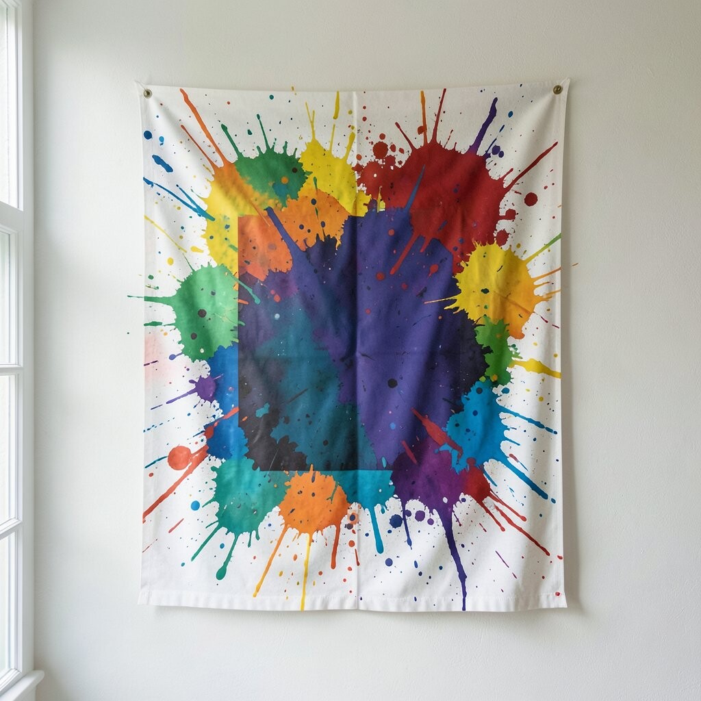
Choose a large central shape, like a rounded rectangle or circle, and paint a clean color-block border around it. Then let splatters spill into the border, so the shape feels like it’s framed by energy.
You can paint the border first, let it dry, then flick splashes using a toothbrush or stiff brush over a second layer of darker paint for depth. This gives you a balanced look because the center stays calmer, while the outer fabric feels expressive.
8. Kid-Friendly Handprint Splatter With Adult Styling
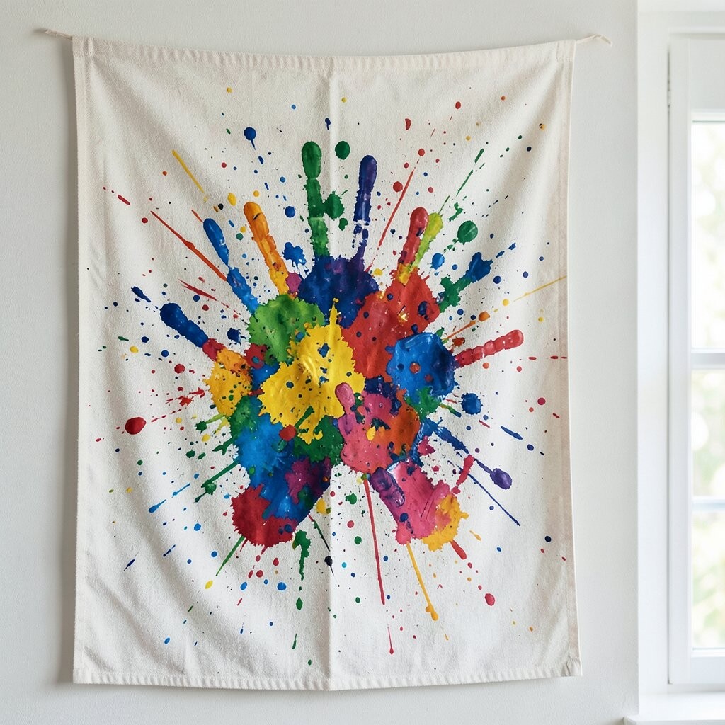
Even if you’re aiming for grown-up style, handprints can work when you use them sparingly and with a limited palette. Press hands lightly in one or two colors, then add abstract flicks around the prints to blend them into the overall pattern.
This has a joyful benefit because it turns the wall into a memory piece, not just decoration. To keep it trendy, use larger paint gestures and fewer prints so it feels like art rather than a craft project.
Personalize by mixing one metallic paint splatter in a small area, like a corner near the ceiling, so the texture catches the light. For cost, most supplies are basic craft items, but using fabric paint or adding a medium helps the surface hold up.
9. Metallic Mist Splatter With a Night-Sky Feel
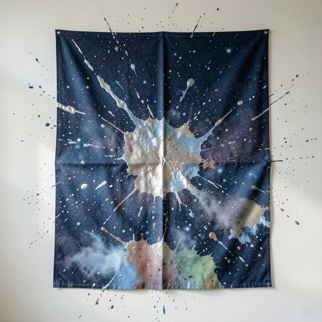
Metallic splatter looks magical when you build it like a soft mist rather than chunky dots. Use a dark fabric base, then flick silvers and deep blues so the paint glimmers like a night sky.
For practical tips, apply metallic paint in thin coats and avoid soaking the fabric, since too much can cause a sticky surface. This is a strong uniqueness play because metallics add visual depth, and the wall becomes more interesting with every angle of light.
Personalize with a tiny “constellation” cluster near eye level, using small dots placed thoughtfully. Current trends show people leaning into moody palettes and textured wall hangings, and metallic mist splatter fits right in while still feeling cozy.
10. Map-Grid Splatter: Coordinates Without Being Literal
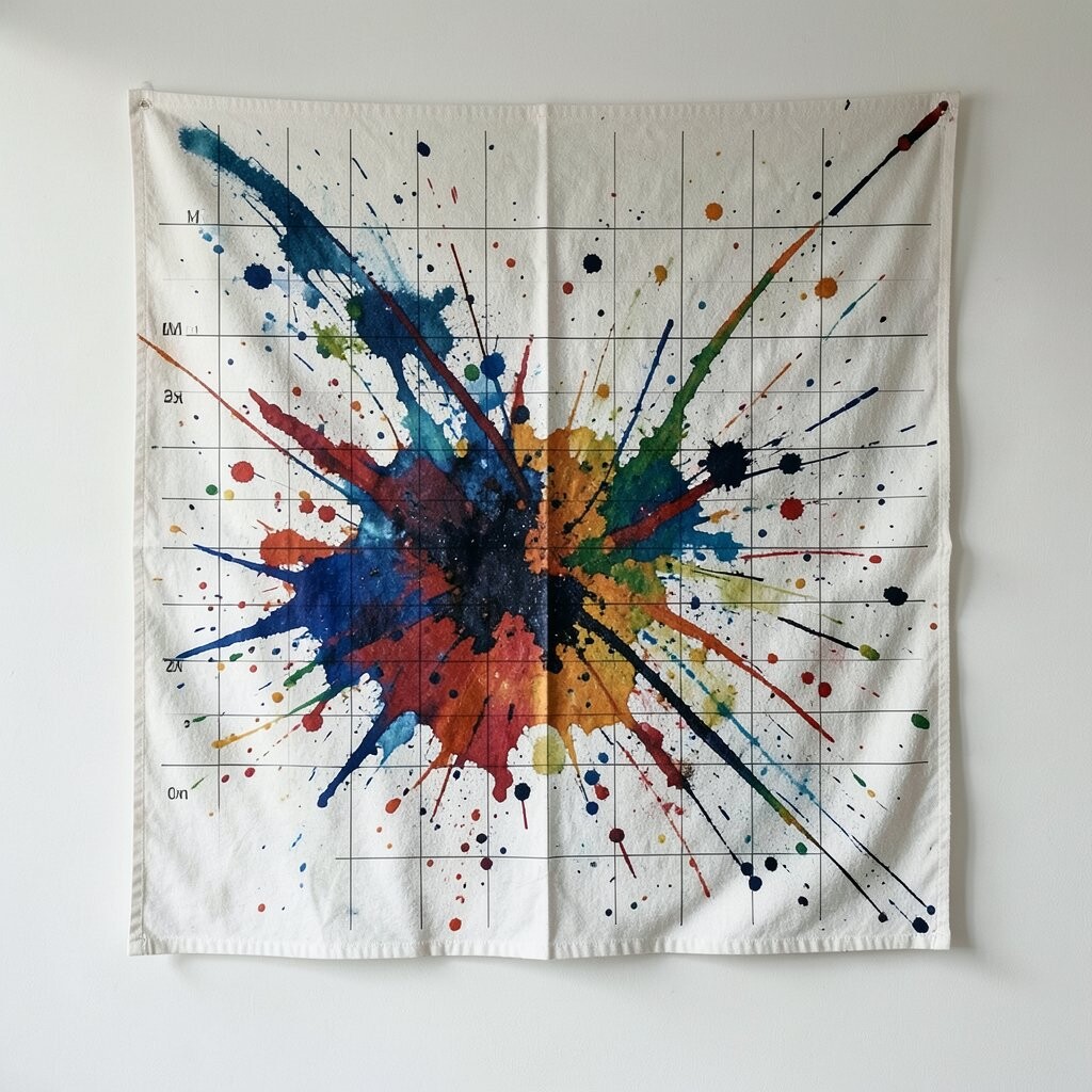
Think of a grid on fabric that suggests a map, but keep it abstract by splattering across and around the lines. Paint thin grid stripes, then add irregular bursts that break the grid so it feels like a visual diary page.
This benefits you because grids create structure, while splatter adds creativity, so the overall look feels intentional instead of random. It’s also a nice option for small rooms because clean lines help the space feel organized.
11. Geometric Arrow Direction With Controlled Splatters

Pick one strong direction, like arrows pointing toward a focal point, and paint geometric arrow shapes on the fabric. Then splatter paint so it “sprays” from the arrow edges, as if the design is launching color outward.
Use a ruler for crisp arrow angles, but let the splatter stay playful to keep the fabric from feeling too rigid. This uniqueness comes from mixing precision with chaos, and the controlled direction helps your eye move around the room.
For personalization, choose arrow colors that echo your flooring or artwork, then add a few splatters in a lighter shade that matches your walls. Cost can stay low since you can use tape, a couple of brushes, and paint you already own.
12. Texture-First Dye Resist With Splatters for Depth
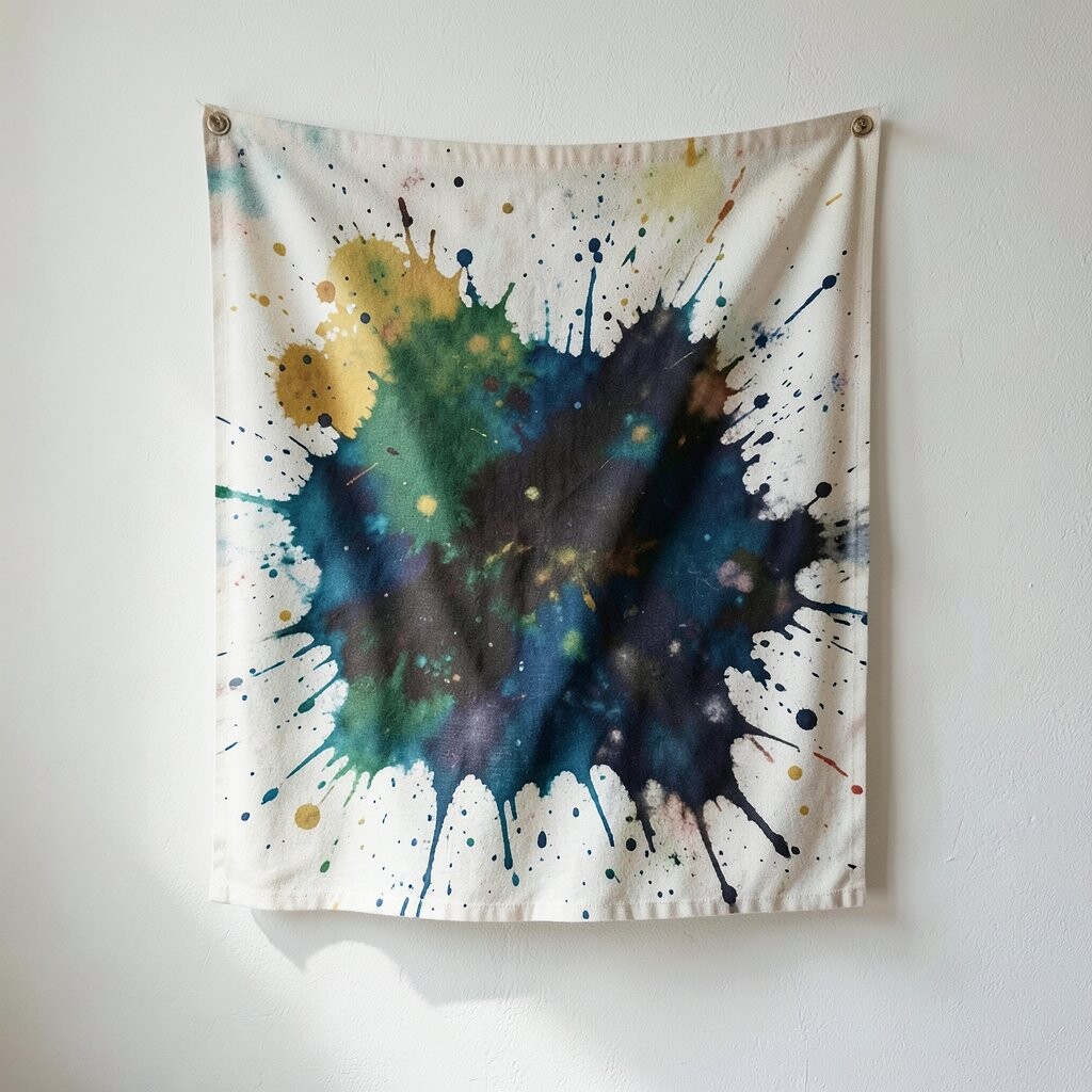
Before you splatter, scrunch, twist, or knot the fabric slightly, then apply dye or paint so the folds act like a texture stamp. After unfolding, add small abstract splatters on top for the final artistic punch.
You’ll get a rich layered look because the texture shows through even when colors are similar. This benefits your project because it reduces the need for complex designs, and the splatter becomes the finishing detail rather than the whole plan.
Personalize by using your favorite fabric-dye colors or paint shades and focusing splatters near the flatter areas where the fabric looks smoother. For practical care, seal the paint properly once dry so your wall art stays pleasant to touch and easier to clean.
13. Feature Wall Combo: Fabric Splatter + Lighting and Shelves
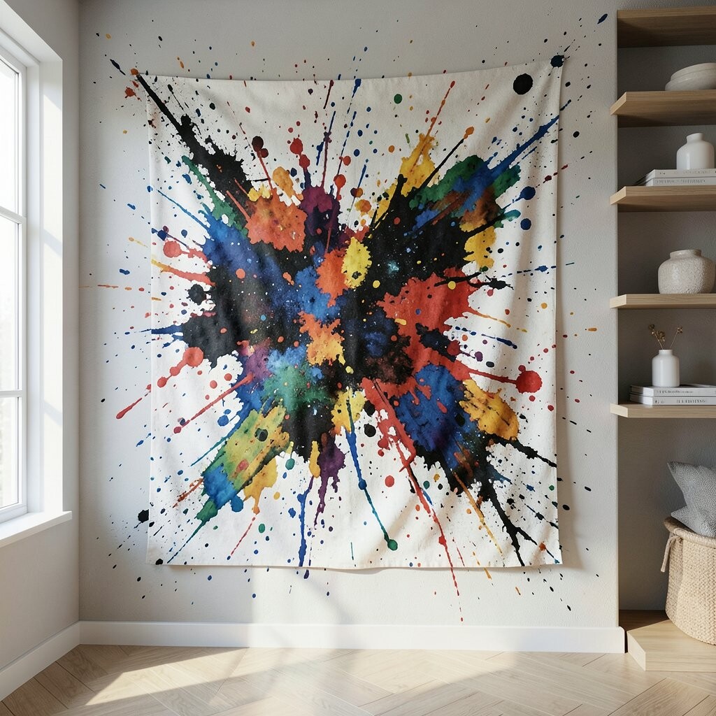
You can make your abstract paint-splattered fabric feel more like a gallery installation by adding simple shelves or a narrow ledge nearby. When you place warm lighting aimed at the fabric, splatters cast tiny shadows that make the texture feel deeper.
Try hanging the fabric slightly off the wall so the paint has more chance to catch light, and use a few framed objects that match one of your splatter colors. This unique combo improves the overall look because it turns a flat wall into a layered scene, and it helps you style the space without extra painting.
For cost, you can keep shelves minimal and use battery lights if wiring is tricky, while still getting a premium effect. Personalize the wall by repeating one paint shade in the accessories so everything feels connected.