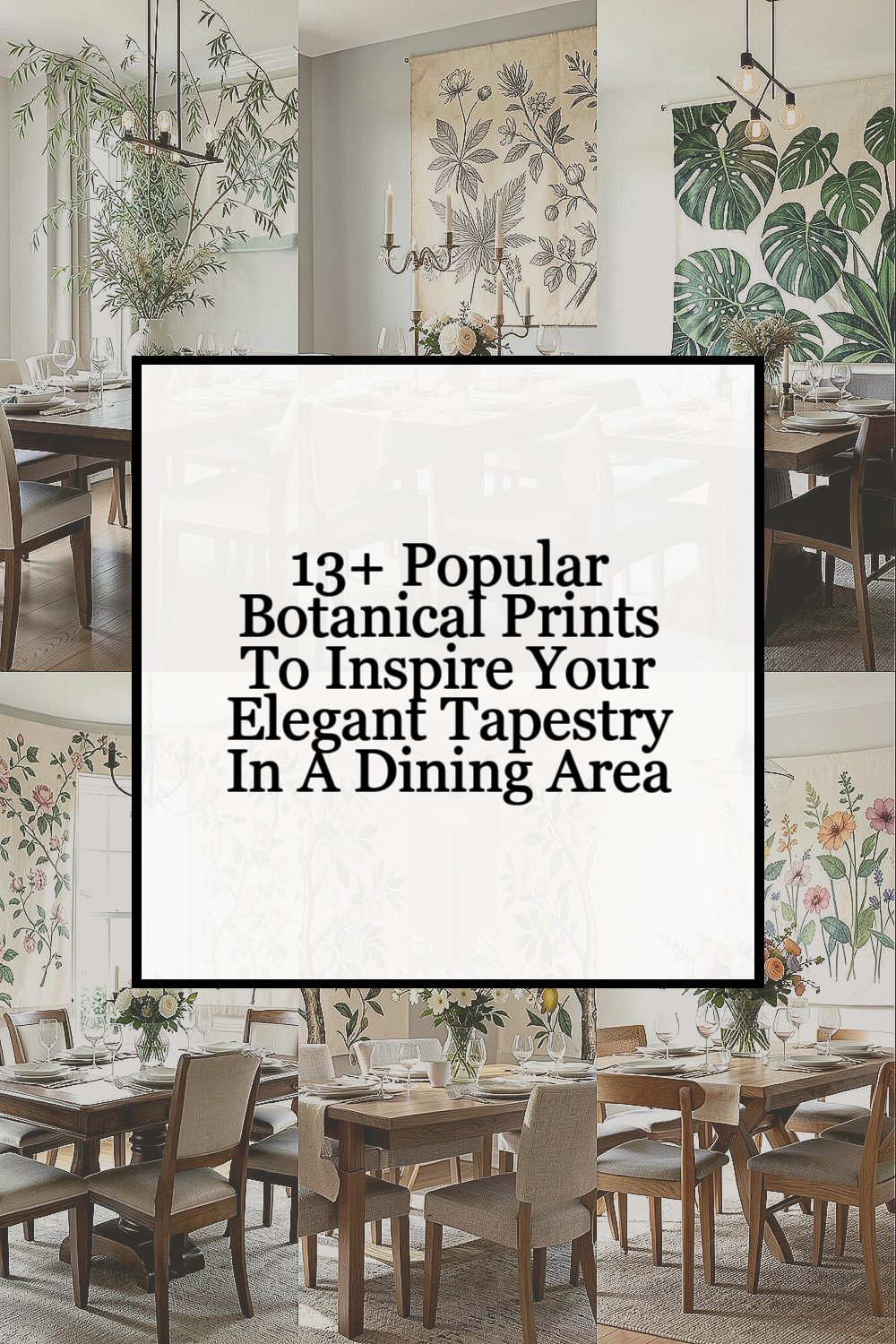
The right botanical print can make a dining room feel calm and dressed up at the same time. With a few smart choices, it can also feel personal every single day.
Let your walls and textiles share the same plant story, from soft leaves to bold blooms.
1. Willow Branches in Soft Green
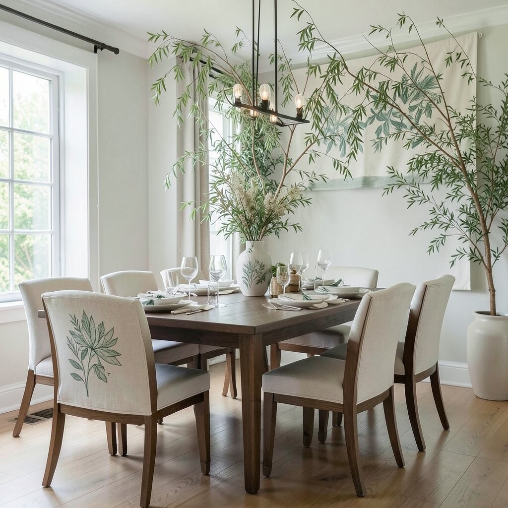
Think of thin willow strands floating across a pale background like slow-moving ribbons. When you picture the dining area, the print’s gentle curves can echo the rhythm of clinking glasses and warm candlelight.
This style feels soothing and easy on the eyes, which helps conversations stay relaxed. If your dining chairs already have strong shapes, willow branches add elegance without crowding the room, especially when you pair the print with light wood and cream linens.
To make it work in real life, choose a tapestry size that covers the most blank visual space behind a dining table or buffet. For personalization, match the green tone to one small detail, like napkin rings, a ceramic vase, or even a cabinet handle finish. If you want a budget-friendly route, look for prints that are available in downloadable sizes or reprint-friendly artwork and keep the frame simple.
2. Vintage Botanical Etchings on Aged Paper
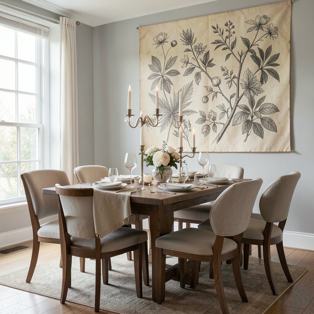
Picture delicate engravings of leaves and stems printed in muted ink, with the paper looking gently worn. That old-world vibe can make a modern dining room feel collected and lived in, not sterile.
Etchings are also great for texture since the fine lines add interest even from a distance. They tend to hide small flaws in walls and they work well when your dining area has neutral furniture and warm lighting.
Choose a tapestry design that includes varied line weights so the composition stays crisp, especially if you view it across the room. For a practical styling move, hang it so the center aligns with the table’s widest point, and add a small gallery of botanical art in matching ink colors. In terms of cost, vintage-style prints are often more affordable than fully hand-painted work, especially when you select a fabric that prints cleanly.
3. Bold Monstera Leaves for Modern Drama
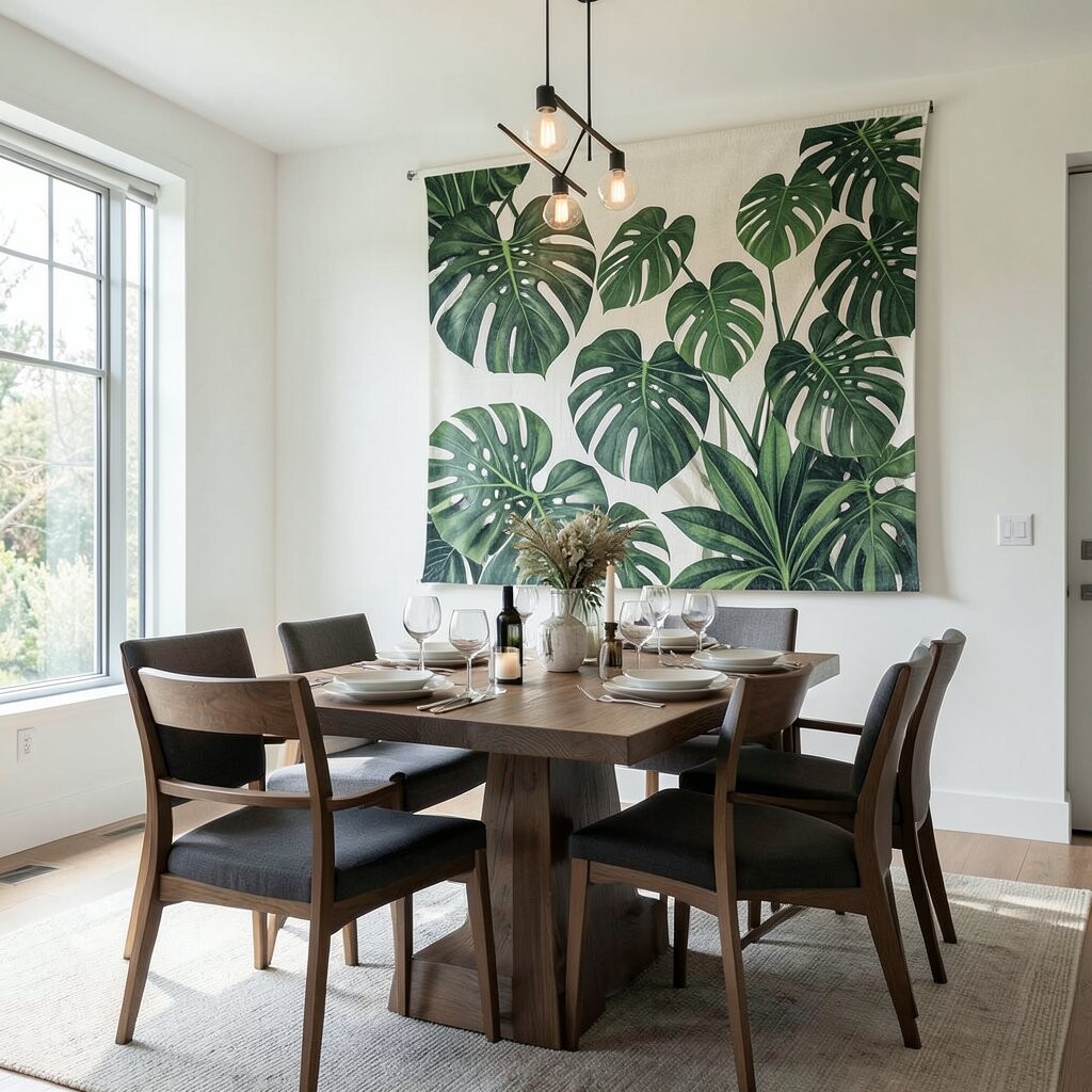
Monstera is the kind of botanical print that instantly makes a room feel current. Large leaf shapes with cutout windows can create a gallery look behind your dining setup.
This print brings a confident pop of pattern, which is helpful if your dining room is mostly plain. It also works as a visual anchor, giving the eye a strong focal point when you’re setting the table and arranging centerpieces.
For best results, pick colors that echo your existing decor, like deep green with black accents or bright emerald with warm brass. You can personalize the look by tying the palette to your placemats and glassware, so everything feels intentional. If you’re watching cost, choose a design with fewer colors and clean edges, since simpler prints often reduce production and framing expenses.
To keep it cozy rather than too loud, balance the bold leaves with soft textiles such as linen curtains or a woven runner.
4. Classic Rose Vines with Gentle Bloom
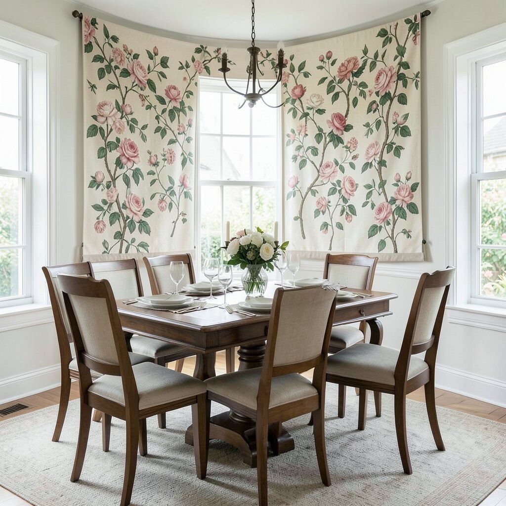
Imagine rose vines climbing across a soft background, with blossoms scattered like little bursts of joy. In a dining area, this print can feel romantic without turning overly formal.
Roses add a warm emotional tone, which many people find makes meals feel special. They also pair beautifully with tableware that already has slight patterns, like china with scrollwork or dinner plates with a hint of gold.
When choosing a tapestry, consider a layout where vines curve naturally around an empty center, because it gives you room to place a centerpiece. Personalize it by using rose-adjacent colors in the room, such as blush napkins or warm terracotta ceramics that bring the artwork out in daylight. If you want to manage cost, look for designs that come in standard sizes and avoid complex custom framing unless the print truly needs it.
5. Citrus Branches and Sunlit Blossoms
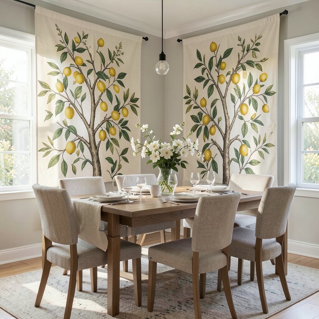
Bright citrus prints can feel like sunshine that never leaves the table. Think orange and lemon branches with glossy leaves and tiny blossoms that look freshly painted.
This is a great choice for dining spaces that need energy, especially in rooms with cooler tones. Citrus patterns also feel playful, so they pair nicely with casual dinnerware and everyday hosting.
Try selecting a tapestry with a slightly lighter background so the room doesn’t feel heavy during long meals. For practical personalization, match the zest color to an accent like fruit-themed ceramics, a runner with warm tones, or a vase filled with real branches during seasonal gatherings. If budget matters, choose a design with a limited color range, since fewer hues usually mean more options and easier sourcing.
6. Watercolor Wildflowers in Loose Color Wash
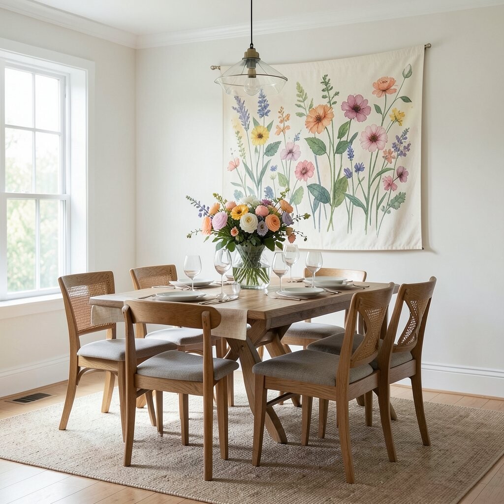
Wildflower watercolor prints look airy and friendly, like a sketch that grew into art. Soft petals drifting across the fabric can make your dining area feel creative and welcoming.
This style is especially beneficial if you want something elegant but not too strict. Watercolor textures also work well when you plan to change seasonal decor, since the palette often stays flexible.
Look for a print where the flowers vary in scale, with a few larger blooms that create depth. Personalize your dining setup by adding matching shades to the tablecloth or napkin set, even in small ways like one color in the center of each place setting. For cost considerations, watercolor-style prints can be widely available, so you can often find good quality fabrics without paying for rare originals.
7. Botanical Sea Ferns and Coastal Greens
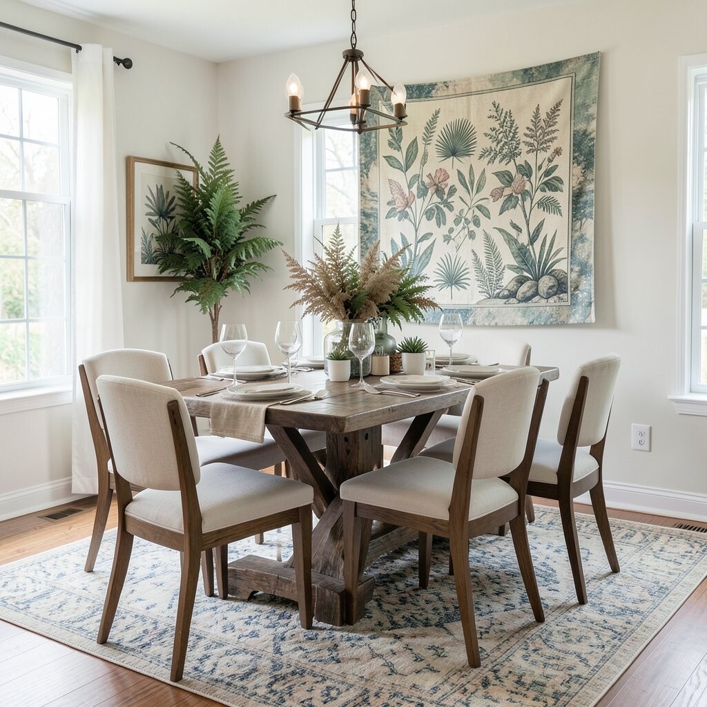
Coastal botanical prints can bring a calm, breezy mood, even if you live far from the shore. Sea fern artwork with slender fronds and seafoam greens feels gentle and quietly luxurious.
This kind of imagery is a smart benefit for dining rooms because it promotes a relaxed atmosphere. The fine, feathery lines also look good against textured walls, so your space feels rich without heavy visual weight.
To make it practical, choose a tapestry that uses cool greens and pale neutrals, then echo that palette in your glassware or vase. Personalize it with coastal objects like driftwood-toned frames or subtle shell accents that don’t steal attention from the print. If you’re working with a smaller budget, consider a print that fits standard frame dimensions so you spend more on fabric quality and less on custom sizing.
Make the look feel cohesive by adding a light-colored runner and soft, sandy cushions on nearby seating.
8. Mid-Century Palm Prints with Retro Rhythm
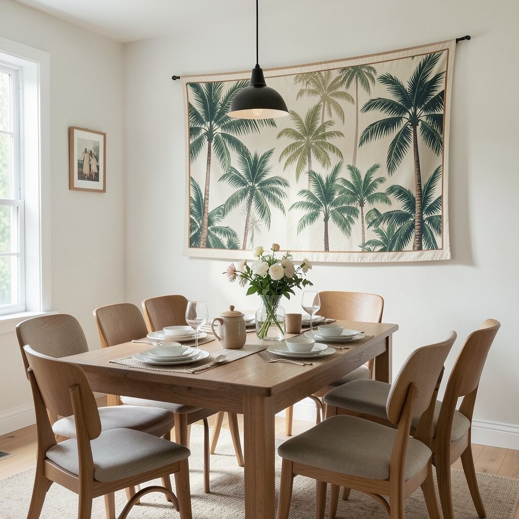
Palms can deliver a retro rhythm that still feels stylish today. With repeating fronds and mid-century layouts, your dining area gets instant character.
This print style is beneficial when you want energy, because bold shapes often make the room feel lively. It also works well if you have furniture with clean lines, since the artwork adds pattern without clashing.
Pick a tapestry where the background color matches your wall tone or one dominant color in your decor. For personalization, mix and match pillows or chair backs with tiny complementary patterns, keeping the palette within two or three main colors. For cost, retro palm designs are often common in print catalogs, so you can compare options and choose a fabric that fits your budget without losing style.
If your dining space faces lots of sunlight, consider a colorfast fabric so the greens and warms stay vibrant.
9. Night-Blooming Flowers on Dark Backgrounds
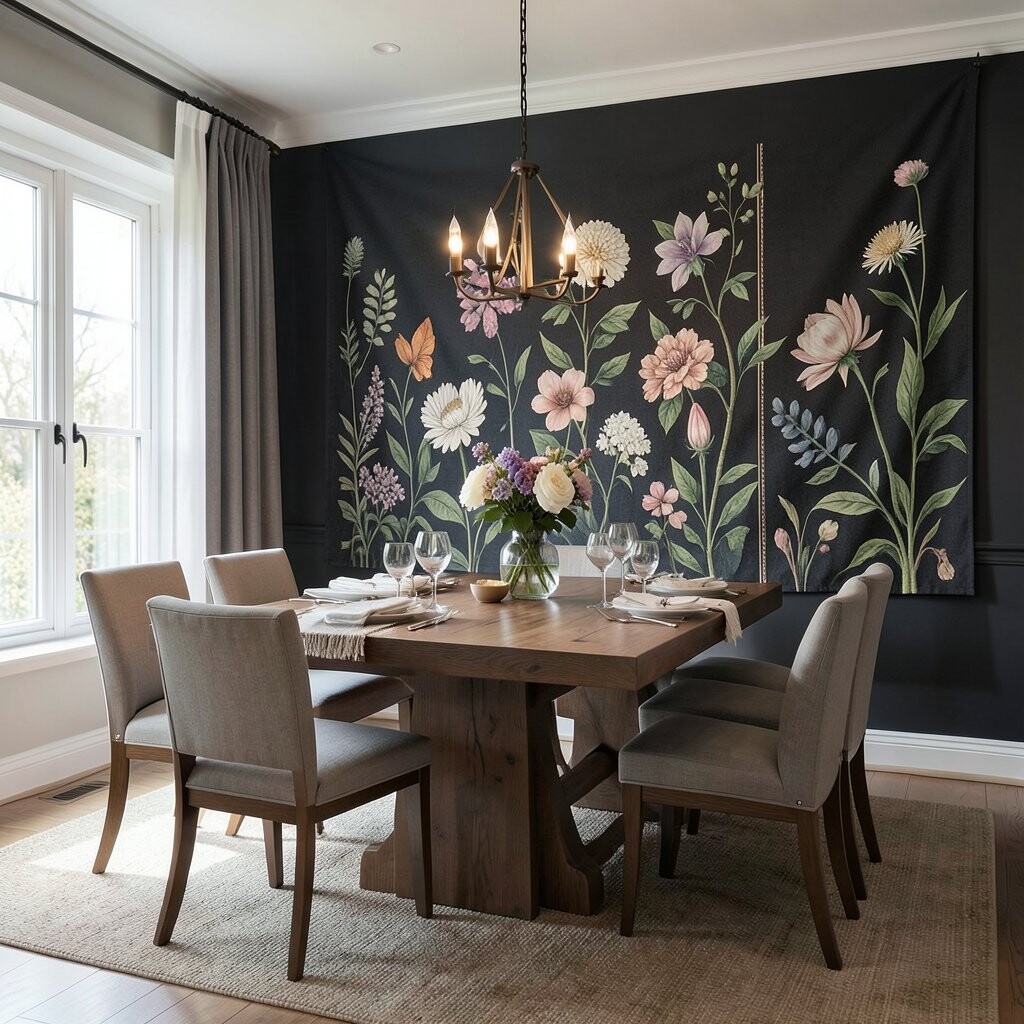
Some botanical prints shine most when they glow against a dark backdrop. Night-blooming flowers with deep greens, rich purples, and soft highlights can feel dramatic and elegant.
This choice offers a strong uniqueness because it turns the dining wall into a moody focal point. It also benefits evening meals, since warm lamps and candles feel extra cozy beside dark-toned artwork.
When selecting a tapestry, check contrast first, because light blooms must stand out from the background at the viewing distance in your dining room. Personalize the look by choosing metallic accents like brass or gold in frames, light fixtures, or candle holders so the print feels intentional. Cost-wise, darker prints can be forgiving, since they hide slight fabric texture differences, which may reduce the need for ultra-premium materials.
Keep the rest of the dining area calmer with solid curtains and simpler table styling so the flowers remain the star.
10. Fern Frames with Symmetry and Soft Geometry
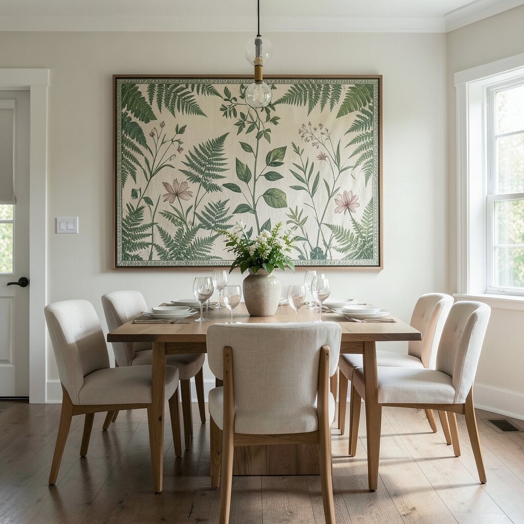
Fern prints that sit inside leaf-like frames can bring a tidy, balanced feel to your wall. Even though it’s botanical, the symmetry makes the room feel orderly and refined.
This style is helpful for dining spaces because it looks structured, especially if your table, light fixture, or shelving already uses straight lines. The uniqueness comes from combining nature shapes with a design that feels almost architectural.
For a practical approach, choose a tapestry where the frame edges align neatly with your wall or the top of a buffet, creating a clean visual boundary. Personalize by echoing the frame color in your dining accessories, like woven placemats or a matching vase. If you want cost control, you can often find symmetrical prints in many sizes, so choosing the right scale becomes easier and less expensive.
To keep the greenery from looking too heavy, pair with airy curtains or a light rug that adds softness underfoot.
11. Cherry Blossoms with a Springtime Whisper
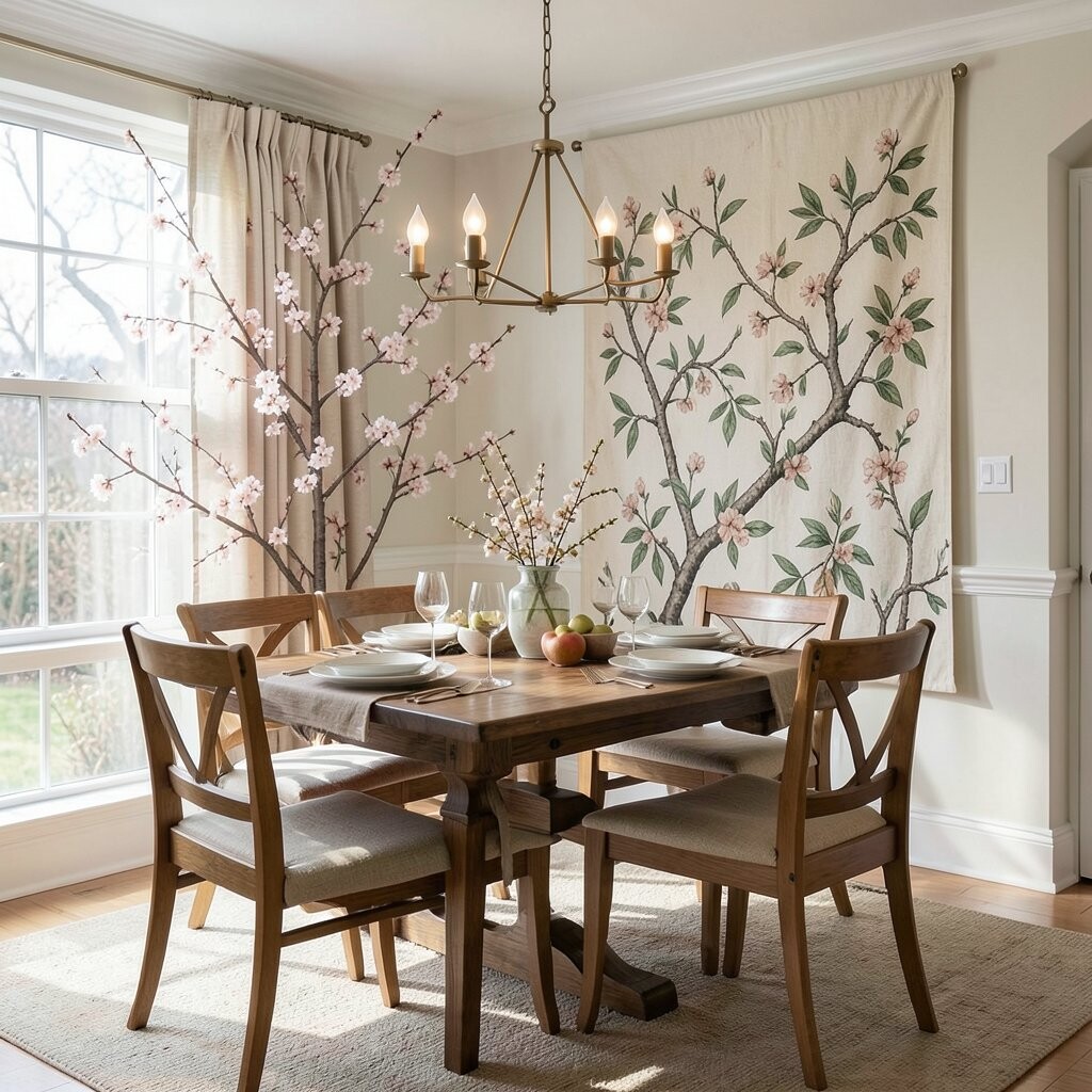
Cherry blossom prints feel delicate, with petals that float like gentle confetti. In a dining area, they create a light, hopeful mood that works for both everyday dinners and special occasions.
This print can benefit your space by adding softness around the room without overwhelming it. It also feels unique because blossoms often include fine branch detail that looks graceful when framed or hung at dining eye level.
Look for a design with clear separation between branches and petals, so the image stays readable from across the table. Personalize it by using subtle pink and warm white in your table linens, or by adding a small floral arrangement that mirrors the print’s main tones. For cost considerations, cherry blossom motifs are popular, which means you can shop around and choose a quality textile that fits your budget.
12. Teal Botanical Prints with Modern Linework
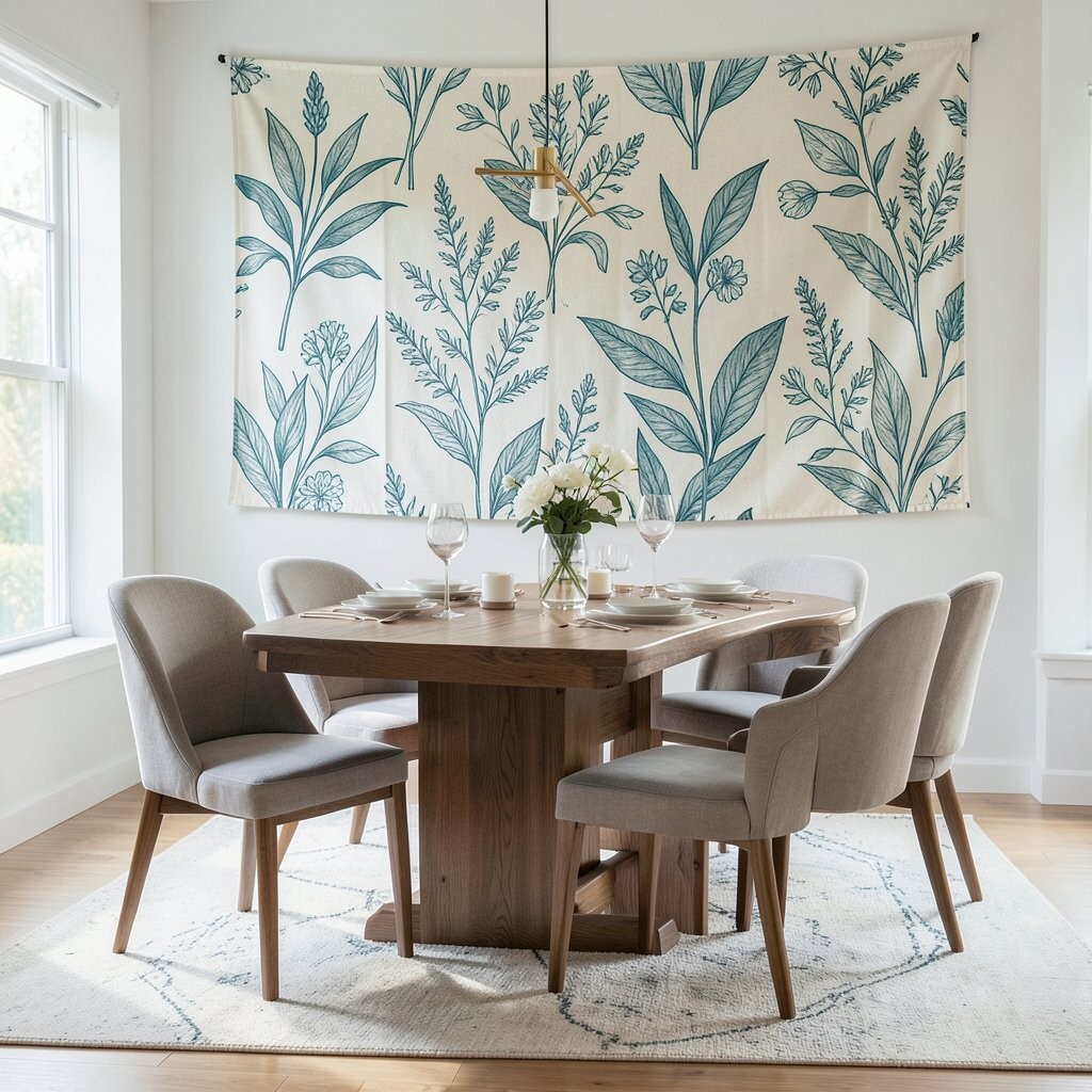
Teal botanical prints bring a modern calm, especially when the leaves are drawn with clean linework. The result can feel like a fresh design magazine spread for your dining room wall.
This is beneficial when you want elegance with less clutter, because line drawings often look crisp and not overly busy. It also provides uniqueness through its color choice, since teal can make neutrals feel richer.
To make the look actionable, choose one dominant teal tone and repeat it in small places like candle jars, a chair accent, or a serving tray. For personalization, pair the tapestry with plain tableware and add one patterned element only, so the room stays balanced. Cost can be manageable because linework designs are frequently available in many fabric types, from affordable printed textiles to higher-end blends.
If your dining room has brass or matte black fixtures, teal often complements them beautifully.
13. Tropical Jungle Foliage with Dense Layering
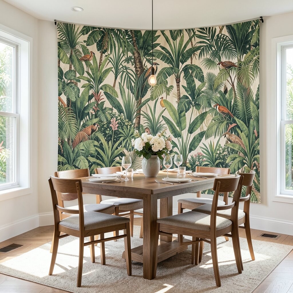
Tropical jungle prints can make your dining area feel like a private greenhouse. Dense foliage, overlapping leaves, and layered depth create a wow moment right when you walk in.
This kind of botanical artwork is beneficial for hiding visual emptiness because the complexity fills space in a stylish way. It’s also unique because it gives the illusion of depth, almost like you could step into the greenery.
Choose a tapestry with a clear color hierarchy, so the darkest leaves don’t flatten the image when viewed from a distance. Personalize it by keeping your dining table styling simple and letting the print carry the theme, then add a small greenery centerpiece to connect the room to the artwork. For cost considerations, remember that very dense, multicolor prints can be pricier, so consider selecting a design that repeats a few signature leaf shapes or offers fewer color tones.
To avoid overwhelming the room, keep nearby walls neutral and use soft textures like woven rugs or upholstered seating.
14. Botanical Mandalas with Leaf-Centered Balance
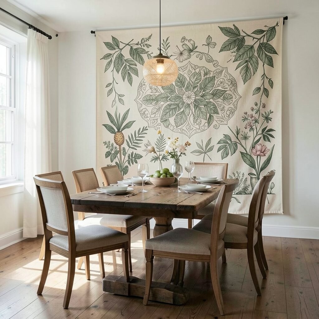
A leaf mandala brings botanical beauty into a calm, centered composition. With layered circles made from leaves and petals, it feels elegant and grounding at the same time.
This print style benefits a dining area because it naturally draws the eye toward the center, which matches how people gather around the table. Its uniqueness comes from mixing symmetrical design with organic shapes, creating a piece that feels both artful and comforting.
For practical installation, hang it at a height that keeps the mandala’s center near the height of a chandelier or wall decor eye line. Personalize by choosing matching table center colors, like soft greens or warm creams, and use matching coasters to tie everything together. Cost can vary, so consider pre-sized tapestries first and only go custom if you want a specific color match for an existing dining set.
If you love seasonal change, keep the tapestry as the stable “anchor” and rotate table linens and candles to match spring, summer, or autumn moods.