
The sidewalk calls for something bold, and chalk can deliver. With the right layout, your menu can feel like an invitation to taste.
That moment before customers step in is perfect for good design, clear choices, and a little personality. When your chalkboard looks thoughtful, people trust the food even more.
1. Hand-Lettered Specials With a Cozy Header
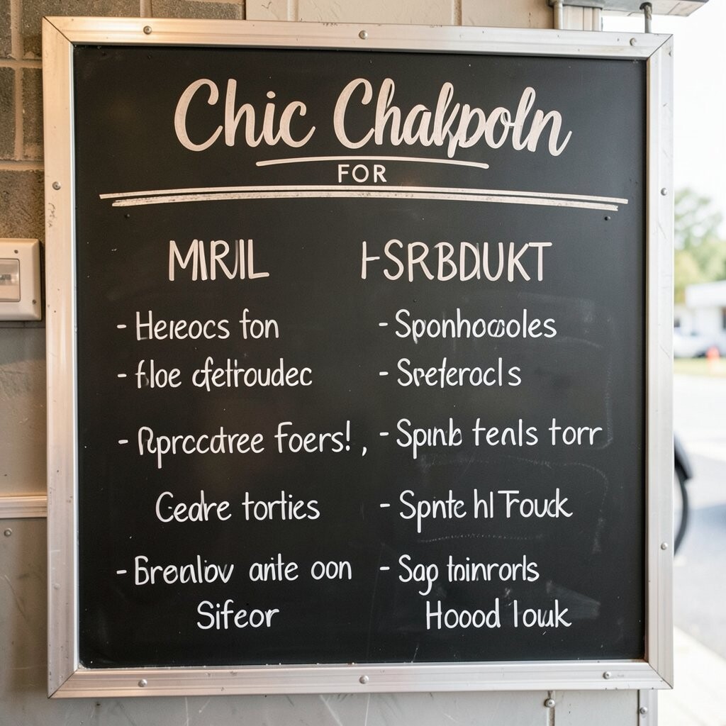
You can write your daily specials in flowing, hand-lettered style, then give them a warm header that matches your truck’s vibe. Keep the letters thick and readable from a few steps away, and use small charm details like dots, flourishes, or tiny icons near the top.
Customers love feeling like your truck is personal, not generic, and a cozy header makes the whole board feel welcoming. This setup also helps you guide attention toward what you want to sell most, which can cut down on last-minute food waste. For practical results, use one main chalk color for the header and a second color sparingly for headings.
2. Color-Blocked Sections for Easy Scanning
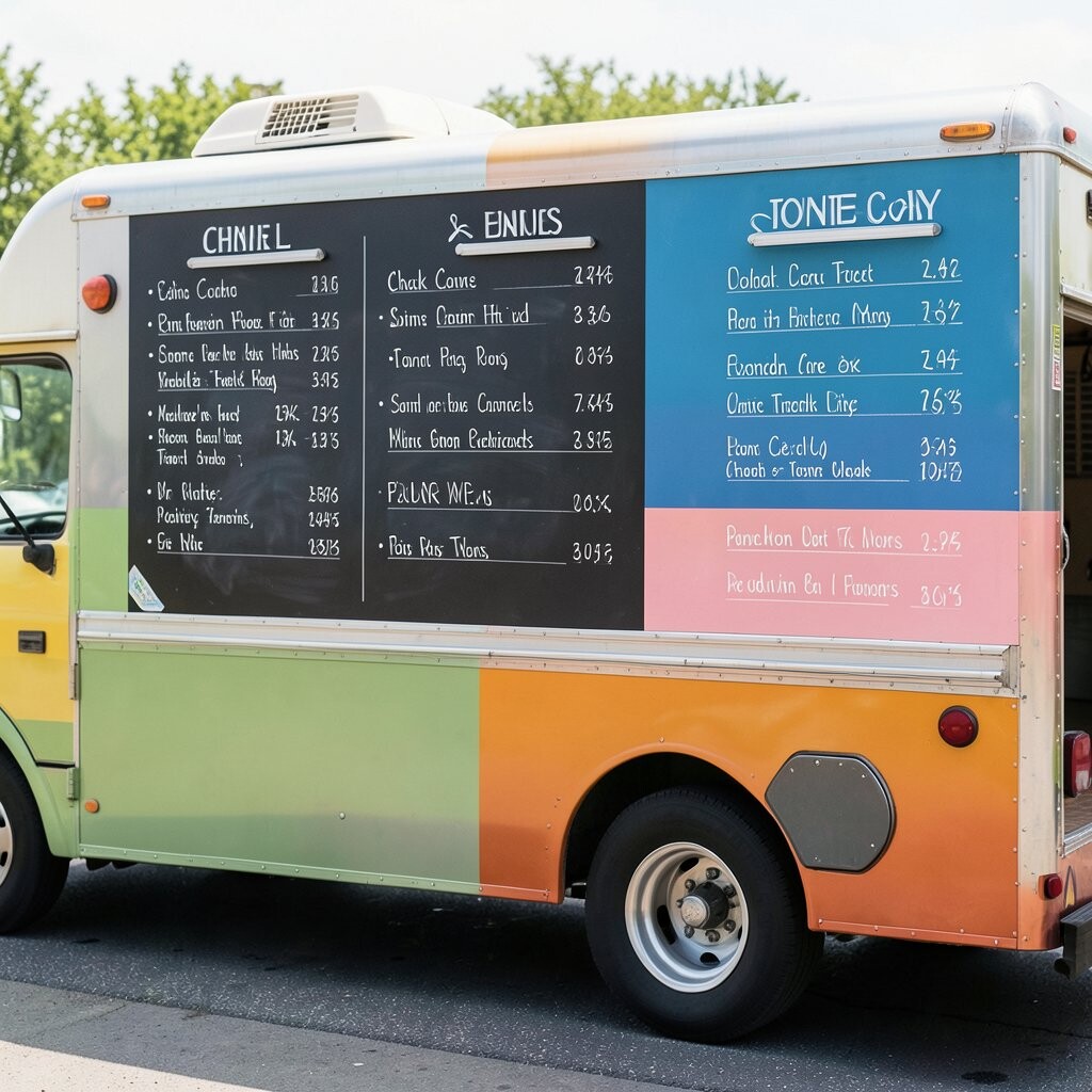
Divide your chalkboard into clean color-block style panels, then assign each panel to a category like sandwiches, bowls, or sides. Even if you only use chalk, you can fake color-blocking with bold backgrounds using darker chalk shades or gentle chalk shading.
This layout benefits busy customers because their eyes can land on the right section faster. It’s also unique because the design looks modern while still feeling handmade, which fits current trends toward “organically styled” menus.
For personalization, use colors that match your truck wrap and keep them consistent across seasonal updates. If you want cost control, keep one chalkboard template and simply rewrite the categories instead of buying new signage each month. Add a small border around each panel to make the board look polished and intentional.
3. Chalk-Doodle Food Icons That Teach Without Words
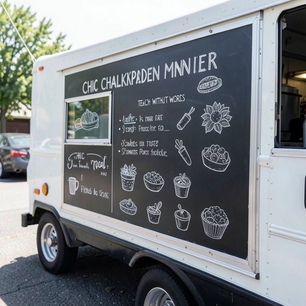
Add small chalk doodles beside each item, like a tiny taco shell, a steaming cup, or a slice of pizza. These icons should be simple and readable, not overly detailed, so they don’t blur from a distance.
Icons help customers understand what’s in the dish at a glance, especially for folks who don’t want to read long descriptions. The uniqueness comes from the playful touches, and today’s audiences often expect visuals that feel fun and friendly.
To make it practical, keep every icon about the same size and place them in a consistent spot aligned with the item name. Personalize by matching doodles to your brand colors, or by drawing a signature item icon in a slightly bigger size. Use a fresh eraser and light hand so your chalk lines stay crisp, since smudgy art can make the board harder to read.
4. Seasonal Script for Limited-Time Flavor Drops
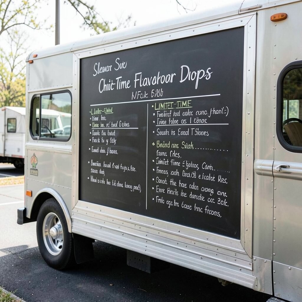
Use a seasonal script style for limited-time items, like “Summer Citrus,” “Autumn Spice,” or “Winter Comfort.” Write the flavor names in a slightly larger, flowing font so they stand out right away.
This idea feels unique because it turns your menu into a living calendar instead of a static list. It also creates benefits for customers who like novelty, since they know your truck will rotate flavors and keep things interesting.
5. Minimalist Names With One-Line Descriptions
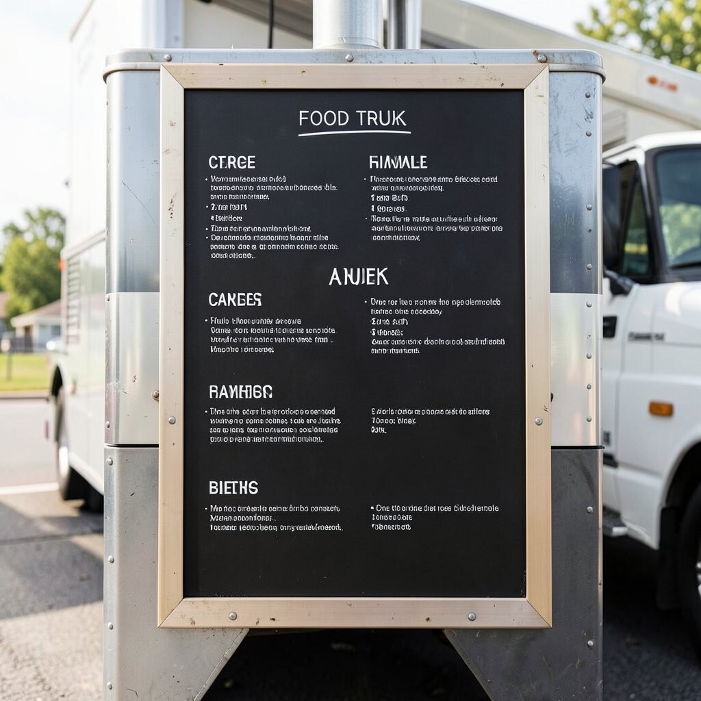
Keep item names short, then add one line that tells the key flavor in plain, friendly words. For example, you can mention “smoky,” “creamy,” “bright,” or “spicy” right under the name in smaller lettering.
This approach helps people choose quickly because they learn what makes each dish special without being overwhelmed. It’s also a smart cost consideration since rewriting one line is faster than rewriting long paragraphs for every update.
Personalize the one-liners based on what sells best, like highlighting a crowd favorite at the top of its category. For practical tips, keep the line length similar for every item so the board looks neat and balanced. Use consistent punctuation and a calm layout so your chalkboard stays easy to read in different lighting.
6. “Build Your Own” Grid for Bowls or Tacos
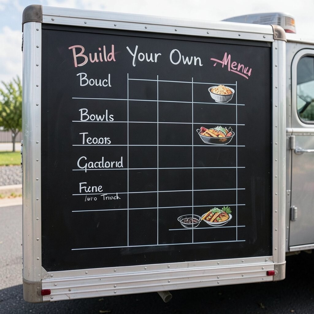
If your menu includes customizable bowls or tacos, a chalk grid can make choices feel fun and organized. Draw a neat matrix with toppings on one side and proteins or bases on the other, using small check marks or dots to show combinations.
This design benefits customers because it removes confusion and speeds up ordering when lines move fast. It also feels unique and on-trend because people enjoy interactive ordering and choose-your-own options.
To keep it practical, limit the grid to only the most popular add-ons and keep the rest for special boards. Personalize the grid with a signature sauce line at the top so people remember what makes your truck different. If chalkboards cost is a concern, use one large board and swap only the topping list when your inventory changes.
When you plan new combinations, test them on busy days so you learn which selections customers actually want. Keep a small chalk note in the kitchen so the grid stays accurate and easy for staff to follow.
7. Chalkboard Menu With Customer-Favorite Star Ratings
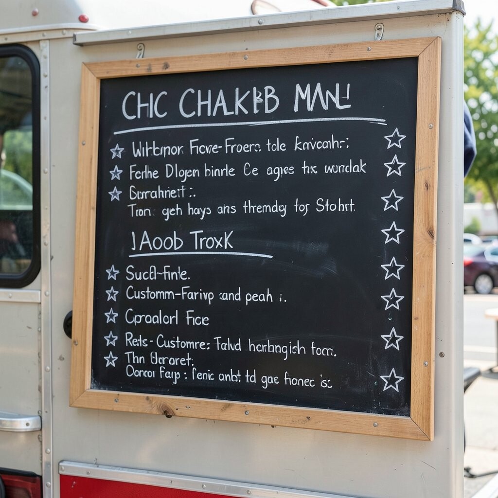
Mark your most loved dishes with chalk stars or little sparkles next to the names. You can write “fan favorite” in tiny script or simply use a consistent star system that staff can update when demand changes.
This helps benefits because customers feel confident choosing something proven, especially when they’re trying your food for the first time. It’s also unique since many boards stop at listings, but yours gives a friendly hint about what people really enjoy.
For practical tips, don’t overuse stars so the spotlight stays meaningful. Personalize by tracking favorites weekly and updating the stars during restocks, so the board stays current. You’ll keep cost down too, since the updates are quick and only require chalk and a steady hand.
8. Quote-Style Menu Lines That Match Your Brand Voice
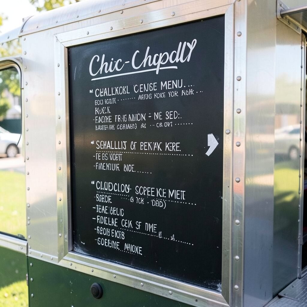
Write a short quote or playful statement at the top that matches your truck voice, like “Big flavor, fast smiles” or “Hot off the grill.” Use an eye-catching script font for the phrase so it becomes a mini sign customers notice from far away.
This idea gives your board personality and helps it feel more like your brand than a generic chalk list. The benefit is emotional, because a welcoming line can make people slow down, read, and then order.
9. Chalk Map Layout With “Where to Start” Flow
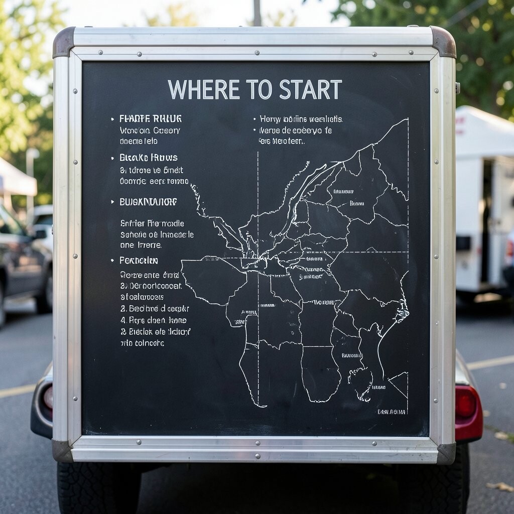
Create a layout that feels like a path, using arrows to guide the order process from start to finish. For instance, point from “choose your base” to “choose your topping” to “pick a sauce,” all with clear arrows and consistent alignment.
This is helpful for customers because it reduces decision fatigue and speeds up ordering. It’s unique because it turns a menu board into a mini experience, which fits current trends toward interactive, story-like branding.
To keep it practical, make the path short, like three steps, and leave enough spacing so it’s readable even during a rush. Personalize by using arrows shaped like your brand symbol, such as a tiny flame or star. For cost considerations, design the base template once, then reuse the same structure while swapping item names as your offerings change.
Assign a staff member to practice the flow out loud so customers hear consistent guidance. When the board and the speech match, people feel cared for and ordering becomes smoother.
10. Texture-Style Lettering With Repeating Border Patterns
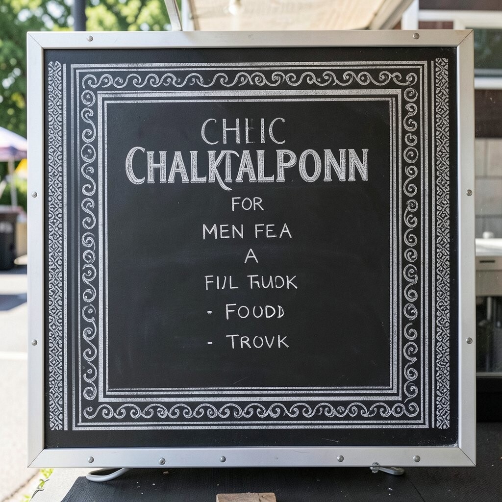
Try textured lettering, like lightly shaded outlines that mimic chalky wood or watercolor edges. Pair that with a repeating border pattern, such as small triangles, wavy lines, or tiny chili shapes running along the edge.
This benefits your board because the eye gets anchored in the frame, making the menu feel finished instead of rushed. It’s also unique since the texture gives your menu depth, which looks great in photos and social media.
For practical tips, keep the text thick and avoid overly thin lines that disappear from far away. Personalize the border pattern to match events, like adding spring leaves or holiday stars during peak seasons. If you’re watching costs, use one chalk color plus one accent so the board stays cohesive without needing lots of supplies.
11. Menu Segments With Pairing Suggestions for Drinks or Sides
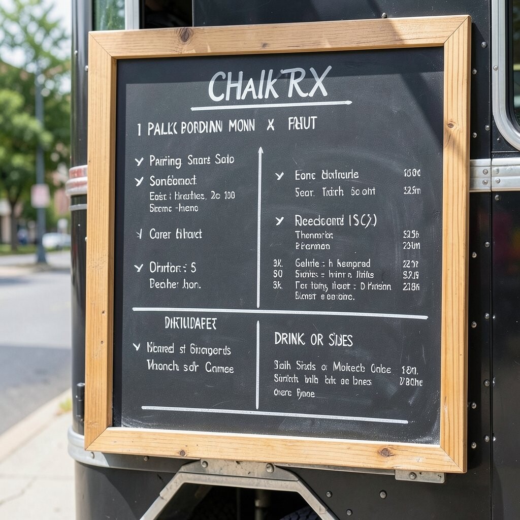
Group items with pairing suggestions that feel helpful, like “Pair with lime soda” or “Perfect beside fries.” Use small chalk circles or brackets to connect a main dish with its recommended side or drink.
This idea benefits customers because it gives them a low-stress path to order a complete meal. It’s also practical because it can increase add-on sales, which helps cover ingredient costs and keeps your menu profitable.
Personalize by highlighting what you’re featuring that week, like a seasonal drink or a limited sauce. You can keep chalk costs low by using a repeating pairing format, then swapping only the specific dish names. To stay on-trend, lean into “small luxuries,” like pairing with creamy dips, sparkling drinks, or crisp seasonal slaws.
12. Small Chalk “Ingredient Highlights” for Credibility and Trust
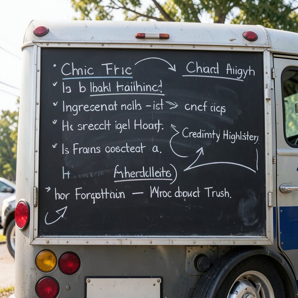
Add tiny ingredient highlights beneath a few key menu items, such as “fresh herbs,” “house-made sauce,” or “slow-cooked.” Keep these short and honest, and use simple icons like a leaf or a drop of sauce to make them quick to read.
This gives customers clarity and builds trust, which is a real benefit when people are deciding where to eat. It’s unique because it blends storytelling with practical information, and that matches current expectations for transparent, quality-focused menus.
For practical tips, choose just a handful of highlights so the board doesn’t get cluttered. Personalize the highlights to your real process, like swapping “house-made” notes when you change your prep style. Keep cost considerations in mind by only adding phrases you can confidently repeat, since accurate claims protect your reputation and reduce confusion at the counter.
When you rewrite the board, double-check with your kitchen lead so the text matches what’s truly in the food that day. A simple, truthful chalkboard can turn a casual order into a repeat favorite.