Wall art can feel fancy without being hard. Small choices in materials, layout, and finishing make your space look styled and calm.
Here are practical ways to make refined pieces that still feel like you.
1. Start With a Visual Plan That Feels Like a “Calm Moment”

Before you buy anything, picture how the wall should feel when you walk into the room. Think of your favorite corner: the colors are steady, the shapes aren’t yelling, and your eyes land in the right place.
Choose a simple palette, like warm creams with muted greens, or charcoal with soft white. Limit your main colors so your artwork looks intentional instead of busy. Lay out your rough arrangement on paper or in a photo on your phone, and adjust until the spacing looks relaxed.
2. Treat Texture as Your Secret Background Layer
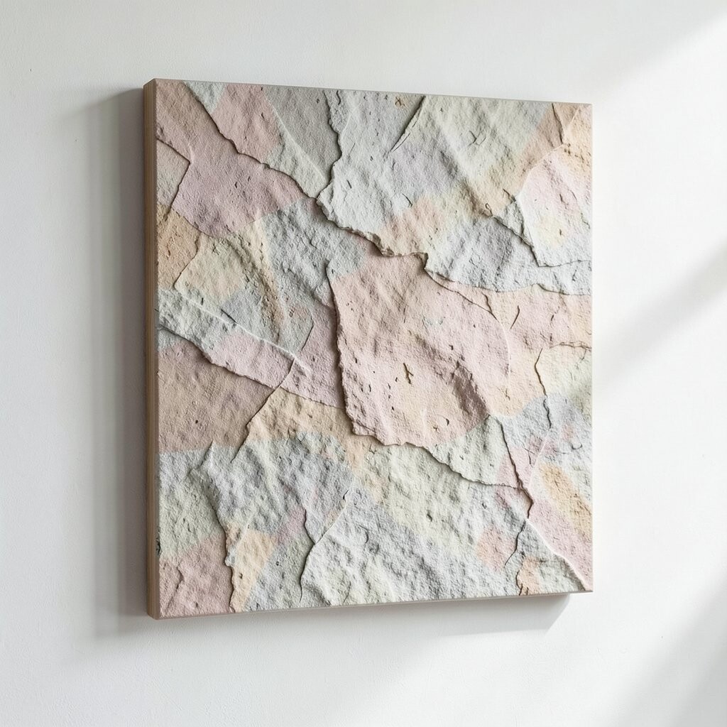
Even when the design is simple, texture adds depth and makes pieces look more expensive. Picture linen-like paper, gentle wood grain, or a lightly raised surface catching light in the evening.
Use textured cardstock, canvas paper, or fabric scraps for subtle dimension. Add a thin layer of clear medium or a matte gel only where you want the eye to notice. If you love a clean look, keep the texture soft and spread it evenly.
You can personalize the vibe by matching texture to your room materials, like using woven fibers in a space with rattan furniture. This trick helps your art blend with everyday life instead of looking pasted on. It also lets you stretch your budget because small surfaces of texture do a lot for the final look.
3. Use the “Light Test” Before You Commit

Refined wall art should look good in real lighting, not just in daylight. Set your piece where it will hang, then check it at different times of day.
Stand back and squint a little, then look again with a normal focus. If highlights flare too much, switch to a matte finish or use less glossy paint. If shadows look muddy, lighten the background or add a thin, gentle highlight.
For personalization, consider how your room’s lighting color affects your palette. Warm lamps can make cool blues feel cozy, while cooler bulbs can brighten creams into crisp whites. This small test helps you avoid redoing hours of work, which saves money and stress.
4. Choose Frames Like You’re Picking Shoes
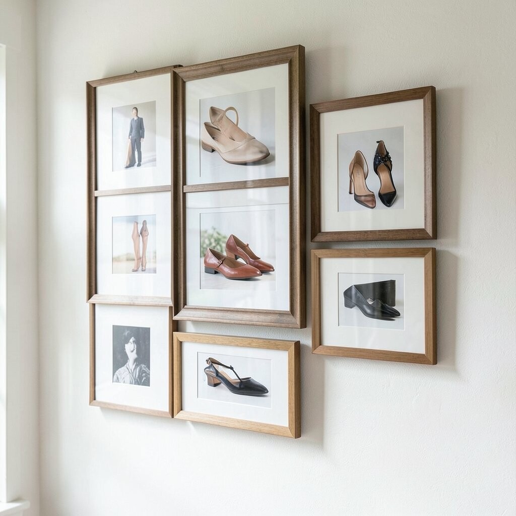
The frame is what makes the artwork feel finished, not just decorative. A good frame supports the piece the way sturdy shoes support a long walk.
For most rooms, simple materials look refined, such as thin black metal, natural oak, or white-washed wood. Keep the frame style consistent with other basics in the room like picture rails or cabinet hardware.
5. Don’t Ignore Mounting Depth and Spacing
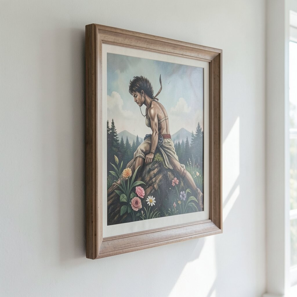
Spacing is part of the design, especially with gallery-style layouts. A slight gap between prints and the wall can make the whole set look intentional.
Use spacers or a shadow box approach if you’re layering paper, fabric, or small objects. Make sure your center pieces align at eye level so the layout feels balanced. If you’re hanging two pieces, keep the distance between them consistent so your brain reads it as a system.
When you personalize, vary the height by a small amount for motion, but keep the overall lines tidy. This creates a “designed” look without needing expensive custom framing. It’s also budget-friendly because careful measuring often replaces extra purchases.
6. Make Color Decisions Based on Objects You Already Own

Instead of chasing trendy palettes, borrow from what’s already on your shelves. If you have a terracotta vase or a navy throw blanket, those colors can guide your wall art.
Pick one dominant color, one supporting shade, and one accent that matches a small detail elsewhere. This makes your art look like it belongs in the room. You’ll feel more confident because the colors come from real life, not guesswork.
7. Give Your Artwork a “Hero” Area and a Resting Area

Refined pieces often have a clear focal point, but they also leave room for calm. Think of a beautiful portrait where the face draws you in and the background quietly supports it.
Place your most detailed or darkest element slightly off center. Keep the rest simpler, using wider negative space or lighter tones. That contrast makes your art feel polished and gives your eyes a place to rest between visual moments.
To personalize, choose the hero area based on what you want to highlight, like a botanical illustration, a meaningful quote graphic, or a favorite geometric pattern. This approach makes even budget-friendly print sets look intentional because the layout does the heavy lifting. It also helps you avoid clutter that can make a room feel tense.
8. Try Oversized Prints for a Designer-Style Feel

Large art can make walls look curated even when the design is simple. A bigger piece creates visual calm and reduces the temptation to fill every inch.
Choose a print with generous margins or a composition that’s comfortable at a distance. If your wall is small, go for a medium piece with strong balance rather than a tiny crowded set. You’ll spend less time fiddling with placement and more time enjoying the look.
9. Use “Repeat, Don’t Repeat Everything” in Pattern and Motifs
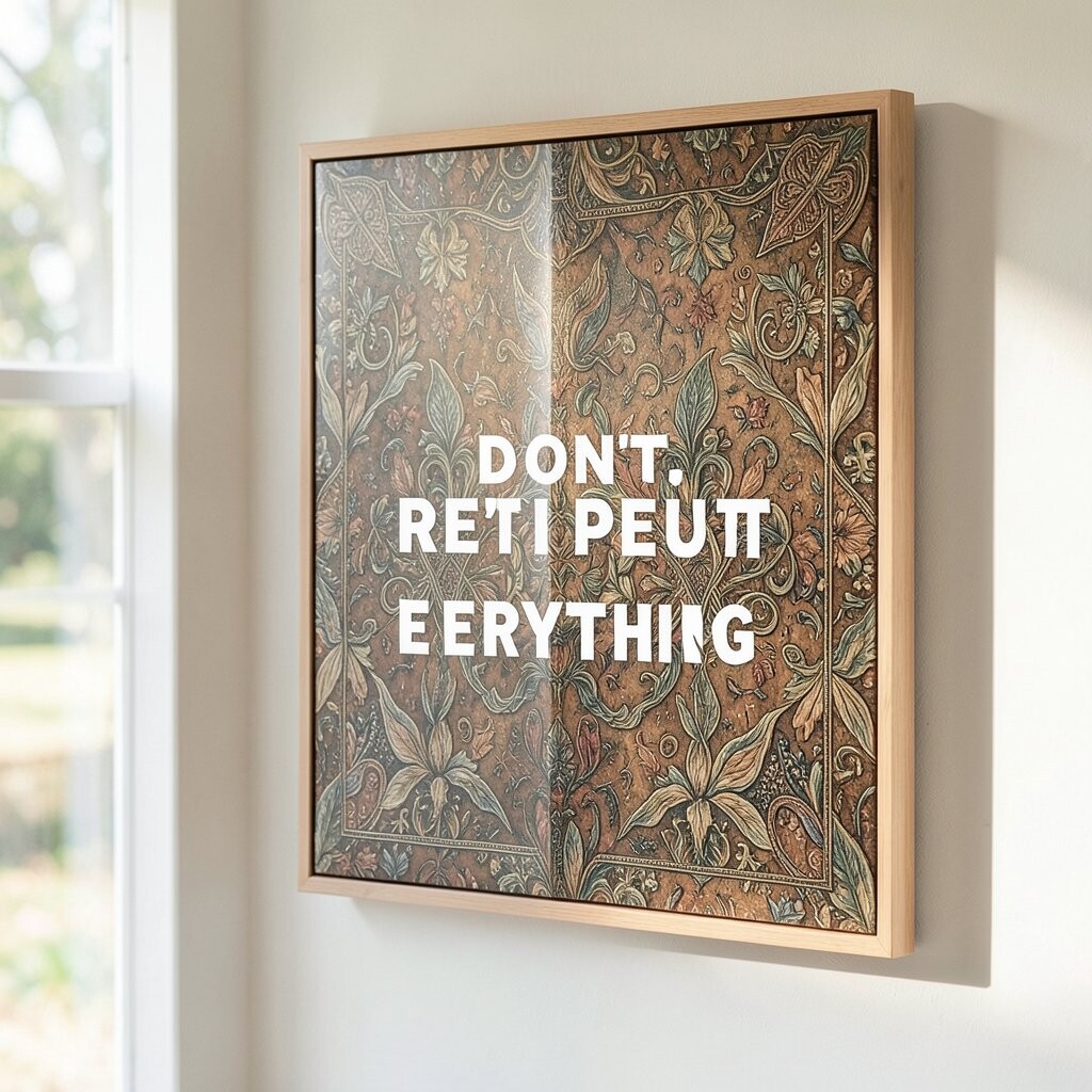
Patterns look refined when they repeat in a controlled way. A small motif that shows up more than once feels like a thoughtful design language.
Pick one recurring shape, like circles, arches, or leaf patterns, and keep it consistent in size and style. Let other parts be simple so the repetition stays elegant. If you’re mixing patterns, choose ones that share a similar color tone or line thickness.
This is an easy personalization strategy, because you can repeat what you love from fabric, stationery, or wrapping paper. It also helps you stay within budget because you can use fewer distinct elements while still achieving a rich look. The result feels cohesive instead of random.
10. Add a Hand-Finished Touch Even If You Use Prints
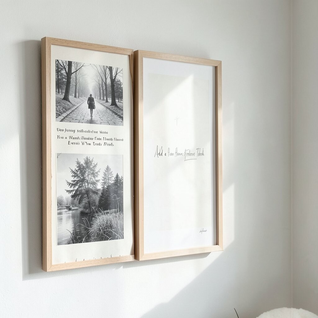
Not every refined piece has to be fully handmade to feel special. A small hand-finished detail can make a store-bought print look custom.
Try painting a narrow accent line, adding a tiny gold or bronze edge, or mounting the print with carefully chosen paper backing. You can also underline a focal shape with neat, consistent brush strokes. Keep the hand detail small and deliberate, so it looks crafted rather than messy.
For personalization, match the finish to your style, like earthy matte paints for a cozy feel or smooth metallic paint for a more glam mood. This approach often costs less than commissioning a full custom artwork. It also gives you pride because your hands are part of the final story.
11. Choose the Right Paper Weight and It Changes Everything
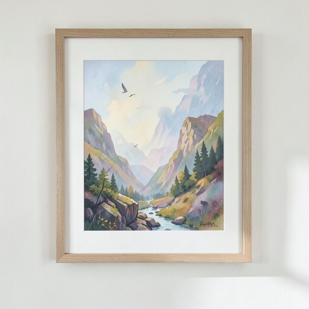
Paper thickness affects how light reflects and how edges look up close. Thin paper can curl or look flimsy, while sturdy paper feels like it belongs in a gallery.
Look for cardstock around photo-print thickness if you’re mounting artwork yourself. If you’re cutting shapes, thicker paper holds crisp edges and stays cleaner longer. Pair paper weight with the mounting method so the final piece sits flat and smooth.
12. Frame With Spacers for a Clean “Floating” Look
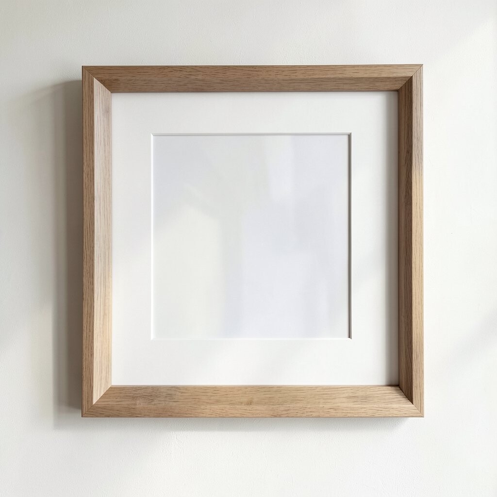
A floating effect makes wall art feel modern and refined. The tiny shadow created by spacers adds a professional touch you can notice right away.
Use spacer clips, deep frames, or a simple mounting layer that creates depth behind the art. Keep the back neat and secure so the piece stays steady. This also helps protect delicate materials like paper prints from direct wall contact.
Personalize the look by choosing the spacer color, such as warm cream or matte black, to match your palette. It can be surprisingly budget-friendly if you repurpose a frame you already own. The added depth makes ordinary prints feel elevated.
13. Build a Gallery Wall With One Shared Rule
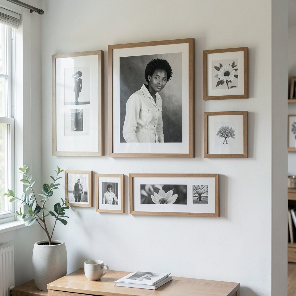
Gallery walls can look refined when they follow one clear design rule. Without a rule, they can turn into scattered decoration.
Pick a consistent alignment method, like all centers lining up or all frames sharing the same border width. Use similar frame finishes so the set looks like a collection. Then allow small variety in size to keep it interesting while staying neat.
14. Let Meaning Guide Your Choices, Not Just Aesthetics
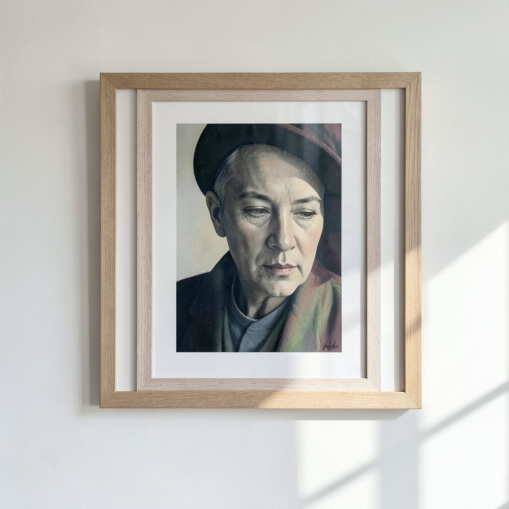
Refinement gets stronger when your wall art has a personal connection. A piece that reflects your memories looks confident and grounded.
Use meaningful sources like ticket stubs turned into a minimalist layout, a child’s drawing cleaned up into a geometric composition, or a map print with a highlighted route. Add a subtle caption or symbol that only you understand, which gives the piece depth. Your room becomes more than a showroom, and that difference shows in how calm it feels.
Cost can stay reasonable because you can repurpose items you already have. You also control the uniqueness by deciding what to keep, what to edit, and what to simplify. The best refined art often has one quiet story at its heart.
15. Finish Edges and Corners for a Polished, Tidy Look
Clean edges make a big difference, especially when your art is visible from a standing position. Tiny rough corners can distract the eye and make a piece feel less finished.
Trim carefully, use a straight blade or cutting tool, and cover raw edges with a thin border. If you mount layered pieces, make sure layers don’t peek out in uneven ways. A neat finishing step can turn a good idea into a refined result.
Personalization can be as simple as choosing a consistent border color across multiple pieces. That small repeat ties everything together and makes your wall feel intentional. It’s also low cost because careful finishing mostly uses time and basic supplies.
16. Follow Current Trends, But Keep Your Own “Signature”
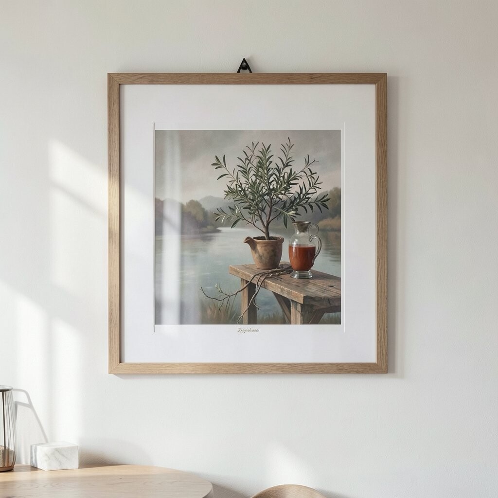
Trends can help you choose materials and styles faster, but refined art feels best when it includes your signature. Look at what’s popular in interiors, like warm neutral palettes, soft botanical lines, or gentle abstract forms.
Pick one trend element to use, such as a contemporary frame shape or a soothing modern print style. Then anchor it with something personal like a meaningful image, your color palette, or a texture you love. That balance keeps your art feeling current without turning it into copycat décor.
Consider cost by using trend-friendly items that don’t require expensive supplies, like printable art, affordable frames, or removable wallpaper backings for texture. Uniqueness comes from your arrangement and finishing choices, not from buying the priciest materials. When you keep your signature in the driver’s seat, the final look stays refined for years.