
The right chalkboard sign can make your shop feel warm before customers even step inside. It also helps busy people instantly spot what you offer and why it’s worth trying.
When you lean into color, neat lettering, and smart placement, chalkboards become both art and a helpful guide. Your menu, your vibes, and your brand voice all show up on the wall in one simple format.
1. Welcoming Front-Door Welcome Board
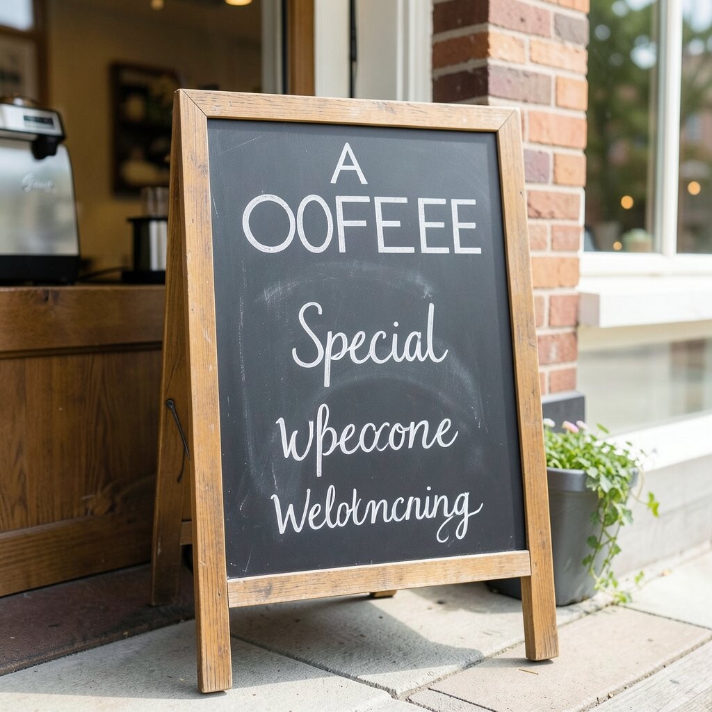
Picture a small chalkboard near the door with a soft border and big friendly lettering. The moment someone passes by, the message sets the mood like a friendly barista greeting them early.
Keep the text short enough to read at a glance, and use one main line that people can spot while walking. Add a seasonal touch such as “Cinnamon mornings” or “Iced latte season” so it feels current without changing everything. Use two font styles only, like rounded for warmth and bold for clarity, so your board looks tidy instead of messy.
2. Daily Special With Color-Coded Promises
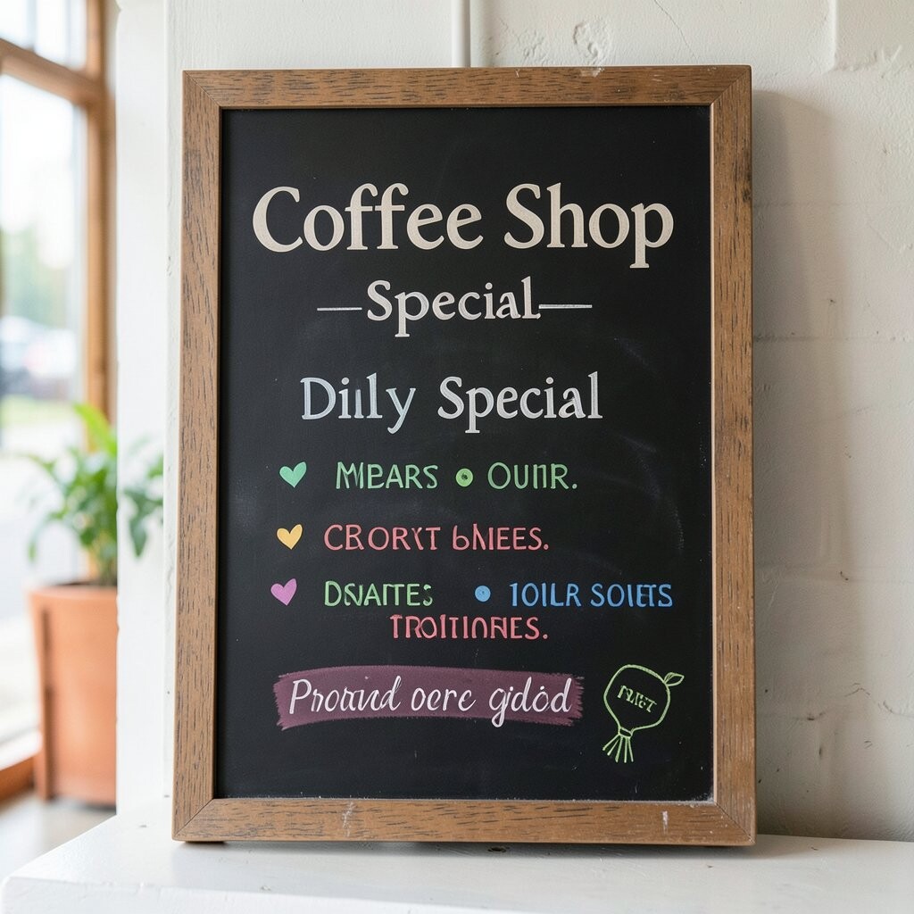
Draw a chalkboard panel that highlights the daily special in a brighter accent shade while keeping everything else classic. A swirl of color around the item name makes it feel like a “featured” moment, not a random note.
Use a clear layout with one highlighted drink at the top, followed by a one-sentence description. If you serve pastries, add a small line with pairing suggestions, like latte plus a flaky bite. Customers tend to order faster when they can quickly picture the flavor and the vibe.
To keep it practical, write the base menu in one consistent place and copy the special in the same spot each day. Consider chalk markers for smoother strokes and fewer smudges, especially if your chalkboard gets heavy use. Personalize the description in your own voice, such as playful words for dessert or calm words for espresso, so it sounds like your shop, not a generic ad.
3. Menu Layout That Reads Like a Friendly Map
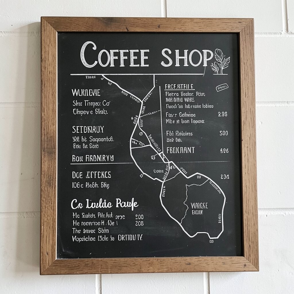
Create a chalkboard menu that acts like a map, guiding people from drinks to add-ons to extras. Large categories and spacing make your board feel organized, even if your shop offers many options.
Write the most popular drinks at eye level and keep the rest in smaller, clearly separated sections. Use simple icons for milk, oat, and caffeine-free choices so customers who skim still understand quickly. When the writing is easy to scan, you reduce the time spent answering the same questions and your line moves more smoothly.
For cost, you can start with a single board and just rotate new chalk colors and seasonal lines as needed. Try a textured frame or magnetic chalk strips to help keep the edges clean and protected. Personalize the board with a small “our promise” line that reflects your sourcing, like local roasters or house-made syrups.
4. Chalk Art Quote That Matches Your Brand Tone
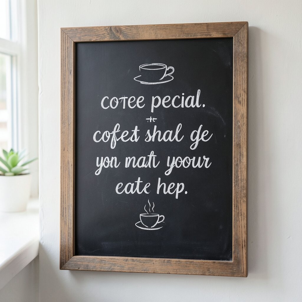
Use a chalkboard section for a quote that feels like your coffee shop in one breath. Think cozy words, playful phrases, or short lines that sound like something you’d say to a regular customer.
Choose a quote that supports your brand tone, such as calm for a quiet shop or bold for a lively one. Keep the lettering big and centered, and add small doodles like steam lines, beans, or tiny hearts so it feels artistic. This adds uniqueness because many coffee shops use chalkboards only for menus, while yours shows personality too.
5. Brew Method Board for Fans of Coffee Science
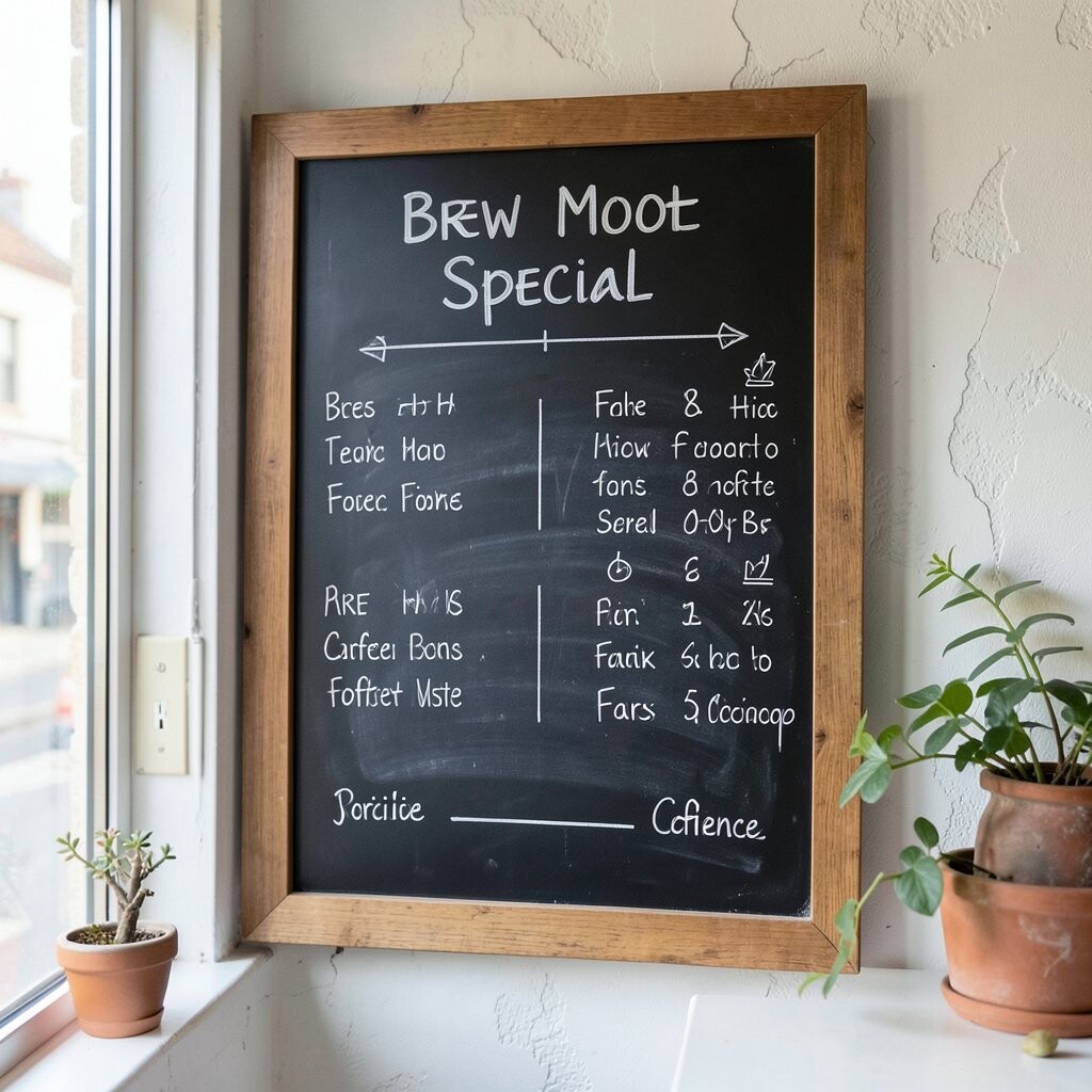
Design a chalkboard that shows brew methods like pour-over, espresso, and cold brew with simple flavor hints. When people can connect technique to taste, the board feels smart and worth reading.
Use a mini “what it tastes like” sentence under each method to help customers choose without feeling pressured. Add a one-line note about intensity, such as bright and clean or rich and smooth. This is especially helpful for first-time visitors who want guidance but don’t want jargon.
To keep it practical, update the chalk board when you switch beans or brew ratios, not every hour. Consider using separate chalk colors for flavor words so the board feels lively while still easy to scan. Personalize the flavor hints based on your actual menu, like describing chocolate notes for espresso when it truly tastes that way.
6. Ingredient Highlights That Show What’s Inside
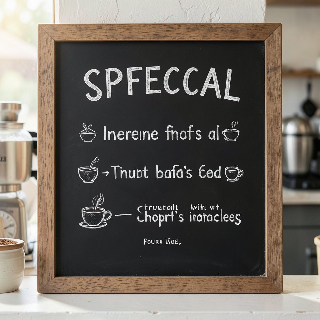
Turn a chalkboard into a “what goes in” display by listing key ingredients you’re proud of. Visuals like small leaf drawings, bean sketches, or syrup drops help shoppers feel the care behind each drink.
Highlight one to three ingredients per board, such as vanilla bean, oat milk, or house-made caramel. When customers understand what’s inside, they feel more confident paying for quality. It also makes your shop stand out because you’re not just naming drinks, you’re explaining what makes them special.
Keep writing consistent by using a uniform format for each ingredient, like a bold name followed by a short description. Choose durable chalk markers if your board gets wiped often, since regular chalk can fade faster under bright lights. For cost, you can reuse the same board and update only the ingredient lines as you change products.
7. Seasonal Wall Board With a Monthly Theme
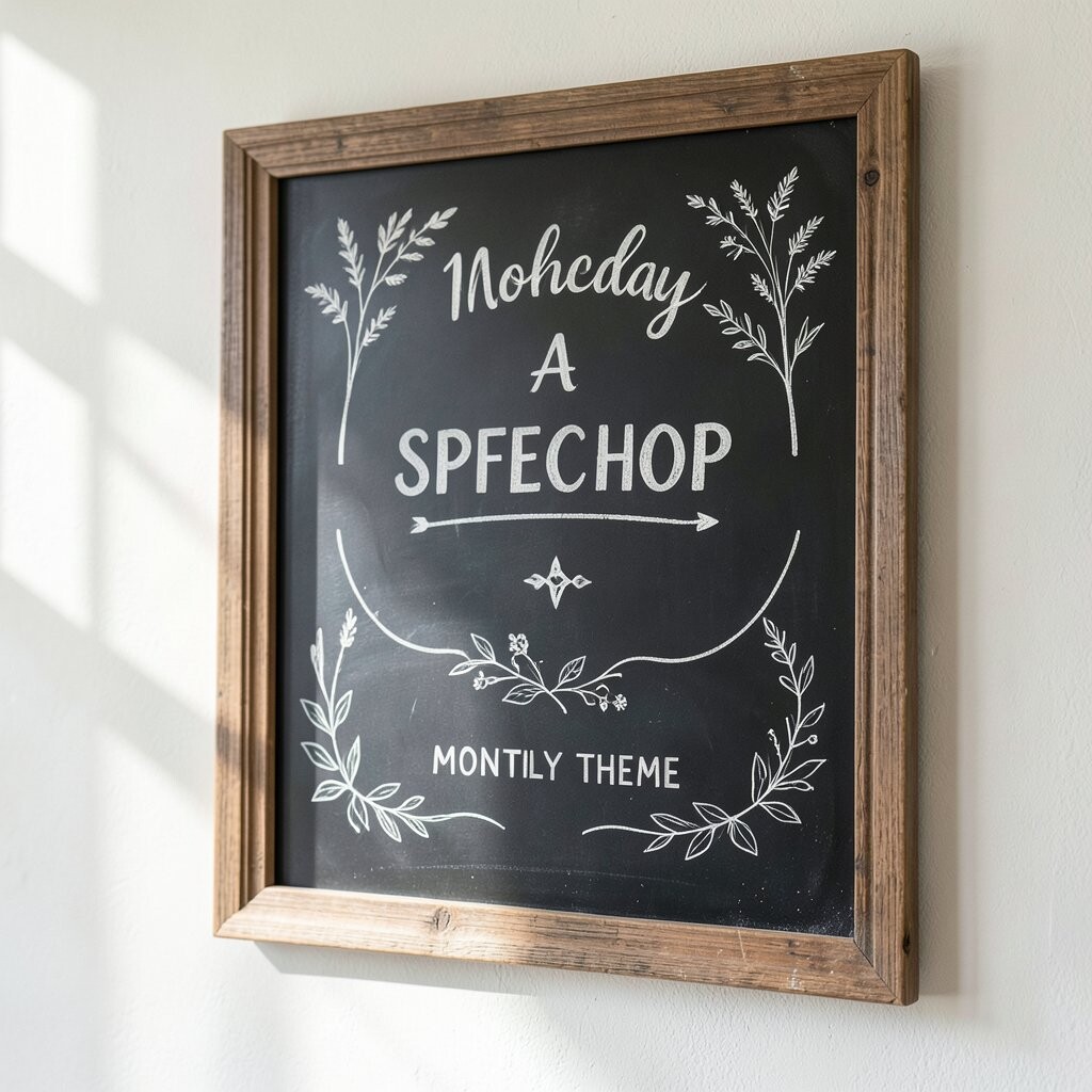
Create a chalkboard display that follows a monthly theme, like “Autumn Spice” or “Summer Citrus.” The visual difference keeps the wall fresh, and regular customers start to look forward to the next month’s look.
Use theme colors and matching doodles, then tie the theme to a few drinks or specials that truly fit. Keep your main menu readable even with seasonal styling, so the board still serves its purpose. This kind of board builds uniqueness because it feels like your shop has a living story, not just a static wall.
To make updates easy, prepare a small set of reusable chalk art templates, like snowflakes, leaves, or citrus slices. You can also keep a “seasonal words” list ready so you don’t reinvent every sentence. Personalize the theme with local references, like regional fruits or a neighborhood nickname, so it feels connected to where you are.
8. Size and Add-On Board With Clear Pricing Cues
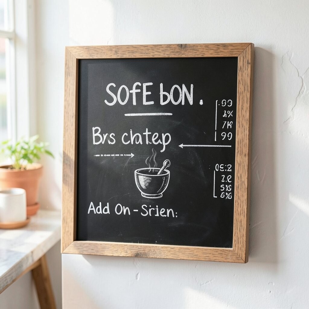
Offer a chalkboard board that explains sizes and popular add-ons in a clean, friendly layout. Customers love seeing choices in one place because it cuts down on back-and-forth questions.
Use large headings for sizes and keep add-ons grouped together, such as extra espresso, flavor boosts, or whipped cream. Write pricing clearly if you include it, and keep decimals consistent so nothing looks confusing. The benefit is faster ordering, and the visual order helps your team stay confident during rush times.
If you want to manage cost, use one board and swap only the lines that change, like add-on availability. Choose a frame that protects the chalkboard surface so it lasts longer and looks sharp. Personalize by adding a fun line about your add-ons, such as “Make it extra bold” for espresso lovers.
9. Customer-Favorite Vote Board With Friendly Energy
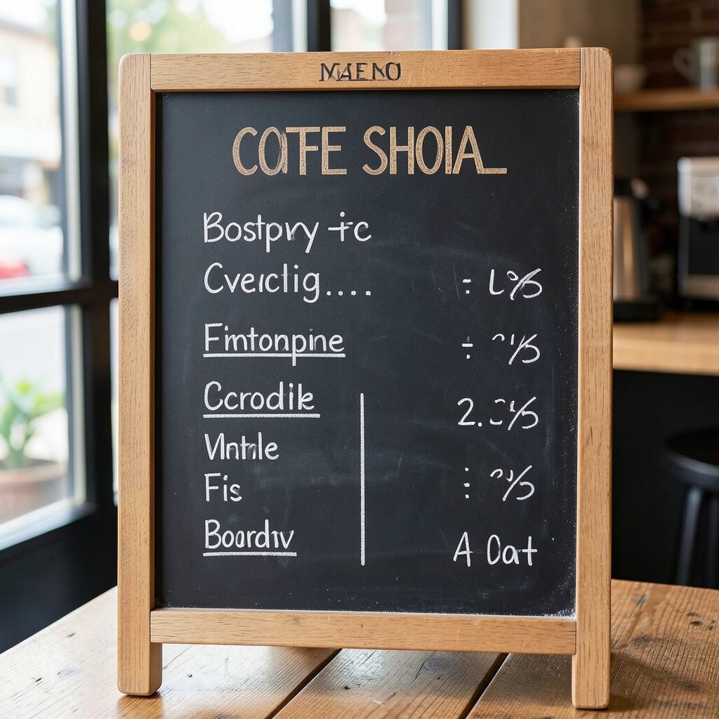
Build a chalkboard where customers can see favorites or vote options, using arrows, check marks, or simple circles. When people recognize what others love, they feel safer choosing and tasting something new.
Highlight two or three best-sellers and add a small “this week’s favorites” line that you update consistently. You can also show “try next” ideas beside popular picks to encourage a playful upsell. This boosts engagement because the board becomes part of the shop’s daily rhythm.
To keep it practical, set a schedule for updating, like every few days or after a weekend rush. Consider a magnetic top strip or chalk-safe tape for a cleaner look, especially if you use temporary marks. Personalize the board by writing in a warm voice, such as “regulars can’t stop talking about this” when it’s true.
10. Cold Drink Ice Levels and Flavor Ladder Board

Show cold drink options with a clear “ice level ladder,” like light ice, standard, and extra ice, written in big readable steps. Visual ladder lines make it feel easy to order and fun to understand.
Add flavor combo ideas on the same board so customers can pick a vibe, not just a drink name. For example, you can pair “citrus” with “lightly sweet” and “chocolate” with “extra creamy” using simple chalk lines. This helps customers tailor their order without feeling overwhelmed at the counter.
For cost and practicality, keep the board near the ordering station so it reduces how often your staff repeats questions. Use chalk markers for smooth lettering on darker chalkboard surfaces. Personalize the ladder by reflecting how your shop actually serves, like your preferred ice amount or sweetness standard.
11. Local Roaster and Community Wall Board
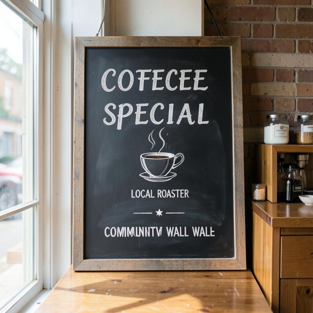
Paint a chalkboard that celebrates your local roaster, your community partners, or a neighborhood event. A small map sketch or a coffee bean chain connects your brand to the area in a way customers feel instantly.
Keep it visually balanced with one main message and small supporting lines so it doesn’t look crowded. Mention where your beans come from and what you’re excited about right now, which builds trust. The uniqueness is strong because people like to support shops that show real relationships, not vague claims.
To manage cost, reuse the board year-round and only change the small lines when collaborations shift. Consider adding dates and event times in a consistent style so it looks professional. Personalize by using a local slogan or referencing a local landmark, as long as it fits your shop’s tone.
12. Allergy-Friendly and Dietary Choice Sign Board
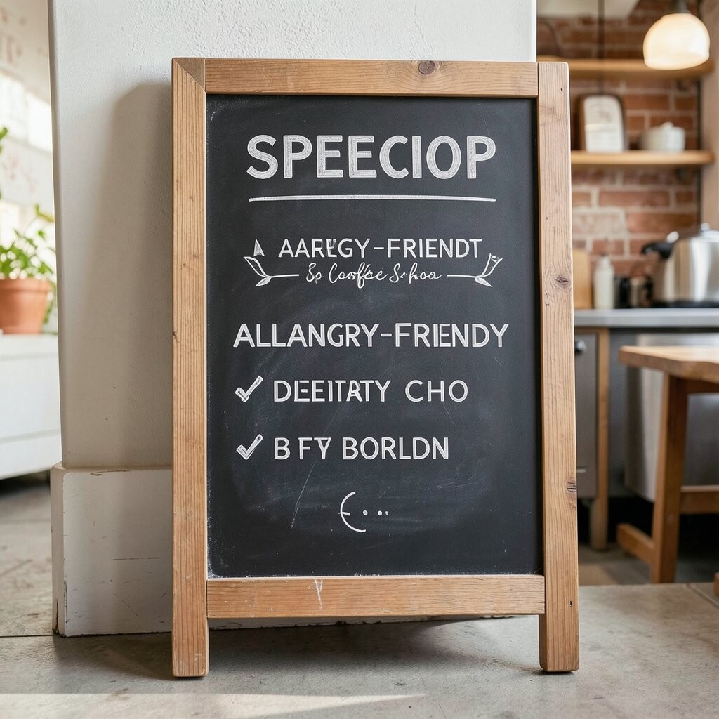
Create a chalkboard that helps customers with dietary needs using clear, gentle language and simple icons. When someone needs to avoid certain ingredients, visible guidance reduces stress and creates trust.
Use easy symbols for dairy-free, nut-free, and gluten-friendly items, and keep details updated as your menu changes. Even if you don’t list everything, a board that points customers to the right options helps them feel cared for. The benefit is a smoother ordering experience and a better customer mood from the start.
For practicality, put the board where staff can easily refer to it, like near the register or pickup counter. Use a durable frame and chalk marker so the board stays legible under frequent wiping. Personalize the tone with a reassuring line that sounds like you, such as “We’ll help you choose” written in friendly letters.
13. Hand-Drawn Doodles That Guide the Eye to Popular Drinks
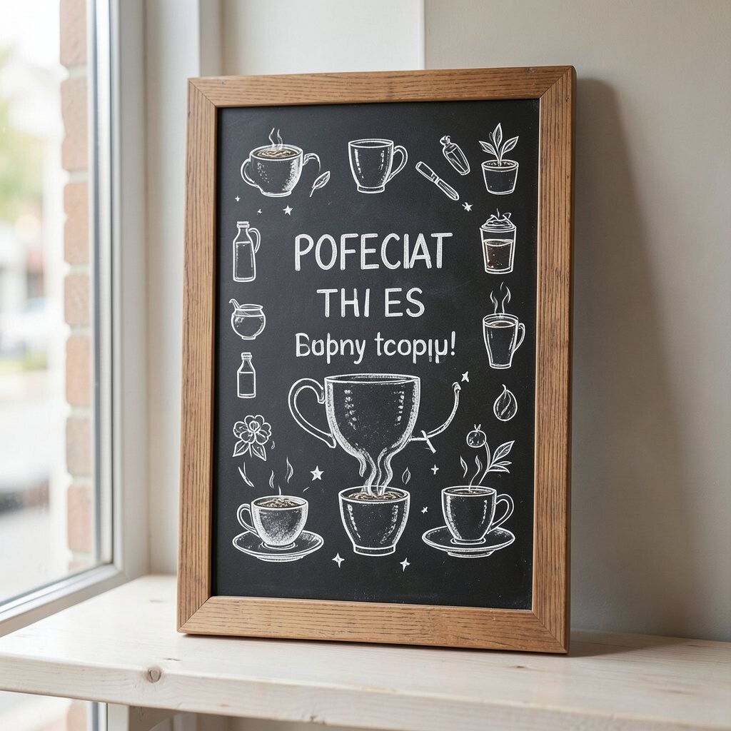
Instead of only words, use hand-drawn doodles to guide customers toward your most popular drinks. Steam swirls near espresso, milk splashes near lattes, and tiny bean clusters near pastries create a fun visual path.
Place doodles next to drink names so people naturally read along with the pictures. Keep doodles consistent in style so the board looks intentional, not random. This boosts uniqueness because it turns ordering into a quick mini experience.
To keep costs down, use simple shapes and repeatable icons rather than elaborate artwork. Use chalk of two or three colors max so the board stays clean and not overly busy. Personalize the doodles with a signature style, like a certain swirl shape or a consistent bean mascot that customers recognize.
14. Coffee Tasting Notes Board With Simple Flavor Words
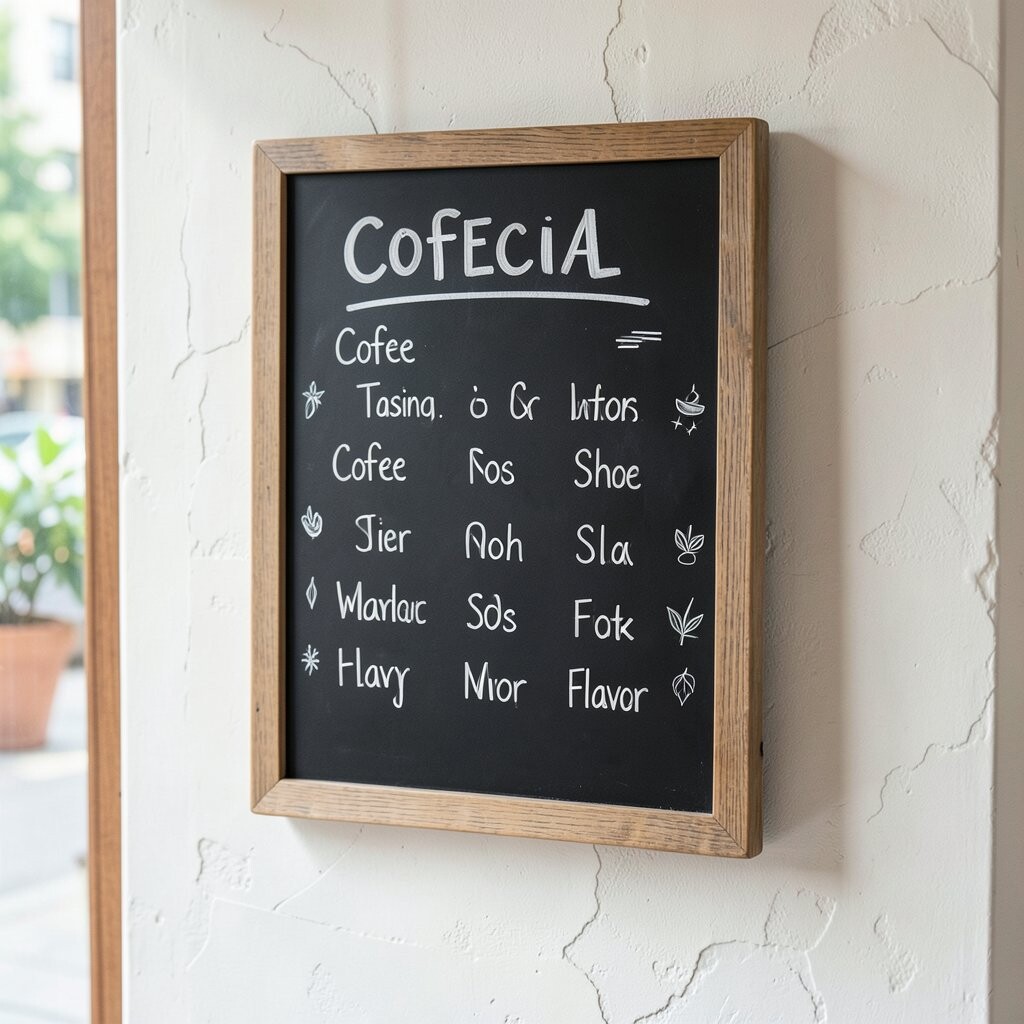
Make a chalkboard that lists tasting notes in plain, friendly words like “caramel,” “berry,” or “toasty.” When customers see flavor cues, they can choose drinks that match what they actually like.
Write tasting notes for your rotating espresso or seasonal beans and update them when you switch roast profiles. Use a small “how it feels” line, such as smooth and mellow, to help people decide quickly. This is beneficial because it teaches taste without making anyone feel tested.
Keep the board practical by choosing only a few tasting notes per drink, usually three to four, so it stays readable. Consider using lighter chalk for background phrases and bold chalk for the main notes to improve contrast. Personalize by using words your regulars already use, which makes it feel like the board belongs to your community.
15. Artful Chalkboard Promotion for Loyalty or Bundles
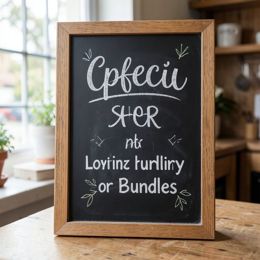
Design a chalkboard that promotes a loyalty perk or a bundle deal with beautiful typography and tidy spacing. Even simple offers can look exciting when the design feels like a poster.
Use a short message that tells people what they get and how it helps them, like a free upgrade after a certain number of visits. Keep the wording easy and friendly so customers don’t have to search for rules. The benefit is that more people notice the offer because it looks like part of your style, not a last-minute sign.
For cost considerations, a single reusable board is easier than printing new flyers every week. Use a consistent layout so your staff can update it quickly and keep it accurate. Personalize the board with a local phrase or a playful stamp doodle that matches your shop’s personality.
16. Chalkboard Play Wall for Kids and Waiting Moments
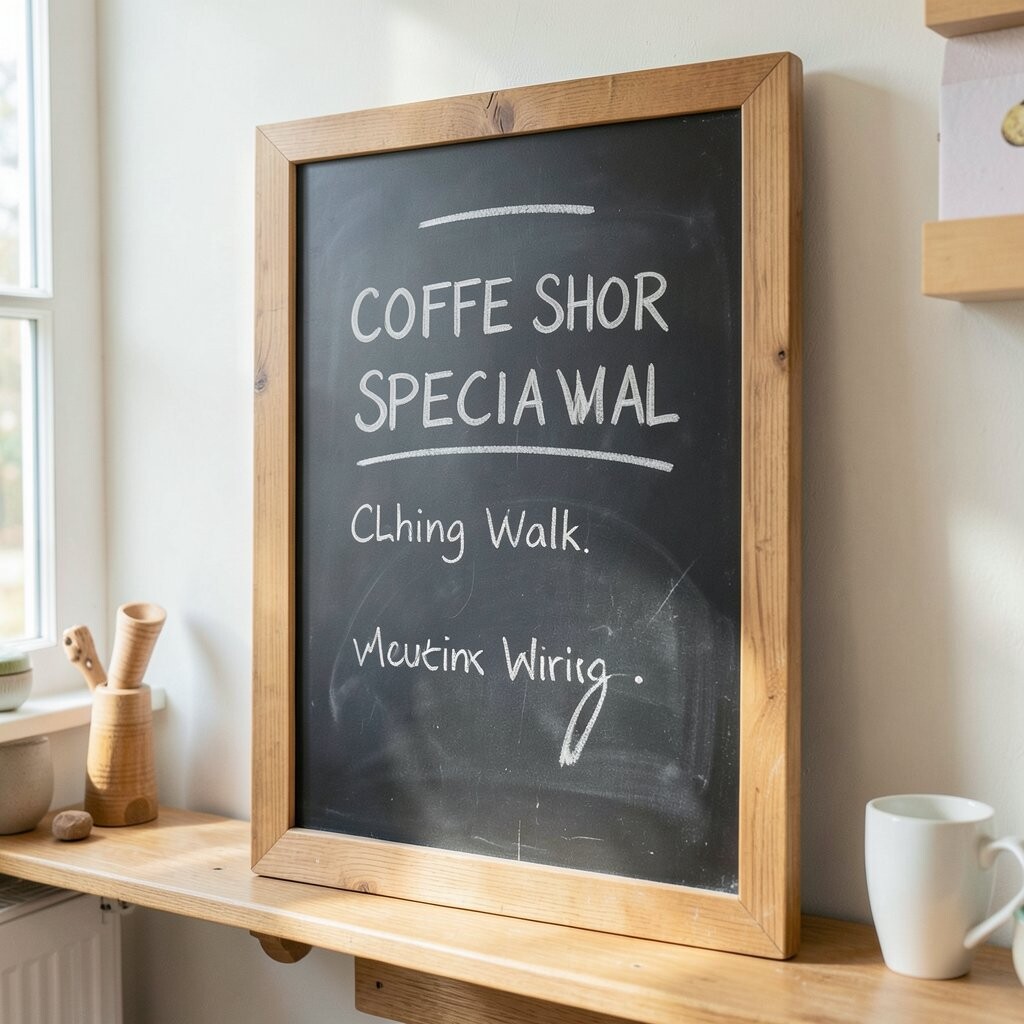
Put a chalkboard play area near where people wait so kids can draw while parents sip. A small section with guided doodles or simple shapes turns waiting into a calm moment.
Include safe, easy prompts like “draw your favorite animal” or “make a happy cup,” and keep it near a ledge for easy access. This boosts the overall vibe because it keeps hands busy and reduces stress for both families and staff. Your shop feels welcoming, which can make families come back.
For practicality, choose a chalkboard surface that wipes clean and place it where it won’t get accidentally smudged during rush. Consider using low-dust chalk for easier cleanup. Personalize with seasonal doodle prompts so the play wall matches your monthly theme without requiring constant new designs.