A textile pattern on the wall can make a room feel instantly warmer. It’s a simple way to add personality without making things feel too busy.
1. The Tone-On-Tone Charm That Looks Like Magic
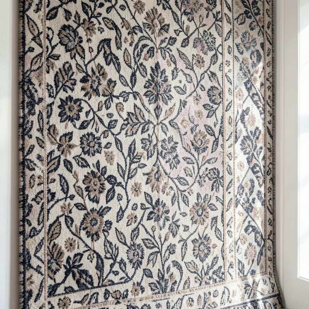
You can create a calm, tailored look by choosing patterns that share the same color family. A soft stripe or subtle geometric print in gentle shades will look like it was made for your space, even when you mix it with plain decor.
Try it in a hallway, bedroom, or reading nook where you want a soothing mood. Pick one base color from your existing fabric, like a sofa throw or curtain panel, then match the pattern to it. When the fabric tones blend, the wall feels “finished,” and your room looks more pulled together.
Keep the pattern scale small if your wall is narrow, and go slightly bolder if the space is wide. If you’re unsure, sample a small section or buy removable wallpaper in the same style so you can change your mind later. This approach is also budget friendly because you can use fewer statement pieces and still get a high-end look.
2. Oversized Motifs That Make Walls Feel Like Art

Large patterns can turn an empty wall into a gallery moment without needing extra frames. Imagine chunky florals or bold abstract shapes standing out clearly from a warm background.
You’ll get instant drama, and the room will feel more intentional. Choose one oversized motif for a focal wall behind a bed, sofa, or console, and let the rest of the room stay simpler. This creates balance and keeps your eyes from bouncing around too much.
To make it feel wearable, repeat one color from the pattern in your pillows, rug, or lampshade. In terms of cost, oversized designs can be less “fussy,” so fewer panels may be needed to make a strong impact. For current trends, oversized botanicals and bold abstract textiles are showing up a lot in modern interiors.
3. The Striped Illusion For Taller Ceilings

Vertical stripes can visually stretch a wall upward, which is great when your ceiling feels low. Thin lines look neat and airy, while wider stripes feel graphic and confident.
This pattern trick also works with removable treatments, so it’s easier than repainting your whole room. If you add a vertical textile pattern to one wall, your furniture will look more balanced. You’ll notice the room feels taller even when you keep your layout the same.
Match stripe colors to your trim or baseboard colors to keep everything cohesive. For a practical move, place the most prominent stripes where the eye naturally goes, like behind a chair or above a dresser. If you want to keep costs down, look for repeating-width designs so your measurements line up with less waste.
4. The Patchwork Play That Builds Cozy Depth
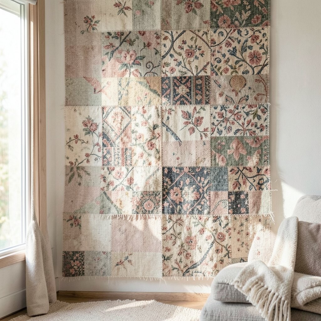
Patchwork-style textiles bring a handmade vibe that instantly feels cozy. You might picture stitched squares, quilt-inspired blocks, or mixed patterns that still look coordinated.
The benefit is warmth without clutter, because patchwork can guide your eyes across the room gently. Choose a limited color palette so the wall looks friendly, not chaotic. This kind of pattern is unique because it carries a “story” feel, like your home has been collected over time.
Try placing patchwork textiles in spaces that need comfort, like a family room or kid-friendly corner. Pair them with plain wood, neutral cushions, and soft lighting so the pattern stays the star. Budget wise, you can create a patchwork look with panels or smaller removable sections instead of going all-in at once.
For personalization, repeat one motif from your life, such as a tiny star, leaf shape, or geometric tile look. You can even match the patchwork colors to a favorite blanket you already own.
5. Repeating Weaves That Add Texture Without Heaviness
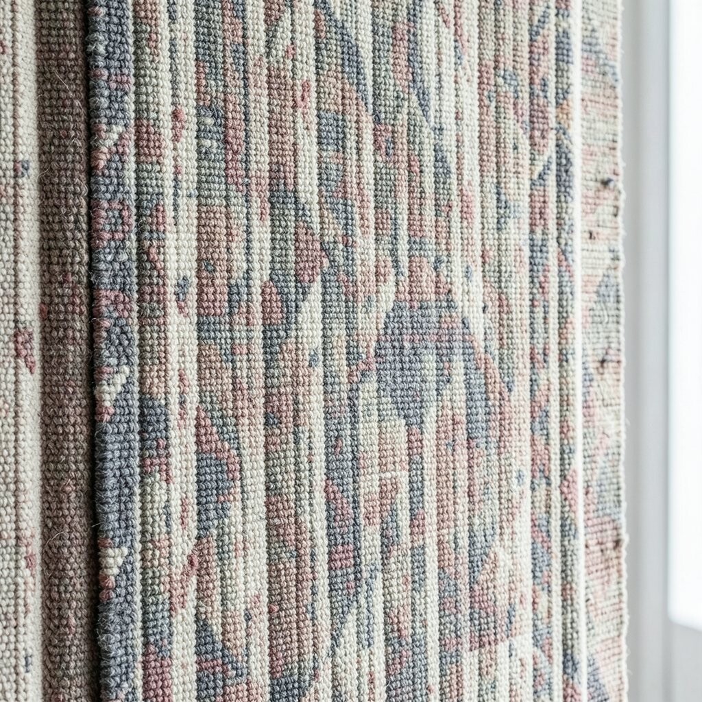
Some textile patterns look like fabric, not like printed graphics, and that difference matters. A woven texture effect, like a linen-style stripe or herringbone weave, makes the wall feel touchable.
You’ll love how it adds depth while still keeping the room calm. Because woven-style designs are often more subtle, they blend easily with modern furniture and classic pieces. This is a great choice when you want uniqueness without loud contrast.
Keep your lighting in mind, since texture patterns look best when light grazes the surface. If possible, position a lamp or wall sconce to create gentle highlights. It can be cost-effective too, because textured looks tend to hide minor alignment issues better than high-contrast prints.
6. Geometric Confidence That Keeps Rooms Crisp
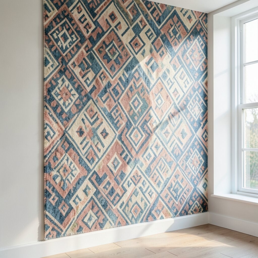
Geometric textile patterns bring clean structure, like a tailored shirt for your walls. Triangles, chevrons, and repeating circles can make a room feel organized and energetic.
When you choose a geometric design, you get a clear visual rhythm that makes furniture placement feel easier. It also helps smaller rooms feel more lively without adding extra objects. If you like modern trends, geometric textiles keep showing up because they look fresh and graphic.
For practical harmony, pick one main pattern and keep secondary patterns very simple. You can personalize by selecting colors that match your favorite art piece or a rug you already own. If you’re worried about cost, look for designs with fewer colors since multicolor prints can be pricier and may require more careful matching.
7. Floral Patterns That Feel Fresh Instead of Fussy
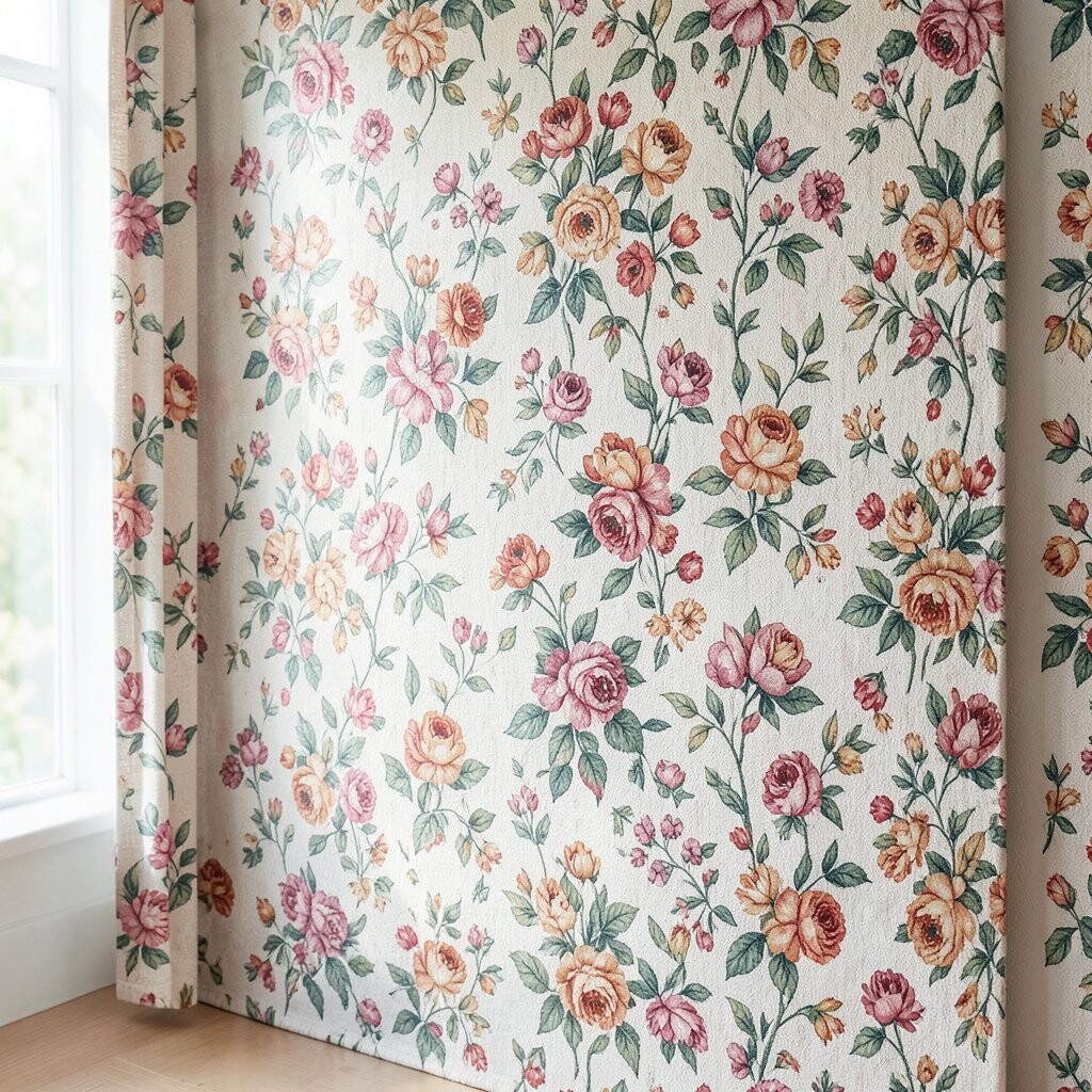
Floral wall patterns can absolutely feel modern when they’re scaled and colored with care. Think of bold leaves, painterly blooms, or sprigs that stretch across the wall.
The benefit is a friendly softness that makes a room feel welcoming all year long. To avoid a dated look, choose florals with cleaner lines, fewer tiny details, or a contemporary color mix like muted greens and warm neutrals. This makes the pattern feel unique while staying timeless.
Place a floral textile behind a vanity, in a breakfast nook, or as an accent wall near a window. Pair with solid curtains and simple bedding so the floral doesn’t fight other textures. For budget considerations, choose removable options if you want flexibility, or pick a single-wall focal design to reduce material needs.
8. Animal-Inspired Textiles For A Fun, Grounded Statement
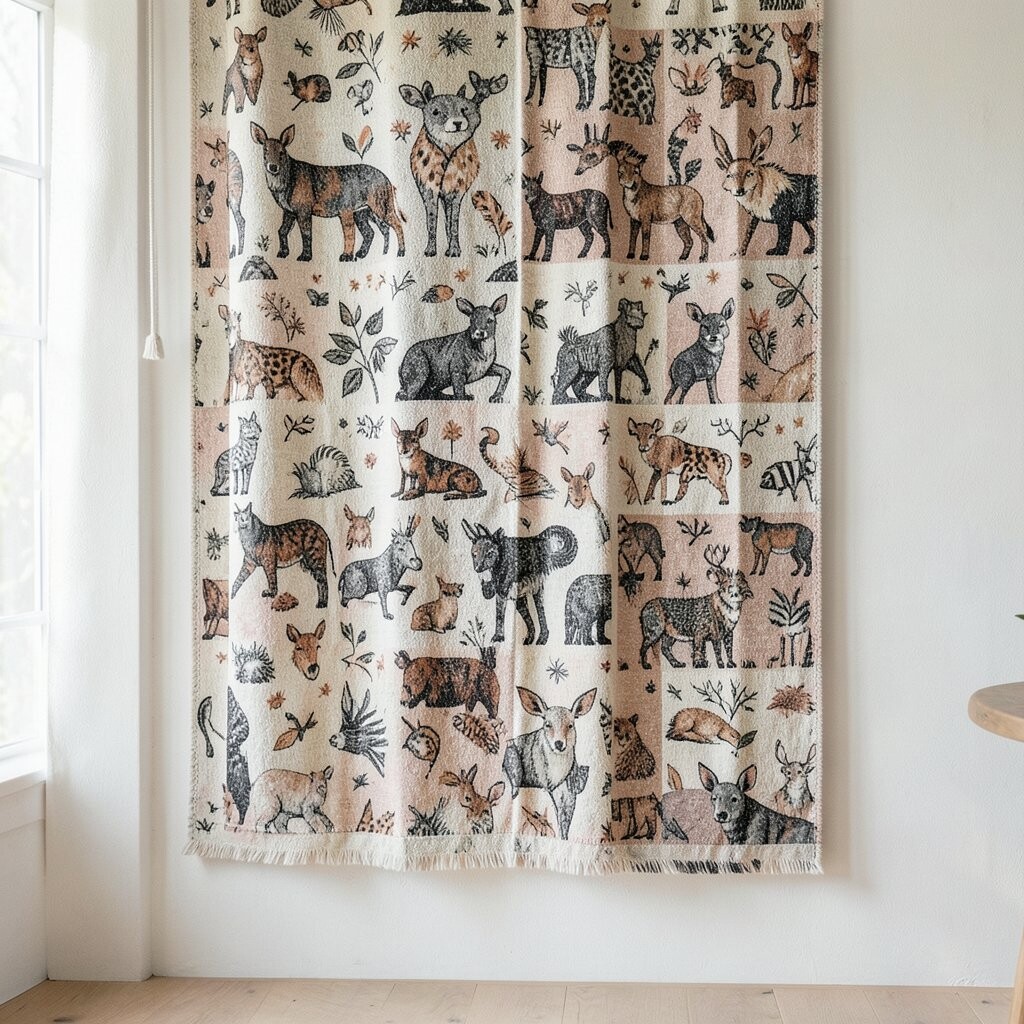
Animal-inspired patterns can make your home feel playful and grounded at the same time. Zebra stripes, subtle leopard spots, or stylized feathers can bring movement to plain walls.
This choice is unique because it adds character while still working with many decor styles. It also gives you an easy way to add drama without needing a lot of extra furniture. If you keep your background color neutral, the animal pattern stays classy rather than costume-like.
Try it in a home office or entryway where you want people to feel instantly energized. For practical tips, use a matte fabric-like pattern so the room doesn’t feel too shiny. Cost can be manageable if you pick a design that uses one or two main tones, because simpler patterns often require less complex printing.
9. Folk Motifs That Bring Heritage And Warmth
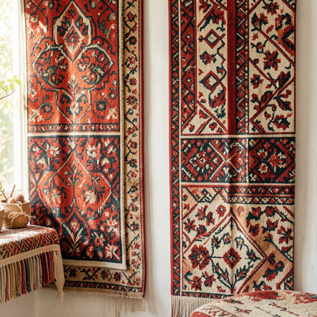
Folk motifs on the wall can give your home a lived-in, heritage feel. You’ll often see repeating stars, embroidered-style lines, and symmetrical patterns that look crafted.
This kind of textile pattern adds warmth and comfort, especially in spaces with natural materials like wood and rattan. The uniqueness comes from the cultural rhythm of the designs, which can feel meaningful instead of random. When you match the colors to your existing textiles, it feels intentional and personal.
Consider using folk motifs in a dining space, a cozy reading corner, or near a bookshelf. If you want a modern touch, choose folk patterns with muted tones rather than bright primary colors. For cost, you can start with one accent wall, and later add matching smaller textile pieces when your budget allows.
10. The Color-Blocked Method That Makes Walls Look Bigger

Color-blocked textile patterns can make a room feel larger and more organized. You can use two or three sections with different patterns, like a stripe panel next to a soft geometric block.
By controlling where the patterns live, you create structure and clear visual zones. It’s an easy personalization method because you can tailor the blocks to your layout, such as aligning one block with a window or artwork. The uniqueness is in the design choices you make, since your wall becomes a custom “map” for the room.
For practical tips, keep the blocks limited so your wall doesn’t overwhelm your furniture. Use one neutral pattern as a base, then add one bold pattern for contrast. Cost-wise, fewer patterned sections can mean less material, and you may be able to use smaller rolls or panels.
11. Mirror-Frame Symmetry For A Polished, Tailored Look

Symmetry can make a patterned wall feel high-end, especially when you frame a mirror or art piece. Picture a repeating border pattern that wraps around the area like a gentle frame.
This approach helps your room look tidy because your eye understands the layout right away. It’s also uniquely satisfying because it turns your wall into a designed scene, not just a background. If you like classic interiors, symmetry is a trend that keeps coming back in textile-style wallpapers.
Try the border effect above a console table, around a mirror in the entryway, or behind a headboard. Keep your pattern colors in line with your hardware finishes so everything feels consistent. If you’re watching cost, borders can be a smarter starting point since they use less coverage than full-wall prints.
12. Subtle Ombre Textiles For Soft, Layered Calm
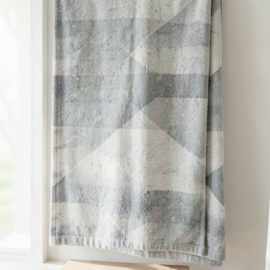
Ombre patterns move from light to dark, creating a gentle gradient like dyed fabric. You can see the mood shift across the wall, which feels soothing and elegant.
The benefit is that ombre adds dimension without sharp contrasts. It also works well with many color themes, from airy whites to warm earthy tones. This pattern can feel unique because it mimics real textile dyeing rather than looking flat.
Keep the ombre aligned vertically if you want a taller feeling, or choose a horizontal fade for a cozy, grounded look. Pair it with layered curtains and textured bedding so the wall and fabric feel like one story. Cost can be reasonable if you pick a design that covers only one focal area, since gradients look best when they’re crisp and uninterrupted.
13. Macro Patterns For Close-Up Wow
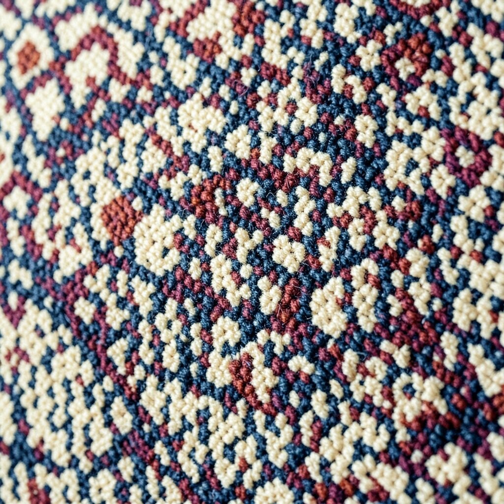
Macro textile patterns make a wall look like you’re seeing fabric details up close. Large-scale stitching lines, oversized dots, and bold woven shapes can feel surprisingly artistic.
When the pattern is big, it reduces visual clutter and turns the wall into a single strong design. This helps your room look styled without needing lots of extra decor. The uniqueness is in the way it changes as you move around the room, which feels alive and modern.
Try macro patterns in a living room or bedroom where you spend time looking at your surroundings. To keep it easy, pick matching solid colors for furniture and keep other patterns to a minimum. For cost considerations, macro designs often allow for simpler color palettes, which can help you stay within budget.
14. Custom-Blend Pairings That Make Your Wall Truly Yours

The best secret is mixing patterns in a way that still feels calm. You can blend a small geometric with a soft floral, or pair a subtle stripe with a woven texture.
This gives you personalization that no store sample can fully match. It also creates uniqueness because the wall becomes a reflection of your own style choices. When you repeat one color across both patterns, the room feels connected and intentional.
For practical tips, start with one “anchor” pattern and build around it using textures or calmer prints. Choose one pattern for the main coverage and use the other as an accent band, panel, or border. Cost can be managed by using the pricier pattern in a smaller area while keeping the rest budget-friendly with simpler designs.
To keep things current, look for textile-inspired prints that feel hand-done, like brushstroke florals and woven effects. Then match your wall colors to your latest favorites, such as a new throw blanket or art print you can’t stop noticing.