The right wall art can make a room feel more alive in minutes. It also lets your personality show without saying a word.
1. Soft-Glow Giclée Prints
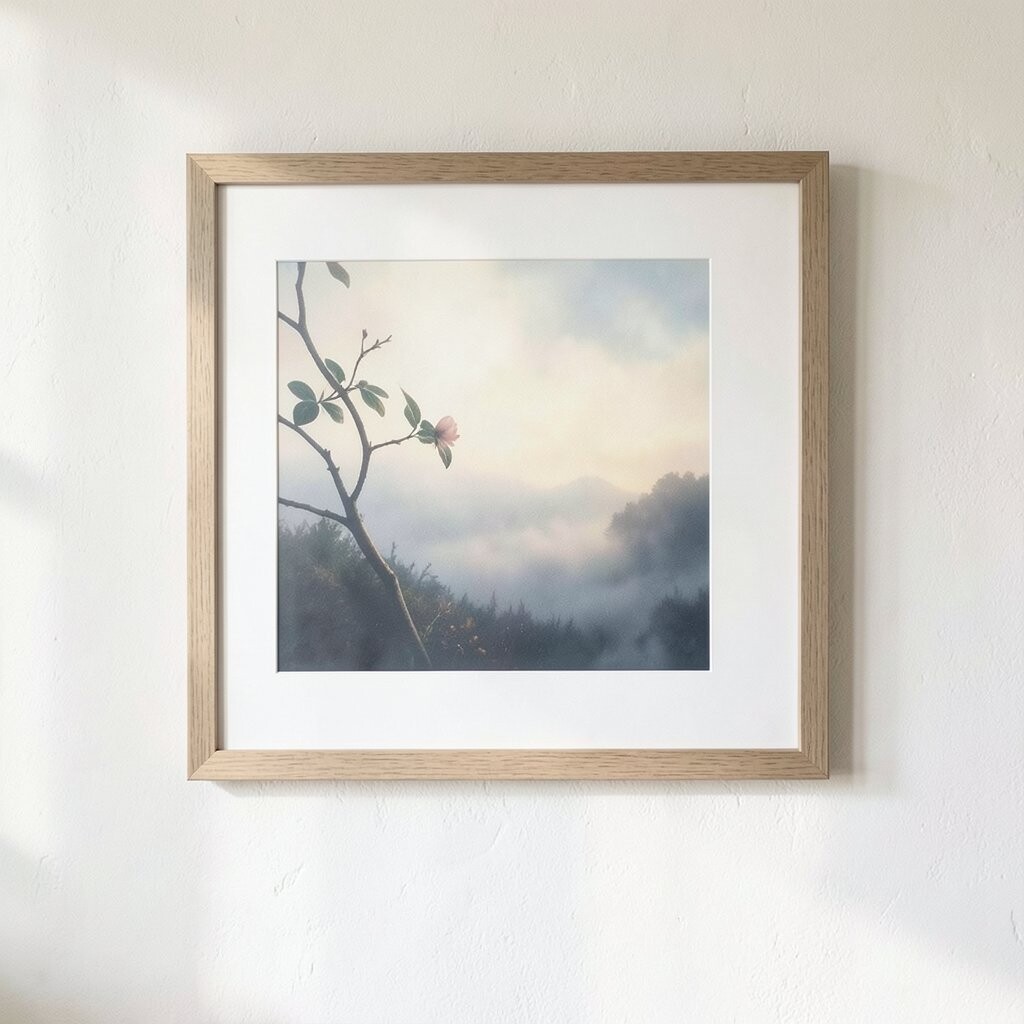
Imagine a close-up landscape or still life printed with gentle color and crisp detail. The texture looks almost like it was made by hand, so the wall feels warmer right away.
Pick a print with a limited color palette, like sand, sage, or muted coral, so it fits your space easily. Hang it at eye level and use a simple thin frame to keep the look refined. For personalization, choose a subject that matches your everyday mood, such as calming florals or coastal light.
2. Framed Botanical Pressings
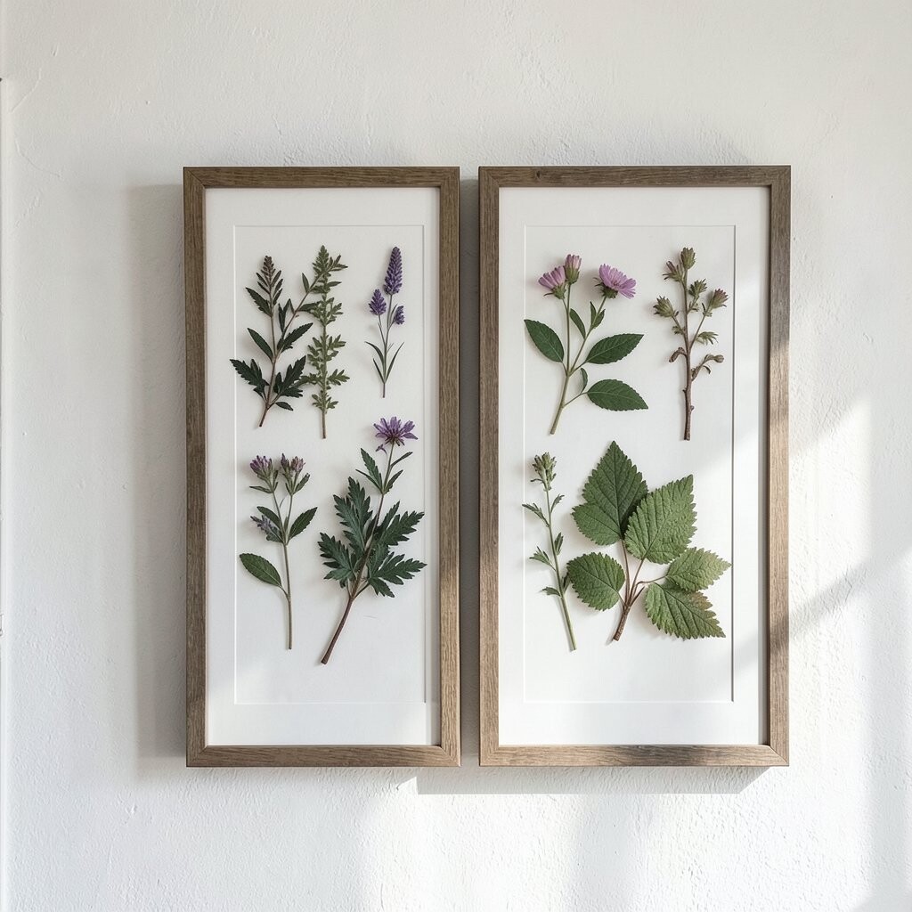
Pressed plant art brings a delicate calm that feels both classic and fresh. When paired with airy lighting, the greens and neutrals look even softer against your wall.
Choose archival paper and frames with UV-protective glass to keep colors from fading. Group two or three smaller pieces in a neat grid to make the wall feel intentional. For a practical twist, mount a botanical theme that matches your kitchen or living room style, like herbs for a cooking space.
If you want to brighten without spending much, start with one botanical print and add another later. This style stays on trend because it blends nature with clean lines. You can also customize by matching the plant tones to your curtain or rug colors.
3. Minimalist Line-Art Portraits
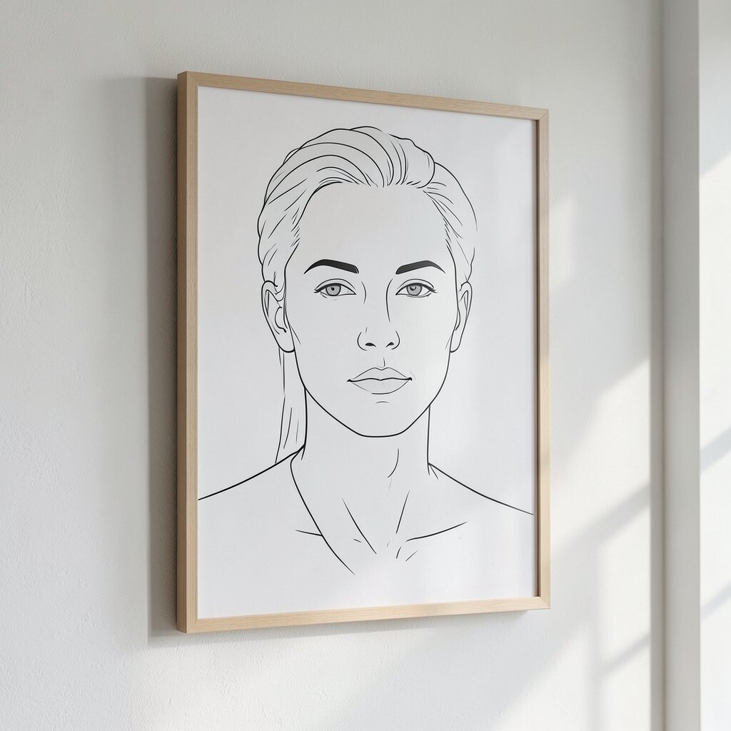
A line-art portrait can look airy and modern, like a sketch that never gets old. Even when it’s small, it adds a refined focal point that makes the whole room feel styled.
Look for portraits with elegant, continuous strokes and plenty of white space. Frame it simply and keep the mat light so your art feels bright instead of heavy. If you like a personal touch, use a line-art version of someone you love or a favorite pet.
This kind of wall art is unique because it celebrates shape over clutter. It also fits today’s trend toward calm, uncluttered interiors. When choosing size, consider how far you stand from the wall, so the lines remain clear but not overpowering.
4. Bold Abstracts in Narrow Color Bands
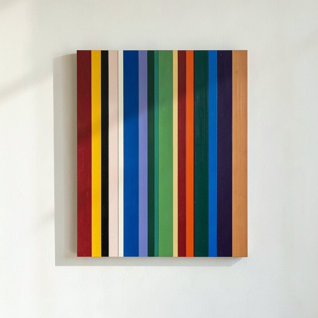
Abstract art can bring instant energy, especially when the colors stay controlled. Narrow color bands look sleek, like design you’d see in a magazine spread.
Pick a piece where your room already has one of the band colors, like navy in your pillows or gold in your lamp. Use a frame with a matte finish to prevent glare from overhead lights. To personalize, choose abstract shapes that echo your space, such as waves for a reading nook or angles for a home office.
5. Vintage-Inspired Travel Posters
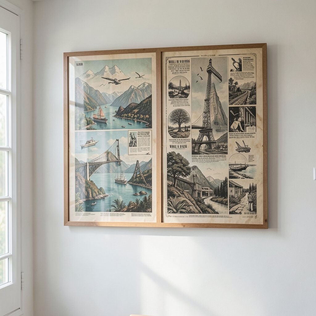
Old-style posters add personality and movement, even in quiet rooms. The typography and illustration style can make your space feel like it has stories.
Choose posters that match your current tones, like cream backgrounds or muted blues. Then keep the framing consistent, using the same color and thickness on each piece. For a budget-friendly approach, hunt for reprints that keep the vintage look without the antique price tag.
This idea feels unique because it mixes nostalgia with a refined wall setup. It also stays relevant since many interiors now mix classic elements with simple modern furniture. If you want it to feel more personal, center a destination you love or a route you’ve taken before.
6. Ceramic-Tone Textured Wall Hangings
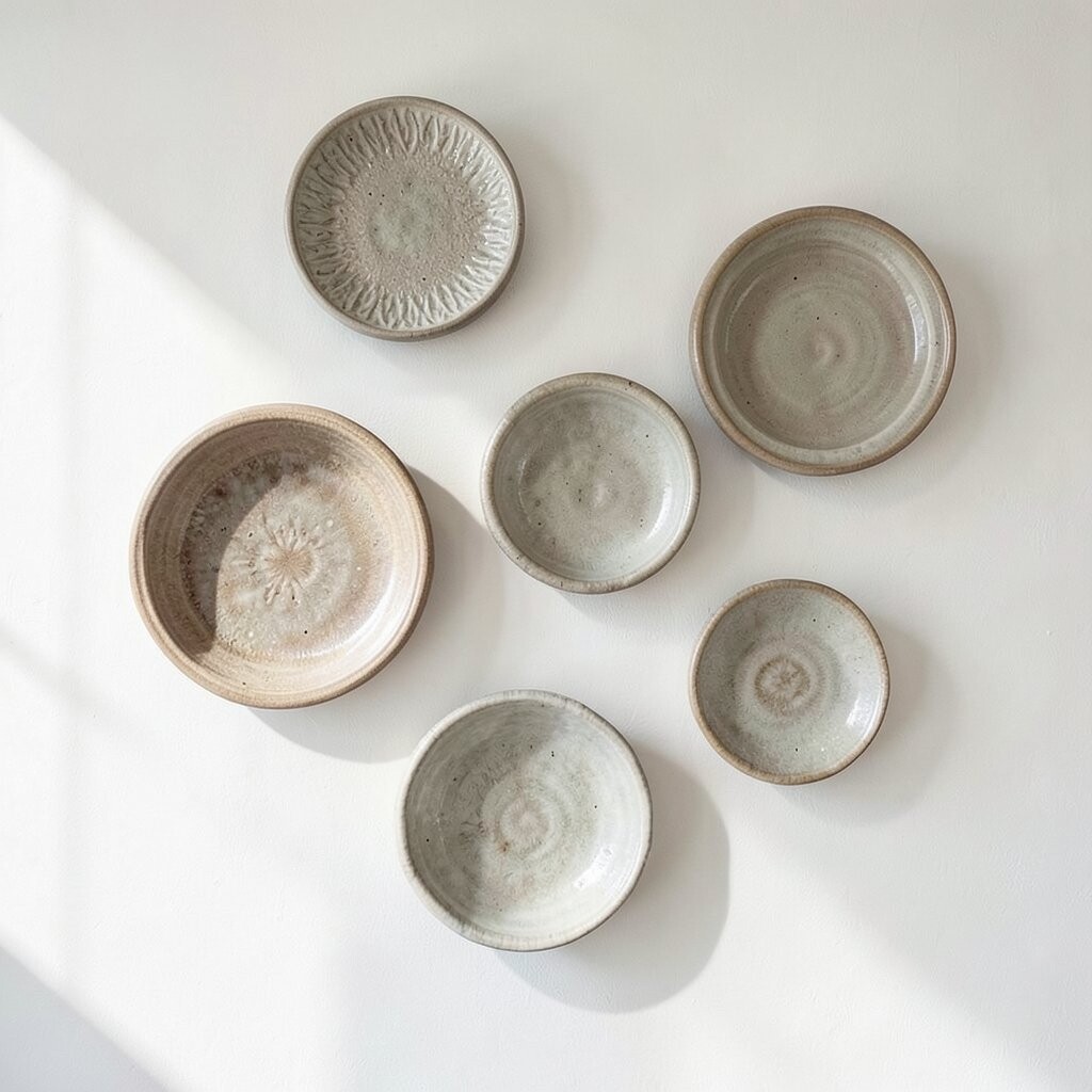
Textured wall art with a ceramic-like look adds depth that looks stunning in natural light. When you move around the room, shadows shift slightly and the artwork feels quietly dynamic.
Choose wall hangings with subtle earthy tones such as clay, oatmeal, or warm gray. Mount it securely and keep the surrounding wall color simple so the texture can shine. For personalization, look for patterns that feel like your style, whether that’s gentle ripples or clean geometric lines.
These pieces can fit many rooms, from a hallway to a dining area. They’re unique because the texture does some of the work that paint or prints usually do. If you’re thinking about cost, compare sizes and materials, because thicker pieces can look more expensive even when they aren’t.
7. Storybook-Style Typography Art
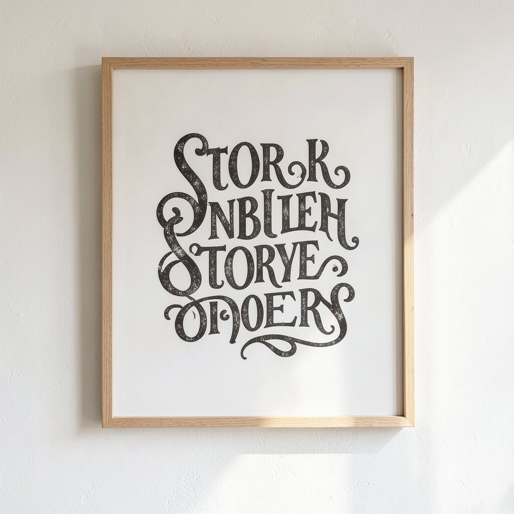
A typography artwork adds warmth without needing a complicated image. A favorite quote or a short phrase can make your space feel comforting and familiar.
Pick text that supports your daily life, such as something calming for a bedroom or something upbeat for a workspace. Keep the font style clean and the background bright, so it doesn’t feel dark or cluttered. For personalization, choose words that match your home values, like “breathe” or “together.”
This works well with current trends toward meaningful decor and less visual noise. Place it near a reading chair or above a console to help it feel purposeful. If you want to stay practical, measure the wall first, then choose a print size that looks good from across the room.
8. Geometric Shadowbox Displays
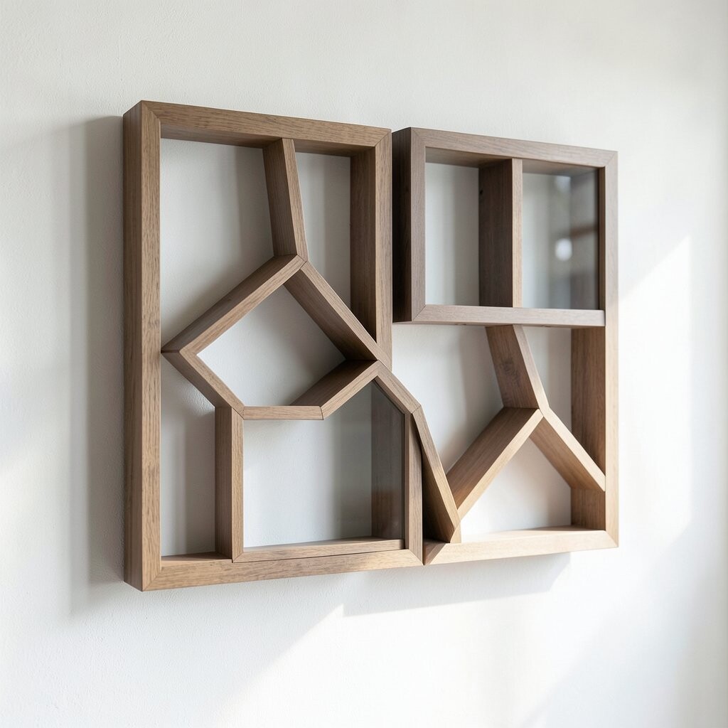
Shadowboxes are a clever way to add dimensional art without overwhelming the wall. They hold small treasures and create depth, so the space feels curated and bright.
Use a box with clean edges and a light backing color for extra glow. Add a few items that look cohesive, like a mini botanical specimen, smooth stones, or tidy paper cutouts. For personalization, build a set based on a theme such as beach finds, music memories, or old letters you still love.
This kind of wall art is unique because it mixes craft with display. It also fits trends toward handcrafted details and personal collections. In terms of cost, you can start with one shadowbox and fill it slowly as you find pieces that match your color scheme.
9. Serene Watercolor Landscapes
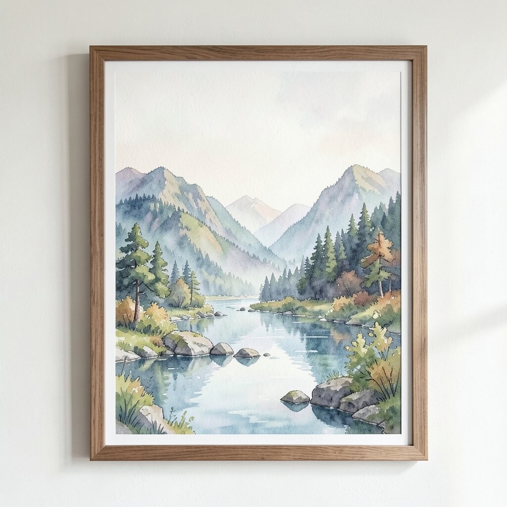
Watercolor landscapes bring gentle color and soft edges that feel soothing. They brighten a room because the pigment looks airy, not heavy.
Choose scenes with lots of sky or open space, like hills with light mist or calm lakes. Keep the framing simple and slightly off-white to maintain that refined look. If you want personalization, pick a landscape that reminds you of a trip or a place you dream about.
These pieces are popular right now because many people want decor that feels light and relaxing. They’re also practical since they pair well with almost any furniture finish. When you buy, check for paper quality and use protective glass to keep colors looking fresh.
10. Elegant Gallery Wall with Smart Spacing
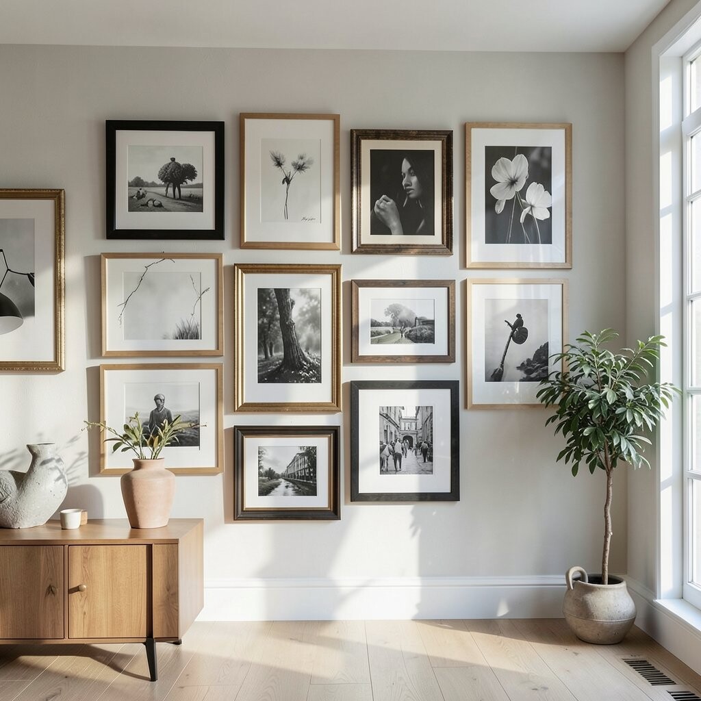
A gallery wall can look polished when spacing is consistent and frames match. It turns a blank wall into a curated display that feels intentional rather than random.
Choose frames that share similar tones, like black and natural wood, and keep the art subjects compatible. Lay everything out on the floor first so you can adjust gaps until it feels balanced. For personalization, mix sizes and include one meaningful piece, like a family photo in art style or a favorite print you can’t stop looking at.
This idea is unique because the structure does the work, even if the images vary. It also fits current trends toward modern gallery layouts with clean lines. For cost considerations, thrift prints or use affordable digital art in matching frames to get the look without paying for expensive originals.
11. Reflective Metallic Abstracts
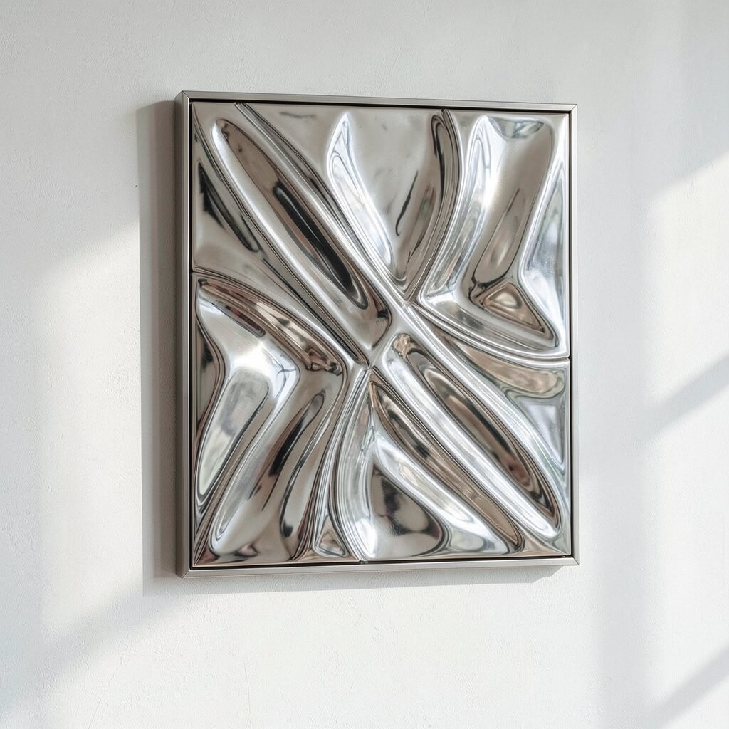
Metallic abstract art adds glow and movement, especially near windows or warm lamps. The shimmer feels refined, like a small light source you can hang on the wall.
Select artwork with gold, champagne, or soft silver tones that match your existing metals. Mount it with a frame that won’t distract, and angle it slightly if possible so it catches light without glare. For personalization, choose abstract forms that feel like your style, such as swirling curves for a cozy living room.
This style is unique because it changes appearance throughout the day. It also stays trendy since many interiors now use reflective accents to brighten neutral rooms. If you’re watching costs, consider smaller pieces first, then add a matching set once you know the best placement.
12. Monochrome Photography with Soft Contrast
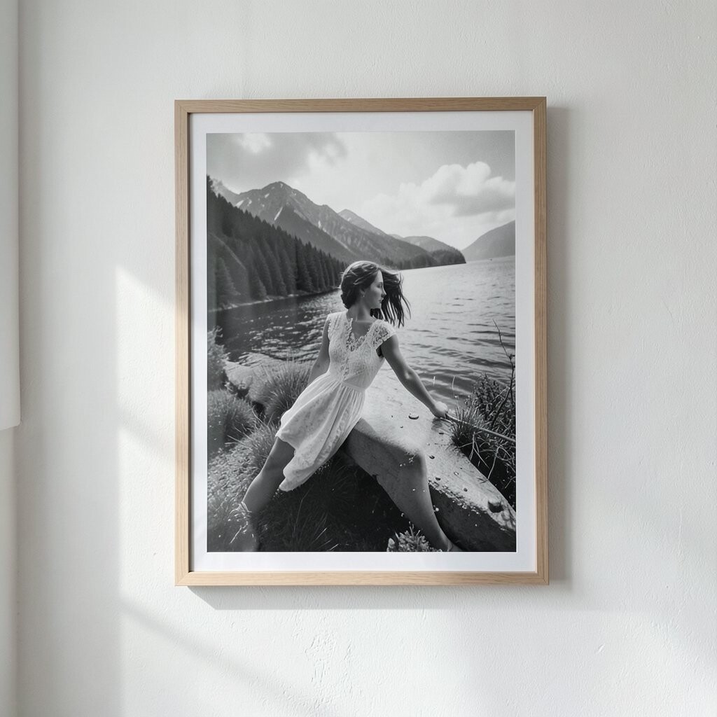
Monochrome photography gives a room a calm, gallery-like feeling. When the contrast is soft, the images look elegant and don’t overpower your furniture.
Choose photos with gentle gradients, like foggy streets, light stone textures, or simple portraits with warm shadows. Use matte frames and a light mat board to keep everything refined and easy on the eyes. For personalization, print pictures you’ve taken yourself, such as nature walks, architecture details, or everyday moments you love.
This idea feels unique because it turns personal memories into a professional-looking statement. It also aligns with current trends toward black-and-white decor that feels timeless. If you want a practical way to manage cost, print locally or use high-quality prints in standard sizes that are easier to find and frame.