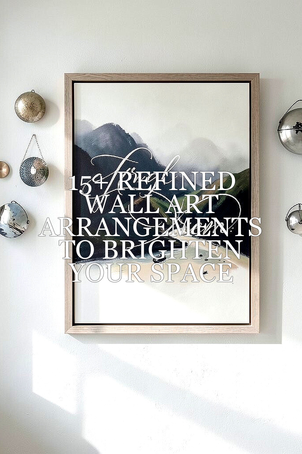
Staring at blank walls can make a room feel smaller and quieter than it should. With the right layout, your space starts to glow with personality.
Wall art works like good lighting for your eyes. It brings balance, color, and a sense of home.
1. The Calm Grid With a Gallery Rhythm
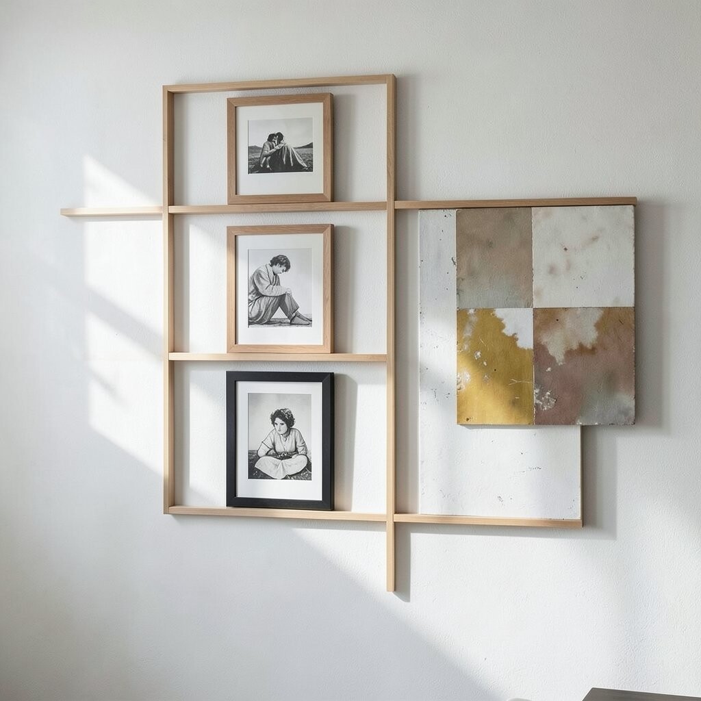
Pick pieces that feel related, like two to four framed prints in the same size family. Arrange them in a neat grid so your wall looks orderly at a glance.
Choose a soft palette for the main frames, then add one accent print with a slightly different tone to keep it lively. Center the group at eye level, then step back and check that the edges look even from across the room. This method makes it easy to match your style without overthinking every decision.
2. One Statement Canvas, Then Smaller Satellites
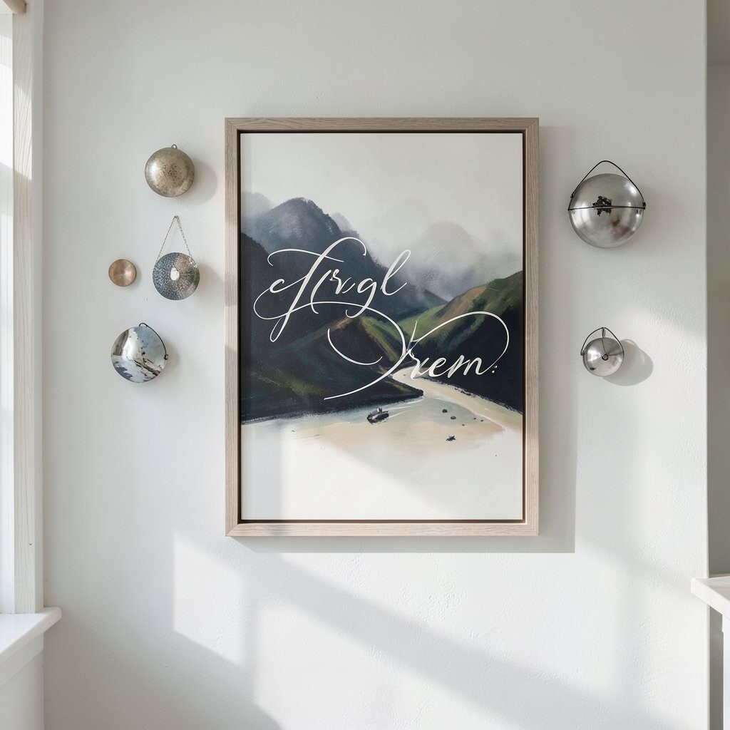
Start with a larger canvas or framed artwork as the hero piece. Place it slightly above center, then flank it with two smaller works like satellites in a gentle arc.
This arrangement draws attention first, which is helpful in busy rooms. Use frames that share the same finish, like black, warm wood, or brushed metal, so everything feels refined rather than random.
For personalization, pick one piece that reflects a memory or favorite theme, such as travel sketches, family photos in artful prints, or a favorite color you want to highlight. Keep the supporting artworks within the same color family so the wall stays calm. If you want to spend less, you can find budget-friendly prints for the smaller sizes while investing in the main piece.
3. Layered Frames With a Soft Overlap Look
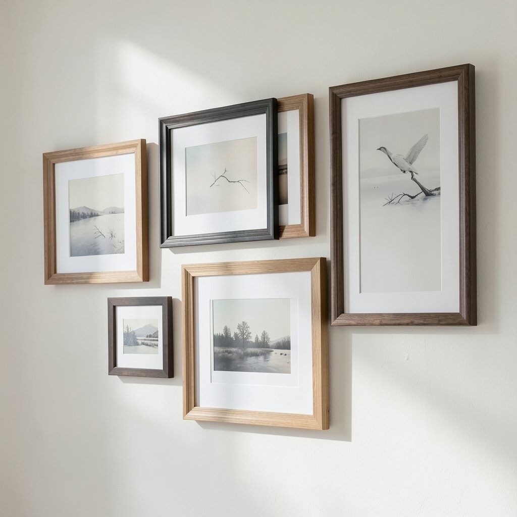
Instead of lining up every frame perfectly, create a relaxed layered effect with two or three artworks overlapping slightly. This gives a creative vibe while still feeling curated.
Try varying frame widths so the layers feel intentional. For example, place a tall print behind a slightly shorter one, then add a smaller photo frame in front to create depth.
To keep the look cohesive, stick to one theme like botanical imagery, abstract shapes, or monochrome portraits. Use spacers or careful measurements so the gaps stay consistent and the overlap looks neat. This style is unique because it looks like your wall has evolved over time, not been assembled in a rush.
When hanging, use a level and mark a reference line for the bottom edges first. That small step helps the layered layout look sharp even if the frames aren’t aligned perfectly.
4. Vertical Lines for a Higher, Airier Feel
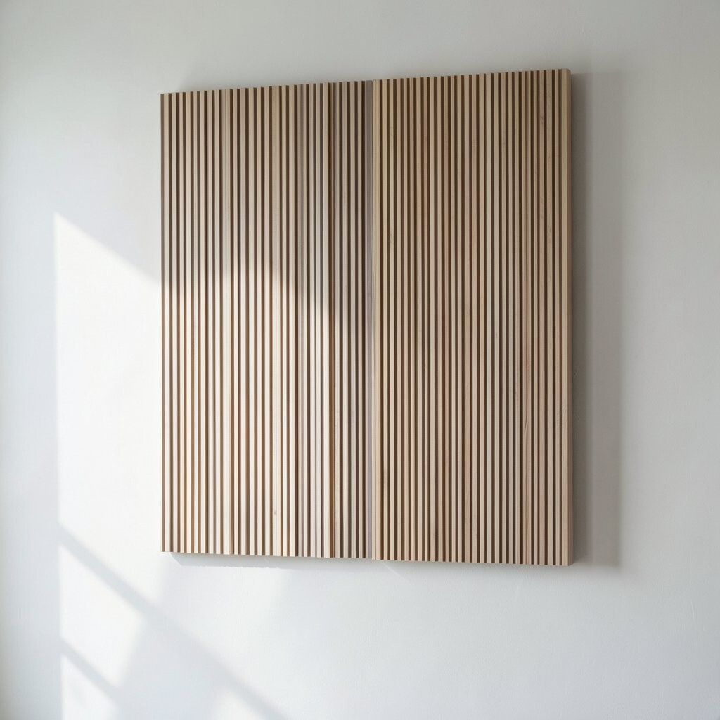
Choose three tall pieces and hang them in a straight vertical line. This simple move makes ceilings feel higher and creates a clean, modern look.
Pick artwork that has movement, like landscapes with sky space, abstract strokes, or prints with long shapes. If your room gets bright daylight, vertical art can catch the light and make the wall feel fresh throughout the day.
For personalization, include one custom print with your initials, a meaningful quote as artwork, or a simple icon that represents a hobby. If cost is a concern, look for poster prints in tall sizes and use inexpensive frames that match your decor. You can also use canvas wraps for a polished finish without pricey originals.
5. The Side-by-Side Conversation Pair
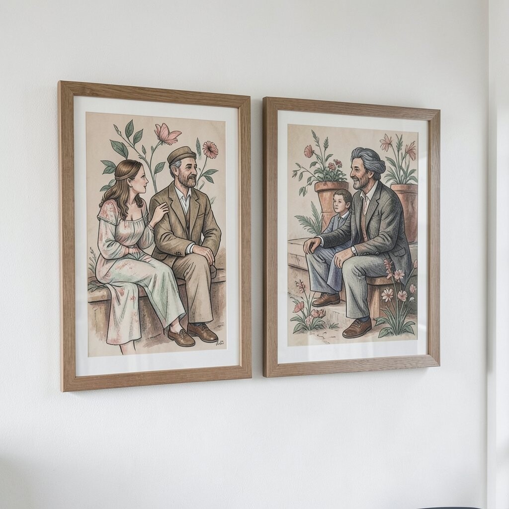
Hang two artworks next to each other, close enough that they feel like a conversation. Choose pieces with matching tones or complementary colors so they belong together.
To make the pairing look refined, align the top edges and keep the spacing consistent. This layout works great above a sofa, console table, or bed because it balances the space without taking over.
If you want uniqueness, try pairing one textured piece with one sleek, printed piece. For example, mix a neutral linen-style canvas with a crisp illustration. Add a small tray or lamp below to anchor the wall and give the pair a complete scene.
6. A Curved Arrangement That Feels Like a Gentle Hug
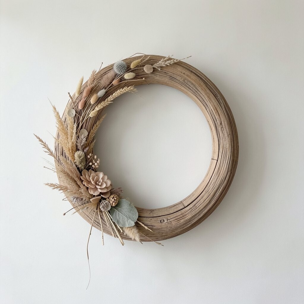
Create a soft arc with three or four artworks, curving inward toward a focal center. Even a mild curve can soften a room and make the display feel welcoming.
This arrangement is great for corners or for walls that feel a bit plain. Use a larger piece in the center and smaller ones on each side, so the curve looks balanced rather than tilted.
Try a theme like soft abstracts, muted landscapes, or framed embroidery-style prints for a unique look. For practical setup, measure the wall width, then map the center point before you hang anything. If you’re working with different frame sizes, plan the curve first so nothing feels squeezed.
7. Over-the-Sofa Centering With Equal Spacing
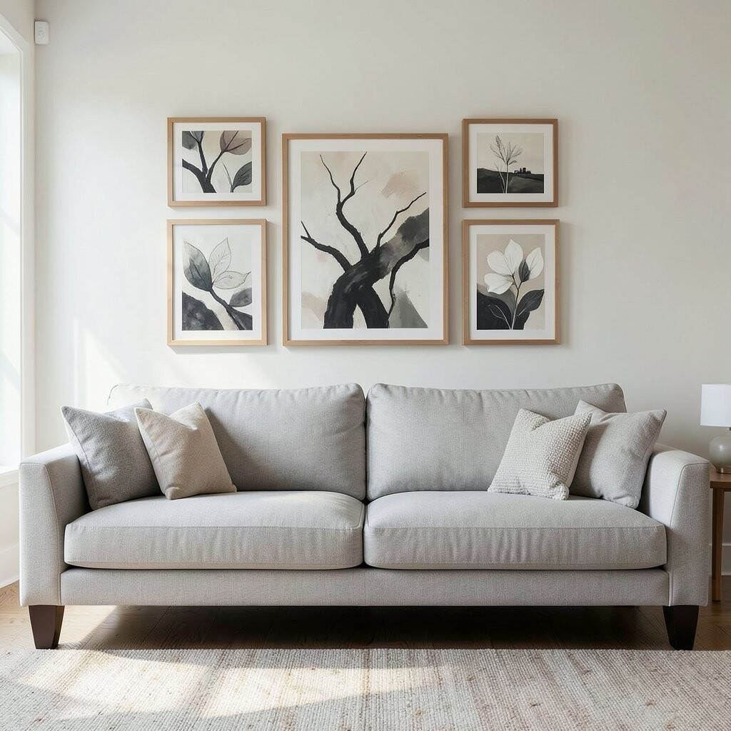
When artwork goes over the sofa, centering matters more than most people realize. Pick one medium or large framed piece, then aim for it to sit about at eye level when you’re seated.
If you prefer a multi-piece look, use two pieces and keep equal spacing from the center line. This makes the wall look tidy and gives the room a finished feel.
For personalization, choose art that echoes the sofa fabric color, such as a print with a similar shade in the background. Current trends favor warm neutrals, natural textures, and gentle abstract shapes, so those directions tend to feel modern without being loud. If you shop with a budget in mind, consider open-edition art prints and swap frames as you upgrade later.
8. The Mirror + Art Combo for Extra Brightness
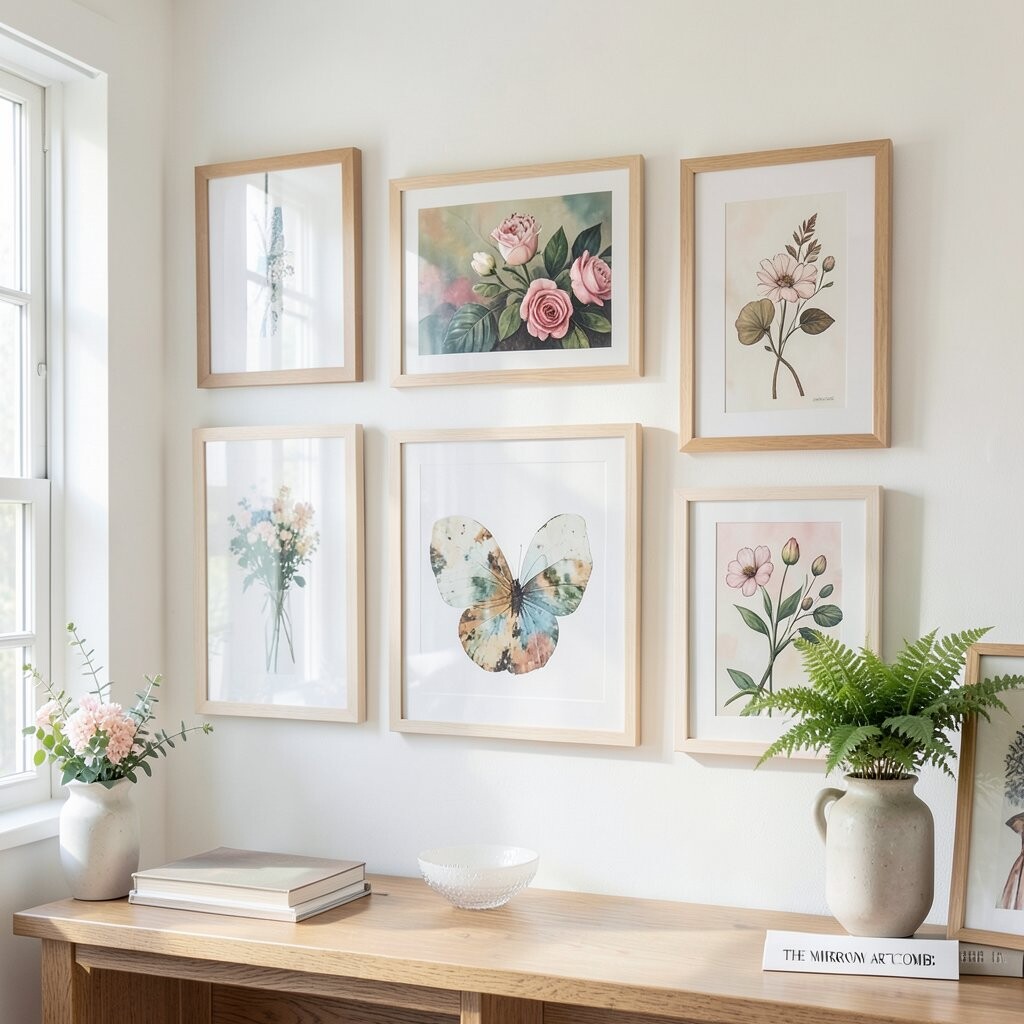
Add a framed mirror and place one artwork nearby so the light bounces and the room feels more open. Mirrors can make a wall feel brighter, especially in rooms with limited daylight.
Choose a mirror frame finish that matches your art frames, like oak wood or matte black. Then hang a complementary piece on the adjacent wall or just beside it, keeping the height similar for a polished look.
This arrangement feels unique because it blends function with style. It’s also practical since the mirror adds daily usefulness without extra clutter.
If cost is a concern, look for a simple mirror in a great frame and print-based art for the companion piece. That mix can look high-end without high prices.
9. Use Color Blocking With Three Bold Works
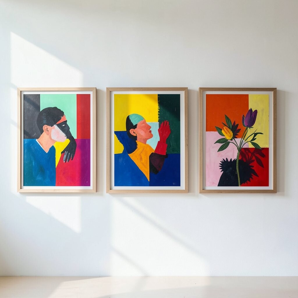
If you love color, use a bold trio arranged side by side or in a slight stagger. Make each piece share one common color, then let the other tones vary for energy.
This method brightens a space because your eye naturally moves across the wall. It also makes it easier to style the room since your furniture and accessories can pull from the artwork palette.
For personalization, choose prints that connect to your lifestyle, like art inspired by your favorite city, your hobby, or your favorite season. Keep the frames consistent, and make sure the artwork sizes feel even enough to look refined. If you’re on a budget, prints from local artists or digital downloads in custom frames can give you real personality without overspending.
10. The Classic Salon Look With Mixed Sizes
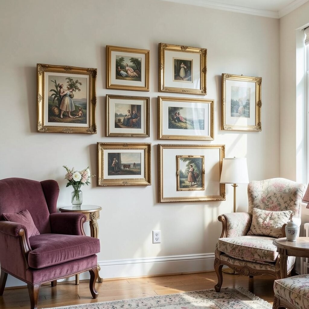
Salon-style means you gather multiple pieces and hang them with an elegant mix of sizes. Think curated, not random, and focus on making a tidy overall silhouette.
Start with the largest frame in the center, then add smaller works around it until the space feels full but not chaotic. Choose a theme like vintage travel prints, black-and-white photography, or botanical illustrations to keep it cohesive.
This arrangement is unique because it feels like a personal museum on your wall. It also gives you room to include different budgets since you can mix one splurge piece with several more affordable prints. Use paper templates and tape to test the layout on the floor before you hang anything.
11. Stair Step Placement for Hallway Glow
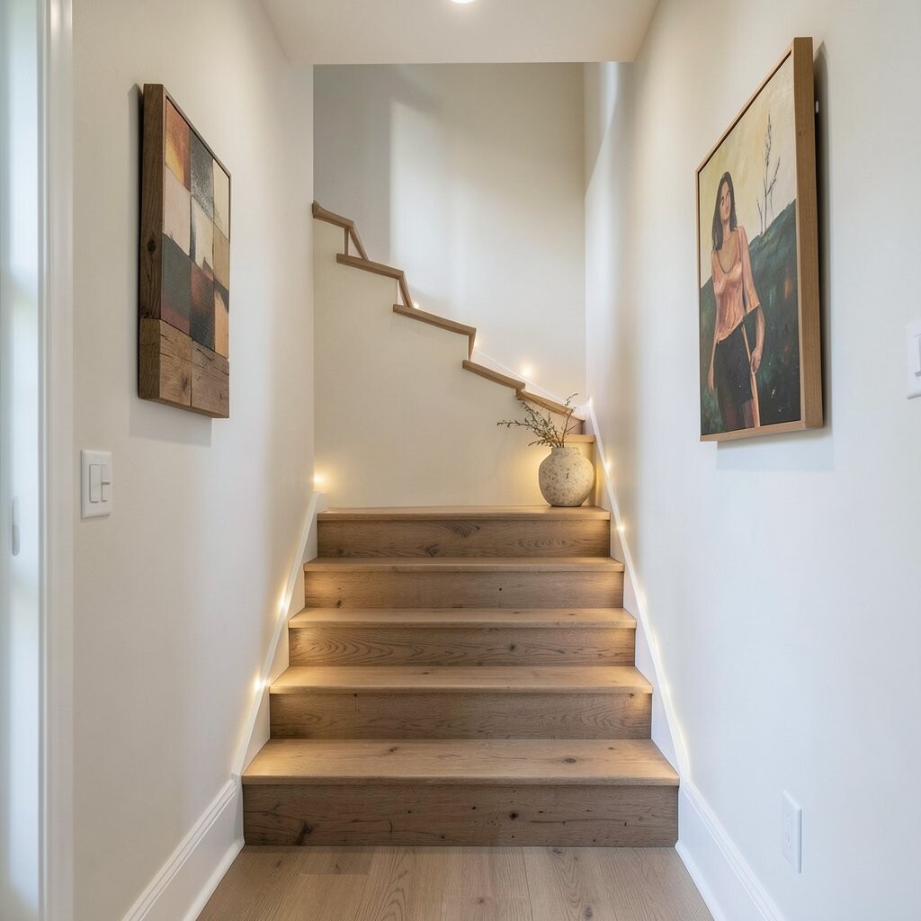
In a hallway, wall art needs to feel guided rather than heavy. Try a stair step placement where the frames gradually rise as you move down the space.
This creates a smooth visual path and makes long hallways feel more interesting. Use smaller frames for the higher end and slightly larger frames for the lower end, so everything feels balanced.
For practical tips, keep the frames at consistent horizontal alignment for the bottom edges, then vary the height slightly by using the stair step plan. Choose prints that are easy to read at a distance, like landscapes with clear shapes or simple abstract color blocks.
To keep cost manageable, mix frame sizes using the same finish and shop for affordable prints in sets. Even a tight budget can look refined when the arrangement is carefully planned.
12. The Monochrome Theme With One Warm Accent
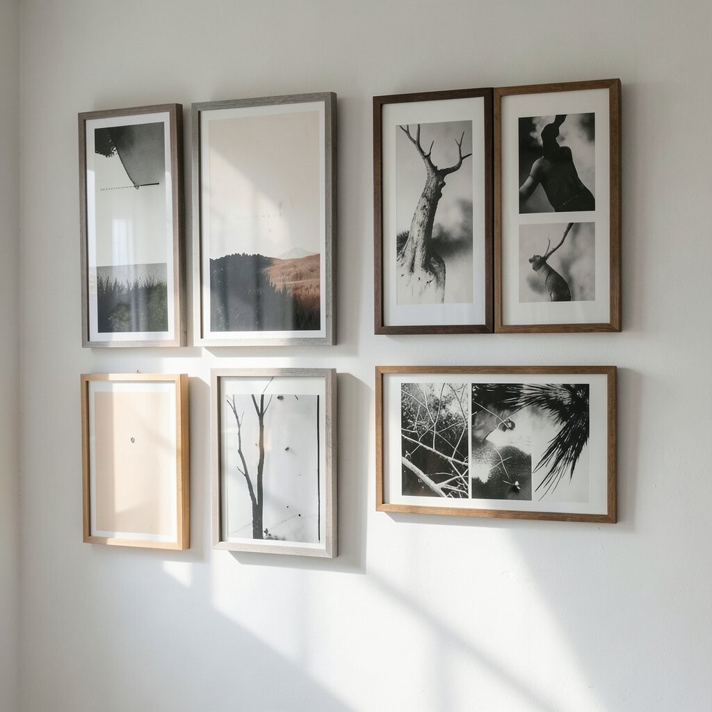
Pick artworks in mostly one color family, such as black, white, and gray, then add a single warm accent piece like terracotta or honey wood tones. This gives a sophisticated look that still feels inviting.
Monochrome layouts are trendy because they pair well with many decor styles. They also make it easier to match your wall art to textiles, rugs, and furniture since the palette stays controlled.
For personalization, make the accent piece something meaningful, like a custom print featuring a favorite quote in a warm ink tone. Use frames with slim profiles for a refined feel, and keep glass or acrylic glare in mind if your hallway or living room has strong light.
If you’re watching spending, monochrome prints are widely available in many price ranges, and frames can be swapped easily as you update your look.
13. Framed Photo Collage With Artful Spacing
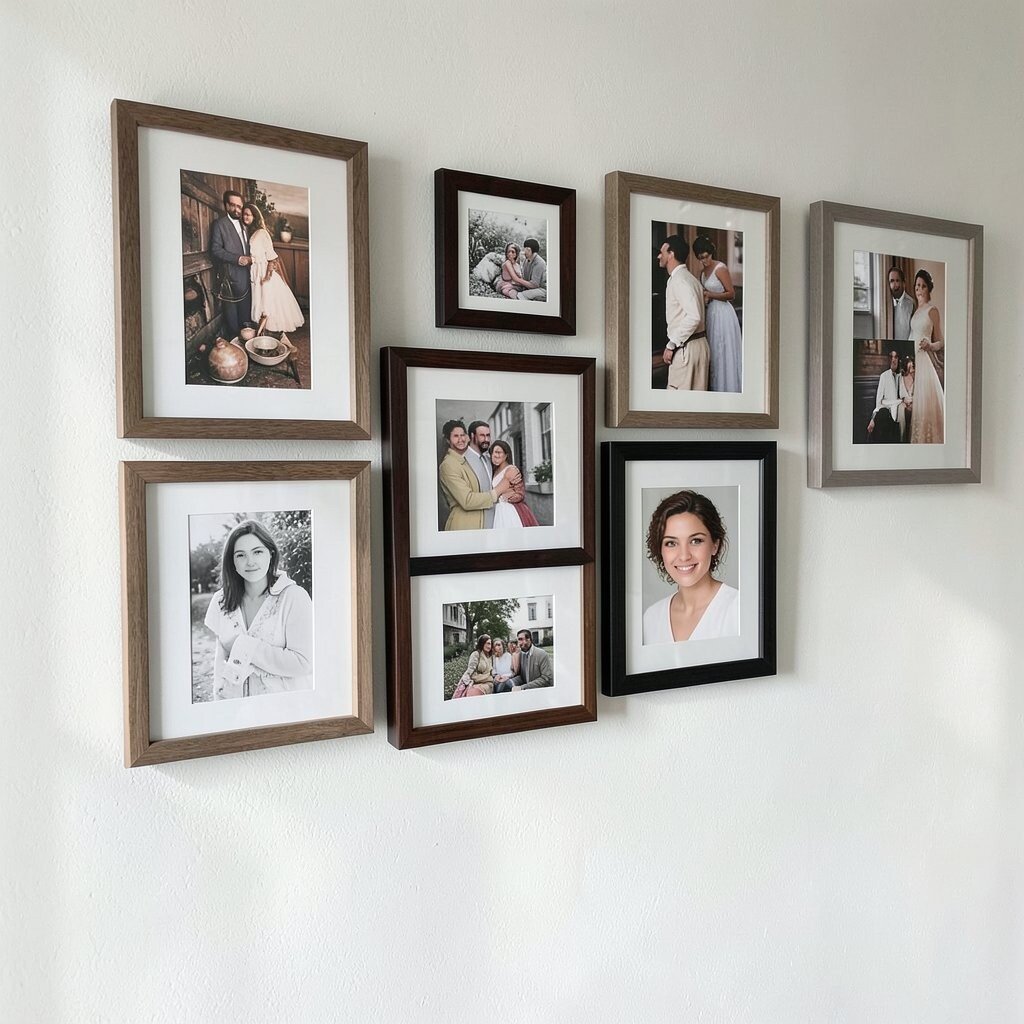
Create a collage using framed photos or photo prints, but keep the spacing consistent so it looks like design, not clutter. Choose images with similar color tones for an elegant, unified vibe.
This kind of arrangement feels deeply personal while still reading as refined. It also makes your wall useful because the photos remind you of places, people, and moments you love.
For uniqueness, mix photo sizes but keep the same mat style and frame finish. Add one artwork-style print among the photos, such as a line drawing of your hometown or a minimal illustration that matches your photos’ tones. If you want an easy upgrade, swap one photo for a print you’ve made from your own artwork or a favorite design collection.
14. Two-Row Layout With a Balanced Upper Breath
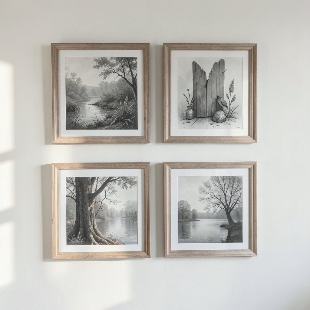
Try a two-row setup with a few artworks in the top row and fewer pieces in the lower row. Keep the rows aligned in a way that feels light, so the wall has “breath” instead of feeling packed.
This is especially useful when you have a larger wall or a wide blank section above furniture. Choose a slightly larger piece in the top row, then use medium and smaller works below to create depth.
For practical tips, mark the center line of your wall and measure the height so both rows sit comfortably within your room’s scale. If cost is a factor, you can use a combination of thrifted frames and affordable prints, then unify everything with spray paint or mat board in matching tones.
The uniqueness comes from how the layout creates a quiet rhythm across the wall, guiding your gaze without demanding attention.
15. Minimal Line Art for a Clean, Bright Look
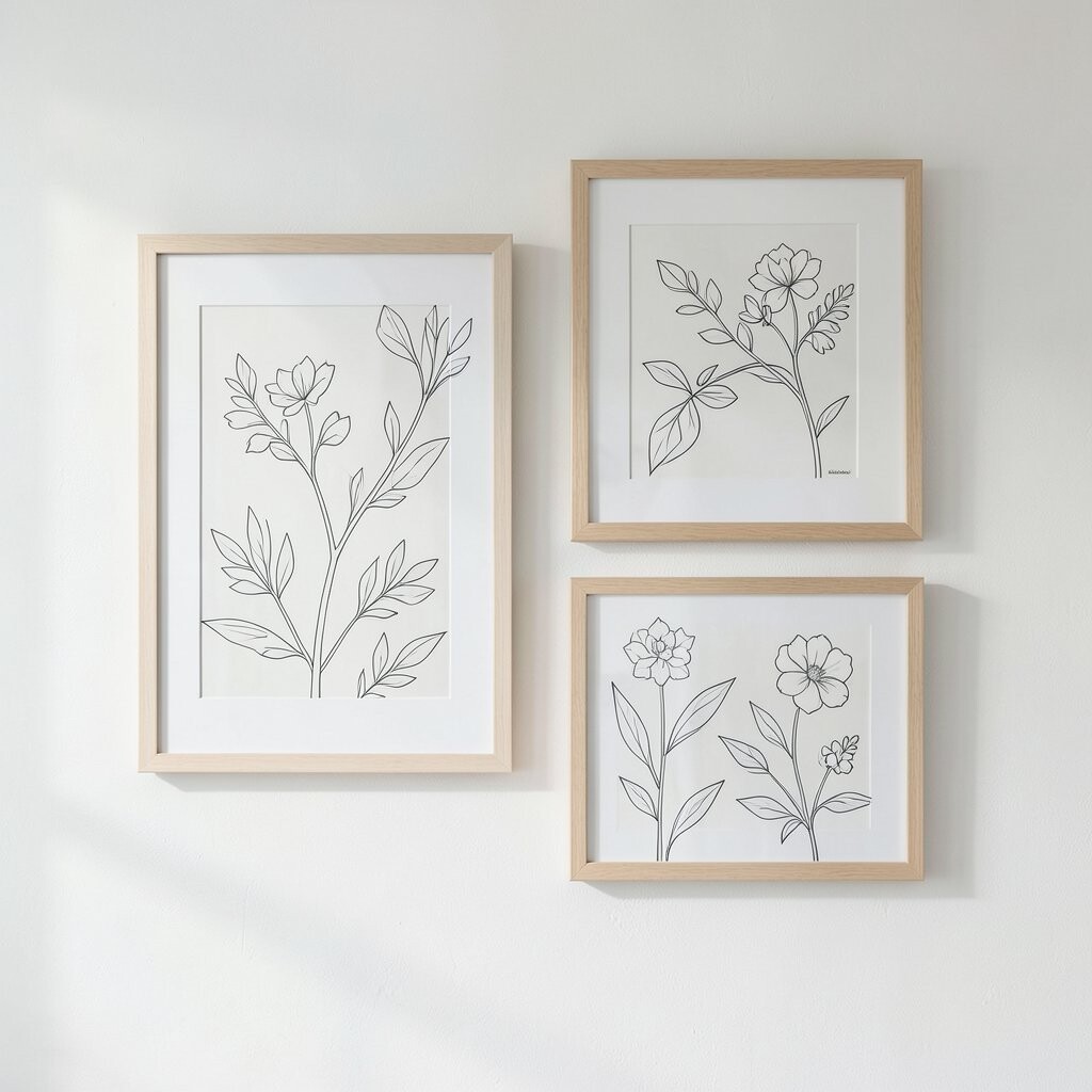
If your space already has lots of texture, minimal line art can brighten it without adding visual noise. Use simple prints with thin lines, soft gradients, or gentle shapes.
This trend fits modern homes because it feels airy and calm. It also works beautifully in small spaces where you want your wall to look neat and spacious.
To personalize, select line art that matches your interests, such as botanical line drawings, simple city skylines, or custom outlines of meaningful places. Choose frames that are slim and light-colored to keep the wall open.
For cost considerations, line art prints are often budget-friendly, and many sellers offer sets that make matching easy. Spend a little extra on sturdy frames if you want a more refined finish that lasts.
16. Seasonal Flex Wall With Rotating Inserts
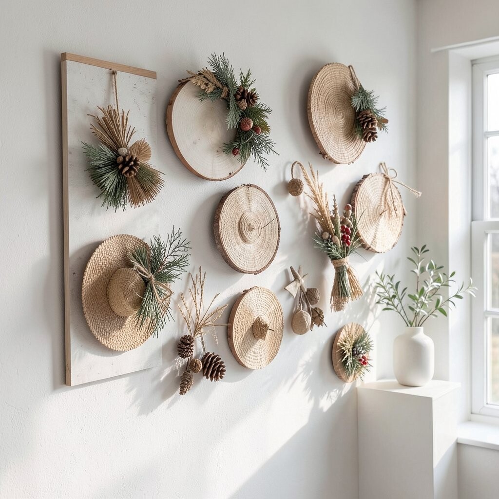
Create a gallery wall using frames that can hold different inserts, like print-friendly sleeves or mat board swaps. This way you can update the look when seasons change, holidays arrive, or your tastes evolve.
It’s a smart way to keep your space feeling fresh without buying all new artwork every time. Pick a consistent frame finish and mat color so each new insert still looks coordinated.
For uniqueness, choose a base style that stays, like neutral landscapes or simple abstracts, then rotate accent prints that match the mood you want. For personalization, include small meaningful pieces, like notes turned into typographic art, pressed flower scans, or photos cropped into clean, modern shapes.
This approach can also help with cost since you can purchase just a few new inserts rather than replacing every frame. When you hang the frames, keep the layout steady and let the content change, so the wall remains refined and intentional.
When it’s time for the next update, take a photo of the layout first so you can recreate spacing quickly and keep everything looking even. A small routine like that turns decorating into an easy, enjoyable habit.