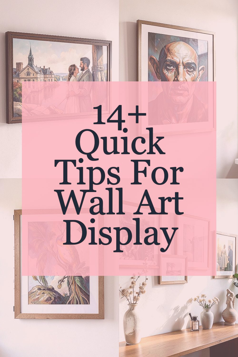
A room can feel unfinished until its walls start doing their job. The right wall art makes the whole space look cared for and quietly impressive.
Small changes in placement, scale, and lighting can make a big difference. When your display feels intentional, your home starts to look like it belongs to you.
1. Start With the Right Wall Space
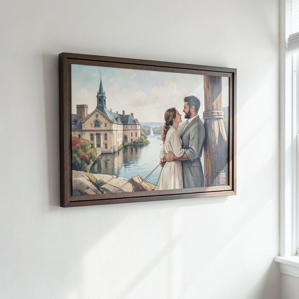
Pick a wall that naturally draws your eyes when you enter the room. Stand back and picture the art as part of the view, not as an afterthought.
Look for clear sight lines around the area, especially above furniture. A large blank stretch looks best with a bigger piece, while narrow walls often suit smaller frames or a tight group. If the wall has strong features like windows or vents, plan for them so the art doesn’t fight the layout.
2. Use Scale That Feels Balanced
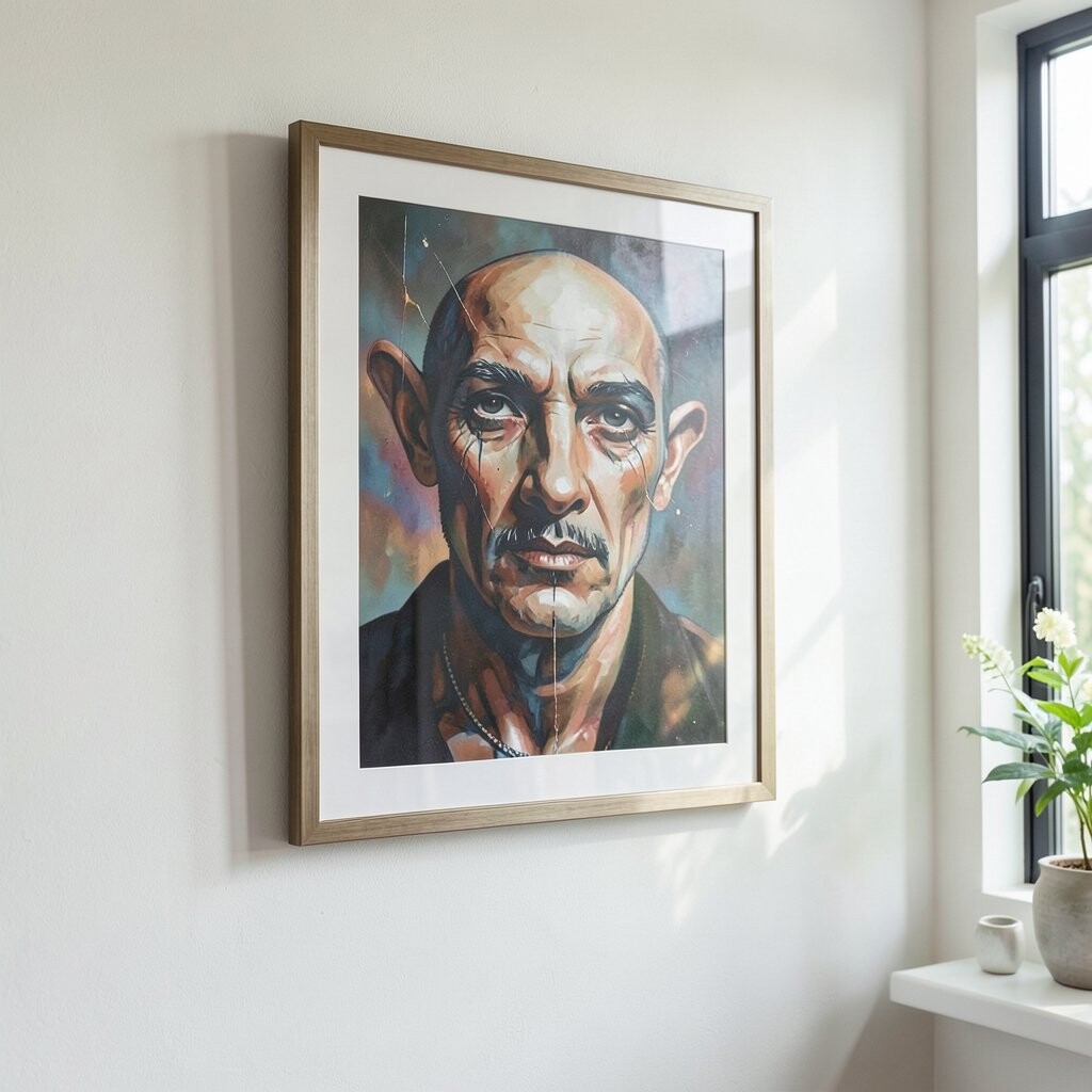
Great wall art looks like it belongs at your wall’s size, not like it was dropped there. A tiny print can disappear, while an oversized canvas can overpower everything.
For a dining or living area, choose art that sits comfortably over the main furniture piece. As a quick guide, aim for your artwork’s width to feel like it fits the space across the wall, rather than leaving awkward gaps. If you love a dramatic look, go slightly larger and let the piece become the focus.
When in doubt, mock it up on the wall with masking tape. You’ll see instantly if the proportions make sense and you’ll avoid buyer’s regret.
3. Measure Height Like a Pro
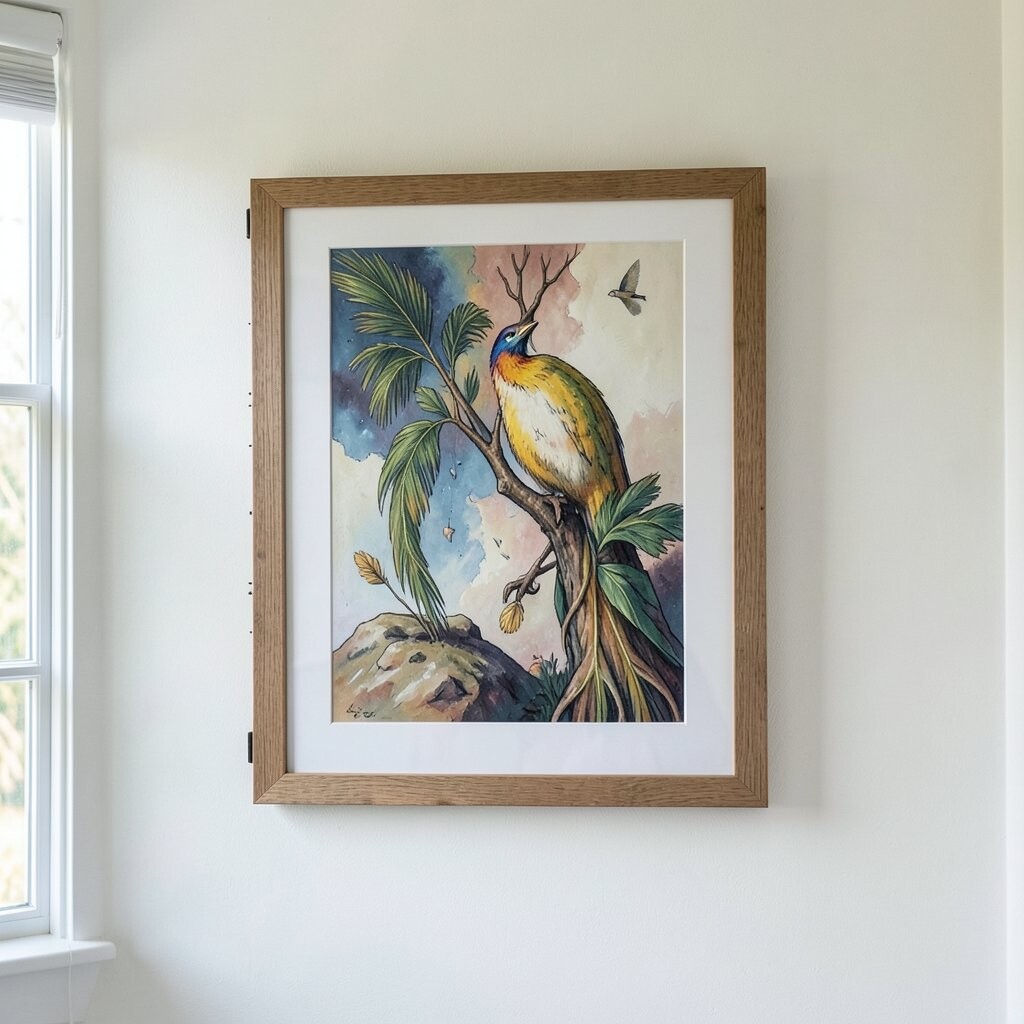
Even if you love the artwork, height can make it look right or weird. A balanced center height helps your wall art feel calm and intentional.
Try placing the artwork so the visual center lands around eye level when you’re standing. Consider how the room is used, too, because seating height changes what feels “centered.” If you hang multiple frames, make the group’s center land where a single piece would.
For rooms with tall ceilings, you can go slightly higher, but keep the art aligned with how people actually see the wall. Use a level and take a moment to double-check before the hooks go in.
If you’re unsure, tape it up first and stand in your usual spot for a minute. Your eyes will tell you more than any guesswork.
4. Mix Styles Without Creating Chaos
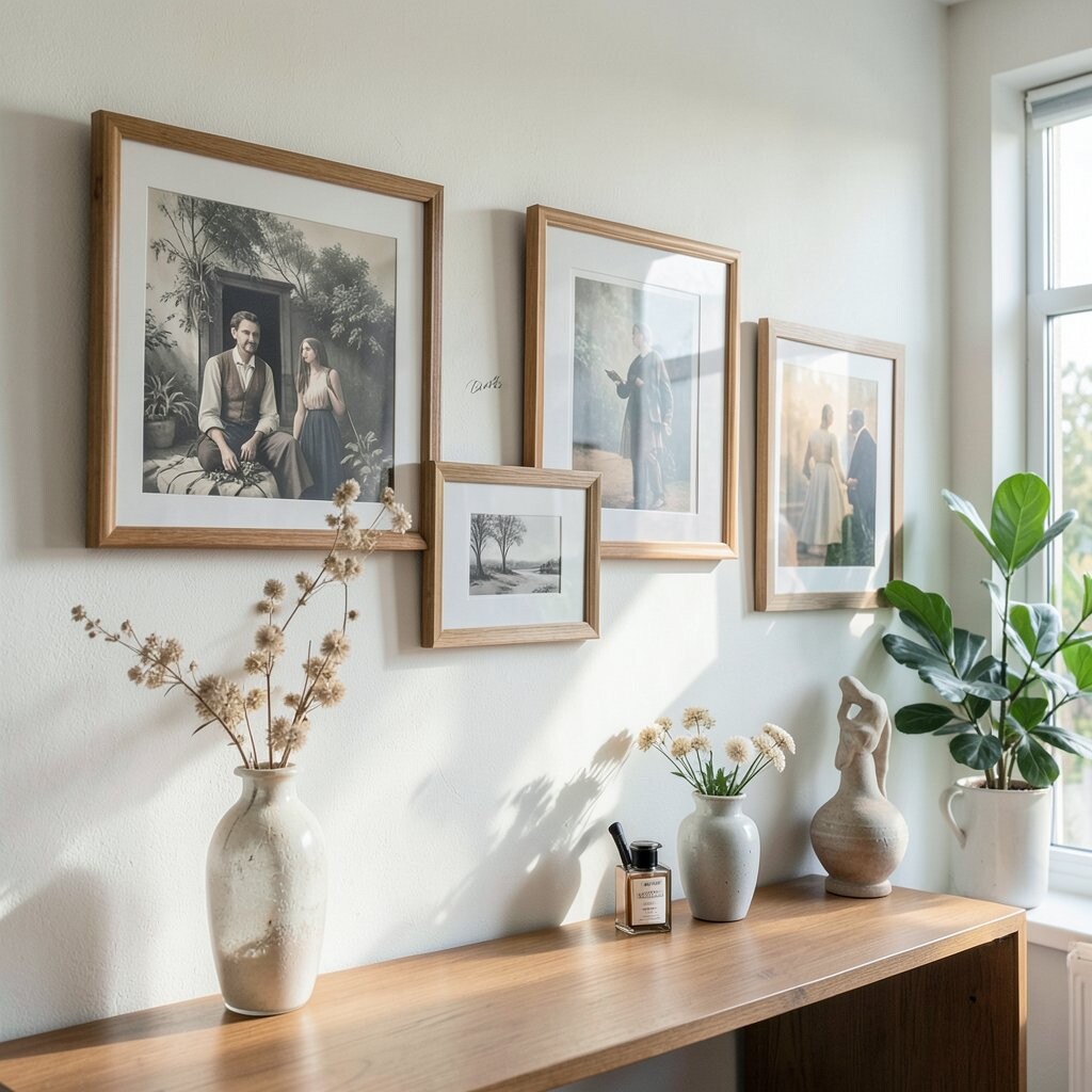
Refined wall art doesn’t mean everything must match. It means the pieces work together through color, shape, and mood.
If you love modern frames but also have vintage prints, choose a shared element like a consistent tone or theme. Black and warm wood frames often blend nicely across styles. For a clean look, limit the palette so the wall feels cohesive.
5. Choose a Color Story You’ll Enjoy Daily
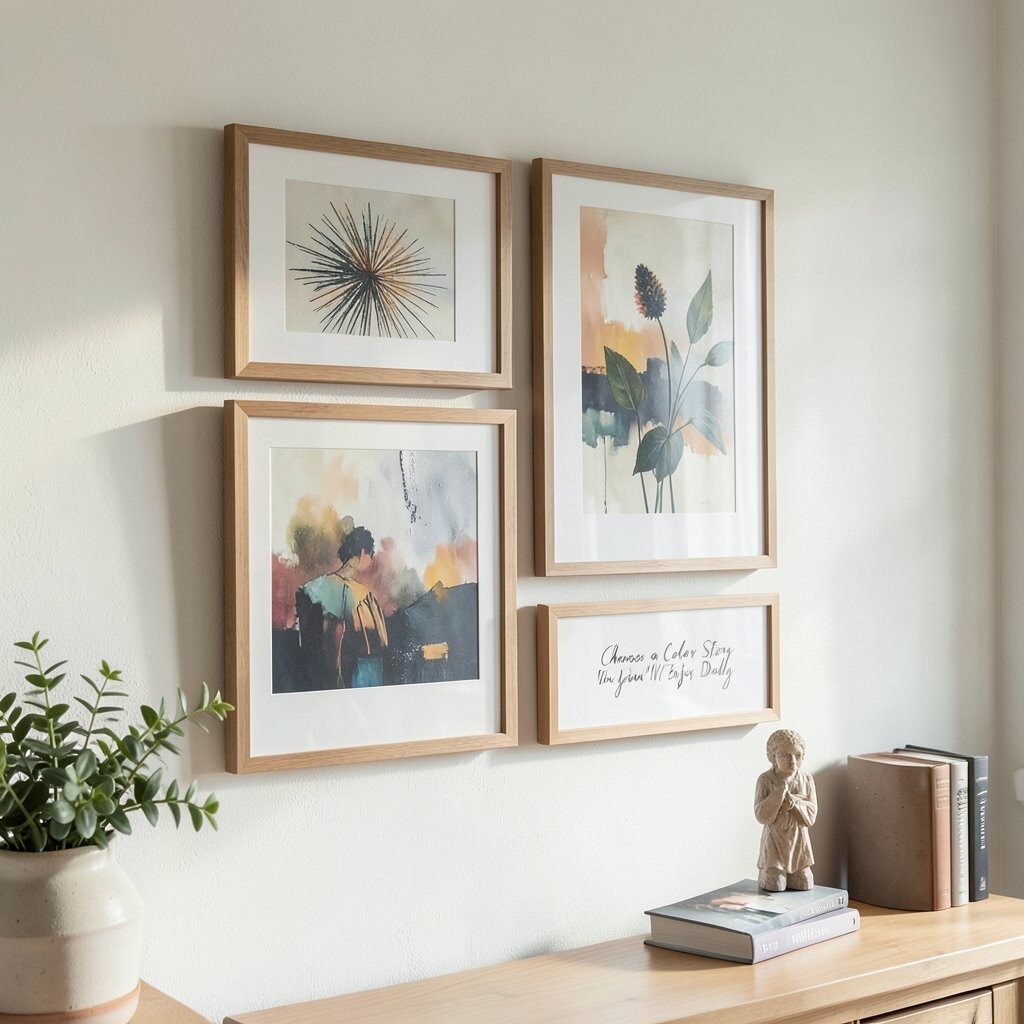
When your wall art mirrors the room’s colors, the space feels smooth and lived-in. You’ll notice how everything looks like it belongs together, even when you change small decor.
Pull one main color from the artwork and repeat it in a pillow, rug, or vase for a gentle connection. Pick a second accent color only if it’s used sparingly, because too many accents can make the wall feel busy. Neutrals like cream, charcoal, and soft beige can also make art stand out while staying easy to style.
If your walls are cool gray, warmer art tones like sand, terracotta, or muted gold can feel inviting. On warmer paint, crisp blues or deep greens can add fresh energy without clashing.
6. Keep Spacing Consistent for Gallery Energy
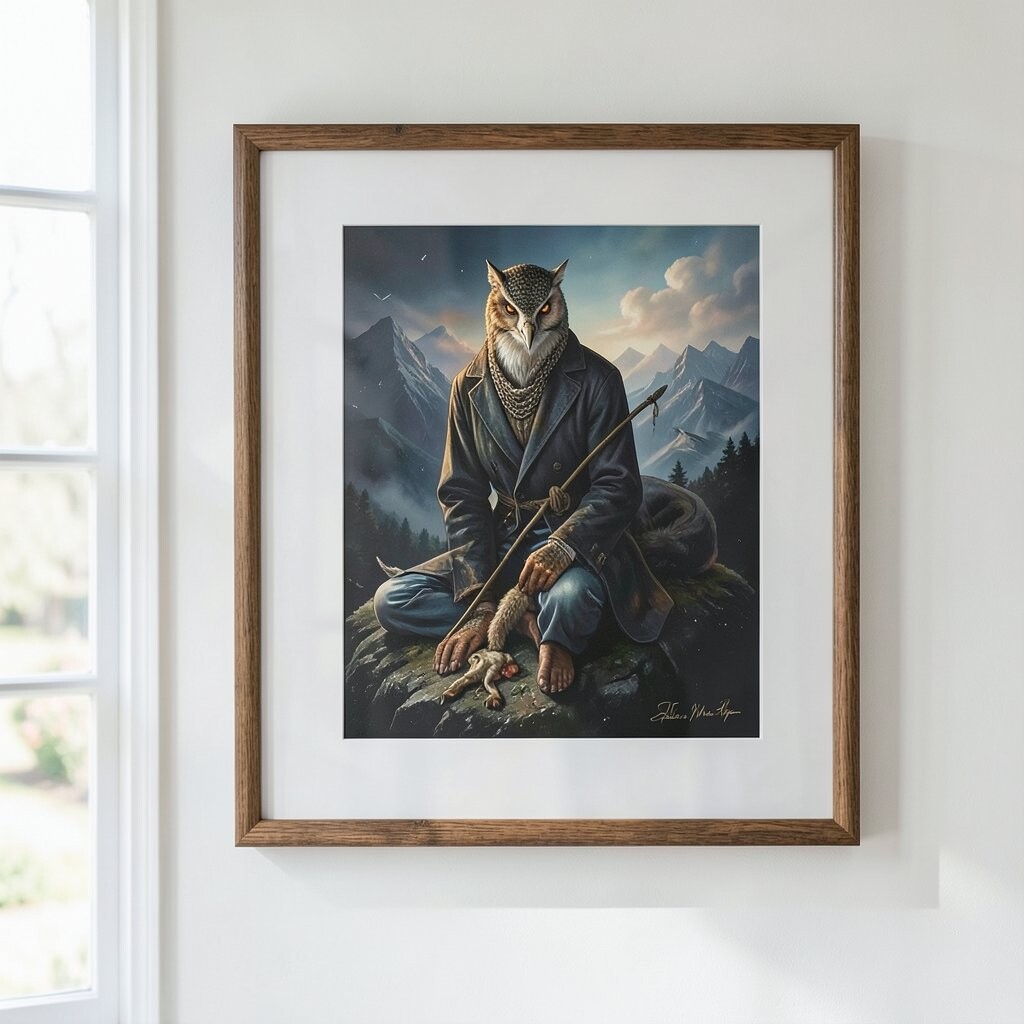
When frames are spaced thoughtfully, the display looks polished instead of accidental. Consistent gaps make your wall art feel like a curated gallery.
Use the same spacing between pieces, even if the frames aren’t identical. A steady rhythm guides the eye across the wall and keeps the arrangement tidy. Lay the frames on the floor first so you can adjust the layout before anything is hung.
Small changes matter, like shifting one frame a few inches can fix a lopsided feeling. If you’re hanging prints in a grid, align them carefully so the edges form neat lines.
7. Use Lighting to Make Art Look Expensive
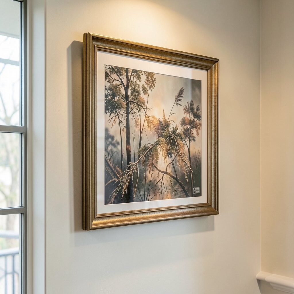
Wall art can look flat under regular overhead lighting. Adding the right light helps the colors pop and gives your space a “designed” feel.
Consider picture lights, track lights, or even a soft lamp placed nearby. Aim for light that reaches the artwork without blasting it with harsh glare. Warm bulbs often make wood frames and rich colors feel cozy, while neutral bulbs can keep colors crisp.
8. Layer Materials for Soft, Sophisticated Texture
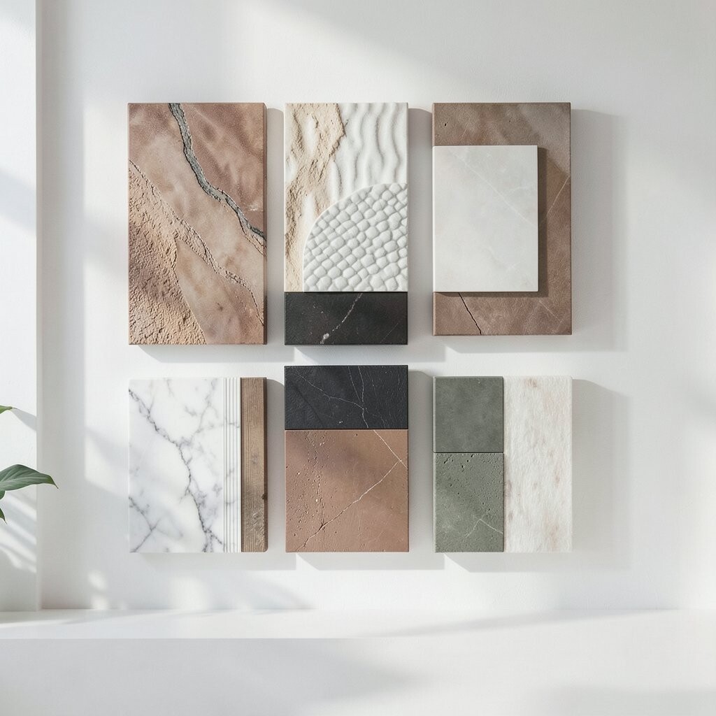
Refined wall displays often look richer because of texture, not just color. Mixing materials like wood frames, metal accents, and paper prints adds depth.
If you love a sleek look, pair slim black frames with a matte art print or a thin gallery canvas. For a warmer vibe, mix natural wood with woven or textured elements like linen or watercolor prints. Texture makes the wall more interesting up close and more calming from a distance.
9. Create a Focal Point With One Hero Piece
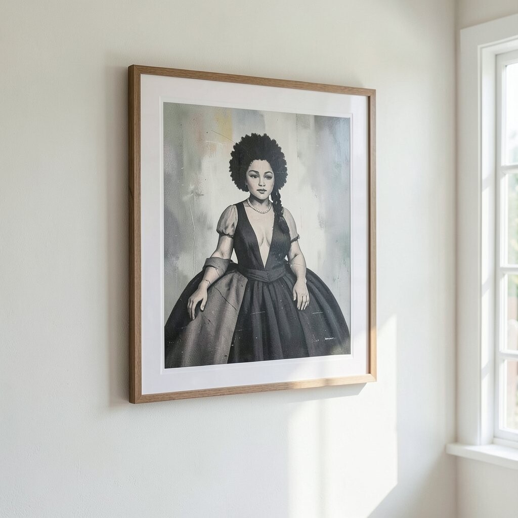
Your wall can feel busy when everything competes for attention. One “hero” artwork gives the room a clear center of gravity.
Choose your favorite piece, then build around it with smaller prints or simple frames. The smaller items can echo its colors or subject matter, but they should support the main piece, not overshadow it. A hero canvas, bold photograph, or large abstract print often does the trick.
This approach also helps with cost, because you can spend more on one special piece while keeping other frames budget-friendly. Even affordable prints look refined when they sit in a well-chosen layout.
10. Choose Frames That Match Your Room’s Mood
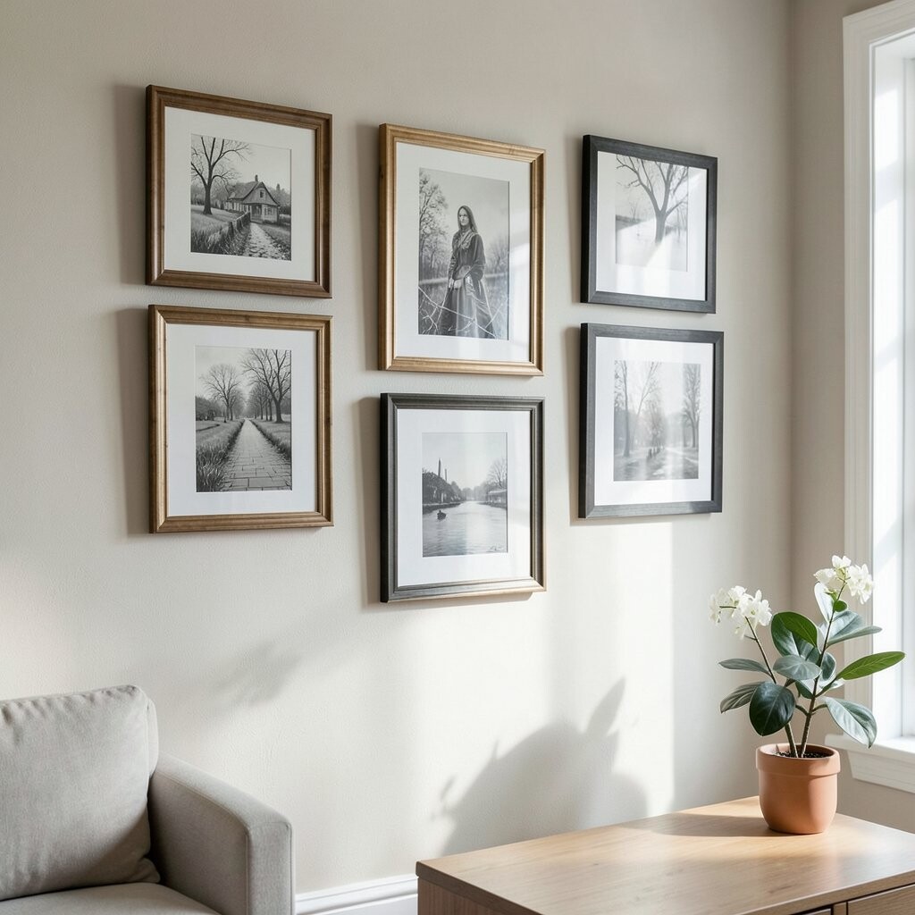
The frame is like the outfit your art wears. It can make the same print feel casual, elegant, or gallery-like.
For modern interiors, clean frames with simple lines keep the look crisp. For traditional spaces, slightly wider frames with gentle details can feel comforting. Matte finishes often look more refined than shiny ones because they reduce glare.
If you want a quick upgrade, swap just the frames you already own. Many thrift finds look amazing once you add a consistent frame style and matching mat.
11. Try a Slightly Off-Center Composition
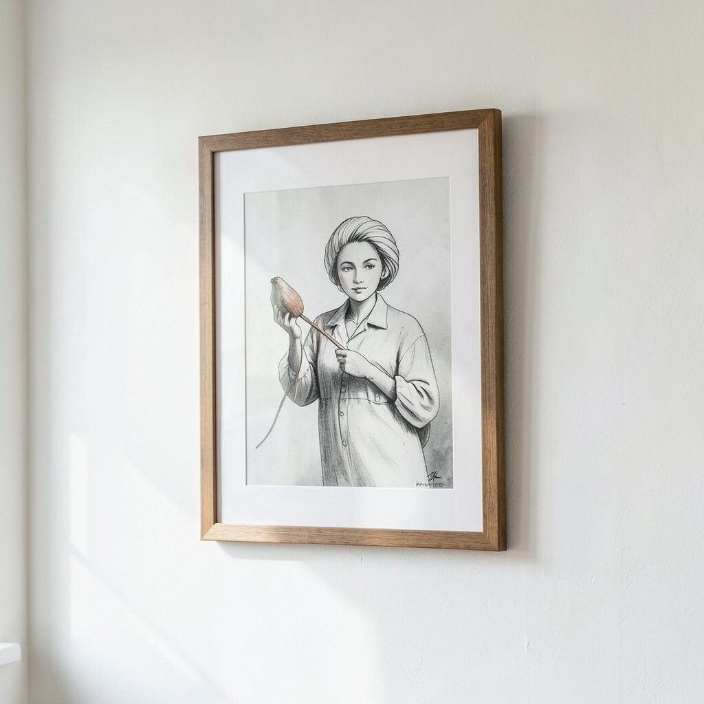
Perfect symmetry is beautiful, but a little asymmetry can feel more artistic. When done gently, it adds movement and personality.
Place one larger piece slightly higher or a bit off the centerline of the group. Then balance it with smaller pieces or a lower anchor on the other side. The goal is to keep the whole arrangement stable, not random.
Step back often while adjusting. Your brain will notice what feels “off” faster than you think, so trust your eyes and make tiny tweaks.
12. Personalize With Meaningful Collections
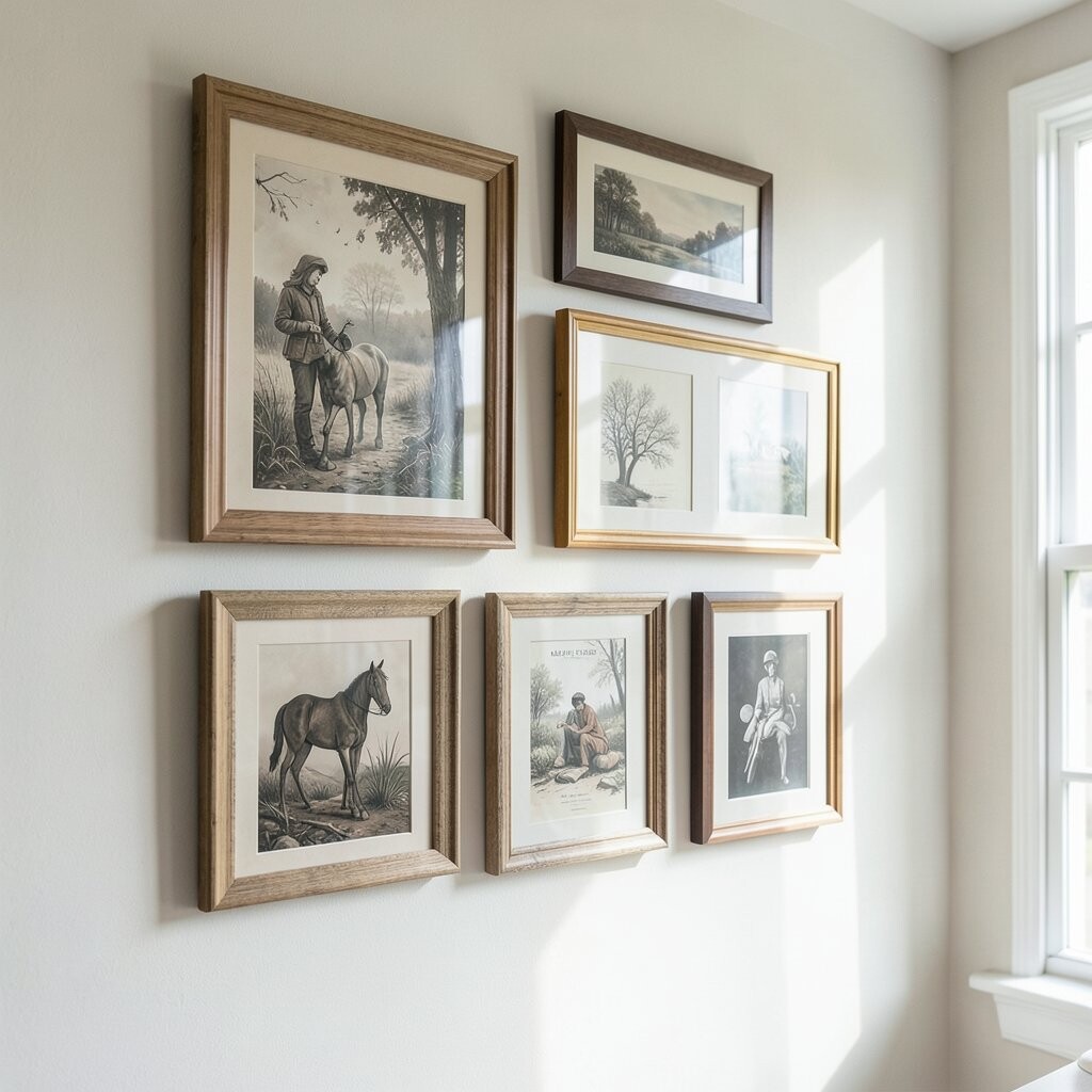
Art becomes special when it relates to your life, not just your taste. Personal pieces add warmth and make your home feel uniquely yours.
Think about framing family photos in a consistent style, or turning travel postcards into a small display. If you love creating, hang your own sketches or prints so the wall reflects your hands and ideas. You can also personalize with quotes from books you love, as long as the typography fits the room’s color story.
Even a small collection can look polished when the frames match and the spacing stays consistent. This is a great way to build a display over time without buying everything at once.
13. Use Affordable Art, Not Cheap-Looking Choices
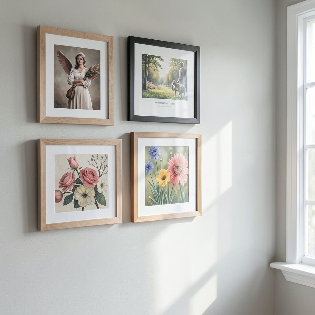
You don’t need a huge budget to get a refined look. Many affordable prints can look high-end when you choose the right paper, mat, and frame.
Look for prints with rich color or texture, even if the subject is simple. A neutral mat and a quality frame often elevate budget art more than upgrading the print itself. If you’re shopping online, check for thick paper or archival inks, because those details show up in real life.
You can also create a coordinated set by buying smaller matching prints. Then arrange them as a group so they read as intentional, not scattered.
14. Follow Current Trends, Then Make Them Yours
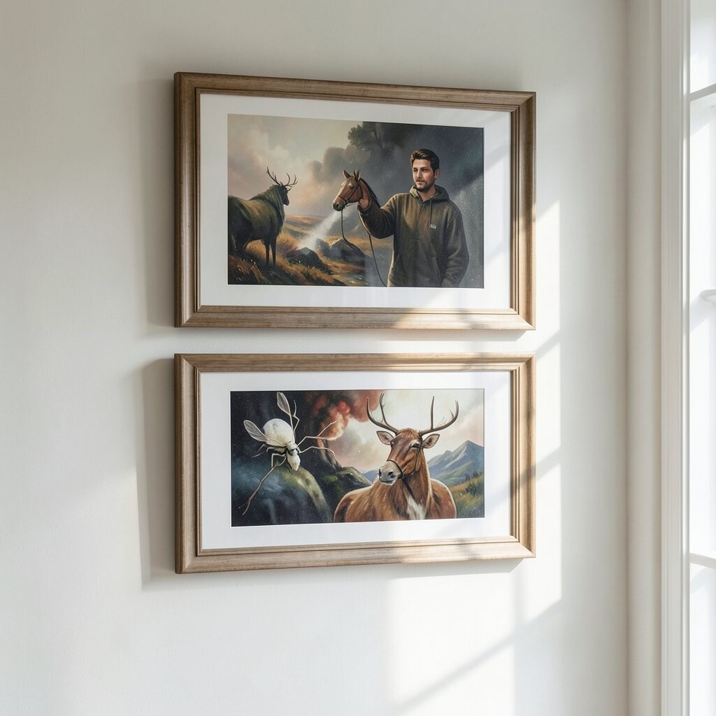
Trends can guide you, but your space should still feel like home. Right now, many refined interiors lean toward organic shapes, layered textures, and softer palettes.
Rounded frames, abstract line art, and nature-inspired themes feel current and calming. Another trend is using negative space, which means leaving breathing room around the art. If you like minimal walls, a single statement piece with a clean frame can be the most on-trend option for you.
Choose trend elements in one or two ways, then stick to your personal favorites. That balance keeps your wall from feeling like it belongs to someone else.
15. Secure Everything and Keep It Maintenance-Friendly
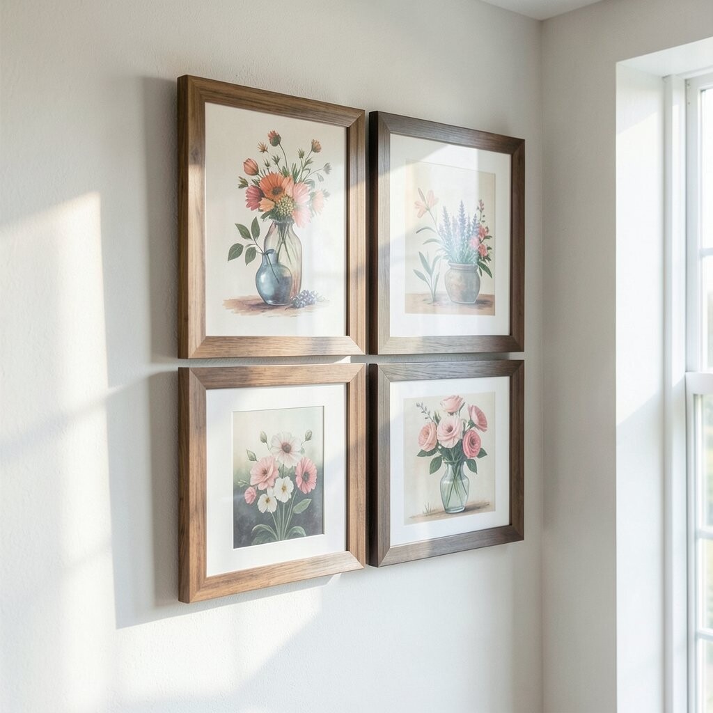
A gorgeous display should also be practical. When your frames are secure and your art stays easy to clean, your wall looks good for longer.
Use proper wall anchors for the weight of the piece so nothing shifts over time. Wipe frames gently with a soft cloth and avoid harsh cleaners that can damage finishes. If you use glass, be mindful of fingerprints and glare, since these small things can dull the look.
As seasons change, you may want to adjust tiny decor around the art, like swapping seasonal pillows or adding a fresh vase. Because your layout is sturdy, those updates won’t disrupt the overall design.
When you plan for longevity, your wall art becomes a reliable backdrop for everyday life. That’s the kind of refined shine that keeps showing up.