The wall is already a canvas; you just choose the mood. Paint can turn an ordinary corner into something people talk about.
Ready to make your next piece feel bold and personal? Here are creative graffiti designs that give you clear visual ideas, practical ways to start, and room to add your own style.
1. Bubble-Beat Letters
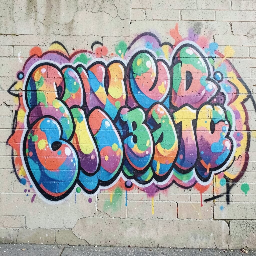
Picture thick, rounded letters with a soft shine, like candy wrapped in color. The outlines look puffed up, and the inside fills glow with bright gradients.
Start by sketching big shapes with a light marker, then add a chunky outline that follows your curves. Use two or three colors in a smooth shift, like teal to lime, and keep highlights near the top edge.
2. Wildstyle Wind Arrows
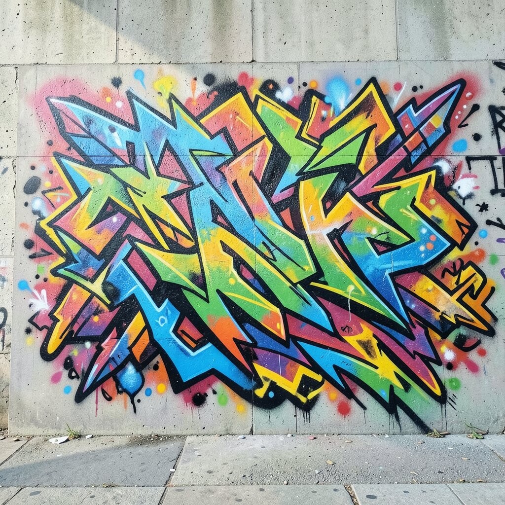
Imagine letters that fly forward, with arrows and swooshes that twist like wind. Small spark shapes and sharp turns make the whole piece feel fast, even when you stand still.
Plan your layout with a simple baseline first, then layer arrow strokes around the letters so the flow has direction. Use fewer colors than you think at the start, because clean lines and good spacing will look impressive right away.
Try adding a tiny signature tag in the corner, matching your main color palette. If you want the style to feel current, keep the arrow shapes crisp and the background slightly muted so the motion pops.
3. Mosaic Wall Portrait
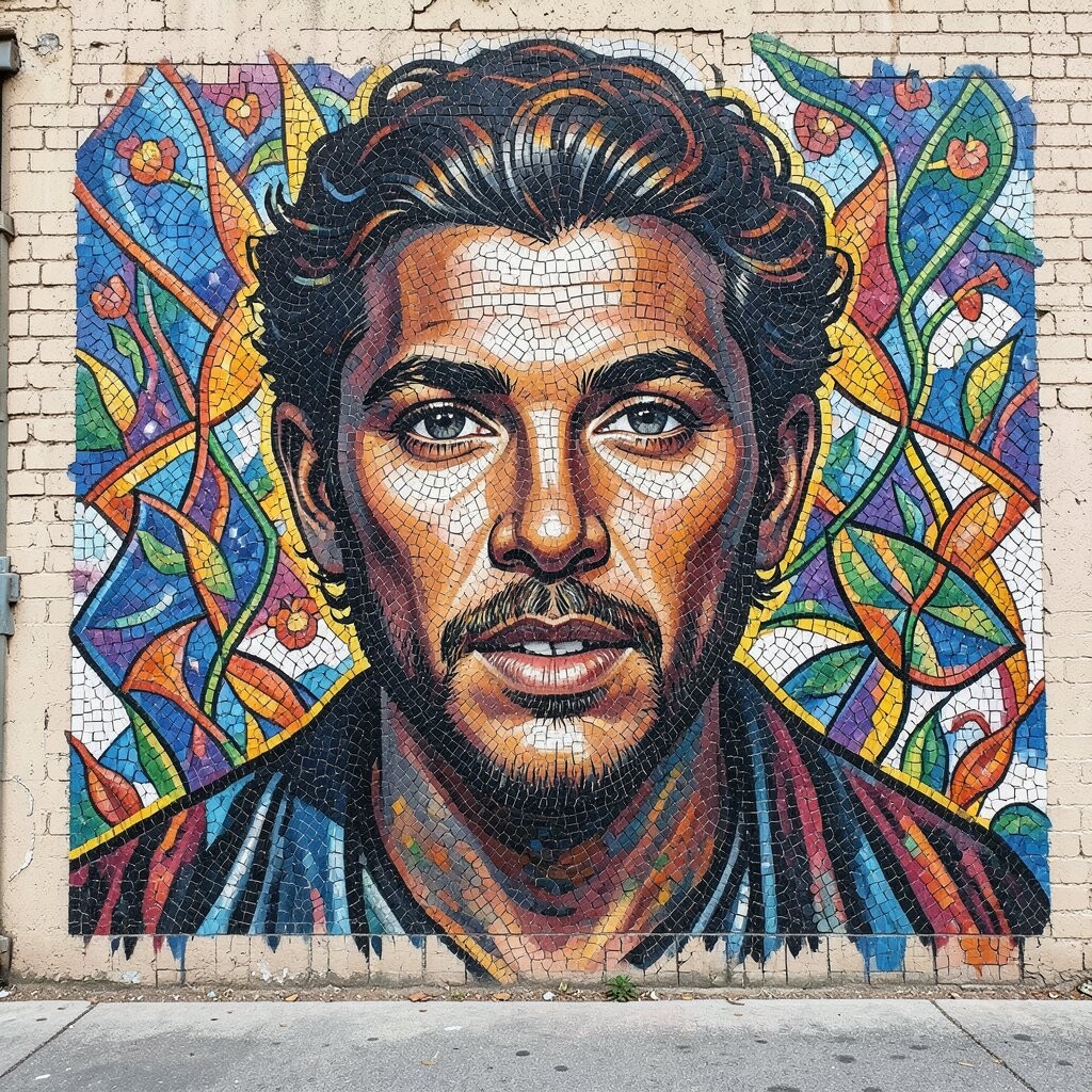
See a portrait formed from small repeating tiles, like stained glass made from spray paint. Each tile can be a different shade, and the face emerges through the pattern like a slow reveal.
Draw a light grid over your sketch, then fill major regions first, such as hair, cheek shadows, and the nose line. When you paint, keep tile spacing consistent so the portrait reads clearly from a distance.
To personalize it, choose colors that match your favorite album art or your own childhood memories. For cost, use a limited set of colors for the tiles and mix lighter tones by layering transparent coats rather than buying too many new cans.
If you want a trendy look, add a few “broken tile” sections near the eyes, where the mosaic seems to scatter slightly.
4. Stencil Shadow Animals
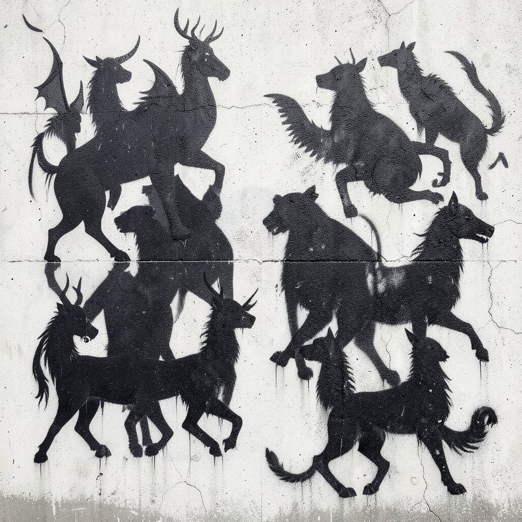
Visualize a calm animal silhouette, but the animal is made from layered stencil shadows. The edges look layered and crisp, and the negative space behind the figure creates extra depth.
Choose an animal shape that fits your wall size, like a cat, fox, or owl, then trace it onto stencil material and cut clean gaps. Paint the darkest layer first, then add mid-tones and highlights so the shadow effect looks dimensional.
5. Sunset Chrome Cityscape
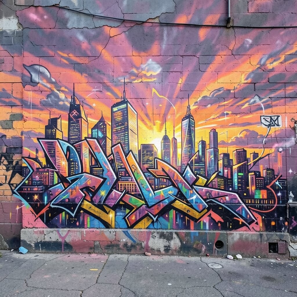
Think of a skyline outlined in shiny, metallic strokes, fading into a warm sunset background. Buildings feel tall and sleek, and the sky breathes with peach, pink, and deep orange.
Sketch the horizon line, then draw simple block shapes for buildings before you add details. Use a metallic color for windows or rooftop edges, and keep the sky filled with soft spray passes to avoid harsh blotches.
For personalization, place a “hidden” landmark that only you recognize, like a small bridge shape or a custom sign. If you’re watching your budget, reuse the same metallic can for accents only, since metallics can be pricey.
6. Koi Wave Calligraphy
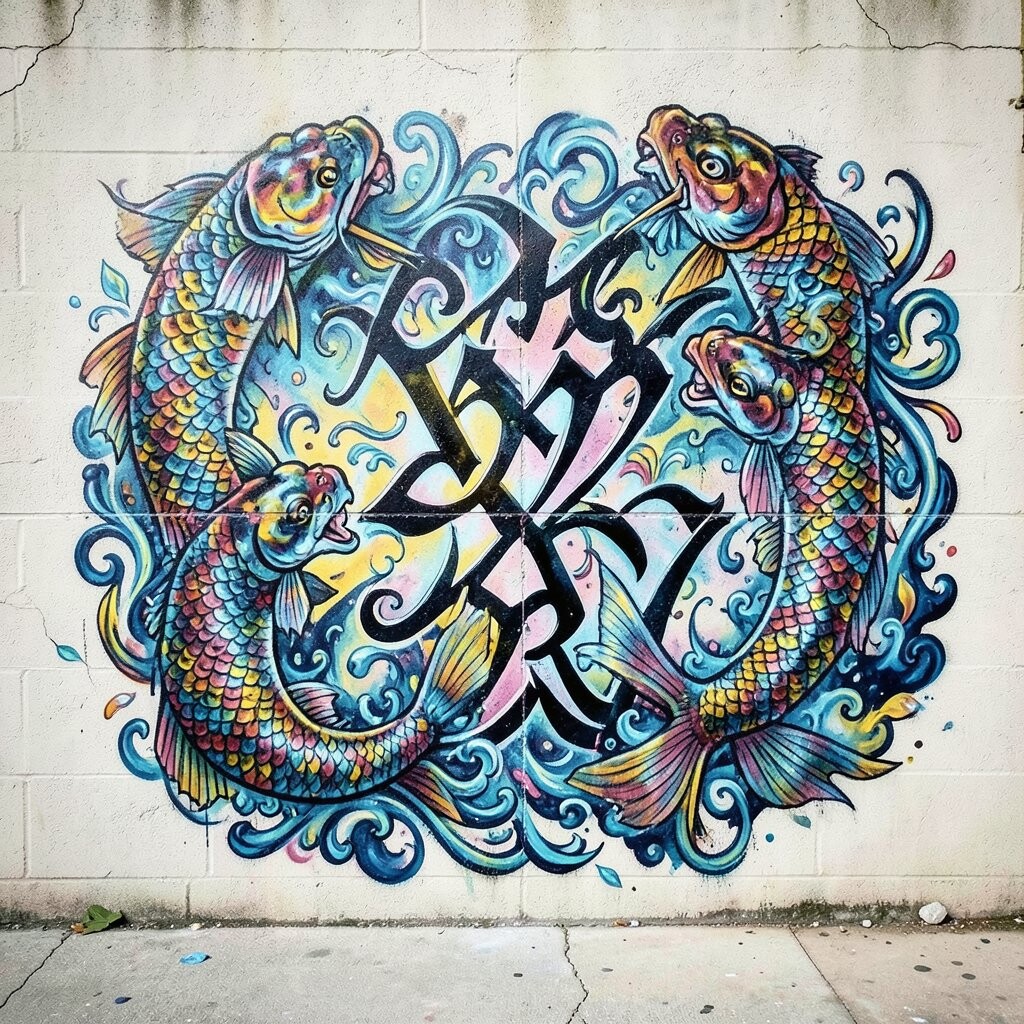
Picture calligraphy strokes that bend like water waves, with koi fish gliding through the curves. The lines can be smooth and ribbon-like, and the fish shapes add playful life to the flow.
Start with one sweeping stroke for the main word, then design wave paths that cross behind it. Add koi outlines where the curves tighten, and fill their bodies with light-to-dark color blends for a natural look.
Try pairing your calligraphy with a pattern background of faint bubbles or spray-dots for extra texture. This design feels current when you keep the strokes clean and let the water wave carry the energy instead of overloading the wall with effects.
Cost stays friendly because you can limit yourself to a main color, a contrast color, and a light highlight.
7. Neon Ramen Noodles Scene
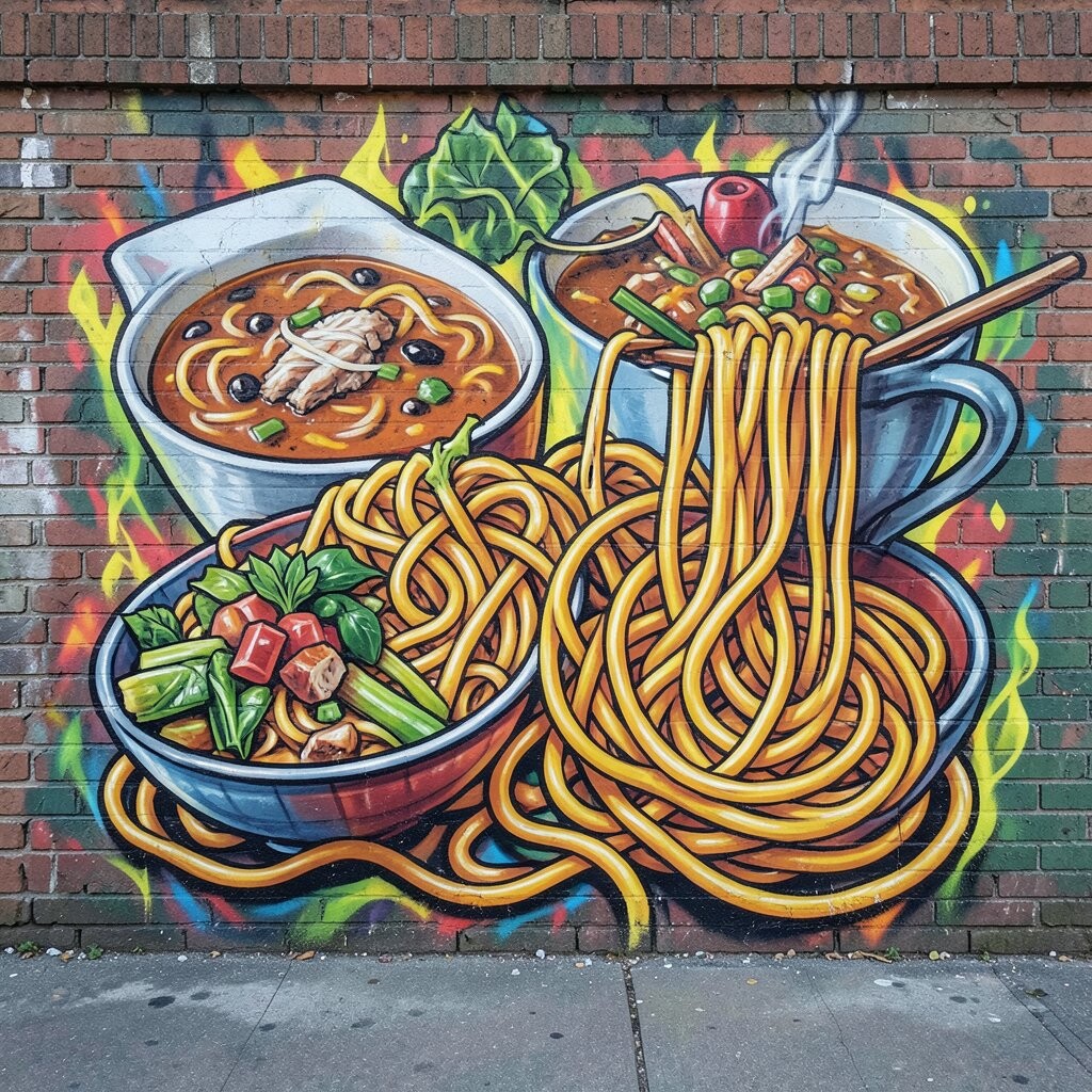
Imagine a playful graffiti scene where ramen noodles swirl into a glowing galaxy. The bowl looks bold, the chopsticks feel elegant, and tiny steam lines turn into stars.
Draw the bowl and noodles first using simple rounded shapes, then add neon outlines for the glow effect. For highlights, use lighter spray passes and keep steam lines thin so they look delicate, not messy.
Personalize it by adding your own toppings as symbols, like a heart for love or a moon for your favorite night snack. If you want a practical shortcut, make a small color test card and match your can colors before you start on the wall.
8. Botanical Ink Branches
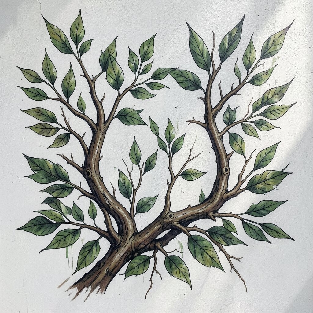
Visualize branches that look like they were drawn with ink, but sprayed with soft edges and gentle color fades. Leaves cluster in layers, and thin vines curl like handwriting across the wall.
Use a sketch of the branch shape, then spray in light layers so the leaves build gradually. A great trick is to vary pressure and distance to create thicker lines where the stem is stronger and thinner lines where the vine thins out.
9. Optical Illusion Checker Tunnel
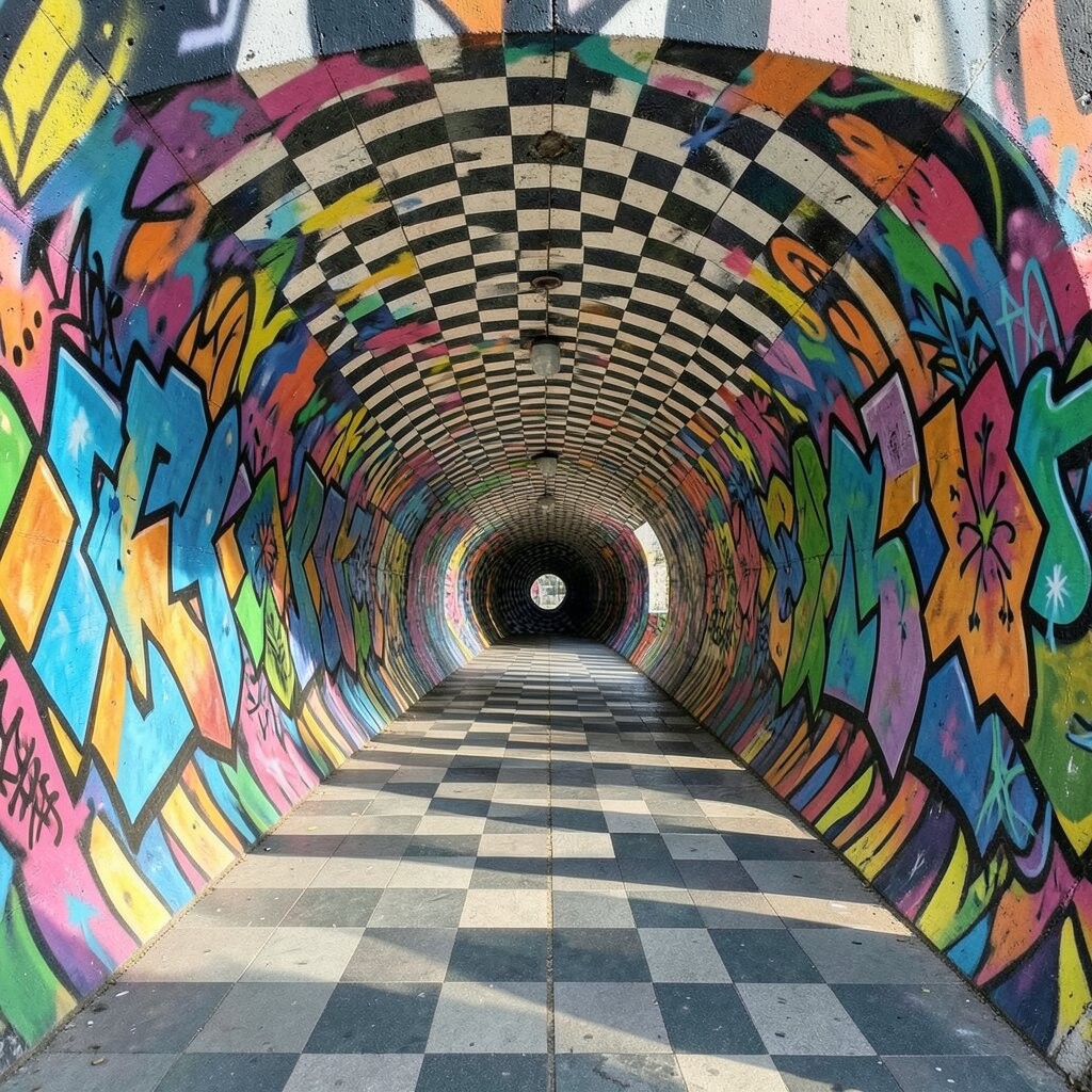
See a checker pattern that bends inward, like a tunnel you can step into with your eyes. The contrast makes the wall feel deep, and the geometry turns flat paint into movement.
Plan the tunnel with a vanishing point, then draw squares that get smaller toward the center. Use a steady hand and a guide line with masking tape so your checker edges stay sharp.
Uniqueness comes from the colors you choose, like cool blues for “night space” or warm reds for “heat tunnel.” Keep costs lower by using two strong colors plus white for correction and lighter transitions.
This design fits current street styles when the checker lines are super crisp and the background is clean, letting the illusion do the talking.
10. Portrait With Flying Sticker Collage
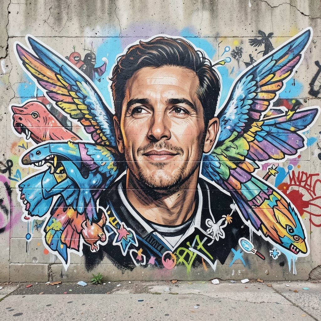
Picture a face that feels like it’s cut out of a magazine, surrounded by floating sticker shapes. The collage can include tiny icons, torn paper textures, and bold outlines that look like real stickers slapped on the wall.
Start with a simple portrait silhouette, then block in big shapes for hair, shadows, and skin tones. Add “sticker” pieces around the face using different outline thicknesses so the collage looks layered.
To personalize it, print or sketch your own icon set, such as favorite fruits, a hobby symbol, or a small animal you love. If you want to manage cost, you can paint most stickers as simple shapes and add only a few detailed ones.
11. Geometric Wave Badge
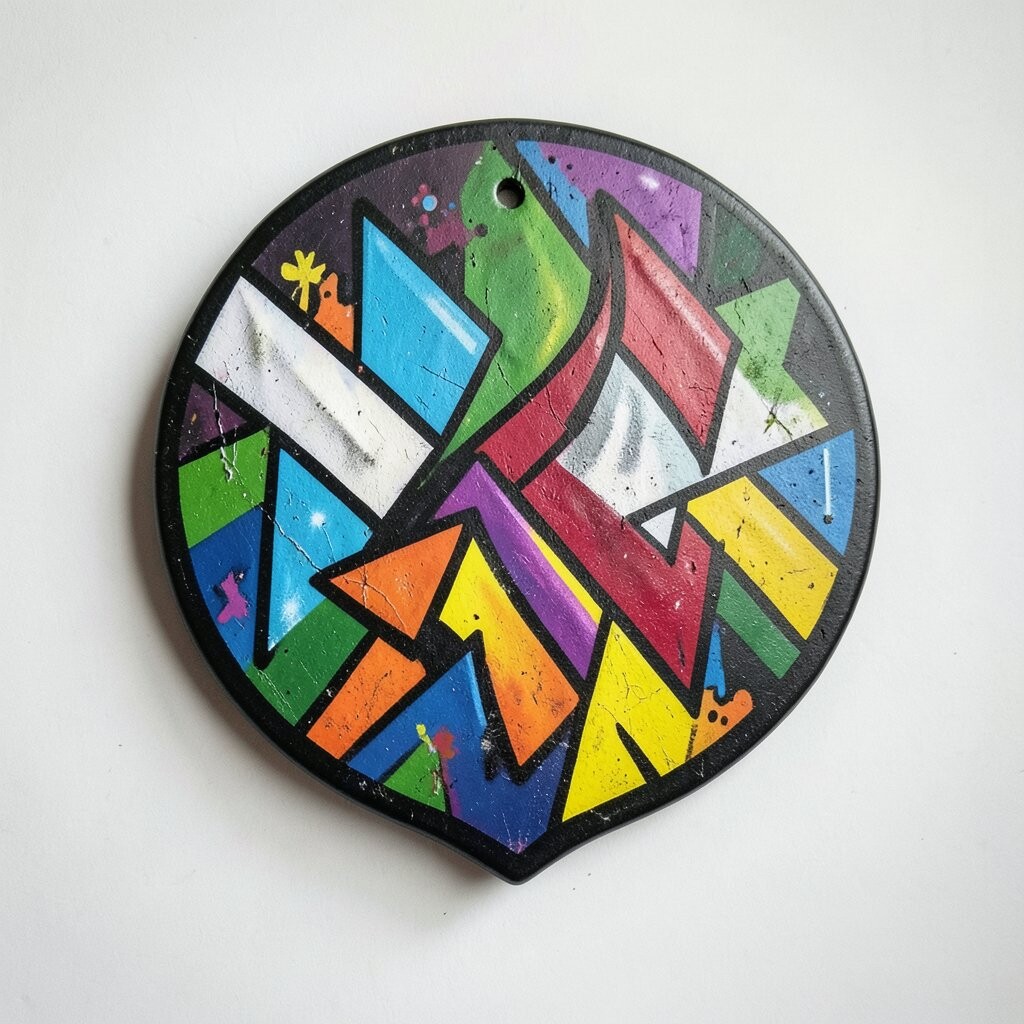
Imagine a badge shape made from repeating triangles and angled stripes, with waves running through the center. The overall look is bold, organized, and energetic, like a team logo made from graffiti.
Draw a clean outline first, then split the badge into sections so each part has a job. Use contrasting colors for alternating triangles, and add a thin stripe that curves through like a wave spine.
Make it unique by choosing a personal color theme, like your school colors or the shades of your favorite hoodie. For practical results, use painter’s tape edges for sharp lines, because clean geometry can be hard to freehand.
12. Watercolor Drip Halo
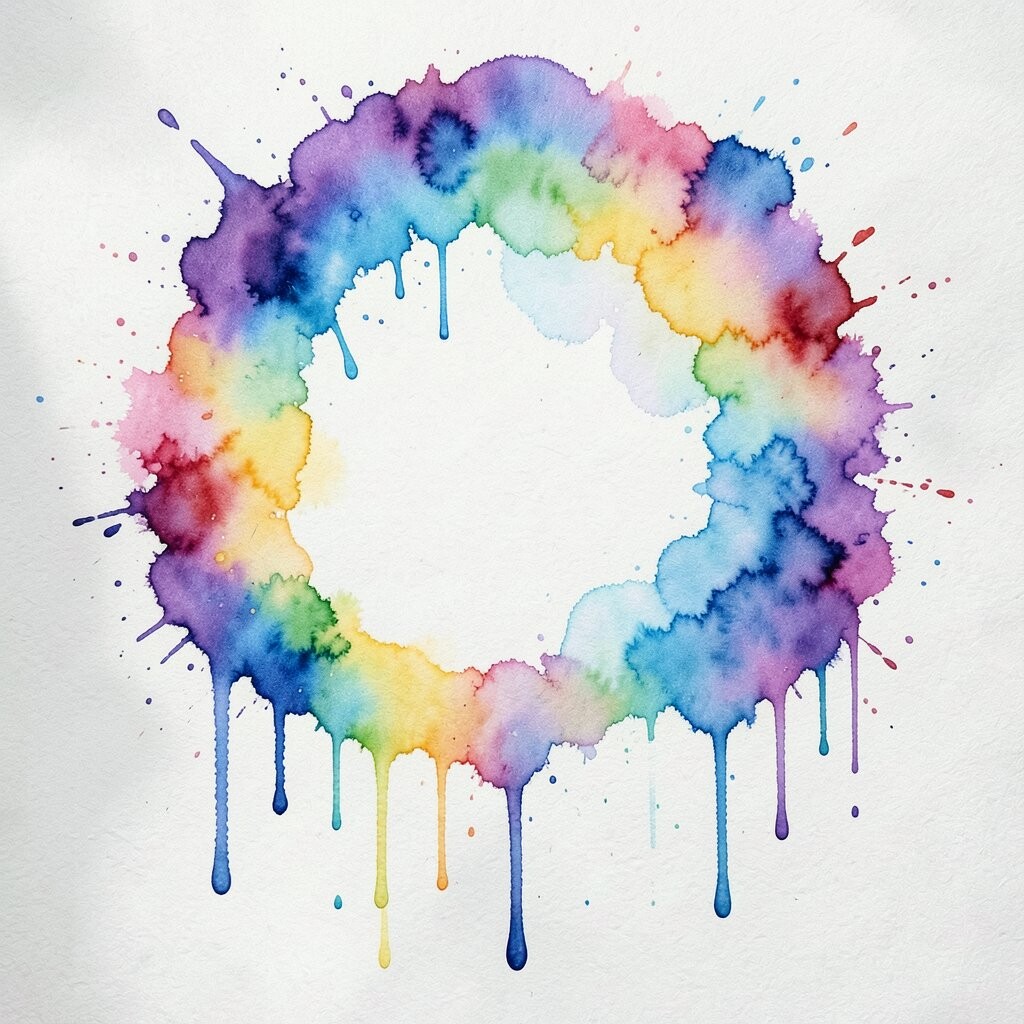
Visualize a halo of color made from watercolor-like washes, with drips spilling downward. The glow effect feels soft and dreamy, while the drips add a messy, street-made texture.
Sketch a halo circle and then spray in light, watery layers so the colors blend without harsh edges. When the top layer starts to dry, add controlled drips by tipping the can slightly and working in small sections.
Personalize the halo with a symbol in the middle, like a star, a tiny face, or initials in bubble letters. This style stays trendy when you keep the background simple and let the drip shapes be the main drama.
13. Cypher Map Coordinates
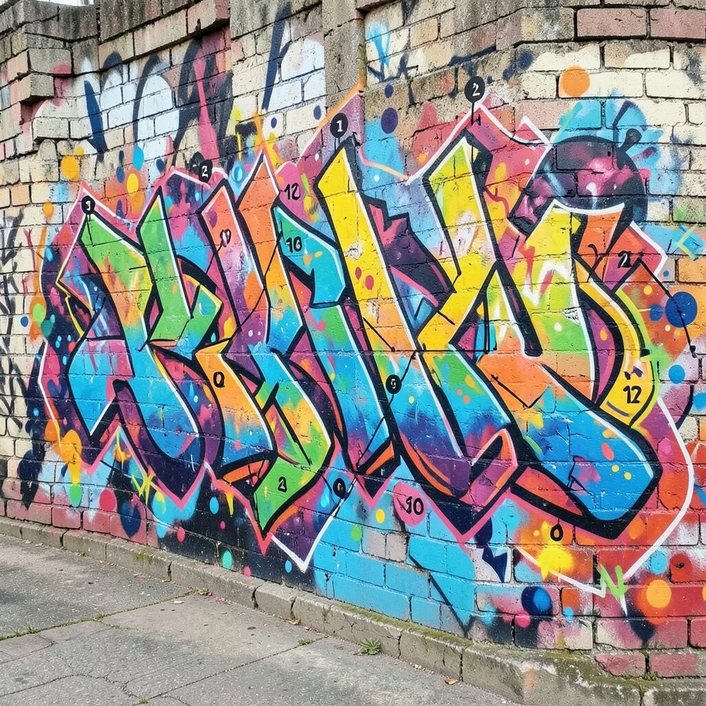
Picture a map-like wall with lines, dots, and coordinate marks that lead you to a hidden message. The design feels like a coded route, and the typography blends with technical shapes.
Start with a rough map layout, then draw paths that connect dots like a travel plan. Add stamped-looking text in your own style, using small caps letters or simple block numbers, so it looks like a real coordinate system.
Uniqueness shows up when you add personal “locations,” like your neighborhood, your favorite street, or a memory spot. For cost considerations, you can rely on one dark color for the map lines and use a bright accent for the main endpoint dot.
If you want the look to feel current, keep the lines thin and precise, and let the background be mostly blank so the message stays readable.
14. Cartoon Robot Hugging Heart
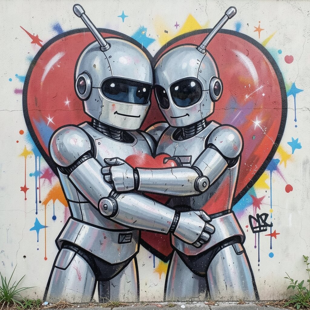
Imagine a cute robot character with rounded edges, holding a big heart like a comfy hug. The robot’s face can be playful, with simple eyes and a smiling mouth, while the heart pops with bright color.
Sketch the robot body first, then add the heart in front so it becomes the focal point. Use a limited palette with one accent color for the heart, and keep the robot outlines bold for a clean comic vibe.
Personalize it by giving the robot traits, like a tiny wrench badge, a favorite color stripe, or a custom “antenna” shape. For a budget-friendly approach, you can reuse your outline colors for small details and spend extra only on the heart highlight so it shines the most.
This design feels desirable when you leave room for your character to breathe, meaning not every inch needs extra stickers or effects.