The wall can look like soft stone, warm sand, or a gentle wave with just the right plaster layers. Small texture choices can make a room feel richer, calmer, and more personal.
You do not need a whole renovation to get that layered look.
1. Limewashed Veil Over Dry-Layer Sand
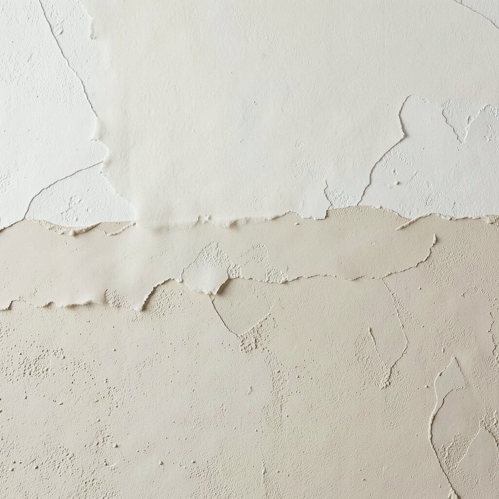
A base coat of gritty plaster creates a dry, sandy skin that catches light like late-afternoon sun. Over it, a limewash veil adds movement, with faint speckles that feel natural and breathable.
Layering this way helps hide tiny wall flaws while still keeping the finish airy. It is unique because the texture reads as both raw and refined, depending on how the light hits. For practical results, apply the sand-texture coat evenly, let it firm up fully, then brush the limewash on in soft, overlapping strokes.
2. Venetian Marble Ribbons in Soft Gray
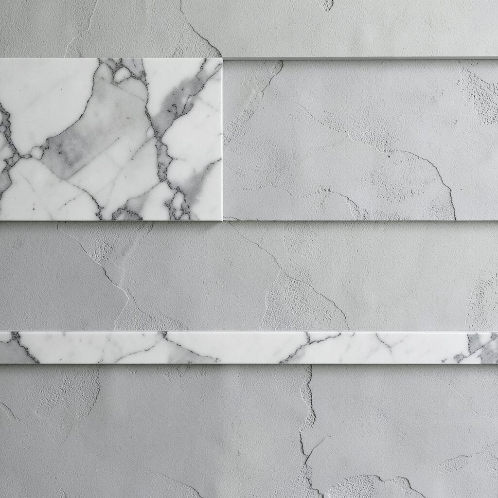
Think of plaster that behaves like satin, with ribboned streaks that look carved from a calm river. Venetian-style layering often uses thin passes that create sleek swirls, especially when you keep the palette in soft gray.
This look makes spaces feel elevated without turning them cold. To personalize it, vary pressure slightly while troweling so some ribbons look crisp and others melt into the next layer. Use careful cleanup and consistent timing, because thicker buildup can dull the sheen and increase material use.
For cost, Venetian techniques can be economical if you buy plaster in bulk and hire a helper only for large areas. Plan for extra time on trim edges, where the look can either sharpen beautifully or get messy fast.
3. Clay Thumbprint Texture With a Polished Top Layer
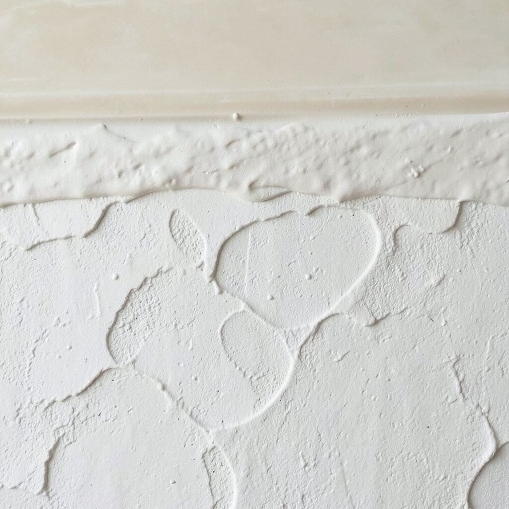
A clay-plaster base shaped with gentle thumbprint impressions gives you a playful, tactile wall. Then a thin smoothing layer on top adds a subtle sheen, like a glaze over handmade pottery.
That contrast of rough and refined is what makes it feel instantly unique. It is also practical for busy homes, because the deeper bumps hide marks and fingerprints better than flat finishes.
To get the best result, press impressions in a steady rhythm and keep your top layer very thin so the pattern still shows through. You can personalize the scale by using broader, lighter touches for a calmer look or smaller, tighter touches for more energy.
If you are worried about cost, start in one hallway wall to learn your timing and material spread before scaling up.
4. Rag-Rolled Plaster Waves With Warm Undertones
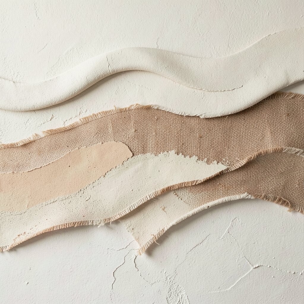
Rag-rolled texture brings soft wave patterns that look like fabric, but made of plaster and light. When you choose warm undertones like honey beige or muted terracotta, the ripples glow rather than look harsh.
This technique is great for adding character without needing dramatic color changes. It helps cover uneven spots because the rolling action breaks up visual lines across the wall. Keep a consistent technique by re-wetting your roller lightly as you move, and work in sections you can finish before the plaster starts to set.
5. Micro-Trowel Swirls Over Lime Mortar
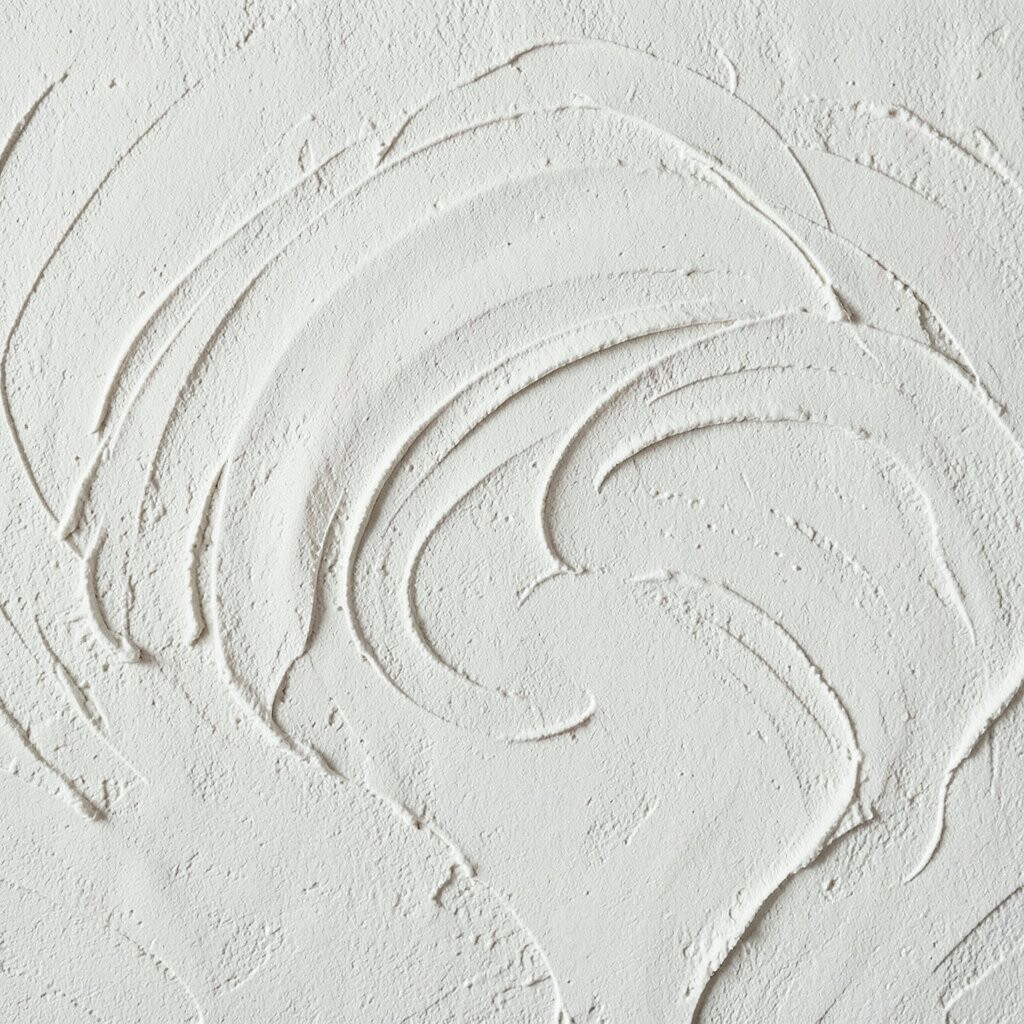
Micro-trowel swirls create tiny, controlled motion that looks almost like shimmer when you pass by the wall. A lime mortar base keeps the background natural, while the top layer adds delicate movement.
This layered finish can make even a small room feel designed, because the texture turns ordinary light into a soft pattern. It is unique in how it stays subtle up close yet becomes more visible from across the space.
For practical tips, use a clean trowel and keep your strokes short so you do not flatten the swirl texture. Personalize by choosing a slightly deeper tint for the base, then finishing with a lighter top coat so the swirls show up like faint topographic lines.
6. Stippled “Old World” Texture With Darker Edge Highlighting
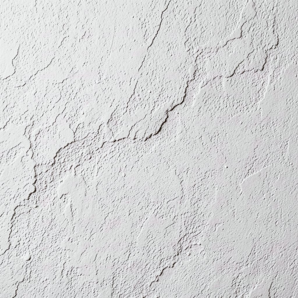
A stippled finish can look like aged stone, especially when you keep the surface busy but still balanced. After the stipple layer sets, a faint darker edge highlight can deepen the pattern around corners and edges.
That edge emphasis makes the wall feel layered even when the overall color stays calm. It is uniquely effective in rooms with natural light, because shadows do a lot of the styling work for you.
To make it practical, use a consistent stippling tool and test on scrap board to match density. For personalization, bring the darker highlight color into small accents like picture frames or shelving brackets so the wall feels intentional, not accidental.
Material costs stay reasonable because you are not adding heavy build. The main investment is time, so plan for slower progress and good ventilation.
7. Knife-Scar Layers With a Soft Matte Finish
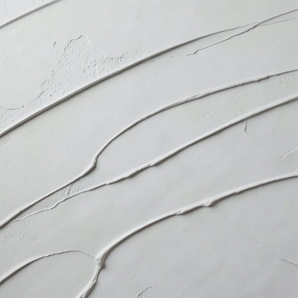
Knife-scar plaster layers show thin, deliberate marks that feel like brushwork, but in three dimensions. The look becomes especially elegant when you keep the final coat matte, letting shadows define the lines.
This is a great option if you want visible technique without high gloss. The uniqueness comes from the way each pass leaves a slightly different arc, giving your wall a personal signature.
For best results, keep layers thin and let each coat set just enough to hold shape. Personalize with color blocking by using two close tones, like warm white and pale oat, so the scars read clearly without looking loud.
Cost considerations are mostly about labor and cleanup, because more passes mean more time. Start with a single feature wall if you want to keep totals lower while you get comfortable with the tool handling.
8. Geometric Trowel Blocks With Light Clay Color
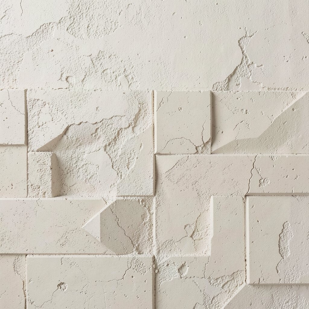
Geometric plaster blocks can look crisp like modern art, but still feel soft because plaster always has subtle depth. A light clay color keeps the design warm and wearable, especially in living areas.
This approach is practical because you can control visual clutter by limiting the number of blocks and letting negative space breathe. It is unique when the blocks share the same plaster system but differ in texture direction, such as cross-trowel versus straight trowel lines.
Personalize by turning the pattern slightly off-center or repeating one block shape around a doorway. For cost, geometric layouts can be budget-friendly if you use painter’s tape carefully and avoid complicated molds.
To keep clean lines, remove tape before the plaster fully dries, then touch up edges with a small brush for precision.
9. Swollen Sponge Texture With Glaze-Like Color Depth
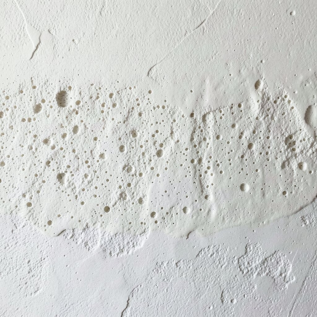
A swollen sponge texture creates rounded micro-mounds that look almost like pores in stone. Add a deeper glaze tone on top, and the wall gains color depth that changes through the day.
This layered finish helps hide surface imperfections because the sponge pattern breaks up flat reflections. It is uniquely inviting in bedrooms and reading nooks, where the texture feels gentle instead of sharp.
For practical tips, keep your sponge damp but not dripping, and work with light pressure so the texture stays consistent. Personalize by choosing a glaze color that matches your textiles, like a muted olive with linen or a softened navy with warm oak.
10. Raked Lines Embedded in a Soft Lime Base
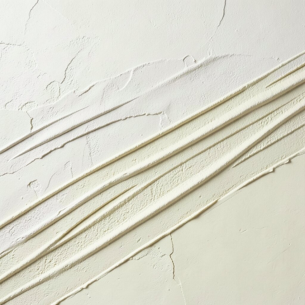
Raked lines can feel calm and architectural, like light scratching across sand. When you rake the plaster while it is still pliable, you create tiny channels that catch light and make the wall feel deeper.
This technique is great for making long rooms look more dynamic without adding loud color. It is unique because the lines can stay subtle in daylight but glow when a lamp hits at an angle.
To personalize, vary the spacing of your rakes so one section feels more open and another feels denser. For practical results, keep your rake tool clean and use the same angle throughout, since changes can shift the shadow pattern.
Cost is usually manageable since raked finishes do not require complicated tools. The bigger factor is prep, so spend time on base smoothing to keep the raked lines looking intentional.
11. Feathered Light-Catch Plaster With Thin Layering
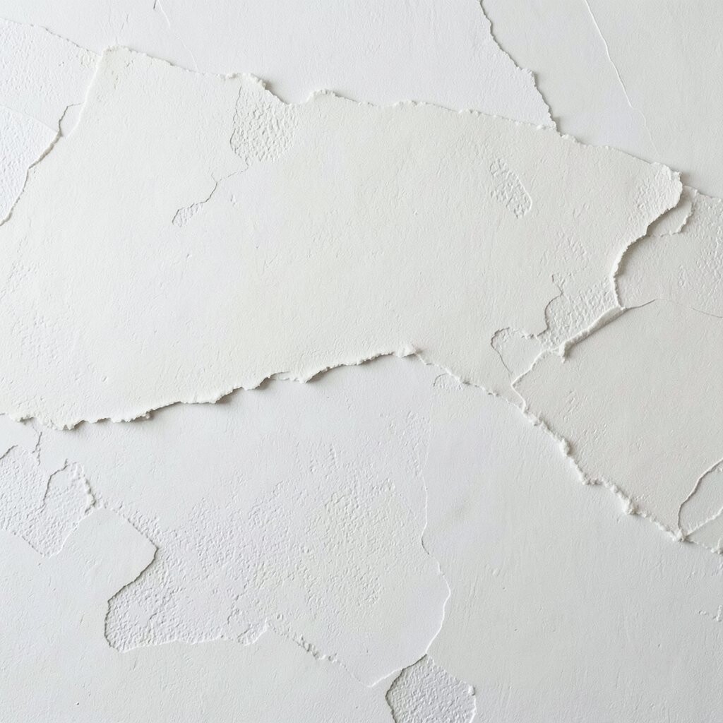
Feathered plaster finishes look like soft clouds, created by blending thin layers into each other. The surface catches light in a gentle gradient, especially when you keep colors close to one another.
This layered approach is practical for tricky walls because it smooths the transition between imperfections and creates a forgiving look. It is unique because the wall never reads as one flat color; it feels alive and constantly slightly different.
For personalization, pick a base tint and then add a top tint only a shade lighter or warmer. Use a wide feathering tool and overlap your edges so the finish stays seamless.
12. Crackle-Like Plaster Over a Stabilizing Seal
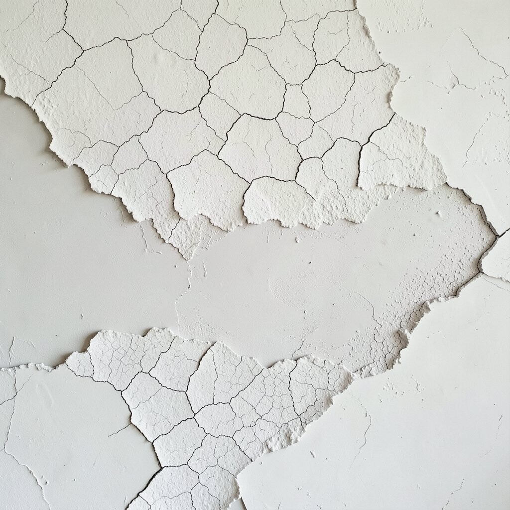
Crackle texture can look like old frescoes, with fine lines that resemble dried paint. With plaster layering, you can achieve a controlled crackle effect that stays stylish rather than fragile.
This technique becomes practical when you use a stabilizing seal or proper curing method so the finish holds up to everyday life. The uniqueness is in the contrast between the crackle pattern and the smoothness of the colors around it.
To personalize, choose a crackle highlight shade that is just slightly lighter than the base, so it feels delicate instead of bold. Keep in mind that crackle effects can show flaws in prep, so repair and skim before applying texture.
Cost considerations are important here, since sealers and correct curing time can add expenses. Still, the result can be worth it because one wall can deliver the charm people usually associate with historic buildings.
13. Lime Plaster Over Woven Texture Mat Imprint
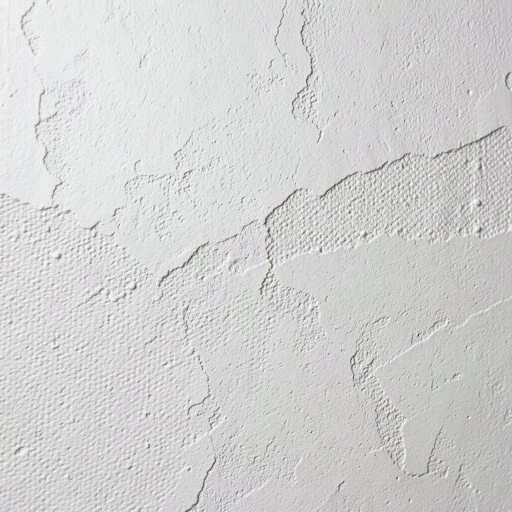
If you want a plaster finish that looks subtly woven, you can imprint a texture mat into the wet layer. Lime plaster adds softness and breathability, so the woven pattern feels organic rather than manufactured.
This wall choice is practical because it creates a repeating texture that helps disguise small marks. It is unique because it blends artisan pattern with the airy, natural look lime is known for.
Personalize by choosing the weave density you like most, from tight and delicate to looser and more dramatic. For tips, apply even pressure while imprinting and keep edges consistent so the pattern does not drift.
On cost, mats and specialized additives can raise the budget slightly, but the method can still be economical compared to fully custom mold systems. Buy extra mat sheets so you can maintain pattern alignment without rushing.
14. Oversized Trowel “Cloud Beds” in Sandstone Tone
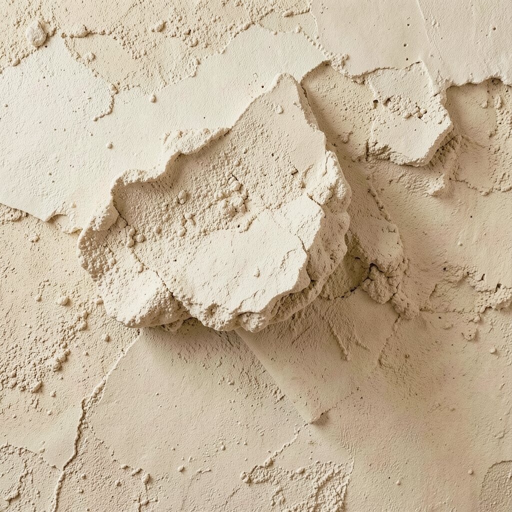
Cloud beds use oversized trowel movements to create broad, cushioned waves across the wall. A sandstone tone keeps it grounded, making the wall feel like a natural landscape.
This finish is practical because it hides minor bumps and patch repairs, especially when your cloud shapes are varied. It is uniquely calming, with texture that feels big and soft rather than busy.
For personalization, choose where the strongest clouds sit so the wall composition matches furniture placement. Keep tips consistent by using the same trowel width and avoiding sudden direction changes that can create stiff lines.
Cost considerations are favorable if you work in large panels, because broad troweling can reduce the number of steps. Still, allow enough curing time between coats so the surface does not crack or flatten.
15. Metallic Pigment Veils With Soft Plaster Depth
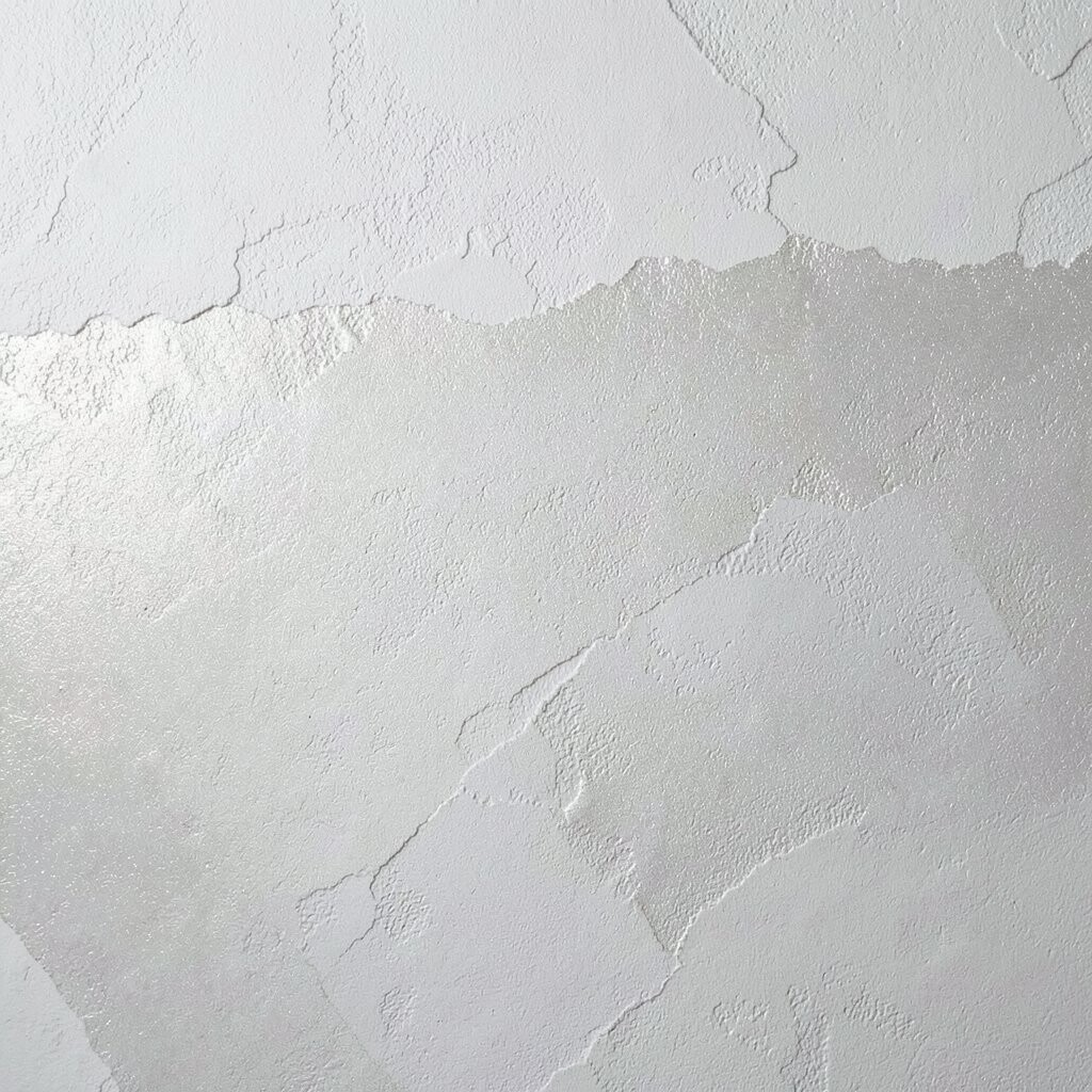
Metallic pigment veils over plaster add a quiet glow without turning the wall into a mirror. When the underlying texture is visible, the metallic effect looks like light trapped in stone.
This is a practical way to bring trend-forward style into everyday rooms because you can keep the sheen subtle. The uniqueness comes from the way tiny texture shadows make the metallic flecks appear deeper and more dimensional.
To personalize, match the undertone to your fixtures, like warm gold-leaning pigments for brass accents or cooler silver-leaning pigments for chrome. For tips, test on a small section first since pigment concentration can shift fast.
Cost is moderate, because metallic additives are usually priced higher, but you use very thin amounts in a veil. Plan for proper ventilation and clean tools, since metallic dust can stain surfaces and clothing.
16. Layered Plaster Panels With Recessed Shadow Lines
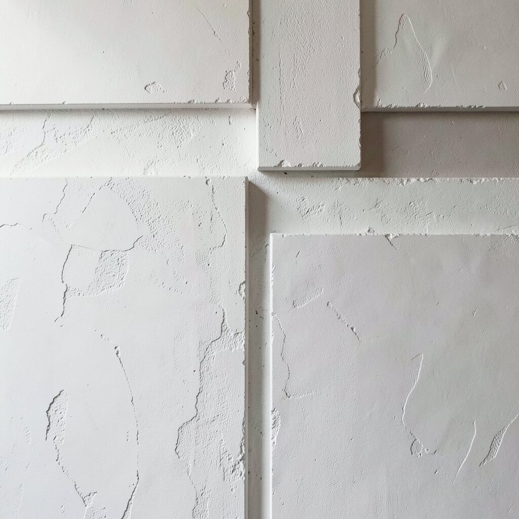
Recessed shadow lines turn a plaster wall into a set of layered panels that look custom and dimensional. By building texture within each panel and letting the edges fall back, you get a dramatic layered effect without heavy construction.
This approach is practical because it can define architectural features and make lighting placement easier. It is unique because the shadows become part of the design, changing with the time of day.
For personalization, choose different textures per panel, such as smoother finish in one and sand-raked finish in another. To keep it tidy, plan panel size carefully and maintain consistent depth so the wall feels balanced.
Cost considerations depend on how you form the shadow lines, but you can save money by using simple edging materials and focusing labor on one wall section. If you want a high-end look, prioritize straight lines and clean caulking so the layers read crisp.