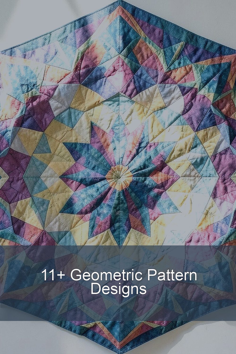
Geometric patterns have a way of making simple spaces feel alive. When shapes click together, your eyes start smiling.
They can be bold, calm, or playful, and you can build them with tools you already have.
1. Kaleidoscope Hex Bloom
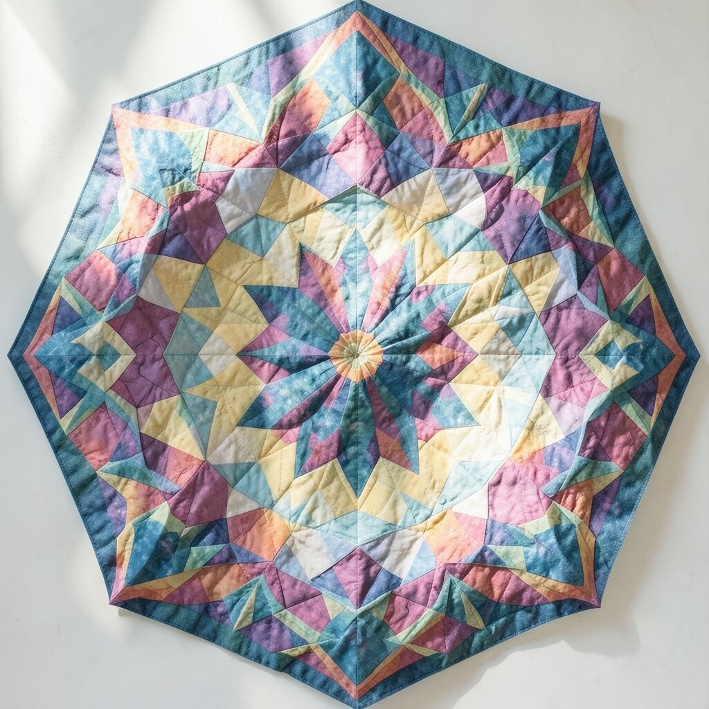
Picture a ring of repeating hexagons, like a tiny garden made from glass. Each piece seems to rotate around a center, creating a bright, ever-changing feel.
This design is great for posters, wrapping paper, or a page in your sketchbook that you want to feel energetic. Start by drawing one neat hexagon, then copy it around a circle until the center looks full. For an easy personalization, choose two colors for the main shapes and add a third color only at the smallest inner accents.
2. Stacked Square Pulse
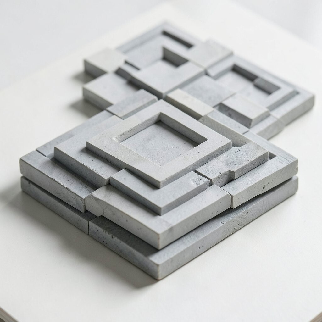
Think of squares like steps, layered so they look like they are gently pulsing. Even when everything stays flat, the pattern gives a subtle rhythm that pulls you forward.
You can use this for murals, phone backgrounds, or fabric prints that need a modern, organized vibe. Draw a grid, then shift every new row by half a square so the lines never feel perfectly still. To keep it budget-friendly, work with washable markers or inexpensive craft paint, and test your spacing on scrap paper first.
If you like a trendier look, try high-contrast colors such as black and cream, then add one soft pastel layer for balance.
3. Triple Triangle Weave
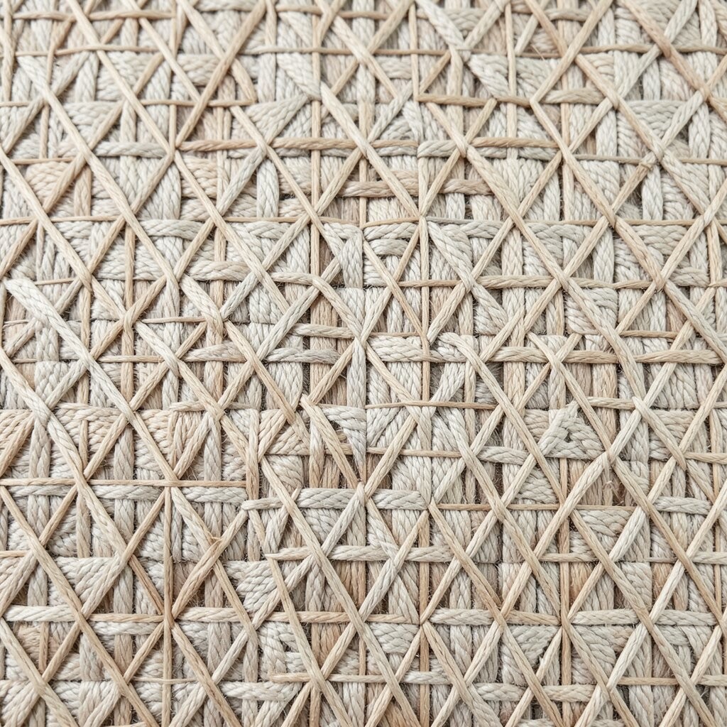
Imagine triangles braided together, forming little stars and repeating clusters. The texture feels woven, but it is really just smart alignment of simple shapes.
This style looks fantastic on notebooks, tote bags, and even simple wall art where you want a handmade feel. Begin with one triangle, then mirror it across a center line, repeating until a lattice appears. For practical tips, keep your triangle size consistent and use light pencil dots as “anchors” so nothing drifts.
Make it unique by coloring every third triangle in a different shade, or by using one metallic pen for tiny highlights that catch the light.
4. Zigzag Ribbon Lattice
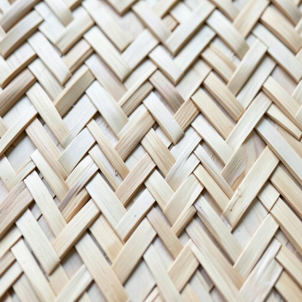
Picture a long zigzag ribbon that loops into a repeating lattice, like a braid made for a scarf. The angles create motion, and your brain keeps tracking the path like it has a story.
You can use it to liven up a hallway runner design, a book cover, or a pattern tile sheet for future projects. Draw two parallel guide lines, then connect them with a steady zigzag rhythm, and finally repeat the band across your layout. Try personalization by changing the “ribbon width,” meaning the number of zigzag points between each repeat, so it feels custom to your space.
5. Polka Mandala Dots
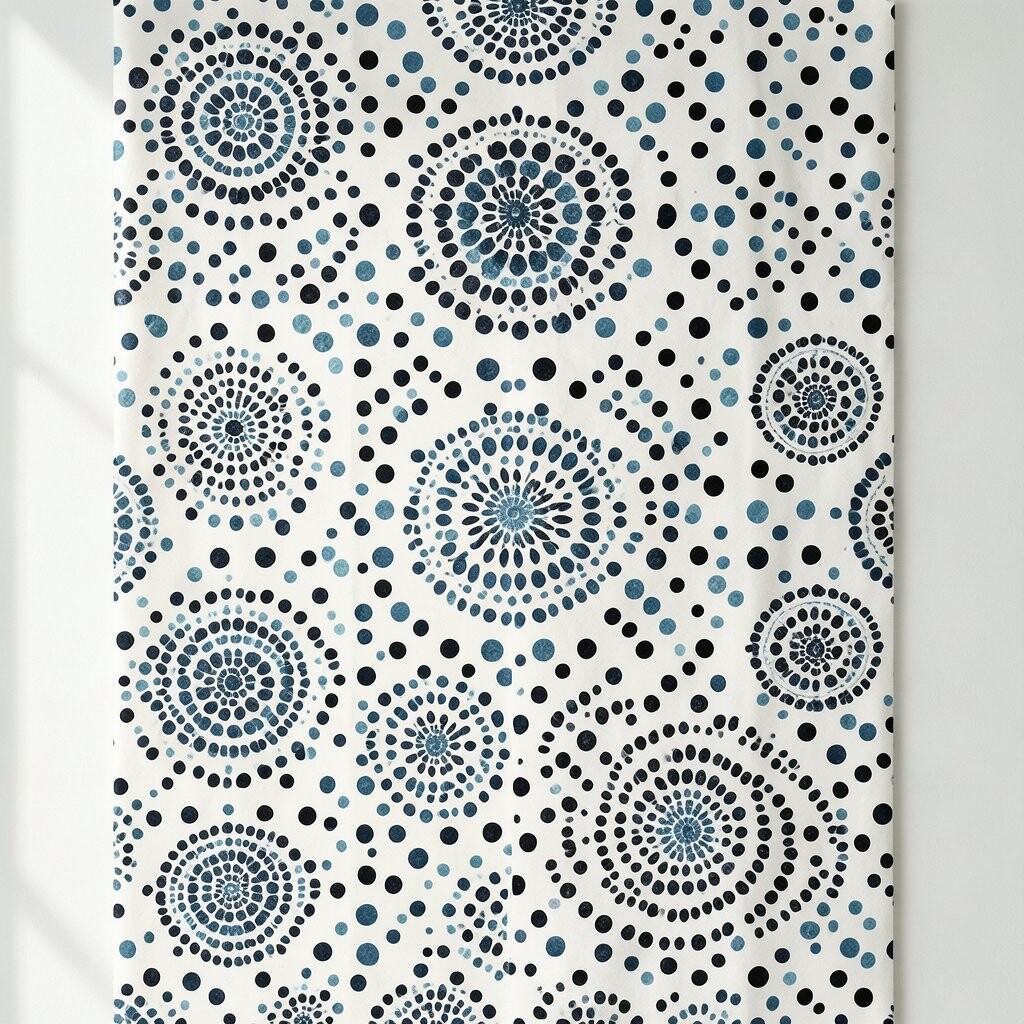
Think of circles arranged in rings, where tiny dots build a mandala-like glow. It feels playful at first, then surprisingly calming as the layers settle into place.
This pattern is wonderful for greeting cards, planner stickers, and easy prints on fabric because circles are forgiving. Start with a few concentric circles, then add dots at equal spacing like a friendly rhythm. For a practical approach, use a stencil or a small round object to keep dot sizes even, which makes the whole look feel polished.
For cost considerations, you can do this with a single pen and a steady hand, then add one color wash using a cheap watercolor set.
6. Waveform Parallelogram Flow
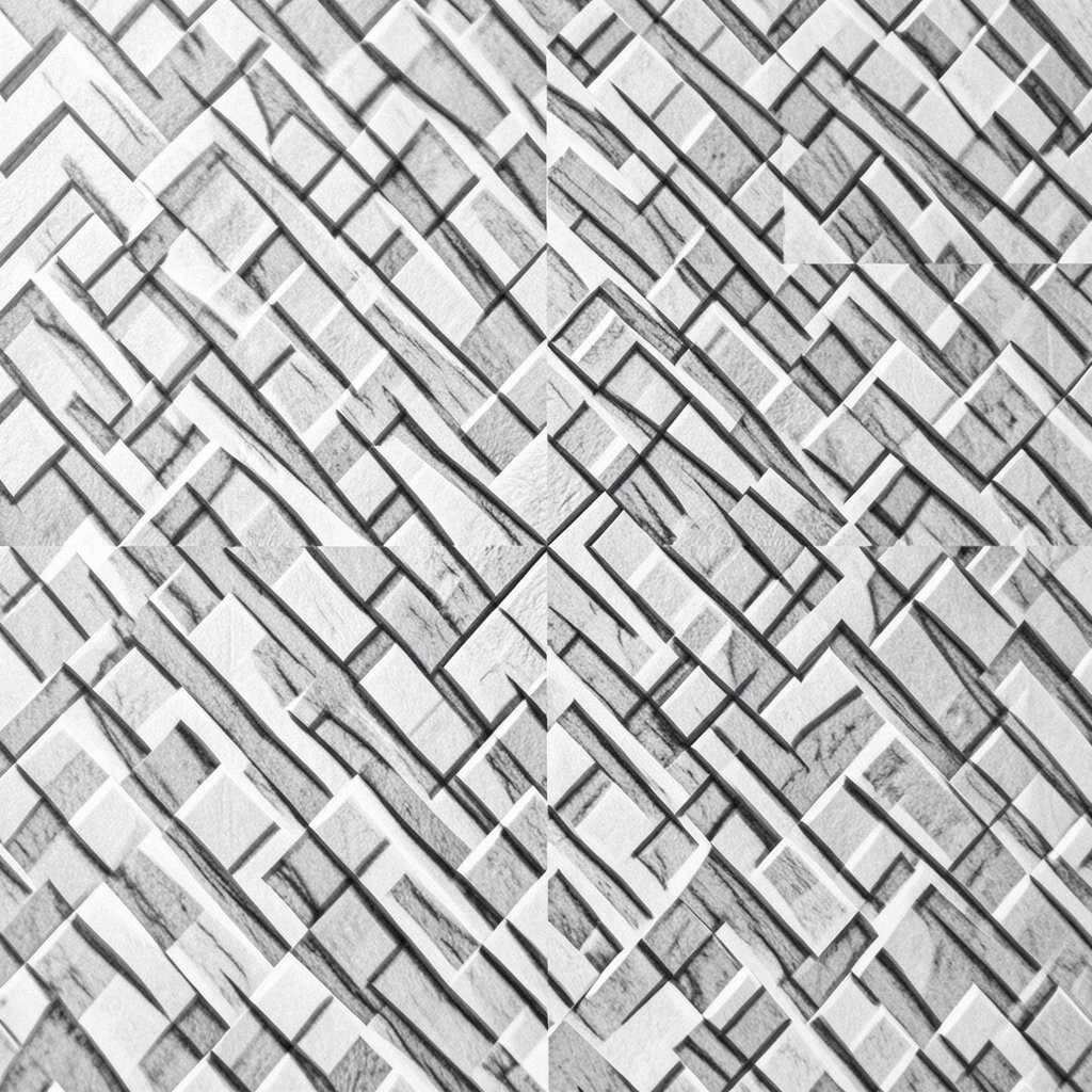
Imagine parallelograms sliding like gentle waves, creating a soft, flowing pattern. The lines curve in your mind even though the shapes stay angular.
This design works well for modern wallpaper, art prints, and even a digital background when you want movement without chaos. Use a grid, then shift each row slightly left or right so the blocks look like they are drifting. If you want it to feel more “right now,” choose a limited palette and add a thin line between shapes to make the pattern crisp on screens.
7. Angular Star Compass Grid
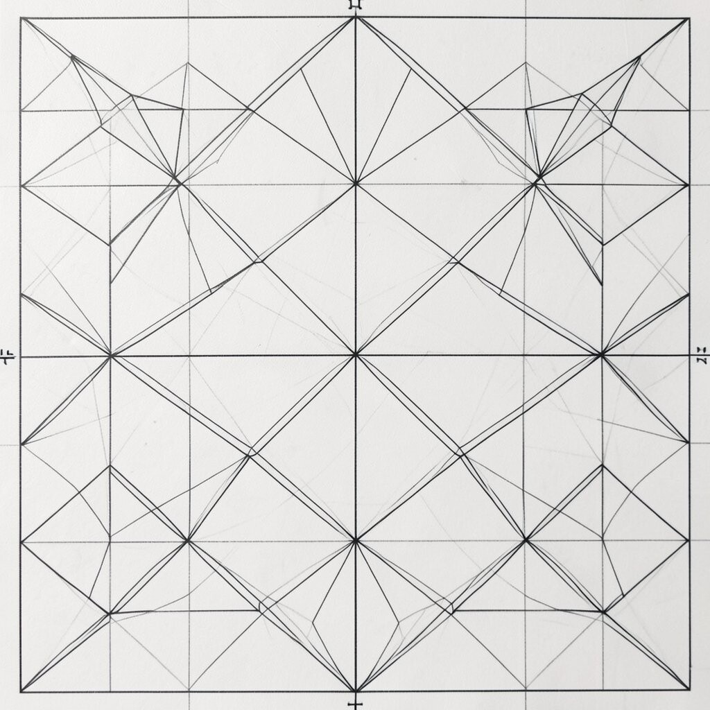
Picture a compass-like layout where stars form at the intersections of a careful grid. The design feels confident, like a map that always points somewhere interesting.
This is a great choice for typography-adjacent art, such as labels, title cards, or framed wall pieces. Sketch a regular grid first, then place small triangles and line segments that meet at points, letting the stars emerge naturally. For practical tips, keep your line thickness consistent and erase early pencil marks so the final intersections look sharp.
To personalize, try swapping the star points for your favorite colors or using a gradient effect by starting one color near the center and shifting outward.
Cost-wise, you can make it with pencil and ruler alone, then upgrade with a single fine-tip marker when you are ready for the final pass.
8. Circuit Squares With Corners
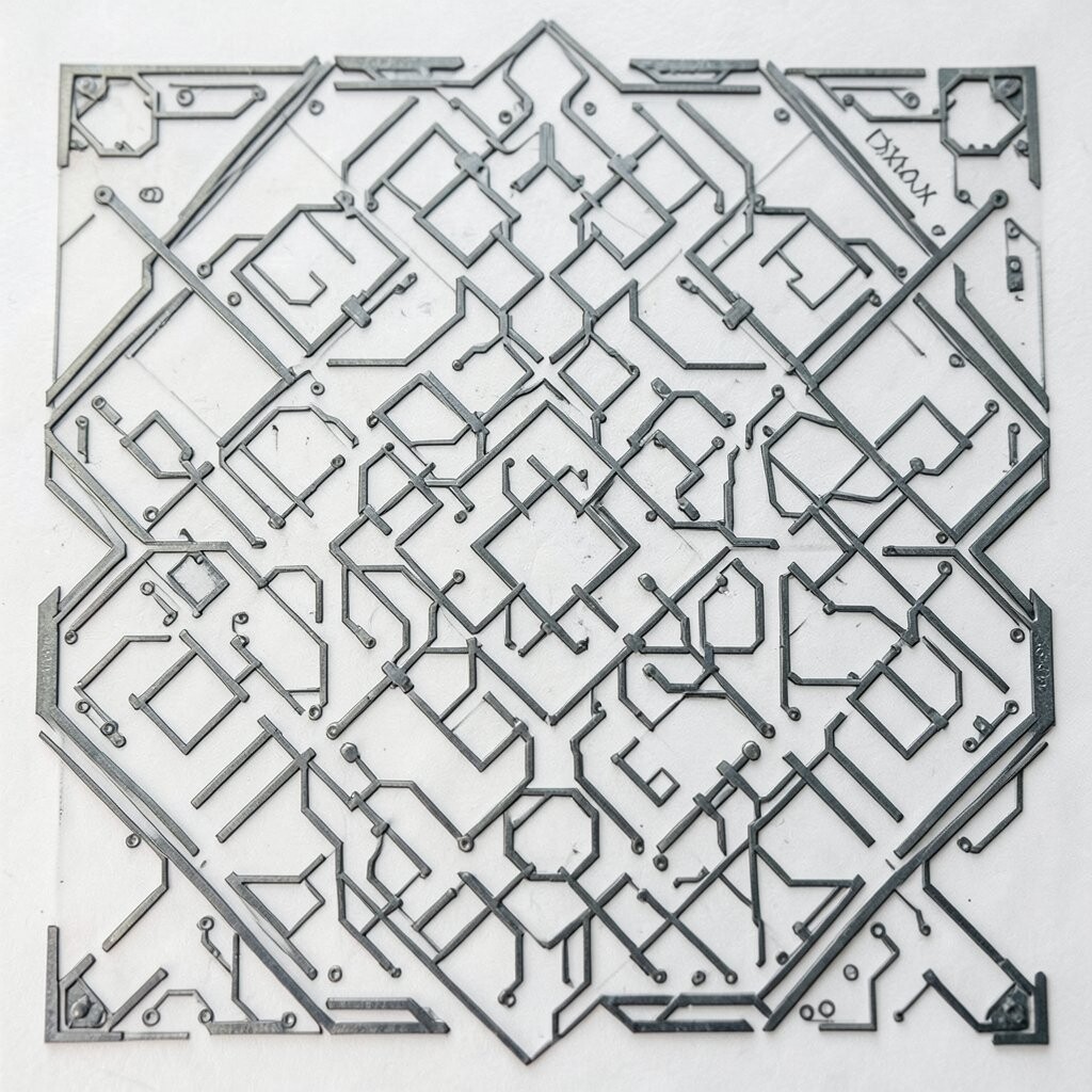
Imagine tiny square “stations” connected by sharp corner turns, like a friendly computer circuit. It has a tech vibe, but the repeated squares keep it warm instead of cold.
You can use this for stationery sets, packaging accents, or a playful section of a website header. Start with a row of squares, then draw connecting lines that turn at right angles, repeating in a tight loop. For personalization ideas, vary the thickness of some connector lines, and highlight one path color so your eye follows a neat route.
9. Monochrome Optical Crosshatch
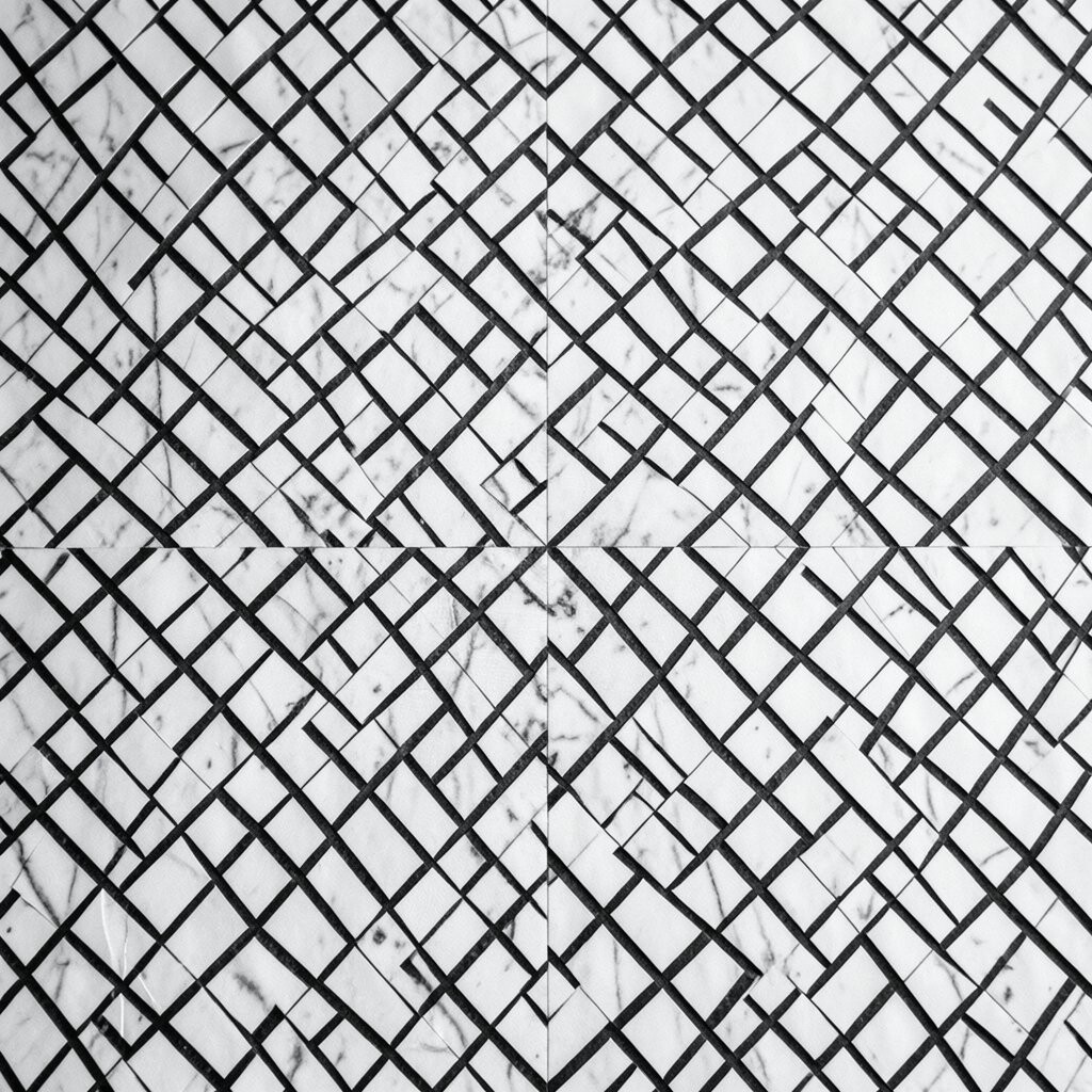
Picture overlapping lines that form a crosshatch, but with a twist: the spacing changes across the design. It creates a subtle optical effect that feels textured and dimensional.
This style is perfect for sketchbook covers, book illustrations, and DIY prints that look high-end even with simple tools. Use a ruler to draw parallel lines, then add a second set that crosses them, changing the spacing every few sections. For practical tips, keep your darkest areas consistent by planning where the tighter hatch goes before you commit in pen.
To make it unique, limit yourself to one ink color and add small areas of blank space, which makes the pattern breathe.
10. Geometric Bloom of Octagons
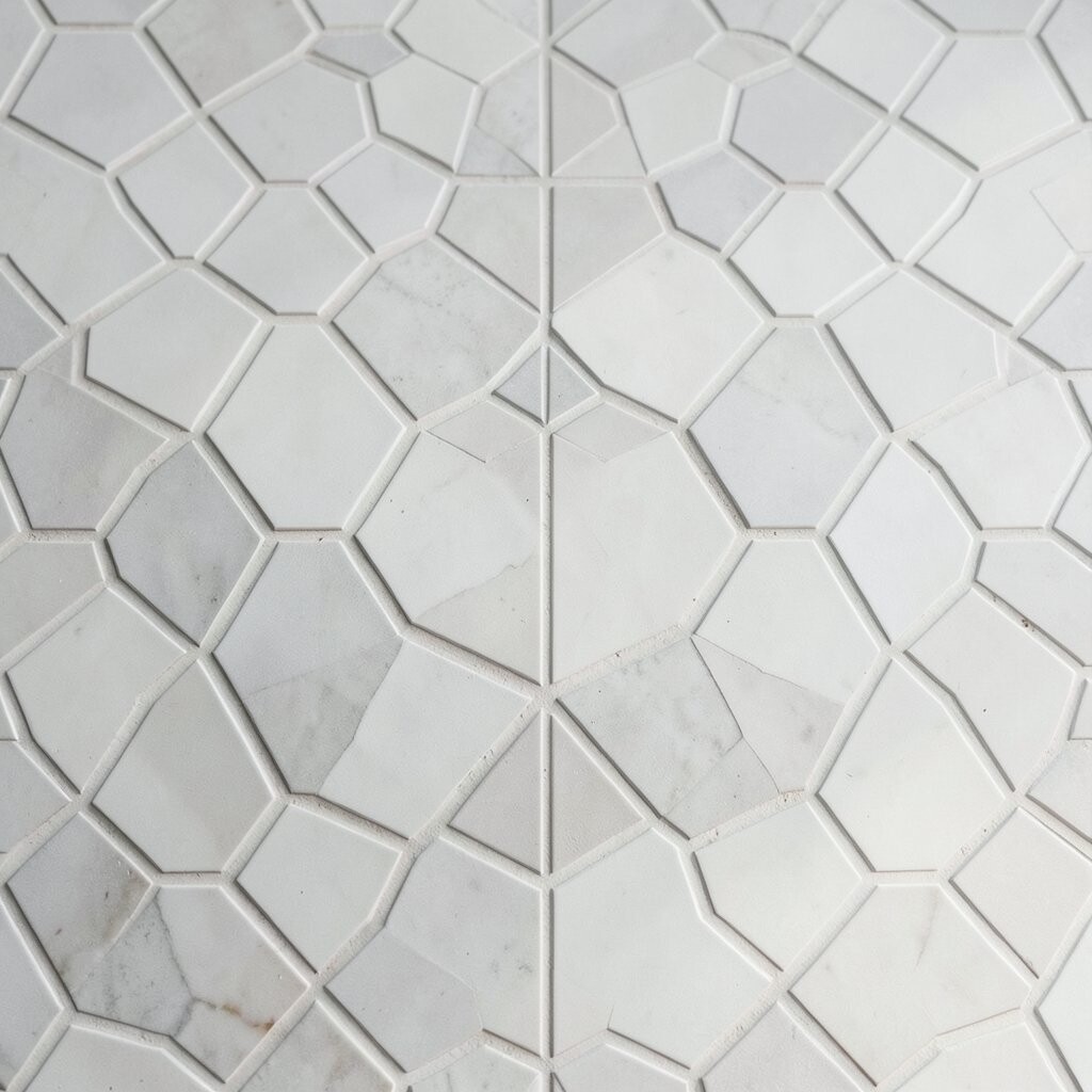
Imagine an elegant cluster of octagons, like a flower unfolding in layers. Each octagon frames the next one, creating a feeling of neat growth.
This design is excellent for wall decals, tiles, or greeting cards that need a classy touch. Draw one octagon, then rotate and resize copies to build a layered bloom, keeping the edges aligned for crisp symmetry. For personalization, choose one color for the outer ring and a contrasting color for the inner ring, then add thin outlines to keep shapes from blending.
If you are following current trends, try a modern “flat” look with solid fills instead of heavy shading, because it reads clearly on everything from print to social media.
11. Checkerboard Horizon Blocks
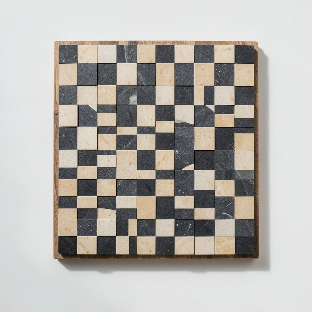
Think of a checkerboard that stretches into a horizon, where block sizes subtly change across the page. The pattern feels like a landscape made from squares, steady but not boring.
This works well for landing pages, posters, and even table runners where you want structure with a little surprise. Draw a standard checkerboard first, then scale one axis gradually so rows or columns get larger as they move away from the center. For practical tips, plan your color order early so the shift looks intentional rather than accidental.
Cost considerations are friendly here since you can use basic paint or markers, and you can keep the design looking sharp by using painter’s tape to lock clean edges.
12. Mandala Squares in Motion Rings
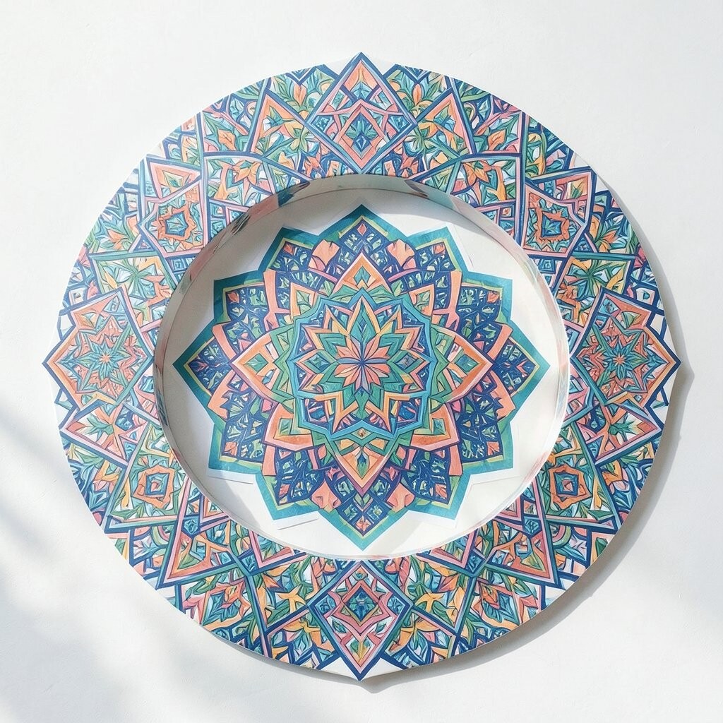
Picture square frames orbiting in rings, like a mandala that keeps spinning even when it is still. The repeating geometry creates a focused center that feels both calm and exciting.
This pattern shines for art prints, planner pages, and fabric panels where you want a “wow” moment without complicated drawing. Start with a center square, then repeat larger square frames around it, turning each ring slightly or changing the spacing so the motion feels alive. For personalization ideas, swap ring colors every two frames and add tiny dot accents only at the corners for a neat finish.
To match modern aesthetics, consider using soft neutrals with one bold accent color, which makes the pattern look fresh and intentional in today’s design styles.
When you want to keep things affordable, use a limited set of craft paints and let one color act as the star while the rest support the structure.