The wall is more than a background. With the right techniques, it starts acting like a stage.
Small choices in texture, color, and light can make your mural feel alive, even from across the room.
1. Layered Paint Glazes With Light Catching Color
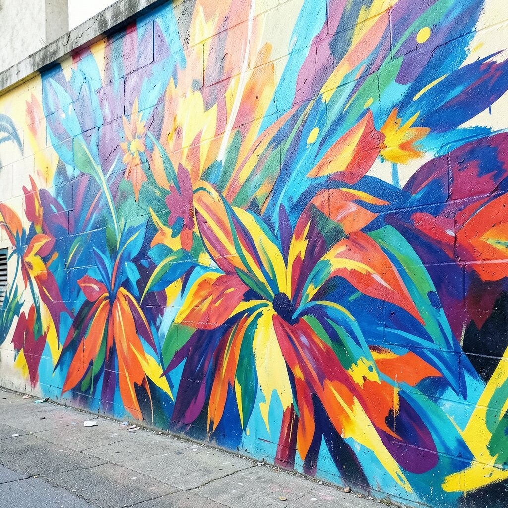
Glazes are like tinted veils that sit on top of paint. When light hits them, the colors shift gently instead of staying flat.
Start with a smooth base coat and let it fully dry, then paint thin, transparent layers. Pick one warm glaze and one cool glaze so you can build depth behind shapes, not just over them.
2. Stencil Depth Using Multiple Passes
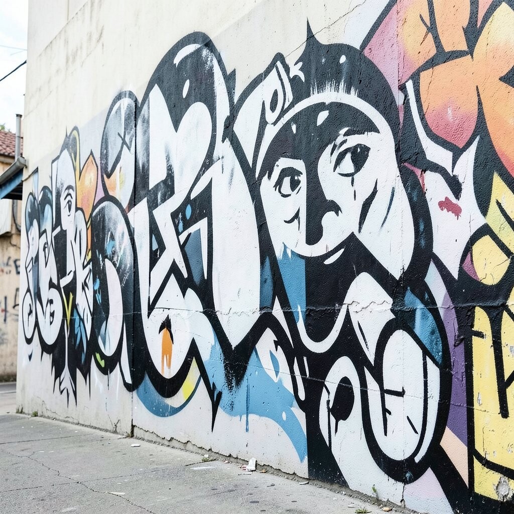
Stencils can look crisp, but multiple passes turn them into something fuller. You can build shadow, midtone, and glow by shifting the stencil slightly each time.
Use a light hand for the first pass, then add darker ink for the second. For the final pass, aim for highlights on the edges, so the design pops without turning messy.
Try using a different stencil scale on top of the main pattern to create surprise details that feel personalized.
3. Tape Resist Lines for Clean Geometry and Sharp Energy
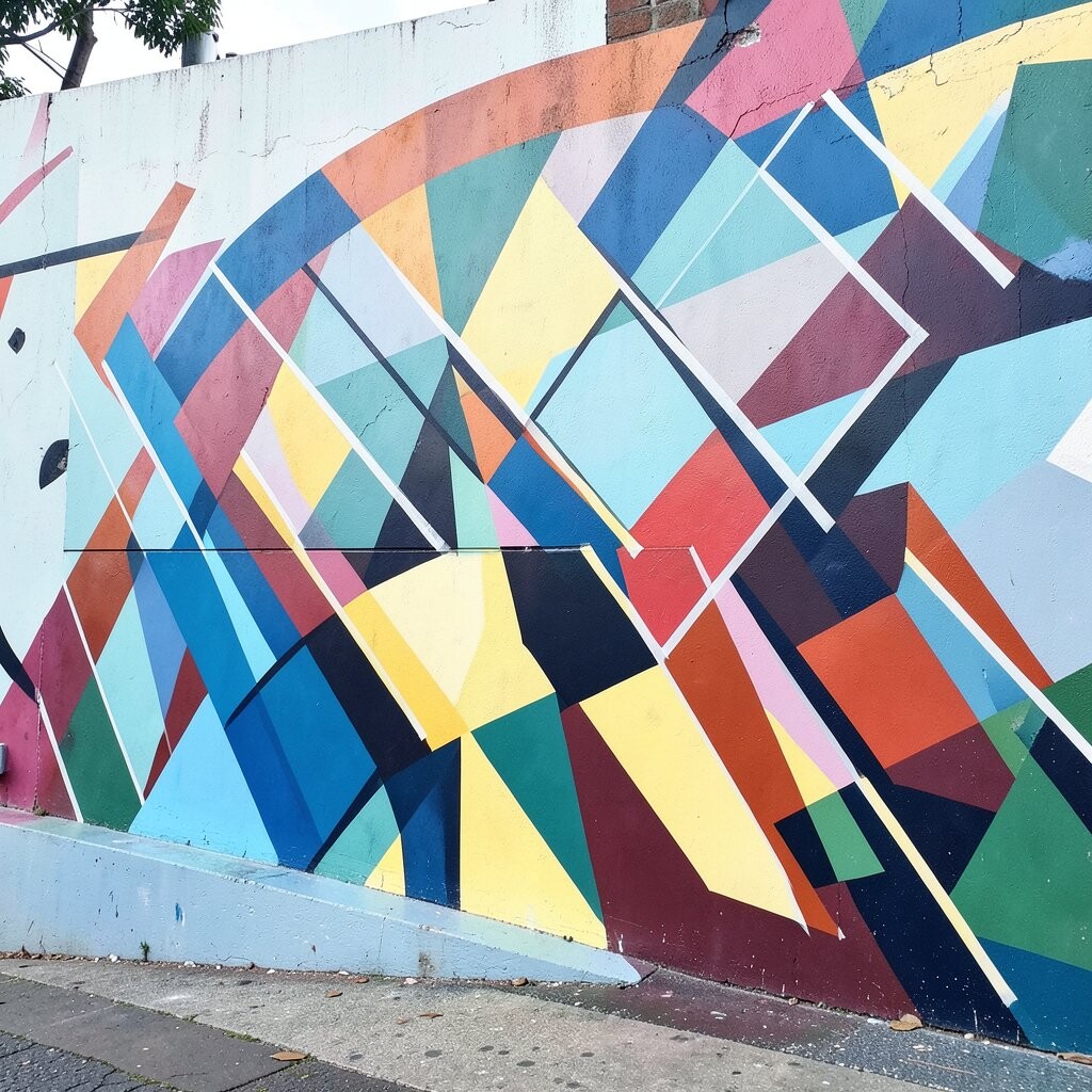
Tape resist gives you crisp boundaries while still letting paint stay playful. Straight lines become a strong rhythm that frames your artwork.
Press the tape firmly along the edges and pull it back slowly while paint is still slightly tacky. Use painter’s tape for thin lines and craft tape for bolder sections.
Pick a limited palette, then alternate matte and satin paint so your geometry feels crisp and modern.
For personalization, match the line thickness to the size of the room, like thinner lines for a small hallway and thicker lines for a wide feature wall.
4. True Dry-Brush Texture for Vintage Character
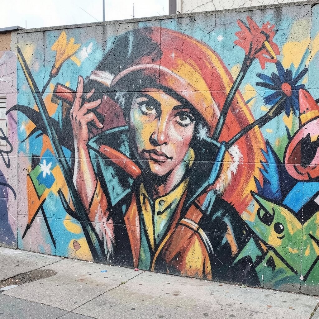
Dry-brushing creates that worn, friendly look that feels lived in. It’s great for adding texture behind characters, buildings, or floral shapes.
Load a mostly-dry brush with paint, wipe off extra on a paper towel, then lightly sweep over raised areas. Work in light layers so you control how much texture shows.
5. Color Blocking With Negative Space That Breathes
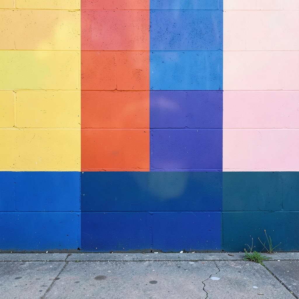
Negative space is the quiet area that makes everything else stand out. When you leave breathing room, your mural reads clearly from far away.
Plan a few large blocks in bold colors, then hold back on details until the shapes feel balanced. Choose one background color that matches the room lighting so it stays calm.
To personalize, add a small repeated symbol in the empty spaces, like a star in each corner of a block, so it feels intentional.
6. Sponging for Soft Gradients and Organic Movement
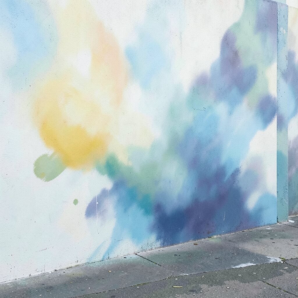
Sponges can make gradients that look natural instead of airbrushed. They’re perfect for clouds, sunsets, foliage, and any area where you want movement.
Use two or three sponge shades and dab lightly, blending where colors meet. Rinse and dry the sponge often so you don’t accidentally muddy your palette.
7. Metallic Paint and Foil Accents for Catch-Your-Eye Sparkle
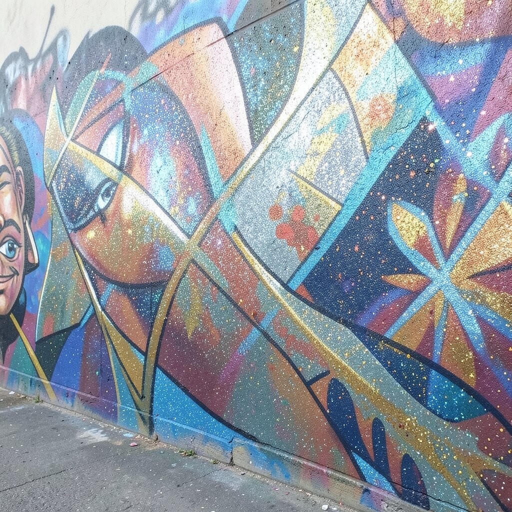
Metallics add an instant wow when light bounces off them. Even small touches can make your mural feel special and not like plain wall paint.
Apply metallic paint with a small brush for fine lines, then add a few spots with a foam applicator for texture. Keep it controlled by using metallic only in focal areas like eyes, highlights, sun rays, or sign-like lettering.
For budget planning, use metallic sparingly and combine it with matte paints, since a little shine goes a long way.
8. Oversized Photo Transfers for Personal Memories
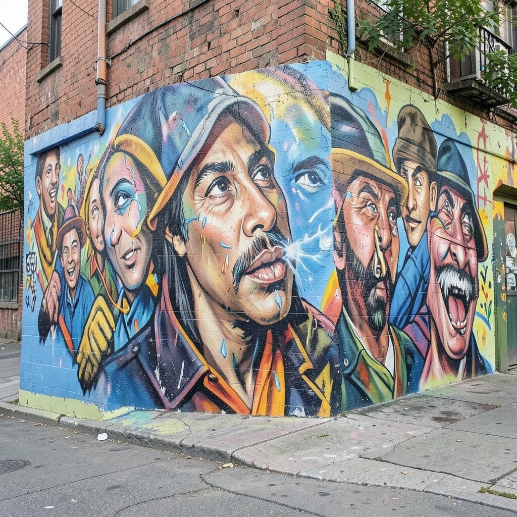
Photo transfer techniques can turn your wall into a storytelling canvas. A portrait, pet photo, or family moment can become part of the mural like a secret treasure.
Print your image in a size that matches the wall distance, then prep the surface so it’s smooth and sealed. Seal over the transfer to protect it, especially if the mural will face daylight.
For personalization, edit the image into a simplified style with fewer colors so it blends with your painted background instead of looking pasted on.
9. Color-Shift Paint Effects With One Wall, Many Moods
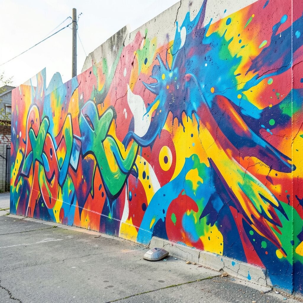
Color-shift products change tone as you move, which makes the mural feel interactive. One angle might look cool and calm, and another angle can feel warmer and bolder.
Use this effect on accents like scales, wings, wave tips, or city lights rather than across the whole wall. Apply in thin coats for a smoother shift that doesn’t crack or look patchy.
10. Layered 3D Elements With Wall-Safe Texture Media
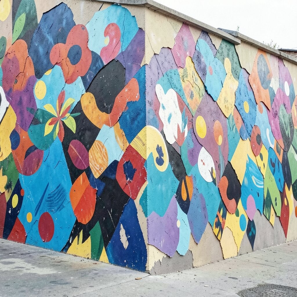
Raised details bring your mural into real space. When parts of the design stick out, shadows form naturally and make everything look deeper.
Choose wall-safe texture mediums and add them with a palette knife, sponge, or small putty tools. Press patterns gently, then paint over the texture so it matches the rest of the mural.
To keep it practical, only build height where viewers will look, like flowers, borders, or the center figure.
11. Light and Shadow Design With Strategic Highlights
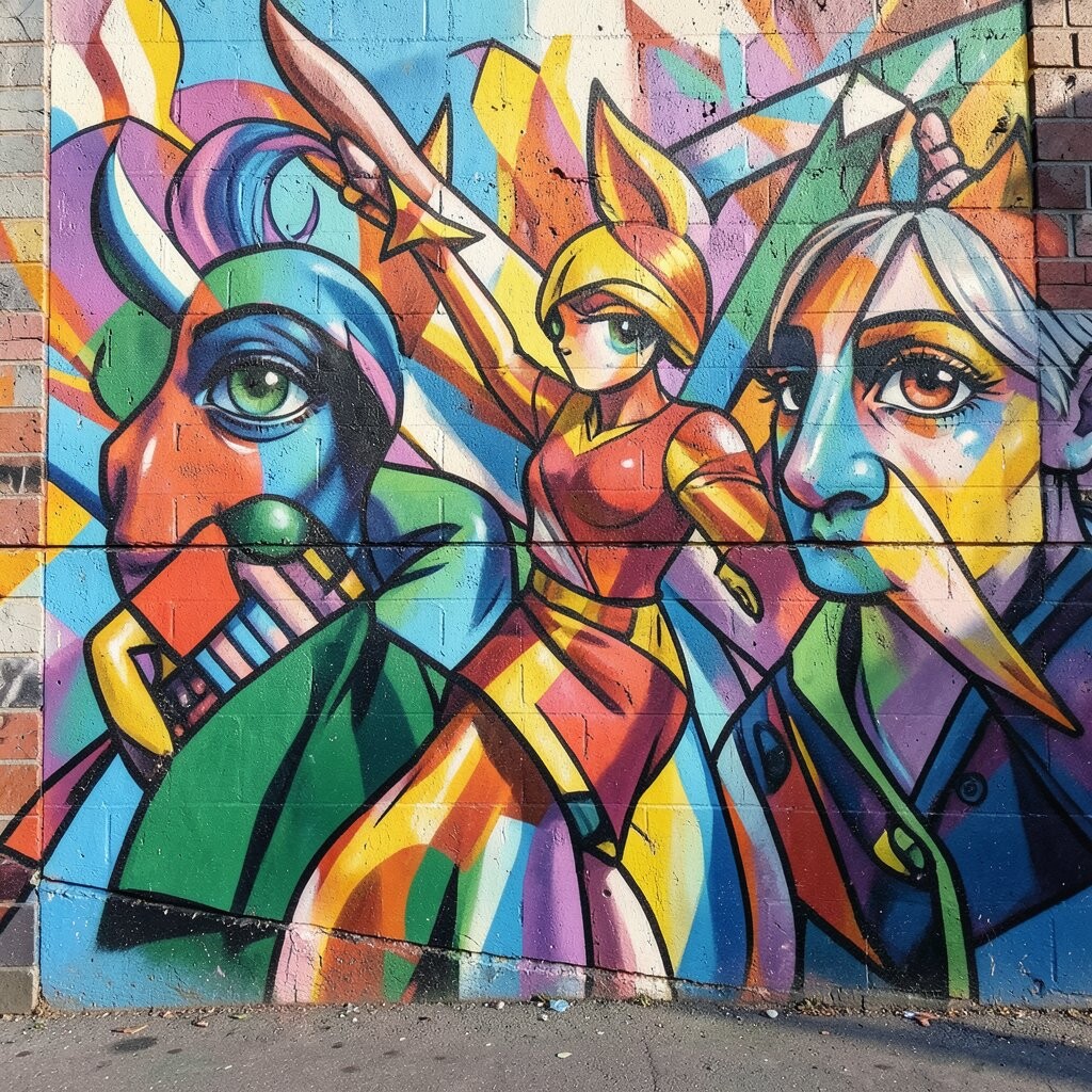
Shadow makes art feel believable, and highlights make it feel alive. When you paint where light should land, your mural starts looking three-dimensional.
Decide where the room’s main light comes from, then paint brighter edges facing that direction. Add soft shadow under shapes using a darker, desaturated tone so it looks natural instead of harsh.
12. Chalk-Line Grids for Perfect Perspective in Murals
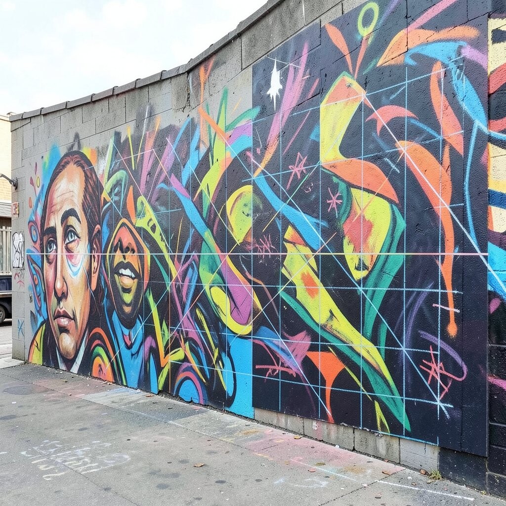
Perspective can be intimidating, but a simple grid makes it easier. Even a basic vanishing point helps buildings, streets, and murals with depth look convincing.
Lightly mark guide lines with a chalk line or pencil, then sketch the main outlines over the grid. Remove or blend guide marks as you paint so they don’t show through the final colors.
For a personalization twist, align the vanishing point with a real feature in your room, like a window or doorway, so the mural feels connected to the space.
13. Brushwork With Characterful Hairline Details

Fine brush details are where murals get their personality. Tiny lines, dots, and curved strokes can turn a simple shape into an expressive character or pattern.
Use a small round brush and paint slow, aiming for steady pressure. Add detail last, so the bigger color blocks set the foundation first.
Try a trend-friendly look by mixing clean lines with a few hand-drawn imperfections, because that human texture is popular right now.
14. Color Wheel Planning for Bold Yet Friendly Palettes
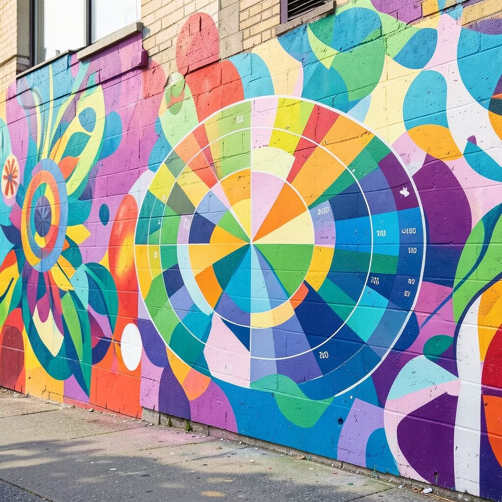
A smart palette helps murals feel bold without feeling chaotic. When colors sit well together, your design reads clearly and stays pleasing for long periods.
Pick a main color family, then add one accent using a contrasting hue that still fits your room’s vibe. Test paint swatches on the wall and view them in morning and evening light, since lighting can change how colors feel.
15. Protective Sealing for Long-Lasting Beauty and Easy Cleaning
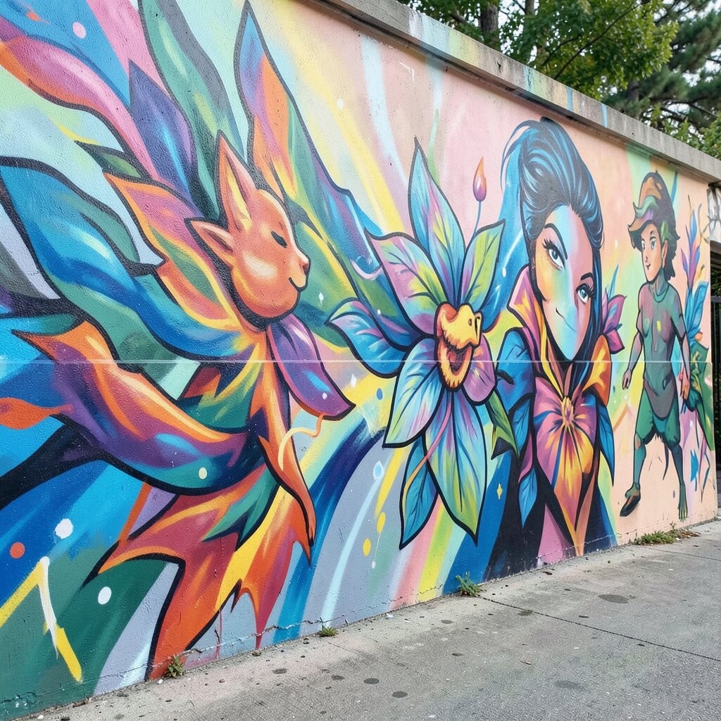
Even the most gorgeous mural can fade if it’s not protected. A good seal helps keep colors brighter and makes daily cleaning much easier.
Choose a sealant made for walls and follow drying times carefully before applying the next coat. For kitchens or sunny rooms, look for finishes designed for durability and UV resistance.
To keep costs under control, seal the most touched areas first, like near doors and seating, then cover the rest for full protection.
Finally, personalize your mural’s longevity by using a satin finish for a gentle glow that still feels warm, not shiny.