
Walls can feel flat until color finds its rhythm. With the right mural technique, your space starts telling a happier story.
1. Color-Blocking With Oversized Shapes
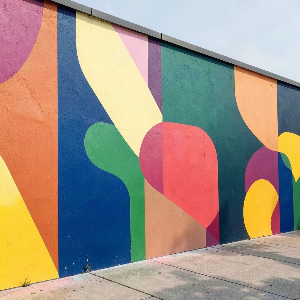
Start with bold blocks like chunky rectangles or playful circles that feel almost like stickers on a wall. Choose a clean wall color first, then build layers of saturated hues around the room’s main tones.
Oversized shapes pull attention and make spaces feel larger and brighter right away. You can use painter’s tape to map edges, then roll paint for a smooth finish. For personalization, match the shapes to your favorite patterns, like sunshine dots, ocean swells, or retro candy stripes.
2. Ombre Gradient From Floor to Ceiling
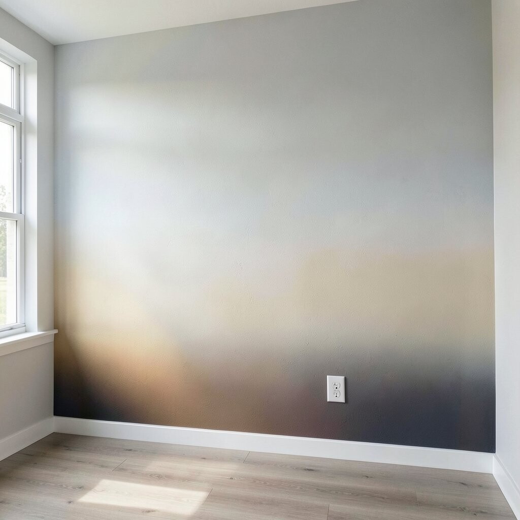
An ombre mural fades one color into another, so the wall feels like it’s breathing. Picture a soft sunrise effect, where warm tones near the bottom slowly shift to cooler tones near the top.
This technique adds gentle movement and makes light look warmer and more natural. To get a smooth blend, sponge lightly or use a blending brush, working in small sections. If you want a budget-friendly route, choose two or three colors and keep the transitions gradual instead of using many shades.
Pair the gradient with simple decor like plain frames or a solid curtain so the wall stays the star. For a current look, many people are choosing earth-tone ombres that feel calm, not loud. Add a subtle highlight line near where the gradient changes to make the fade look extra crisp.
3. Stenciled Botanical Branches With a Fresh Twist
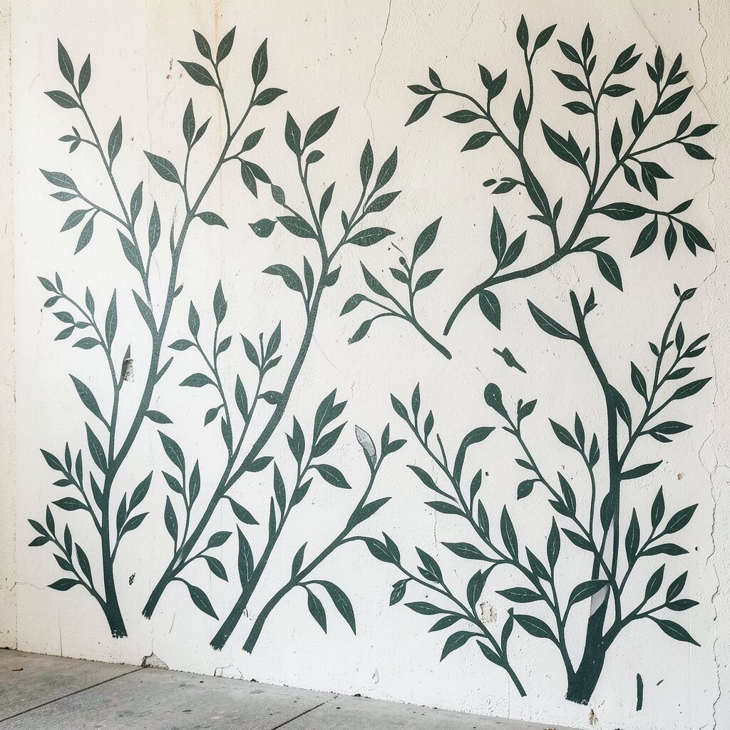
Think of leafy branches spreading across your wall like vines after a rainstorm. Use stencils for crisp edges, and choose a palette that suits your mood, such as deep green with creamy white.
Botanical murals bring an instant outdoors feel, which can make rooms feel more relaxed and inviting. Paint with a dry brush method inside the stencil so the leaves look lightly textured. For uniqueness, rotate stencil positions so no two branches are perfectly identical.
If you’re working on a rental, choose removable painter’s tape and keep the design contained around one area. To personalize, add a few custom leaf types using freehand details after the stenciling is done. This kind of mural is also cost-friendly because stencils let you reuse the same shapes without buying many specialty paints.
4. Faux Plaster Texture With Soft Geometric Lines
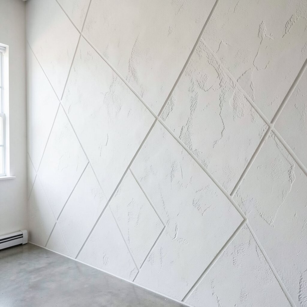
Create a wall that looks like it’s been lovingly hand-finished, even if you paint it in a weekend. Use a sponge or roller technique to make a plaster-like surface, then draw gentle geometric lines on top.
The textured base makes light bounce differently, so your room looks brighter throughout the day. For a modern trend, people love warm neutrals with just a hint of color, like clay with muted teal lines.
Keep lines thin and slightly imperfect so they feel natural rather than too perfect. You can personalize by choosing a shape theme that matches your space, like arched curves for a cozy corner or clean angles for a home office. If you want to keep costs low, focus texture on one wall and repeat smaller line elements on another.
5. Drippy Paint Art With Controlled Motion
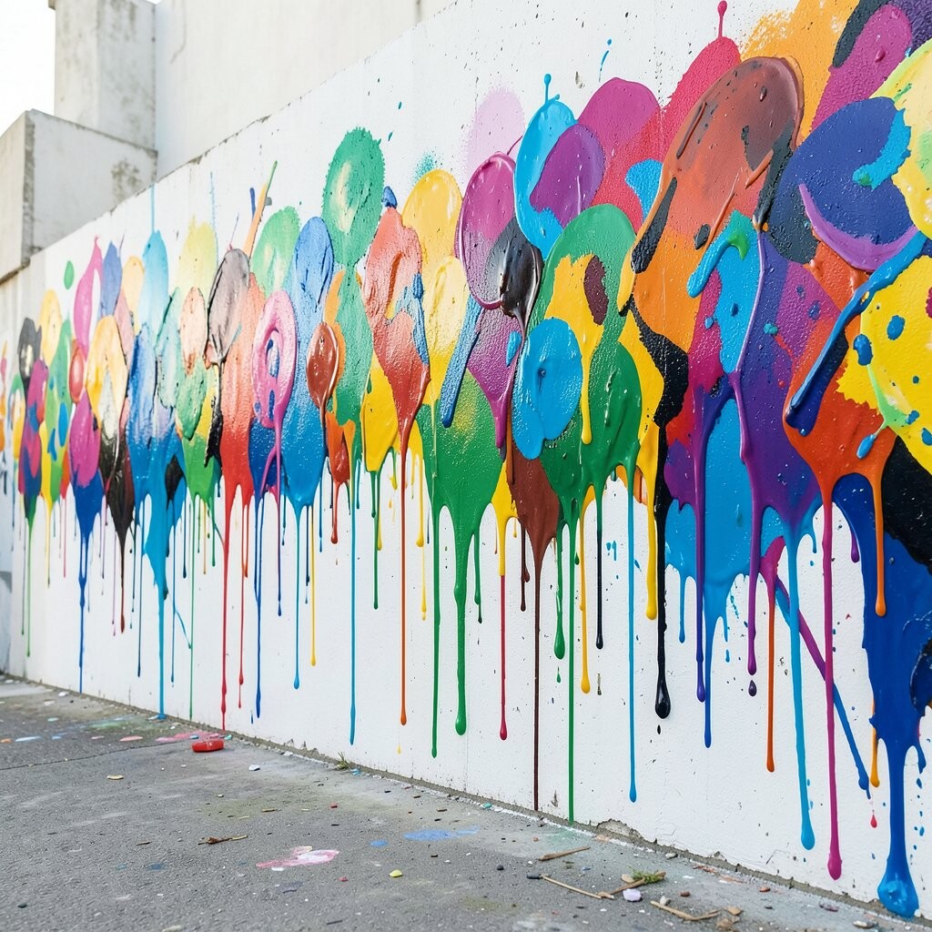
Drips can be playful, but they still need structure to look good on a wall. Sketch a simple layout first, then paint thick strokes that let paint fall in neat, intentional lines.
This technique adds energy and a bold personality, making even a dull room feel lively. Use drip paint sparingly near the top or around one main shape so it stays stylish, not messy.
To personalize, combine drips with a calm background color, like soft gray or warm beige. For practical success, use painter’s tape to block off areas you don’t want drips to reach. Cost-wise, you can keep it simple with two main colors plus one accent.
6. Storybook Checkerboard With Hand-Painted Depth
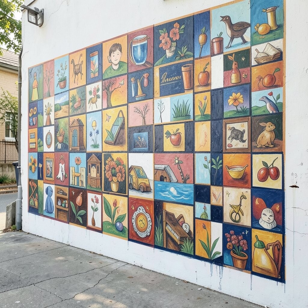
A checkerboard mural can look fun and classic, especially when you add hand-painted depth. Imagine squares that alternate between light and slightly darker tones, with gentle shading that makes the grid feel dimensional.
This technique brings order and cheer, so your space feels organized while still looking artistic. Start by marking a simple grid lightly with pencil, then paint large blocks for easy progress.
For uniqueness, vary the size of a few squares or round the corners so it feels handmade. Choose colors that match your existing decor, such as cream and muted olive, to keep the mural from fighting with furniture. If you’re aiming for a budget-friendly option, use acrylic paint colors you already own and keep the shading minimal.
7. Sunburst Rays That Frame a Focal Point
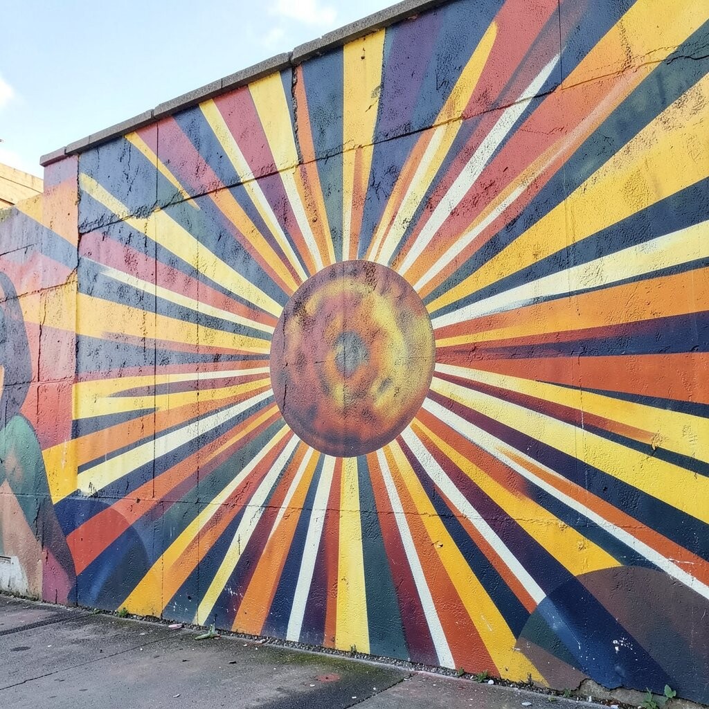
Sunburst murals look like light beams, instantly making a corner feel brighter. Place them behind a mirror, a reading nook chair, or a cabinet to create a living spotlight.
The rays guide your eyes and make the wall feel energetic without needing a huge scene. Use a compass-like approach by marking a center point, then tap in lines with painter’s tape for straight guidance.
To personalize, choose ray lengths that fit your wall height, and add a small circle or soft gradient at the center. Current trends favor sunbursts in muted tones, like terracotta and blush, paired with clean white walls. Keep costs manageable by sticking to one color plus one accent color.
8. Washi-Tape Resist Patterns With Paint Layering
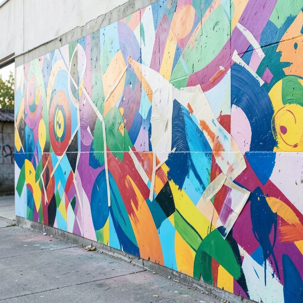
Washi-tape resist is a clever way to make crisp pattern lines without complicated masking. Press tape onto your wall in repeating shapes, paint over it, then remove the tape to reveal clean edges.
This technique creates sharp contrast that looks neat and professional. It’s also great for personal style because you can copy your favorite wallpaper look or create your own rhythm of shapes.
For best results, press tape firmly and keep paint coats light so it doesn’t bleed under the edges. If your budget is tight, wash tape is often cheaper than custom stencils, and you can reuse the same concept on multiple walls. To keep it on-trend, choose modern pattern layouts like small stripes, mini triangles, or overlapping circles.
9. Geometric Linework Like a Modern Blueprint
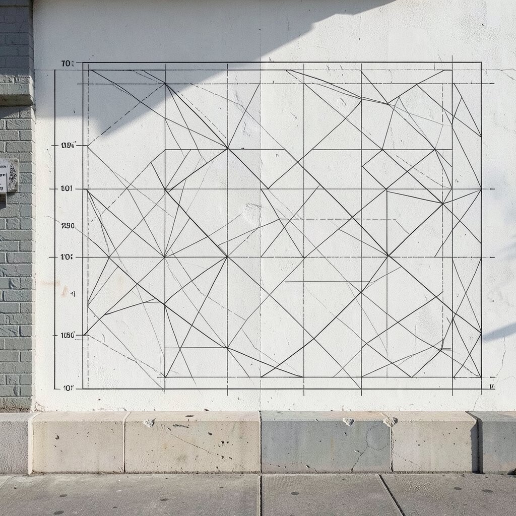
Instead of big color splashes, use thin lines that resemble a blueprint or architectural sketch. Pick one wall and draw flowing shapes, curves, and blocks with a consistent line thickness.
This mural technique feels sleek and keeps your room looking bright because it doesn’t cover every inch with heavy paint. Choose a contrast color that pops, such as black on white, or deep navy on light cream.
Personalization is easy here because you can follow your own style of curves and angles. Try adding small dots or tiny labels with a stencil font, keeping them subtle so they don’t overwhelm. For cost considerations, linework uses less paint and fewer materials than full coverage murals.
10. Faux Color-Drunk Marble Swirls
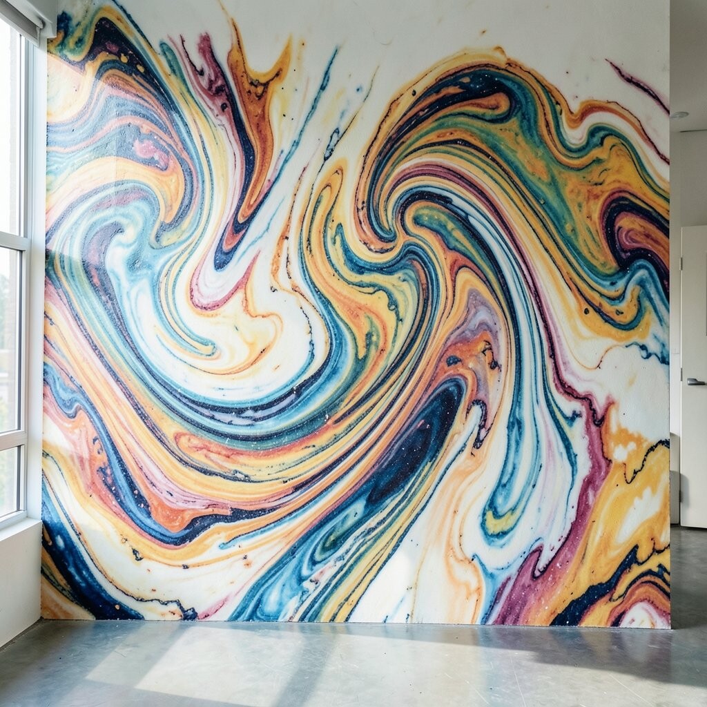
Marble murals look elegant, but you can make them feel fresh with bolder swirls and playful color choices. Start with a light base coat, then pull veining lines through the paint with a thin brush and a gentle hand.
This technique adds luxury without needing real stone, and the reflective look helps a room feel more open. Use a small amount of paint for the veining, then soften edges with a dry brush to mimic natural stone movement.
If you want uniqueness, select colors that match your home theme, like soft gray with hints of copper or creamy white with sea-green undertones. To keep it practical, work in a limited area first, then expand once you like the look. Cost-wise, you can get a high-impact finish using only a few paint colors and basic brushes.
11. Dip-Dyed Fabric Look With Vertical Panels
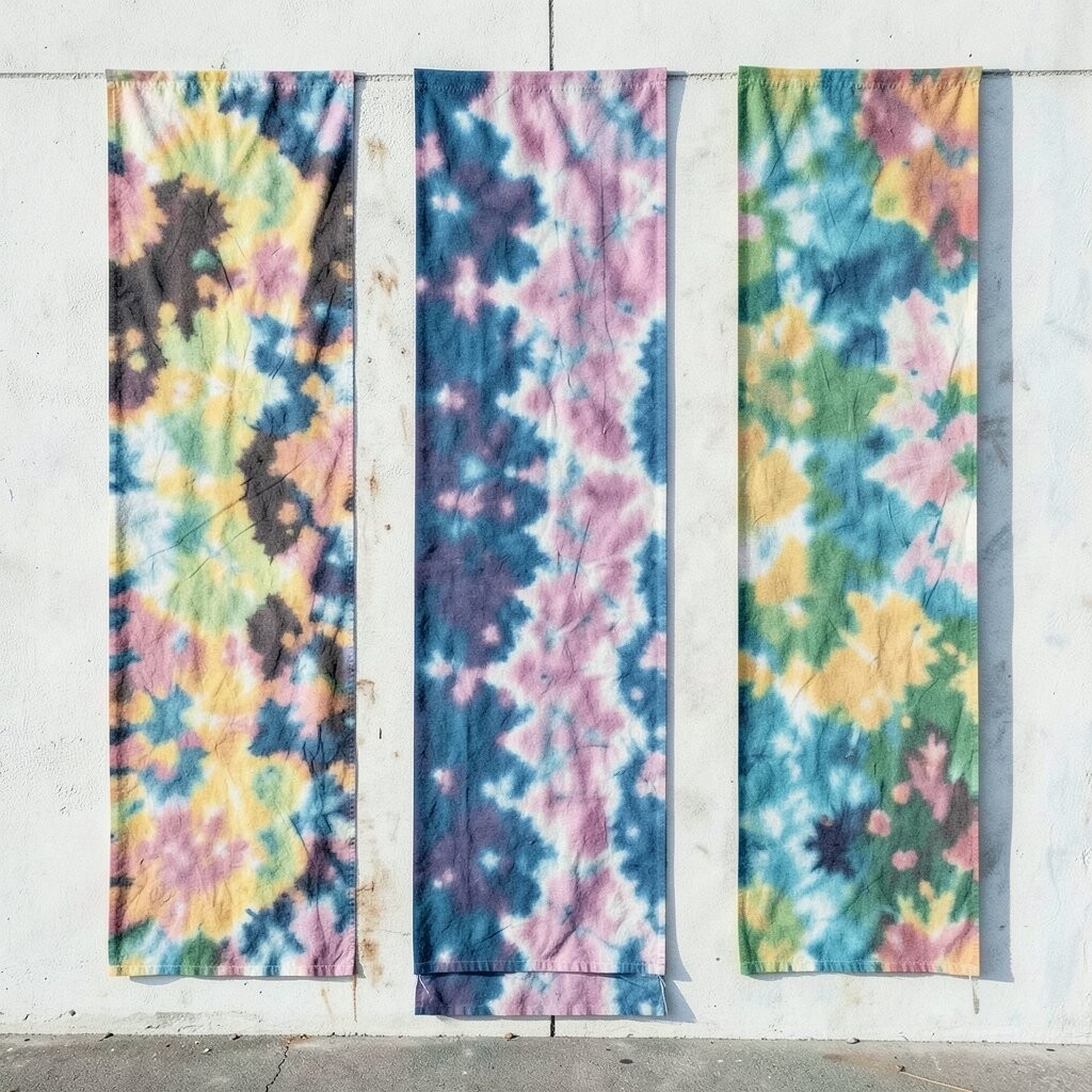
This mural style mimics the look of dyed fabric, using vertical bands that blend and fade. Imagine hanging cloth in color, but translated into paint with smooth vertical transitions.
Vertical panels can make ceilings feel taller, which often makes a room look brighter and more spacious. Use three to five vertical columns and blend them so the edges look soft, like fabric fibers absorbing dye.
For personalization, match the bands to your bedding or rug colors, even if you keep them muted. A current trend favors “quiet color” murals, where the tones are rich but not overly loud. If you want to control cost, focus on one wall behind a sofa or bed and use the same palette for smaller accents elsewhere.
12. Chalky Weathered Waves With a Coastal Mood
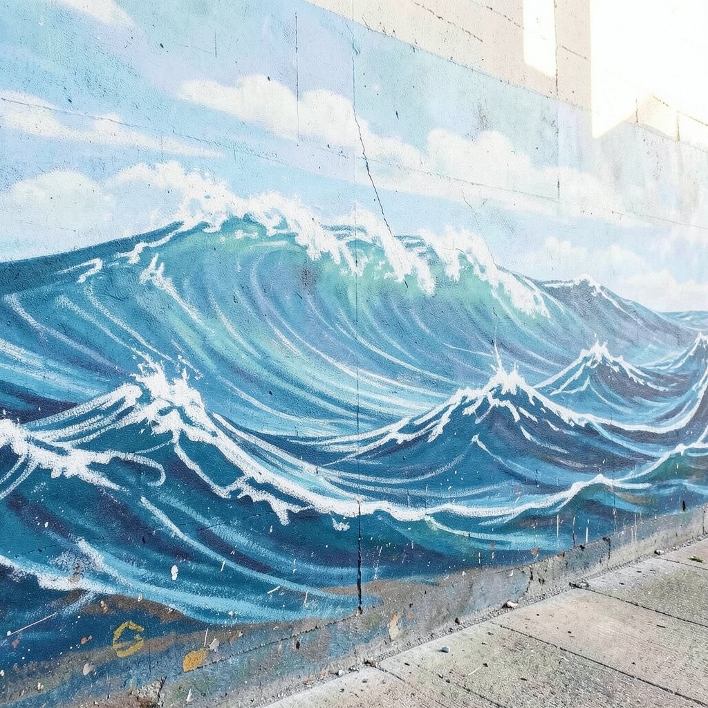
Wave murals can feel soothing when you paint them in a chalky, weathered style. Use a slightly matte finish and soften the wave edges so the lines look sun-bleached.
This technique brings calm energy and can make a room feel airy, especially in spaces that need a lighter vibe. Try adding a few foam-texture touches using a stippling brush for realism without overworking the design.
Personalization can be as simple as choosing wave colors that match your decor, like seafoam green with warm sand. For a modern take, pair the coastal mural with minimal, clean furniture lines. Keep costs in check by using fewer colors and relying on texture for interest instead of lots of paint layers.
13. Tiny Tile Mosaic Look Using Small Paint Marks
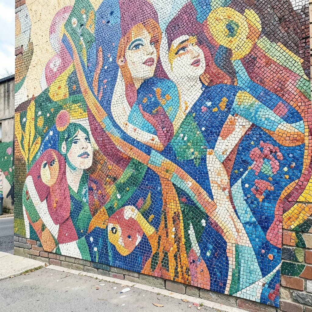
A mosaic mural can look intricate while still being surprisingly doable. Instead of using real tiles, paint tiny squares and rectangles to form a pattern like a tiled backsplash, but on a wall.
This technique adds sparkle and visual interest, making plain walls feel intentional and brighter. Use a consistent size grid by marking guide dots, then fill in small blocks with varying shades for depth.
To make it unique, include a few “imperfect” pieces that break the rhythm, like one larger tile or a tiny curved shape. Current trends often lean toward matte ceramics and gentle color mixes, so try muted blues, soft terracotta, and creamy whites. Cost-wise, you can get the look with basic acrylics and a small brush, no expensive materials needed.
14. Accent Halo Painting Around Art or Lighting
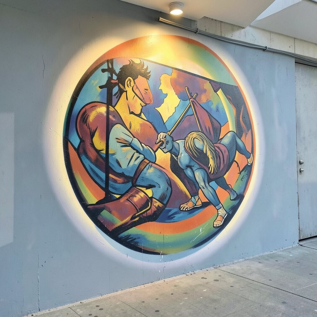
Halo murals create a glowing effect around a frame, sconce, or gallery wall, as if light is pooling gently. Paint a soft circle or rounded shape behind the focal point, then blend outward until it fades into the wall.
This technique makes your favorite spot feel more important and can brighten darker corners. Use warm tones like peachy beige for cozy vibes or cool tones like pale blue for a crisp, airy feeling.
For personalization, tailor the halo to your setup by adjusting its size and position and matching the color to your room’s mood. You can also add a subtle second ring in a contrasting color for a layered glow. If you’re thinking about cost, halos use very little paint, so you can add a big upgrade without overspending.
15. Luminous Faux Backlit Panels With Metallic Highlights
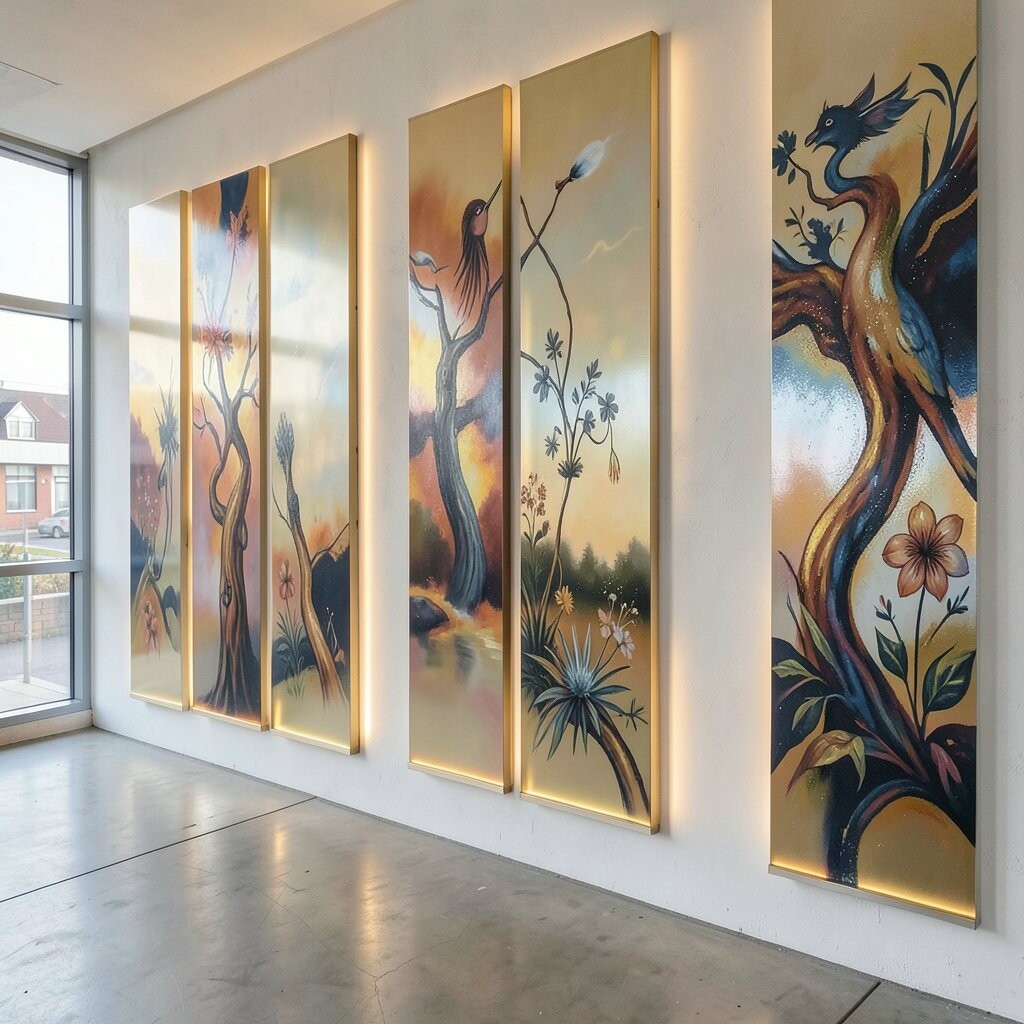
For a dramatic yet friendly look, paint the illusion of backlit panels using light gradients and metallic highlights. Imagine soft panels stacked on the wall, with gentle glow edges that make colors look warmer.
This mural technique turns an ordinary wall into something that feels like modern art lighting. Start with a translucent gradient in the panel area, then use a fine brush to add metallic streaks along the brightest edges.
Personalization comes from choosing your glow color, such as amber for warmth or icy white for a clean look. A current trend favors “soft tech” decor, where art feels like it could be part of a light installation, even if it’s just paint. To keep costs reasonable, buy only one metallic paint and a couple of gradient base colors, then focus on one statement area.