Something magical happens when you arrange visual ideas side by side. A gallery can make even small corners feel full of intention.
In this article, you’ll find practical gallery concepts that work for home, studios, and community spaces. Each idea includes ways to style, budget, and personalize so the final look feels like you.
1. Theme-First Storyboards for Every Wall
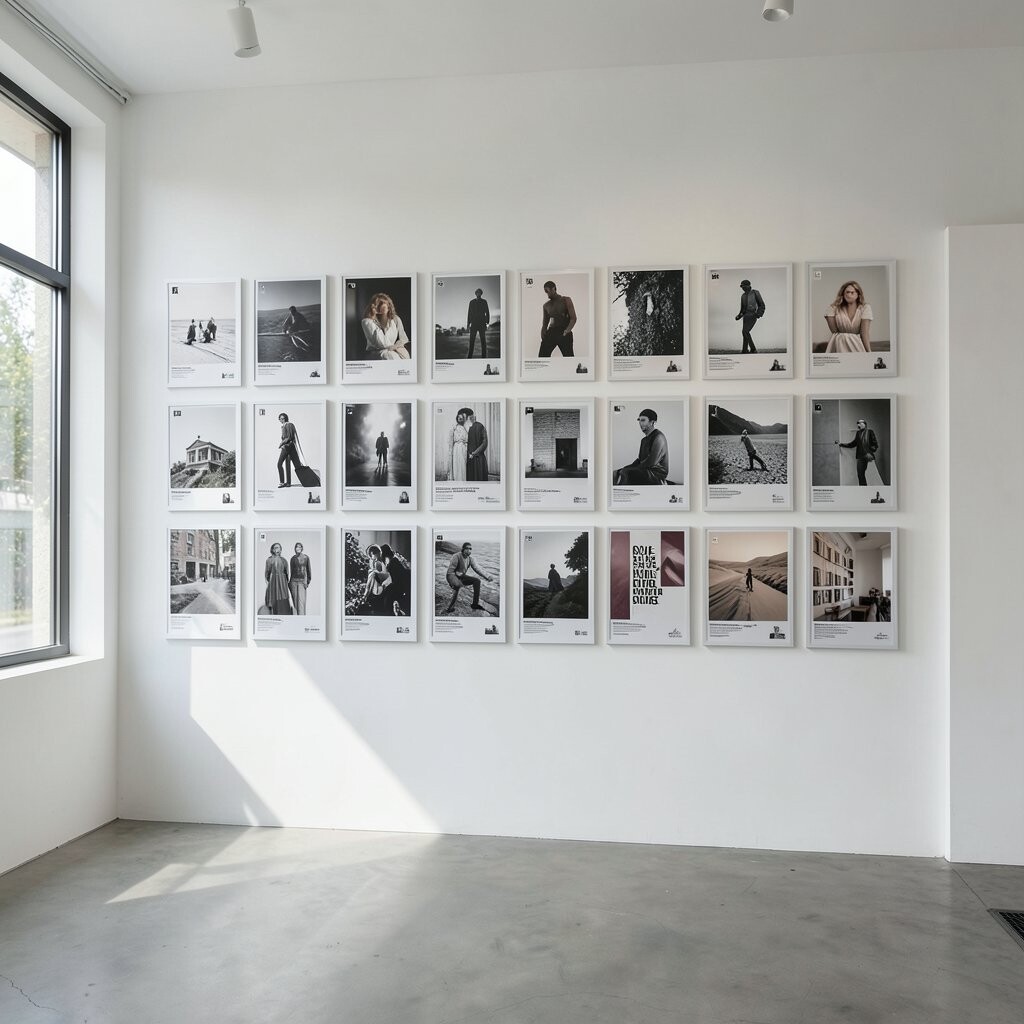
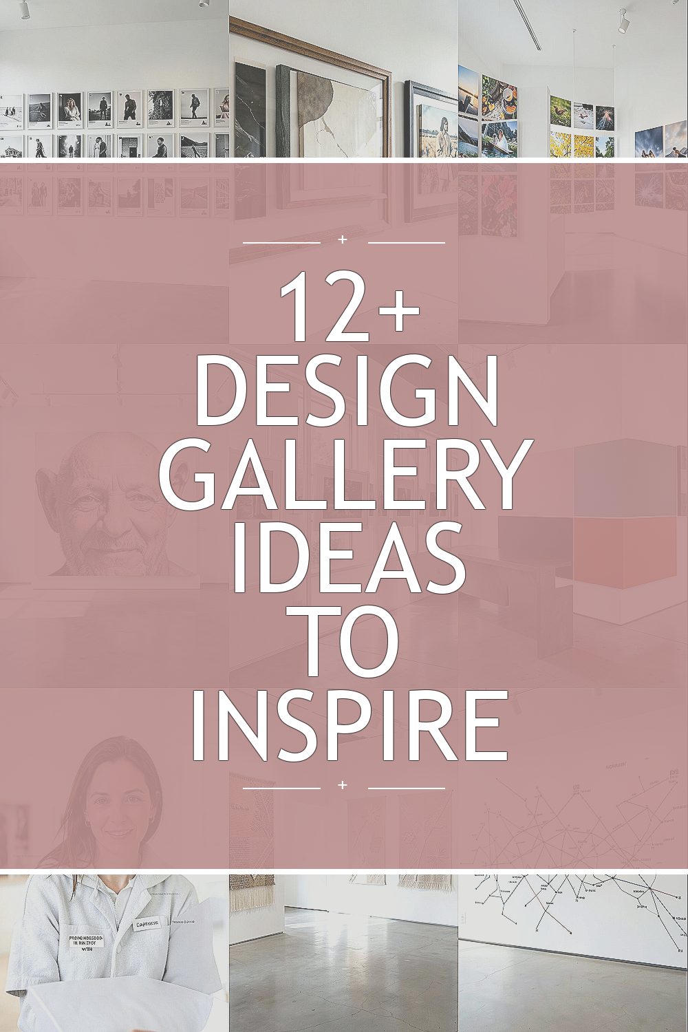
Pick one theme and build a clear visual storyline from top to bottom. For example, a “morning to night” theme can move from bright yellows and soft textures to deeper blues and calmer neutrals as you go across the wall.
Start by laying out prints on the floor before you hang anything, so you can see the order like a movie strip. Use repeating shapes, one or two consistent frame colors, and a similar mat style to keep the journey smooth and satisfying.
2. Layered Frames With a Mixed Materials Mix
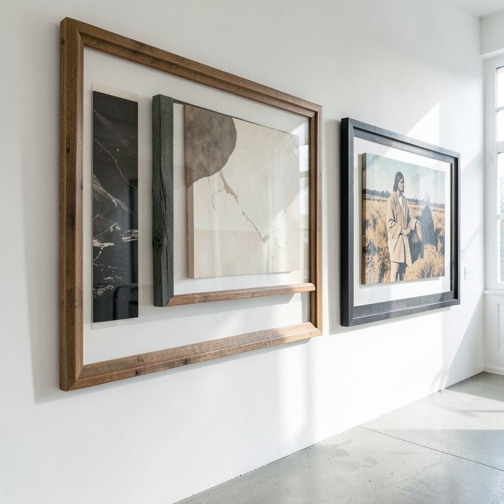
Instead of matching everything, mix frame materials like wood, metal, and painted frames. A gallery wall that includes different finishes feels warm and lively, especially when the artwork varies from photos to line drawings.
Choose a color family to tie the mix together, such as warm oak tones plus black accents. Keep spacing even by using the same spacer thickness or painter’s tape markers before you nail.
For a budget-friendly approach, shop thrift stores and online marketplaces, then repaint only the frames that look too mismatched. Current trends lean toward lived-in collections, so imperfect matches can look stylish instead of messy.
3. Rotating Seasons With a Changeable Grid
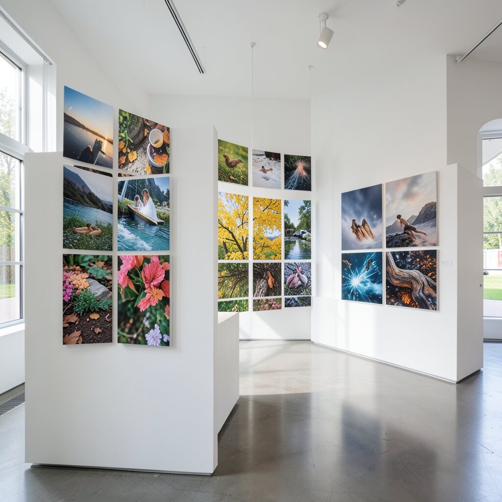
Make your gallery feel alive by designing it as a grid that you can update each season. When spring arrives, swap in lighter art and botanical colors, then switch to richer tones during colder months.
Use frames with the same size so switching is fast, and keep spare artwork stored in protective sleeves. This reduces waste because you re-use frames and change only the inserts, which is kinder to your wallet.
Many people also add removable wall mounts so you can rehang without damaging paint. The uniqueness comes from your timeline, since the wall becomes a record of how your taste changes through the year.
If you want a current look, lean into curated minimal pieces for one season and bolder, texture-rich items for the next. Add a small label on the back of each frame set so you can repeat your system quickly later.
4. Oversized Focal Piece With Supporting Satellites
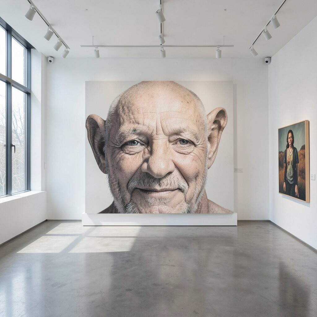
Choose one large artwork as the anchor, then surround it with smaller pieces like supporting characters. This works beautifully in hallways and living rooms because your eyes know where to land first.
Keep the supporting art in the same mood, even if the subject changes, so the whole wall looks intentional. A neat trick is to align the centers of frames at a consistent height, then let the sizes do the talking.
5. Gallery Windows Using Clear Acrylic and Shadow Gaps
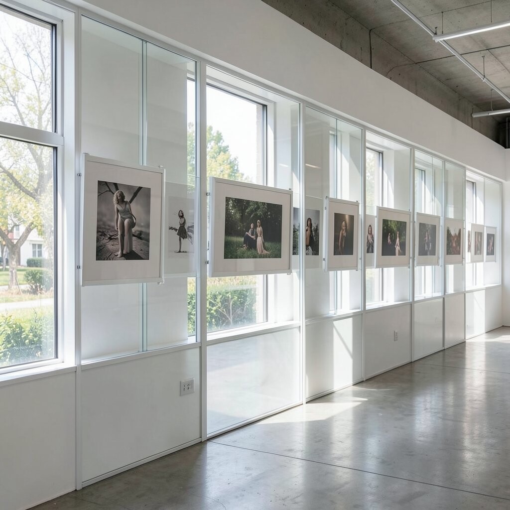
For a modern twist, use acrylic frames or floating mounts that create a tiny shadow gap. The visual effect makes your art look like it’s hovering, which feels fresh and airy.
When you choose clear or semi-clear display styles, the background becomes part of the design. Pair this with a neutral wall color or a textured paint so the floating pieces stand out without feeling heavy.
To keep costs reasonable, use acrylic for only the largest or most special pieces. This way you still get the trendy look, while other frames can be standard and simple.
6. Color-Blocking Layouts With One Bold Palette
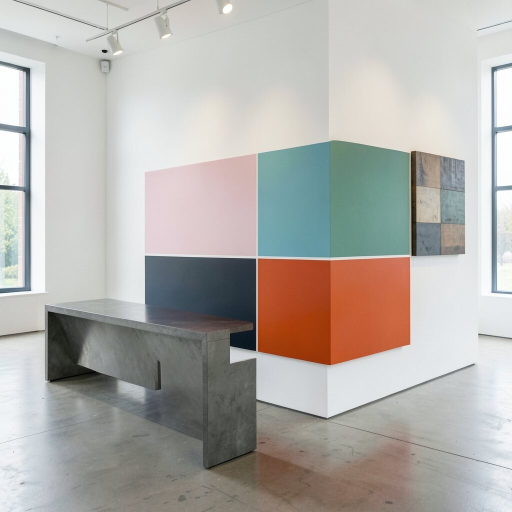
Pick a bold palette, such as teal, cream, and warm brass, then arrange art by color blocks. You’ll see how quickly a wall looks organized when colors fall into distinct zones.
Think about contrast and balance, too, by placing stronger colors near the center and softer tones around the edges. This is great for people who love a clean, graphic feel and want their gallery to look styled without much effort.
To keep it practical, start with digital prints that you can size easily, then upgrade to original pieces as your collection grows. Many current gallery trends show strong color grouping because it makes the display feel curated rather than random.
Personalize it by selecting art that matches your everyday life, like favorite travel photos in one color filter or patterned drawings that share similar hues.
7. Personal Photo Poetry With Captions Hidden in Plain Sight

Turn a gallery into a personal journal by arranging photos like short verses. Use black-and-white images for calm storytelling, then add one color photo as a bright surprise.
Instead of crowded captions, consider placing small notes inside the frame margins or on the mats. This keeps the wall visually clean while still giving your story a private layer.
Use consistent lighting tones, like warm indoor shots or cool outdoor shots, so the whole set feels cohesive. The benefit is emotional, because every glance brings back a memory, but the design still looks polished.
If you want a low-cost version, print your photos at home or through an affordable service and use thrifted frames. Personalize the look by choosing mat colors that match your furniture, such as soft gray, sand, or deep navy.
8. Texture-Driven Displays With Fabric, Weaving, and Paper Relief
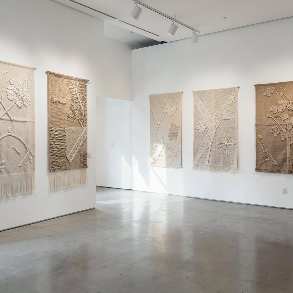
Not every gallery needs to be flat on the wall. Include fabric art, woven pieces, or layered paper relief so the space feels richer and more tactile.
Mix textures thoughtfully by using a repeating base color, like cream or muted taupe, then add a few standout textures. You’ll get uniqueness through surface, even if the artwork themes are simple or abstract.
For practical hanging, use sturdy backing boards and strong picture wire so heavier pieces stay secure. If you’re working with lightweight paper, avoid direct bright sun to help prevent fading.
9. Map Lines and Coordinates for a Travel-Loving Gallery
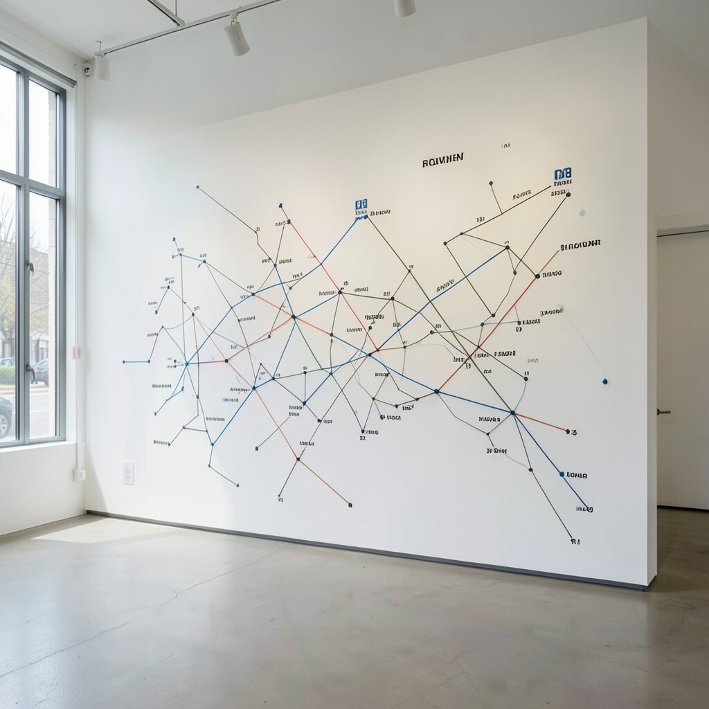
Create a travel-inspired gallery using maps, coordinates, and small drawings of routes. Visual lines can guide your layout, making the wall feel like a living itinerary.
Choose one approach, such as actual map prints or minimalist line maps, and keep the style consistent. This gives the wall a tidy look while still feeling full of stories.
Personalize by marking places that matter to you with pins, tiny labels, or custom cut paper shapes. A current trend is subtle “data art,” where maps and typography feel modern, so this idea fits right in.
For budget planning, print map pages and use simple frames, then save money for one or two custom pieces. The benefit is that you can keep adding new places over time without rebuilding the whole wall.
10. Monochrome Art With One Metal Accent
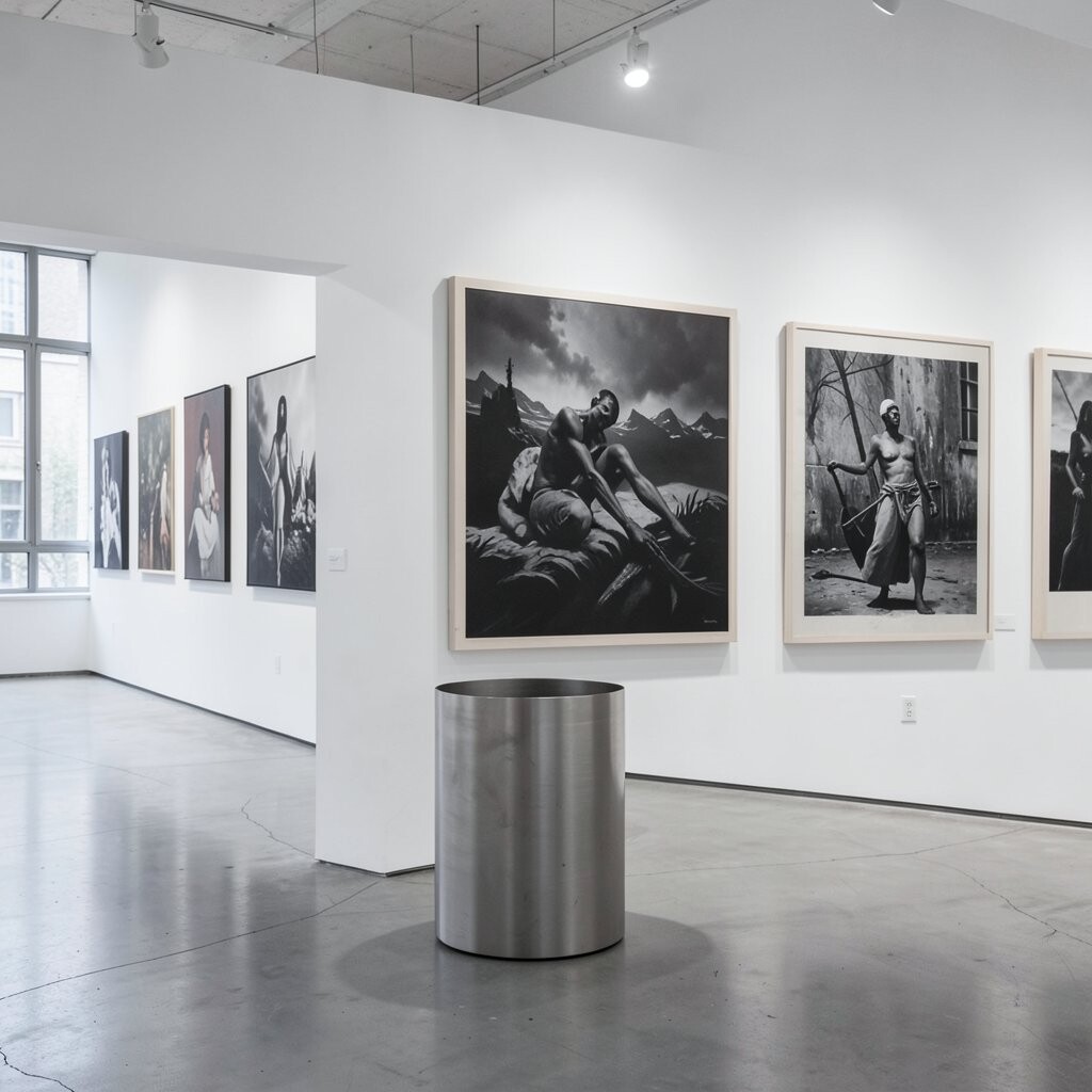
A monochrome gallery looks elegant and focused, especially when you use different shades like charcoal, off-white, and soft gray. Add one metal accent, such as gold or brushed steel, to keep it from feeling flat.
Layer the layout with art styles that differ in texture, like ink sketches plus photography plus subtle typography. Your wall still feels varied, even when everything is nearly the same color.
To keep it practical, use a limited frame palette so you don’t spend too much time matching. This is also easy to maintain because you can swap in new monochrome pieces without breaking the theme.
11. Two-Shelf Gallery in a Frame-Within-a-Frame Setup
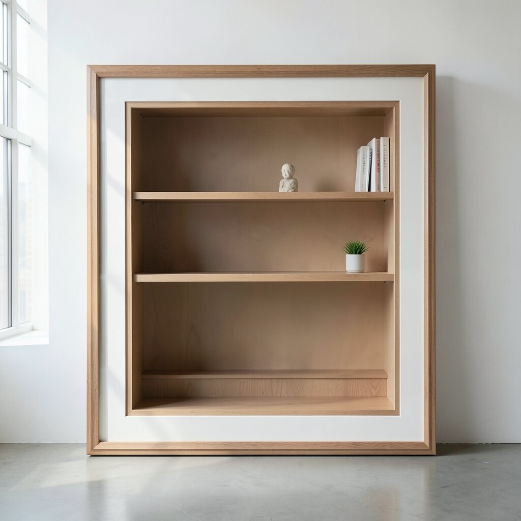
Use ledges or two narrow shelves to create a “gallery within a gallery.” Display small framed art on top, then place objects below, like ceramics, books, or small sculptures.
When the shelves line up with the wall frames, the whole area feels like a styled nook rather than scattered decor. This approach is great for renters because you can often anchor shelves into studs while keeping changes reversible.
For uniqueness, keep one shelf more minimal and the other more playful, so your eye enjoys both calm and surprise. You can also rotate small items seasonally, which saves money since you only update parts of the set.
Choose a finish that matches your room, like matte black shelves for modern spaces or warm wood for cozy rooms. The cost can be low if you use secondhand shelves and repaint them for a fresh look.
12. Shadow Art With Cutouts, Silhouettes, and Deep Mats
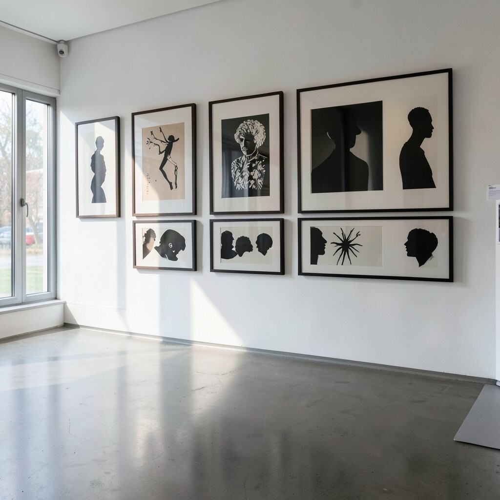
Try deep mats and cutout silhouettes to create shadow art that changes how light hits the wall. Even simple shapes, like leaves, faces, or geometric patterns, can feel dramatic when spaced away from the glass.
Use a consistent technique, such as black cutouts on cream backgrounds, so the gallery reads as one idea. This makes the design look intentional even if you mix different subjects.
For practical results, measure carefully and use mat board spacers or foam board layers so the depth looks even. If you want to keep costs down, create your cutouts with craft blades and thicker cardstock or reuse sturdier paper from old packaging.
Personalize it by choosing silhouettes connected to you, like family names, favorite animals, or symbols from places you love. The benefit is a unique three-dimensional look that still feels clean and modern.
13. Interactive “Pinboard-to-Print” Gallery for Frequent Updates
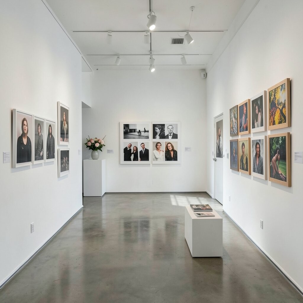
Build a gallery that can shift often by using a cork board, peg rail, or magnetic wall for display. You can pin temporary prints, then replace them with finalized frames when you know what you love.
This idea is helpful for artists and busy people because it removes pressure to get everything perfect on day one. You can test color palettes, try new layouts, and then commit only when your choices feel right.
Use a consistent border or frame size even while the content changes, so the wall still looks polished. For cost considerations, start with a budget cork board or peg rail and add frames only for the pieces that become your favorites.
Current trends favor flexible styling, where galleries evolve with the seasons and with ongoing projects. Personalize it by creating categories that reflect your life, like “sketches,” “photos,” and “memories,” all shown in one cohesive system.
To make it look neat, keep a small spacing rule and only pin artwork that fits your chosen color mood. Over time, your gallery becomes a living collage that feels uniquely yours.