Color blocking can make a room feel instantly more alive. The trick is choosing blocks that match your mood and your walls.
With the right layout, even soft pastels or bold brights can look polished and welcoming. You’ll get contrast, movement, and a style that feels truly yours.
1. Soft Blush With Buttermilk Panels
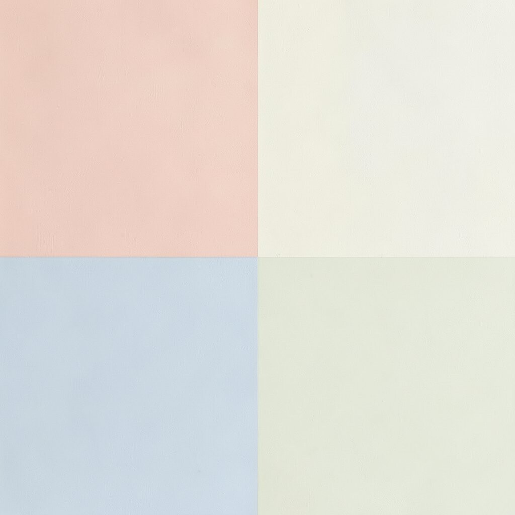
Start by picturing a wall where blush pink feels airy and warm, like light bouncing off curtains. Add buttermilk panels to bring in a cozy, sunny balance.
This pairing works beautifully when you want pastels to feel cheerful instead of sleepy. Keep the blocks a little larger so the colors read clearly from across the room. Use painter’s tape to plan crisp edges, and consider semi-matte paint to avoid glare.
2. Powder Blue Meets Warm White Strips
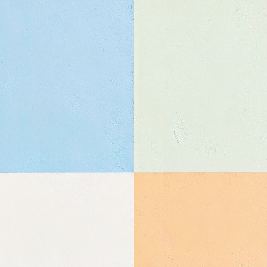
Think of powder blue as your calm base, then slice it into sections with warm white strips. The contrast feels clean, like crisp air after rain.
These strips make the wall look taller and more organized, which is a big win in small rooms. For the most flattering look, stagger the strip widths so it feels modern rather than boxy. Apply a primer first if your wall has stains or uneven color, because even coverage helps the blocks pop.
If you want it to feel more personalized, add one thinner accent strip in a slightly deeper blue so your eye has a place to land. This kind of design also stays timeless, which matches current trends toward simple shapes and calm color stories. You can often keep costs reasonable by using one main blue and one white, plus tape and roller covers.
3. Coral Corner Blocks With Linen Neutral
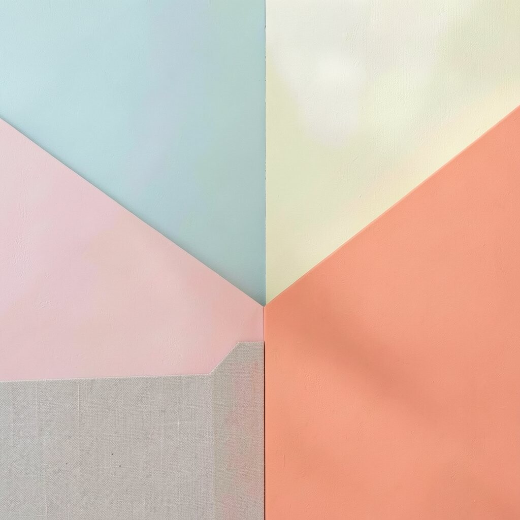
Picture a corner wall where coral blocks jump out, but the rest stays grounded in a linen neutral. The room feels sunny and welcoming without turning chaotic.
Coral works especially well when you want bright energy while still keeping things soft around the edges. Use larger coral rectangles near the top or in the most visible section of the wall. Then let linen neutral fill the gaps so the overall look feels airy and balanced.
For a practical upgrade, match the neutral paint to your existing trim or furniture undertones. Coral can vary in warmth, so test two shades on the wall at different times of day. This gives you confidence before committing, which can save money on extra paint coats.
If you love the current trend of “warm accent zones,” this layout gives you that effect in a way that looks intentional. Personalize it with coral blocks behind a reading nook chair, so every time you sit, the wall feels like part of the experience.
4. Sage Green Bands Over Soft Sand
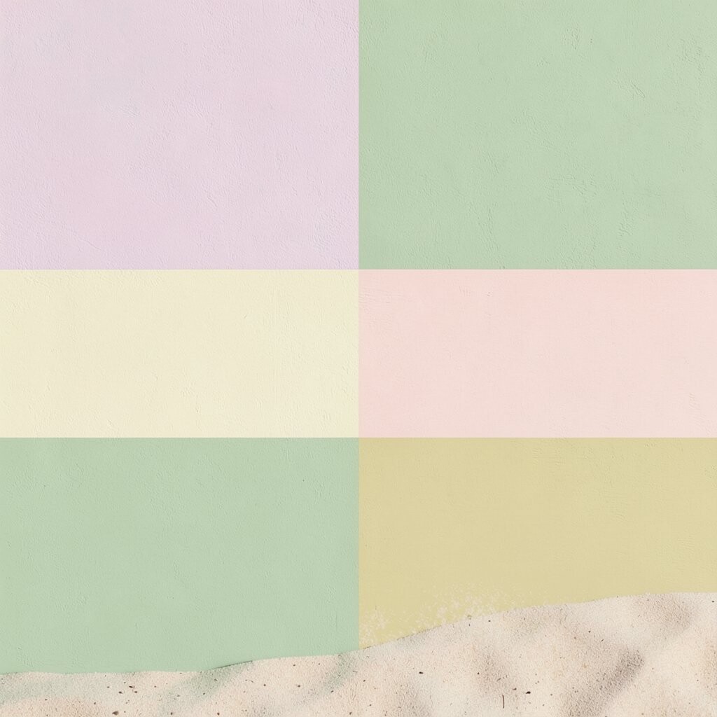
Sage green bands layered on soft sand create a gentle, spa-like vibe. Imagine slow sunrise colors that feel comfortable and modern at the same time.
This option is perfect if you want pastels to feel fresh while staying grounded. Keep the bands at eye level in the most visible area so the effect feels curated. When you paint, press tape down firmly and remove it slowly while the paint is still slightly tacky for sharp lines.
If your room has natural wood or woven textures, this color story looks especially good. You can also add one small sage rectangle near a shelf to make the design feel connected. Because both colors are calmer, it’s easier to live with long-term and less risky if you change decor later.
5. Terracotta Squares With Creamy Off-White
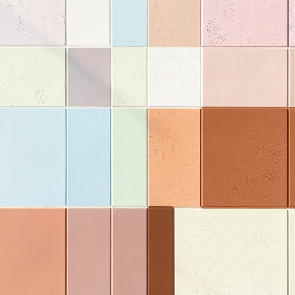
Picture terracotta squares floating on a creamy off-white wall. The result feels artsy and warm, like a handmade tile pattern without the fuss.
This style gives you strong uniqueness because square blocking looks graphic and full of personality. Keep the grid loose rather than perfectly uniform so it feels organic. A quick practical trick is to draw light pencil lines for layout only, then tape along your guide marks.
Terracotta also pairs well with many modern decor trends, especially earthy accents like rattan, clay lamps, and natural fiber rugs. If you’re worried about cost, buy a smaller tester set and plan how many squares you’ll actually need before opening full gallons. Personalize it by using slightly varied terracotta tones for two or three blocks, creating depth that feels intentional.
6. Lemon Yellow Block Over Light Gray
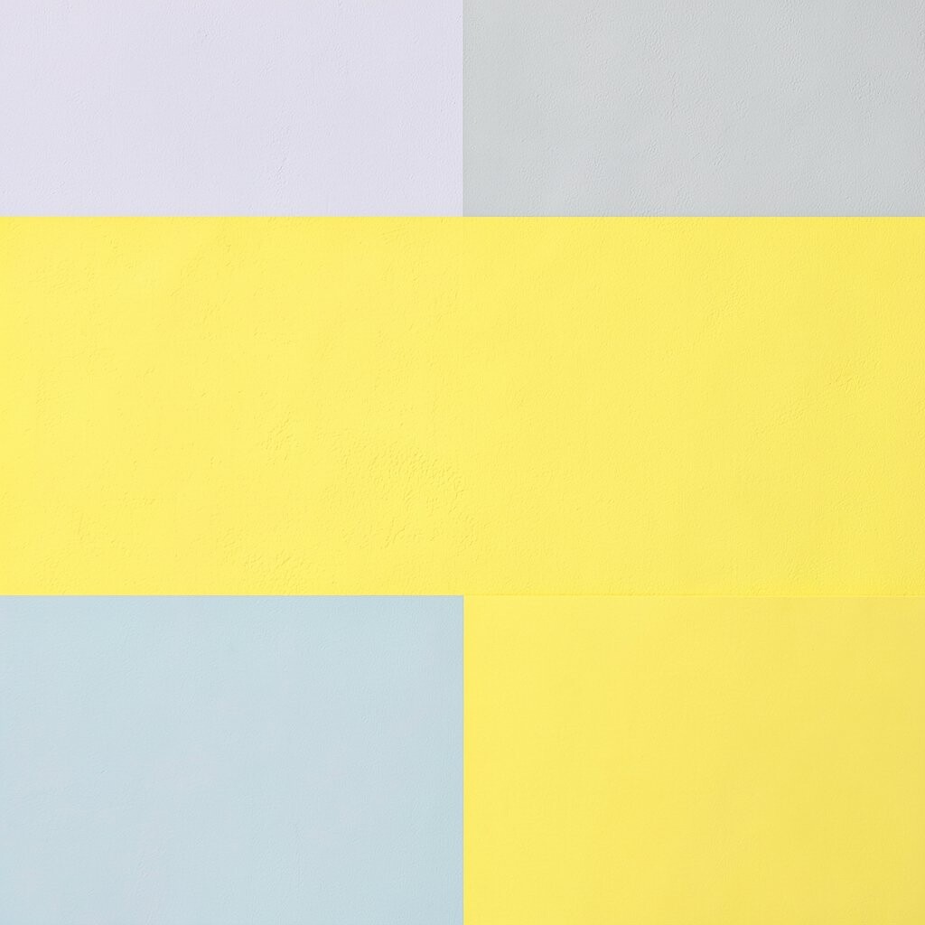
Lemon yellow on light gray looks playful and clean in the best way. It’s like adding a bright splash of energy without the whole room feeling loud.
This is a great pick when you want a bright wall that still feels calm enough for everyday life. Place the largest lemon block where it catches natural light, then use gray in the surrounding sections to keep the space airy. For the crispest edges, use a high-quality tape and roll over the tape line gently before painting.
Lemon yellow can be tricky, so test swatches and pay attention to undertones. Some lemons lean more orange, while others feel more greenish, and the difference shows up fast. If you want it to look trendy, pair the wall with simple, modern frames and keep your other colors neutral. This approach can fit many budgets because you’ll mostly use two paints and tape.
7. Lavender Panels With Charcoal Outline
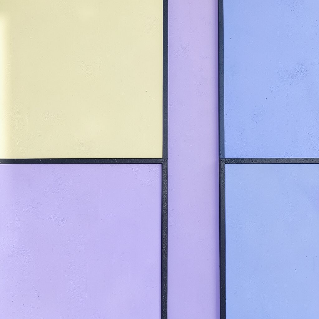
Imagine lavender panels that feel dreamy, then framed with a thin charcoal outline. The edges create a gallery-wall vibe, even in a small space.
This is a smart way to keep pastels from looking flat. The charcoal lines add structure and make the lavender look richer and more intentional. Use painter’s tape to create the outlines, and paint the lavender first, then carefully remove tape before adding the charcoal so the layers stay crisp.
If you like uniqueness, try mixing panel sizes so the wall looks collected instead of cookie-cutter. Lavender plus charcoal also matches current trends toward “bold outlines” and modern contrast. For personalization, echo the charcoal color in decor like a matte vase or a black picture frame. Cost-wise, charcoal is often darker and covers well, so you may not need as much paint overall as you think.
8. Teal L-Shaped Blocks With Soft White
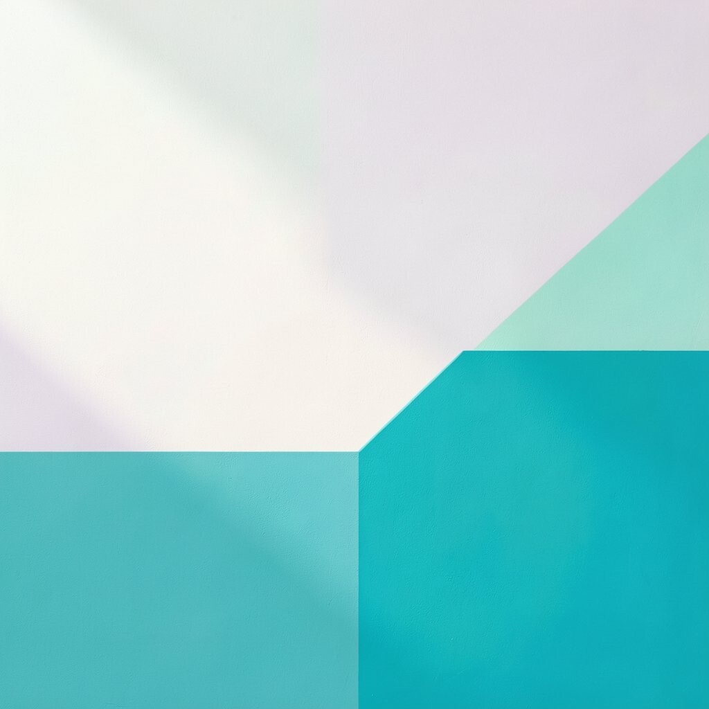
Teal L-shaped blocks can make a wall feel like a design studio backdrop. Picture sharp angles that guide your eyes and add movement without clutter.
Teal is bright but still balanced, especially when paired with soft white. Keep the teal blocks in an L pattern around a doorway or a key furniture spot, so the shape feels purposeful. Use a level and measure twice, because angled tape lines look best when they’re truly straight.
This layout works well in current styles that favor geometric planning and clean lines. It also helps you personalize the wall by repeating the teal shape in smaller ways, like a matching accent shelf bracket. If you want to manage cost, use soft white as the big background and reserve teal for the bold blocks, so the expensive color goes farther.
For practical comfort, choose a paint finish that’s easy to wipe, especially in hallways or kitchens. That makes your new wall look fresh for longer with less effort.
9. Peach And Mint Vertical Division
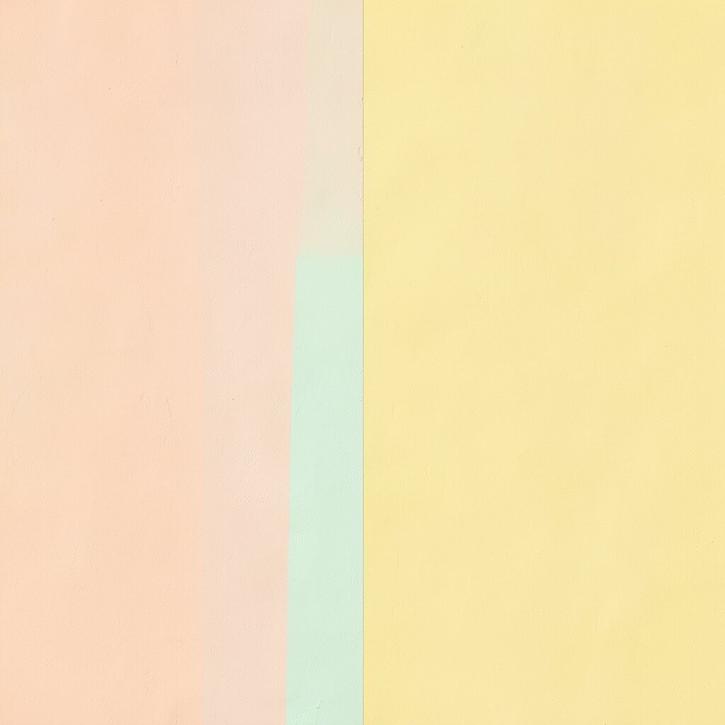
Vertical color division with peach and mint can feel refreshing and light. The wall looks like it’s breathing, with color that flows up instead of only sitting flat.
Peach brings warmth, while mint adds a cool snap, so together they look sweet and balanced. Choose vertical blocks that are slightly different widths so the design feels lively. A helpful tip is to start with the widest section so you can align everything from a stable anchor point.
If you want the effect to look taller, keep the vertical blocks uninterrupted and avoid small breaks near the ceiling. This color combo also fits many modern trends that lean toward “fresh and fruity” palettes for cozy spaces. For personalization, use a deeper peach on one block to create a subtle gradient feel without mixing paints on the wall.
10. Bright Pink Rectangle Feature With Baby Gray Surround
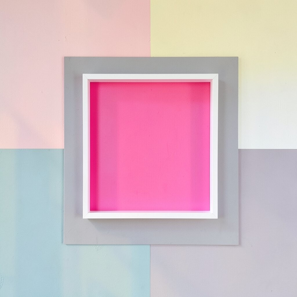
A bright pink rectangle feature instantly turns a wall into the room’s mood board. Surround it with baby gray so the pink feels even more vibrant and confident.
This approach is great when you want one big statement without covering every inch in bold color. Place the feature behind a sofa, a desk, or a dining sideboard so it becomes the visual focus. For crisp edges, paint the gray first, tape the rectangle, then paint pink carefully and remove tape before the paint fully dries.
Pink can be bold, so keep surrounding decor simple with whites, light woods, and soft fabrics. This keeps the design from feeling overwhelming while still feeling exciting. If you’re cost-conscious, you’ll likely use less bright paint because it’s mostly contained to one rectangle. Add uniqueness by using a second thin line of a slightly different pink shade inside the rectangle for a “shadow” effect.
11. Monochrome Pastel Blocks With a Single Accent Pop
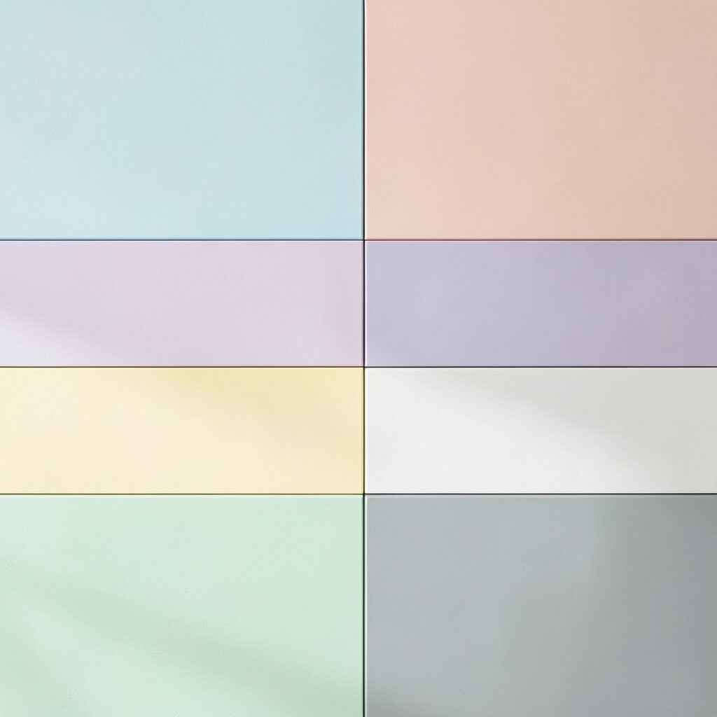
Start with a pastel wall that uses several related shades, like powder, oat, and soft rose. Then add one accent block in a vivid color for a surprising hit.
This method looks high-end because it keeps everything cohesive. You get movement from the block layout, but the colors don’t fight each other. Try using three pastel tones as the main blocks, and place the vivid accent near eye level so it feels like a deliberate moment, not an accident.
It’s also a practical way to manage cost because your pastel shades might come from the same base system or color family. For personalization, choose your accent color based on your existing textiles, like a cushion or a rug pattern. Current trends favor intentional contrast like this, where one bold note makes the rest feel curated.
If your space is small, this strategy can keep it from feeling heavy since most blocks stay light. It’s a friendly way to go bold while still feeling safe and comfortable.
12. Warm Gold Frames Around Light Blue Fields
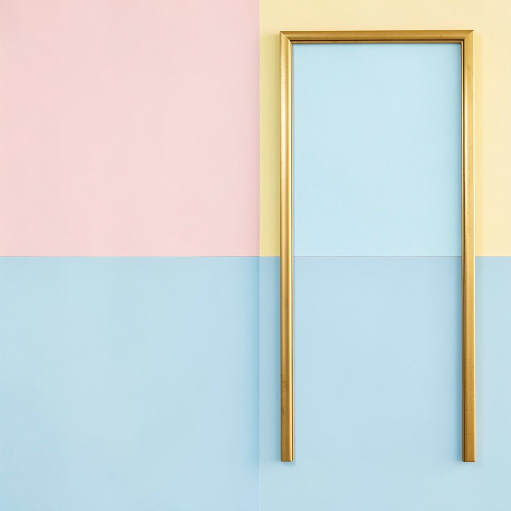
Warm gold frames around light blue fields feel like classic architecture with a modern twist. Imagine a wall designed like a series of windows that glow softly in daylight.
This layout is unique because the gold acts like a “drawn” structure, even though it’s real paint. Use light blue as the main fill, then create framed rectangles with gold lines using tape. To keep things tidy, paint the gold carefully and use a smaller angled brush for the edges around tape.
You’ll also benefit from how this style organizes the room visually. It looks especially good in living rooms with neutral furniture because the gold brings warmth and the blue keeps the vibe fresh. For personalization, vary the spacing between frames so it feels tailored to your wall size instead of perfectly factory-made.
Cost can be managed by using gold paint for lines only, not huge blocks. If gold feels too intense, choose a muted metallic or a warm tan instead. Either way, the frame approach is very on-trend for people who love design details that feel special.
13. Dark Navy Geometry With Pastel Neighborhood
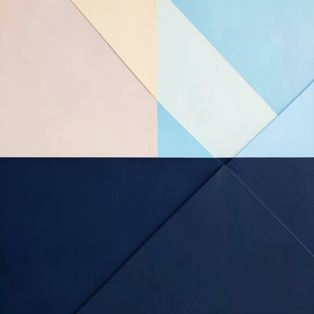
Dark navy geometry makes pastels look brighter, like a nighttime sky for soft colors. Picture navy triangles and rectangles scattered around a wall, while pastel blocks fill in the friendly spaces.
This combination feels bold and modern, yet it still lets you keep a pastel mood. The navy gives structure and contrast, making even delicate shades stand out. For a practical result, limit navy to certain geometric areas and keep most of the wall light so it doesn’t shrink the room visually.
To personalize, choose pastels that match your decor, like blush with cream, or mint with soft gray. This kind of geometric blocking also reflects current trends toward statement shapes and playful contrast. If you’re worried about effort, plan your design with paper templates so tape lines are fewer and easier to measure.
Cost-wise, you may spend a bit more on the dark paint, but you’ll use it strategically. The payoff is huge because the navy pattern will read clearly and remain striking even as you swap pillows, art, or rugs over time.