
A wall of chalkboard signs can make everyday choices feel special. It turns a simple menu into a warm, hand-drawn invitation.
1. Rustic Welcome Menu Wall
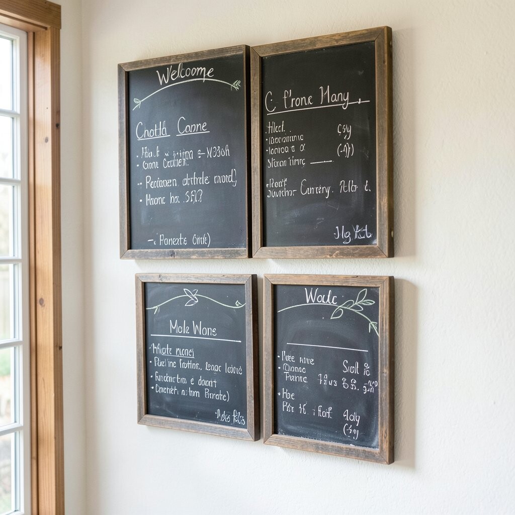
The first thing you notice is the cozy, slightly imperfect texture of chalk on dark boards. Each sign sits like a mini poster, with inviting headings and neat lists that feel homemade.
This style works because it softens hard surfaces and brings visual comfort to a busy counter or entry spot. Use thick chalk lines for the main items, then thinner strokes for details like prices, descriptions, or spice notes.
To make it practical, plan your layout so the biggest sign is at eye level and the smaller boards flank it. Choose wood frames or natural trim to match your space, and keep the writing consistent by using one chalk color for headings.
2. Modern Minimal Blackboards
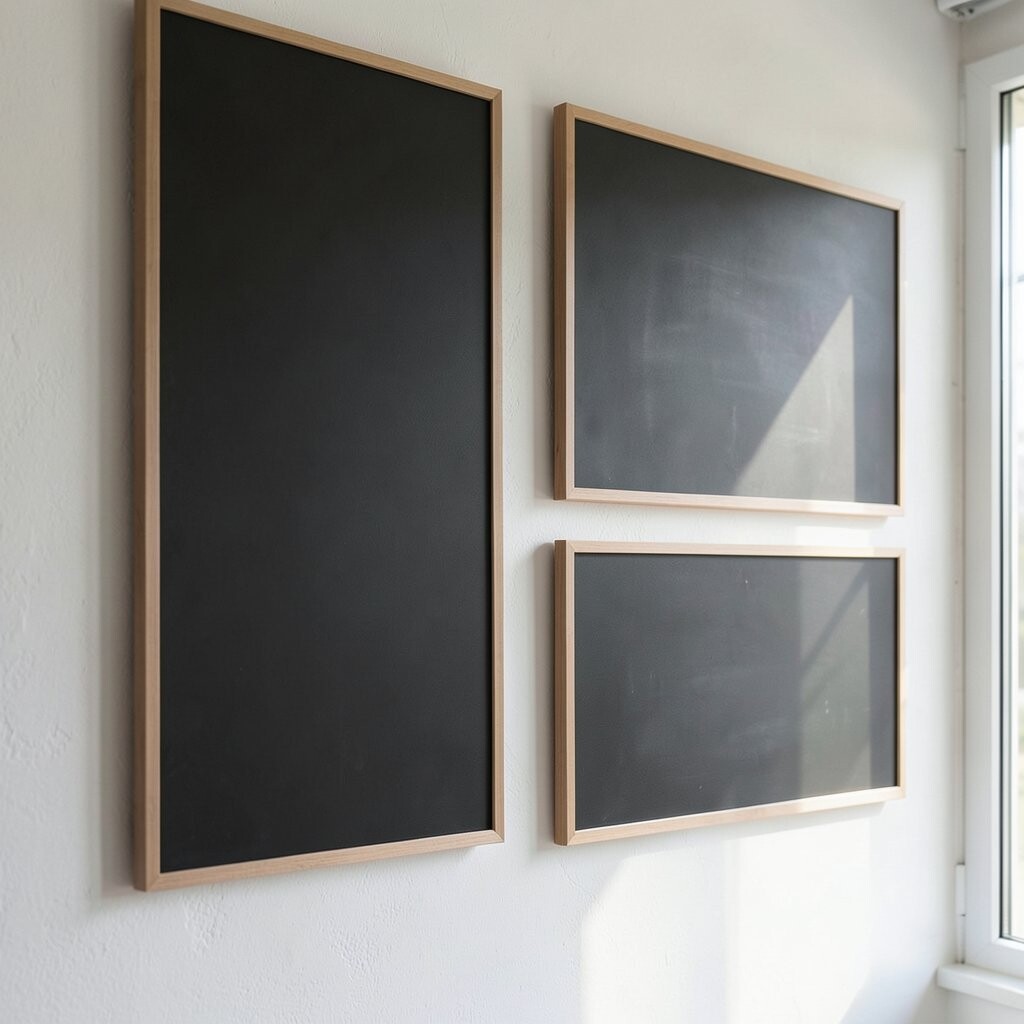
For a clean look, a row of sleek chalkboards can feel calm and organized. The matte black surface makes your fonts stand out without visual clutter.
Switch to simple typography style lettering, with lots of spacing between sections. This benefits you because customers can scan faster, and your wall stays tidy even when you update the menu often.
To keep it easy, use the same grid spacing on every board so lines and alignment look uniform. If you want it to feel unique, add a small icon style near each category, like a tiny coffee cup or leaf, drawn in one consistent size.
3. Vintage Café Menu Gallery
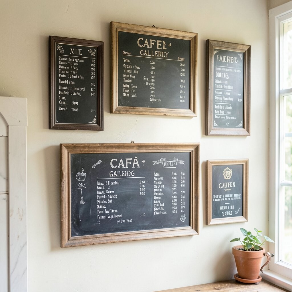
Imagine a gallery wall where chalkboards look like they belong in a charming old street café. You get layers of frames, different board sizes, and a mix of handwriting that feels full of character.
The visual appeal is strong because the wall becomes part of the storytelling, not just a place for prices. You can also add short seasonal notes that make repeat visits feel fresh without changing everything.
Try mixing one large “Today’s Specials” board with several smaller boards for drinks, desserts, and quick bites. For personalization, write in a slightly curved script on the larger signs and keep the smaller ones more straightforward.
As a cost consideration, you can start with fewer boards and add more later since chalkboards are easy to swap. Look for sales on framed boards, and reuse cheap frames from craft stores if needed.
4. Coastal Blue Beach-Theme Boards
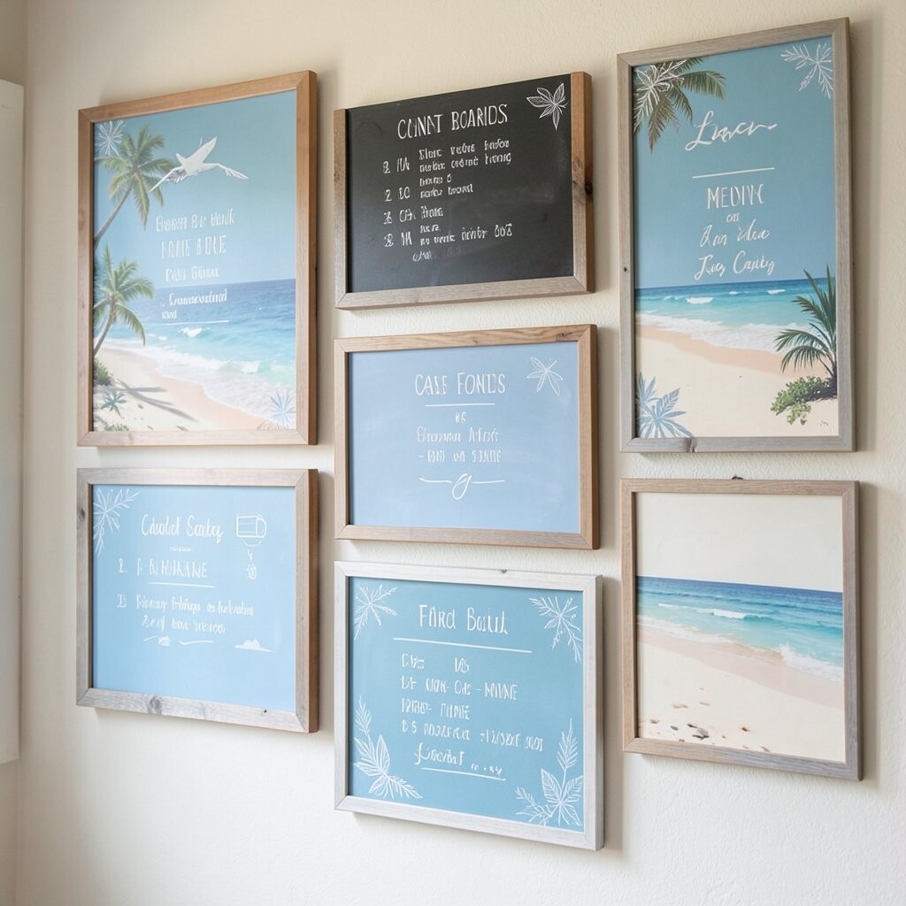
A chalkboard wall can feel beachy when you pair it with soft coastal colors and light wood. The contrast of dark boards with airy signage creates a breezy look that still reads clearly.
Add subtle accents like sand-tone borders on each board or a single splashy color chalk for icons. This is a practical way to keep the vibe fun while still making menus easy to understand for families and visitors.
Use short item lines and avoid overcrowding, especially if your chalk writing is more playful. For uniqueness, draw simple wave patterns between sections so your layout looks designed without taking extra time.
5. Farm-to-Table Ingredient Wall
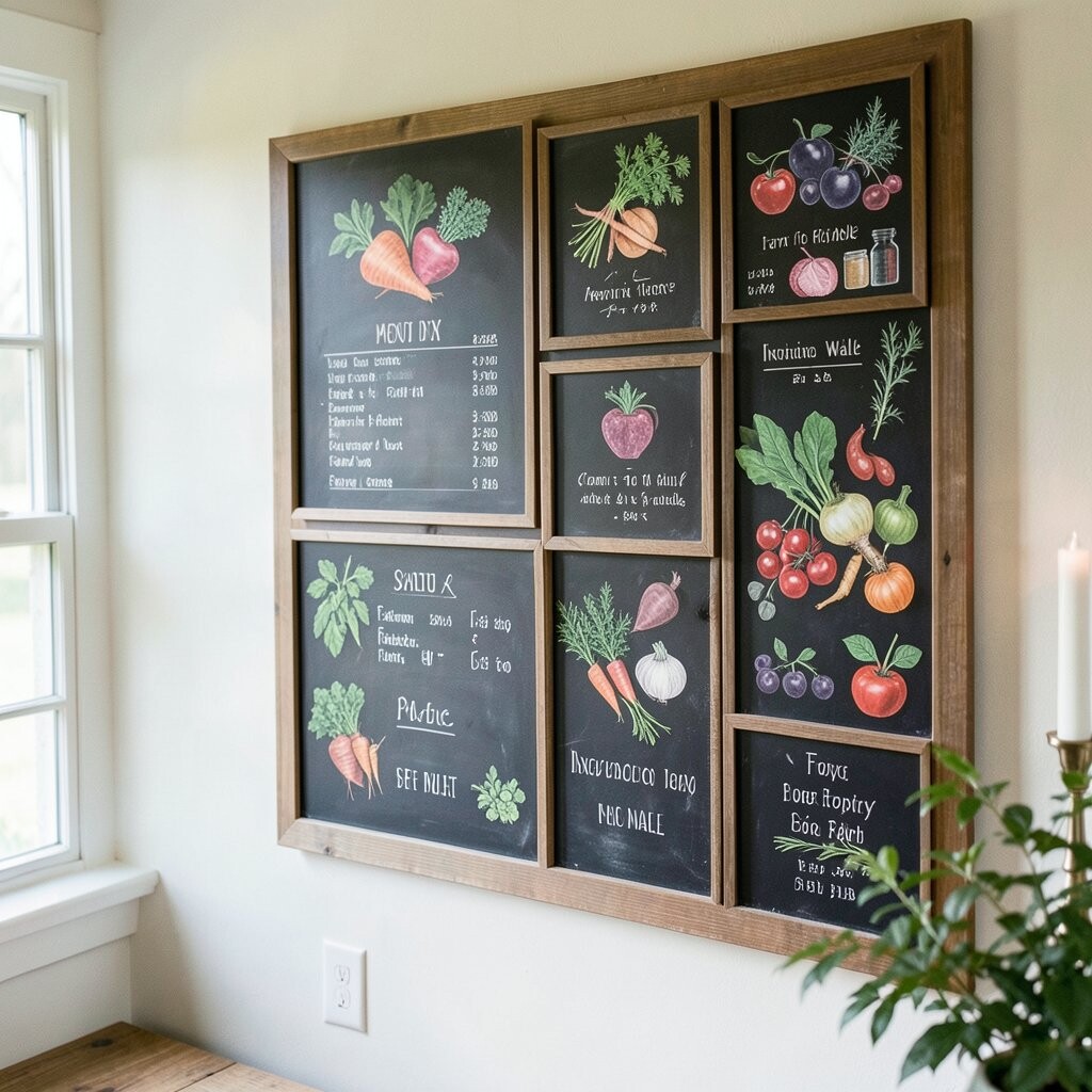
A “farm-to-table” chalkboard wall instantly makes the space feel fresh and grounded. You’ll love seeing handwritten ingredient lists beside small drawings of herbs, vegetables, or eggs.
This benefits your menu because customers connect ingredients to quality, not just names. Keep wording friendly and direct, like writing “roasted carrots” instead of vague descriptions, and add an easy seasonal rotation when possible.
Personalize it by dedicating one board to sourcing, such as “Local farms we love,” and update it weekly. For practical tips, use a consistent format across boards so the wall looks organized even as items change.
6. Color Pop Chalkboard Accents
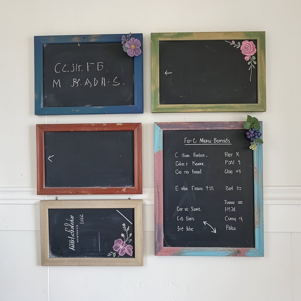
Even though chalkboards are known for black and white, color accents can bring them to life. Think bright chalk icons, colored borders, and tiny spot illustrations that make your menu feel playful.
This approach is unique because it guides attention while still keeping the main text readable. Use color only for key items like specials, allergy reminders, or “new” dishes so the wall doesn’t turn busy.
Try pairing colors with your brand, like teal for drinks and warm orange for comfort food. To personalize, add a small signature doodle in the corner of each board so customers learn your style.
7. Monthly Specials Countdown Board
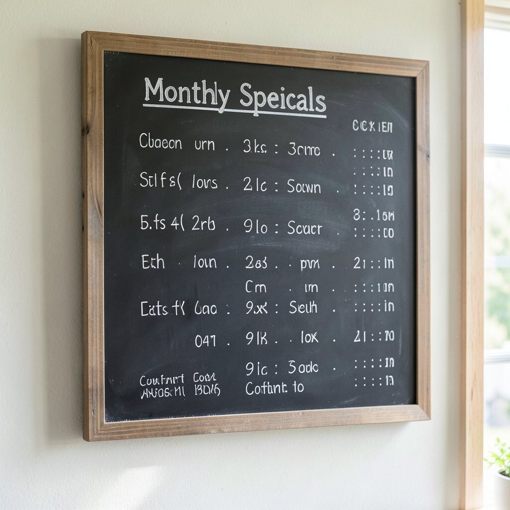
A chalkboard wall can include a “monthly specials” section that feels like a countdown to something good. The visual rhythm of a repeating layout makes it look intentional and inviting.
Write a main headline, then list a few rotating favorites, each with a short note on flavor or ingredients. The benefit is that your menu stays dynamic without you rewriting everything from scratch.
For practical tips, keep a template in mind so you can update dates and items quickly. Use light chalk for background hints, like faint lines or small patterns, so the main writing remains the star.
8. Wine and Coffee Pairing Boards
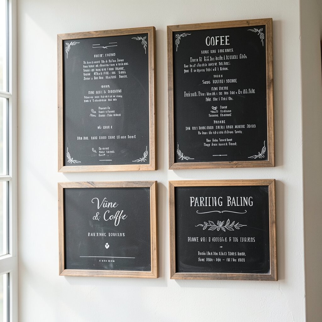
Chalkboard signs become extra charming when they show pairings, not just separate lists. You can picture a wall where coffee flavors sit next to sweet bites, and wine notes match small plates.
The benefit is that the menu feels helpful, and customers enjoy choosing combinations. Use clear, simple wording like “bright espresso with citrus cake” so people can imagine the taste right away.
Make it unique by drawing tiny tasting notes icons, such as a sun for bright flavors or a leaf for herbal profiles. For personalization, create two styles of handwriting, one for drinks and one for food, so sections feel distinct.
To manage cost, use just a few boards for pairings and rotate lists weekly instead of printing new signage constantly. A new chalk set and a clean eraser can go a long way toward keeping everything looking fresh.
9. Chalkboard Shape Wall With Frames
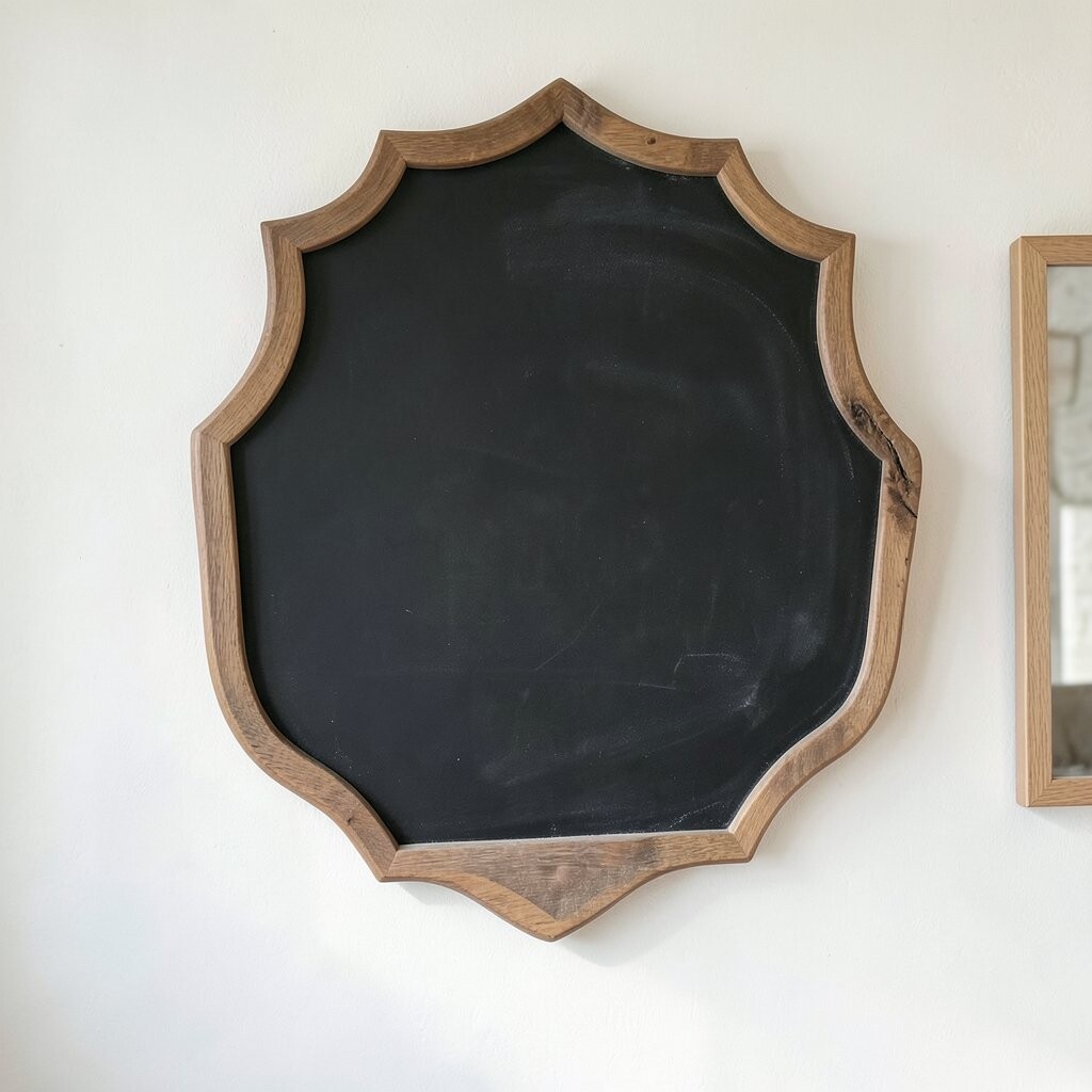
Instead of using only rectangles, you can build a chalkboard wall with fun shapes like circles, arched boards, or labels. The visual change makes your menu feel like décor, not just information.
These shapes offer a unique way to group items, such as putting sandwiches in one rounded board and desserts in a tall arched one. It also benefits readability because customers naturally look where shapes guide them.
Keep practical tips in mind by ensuring each board still has enough writing space for clear item lines. Choose frames that match your room, and lightly sand or repaint if you want a smoother finish without spending much.
For personalization, carve tiny seasonal stamps into the frame style, like a small star for winter or a tiny leaf for spring. If you’re watching cost, consider thrifted frames and buy only the chalkboard material as needed.
10. Kids’ Corner Snack Wall
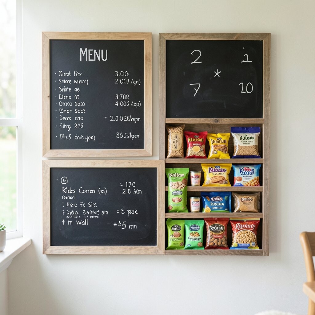
A dedicated chalkboard wall for kid-friendly snacks brings warmth to family-friendly spaces. Bright icons and friendly handwriting make it feel like a mini playground of flavors.
Write shorter menu lines with simple words, and include a small “no fuss” section for easy picks. The benefit is that parents can scan quickly, and kids feel included when the choices look fun.
To personalize, add simple checkmarks for choices like “mild” or “crunchy,” and draw smiling faces near favorites. For practical tips, keep the board heights comfortable for both adults and children, especially if it’s near a high-traffic counter.
11. Night Market Street-Style Menu Boards
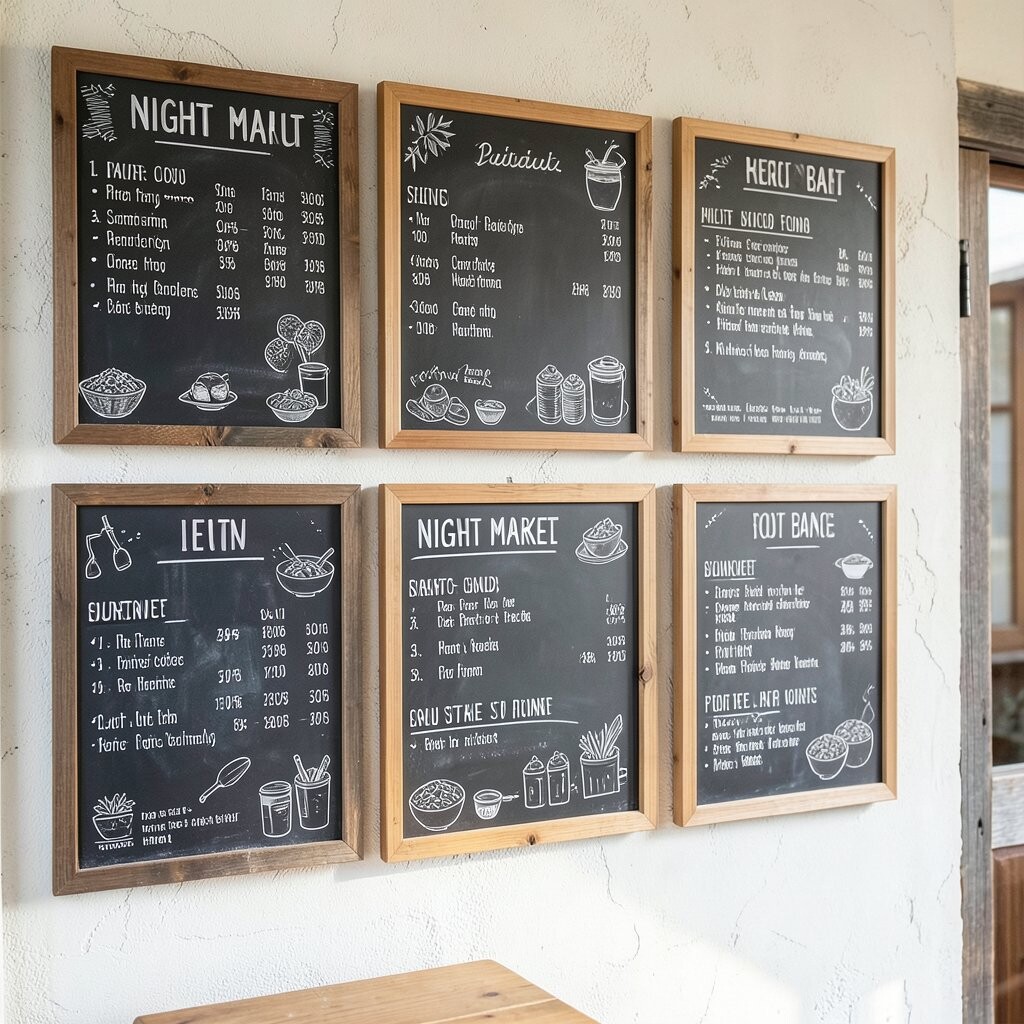
If you like an energetic vibe, a street-style chalkboard wall can bring that “night market” feeling indoors. Imagine stacked boards, bold headings, and little doodles that look like they’re part of a lively scene.
The visual energy helps your menu stand out, especially in spaces with lots of competing signs. It’s also uniquely flexible because you can change themes for holidays, pop-ups, or themed evenings.
Use larger chalk headings and keep descriptions short, focusing on flavors and textures. For personalization, add mini stamps like “spicy,” “smoky,” or “sweet” drawn as simple icons so you don’t need long explanations.
Cost-wise, you can reuse boards and just repaint frames when you want a new look. A few quality chalk markers plus extra chalk can help you keep lines crisp even when you erase often.
12. Elegant Blackboard Menu With Gold Details
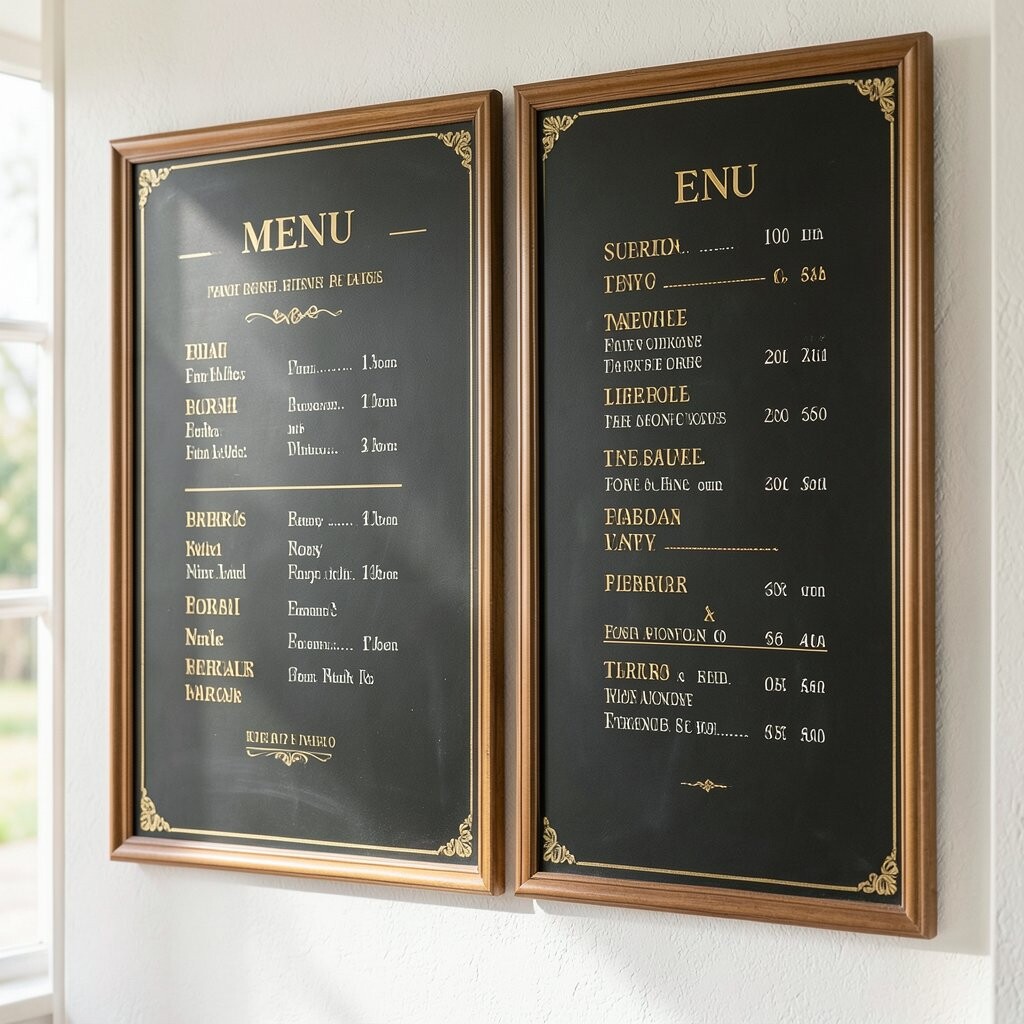
Chalkboard signs can look surprisingly fancy when you add gold-toned accents. Even if the boards stay dark, the details make the whole wall feel dressed up.
This benefits your space because it gives customers a “special occasion” feeling without adding clutter. Use gold highlights sparingly, like underlining key items or marking drink names, so the text stays readable.
For practical tips, write the main menu in clean chalk, then add gold accents with a separate tool for steady results. Personalize by using your brand color as a soft accent line, so the wall matches your overall décor.
13. Garden Patio Herb and Tea Wall
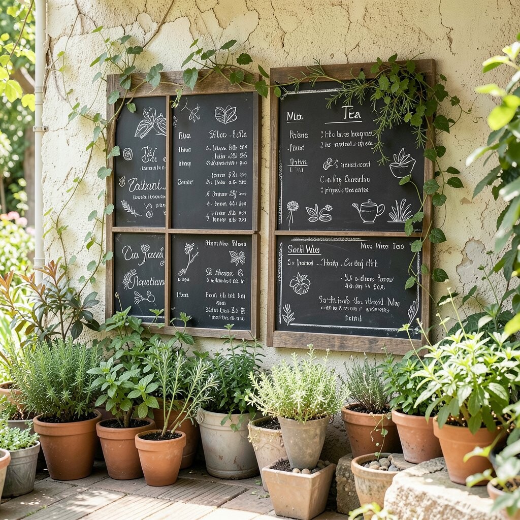
A chalkboard wall near a patio can feel like a garden guide. When you draw herb sketches and tea descriptions, the area becomes more inviting, like you’re sharing secrets.
This style is unique because it blends nature cues with helpful menu guidance. It also benefits customers by making it easy to choose based on flavor mood, like “earthy” or “bright.”
Try organizing the boards by brew method or herb family instead of just listing items. For personalization, add a small “pair with” line for each tea, such as “great with scones” or “perfect with citrus desserts.”
Cost considerations are friendly here since you can start small and expand as your patio menu grows. Keeping a schedule for outdoor touch-ups helps too, since chalk can fade with heavy moisture exposure.
14. Interactive “Write Your Own” Message Boards
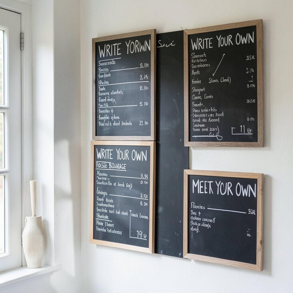
One of the most charming chalkboard wall ideas is adding a space where people can participate. A blank or lightly lined board invites customers to leave notes, requests, or compliments in your own chalk style.
The benefit is that your wall becomes lively, not static, and it builds a sense of community in your space. To keep things manageable, set clear boundaries with simple sections like “suggestions” and “thank you,” and wipe it clean regularly.
For uniqueness, include a small seasonal question prompt, like “What should we feature next?” and draw a tiny border around the prompt so it stands out. Personalize the rest of the menu with consistent lettering so the interactive part feels integrated, not random.
As a cost consideration, this can reduce the need for extra printed signage since you can update the prompt quickly with chalk. Use a good eraser and consider a soft cloth for quick smudges so your wall looks tidy even on busy days.