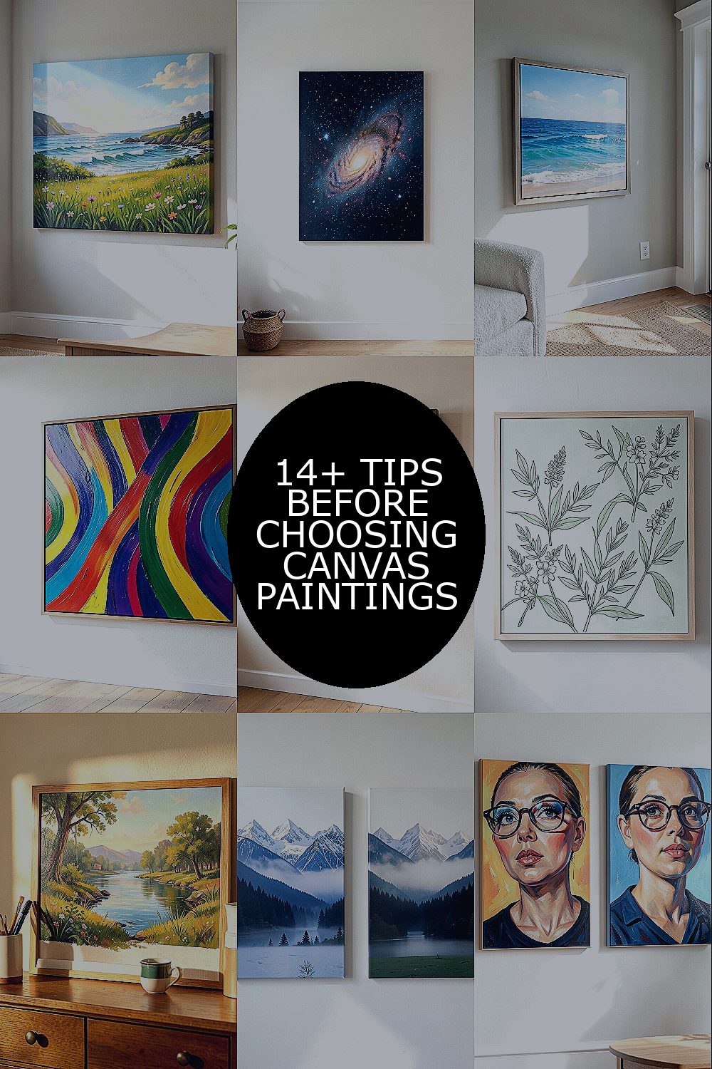
The right canvas painting can make your room feel alive in a heartbeat. It also helps your space look like it has your personality baked into every corner.
Below are canvas favorites that add color, comfort, and conversation-ready style without overwhelming your home.
1. Sunlit Meadow Waves
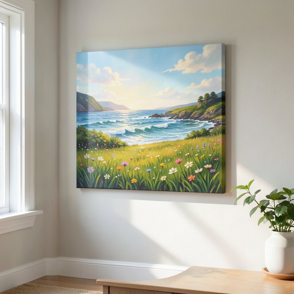
Picture a wide canvas filled with soft grasses and gentle hills, where warm yellows blend into honeyed greens. The brushstrokes look like a breeze moving across the scene, and it instantly feels brighter than the wall around it.
You can use this kind of painting to make a living room feel calm but not dull, especially if your furniture is neutral. Pick a frame color that matches your decor, like natural wood for a cozy look, and try hanging it at eye level so it feels welcoming.
2. Celestial Night Bloom
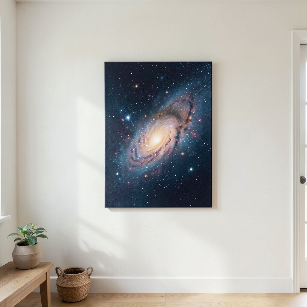
Imagine deep navy tones with scattered star dots and blooming flowers that rise like magic from the dark. The contrast feels dramatic yet soothing, and your eyes naturally rest in the center of the canvas.
This painting style works great for bedrooms, reading nooks, or any space that needs a little quiet drama. For a personalized touch, choose a matching pillow color from the painting’s petals and repeat it on two or three small items so the room feels intentional.
If you want to stay budget-friendly, look for smaller canvases that still pack a punch with color. Canvas prints often cost less than original art, and you can still get that “wow” effect with the right size.
3. Coastal Doorway to Blue
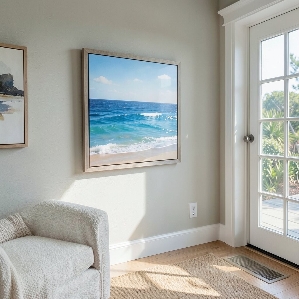
Think of a seaside view where the horizon is crisp and the sky feels wide, as if you could step right into the air. A doorway or arch shape adds structure, and that geometry helps the artwork look polished and modern.
This kind of canvas painting brightens your wall because blue hues reflect light well, especially near lamps. Choose a piece with both light and mid-tone blues so your room won’t feel flat when the sun goes down.
To make it practical, place it across from a mirror or near a light source so the colors look even more vivid. For personalization, pair it with shell-toned decor like off-white ceramics or pale sand-colored textiles.
4. Bold Abstract Color Ribbons
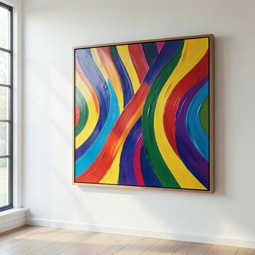
Picture layered swaths of paint that curve like ribbon candy across the canvas, mixing teal, coral, and soft cream. The motion in the strokes makes the artwork feel playful, and it adds energy without requiring a detailed scene.
You’ll benefit from this piece if your wall feels too plain, because abstract art gives instant color and movement. If your room is already busy with patterns, pick an abstract canvas that stays mostly in one or two dominant colors so everything stays balanced.
5. Vintage Market Street Warmth
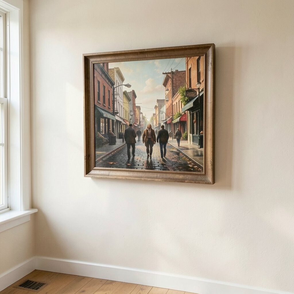
Close your eyes and you can almost smell fresh bread as you look at a street scene with warm storefront colors. The painting style feels nostalgic, and the gentle perspective makes the space seem deeper than it actually is.
This is a great option for hallways and dining areas because the warm palette feels social and inviting. Try matching the painting’s main color to a simple element like a runner rug, a candle holder, or the finish of your wood furniture.
If you’re shopping with cost in mind, look for canvases that include a clear focal point like a storefront sign or a bright doorway. Those tend to feel more “complete” even at smaller sizes, so you get more visual impact per dollar.
6. Botanical Line Art in Soft Green
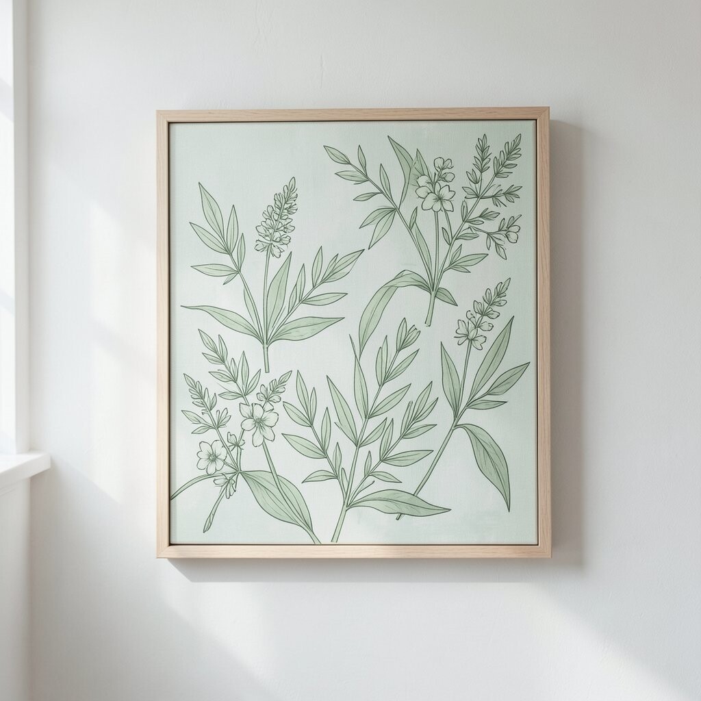
Imagine slender leaves drawn with confident lines, then lightly shaded with calm greens and pale neutrals. The style is airy, and it makes your wall feel fresh instead of crowded.
This painting gives you the best of both worlds, because it looks modern while still feeling gentle and natural. It’s especially helpful if you want color but you don’t want loud colors competing with your furniture.
To personalize it, choose a plant-based piece that includes a few hints of your favorite accent color, like mustard or terracotta. You can also repeat the leaf shape in decor by using throw pillows with subtle botanical prints.
When it comes to practicality, line art often looks great in smaller formats, so you can upgrade your walls without breaking the budget. Look for canvases that feel crisp and clean up close, because that clarity makes the whole design feel more expensive.
7. Golden Hour Tabletop Light
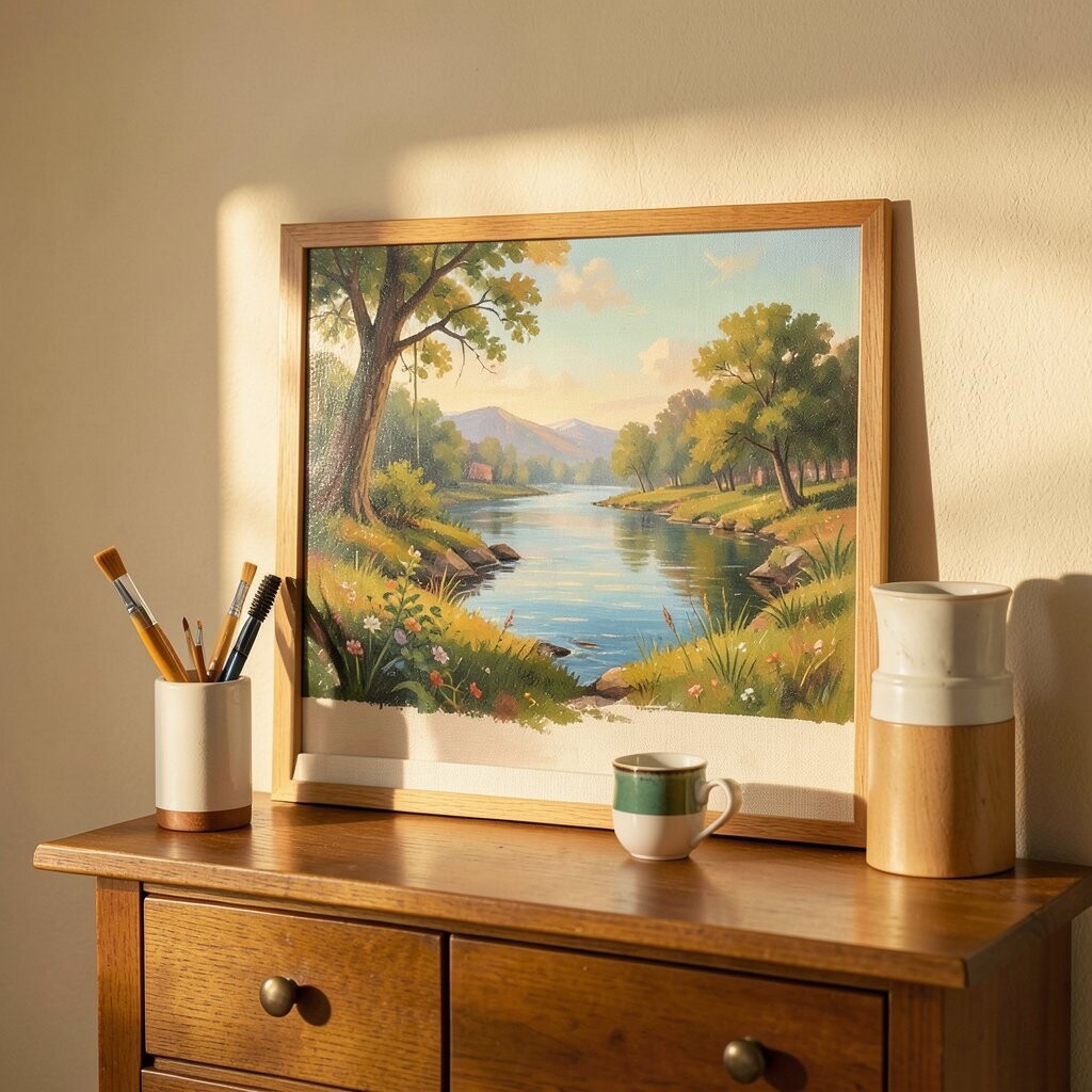
Think of warm still-life objects, like a vase with sunlit tones, painted with rich golden highlights. The shadows are soft, and the whole scene looks like it’s glowing even when your lights are off.
This style brightens your wall by adding warm color temperature, which makes spaces feel cozier fast. It also works well in kitchens and dining rooms because it pairs beautifully with everyday textures like glass, wood, and stone.
If you want an easy personalization idea, match the painting’s dominant warm color to your lamp shade or a nearby ceramic set. A simple wooden frame can make it look classic, while a thin black frame can push it toward modern style.
8. Mountain Mist Minimalism
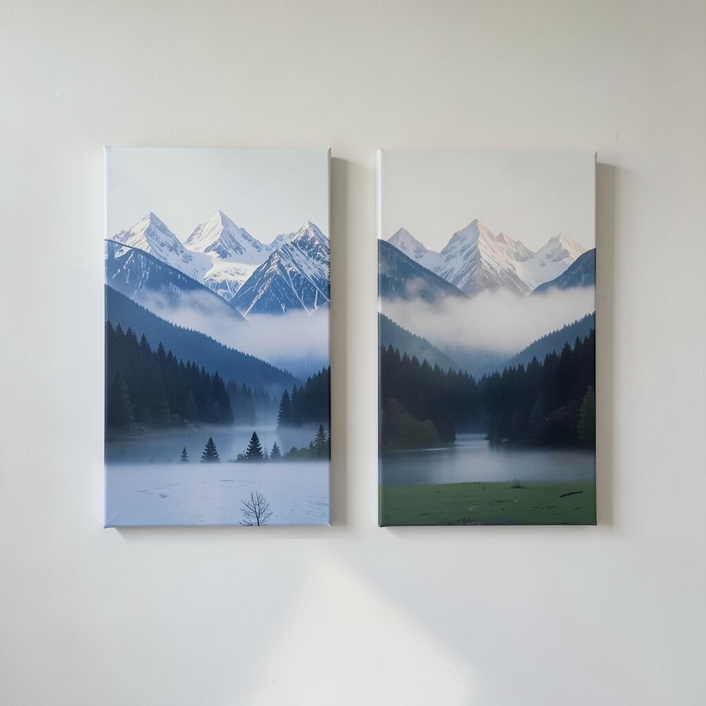
Picture soft mountain shapes fading into misty grays and pale blues, like the view from a quiet overlook. The calm spacing across the canvas makes your room feel bigger, and the colors are gentle on the eyes.
This is a strong choice for people who want brightness without intense contrast. If your space has lots of dark furniture, the mist tones balance everything and keep the wall from feeling heavy.
For practical hanging, center it in a spot with natural light, since the lighter grays will reflect that brightness back. Personalize the look by choosing a canvas size that matches your wall proportion, like a taller piece for high ceilings or a medium piece for a standard wall.
9. Color Splash Pop Faces
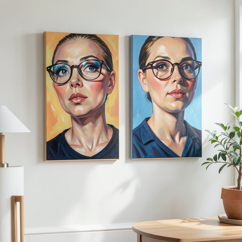
Imagine playful portraits built from bold blocks of color, with expressive eyes and lively shapes. The painting feels fun and creative, and it gives your room an instant personality boost.
This kind of artwork is perfect when you want something upbeat that still looks stylish. It also works well in spaces like home offices or craft rooms because it can make work feel less boring and more inspiring.
To keep it practical, hang it where you’ll see it often, like near your desk or entryway. For personalization, echo one of the painting’s brighter colors in small decor items, such as a pen cup, a framed photo, or a throw blanket.
In terms of cost, many pop-art style canvases are available as prints, so you can choose higher size impact without spending original-art money.
10. Watercolor Rainbows Over Waves
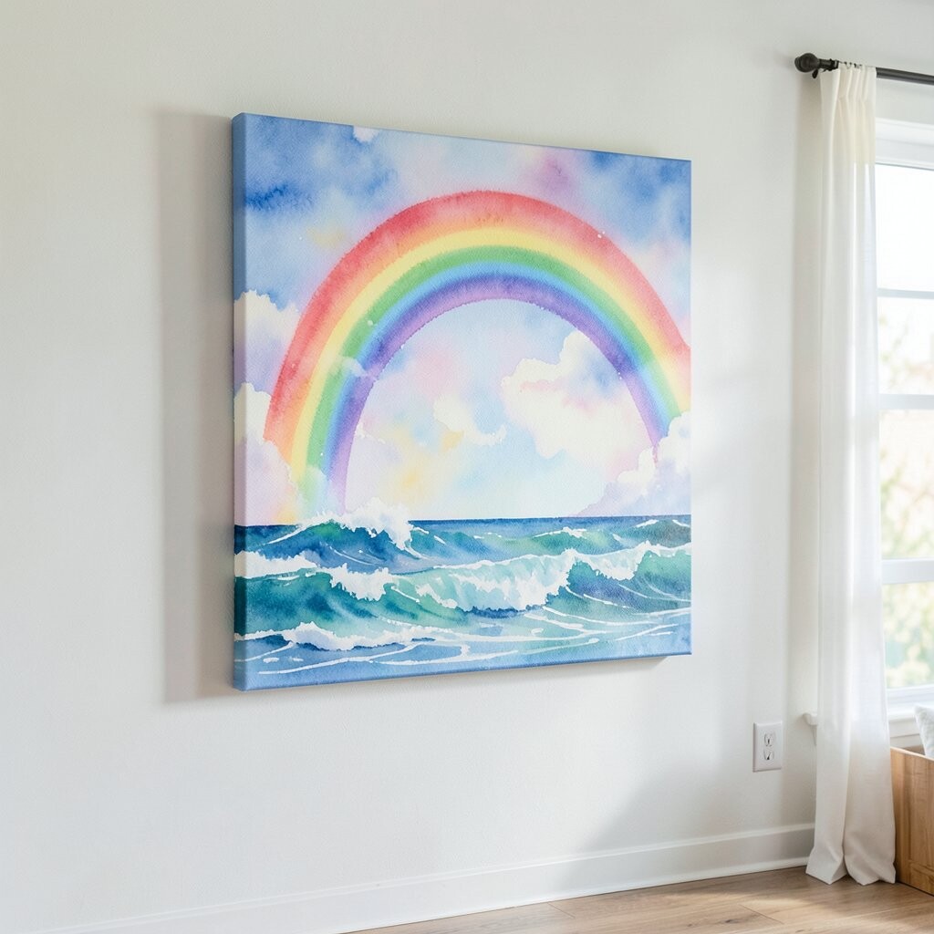
Picture a watercolor scene where gentle rainbow tones float above soft wave lines, with edges that look naturally blended. The painting feels light and dreamy, and it brings in color without looking harsh.
You’ll love how it brightens a room because the watercolor look spreads color softly across the canvas. It’s a great fit for nurseries, kids’ rooms, or even a bathroom where you want an easy mood lift.
Personalization is simple here, since you can match rainbow colors to items you already own, like towels or bedding. If you want a more grown-up vibe, choose a painting where the rainbow tones are muted and layered, not neon and loud.
11. Abstract Geometric Harbor Maps
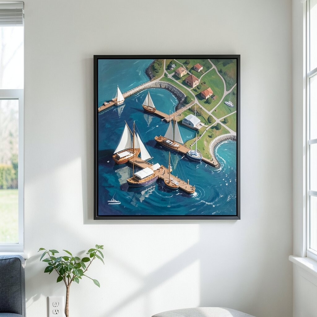
Imagine a canvas that looks like a chart or map, with geometric shapes and layered lines that resemble a harbor plan. The colors feel modern, like slate gray, muted teal, and warm sand, which gives it a clean look.
This painting helps your wall feel organized and stylish because the shapes create a sense of order. It’s also a practical choice if you’re aiming for a modern or industrial decor style.
For a personalization idea, choose a frame that matches your room’s hardware, like brushed brass for warm metals or matte black for modern fixtures. If you want a quick upgrade, hang it slightly off-center with balanced decor on the opposite side so the layout feels curated.
Cost-wise, geometric map art often comes in many sizes, so you can compare options and pick a canvas that fits your budget while still looking bold.
12. Warm Portraits in Soft Focus
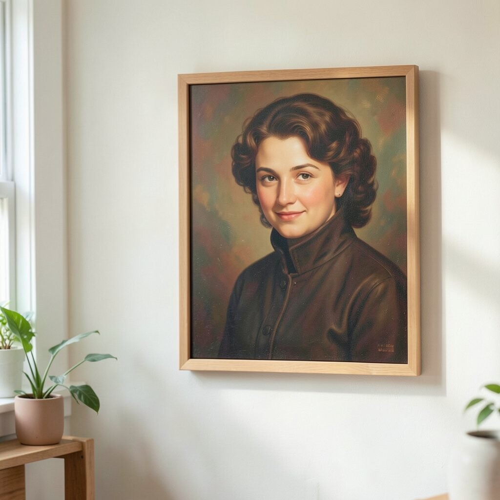
Picture a face portrait painted with gentle blur effects and warm skin tones, like a memory you can hold. The mood is intimate, and the softness makes it feel classy instead of flashy.
This is a great option if you want art that feels personal but not too literal. You can place it in a living room or bedroom where you want comfort and a slightly emotional vibe.
For practical personalization, pick a color palette that matches your existing throw pillows or curtains, so the artwork blends with the room. If you enjoy DIY touches, consider commissioning a version that resembles someone meaningful to you, like a family member or pet-themed companion.
13. Street Lights at Night Glow
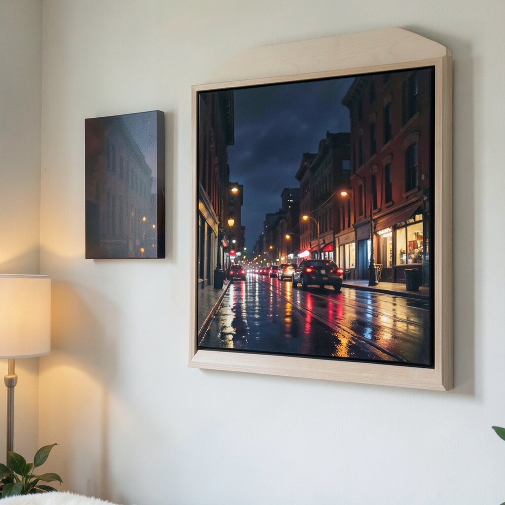
Imagine a night scene with glowing street lamps reflected on wet pavement, painted with rich purples and gold highlights. The light spreads across the canvas and gives your wall a lively, nighttime atmosphere.
This painting brightens your room because the golden highlights create a warm focal point, even in dim lighting. It also looks great when you have accent lighting, since the colors will echo the glow from your lamps.
To keep it actionable, choose a canvas with a clear center, like a lamp or intersection, so it’s easy to see from the doorway. Personalize the style by pairing it with dark wood frames or by selecting a painting that repeats a color already in your rug.
14. Autumn Leaves in Gentle Reds
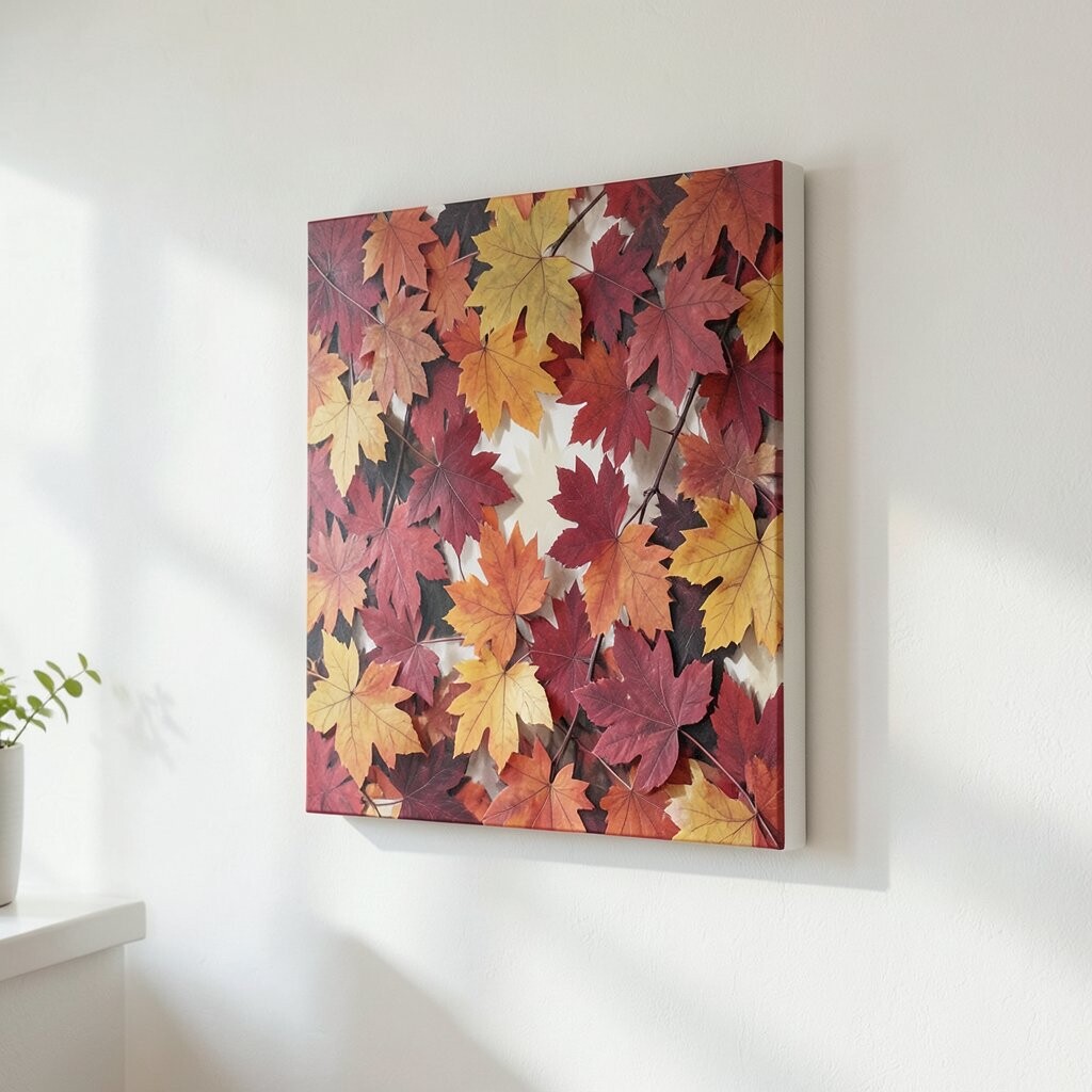
Picture a canvas that captures fall leaves with soft edges and layered reds, oranges, and warm browns. The painting feels comforting and seasonal, but the palette can still work year-round because it leans warm and earthy.
This style adds warmth to your wall and makes a room feel more inviting right away. If your space feels too cool, the autumn tones counterbalance that and bring your decor together.
For personalization, match one of the main leaf colors to a throw blanket or a set of coasters. Practical styling works well when you pair the painting with simple decor, since the artwork already provides the visual richness.
15. Pastel Cityscape Daydream
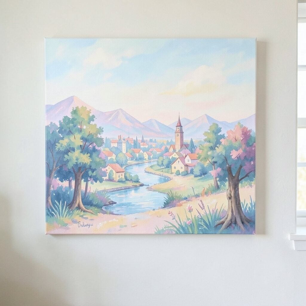
Imagine a city skyline painted in light pastels, with soft buildings and airy skies that feel bright and calm. The scene is playful but not childish, and it brings a lightness that can lift the whole room.
This painting is a smart pick for beginners because the colors are easy to pair with many decor styles. It also looks especially good in spaces with lots of white or cream, since the pastel tones pop gently.
For personalization, choose a cityscape where one building has a slightly bolder accent color that you can echo in a vase or lamp base. When you’re thinking about cost, pastel canvases are often widely available, so you can find a great match in your size and price range.
To make it feel intentional, hang it in a spot where it can be seen from seating, like across from a couch or in a bright corner near a plant.