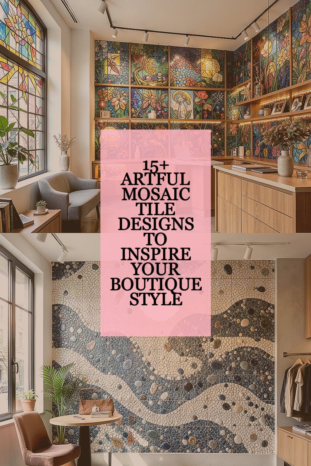
Small squares can make a room feel like a boutique showroom. The right pattern adds charm, personality, and a little daily joy.
Even when your space is modest, clever tile choices can bring big visual impact. You can also tailor colors and layouts so it feels truly yours.
1. Stained Glass Glow
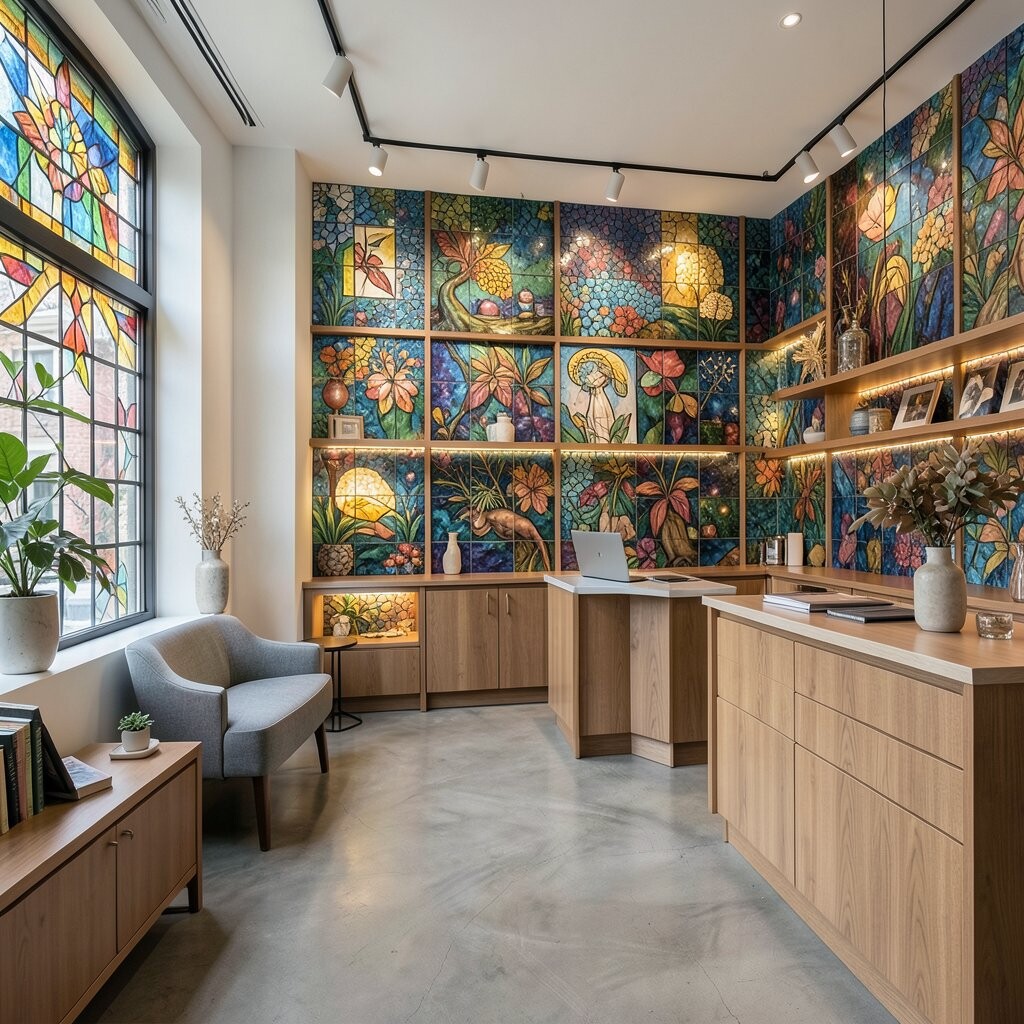
Imagine mosaic tiles that catch light like stained glass, with jewel-like colors layered in gentle gradients. As the sun hits the surface, it creates a soft shimmer that makes everyday routines feel more special.
Choose glass or glossy ceramic tiles in blends like teal to emerald or amber to honey. This look stands out without needing bold wall art, and it works beautifully for a backsplash, shower wall accent, or a vanity surround. For practical placement, keep the largest color area behind key sightlines, then use tiny detail pieces near edges and corners so the pattern stays crisp. To personalize, mix two or three related tones you already love, and repeat them in small spots to tie the room together. If you want a boutique feel without overspending, start with a single feature wall or a framed mosaic strip rather than covering every inch.
2. Sea Pebble Wavework
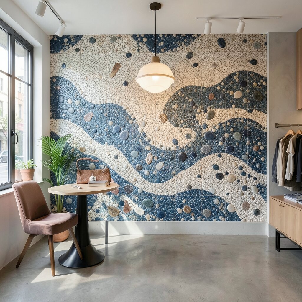
Picture rounded pebble shapes pressed into a tidy mosaic, creating gentle wave lines that look calm and collected. The surface feels soothing to the eye, like stepping from tile into a coastal daydream.
This design is great for bathrooms and spa-style powder rooms because it hides small visual distractions and looks cozy under warm lighting. Opt for small rounded tiles in sand, oyster, and driftwood grays, then add thin wave bands in muted blue-green for motion. Use a slightly larger grout line if you want the waves to look more pronounced, or keep grout tight for a cleaner, modern finish. Personalize by adding a narrow “shoreline” stripe around the room perimeter so it feels intentional and finished.
Cost-wise, you can keep it friendly by using pebble-inspired tiles only where water splashes most, then transition to flatter mosaics on surrounding sections. A current favorite is mixing matte and lightly polished pieces so the pebble texture still looks elegant in daylight.
3. Moroccan Star Lattice
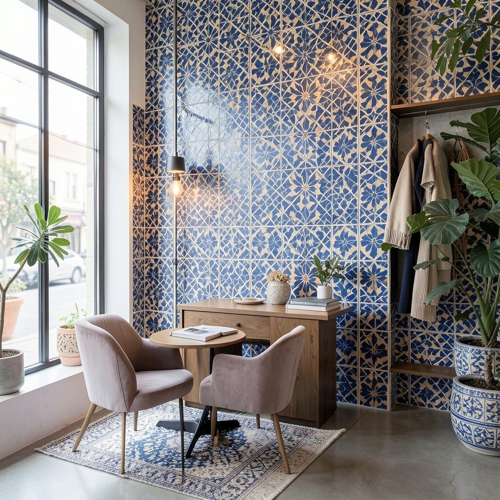
Think of intricate star patterns woven into a mosaic grid, like a warm lantern pattern made from stone and color. The repeating geometry draws attention, yet it feels welcoming when the palette stays earthy.
Use this style as a focal point behind a sink, on a fireplace surround, or on a niche shelf. It brings strong uniqueness because the star geometry can be made subtle or bold, depending on your tile scale and color choice. For a practical approach, keep the overall colors in a tight family, such as terracotta, cream, and deep olive, so the design feels boutique rather than busy. To personalize, choose one accent color and use it sparingly in the star centers or border lines. If budget is tight, create a “window” of lattice on one wall section and fill the rest with simple matching tiles.
This year’s trend is pairing Moroccan-inspired patterns with softer, lighter grout so the design looks airy. Warm lighting also makes the stars feel more inviting, especially in small spaces.
4. Modern Metro Confetti
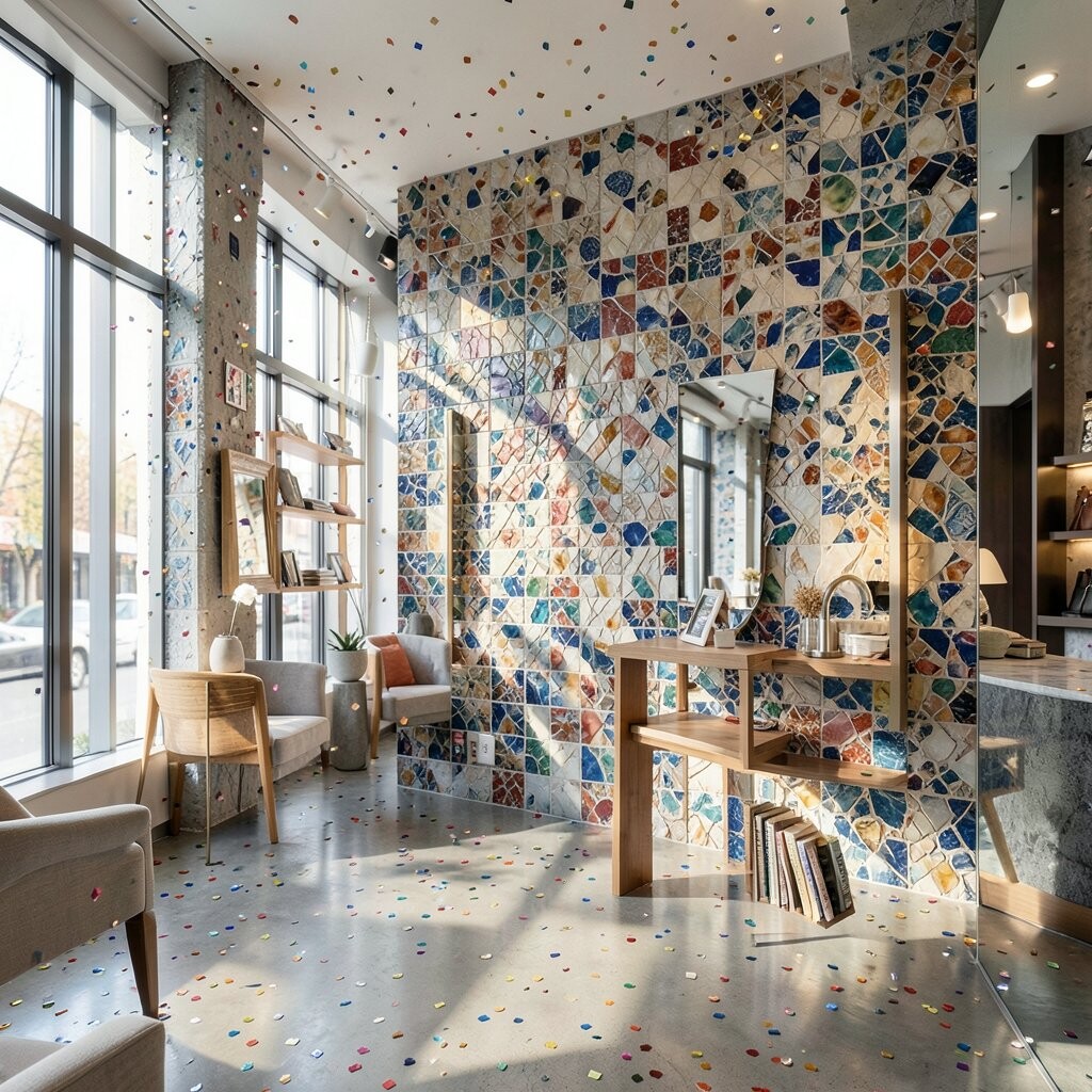
Picture neat, subway-style tile pieces arranged in a mosaic that looks like confetti scattered across a clean base. The pattern stays orderly, but the color pops keep it playful.
Use it on a backsplash or a narrow hallway wall where you want energy without visual chaos. Pick two neutral tones and one bright accent so the confetti effect looks curated. For a practical tip, place the brightest pieces at eye height so the design feels like a highlight rather than a distraction. Personalize by matching the accent to your cabinet hardware, a favorite mug color, or a throw blanket you already own.
5. Botanical Vine Micro-Mosaic
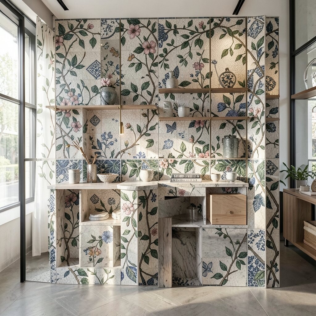
Imagine tiny leaf shapes and curling lines forming a vine that winds across the wall like living art. It’s delicate up close and more graphic from a distance, which makes it feel boutique and not overly themed.
This design works especially well in kitchens, laundry rooms, and sunlit bathrooms. Choose muted greens, warm creams, and soft grays to keep it calm, then add occasional tiny gold or light bronze tiles to catch light. Use the vine as a border around mirrors, shelves, or a backsplash edge, so the rest of the wall stays simple. For personalization, map the vine flow to your space by running the “growth” from a corner toward a focal point like a window or vanity.
If you’re watching cost, consider using micro-mosaic only along trims and key lines, then use larger plain tiles for the broader wall. A current trend is nature-inspired patterning that feels minimal, so light grout and understated tones will keep it modern.
6. Art Deco Fan Bands
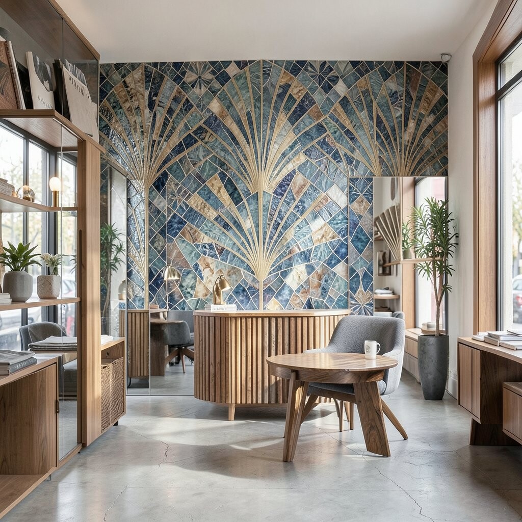
Picture fan-shaped motifs made from slender mosaic pieces, arranged in smooth bands that echo Art Deco style. The look feels glamorous, but it can still be neat and refined.
Use this pattern in entryways, powder rooms, or on a feature wall behind a bench. It creates a clear focal point and gives your space instant character, even with simple decor. For practical results, align the fans with the center of the room or the midpoint of your vanity so it looks intentional. Personalize by choosing a metallic accent tile color that matches your fixtures, like brushed gold, champagne, or copper undertones.
7. Tuscany Terracotta Bloom
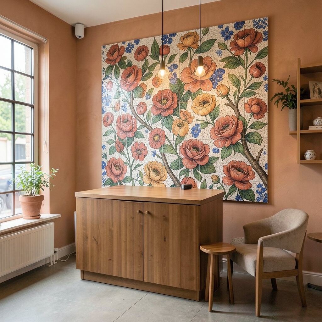
Think sun-warmed terracotta shapes arranged like a blooming patchwork, with gentle swirls of cream and soft clay tones. The palette feels friendly and inviting, like a kitchen that always smells like fresh bread.
This mosaic design shines in kitchens and dining spaces because it adds warmth without needing bright colors. Keep the design grounded by using a mix of matte terracotta and textured tiles that catch light slowly. For a practical tip, place the densest pattern behind the stove or sink so daily messes stay visually softened. To personalize, echo your backsplash colors in small elements like bowl patterns, chair cushions, or countertop accessories.
If you want to manage cost, use terracotta mosaics as an inset panel, border, or repeated band rather than covering the entire wall. Right now, trend-forward spaces are leaning into warm, earthy textures paired with simple, clean cabinetry for contrast.
8. Japanese Ripples Zen Grid
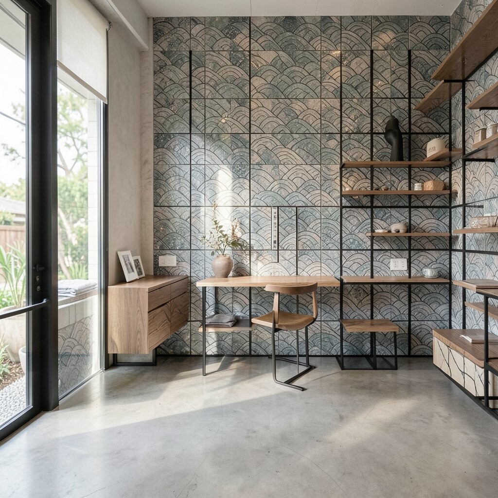
Imagine a calm grid of tiles with ripple-like waves that run horizontally, like water smoothing itself. The design looks balanced and peaceful, especially when colors stay near nature.
Use this mosaic for bathrooms, reading nooks, and even spa-like laundry corners. It benefits your space by adding rhythm without heavy busyness, which helps smaller rooms feel more open. For practical installation, keep the ripple lines level and repeat them in a predictable spacing so the pattern looks crisp. Personalize by selecting tile tones that fit your home, such as pale gray with off-white ripples, or soft blue with warm cream.
9. Geode Prism Scatter
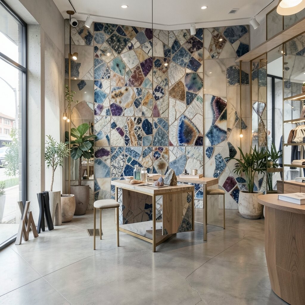
Picture mosaic fragments that look like geode slices, with faceted colors that seem to hold light inside. From far away, it reads as a pattern; up close, it reads as little treasures.
This design is unique because it adds depth even when the wall is flat. Consider using it as a backsplash centerpiece, on the back of open shelves, or on a small accent wall. For practical tips, choose a limited color range, like amethyst purple, smoky gray, and clear quartz tones, so it feels cohesive. Personalize the vibe by repeating one “prism” color near corners or edges, making the design feel guided rather than random.
Cost can be managed by using geode-inspired tiles sparingly, then surrounding them with simple solid tiles. Current trends are favoring “statement pockets” of pattern, where a small area does the heavy lifting.
10. Checkerboard Charm Modernized
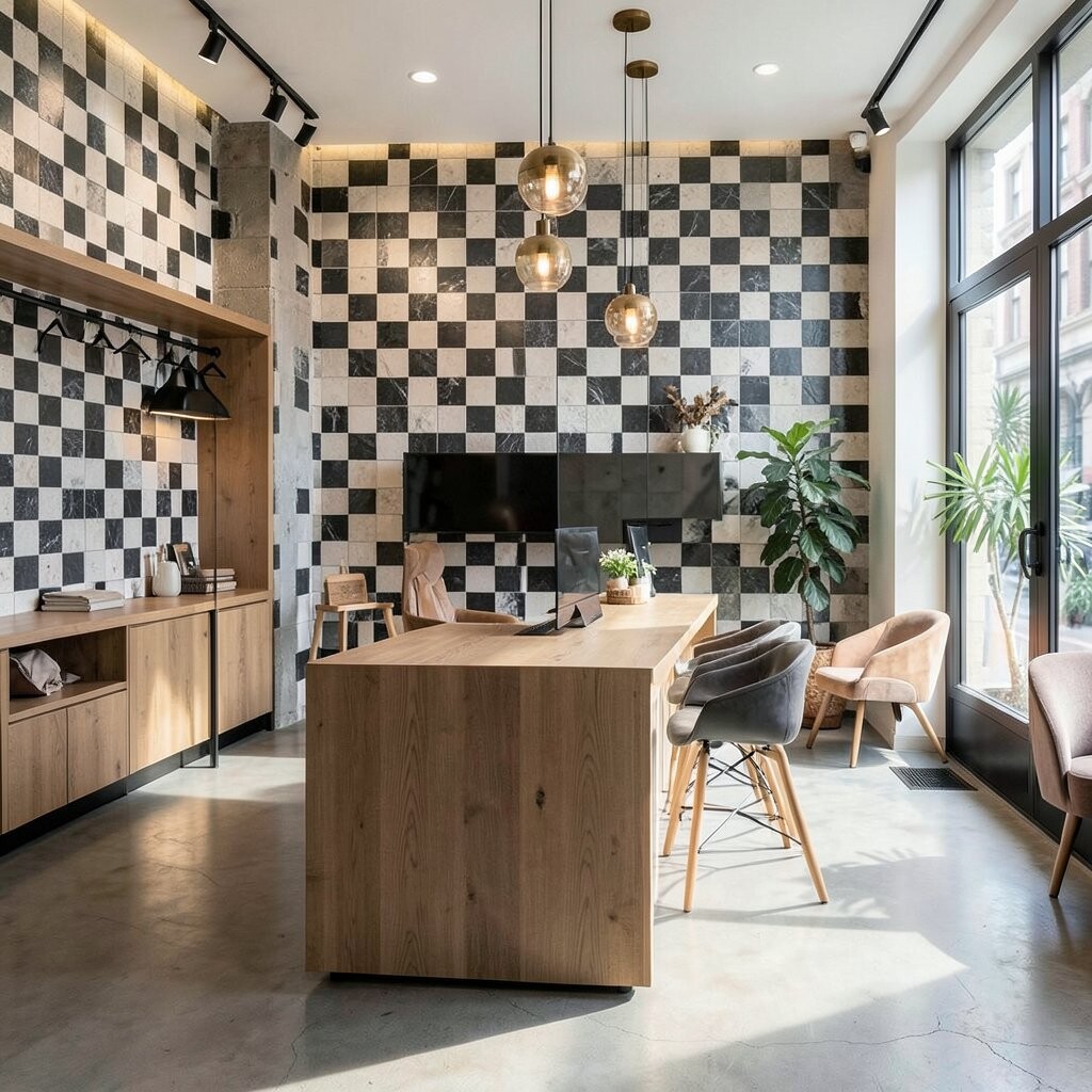
Think of a classic checkerboard pattern, but created with mosaics that soften the contrast and bring a boutique twist. The result looks playful, yet still organized and stylish.
This works in kitchens, entry floors, and bathroom niches where you want easy structure. The benefit of a checkerboard is that it guides the eye and makes surfaces feel tidy, even in busy homes. For practical tips, pick two colors that relate to each other, such as warm cream and muted espresso, instead of stark black and white. Personalize by selecting one accent tile finish, like glossy pieces in a mostly matte pattern, to add a small flash of personality.
11. Candy Stripe Ribbonwork
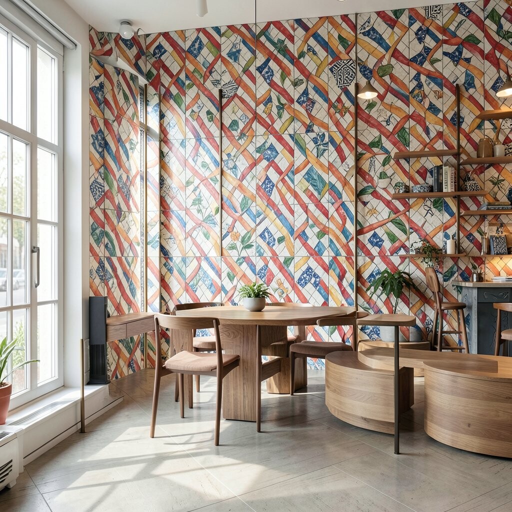
Imagine long ribbon lines made of mosaic tiles, sweeping across a surface like a candy stripe but designed with grown-up taste. The curves can be bold, while the overall look stays clean and bright.
This is a fun choice for kids’ guest bathrooms, breakfast nooks, and even behind a desk. It adds movement and makes plain walls feel lively without adding clutter. For practical placement, keep the ribbon centered and consider repeating it in a smaller version on an adjacent area, like a shelf face. Personalize by matching your ribbon colors to seasonal decor, using a base neutral and rotating accent tones.
If budget matters, limit the ribbon to a vertical panel or a single continuous band that runs from splash height upward. A current trend is using soft curves rather than sharp angles, which makes the design feel more welcoming.
12. Calligraphy Script Border

Picture mosaic strokes that resemble handwritten calligraphy, with thin lines and confident swirls. It feels artsy and personal, like the room has a signature.
This design benefits your space by adding elegance without needing a large mural. Use it as a border around mirrors, along the top edge of a backsplash, or framing a recessed niche. For practical results, choose a mosaic set with consistent line thickness so your “script” stays readable and neat. Personalize by selecting a palette that echoes your favorite artwork tones, then mirror those shades in a few scattered dots within the border.
13. Sunburst Wheel Geometry
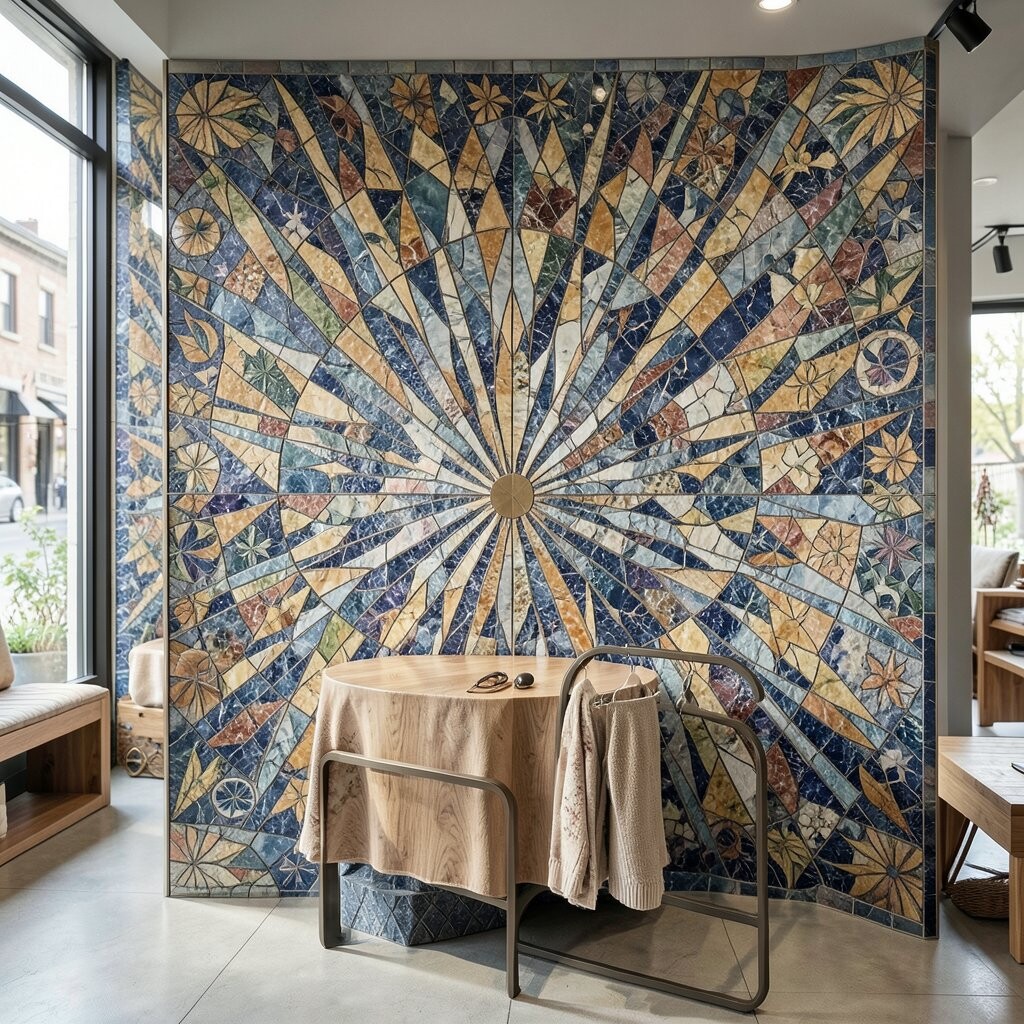
Imagine a mosaic wheel pattern radiating outward, like a sunburst captured in small pieces. The effect brings instant energy and makes even a plain wall feel like a design moment.
Use a sunburst motif behind a vanity mirror, on a fireplace hearth accent, or inside a small entry alcove. The visual benefit is strong focal energy that feels stylish, not loud, especially when you keep your palette controlled. For practical tips, start with a simple center circle and expand outward with fewer spokes if you want it easier to install and still look impressive. Personalize by selecting spokes that match your decor style, like warm wood tones with creamy tiles for a cozy look, or cool grays with a silver accent for a modern boutique vibe.
Cost considerations are easier here because you can create a single centerpiece rather than repeating the sunburst everywhere. Current trend preferences often favor one bold motif paired with calm surrounding surfaces.
14. Scandi Soft Sand Panels
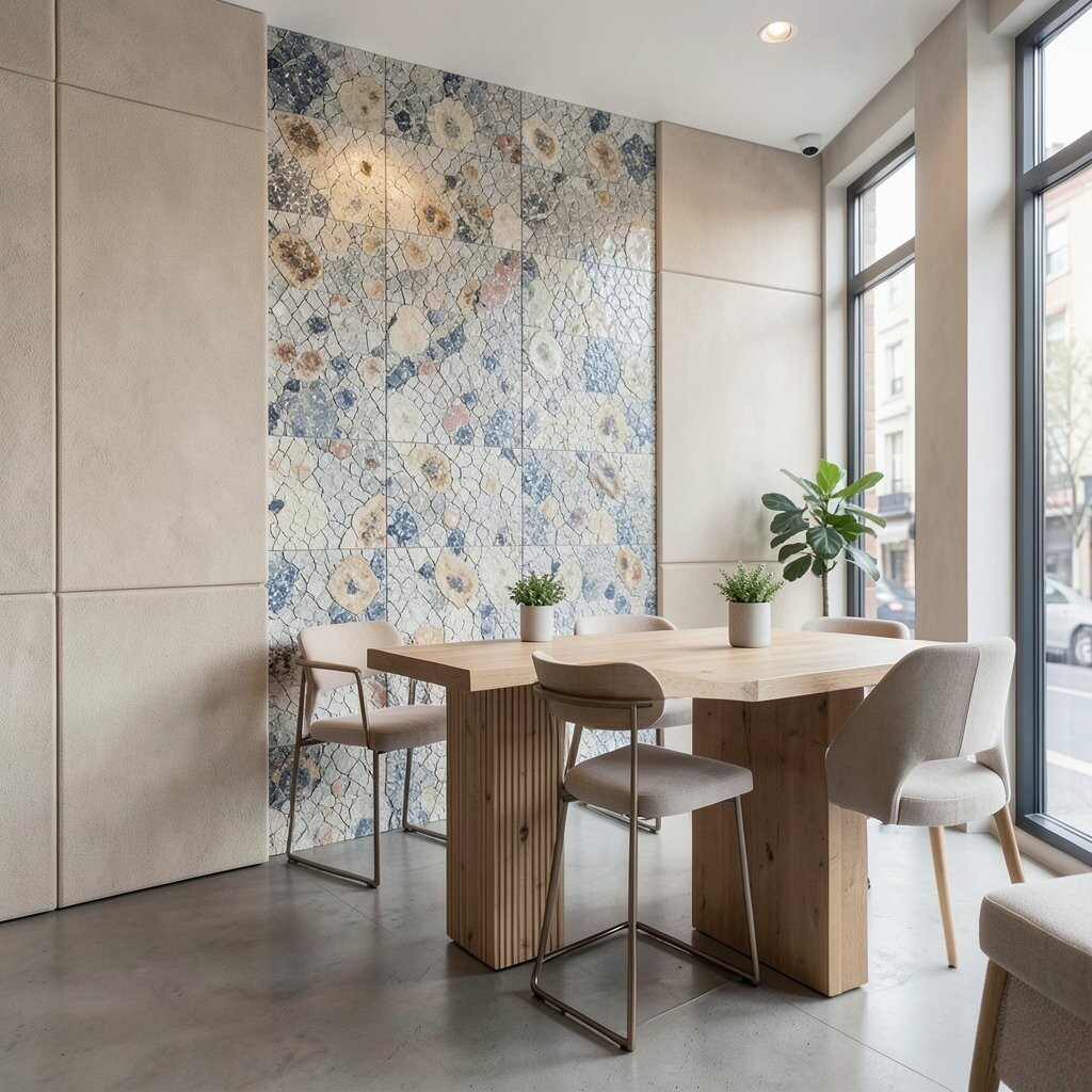
Picture a calm mosaic made from small, evenly colored tiles that blend like sand dunes. The design feels soothing, modern, and quietly luxurious.
This style benefits homeowners who love minimal decor but still want texture. Use it in bathrooms, laundry rooms, and kitchen backsplashes where practicality matters because the pattern doesn’t show every tiny speck. For practical tips, choose similar-toned tiles so the mosaic looks cohesive, then add one or two slightly darker bands for definition. Personalize by adding subtle movement through tile direction changes, such as horizontal rows that shift to diagonal near corners.
15. Cobalt Coast Portrait Accent
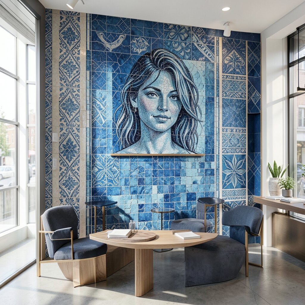
Imagine a mosaic that uses cobalt blues and seafoam tones to frame a “portrait” shape, like a calm window into the ocean. The design feels artistic while still grounded in wearable color.
Use it as a framed panel behind a sink, as a backdrop for a soap niche, or inside a shower feature zone. The uniqueness comes from the contrast between the deep blue frame and the lighter interior tones, which gives a boutique gallery vibe. For practical tips, keep the shaped panel smaller so it doesn’t overwhelm the room, especially in compact bathrooms. Personalize by echoing the coastal palette in accessories like towels, glass jars, or a mirror with a similar finish.
Cost-wise, shaped accents are usually easier on the budget because you concentrate the mosaic work where it matters most. A current trend is pairing bold blue accents with warm neutrals, so consider creamy grout and light-colored tiles nearby.
16. Velvet Mosaic Ombre Terrace
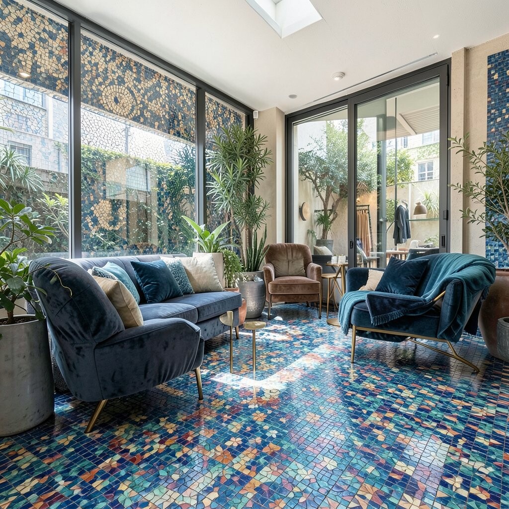
Picture an ombre gradient created by mosaics, fading from deep to light like velvet fabric laid across a wall. The look feels smooth, stylish, and surprisingly elegant.
This design benefits your space by making it feel taller and more fluid, especially in hall bathrooms and shower walls. Choose colors that suit your mood, such as deep forest to soft sage, or charcoal to pale smoke, then keep the tile size consistent for a seamless fade. For practical installation, plan the gradient carefully by marking your starting and ending points so the fade lands where your eye naturally goes. Personalize by choosing a lighter grout for airy brightness or a matching grout tone for a more tailored, gallery-like finish.
If you want to keep costs in check, use the ombre as a section of the wall, then surround it with simple solid tiles. Right now, homeowners are loving soft gradients because they feel modern while still offering strong visual texture.