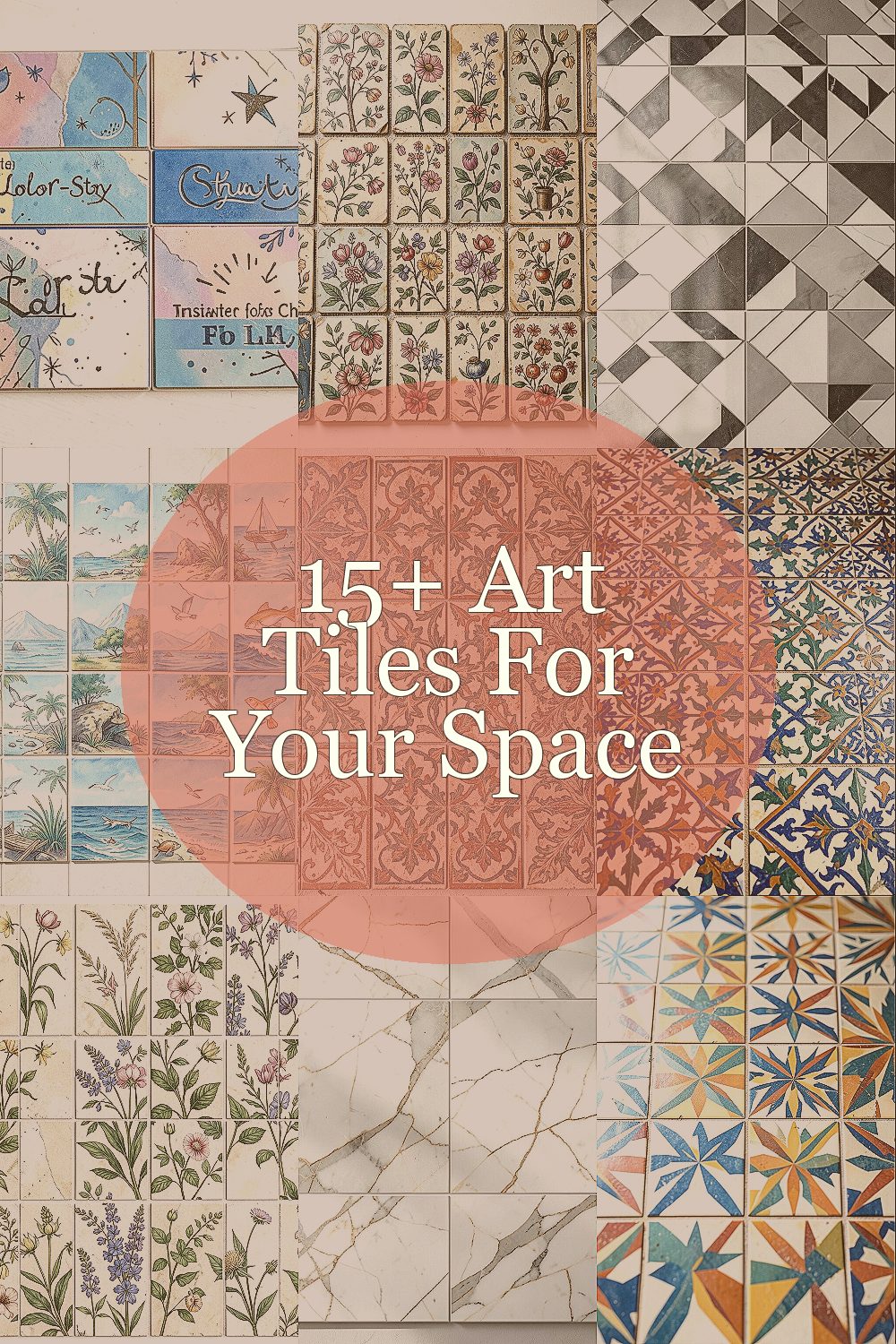
The right tile can make a room feel like it has a personality. A few small surfaces can carry big mood.
1. Color-Story Statement Tiles for Instant Cheer
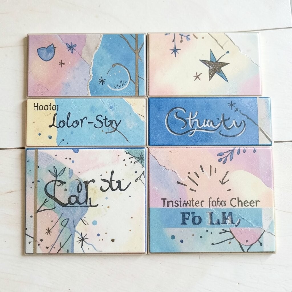
Imagine walking into a kitchen or hallway and seeing a wall of art tiles that feels like a sunrise. The glaze catches light and turns everyday steps into something more enjoyable.
Pick a color story that already exists in your space, like warm beige with terracotta or cool gray with deep teal. Match one or two shades from your decor so the tiles look intentional, not random. If you want an easy win, use a small mosaic band behind a shelf or along a backsplash instead of covering every inch.
2. Hand-Painted Patterns That Look Collected Over Time
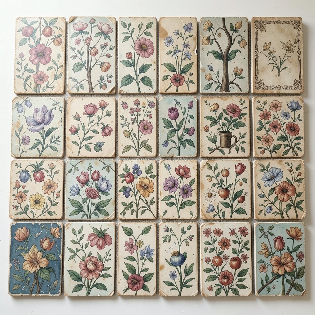
You can almost feel the brushstrokes when you choose hand-painted inspired art tiles. Swirls, speckles, and tiny variations make the surface feel alive, even when the room is quiet.
These tiles add uniqueness because no two pieces are exactly the same, and that makes the design look gathered rather than manufactured. They also give you a personal touch when you repeat one favorite motif in different spots.
For practical placement, consider a feature strip around a mirror or a small area behind a vanity. To keep the look cohesive, pick one main color from the pattern and repeat it in towels, planters, or wall art.
3. Geometric Modern Tiles for Clean Lines and Big Energy
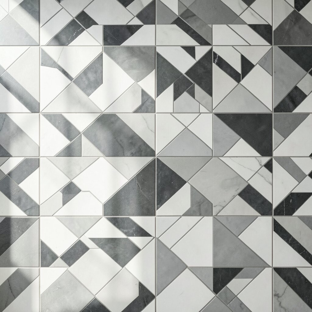
Geometric art tiles bring a crisp vibe that works in both modern and classic homes. Bold shapes can make a small room feel more organized, like everything has its place.
Choose a pattern scale that fits your space; large motifs can feel dramatic in a wide entry, while smaller ones suit tight bathrooms. When installed thoughtfully, they can also guide the eye toward features like vanities or built-in shelving.
If you like practicality, use them as an accent where you want attention but not overwhelm. Pair them with simple cabinet fronts or plain painted walls so the tiles stay the star.
4. Coastal-Inspired Tile Scenes That Calm Your Mind
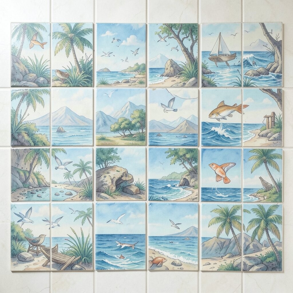
Think of sea glass colors, sandy neutrals, and wave-like textures that make a room feel softer. Coastal scenes look especially nice where people slow down, like bathrooms and reading nooks.
These designs offer a gentle benefit because they visually reduce harsh contrast and create a relaxing mood. If you love personalization, pick a coastline palette that matches your lifestyle, from bright aqua for a fun vibe to muted sage for a quiet feel.
5. Vintage Medallion Tiles for a Touch of Old-World Charm
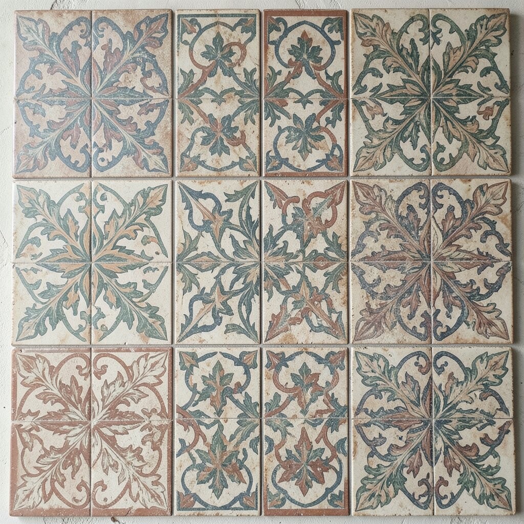
Medallion art tiles can feel like a tiny piece of heritage tucked into your home. Circular patterns add movement, and they look beautiful when the light hits the glazed surface.
They bring uniqueness by combining classic shapes with modern styling, especially when you use them as a border or focal panel. A good trick is to center them around a mirror, range hood, or fireplace surround so the design reads clearly.
Cost can be manageable if you choose a few hero tiles and build the rest with simple coordinating colors. Balance the expense by keeping the medallion area compact and letting surrounding surfaces be calm.
6. Moroccan-Style Tiles That Add Drama Without Effort
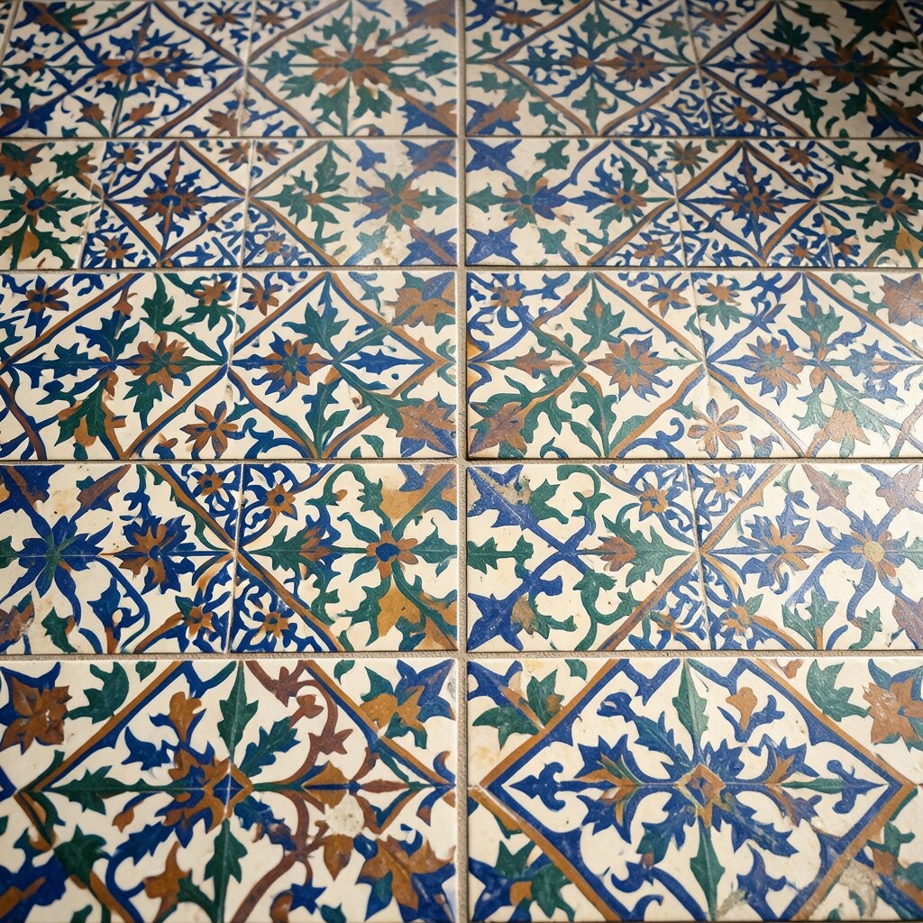
Moroccan-inspired art tiles bring a lively, decorative feel that can turn a basic wall into a celebration. The mix of angles and small detailing creates depth that looks great up close.
They’re great for benefits like creating visual warmth, especially in rooms with lots of smooth surfaces. For personalization, select a tile that echoes your existing metals, like brass faucets, black fixtures, or warm wood tones.
To keep installation practical, choose a pattern that repeats cleanly so matching stays easier. Start with a small zone, such as behind a kitchen sink or the lower portion of a bathroom wall.
7. Botanical Tile Prints for Freshness All Year
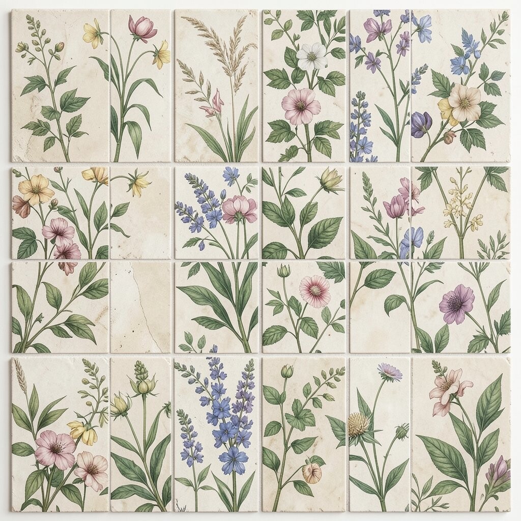
Green leafy tiles can make a home feel like it has fresh air, even in winter. From delicate vines to bold tropical prints, botanical art brings nature into your daily routine.
These tiles offer a unique benefit because they soften hard materials like tile floors or sleek countertops. A simple personalization idea is to match leaf tones with your plants, using colors like olive, fern green, or creamy off-white.
If you want a budget-friendly approach, choose a botanical accent row rather than a full wall. This keeps costs lower while still giving you the joy of color and texture every day.
8. Luxe Marble-Look Art Tiles for a High-End Feel
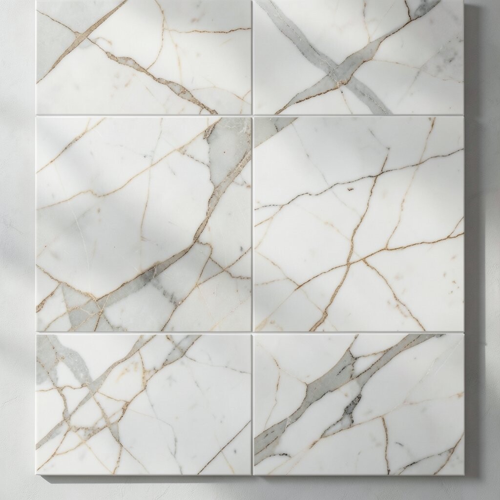
Marble-look art tiles feel elegant and clean, with natural-looking swirls that mimic stone. Even if you don’t want real marble, the visual effect can make a room feel more expensive.
This style has a practical benefit because it pairs well with many finishes, from chrome to brushed nickel to matte black. To personalize, choose a veining direction that aligns with the room’s shape so the pattern looks intentional.
Consider using these tiles in spots where you want durability and easy cleaning, like entry floors or shower walls. Cost can be more reasonable than full stone surfaces, especially when you cover only key areas.
9. Retro Starburst Tiles for Playful Light and Motion
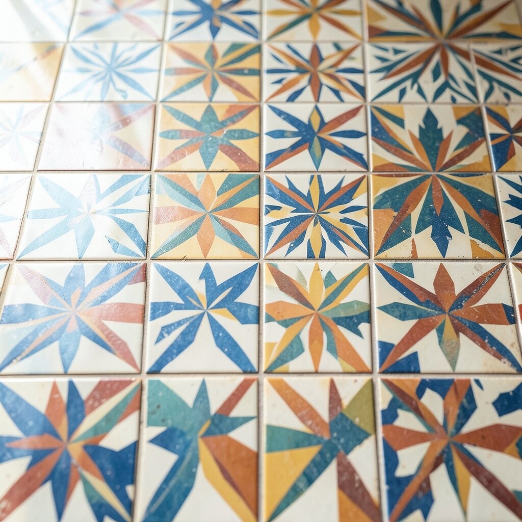
Starburst tiles look like a burst of sunshine frozen in time. They add motion to a room and can make neutral spaces feel cheerful and fun.
The benefit here is mood, because bold patterns often lift how a space feels without changing your furniture. For uniqueness, mix starburst tiles with simple solid tiles so the pattern stays punchy instead of busy.
Try a practical layout by placing starbursts near a mirror or a small table so they catch light when you move around. Keep the rest of the color palette limited, like pairing warm cream with one energetic accent color.
10. Monochrome Textured Tiles for Calm and Depth
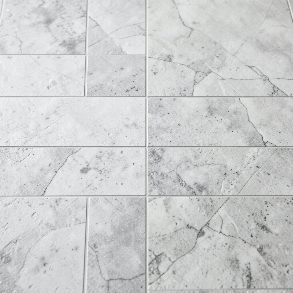
If you love a quieter look, monochrome art tiles can be the perfect middle ground. You get visual depth from texture and relief, even when the colors stay neutral.
These tiles provide benefits like easy styling, because black, white, and gray tones blend with almost everything you own. Personalization is easy too since you can choose the texture you like best, from subtle dots to raised geometric lines.
11. Folk-Art Inspired Tiles for Warm, Homey Character
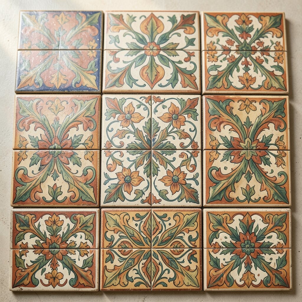
Folk-art style tiles bring cozy charm with patterns that feel handmade and welcoming. Bright accents and friendly shapes can make a kitchen feel lived-in and joyful.
They’re unique because they don’t try to be perfectly symmetrical, and that makes the design feel human. A practical approach is to repeat one shape across a small section so the room looks coordinated.
For cost considerations, choose a few tiles with strong color and surround them with cheaper, simpler tiles that match the background tone. This way you still get personality without overspending.
12. Night-Sky Tiles With Subtle Sparkle for Evening Magic
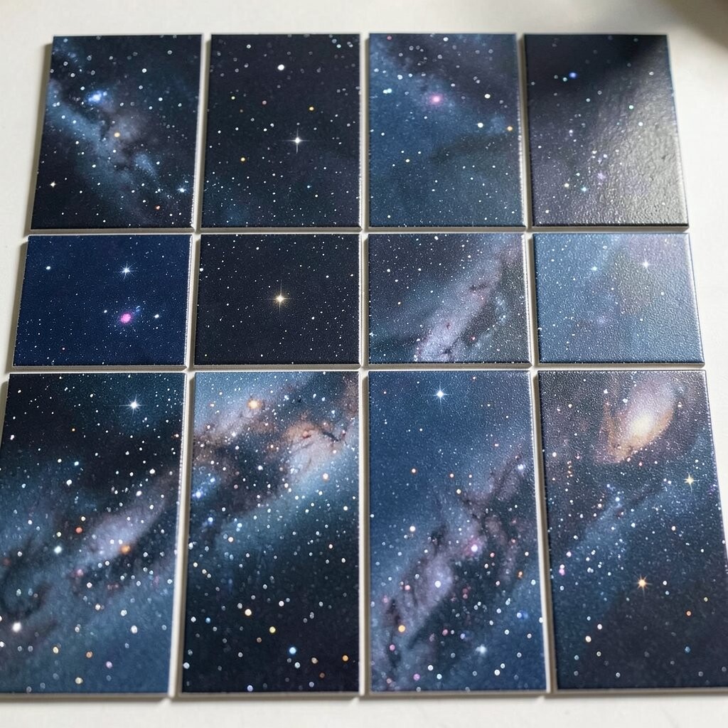
Night-sky art tiles can turn an everyday bathroom or powder room into a calm nighttime retreat. Little star-like specks and deep gradients create a dreamy effect without needing dramatic lighting changes.
One benefit of this style is that it adds a sense of comfort, especially in spaces used for winding down. Personalization can be as simple as selecting a tile that leans more navy or more charcoal based on the rest of your color palette.
Make it practical by using the tiles as a feature panel or behind a vanity light. If you want to keep it budget-friendly, cover a small vertical section where the design can shine without needing a full wall.
13. Watercolor-Style Tiles for Soft Color Transitions
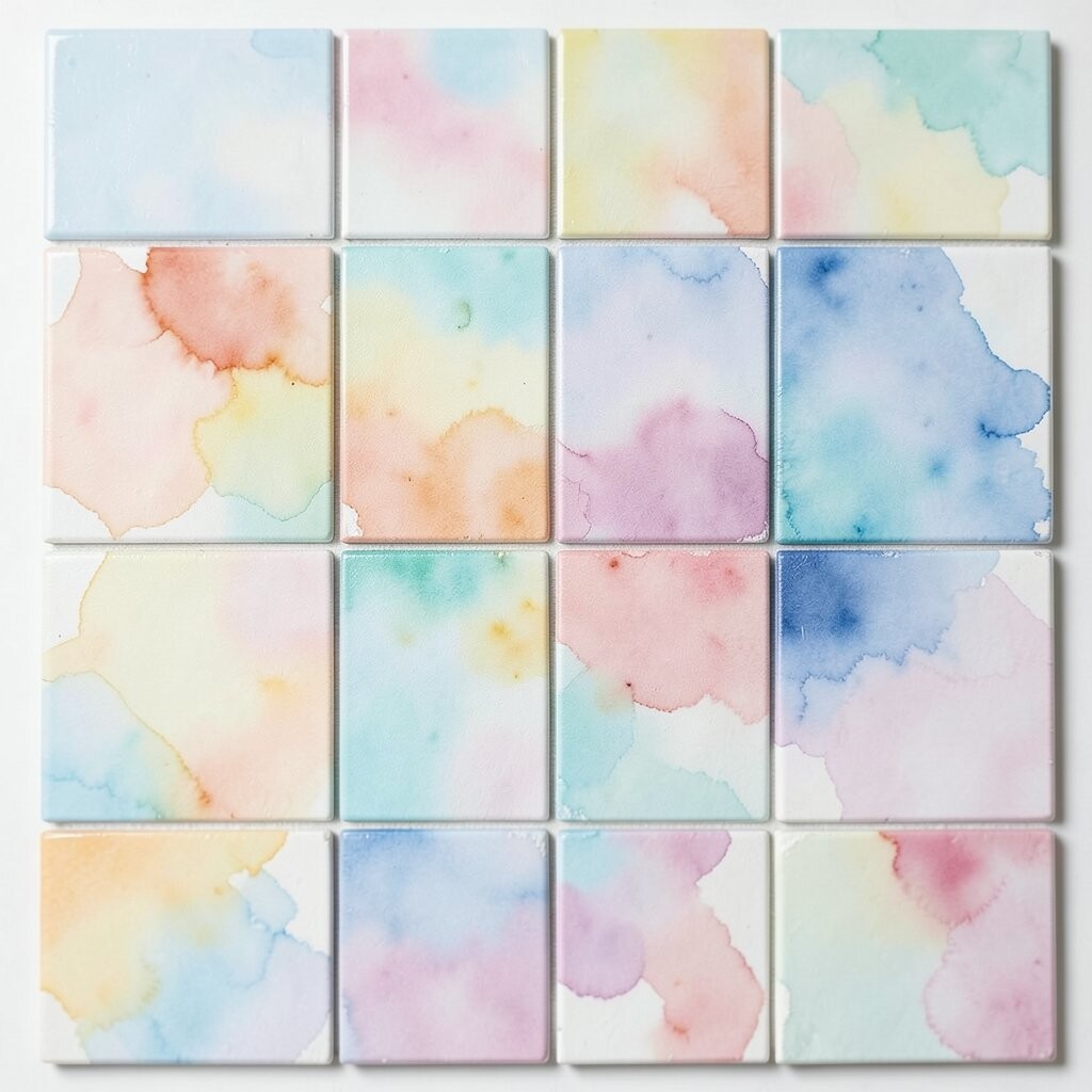
Watercolor art tiles look like paint washed across ceramic, with gentle blends and light gradients. The result feels light, airy, and modern, even when the pattern is artistic.
This approach offers benefits like visual softness, which helps rooms feel welcoming rather than sharp. To personalize, match the tile’s dominant wash to one fabric or paint color so the tones feel connected.
For a practical installation, use watercolor tiles along a backsplash or on the wall beside a sink where everyday light will make the colors shift. If cost is a concern, choose fewer tiles with larger coverage impact, like an art panel style layout.
14. Typeface and Pattern Hybrid Tiles for Creative Personal Style
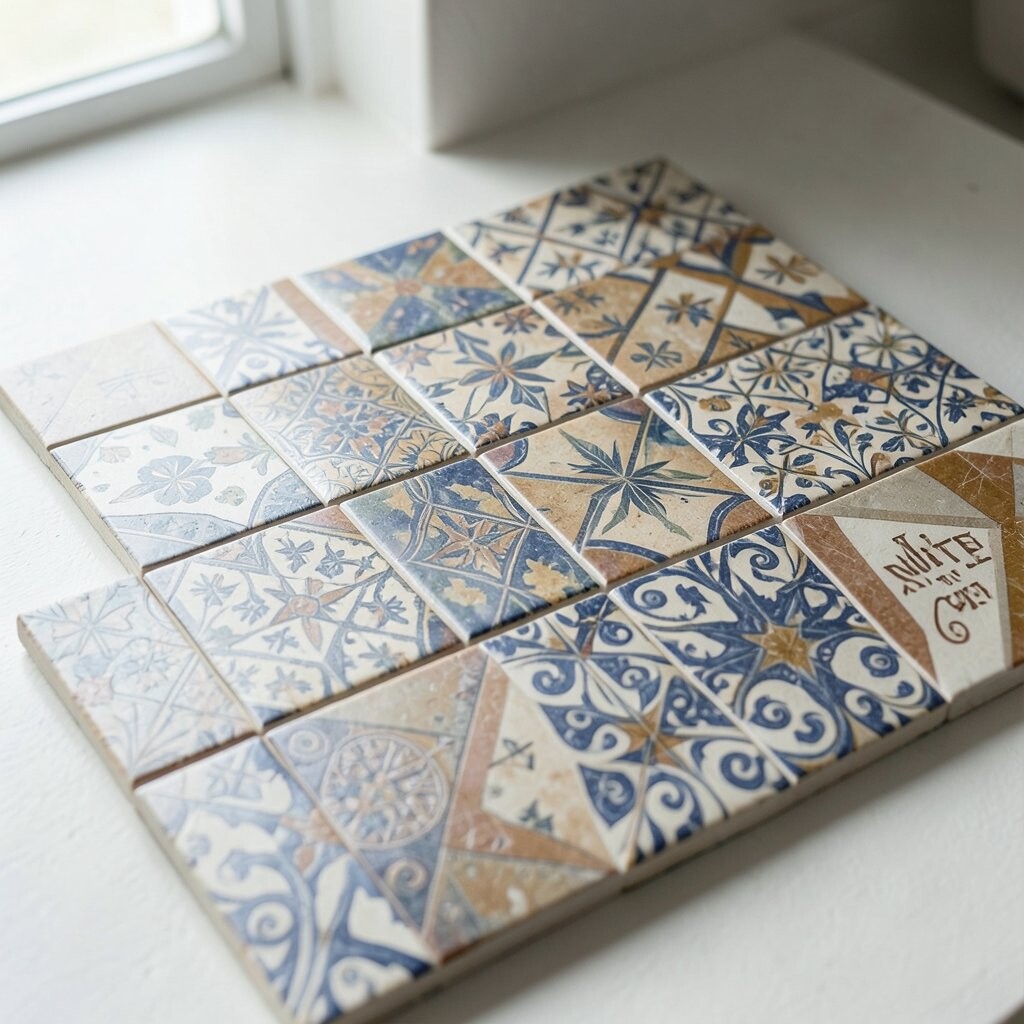
Some art tiles include typography-inspired details or pattern hybrids that look like a design scrapbook. They can bring playful character to a space without needing loud colors.
They feel unique because they add storytelling, and you can pick motifs that match your life, like travel themes or favorite symbols. A practical tip is to keep the surrounding wall simple so your tiles remain readable and the room stays balanced.
To personalize, choose tiles that echo your home office vibes, like small icons or subtle lettering-style marks. Cost can be managed by using them where eyes focus most, such as the backsplash behind a coffee station.
15. Moroccan-And-Mosaic Mix Tiles for Pattern Lovers

If you love rich design, mosaic art tiles can deliver a gorgeous look with lots of tiny color points. Mixing a Moroccan feel with mosaic texture creates depth that looks different as you walk past.
The benefits include a built-in “background” effect, since the small pieces can hide minor wear and visually soften the area. For personalization, select tiles that include a color you can repeat elsewhere, like a rug accent or a painted cabinet edge.
Keep it practical by planning the pattern so you don’t end up with too many custom cuts. Budget considerations are also easier with this style because you can choose a smaller mosaic zone while keeping the rest of the room smooth and calm.
16. Custom Monogram Tiles for a One-of-a-Kind Moment
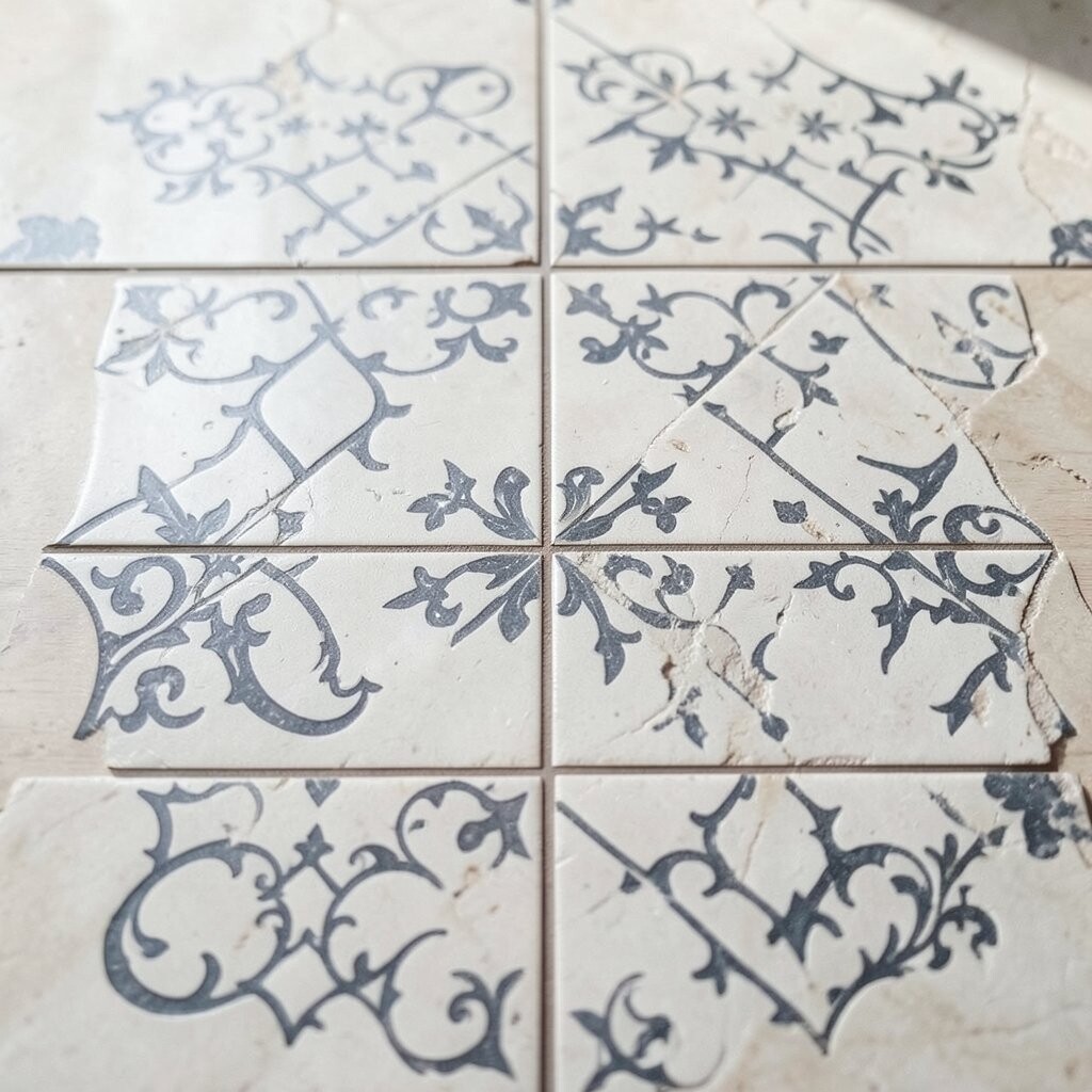
Custom monogram-inspired art tiles make a space feel genuinely yours. Whether it’s initials, a family symbol, or a favorite letter, the tile becomes a personal focal point.
This choice brings unique meaning, and that emotional connection is a real benefit every time you see it. For practical tips, place the monogram where it’s seen daily, like around a vanity, near a front-door entry bench, or as a signature panel on a feature wall.
When thinking about personalization, coordinate the letter style with your other design choices, such as modern straight lines or softer vintage curves. Cost can vary widely, so consider budgeting for a smaller custom area and using standard coordinating tiles everywhere else.