Blank walls can feel heavy, even when the room is full of light. Art made with soft contrasts and bold choices can change the mood fast.
1. High-Contrast Black and White Blocks
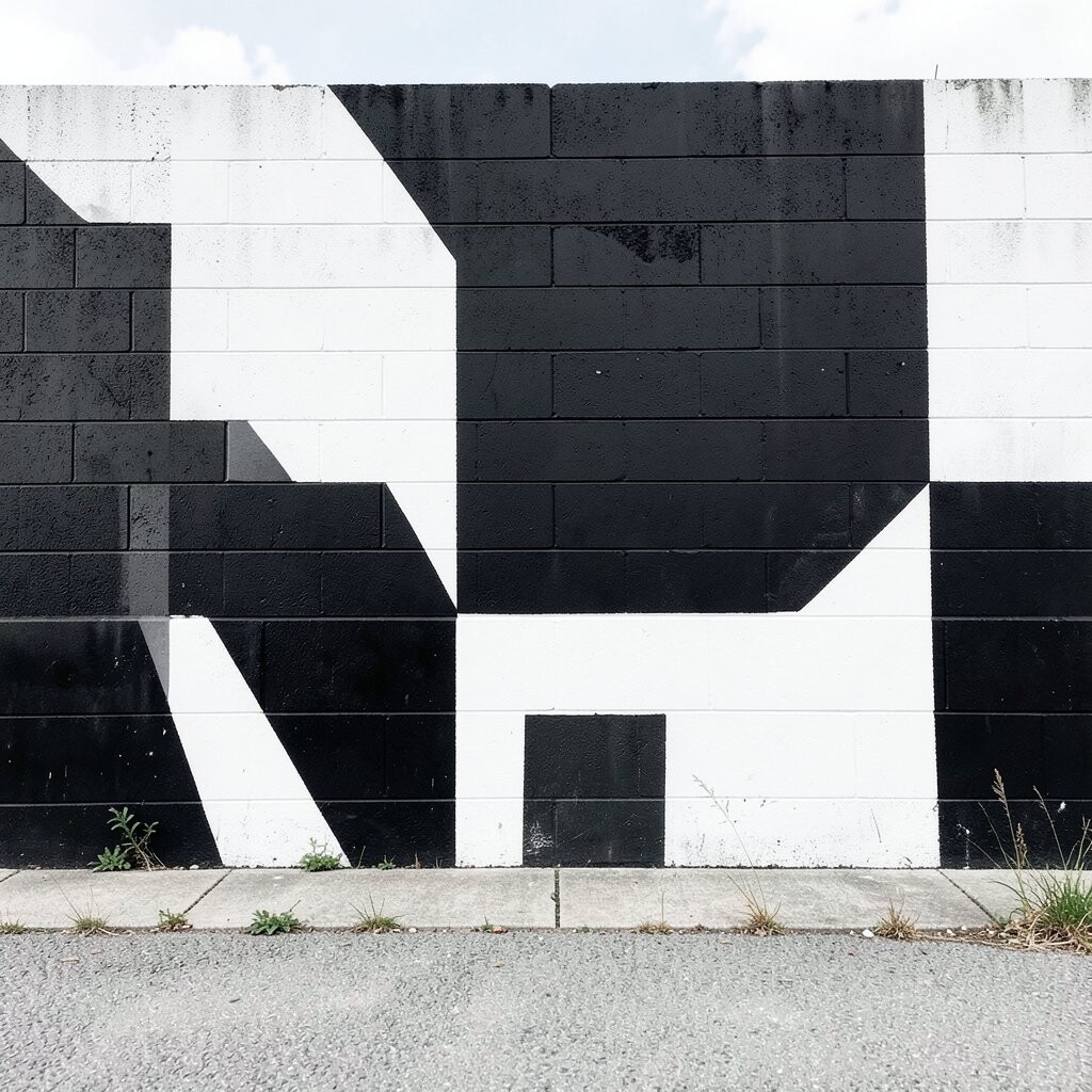
Think of a mural made from crisp black and white shapes, like tidy windows on a busy day. You’ll notice how the strong contrast pulls your eyes forward and helps the wall feel more alive.
Choose simple forms such as rectangles, stacked squares, or sweeping bands that follow your room’s lines. For the best look, measure the wall and sketch a light grid first so the spacing feels balanced. If you want it to feel calmer, use thicker margins between shapes and keep the composition centered around a focal point like a sofa or bed.
2. Ink-Style Line Art That Maps the Eye
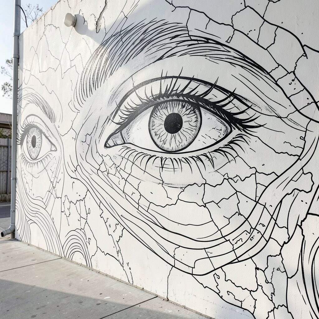
Picture delicate line drawings spreading across the wall like a slow sketch coming to life. Even without color, the flowing curves can make your space feel larger and more relaxed.
Look for designs inspired by plants, coastlines, or city streets, then repeat them in a gentle rhythm. Keep line thickness consistent so the mural stays readable from across the room. You can personalize the pattern by adding a few lines that match your own interests, like musical notes, small stars, or tiny leaf shapes.
To make it practical, use removable painter’s tape to mark the boundary of each section before you begin. If you’re worried about mistakes, start with pencil on the wall grid and then go over key lines with a fine brush. For cost, line murals can be affordable because they use fewer materials than complex shading.
3. Botanical Shadows in Grayscale
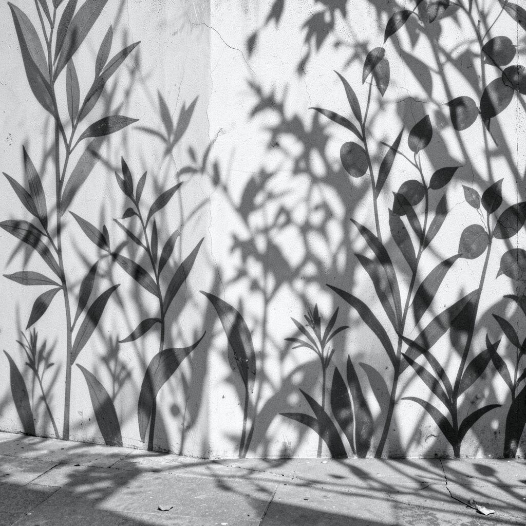
Imagine botanical prints rendered in soft gray tones, where leaves appear as gentle shadows. The wall will feel airy, and your mind will picture fresh air even indoors.
Pick a single plant theme such as eucalyptus, fern, or olive branches, then let the shapes stretch across the wall. A light gray base with darker leaf edges adds depth without turning the mural into a busy scene. If you match the leaf style to your actual decor, like pairing with linen curtains or wood frames, the mural will look like it belongs.
Use a sponge and diluted paint to build the grayscale gradients slowly. Start with light layers, then add darker edges only where the leaves would naturally overlap. This mural style is also beginner-friendly because you can adjust the intensity as you go, which helps keep the project comfortable and fun.
4. Monumental Geometric Panels Without Color
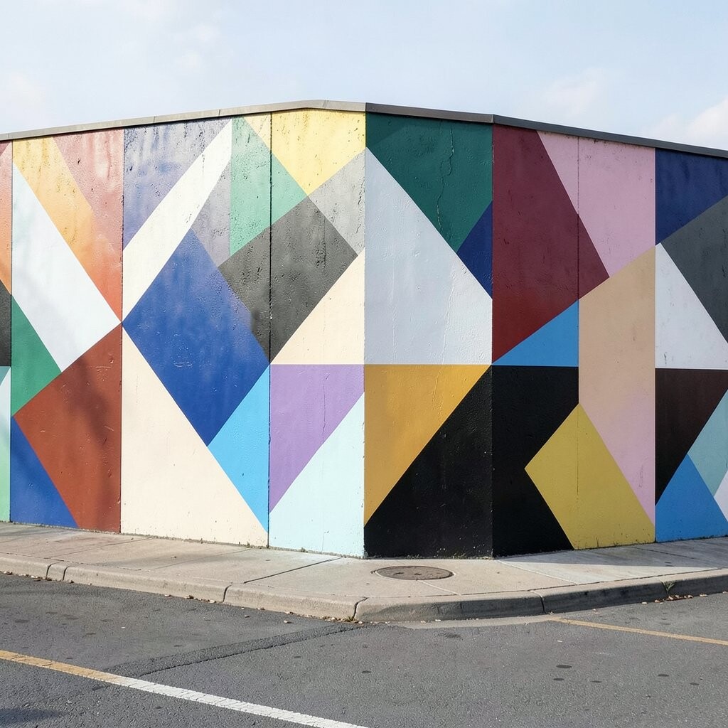
Large geometric panels can look bold even when they stay monochrome. The angles make the wall feel structured, and that structure can bring calm energy to a room.
Try a pattern of interlocking triangles, stepped shapes, or offset panels that echo furniture legs and shelf lines. Keep edges sharp for a clean look, or soften corners slightly if you want a warmer feel. If you’re personalizing, choose geometry that matches your favorite style, like modern minimal, farmhouse, or art deco-inspired curves.
For practical planning, measure the wall height and decide how many panels you want before you paint. Dry-fit painter’s tape strips to preview spacing, then paint in alternating shades of gray so everything stays readable. When it comes to cost, monochrome geometric work often uses fewer color samples, and you can reuse brushes across sections.
You can also create a gallery feel by leaving narrow “frame” gaps between panels, similar to how art is separated in a salon. If you prefer an update later, paint over one section with a new pattern while the rest stays as a base layer. This makes the project feel flexible rather than permanent.
5. Misty Landscape Silhouettes
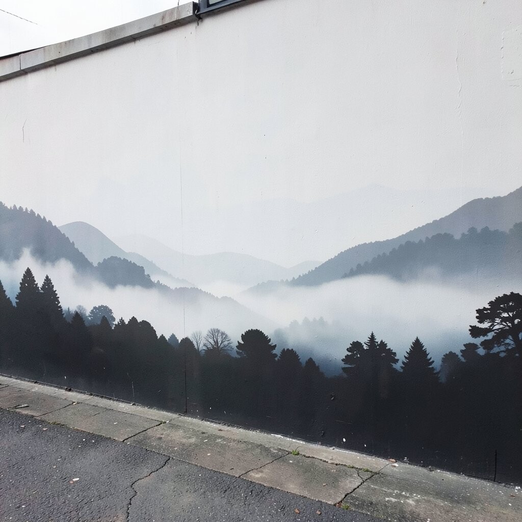
Picture a landscape that fades into a calm haze, with tree lines and hills drawn as quiet silhouettes. Without color, the scene feels poetic and can make your room feel like a window to somewhere gentle.
Choose one horizon moment, such as a sunrise glow rendered as light gray on white, or a forest edge rendered as deep charcoal. Keep the foreground darker and let the background lighten gradually to create depth. This style helps bedrooms feel peaceful and living rooms feel cozy because it softens harsh corners.
To keep the mural practical, start with a simple horizon line, then block in layers of darker shapes. Use a wide brush for the sky fade and a smaller brush for tree edges, so you get clean silhouettes. For personalization, add a small detail that means something to you, like a lone cabin shape near the side of the scene.
If you want a trendy look, consider making the landscape more abstract, like only sketching the main forms and leaving lots of negative space. Negative space is powerful in modern interiors, because it lets the room breathe. Cost stays manageable since large background fades can be done with a limited palette of grays and whites.
6. Brickwork and Concrete Texture Mural
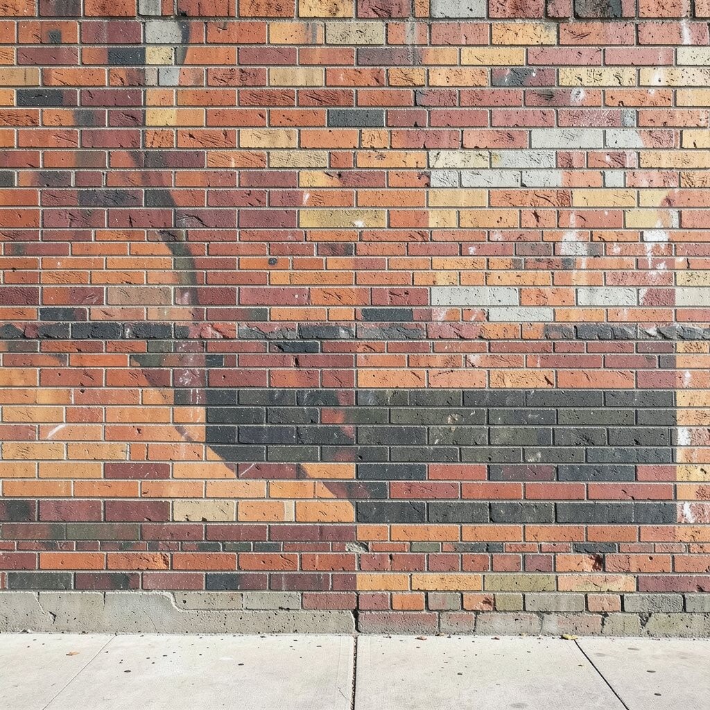
Sometimes brightness comes from texture, not color. A black and white wall mural that imitates brick, stone, or concrete can add character while still feeling clean.
Choose a texture style that matches your space, like industrial concrete for a loft vibe or stacked brick for a warm, classic look. To keep it from looking too heavy, use lighter grays as the base and paint subtle highlights on raised edges. This helps the texture feel dimensional without making the wall feel like it shrinks your room.
You can personalize by adjusting the scale, such as wider “bricks” for a modern look or smaller blocks for a classic feel. If your room already has textured elements like rugs or woven baskets, this mural will blend nicely instead of fighting for attention. For practical application, use a stencil or a textured roller so the pattern stays consistent.
7. Monochrome Washi-Print Inspired Patterns
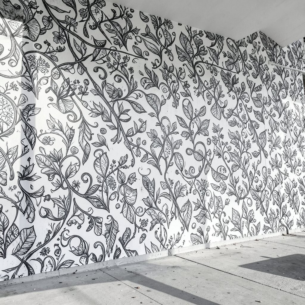
Imagine a wall covered in soft pattern like you wrapped it in handmade paper. Monochrome washes and repeating motifs can make a room feel calm and slightly creative.
Look for designs that feel airy, such as repeating circles, gentle waves, or fine dots arranged in a grid. Keep the pattern light enough that furniture and wall decor still stand out. If you want personalization, choose motifs that echo your everyday items, like the shape of coffee cups, subtle waves from a favorite beach, or tiny swirls that match your scarf pattern.
To make it practical, tape off a test area and paint a small sample first. When the pattern scale feels right, continue using the same spacing so it looks intentional. For cost, patterned murals can be done with basic tools and a single paint tone, especially if you use one brush for dots and one for lines.
8. Abstract Brushstroke “Motion” Wall
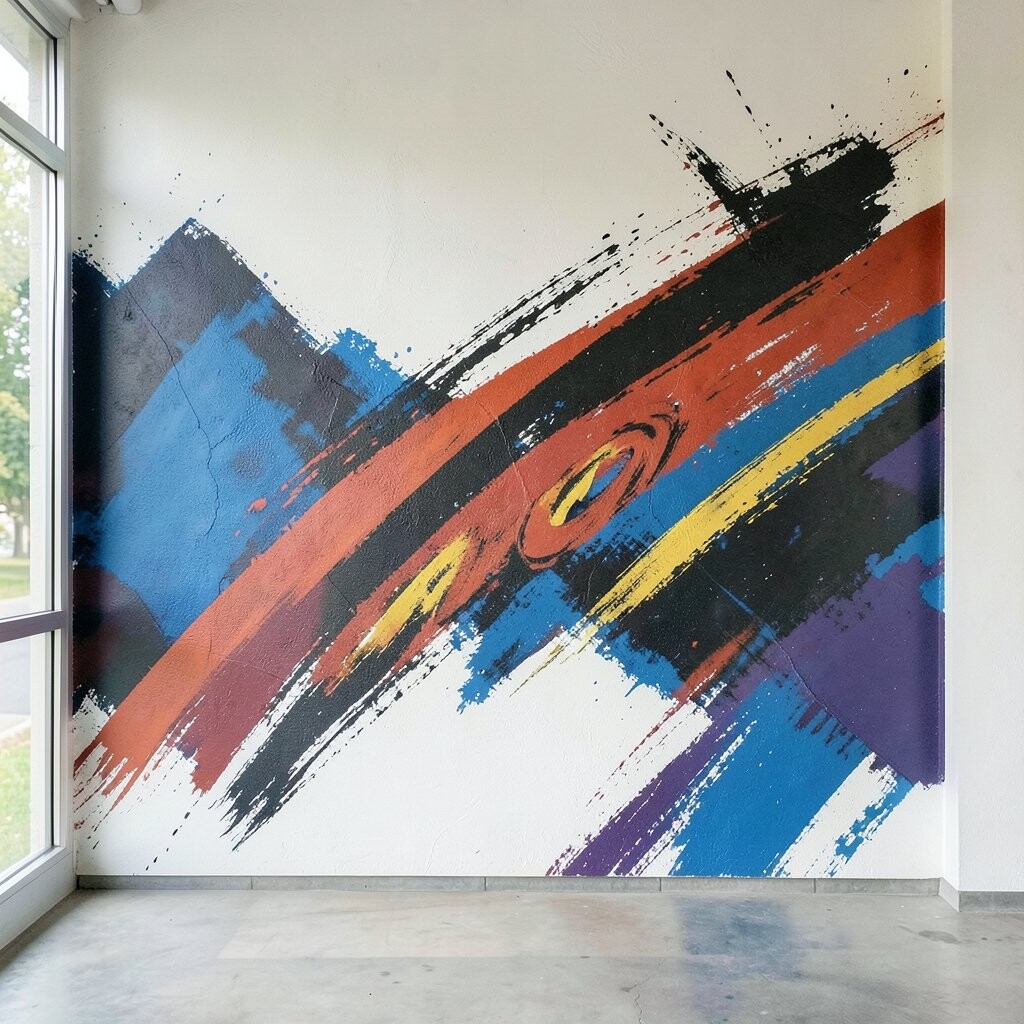
Bold brushstrokes can feel like movement on a quiet wall. Even without color, layered grays and blacks can create a sense of energy that makes a space feel brighter.
Try large sweeping strokes that curve across the wall, then add a few smaller strokes that mimic how your eye naturally moves. Use different paint thicknesses so some areas look matte and others look slightly richer. This adds visual variety that still stays monochrome and easy to match with modern decor.
For a practical start, practice on poster board or cardboard so you learn your stroke pressure and speed. When you transfer the idea to the wall, work from the center outward so you don’t run out of room. Personalize by echoing the direction of your rug pattern or curtain folds.
If you’re following current trends, textured abstract art is popular because it feels human and imperfect. It also hides minor wall imperfections better than perfectly smooth painted designs. Cost is often lower too because you can get a high-impact look with a small number of paint shades.
9. Repeating Medallion Wall in Shades of Gray
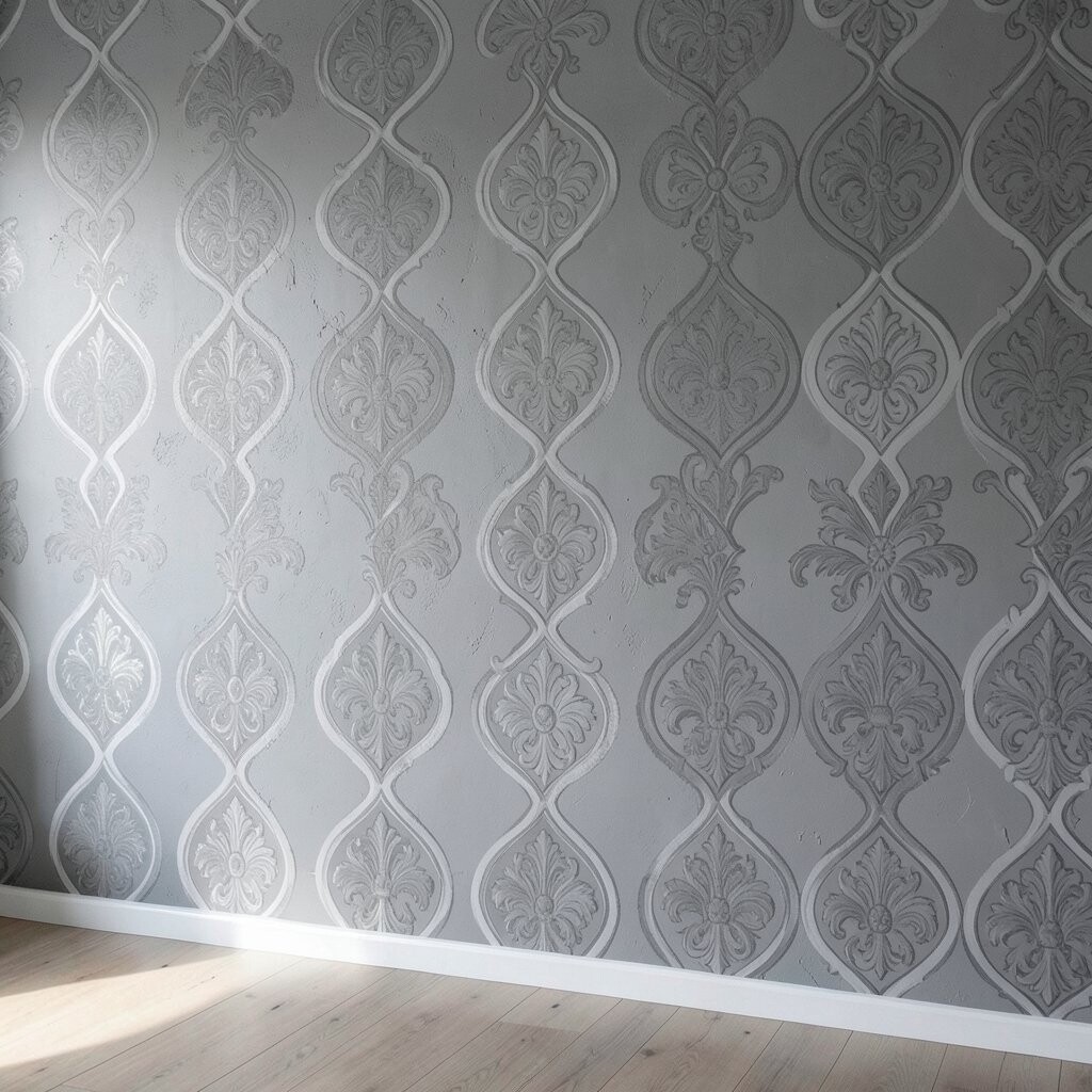
A medallion mural can make a wall feel like it has a hidden spotlight. When it’s monochrome, the design feels elegant without being loud.
Choose a central circular motif and repeat smaller versions around it, like a gentle ring system. Use light gray for the background and darker gray for the medallion lines, so the pattern stays crisp. This approach works well in dining rooms and entryways because it gives the eye a place to rest.
To personalize, redraw the medallion elements to match your style, such as simpler lines for minimal homes or more detailed shapes for traditional tastes. If you use stencils, you can create consistent shapes without needing perfect freehand skills. For practical planning, decide your mural size and leave enough space around the edges so it doesn’t crowd shelves or doorframes.
10. Charcoal Fade Ombre Around a Center Point
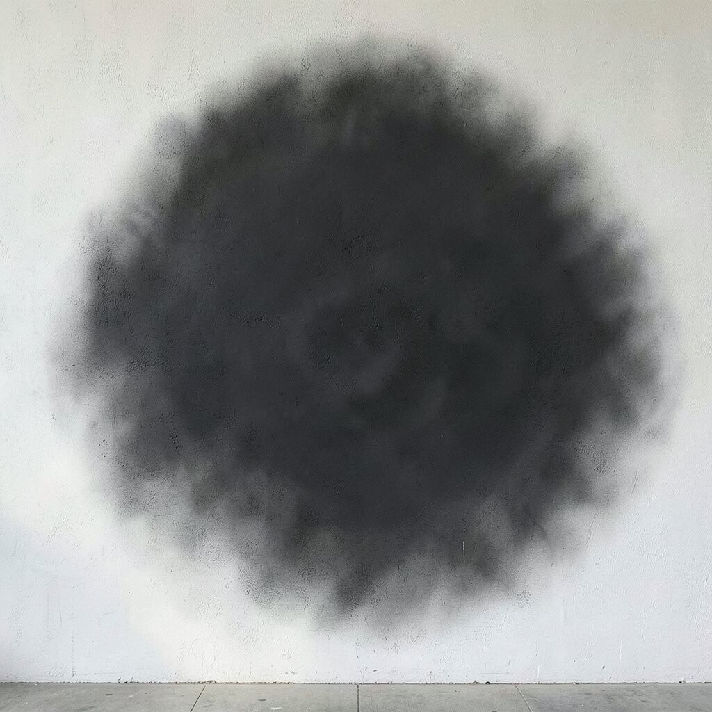
Ombre effects can brighten a room by making one wall look like it glows. A monochrome fade from deep charcoal to soft light gray can feel modern and comforting.
Pick a center point that lines up with a light fixture, art frame, or the middle of a couch. Then blend outward using a sponge or large brush, keeping the transitions smooth. If you want more drama, add a darker ring around the center so the eye has a strong focal layer.
To keep the look clean, use a taped stencil circle as a guide at the center, then blend carefully using horizontal sweeps. Work in layers so the fade builds naturally rather than showing hard lines. Personalize by changing the fade direction, like angling it slightly to follow the wall slope or architectural features.
For cost, this mural can be budget-friendly because you’re mostly working with a few tones of gray. It also reduces the need for detailed artwork, so even limited time can still produce a big result. If you enjoy current trends, minimalist gradients like this are a popular alternative to busy wall prints.
11. Black Frame and White “Art Window” Illusion
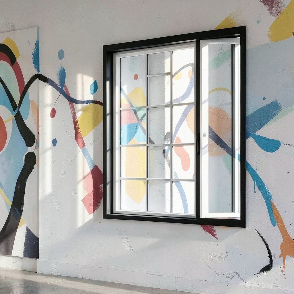
Sometimes brightness comes from creating the feeling of space. A monochrome mural that looks like a set of frames or a window on the wall can trick the eye in a fun way.
Paint a big outer frame, then add inner borders that suggest floating panels. Use near-white backgrounds inside the frames and darker gray for edges so the “windows” stand out. This style works great when you want the wall to look designed but still flexible for changing decor.
For practical personalization, match the frame style to your furniture, such as sleek lines for modern pieces or thicker, more textured frames for farmhouse looks. You can even leave one inner panel blank so you can rotate seasonal art, photos, or a simple monochrome print. Cost stays reasonable because painting frames mainly uses straight lines and a limited number of tones.
12. Optical Pattern Waves That Feel Like Light
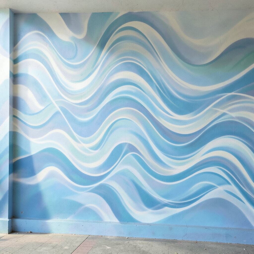
Optical wave patterns can make a wall feel active without adding any color. When you use alternating grays, the ripples can mimic light moving across a surface.
Try simple sine-wave lines, stacked contour curves, or repeating chevrons that shift gradually in spacing. Keep the contrast gentle so the pattern looks elegant rather than overwhelming. In rooms that feel too flat, this kind of visual rhythm can add depth and make corners less noticeable.
To make it practical, draw a few guide lines first and keep the spacing consistent. A projector app or simple grid method can help you scale the pattern correctly if you’re working on a larger wall. Personalize by choosing the wave direction that fits your layout, such as flowing horizontally for a wider feel or vertically for a taller look.
For cost considerations, optical murals can be inexpensive because they rely on paint, a few brushes, and patience. They also hide uneven paint texture well, which helps if your wall isn’t perfectly smooth. This is a trendy choice because op art looks bold and stylish even in minimal homes.
13. Monochrome Portrait Silhouette With Soft Grounding
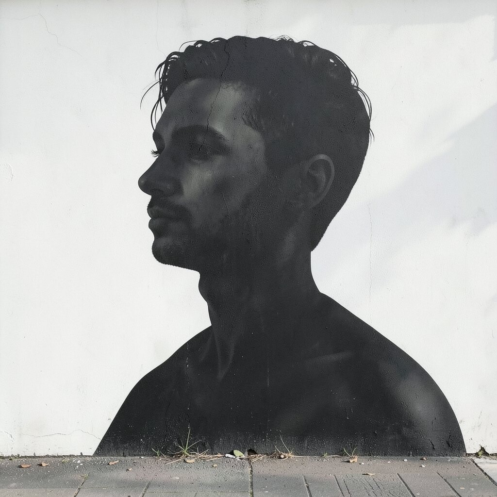
A portrait silhouette mural can feel deeply personal, especially when it stays monochrome. The shape alone can carry emotion and make the wall feel like it has a story.
Choose a loved one’s profile, your own silhouette, or an iconic shape like a famous building outline rendered in gray-black tones. Add a soft ground layer beneath it using lighter gray so the silhouette doesn’t feel like it’s floating. This gives the wall a grounded, finished look that still feels airy.
For practical tips, trace a printed image onto transfer paper or use a simple grid to keep proportions accurate. Start by painting the background wash, then place the silhouette last so it stays crisp. Personalize further by adding subtle texture around the silhouette, such as small dot fields or faint lines that reflect handwriting, music, or a favorite pattern.
If you’re thinking about cost, portrait work can be done without expensive materials by using basic brushes and a limited paint set. It also keeps your design unique, because no one else will match your exact story and silhouette choice. This approach fits the current trend toward meaningful home decor that looks artistic rather than generic.
You’ll get the best effect when the mural sits near natural light, like by a window or across from a bright lamp. Even on cloudy days, the contrast can make the wall read as brighter and more intentional. When the rest of the room stays calm, the silhouette becomes the calm focal point that ties everything together.