Wall sconces can change the mood of a room without making it feel busy. The right finish helps light look warmer, cleaner, and more personal.
In this guide, you will see common wall finishes and how each one pairs with popular sconce styles. You will also pick up practical ways to match materials, plan placement, and avoid common mistakes.
1. Brushed Nickel Sconces for Clean, Modern Light

Brushed nickel sconces catch light with a soft shimmer that never looks harsh. In a bright hallway or near a bathroom mirror, they make surfaces feel crisp and fresh.
This finish works especially well when your walls are painted in warm whites, cool grays, or gentle greiges. Choose a sconce with smooth lines and a clear or frosted glass shade so the glow spreads evenly. If you want a little drama, add a fabric shade in a light tone to soften the reflections.
2. Oil-Rubbed Bronze to Add Cozy Warmth
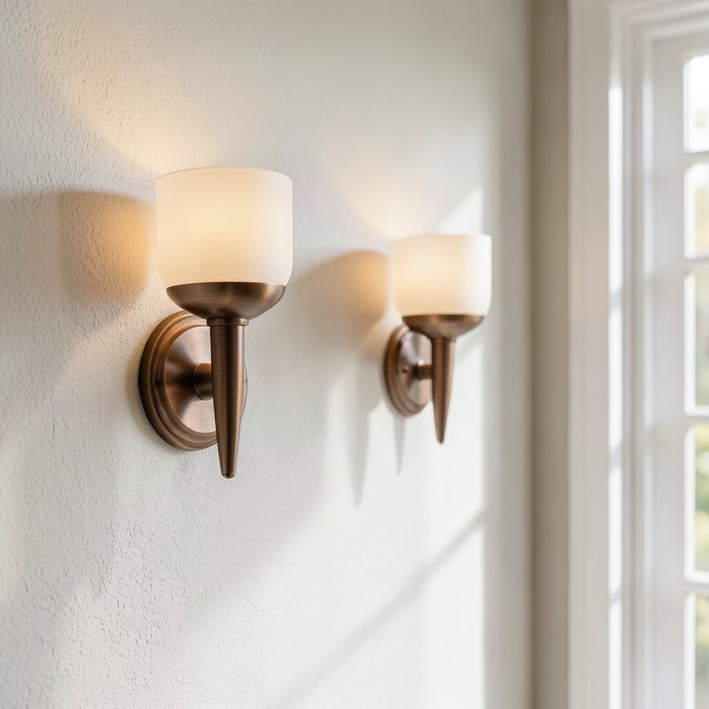
Oil-rubbed bronze looks like old-world metal with deep tones and subtle aging marks. It creates a cozy frame for light, especially in living rooms and bedrooms with darker accents.
Pair this finish with warm wall colors like creamy off-white, dusty taupe, or muted olive. The deeper metal tone helps candle-style bulbs look rich rather than too bright. For a practical upgrade, use LED bulbs with a warm color temperature so the glow stays gentle after dark.
If your space includes wood floors or black window frames, this finish often blends in naturally. Try matching only the metal accents instead of every hardware piece, so the look feels intentional, not forced. Consider spacing sconces so each one highlights a patch of wall art or wall texture rather than aiming at flat space.
3. Matte Black Finishes for Bold, Graphic Contrast

Matte black wall sconces bring instant structure to a room. Their clean silhouette looks striking against light walls and makes your lighting feel designed.
When you use matte black, think about how the finish echoes other fixtures like faucets, curtain rods, or ceiling fans. It is a great match for satin or eggshell paint because it reduces glare while keeping lines sharp. To personalize the look, select shades that vary in height and shape, such as a narrow cylinder next to a rounded dome.
For cost control, start with one statement pair on the most visible walls. Then keep the rest of your lighting simple so the black sconces stay the focus. You can also update the look quickly by swapping bulbs for brighter options or changing from frosted glass to open shades.
4. Polished Chrome for Bright, Reflective Energy

Polished chrome wall sconces reflect more light than many other finishes. They look especially lively in small spaces where you want the room to feel bigger and brighter.
This finish shines when paired with smooth walls and high-contrast accents. Use it with crisp white paint, soft light grays, or marble-look surfaces to enhance that clean, modern vibe. Keep the rest of your decor balanced by choosing minimal wall art or sleek frames.
5. Antique Brass to Warm Up Walls with Gentle Glow
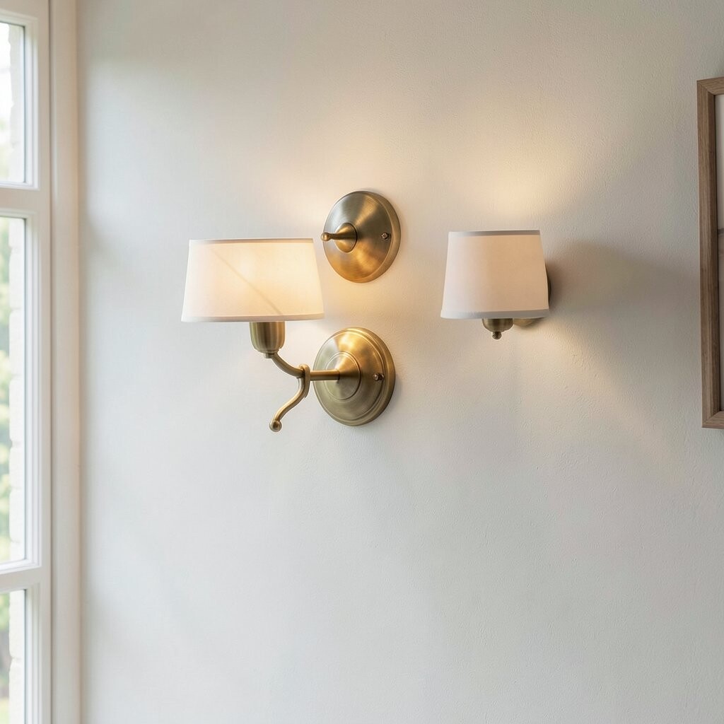
Antique brass has a soft golden look that feels welcoming even when the lights are off. It adds warmth to corners, reading nooks, and spaces where you want a calm glow.
It looks wonderful against creamy paint colors, warm sand tones, and subtle blush undertones. If you have furniture with natural wood or rattan textures, this finish helps everything feel connected. For a practical plan, match the brass to one or two other details like door handles or picture frame accents.
To control cost, consider installing sconces only where they matter most, like on each side of a mirror or above a console. You can also select shades that are easy to clean, such as opal glass, so your glow stays consistent. Add dimmers if possible so you can shift from bright task lighting to slow evening warmth.
6. Faux Wood and Natural Textures for an Earthy Layer
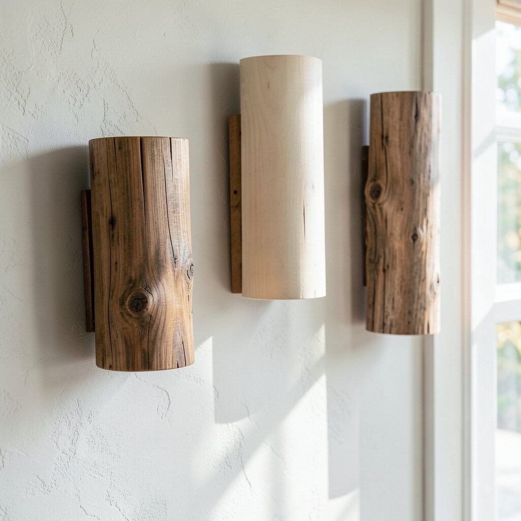
Natural wood-look finishes on wall sconces bring a soft, grounded feel to your space. They blend beautifully with boho decor, farmhouse styles, and rooms that use plenty of plants.
Use this finish on walls with warm neutrals, light clay tones, or subtle textured plaster effects. A warm-toned bulb helps wood finishes look even richer, so your lighting feels more like part of the room than a separate object. Choose a shade shape that gives you the right light spread, such as a wider top for ambient lighting.
This option can also be budget-friendly when you pick faux wood that resists warping. For personalization, stain or top-coat your surrounding wall area with matching tones, if you are painting. Place sconces where they can highlight a natural wall detail, like a woven wall panel or a textured art piece.
7. Porcelain and Off-White Shades for Soft, Elegant Light

Porcelain or off-white wall sconces feel delicate and classic. The light they cast looks smooth, with fewer harsh shadows on the wall.
This finish pairs nicely with traditional trims, crown molding, and smooth painted walls. Try it in a dining area where you want a warm glow across table surfaces. If you want a little sparkle without going flashy, choose porcelain with a faint speckle or subtle glossy sheen.
For practical placement, mount them so the light lands around eye level for comfort. If you are using them near artwork, aim the beams slightly above the center so your pieces look lifted. Consider switching to warm LED bulbs to keep the look soft while reducing energy use over time.
8. Brushed Brass and Satin Gold for a Refined Shine

Brushed brass and satin gold finishes offer a refined glow that looks polished but not flashy. They sit between modern and classic styles, which is why they feel so versatile.
Match them with warm whites, greige tones, and soft taupe walls for a balanced look. If your room has light wood cabinetry or pale stone counters, this finish often harmonizes with everything around it. For an easy upgrade, pick a sconce with adjustable arms or a directional shade so you can aim the light where you need it most.
9. Hand-Painted Ceramic for Artistic Personality

Hand-painted ceramic wall sconces add real personality to your walls. When the pattern is subtle, the light feels gentle and the room feels like it has a story.
This finish works well in spaces with soft color palettes, like dusty rose, light teal, or calm butter-yellow. Keep the rest of your decor simple so the artwork on the sconce stays the star. You can personalize by selecting colors that echo your throw pillows, curtains, or a nearby rug.
For practicality, choose a ceramic glaze that resists fingerprints and dust. Wipe it regularly with a soft cloth so the paint stays clear and the shine stays true. If you are watching cost, start with one pair in a key area like a hallway, then add more later if the budget allows.
Placement matters too, so mount them at a height that lets the light wash the wall behind them. That makes the colors look richer and creates a cozy glow trail in the room.
10. Clear Glass and Crystal Accents for Sparkly Drama

Clear glass sconces with crystal accents look like tiny light sculptures. They bring sparkle to entryways, glam bedrooms, and rooms with chandelier energy.
To make this finish feel intentional, pair it with clean wall paint and simple trim. White walls make the glass stand out, while pale grays help it look sophisticated instead of too loud. Choose warm bulbs to keep the shine from feeling icy.
For a practical tip, use dimmers so you can control how much sparkle you want. Too much brightness can make the glass glare, especially in daylight. If you love the look but want less cost, choose a frame with glass elements rather than full crystal detailing.
Personalize the feel by matching your glass style to other accessories, like mirror frames or cabinet knobs. When the shapes align, the room looks more designed, even if you keep furniture simple.
11. Textured Plaster and Concrete Finishes for Modern Depth

Concrete-like and textured finishes on wall sconces add depth without being heavy. They look great in modern spaces that use matte surfaces and earthy colors.
Use these sconces with walls that have soft texture, such as limewash or plaster effects. The lighting will highlight the wall details and make the room feel layered. If your walls are flat, add a bit of texture around the sconce area with art, a wall panel, or a fabric-backed accent.
This look can also be easier on the budget because many textured designs hide small scuffs well. Just make sure the finish you choose is sealed enough for regular cleaning. Choose a shade that spreads light gently, so the wall texture creates a calm glow instead of a spotlight effect.
12. Satin White and Cream Finishes for Bright, Airy Walls

Satin white or cream finished sconces blend with the wall and make lighting feel airy. They are perfect when you want brightness without strong contrast.
This style works well with nearly any wall color, but it especially pops on deeper tones like navy, charcoal, or forest green. It also looks beautiful in coastal-style spaces where you want clean lines and soft light. For personalization, try different shade shapes, such as a linen drum for warmth or a smooth opal glass for even glow.
13. Aged Iron for Vintage Character and Strong Presence
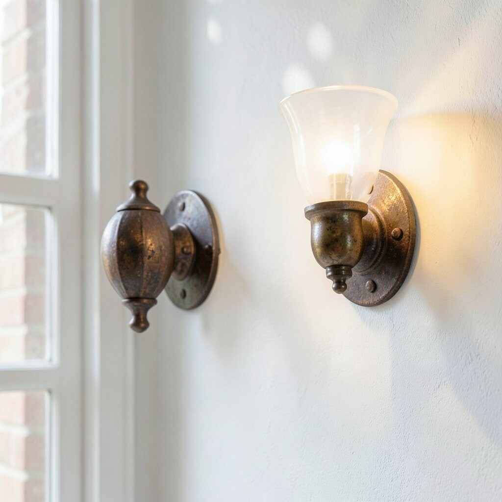
Aged iron wall sconces look sturdy and full of character. Their darker, muted finish brings a vintage vibe that feels at home in rustic, industrial, and traditional settings.
Pair aged iron with warm paint colors like cream, warm gray, or muted brick red. The metal makes these colors feel richer and helps the light cast a flattering warmth on the wall. Choose a bulb that gives a soft halo effect, especially if your sconce has open sides or decorative scrollwork.
If you want practical guidance, install them near furniture where you already have warm wood or leather. The finish will match the room’s feel instead of looking like a separate decorative element. To manage cost, pick one standout iron pair as an anchor, then repeat smaller metals elsewhere only if it suits your design.
Personalize the look by selecting sconces with decorative elements that echo your cabinet handles or bed frame details. Consistency makes the whole space look more custom.
14. Mixed Metals for a Trendy, Collected Look
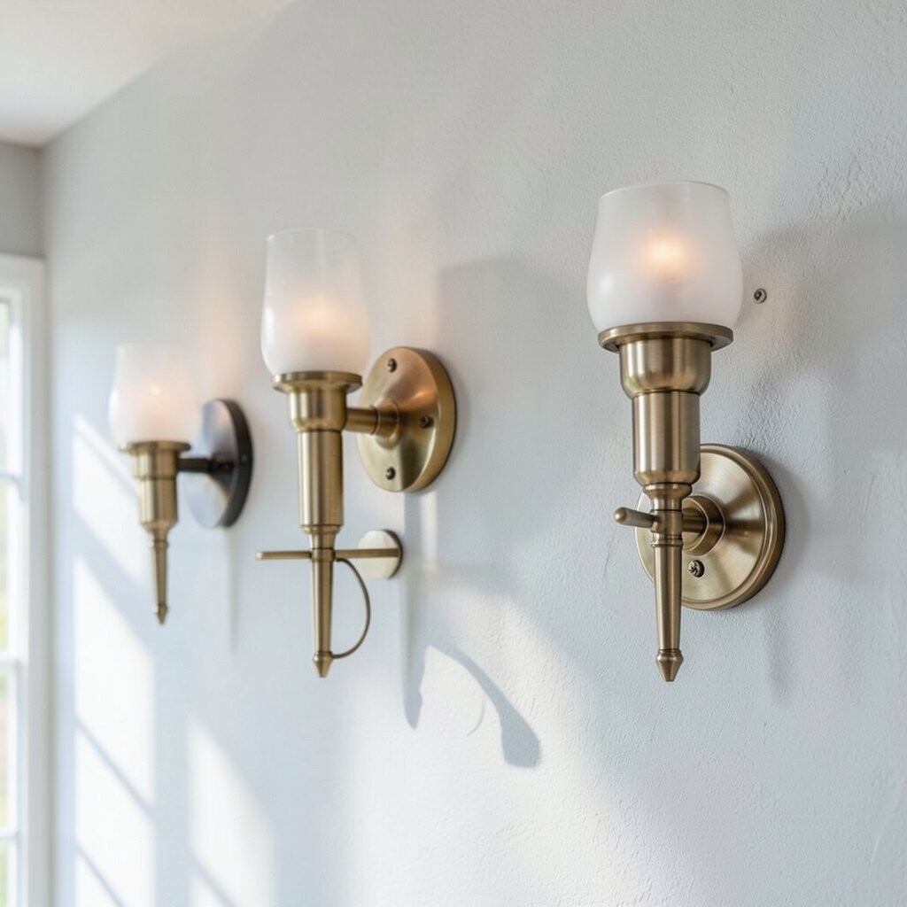
Mixed metal wall sconces feel modern and collected, like you built your room piece by piece. This trend is popular because it adds visual interest without locking you into one finish forever.
You can mix brass with black, chrome with warm gold, or nickel with bronze, as long as one metal stays dominant. This helps the room look intentional rather than random. If your wall paint is neutral, mixed metals will stand out more, so choose a finish mix that fits the mood you want, like warm and cozy or sleek and bright.
For practical results, repeat the smaller metal accents elsewhere, such as in picture frames, curtain hardware, or light switches. That repetition keeps the look cohesive even when finishes differ. Consider cost by investing in one high-quality mixed-metal sconce pair, then choose simpler matching designs for other rooms.