
Your home can feel instantly more alive with the right color in the right places. Jewel tones add warmth, richness, and a little wow factor without needing a total makeover.
From deep greens to glowing purples, these shades bring personality into everyday rooms. Keep reading for practical ways to use them so your space looks styled, not fussy.
1. Emerald Green
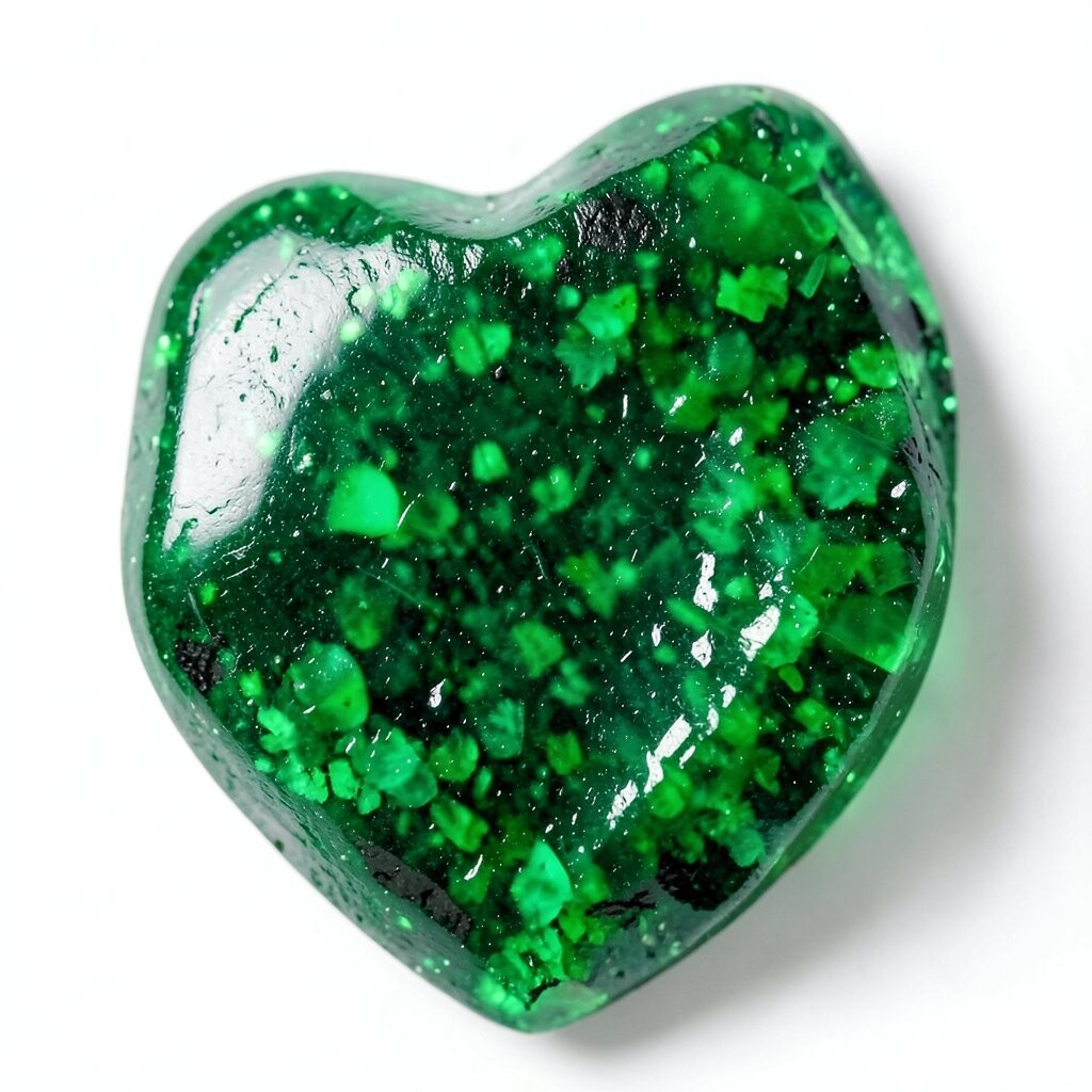
Emerald green brings a lush, grounded feel that looks beautiful in both modern and classic rooms. Imagine velvet cushions catching the light while the walls stay calm and balanced.
Use it with creamy whites and warm wood so the color feels inviting. Try an emerald throw blanket or a few framed prints, then repeat the shade through small details like vases or curtain tiebacks.
2. Sapphire Blue
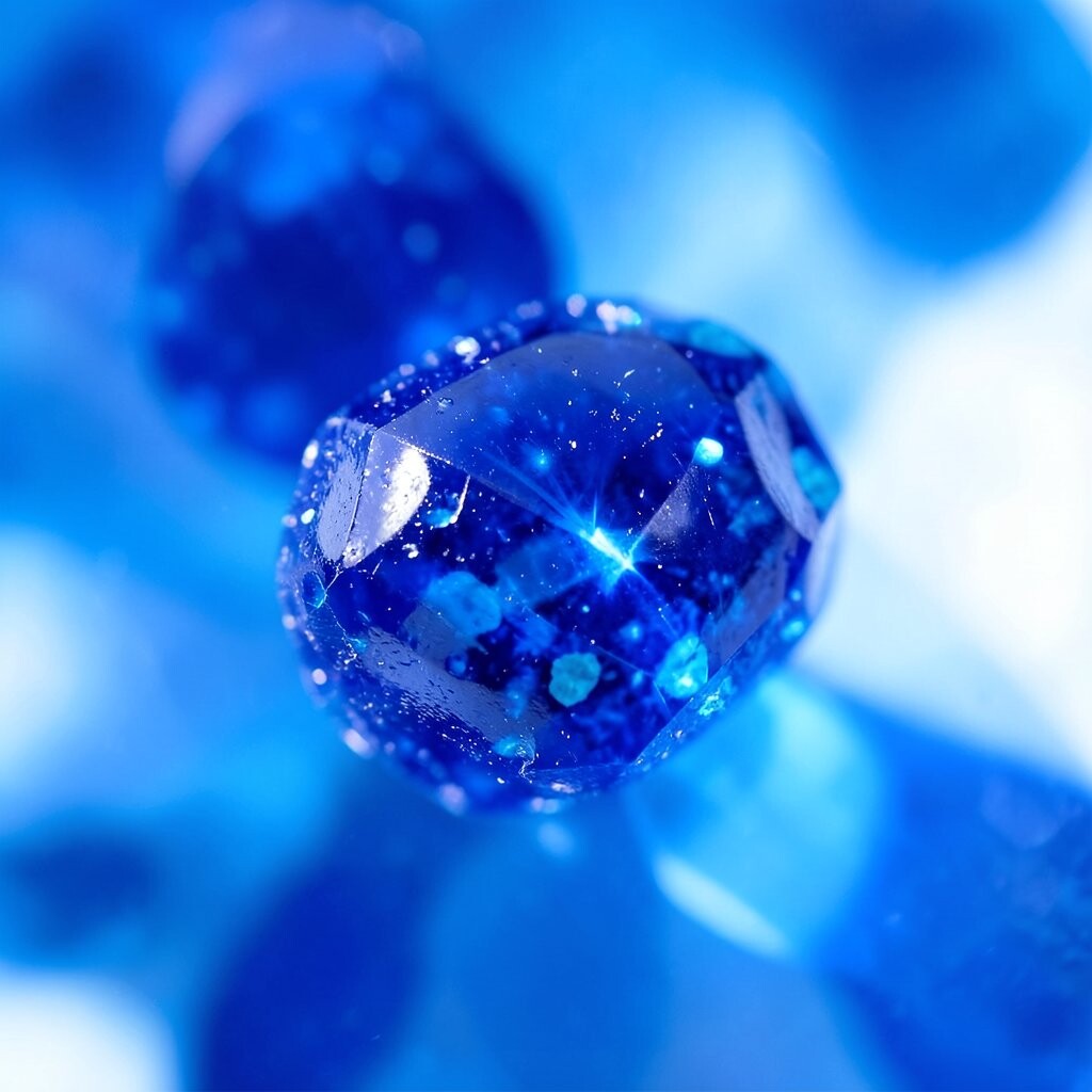
Sapphire blue feels crisp and confident, like clear skies with a deeper, moodier twist. You can picture it in a statement rug where the whole room seems to “click” together.
Pair sapphire accents with soft grays or off-whites to keep things fresh. For practical placement, choose one focal point such as a sofa pillow set or a single accent wall behind a reading chair.
If you rent, use removable wallpaper strips or peel-and-stick tiles for a temporary pop. This tone is also trending because it photographs well and makes neutral rooms look styled for social media.
3. Amethyst Purple

Amethyst purple adds a playful sense of mystery that still feels cozy. Think of lilac-violet lamp shades glowing at night with a gentle, flattering light.
Use it sparingly at first, then build confidence with matching textures like knit throws and smooth ceramics. A good personalization idea is to mix amethyst with small hints of gold in frames, mirrors, or drawer pulls.
If you want cost control, start with a single accent piece such as curtains or a picture mat set. This color uniqueness works best when the rest of the room stays simple enough to let the purple feel special.
4. Ruby Red
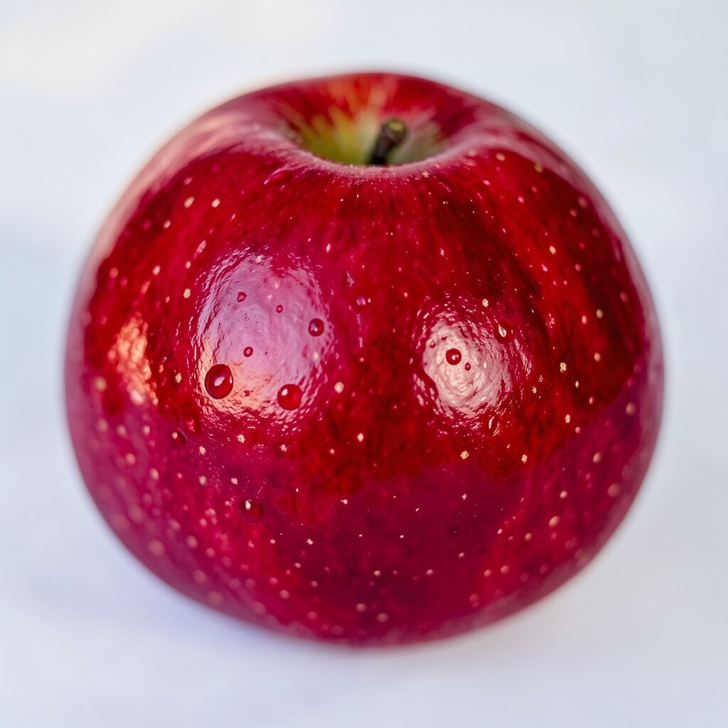
Ruby red is bold and energizing, and it can make even plain spaces feel celebratory. Picture a deep red runner in a hallway, creating instant rhythm as you walk by.
To keep ruby from feeling too intense, pair it with black accents, warm beige, or muted taupe. Use one larger item like an upholstered chair, then balance with lighter pieces such as linen curtains or pale wall art.
5. Topaz Orange
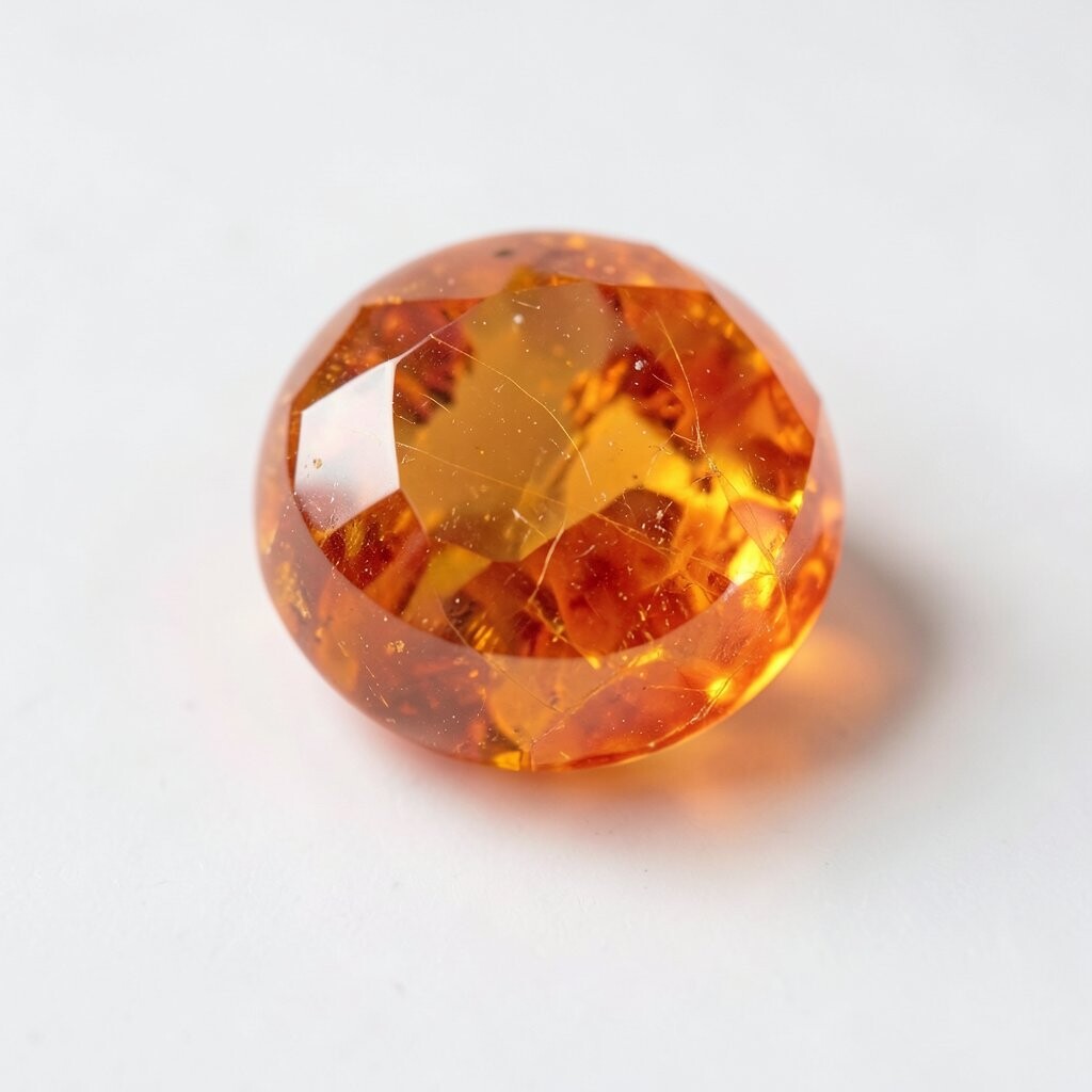
Topaz orange brings a sunny, welcoming glow that feels cheerful without being loud. Imagine terracotta tones meeting bright daylight in a kitchen nook.
Try it in small, movable ways, like an orange ceramic bowl collection or a patterned table runner. You can personalize the look by choosing orange shades that match your favorite artwork or even your existing wood stain.
For current trends, this warm jewel tone works great with natural materials like rattan, stone, and matte black hardware. If you’re watching your budget, look for affordable prints and swap them seasonally.
6. Emerald Black? Actually, Deep Teal
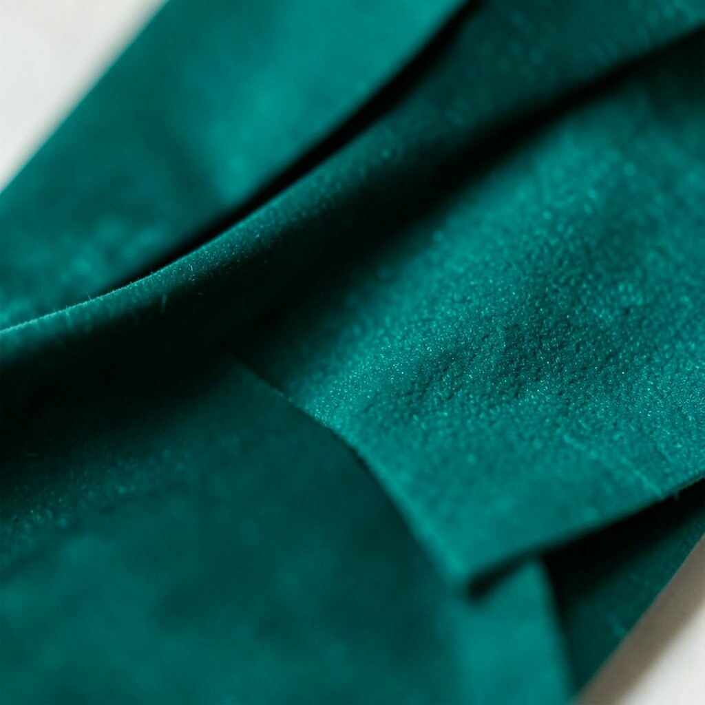
Deep teal sits between blue and green, giving a rich, watery glow that feels calm and stylish. It reminds people of ocean depth, which is why it’s so naturally soothing.
Use teal in layered ways so it looks intentional, like a teal rug plus matching glass vases. Practical tip: keep one or two neutral colors nearby, such as warm white and light oak, so the room stays bright.
To personalize, choose teal fabrics with different textures, like boucle and velvet, for a more designer feel. This tone is trending because it makes neutral decor look richer while still feeling current.
7. Garnet Wine
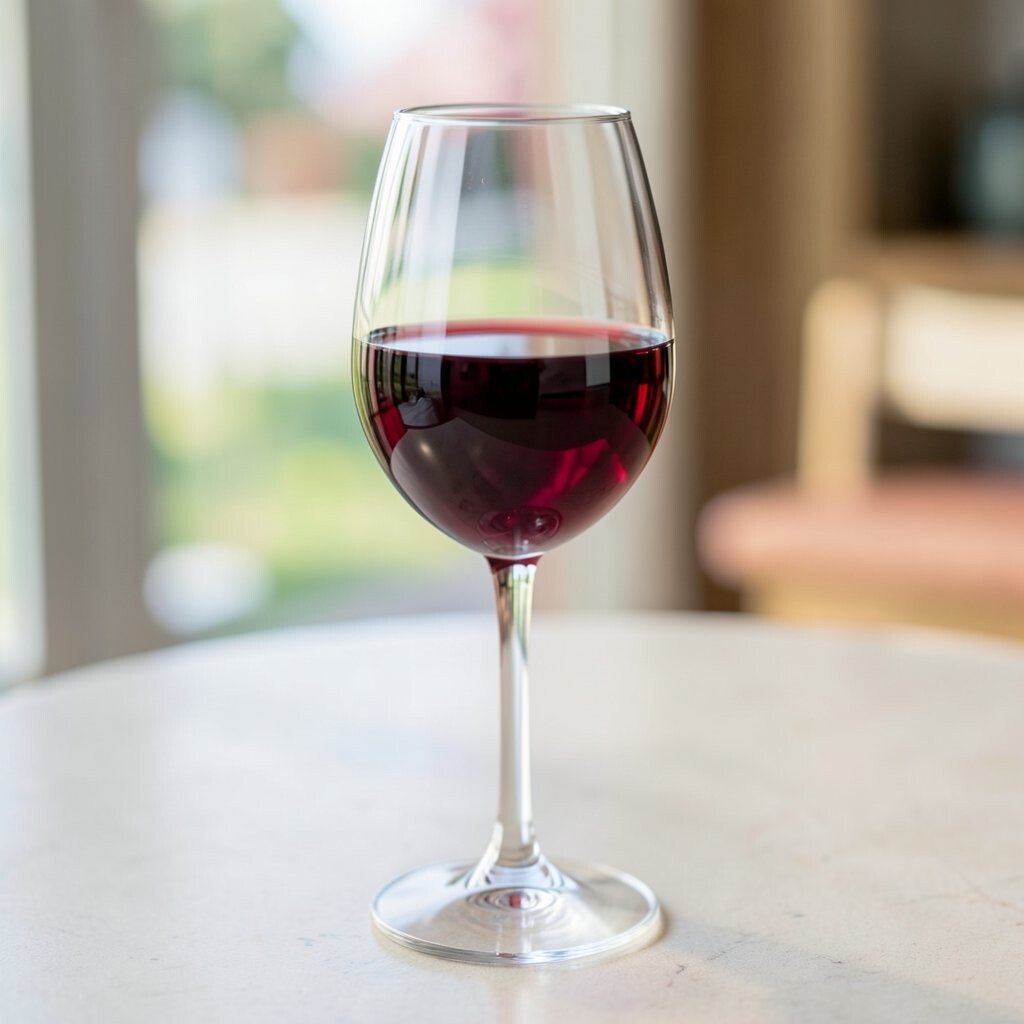
Garnet wine is a warm, elegant color that brings cozy energy to living rooms and dining areas. Picture a wine-toned accent chair surrounded by soft beige walls and gold-toned lighting.
Pair garnet with chocolate brown, cream, and subtle metallics to create a layered, high-end look. If you want an easy personalization idea, select curtains in garnet and repeat the shade through smaller items like coaster sets or throw pillows.
For cost considerations, a single statement piece often goes further than repainting everything. This jewel tone also feels unique because it reads different in daylight versus evening, so your space looks interesting across the day.
8. Sapphire Teal? Keep It as Cobalt
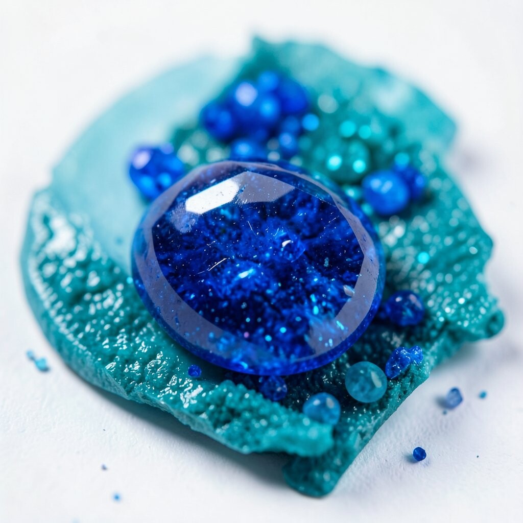
Cobalt is a bright jewel tone that feels playful, crisp, and modern. Think of cobalt mugs on a countertop, instantly making your kitchen feel more cheerful.
Use cobalt as a pop color against white cabinetry, light stone counters, or pale walls. A practical approach is to choose one room with strong contrast, such as an entryway bench cushion or a gallery wall of cobalt prints.
9. Forest Moss
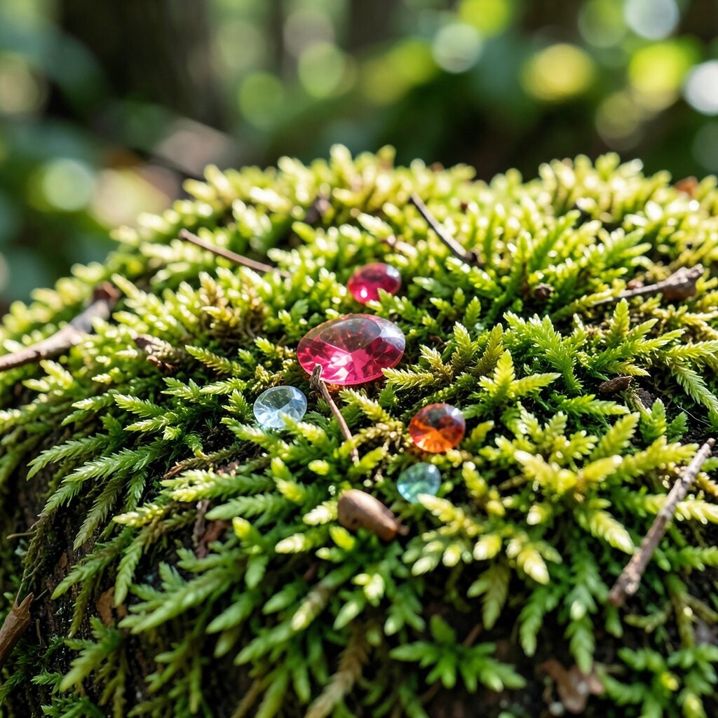
Forest moss green feels grounded and nature-inspired, like stepping into a shaded garden. It works beautifully in bedrooms because it adds comfort without looking dull.
Try moss on bedding, curtains, or an accent wall behind a headboard. To keep it balanced, pair it with warm whites and earthy browns so the look feels soft, not harsh.
Personalize by mixing moss with natural textures like wood frames and woven baskets. If you’re thinking about cost, consider a moss duvet cover or washable slipcovers first, then upgrade accessories later.
10. Pearl Silver-Gray with Jewel Undertones

Pearl gray with a hint of jewel undertone gives your decor a polished glow. It looks like morning light reflecting off stone, so it feels both fresh and luxurious.
Use it in metals, painted furniture accents, or subtle shimmery fabrics. A practical tip is to pair it with deeper jewel colors like emerald or amethyst so the room has both contrast and softness.
11. Citrine Gold
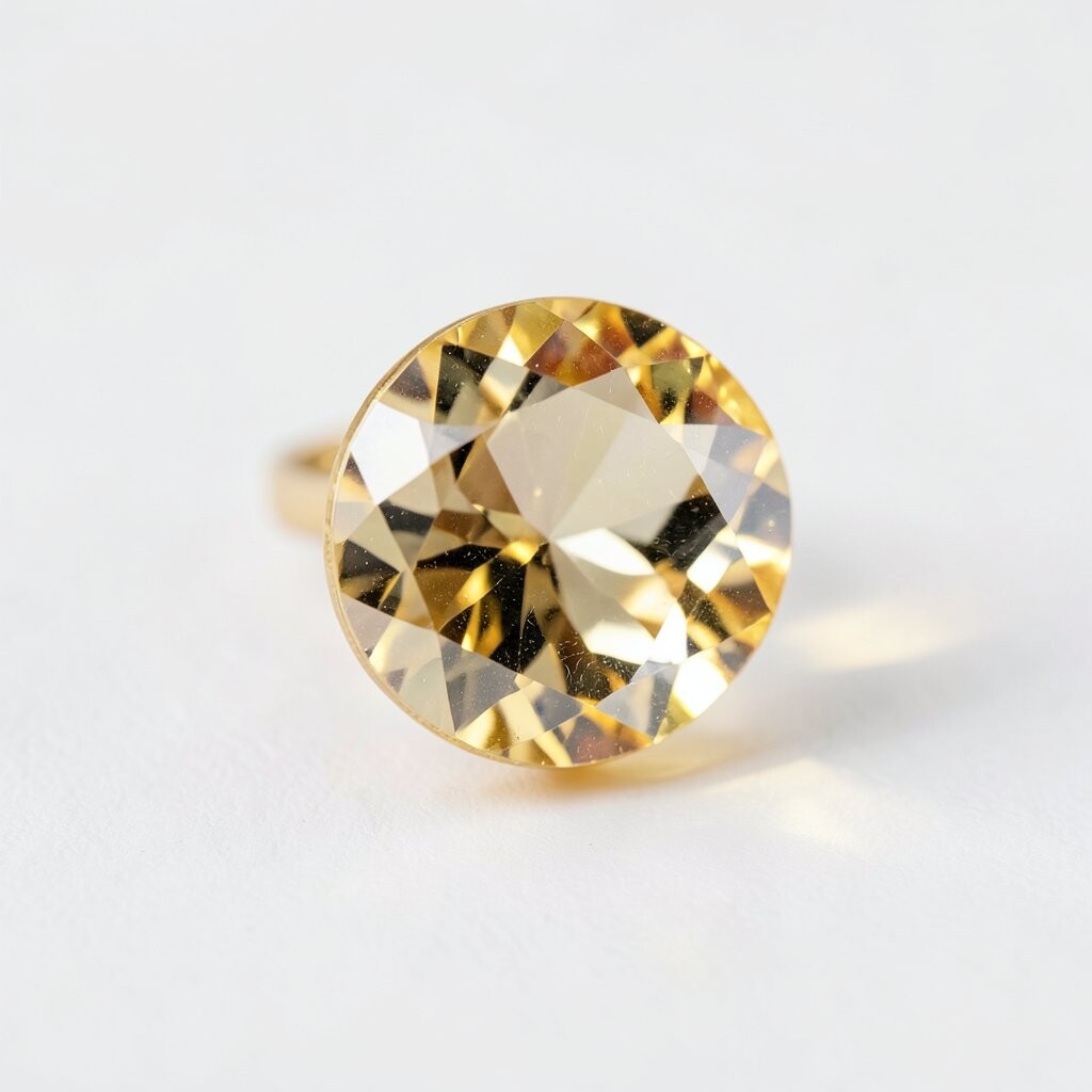
Citrine gold adds a sunny brightness that feels fancy without being fussy. Imagine a gold-framed mirror catching light and making the whole room look bigger.
Use citrine through lighting, hardware, and decor objects like picture frames or candle holders. For personalization, match the gold tone to your existing metals so everything looks cohesive and not random.
Cost considerations are friendly here because small upgrades often make a big impact. This shade is also popular in current decor because it blends well with both cool and warm color palettes.
12. Lapis Lazuli
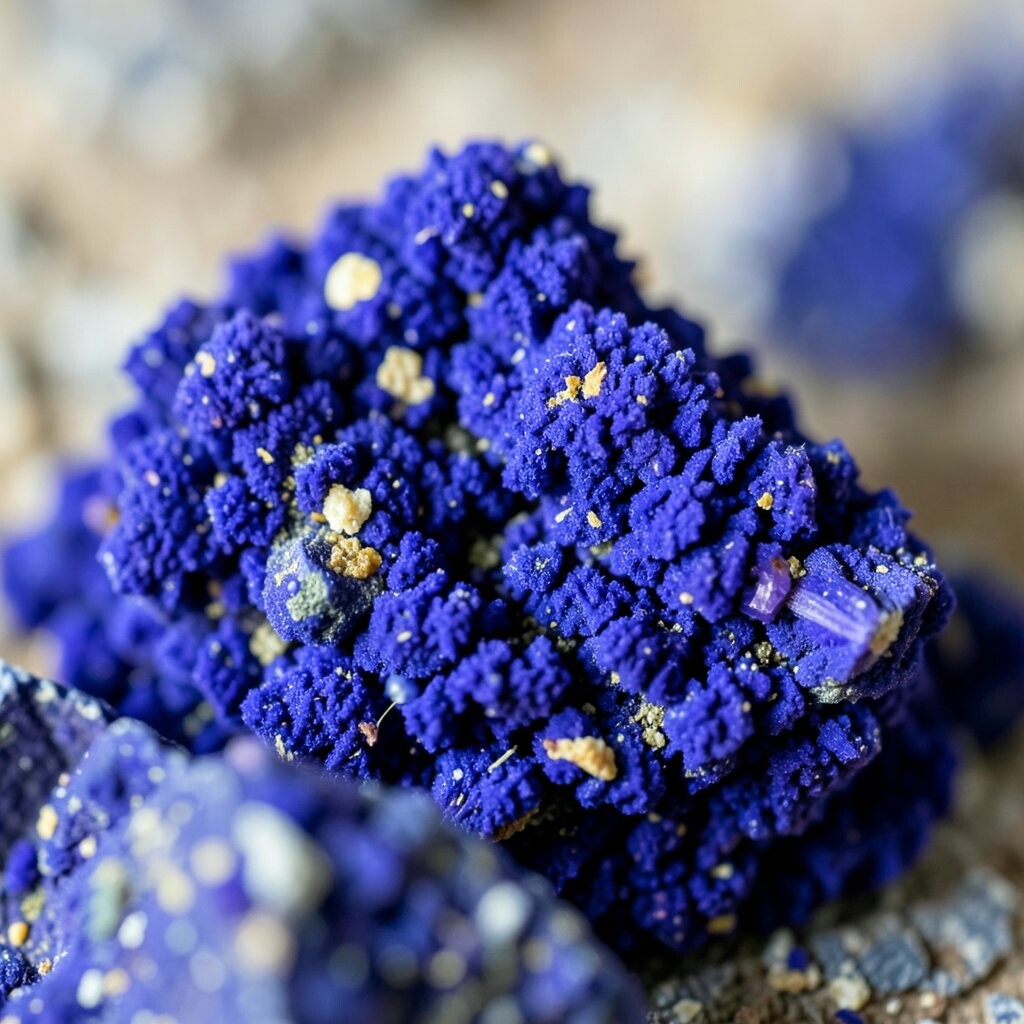
Lapis lazuli brings a dramatic, artistic vibe that instantly makes a room feel curated. Picture it in a bold piece of art or a richly colored accent rug that anchors the space.
Pair lapis with warm neutrals like cream and caramel so the blue stays vibrant but not icy. Practical tip: choose one main lapis element, then keep other patterns simple so the color remains the star.
13. Blush Coral with a Jewel Twist
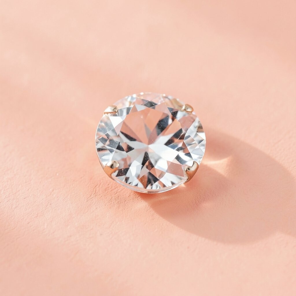
Blush coral with jewel-like energy adds warmth and softness at the same time. It can look like rosy sunset tones when paired with natural light.
Use coral in living spaces where you want a friendly mood, like on throw pillows, a ceramic vase collection, or a lightly patterned curtain. To personalize, pick coral shades that echo your favorite artwork and then repeat them in tiny ways, such as in book spines or decorative trays.
If you’re mindful of cost, try a coral accent rug or a washable cover before committing to bigger changes. This tone feels unique because it sits between pink and orange, giving a fresh twist compared with typical pastels.