
The right frames can make a room feel like it has a personality of its own. When the mix feels intentional, your walls start doing more than holding pictures.
Choosing combinations is also a practical shortcut to make your decor look styled, even if you’re working with limited time. Small decisions about color, spacing, and layout can add up fast.
1. Mixed-Size Gallery With Warm Wood and Cream Mats
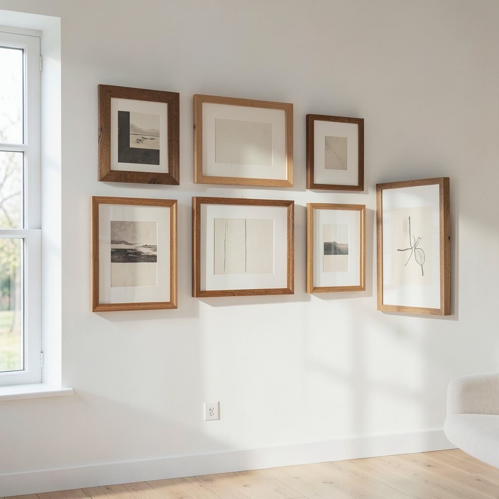
Start by grouping prints or photos in different sizes, then unify them with warm wood frames and cream mats. You can picture a cozy set where every frame catches light a little differently, like a soft gallery in a small café.
Keep the spacing even and let the mats bring breathing room around each piece. This combo helps your wall feel balanced, while the wood tones add comfort. Choose mat colors that match your couch or curtains so everything looks like it belongs together.
2. Black Frames, Colorful Art, and a Single White Accent Border
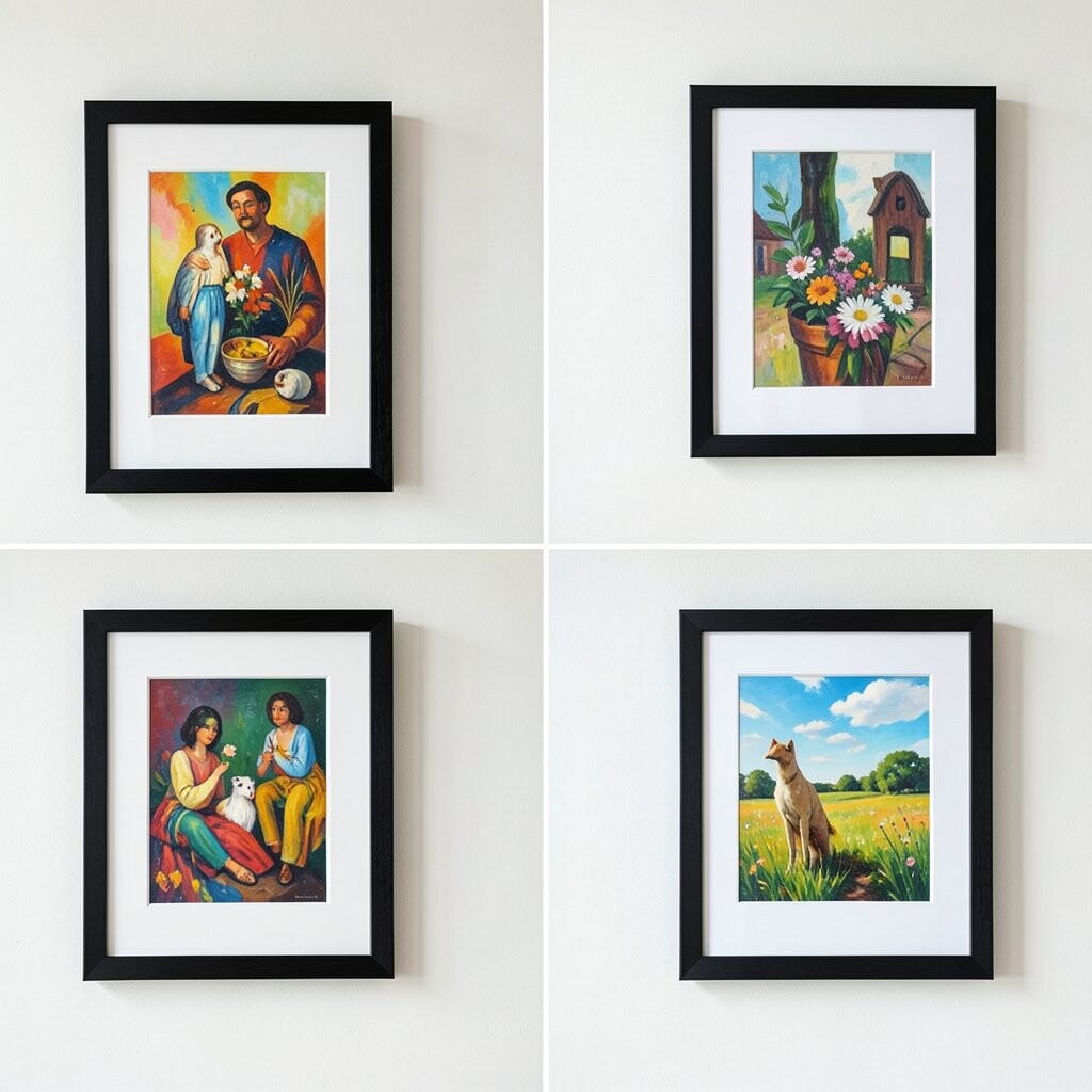
Picture a wall where sleek black frames hold bright art, and one piece gets a crisp white border that pops against the rest. The contrast can feel bold but still clean, especially in rooms with light walls.
Use one consistent frame width so the black looks cohesive, then vary the artwork styles without losing harmony. This combination draws the eye in layers and makes your favorite colors look more vivid. For a practical win, hang the frames at eye level and step back to check alignment before you commit.
If you want personalization, pick artwork that matches a hobby or interest, like travel sketches or family portraits. Keep cost in mind by using standard black frames for most pieces, then splurging on one statement print for that white accent border. Current trend energy favors sharp contrast and simple materials, which makes this pairing feel modern.
3. Floating Frames Over a Textured Accent Wall
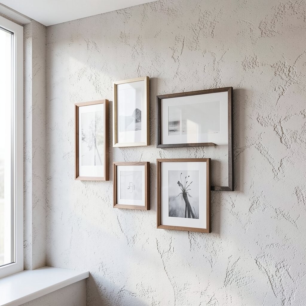
Think of frames that look like they’re hovering, especially when they’re set on a wall with subtle texture. The combination feels airy, like your photos are gently suspended in the room.
Choose frames with clear acrylic fronts or shadow-gap styles so the pieces float visually. This helps your wall look taller and gives a tidy, contemporary feel without needing lots of extra decor. Use lighter artwork such as line drawings or landscapes to keep the look from feeling heavy.
For practical tips, secure heavier frames with anchors and make sure your texture doesn’t catch glare from the glass. Personalize by mixing in a few pieces with different orientations, like one portrait and two landscapes, to create rhythm. If you’re watching your budget, try fewer larger frames instead of many small ones, since fewer frames can reduce hardware and mounting costs.
4. Thrifted Frames in a “Family” Match With One Metal Finish
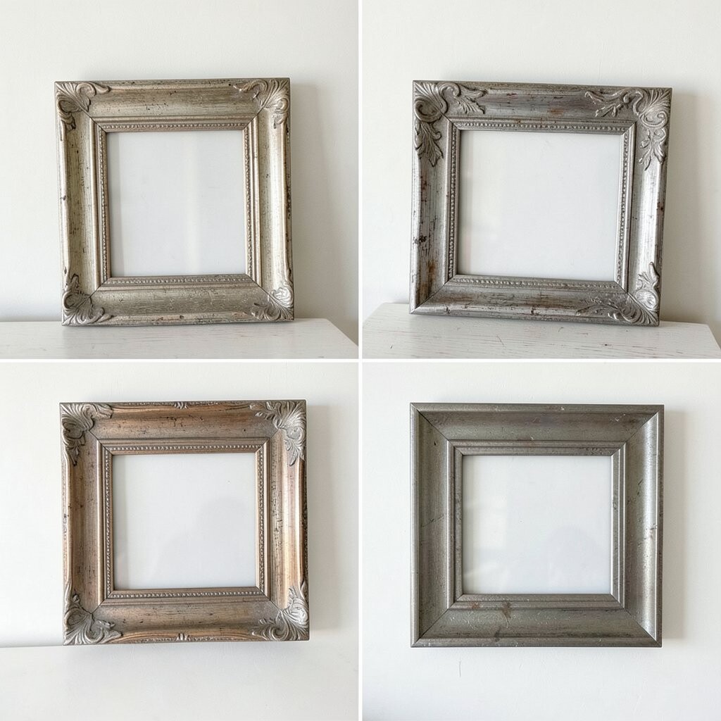
Imagine a collection of thrifted frames that look different at first, but share a common metal detail, like brushed brass, satin nickel, or matte black. The wall becomes a story, not a showroom, and it feels special because you chose it piece by piece.
Pick a unifying finish you can see in every frame, then keep the rest varied. This creates uniqueness while still looking curated, and it can be a budget-friendly way to build a gallery without buying everything new. Sanding and repainting old frames is a simple process, and it also lets you match your room’s lighting and hardware.
Personalize by including one frame that holds a ticket stub collage or a handwritten letter photo scan. For cost considerations, you can buy inexpensive frames, spray paint them, and use custom mats only for your best prints. A current trend is leaning into collected, lived-in styling, and thrifted frame mixes fit that vibe perfectly.
5. White Frames With Black-and-White Photos and One Tiny Patterned Frame
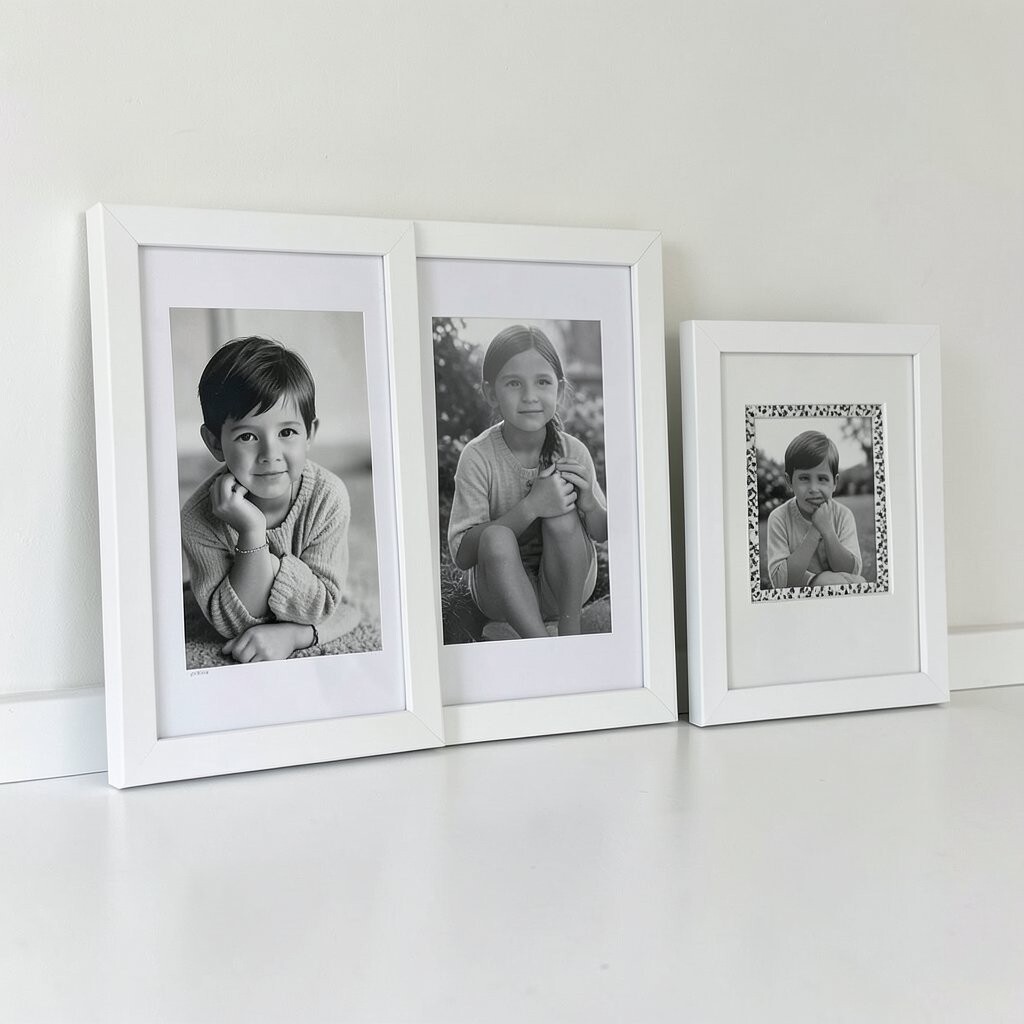
Picture a calm wall where mostly everything is black-and-white, framed in clean white borders. Then one small frame adds a playful touch with a subtle pattern, like a tiny geometric or dotted print.
This combination is great because it looks cohesive while still giving you a surprise moment. The black-and-white photos feel timeless, and the patterned frame adds personality without overpowering the rest. Keep the sizes mostly similar for a tidy look, and use the same mat thickness throughout for a polished finish.
To personalize, choose photos that share a theme, like nature walks, kitchen moments, or candid snapshots of friends. Keep cost low by printing standard sizes at home or at a local print shop, then using a single patterned frame you already love. This look is also a current favorite in minimal styling, where contrast does the heavy lifting.
6. Ornate Vintage Frames Paired With Modern Abstracts
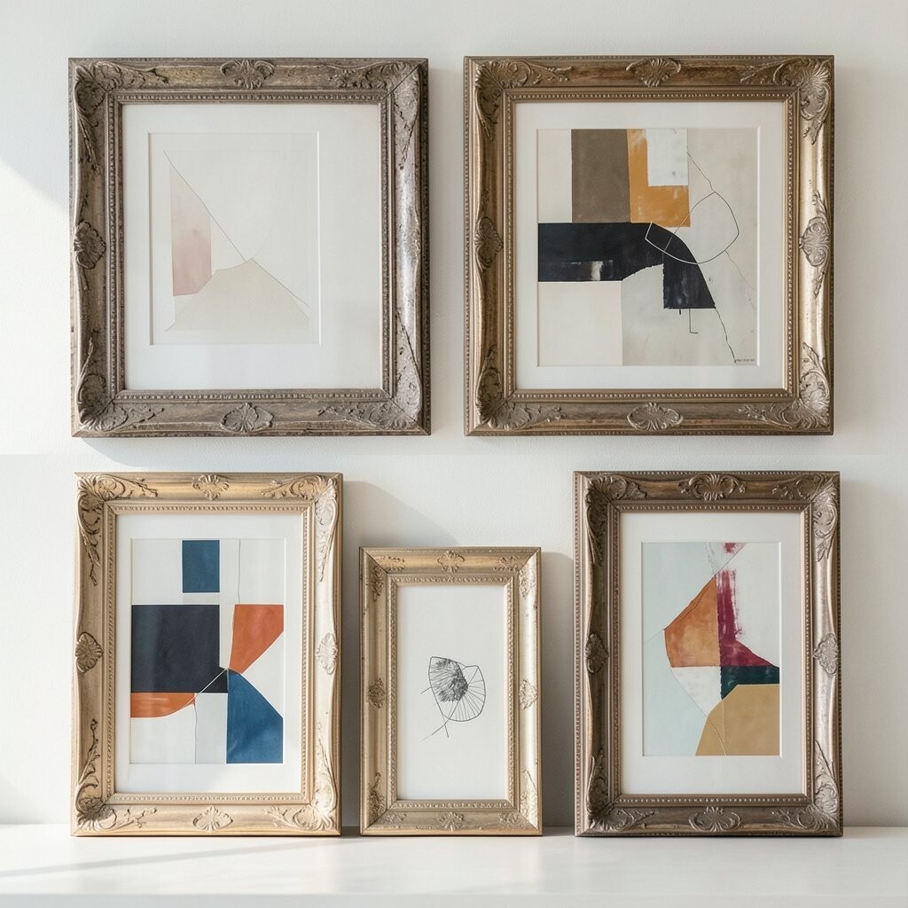
Think of carved, ornate frames paired with simple modern abstract art, so old-world detail meets fresh color. The visual contrast can feel dramatic and surprisingly harmonious on the same wall.
Choose ornate frames in one color family, like gold or deep espresso, then keep the abstracts bold but not too busy. This makes the wall feel curated, not cluttered, and it brings richness to your space. A practical tip is to use matte or lightly textured finishes on the art so ornate details don’t reflect glare too much.
Personalize by selecting abstracts that echo colors already in your room, like a rug tone or lamp shade. For cost, you can hunt for ornate frames that are discounted and use affordable print reproductions for the modern pieces. This mix aligns with a trend toward “contrast styling,” where traditional elements get new life through contemporary artwork.
7. Film-Strip Layout With Slim Frames and Even Spacing
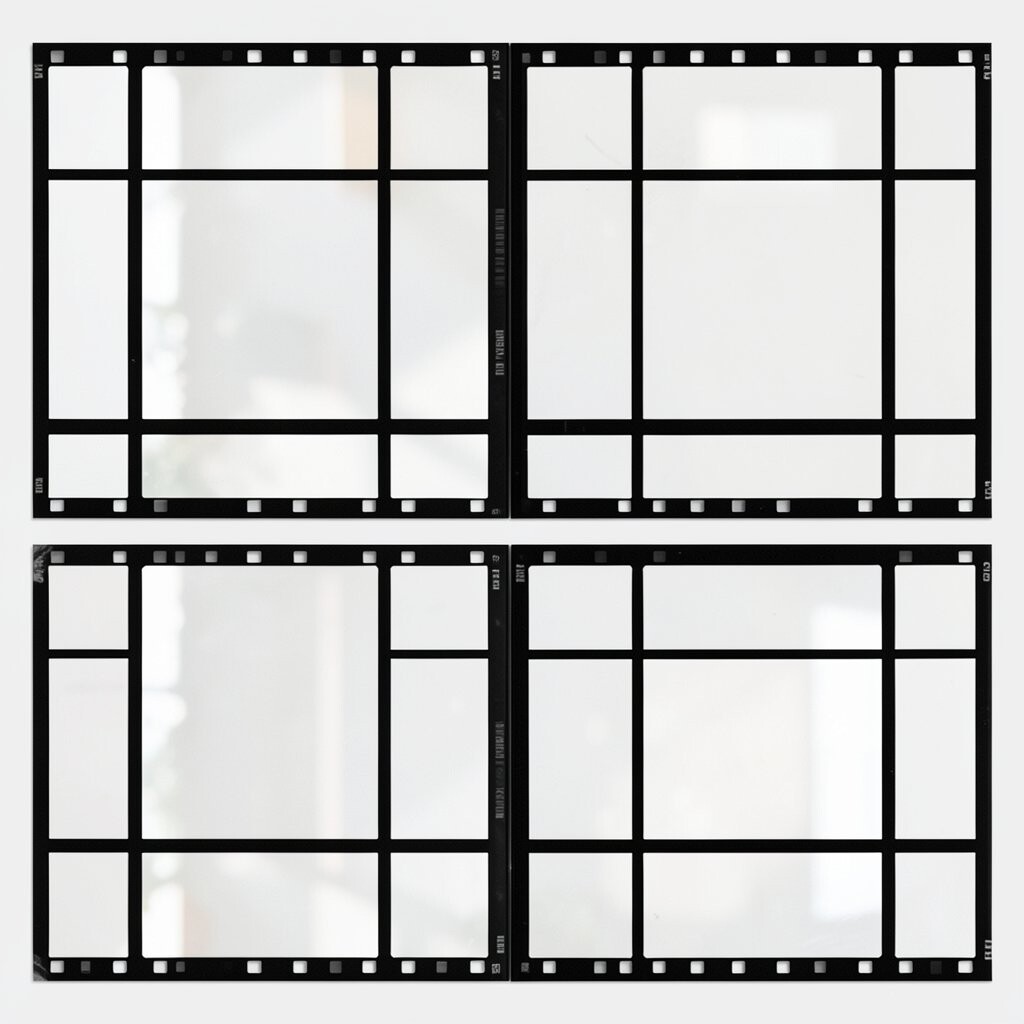
Picture your wall arranged like a film strip, with slim frames lined up in a long, steady rhythm. It feels clever and playful, like your memories are running through a story.
Stick to one frame style, then choose photos with consistent color or a shared mood. This helps the layout look intentional, and it makes your wall easier to plan. Use painter’s tape to map the strip before hanging so you can check how it flows across the wall.
To personalize, rotate a few frames to break the strict line, such as turning one shot slightly for emphasis. For cost considerations, slim frames can be cheaper than wide decorative frames, especially if you find a matching set. Current trends also favor “story layouts” that feel cinematic, and this is a straightforward way to get that vibe.
8. Color-Blocked Frames: One Wall, Three Coordinated Frame Colors
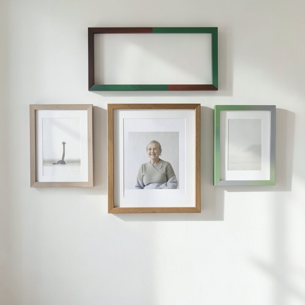
Imagine a wall where frames are grouped by color blocks, like a tidy patchwork of coordinated tones. You might see soft blush frames, sage frames, and warm wood accents all placed with purpose.
This combo gives you structure while letting you be playful, especially if your room has colored textiles. Use three frame colors that already appear in your space so the wall feels integrated. Keep the artwork variety flexible, but consider using similar mat tones to keep the look smooth.
For personalization, assign each color block to a category, like family moments, travel memories, and quotes. Keep cost in mind by shopping sales for one frame color at a time, then balancing the total number across the groups. This style also fits current trends toward color storytelling, where walls become a gentle roadmap of your taste.
9. Oversized Center Piece With a Halo of Smaller Frames
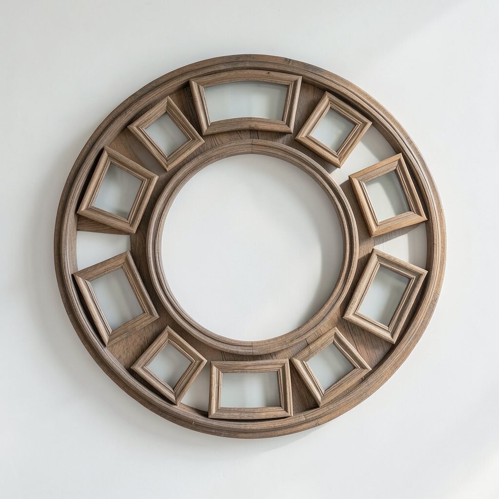
Picture an oversized artwork centered on your wall, surrounded by a “halo” of smaller frames that orbit it. The layout feels confident and gives your wall a focal point you don’t have to hunt for.
This structure helps you avoid the guesswork of a full gallery, and it’s great if you want a high-impact look. Choose the oversized piece first, then select smaller frames that match its frame style or mat color. A practical tip is to measure the center artwork width and plan the surrounding frames so the gaps stay even.
For personalization, put one sentimental photo in the center, then add lighter supporting pieces around it. Cost can be managed by printing the central piece as a larger version while keeping the surrounding frames more affordable. This combination is currently popular because it looks styled in photos and feels elegant in real life.
Make sure the halo doesn’t feel too tight by leaving small breathing space around each frame. If your wall is busy, consider using simple mats and fewer colors. The goal is a welcoming arrangement that looks intentional from across the room.
10. Same-Frame Style, Different Layout: Two Rows With One Diagonal Twist
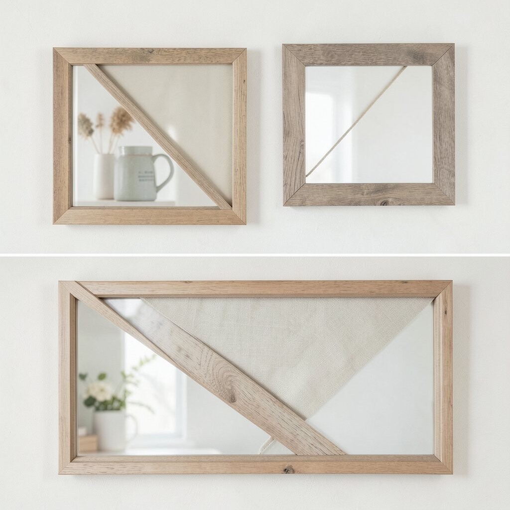
Think of a matching set of frames arranged in two neat rows, then adding one diagonal twist for personality. The result feels organized first, then fun, like a wink in the middle of symmetry.
Use identical frames for most pieces so the wall stays calm, and choose artwork with a consistent color palette. This helps the diagonal twist stand out without turning the entire wall into a jumble. For practical tips, mark the two main rows with tape and plan the diagonal angle before you drill.
Personalize by using quotes or art prints that connect to your daily routine, like morning inspiration or hobby visuals. Keep cost in check by buying one frame style and reusing it across sizes, then printing artwork at a single print shop for uniform quality. The diagonal twist also matches a current trend toward playful geometry in home decor.
11. Mirror-Back Frames With Soft Light and Side-By-Side Quotes
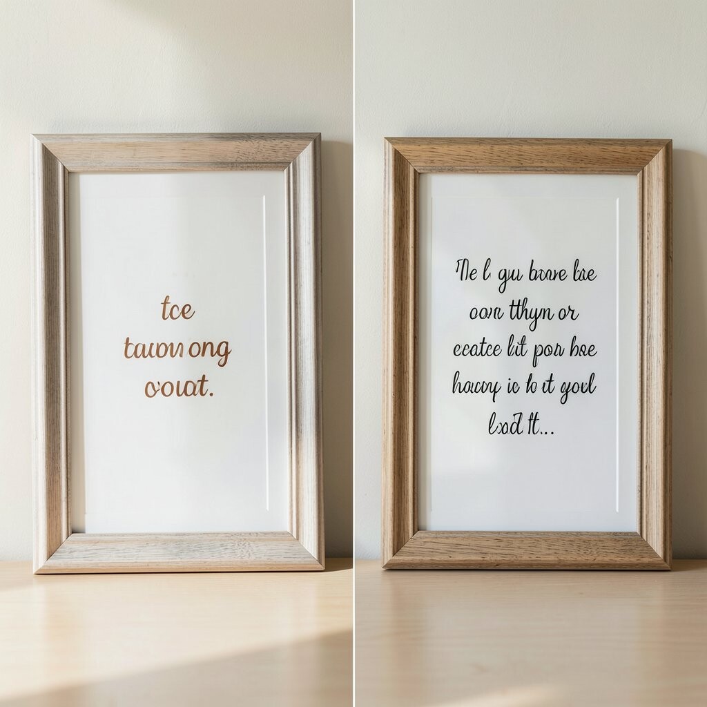
Imagine frames that have a reflective backing or a subtle mirror effect, pairing photos with side-by-side quote cards. The light bounces around the room and makes the wall feel brighter and more inviting.
This approach is unique because it combines decor with a reflective detail that shifts throughout the day. It can also help small rooms feel less cramped, since the mirror effect adds depth. Use quote typography that matches your home style, like simple sans serif or elegant serif, and keep font sizes consistent.
For personalization, choose quotes that reflect your values, like gratitude, calm, or courage, and swap them seasonally. Cost considerations can be friendly here because quote cards are easy to print, and you can use standard frames as long as the backing effect looks right. This is also aligned with current trends that lean into cozy lighting and gentle sparkle.
To make it practical, ensure the reflective surface doesn’t create glare in the spots where you spend most of your evening. Test with a small arrangement first, then add more only if the shine feels flattering. The best version is the one that looks good at different times of day.
12. Oversized Grid Frames With Mixed Border Thickness
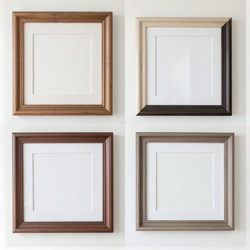
Picture a clean grid layout that feels structured, but the border thickness varies slightly from frame to frame. That subtle difference adds visual interest while the grid keeps the wall grounded.
Choose a consistent frame color and then vary the mat width for different pieces, like some with narrow mats and others with wider mats. This makes your wall look designed without requiring complicated layouts. A practical tip is to keep your artwork sizes aligned to the grid, so even when mats change, the overall wall stays neat.
To personalize, use a set of prints that share a theme, such as botanical images, city skylines, or portraits of family pets. Cost can be managed by printing multiple copies in matching sizes and investing in a good frame color that looks great with everything. This combo fits current trends toward gallery grids that feel both modern and easy to maintain.
If you want a little extra charm, include one frame with a different texture mat, like linen or a lightly speckled paper look. Don’t add too many special materials, or the grid may lose its calm. The best balance is a mostly uniform structure with one or two gentle surprises.
13. Custom Coordinates Frames: Maps, Dates, and Heartfelt Photos
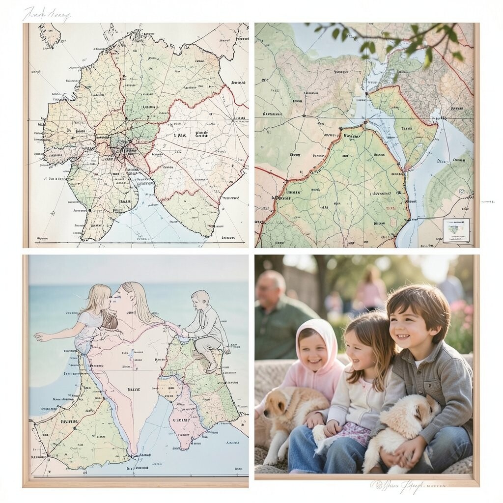
Imagine a wall of frames that includes coordinates on paper, meaningful dates, and photos from those places. The arrangement feels deeply personal, like your home is holding a timeline of moments.
This concept is unique because the frames become a story system, not just decoration. It’s also surprisingly practical since you can plan everything around a theme, such as where you met, your favorite vacation spot, or a family hometown. Choose frame colors that match your room, like classic black for a clean look or warm wood for a cozy feel.
For personalization, print coordinates in elegant text and pair them with small photos or simple illustrations. You can also add tiny details like the weather or a short memory caption in handwriting style. Cost considerations are manageable because maps and text cards are affordable to print, and you can use standard frames for most pieces.
Current trends show a strong interest in sentimental decor, and this type of styling fits right in without needing to follow a fad. If you want it to look polished, keep the paper tone consistent and use the same mat type across the set. The result is warm, meaningful, and easy to update when new memories join the collection.
When you hang everything, step back and check the rhythm, especially the spacing between dates and photos. Adjust until the wall feels like a smooth read, not a busy collage. Your goal is a wall that makes you smile every time you pass by.