
Art can feel quiet when the lighting is wrong. With the right track lights, walls start to glow like they have a secret.
Let’s talk about practical, good-looking ways to aim light where your eyes naturally rest.
1. Treat Your Artwork Like a Spotlight Moment

Imagine a painting framed by a warm halo instead of flat room light. When you aim track lighting carefully, the artwork looks more vivid and alive.
Start by positioning the track so the beam lands slightly above the center of the piece, then adjust until glare fades. Keep the distance moderate so the light feels focused, not harsh. Use a dimmer if you can, since changing brightness helps you match the mood from morning to evening.
2. Use Adjustable Heads for Exact Beam Placement
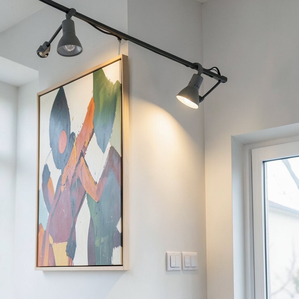
Fixed lights can miss the mark, but adjustable heads can hit it every time. You can angle the beam so it follows the shape of the artwork.
In a living room, this means a landscape stays bright without washing out the surface texture. In a hallway, you can align beams so multiple frames feel evenly lit. If your track system allows it, tilt and rotate slowly, then step back to check how the wall reads from the doorway.
For a cleaner look, match the beam direction across a gallery grouping so the eye sees one intentional plan. This also helps reduce the shadow effect that makes art feel heavy. Consider LED heads with good color quality for the most natural colors.
3. Pick the Right Color Temperature for Skin Tones and Paints

Warm light can make portraits feel gentle and inviting, while cooler light can sharpen details. Color temperature plays a big role in how paintings, photos, and prints appear on the wall.
Use warmer settings for cozy spaces like bedrooms and reading nooks, where you want calm energy. For modern art or crisp photography, slightly cooler light can keep whites looking clean. Watch how skin tones look in both settings, because that quick test often tells you what feels right.
Many people today prefer LEDs because they stay consistent and use less power over time. If your track lights support it, choose fixtures that allow you to fine-tune tone. That way, you can personalize the vibe without swapping bulbs.
4. Reduce Glare by Aiming Slightly Off-Axis

Shiny frames and glossy prints can reflect light like a tiny mirror. When that happens, the artwork may look washed out even if the wall looks bright.
Try aiming the beam a little to the side rather than straight on, so the brightest part lands on the artwork without bouncing back to your eyes. This small angle change can cut glare and keep the image crisp. Also keep the beam tight, since wide beams often spill into nearby surfaces.
5. Keep Beam Spread Narrow for Crisp Detail
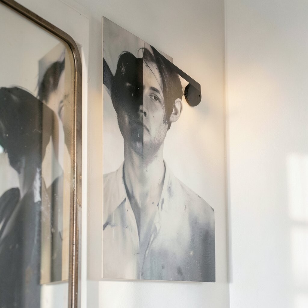
Wide lighting spreads brightness across the wall, but narrow beams highlight the subject. A tighter beam can make brush strokes and photo textures stand out.
Choose track heads that let you control beam angle, then set it so the light covers the art without lighting the whole wall. You get better contrast, which makes colors feel richer. If you’re working with a series of small pieces, narrow beams help each one look intentional.
For cost control, start with fewer heads and adjust angles until you like the results. You can add another head later if your eye says more light is needed. Many homeowners find that one well-aimed beam beats several poorly directed ones.
6. Build a Mini Gallery with Consistent Height and Spacing

Nothing feels more “designed” than art that shares a uniform lighting plan. Consistency makes your walls look curated instead of random.
Use the same rail height and keep the beams at a similar angle for each frame. When the lighting hits in a similar way, shadows line up naturally and the collection feels neat. If the frames vary in size, aim each head to the center of its piece while keeping the overall beam pattern similar.
This approach fits the current trend of gallery-style wall displays in entryways and stair landings. It also helps when you switch prints later, since the lighting system already has a smart baseline. Personalize by mixing frame finishes and letting the light do the “glue work.”
7. Light Sculptural Pieces to Emphasize Texture
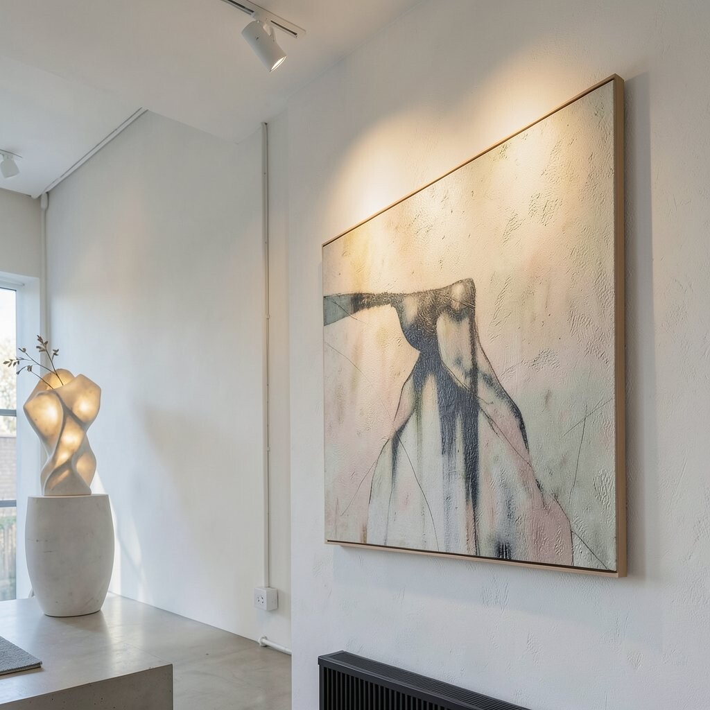
Wall sculptures, metal art, and textured relief pieces look amazing under directional light. Track lighting can reveal depth that flat lighting hides.
Position beams so they skim across the surface rather than blasting straight down. This creates subtle highlights and gentle shadows that show the form. If your art has raised details, a slightly raking angle often makes it feel more dimensional.
You can also adjust to avoid hot spots, especially on glossy finishes. Use a dimmer so you can brighten during entertaining and soften at night. Since materials respond differently, take a moment to test at different brightness levels.
8. Match Light Levels to the Room’s Function

A bedroom should feel calm, while a hallway should feel lively and clear. Track lighting near artwork can help each space do its job.
For spaces used in the evening, use softer brightness and warmer color temperature to keep the wall from looking too “spotty.” In work areas, brighter levels with clean color rendering can help prints feel sharp and readable. If your track has multiple circuits, separate general lighting from artwork lighting so you control them independently.
9. Use Light to Create Depth Around Oversized Frames

Large pieces can either dominate the room or feel strangely flat. Strategic track lighting helps them look grounded and dimensional.
When a big frame has a strong focal point, aim the beam so the brightest area falls near the center and the edges fade smoothly. That glow gives the artwork a sense of presence without lighting every corner of the wall. If the frame is heavy or thick, consider slightly offset angles to highlight the outer edge too.
For personalization, try different placement heights until you like how it frames the piece when you walk toward it. Many people underestimate how much viewing distance matters, especially with large works. A quick test at the room’s main seating spot can guide your final adjustments.
10. Illuminate a Shelf of Art Without Overlighting the Wall
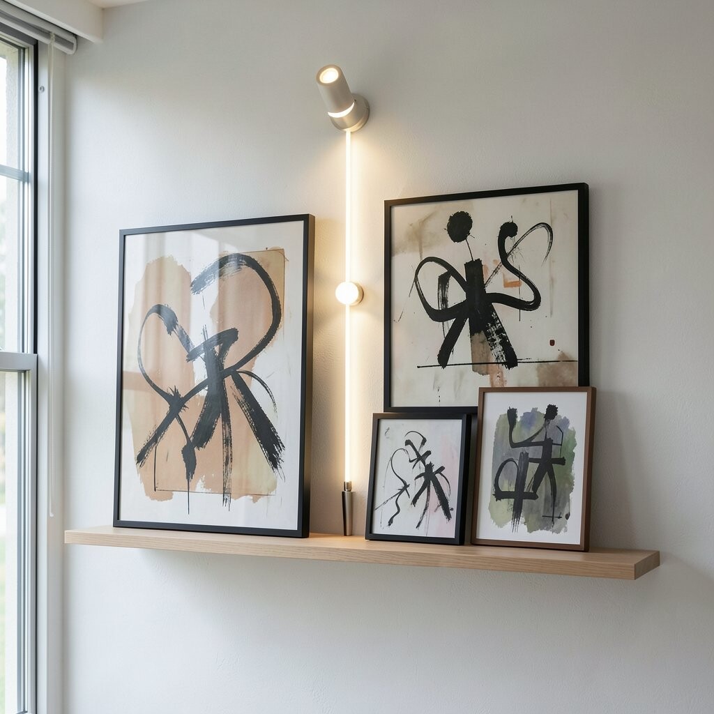
If your artwork sits near shelves, you don’t want track lights to turn everything into a bright spotlight. You want the shelf to feel supported by light.
Aim the track so the beam hits the art first, then gently fades before it reaches nearby decorative objects. This keeps the shelf styling tidy instead of chaotic. You can also use staggered heads along the rail to follow the shelf length and create a smooth lighting band.
It’s a practical way to combine style and function, especially in rooms where you rotate decor. Keep an eye on shadows cast by books and vases, since those can either add mood or distract from the art. With small adjustments, you can make the shelf feel like one cohesive display.
11. Add a Dimmer for Flexibility Through Seasons

Even the best lighting can start to feel off as daylight changes. A dimmer gives you control so artwork stays flattering year-round.
In winter, you might want a brighter beam to fight the darker atmosphere, while in summer you may want softer illumination. This is also helpful when you host guests, since you can shift from cozy to energetic without changing fixtures. Dimming can also reduce glare on glass and finishes.
If you’re budgeting, a dimmer upgrade is often cheaper than adding more heads. It also supports the current trend of creating layered lighting scenes with adjustable emphasis. Personalize by saving a brightness level you like for each time of day.
12. Use Multiple Heads for Even Coverage on Triptychs and Diptychs
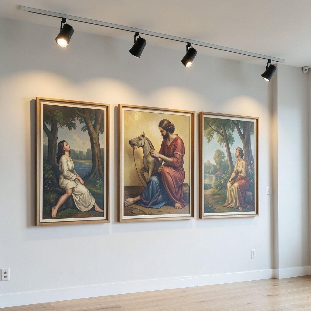
Multi-panel artwork can look uneven when only one beam covers everything. Track lighting lets you treat each panel with care.
Position separate heads so the light reaches each section at a similar brightness level. This helps prevent one panel from looking shadowed while another looks overexposed. If the panels are spaced widely, you’ll likely need multiple heads to keep the glow consistent.
When you dial it in, the triptych can feel like it’s hovering against the wall. That visual effect makes the whole display feel more polished. For practical tuning, start with the center panel, then adjust outward panels until the transition looks smooth.
13. Choose Modern LED Fixtures for Efficiency and Color Consistency
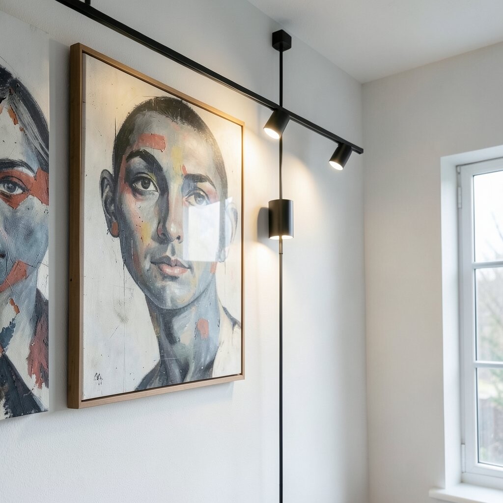
LED track heads are popular because they run cool and stay reliable. They also help you keep color looking steady instead of drifting over time.
Many current designs focus on sleek profiles and better beam control, which makes it easier to target artwork precisely. If you’re upgrading, look for fixtures that provide strong color rendering so reds, blues, and skin tones don’t look dull. That visual accuracy is what helps artwork feel true to life.
Cost-wise, LEDs tend to lower long-term energy use, which can make the upgrade easier to justify. If your budget is tight, you can replace just the heads first and keep the track. Then, when you’re ready, you can adjust spacing or add more heads for future art changes.
14. Personalize the Look by Pairing Track Lighting with Wall Finishes

The wall itself affects how light behaves, even when the artwork is perfect. Paint color, texture, and sheen all change the final look.
On matte walls, track lights can look smooth and flattering, which helps art feel soft and balanced. On glossy or lightly reflective walls, you may need to fine-tune the beam angle to avoid glare. If your wall is textured, raking light can add character, but it may also cast patterns that compete with the art.
Personalize by matching the lighting vibe to the room’s style, such as warm and cozy for traditional decor or slightly cleaner tone for modern spaces. Consider your finish and how it looks at night, not just in daylight. With a few adjustments, your track lighting can make the entire wall feel like part of the artwork.