Tile mosaics can turn a plain wall into a real focal point. A few smart choices can make your room feel brighter and more personal.
1. Classic Glass Mosaic for Instant Glow
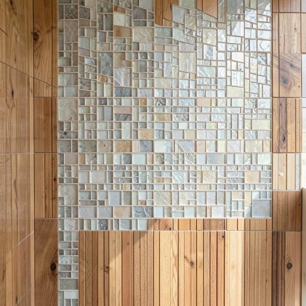
Glass mosaic tiles catch light like tiny mirrors and send it back around the room. When they sit on a wall, they make even a dim corner look lively.
Pick small, consistently cut pieces for a smooth, neat look. For practical placement, focus on areas where people naturally notice, like behind a sink, near a fireplace, or at the end of a hallway. Choose a soft grout color to keep the pattern looking clean and bright instead of busy.
2. Hand-Painted Ceramic Tiles With Artistic Charm
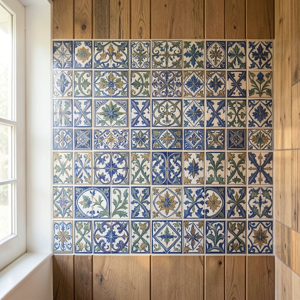
Hand-painted ceramic mosaic brings warmth and personality to your space. You can see tiny brush marks that make each tile feel slightly different.
Use these tiles to create a color story, like sunny yellows mixed with muted blues. If you want it to feel cohesive, match the painted tones to your cabinet finish or fabric colors. A light, glossy sealer helps the wall stay easy to wipe down.
For a practical build, plan a simple layout first so the artwork still reads well from the doorway. Many homeowners like smaller accent areas rather than covering every square inch, especially when the design has lots of character. Cost tends to be higher for custom-painted pieces, so consider using them as a feature band that still looks full.
3. Moroccan-Style Zellige Patterns for Bold Texture
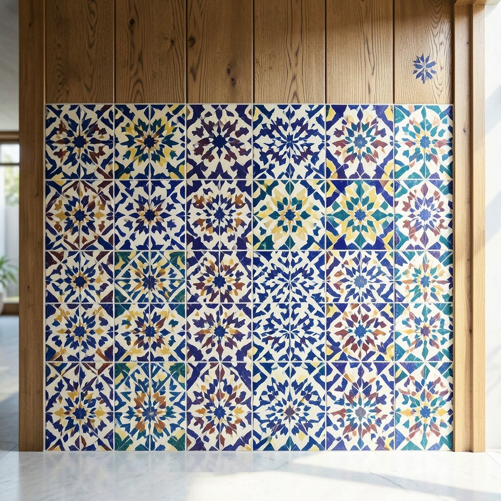
Zellige-inspired mosaics bring rich texture and old-world style. The irregular surface makes light dance in a way that feels more organic than flat tiles.
Look for earthy greens, warm terracotta, and cream tones if you want a bright yet grounded wall. This style pairs well with natural wood, rattan, and matte black fixtures. It also works great in kitchens and bathrooms because the patterns hide small splashes and everyday marks.
To keep installation manageable, start with a pre-mixed sheet layout so edges align nicely. Use spacers and take your time leveling, since the handmade look benefits from clean grout lines. If your budget is tight, choose a simpler repeat pattern for the main wall and save the most intricate tiles for a smaller border.
4. Subway Mosaic in a Rainbow of Neutrals
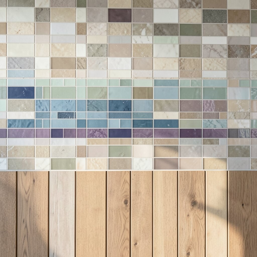
A subway mosaic adds crisp lines with a familiar shape. When you swap plain white for warm off-whites and soft greys, the wall feels brighter without looking loud.
Choose a staggered layout for a tidy rhythm that looks great in modern homes. Pair it with brushed nickel or warm brass hardware to make the tones feel inviting. For upkeep, sealed ceramic or glass mosaics are simple to clean and hold up well with regular use.
5. Marble-Look Mosaic for Quiet Luxury

Marble-look mosaics create a refined sheen that makes walls feel dressed up. You get movement in the pattern without the full cost of natural stone.
Go for light marble tones if your main goal is brightness, like creamy whites with soft grey veining. This look pairs beautifully with clean-lined cabinets and minimalist lighting. For practical tips, choose a version with a consistent backing so installation stays level and smooth.
Consider using marble-look mosaics as a statement strip rather than a full wall if you want the luxury effect while controlling spending. Current trends also show homeowners mixing marble looks with matte finishes, so pair glossy mosaics with matte paint for balance. When grout is slightly warm, the whole wall looks more cohesive and less stark.
6. Mosaic Accent Halo Behind a Vanity
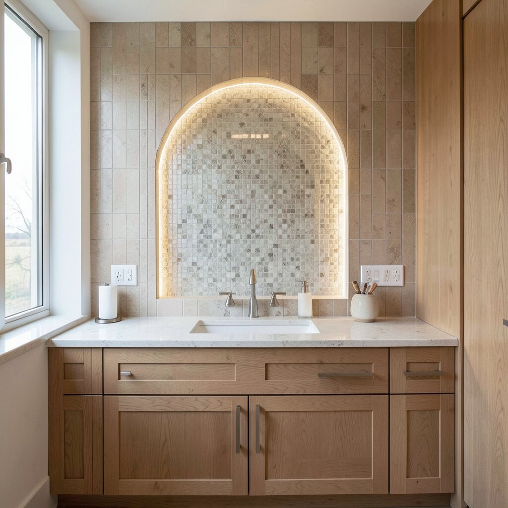
A halo-style mosaic creates a framed glow around a mirror or light fixture. It feels stylish because your eye naturally rests on the ring-like shape.
Use small tiles in a gradient from brighter near the center to calmer at the edges. Soft gold, white, and champagne tones are popular because they blend with warm lighting. This setup is practical too, since it draws attention where you need it for daily routines.
For a clean finish, plan a template using cardboard before you set any tiles. Keep grout consistent and wipe as you go so the surface stays glossy and even. Costs can be lower than full-wall installs because you’re using fewer tiles while still getting a big visual impact.
7. Colorful Smalti Mosaic for Deep, Saturated Style
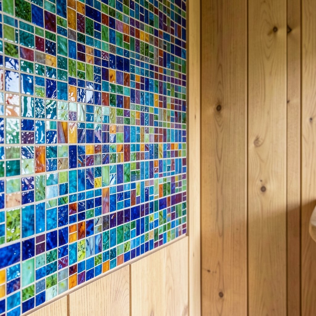
Smalti mosaics have a glassy richness that can look like color in liquid form. When light hits them, the wall feels vivid and full of energy.
Pick a limited palette to keep it from feeling overwhelming, such as deep teal, ink blue, and soft cream. This option feels unique because smalti pieces can vary slightly in color depth. It also hides wear well, especially in entryways or accent corridors where walls get tapped and brushed by daily life.
8. Neutral Earth-Tone Mosaic for Calm Everyday Living
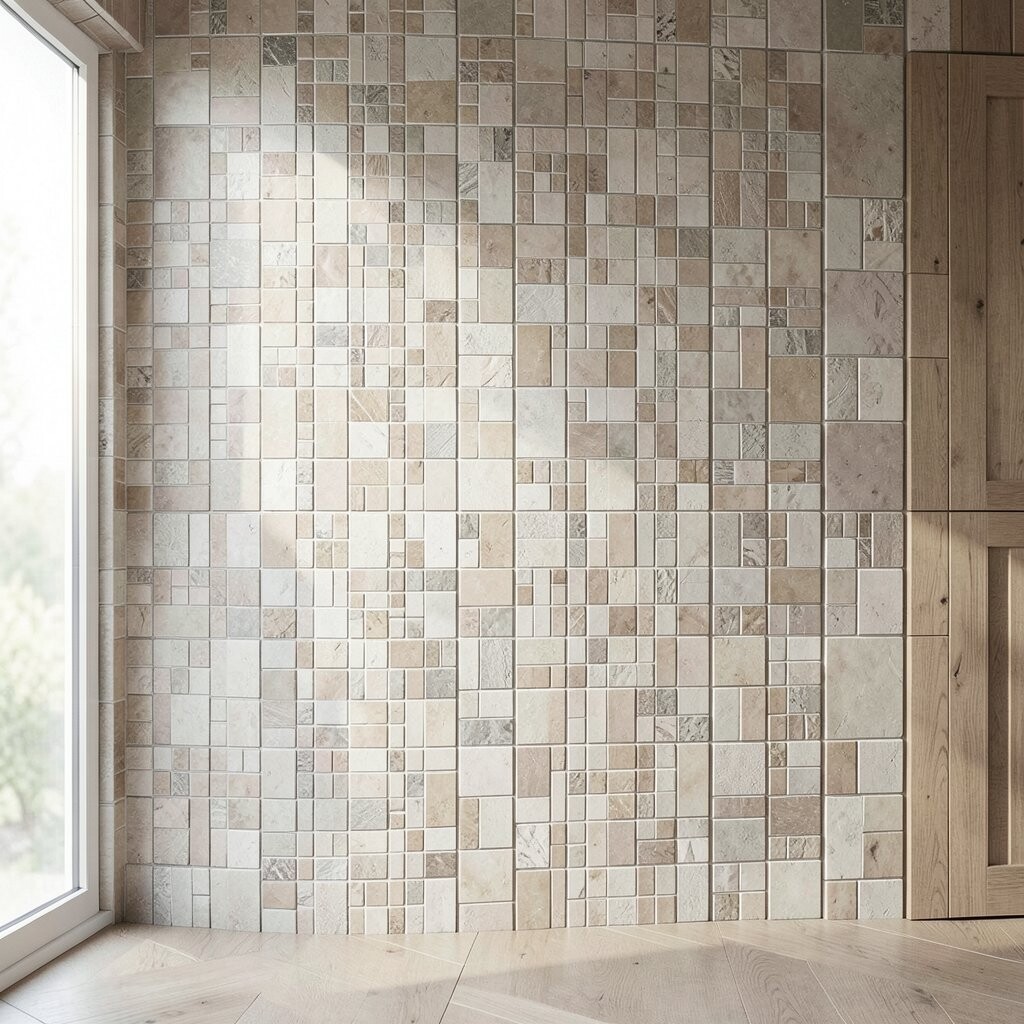
Earth-tone mosaics bring a steady, cozy vibe to your space. Think warm tans, clay browns, and gentle greiges that look great in daylight and evening light.
This style feels unique because it doesn’t rely on bold patterns, yet it still looks layered. Choose matte tiles if you want a softer look that won’t glare under bright lamps. For practical maintenance, matte surfaces can show fingerprints less than high gloss finishes.
To personalize, mix tile sizes so small pieces create movement while larger pieces guide the eye. Current trends lean toward natural textures and blended neutrals, especially in spaces meant for relaxation. If cost matters, prioritize the wall section that faces the most traffic, then fill the rest with simpler tile patterns.
9. Mixed-Material Mosaic With Wood and Metal Touches
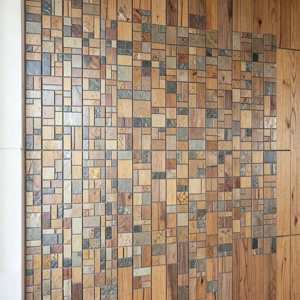
Mixed-material mosaics add depth by combining tile with metal or wood-like elements. The contrast can make a wall feel custom and more expensive than it really is.
Try pairing small ceramic or glass tiles with thin metal inlays to create clean, modern lines. You can also add wood-toned accents to keep the look warm and welcoming. This approach is practical because you can keep most surfaces simple while using specialty pieces as spark points.
10. Geometric Mosaic Lines for a Modern, Clean Look
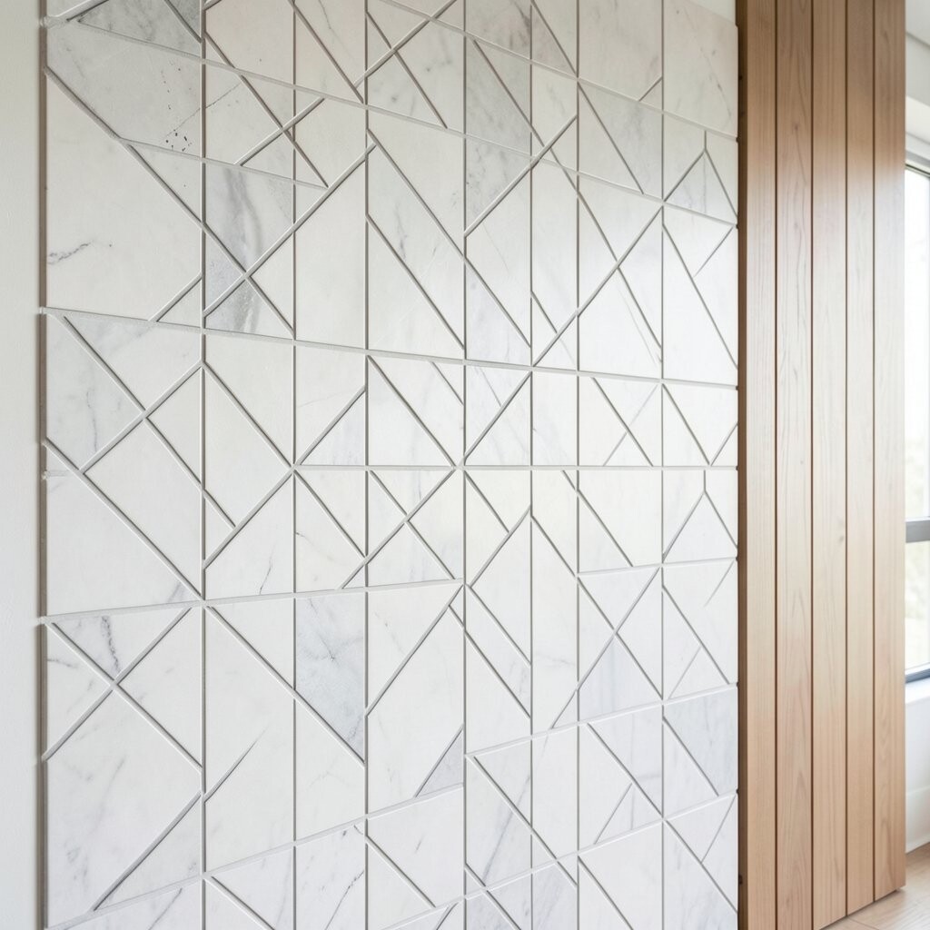
Geometric mosaics feel crisp and current, especially when the layout is consistent. Straight edges and repeating shapes make rooms look organized and bright.
Choose white or light grey tiles with bold contrast in navy or charcoal for a stylish punch. This uniqueness comes from the way geometry guides your eyes across the wall. If you like actionable results, use painter’s tape to map the pattern before any adhesive goes on.
Grout choice matters a lot with geometry since lines need to look sharp. A matching grout color makes the design look sleek, while a contrasting grout color can feel more playful. Budget-wise, geometric designs can be easier to plan with fewer custom cuts if you buy pre-designed sheets.
11. Penny Tile Mosaic for Small-Wall Wonder
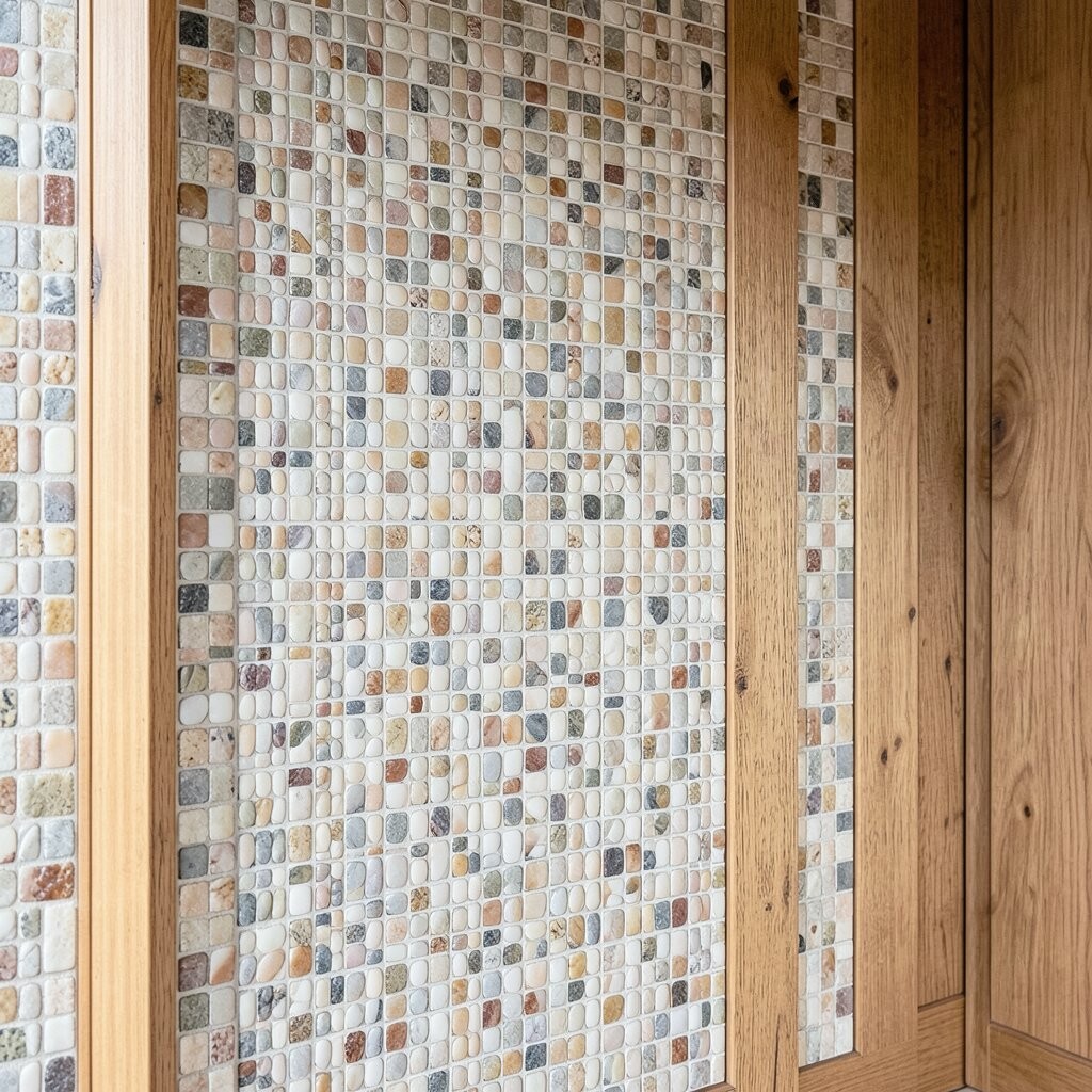
Penny tile creates a bumpy, playful surface that catches light from every angle. It’s especially great for bathrooms, because it adds texture without needing an elaborate design.
Pick light colors like ivory, soft grey, or pale sand to keep the wall bright. This style feels unique because it’s visually interesting even when the pattern is simple. For practical installation, make sure the mesh backing is secure and check alignment after the first few rows.
If you want the wall to feel taller, orient the layout with a vertical pattern or place the tiles up to the height of the vanity. Penny tile can be pricier depending on the finish, so compare per-square-foot pricing and factor in installation complexity. You can also save money by using it as a niche backer or as a small accent wall instead of the whole room.
12. Mosaic Waterfall Effect With Ombré Gradients
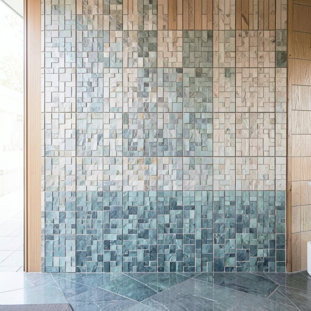
An ombré mosaic feels smooth and dreamy, like a waterfall of color. The gradual shift makes your wall glow in a calm, stylish way.
Use blues, teals, and soft greens if you want a fresh, airy mood. For a warmer look, try peach, rose, and honey tones that pair well with warm lighting. This trend is popular because it feels artistic but still easy to live with every day.
To personalize, match the start color to your wall paint and keep the darkest shade near the bottom for a balanced look. Plan your gradient direction early so it lines up with the room’s natural light. Cost can vary based on how many custom colors you need, but pre-made gradient sheets are often a budget-friendly way to get the effect.
13. Art Deco Fan Mosaic for Glam Without the Overload
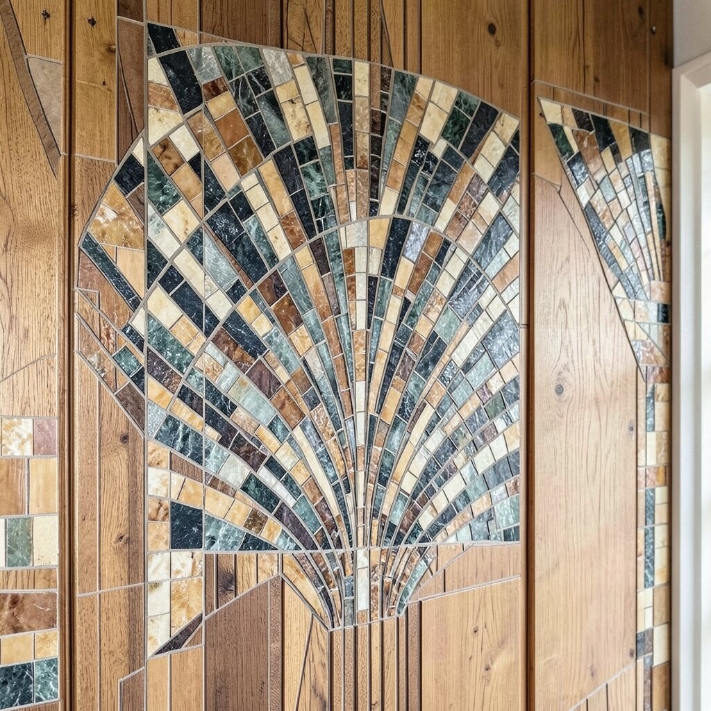
Art Deco fan mosaics bring a classic glow with a bold pattern. They often include fan shapes that feel elegant and stylish even in smaller spaces.
Choose gold, cream, and black accents for a high-contrast look that still feels refined. This uniqueness comes from the repeating motifs, which give your wall a sense of motion. A practical tip is to keep the rest of the room simple, so the mosaic becomes the star.
If you’re working with limited wall space, consider a fan border around a niche or mirror. That approach keeps the glam vibe while managing the tile amount and installation time. Many homeowners find that Deco-style sheets are easier to install because they come pre-patterned.
14. Coastal Shell-Look Mosaic for Soft, Breezy Vibes

Shell-look mosaics create a gentle coastal mood that feels fresh year-round. The curved shapes add subtle texture that makes walls feel like they have depth.
Stick to seafoam, sea glass, and white for the brightest result. This style feels unique because the texture changes depending on the angle you view it from. It also pairs nicely with natural fibers like linen, jute rugs, and light wood frames.
For practical planning, use a simple backing and keep grout in a light neutral so the shells remain the focus. If you want a personalized twist, mix in a few tiles with wave-like patterns to echo the shell texture. Costs can rise if you choose highly detailed shell pieces, so consider using them as an accent panel while keeping the rest in smooth tiles.
15. Minimalist Monochrome Mosaic for Sleek Sophistication
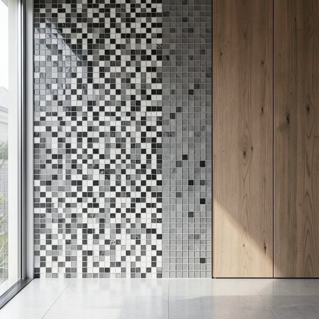
Monochrome mosaics look clean and stylish because everything blends into one calm color family. You get a bright, modern wall without loud contrasts.
Try shades like white-on-white, soft taupe, or pale greige with subtle variation in tile finish. This uniqueness comes from texture differences, such as matte versus glossy or smooth versus lightly speckled. It’s also practical because monochrome patterns hide minor grout discoloration better over time.
When you want personalization, vary tile size within the same color to create movement. This trend fits well with modern interiors that favor calm spaces and simple decor. Cost is often manageable since you can choose widely available tile colors and avoid custom ordering.
16. Bold Pattern Mosaic for a Statement Wall That Feels Custom
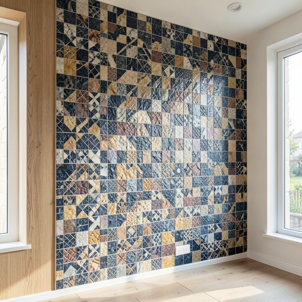
A bold pattern mosaic is the quickest way to make a wall feel custom and full of personality. Even a small accent wall can feel like a design choice rather than a necessity.
Pick a pattern that matches your lifestyle, like playful dots for family areas or elegant medallions for living spaces. This uniqueness shines because you can choose a layout that fits the room’s shape and your furniture placement. For practical tips, keep the color palette consistent with your existing paint and decor so the design feels intentional.
Budget-wise, statement mosaics can be easier to manage because you’re focusing on one area instead of covering everything. Consider mixing one high-impact pattern with simpler solid tiles around it to balance the overall look. If you want it to feel extra personal, add a small border that echoes a favorite fabric stripe or artwork color.