Accent walls can make a room feel freshly styled without a full renovation. Tile mosaics add sparkle, texture, and personal meaning in a way paint alone can’t match.
1. Sunburst Micro-Mosaic Feature
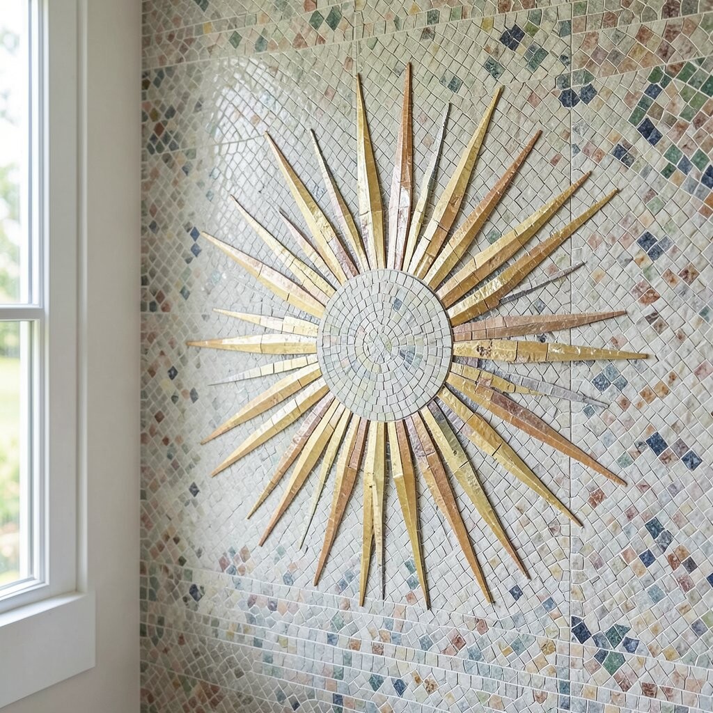
Imagine a warm sun shape made from tiny square tiles radiating from the center. The pattern catches light as you walk by, so your accent wall feels lively even when the room is quiet.
Pick a color story that fits your space, like sandy beige plus soft gold, or ocean blue plus seafoam. Use thin-set mortar and start from the center point, so the rays stay even. If you want a more modern look, choose small tiles with a consistent finish and grout in a matching warm tone.
2. Moroccan-Inspired Geometric Lanes
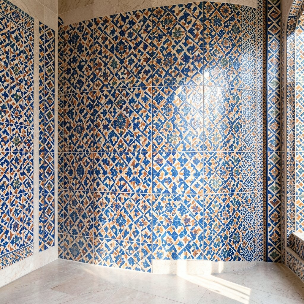
Clean lines and repeating shapes can make a wall feel both bold and organized. Moroccan-inspired mosaic lanes look great behind a sofa, a console table, or in a hallway where you want visual rhythm.
Choose two main colors and one supporting accent so the design stays readable. For a smoother install, consider pre-sorted mesh sheets that help keep angles crisp. Keep grout lines slightly narrow for a polished look and consider sealing if your wall gets regular cleaning.
To personalize it, add a subtle “signature” motif, like a small star near eye level. This style is trending because it blends classic pattern with modern spacing and negative space. Depending on the tile size and finish, costs can range widely, so compare samples and calculate how many sheets you need before buying.
3. Coastal Sea Glass Ombre Wall
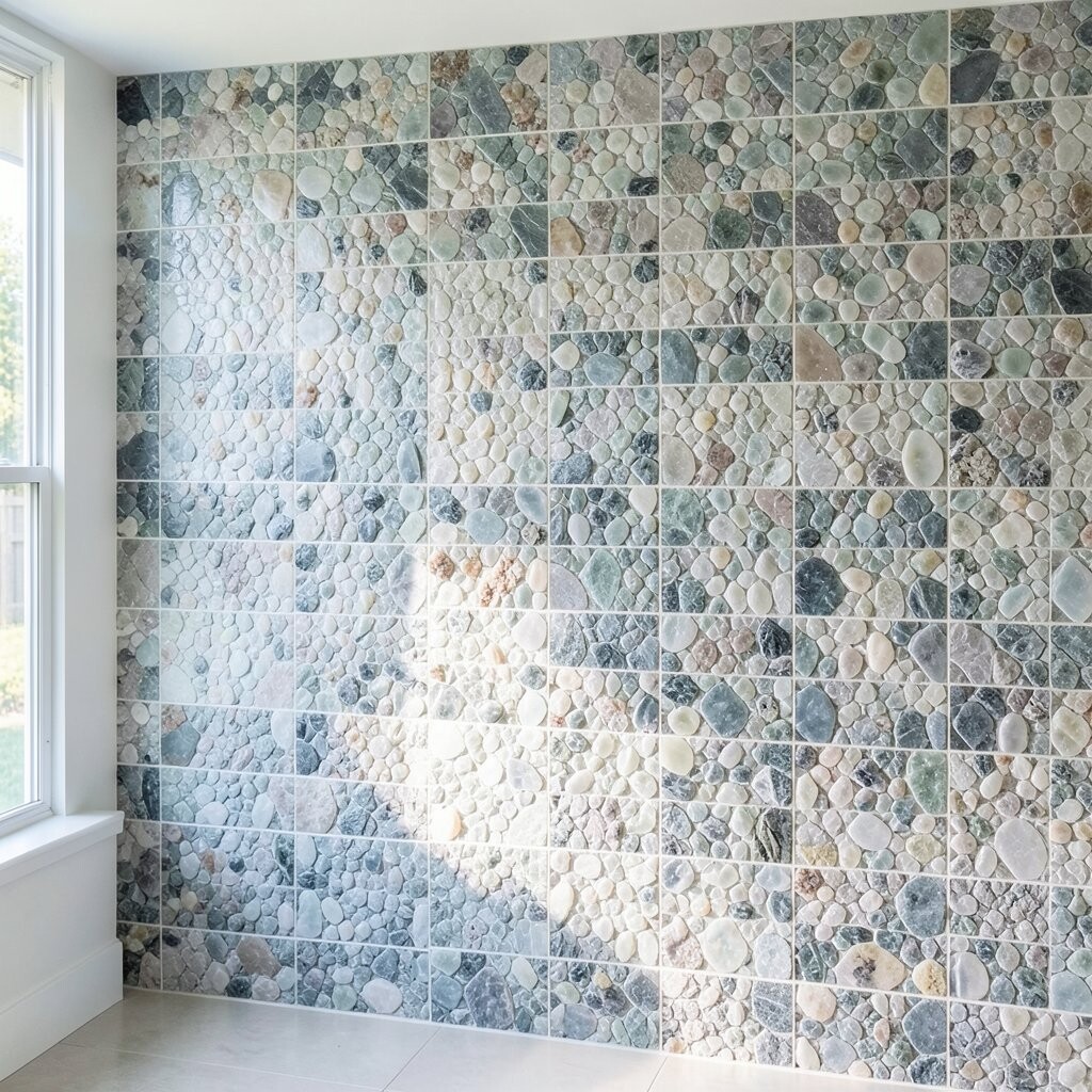
Picture a gradient made from glassy mosaic pieces in pale greens, blues, and silvery whites. It gives off the calm mood of ocean light, and the gentle color shift feels soft instead of loud.
Start with the darkest color at the bottom or side and move lighter toward the center or top. Use a mix of iridescent and matte tiles for depth, but keep the palette small so it still looks intentional. If you have kids or pets, choose tiles and grout that handle routine wiping.
For practical installation, dry-lay a small section first to confirm the fade direction. This kind of ombre is popular right now because it looks custom even when you use pre-made mosaic sheets. A realistic budget win is to use sea-glass tiles only for the main fade area, and keep the rest simple with neutral tiles.
4. Textured White Marble-Look Mosaic Grid
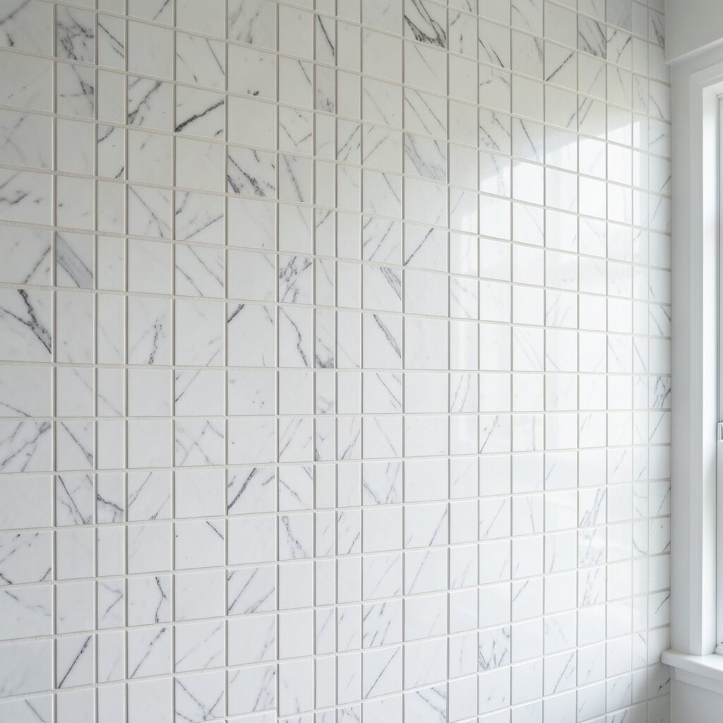
A white marble-look mosaic feels clean, bright, and a little luxurious. It creates a grid texture that works in kitchens, bathrooms, and living rooms without competing with your furniture.
Choose either glossy for a reflective glow or honed for a calm, spa-like vibe. Use larger grout joints for a modern, airy grid, or tighter joints for a smoother surface. If you want an easy upkeep plan, seal the tiles and grout so everyday spills don’t soak in.
5. Art-Deco Fan and Ribbon Accents
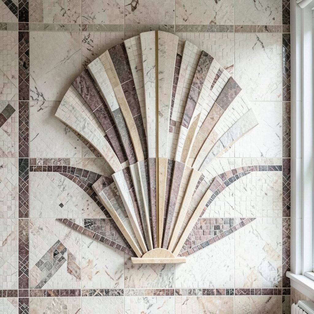
Art-deco style mosaics bring drama through symmetrical curves and ribbon-like bands. A wall featuring fan shapes feels glamorous, especially with warm lighting that highlights the edges.
Use metallic-looking tiles for the “ribbon” sections, then pair them with neutral stones like cream or soft gray. Try outlining the pattern with a thin border so the center design looks framed. For personalization, swap in your favorite color for the metallic band, like muted teal or dusty rose.
This look stays in demand because it mixes vintage mood with crisp geometry. To manage cost, you can place pricier tiles only along the fan lines and keep the rest simple with stone-look mosaics. If you’re installing yourself, use a level and take time aligning the first row, since symmetry depends on straight starts.
6. Rainbow Spectrum Vertical Stripe
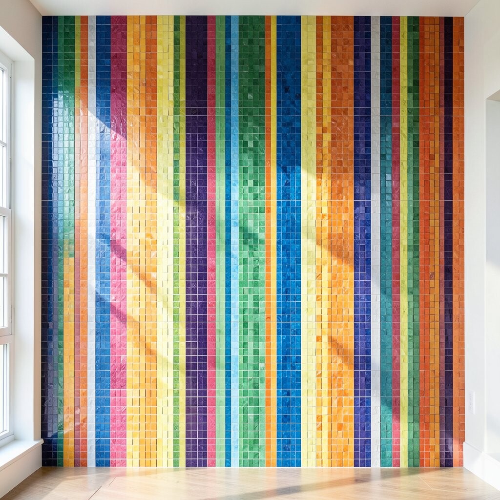
Vertical rainbow mosaic stripes can make a wall feel playful, bright, and full of movement. Thin columns of color are especially striking when placed near a reading chair, game area, or entry spot.
Keep the stripe width consistent and leave a little spacing between bands for breathing room. Consider using small tiles in semi-sheer shades so light travels across the color layers. For a practical approach, order extra tiles for color matching, because some shades shift slightly between batches.
To personalize, pick a rainbow inspired by your décor, like warm sunset colors instead of pure primary tones. Current trends lean toward “intentional color,” where bright pieces are used thoughtfully, not randomly. Budget-wise, you can choose economical dyed ceramic for most colors and reserve glass mosaics for just the top highlights.
7. Botanical Leaf Lattice in Soft Greens
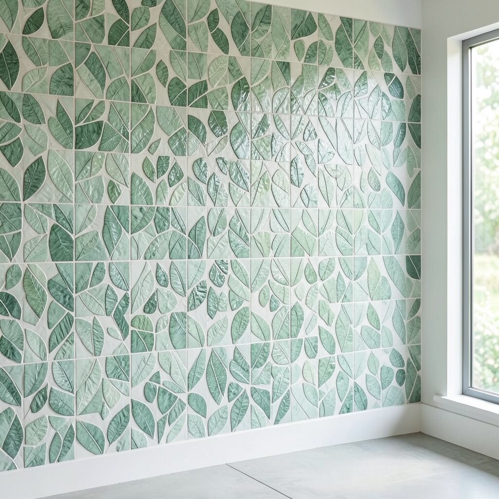
Leaf lattice mosaics add a gentle organic vibe that feels like fresh air. When the pattern is light and airy, the room feels calmer and more welcoming.
Choose green hues that match your plants or your existing wall colors, like sage, moss, and pale mint. Use tan or cream tiles for the background so the leaves stand out without getting busy. For practical tips, plan your layout around outlets and switches, and keep the leaf motif at eye level where it looks best.
If you want a personal touch, include a small cluster of “favorite leaves,” such as a single bold leaf near the center. This type of botanical accent remains popular because it brings nature indoors in a neat, structured way. Costs can be controlled by using a leaf motif only in a focal rectangle and filling the rest with matching solid mosaic tiles.
8. Warm Terracotta Circle Medallion
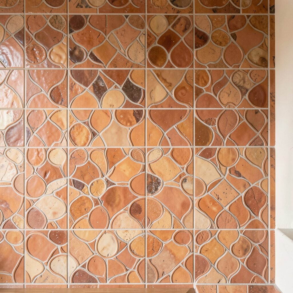
A terracotta circle medallion makes a wall feel like it has a centerpiece. The earthy tones add warmth, and the circular design naturally draws the eye to one spot.
Go for curved mosaic pieces or use small square tiles carefully arranged to form the circle. Keep the grout a warm cream rather than stark white so the whole look feels cohesive. For personalization, add a thin inner ring in a contrasting clay or golden tone to mimic handmade pottery.
Since medallions can look expensive, there’s a smart way to manage cost by using inexpensive tiles for the outer field and upgrading only the medallion border. This style fits current décor trends that favor earthy colors and handcrafted texture. If you’re DIYing, measure twice and mark a center point before laying any tiles, because circles are unforgiving if you drift.
9. Coastal Checkered Accent with Salt-White Grout
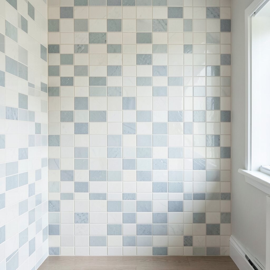
A checkered mosaic gives a crisp, classic look that still feels fresh. With salt-white grout, the pattern can glow and make other colors in the room pop.
Use two tile shades that both feel “light,” like sand and soft gray, or pale blue and sea foam. Keep the check size consistent so the pattern looks sharp from across the room. For practical cleaning, choose grout that’s sealed and follow a gentle cleaner routine to keep it bright.
10. Sunset Gradient Tiles with Bronze Highlights
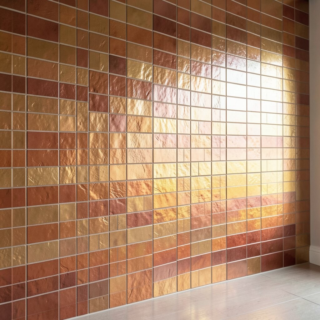
Think of a sunset wall where oranges and pinks fade into warm neutrals. Adding bronze-toned mosaic accents makes the transition look richer, like glowing sky behind the horizon.
To keep it from feeling overwhelming, limit yourself to a few gradient stops, such as peach, tangerine, and blush. Place bronze highlights around the “transition zones,” like near the middle bands, instead of covering the entire wall. This is trending because it feels artistic while still blending easily into modern spaces.
For budget planning, consider using ceramic mosaics for the main gradient and reserving glass or metallic tiles for narrow highlight strips. Personalize it by adjusting the saturation to match your style, going more muted for a calm vibe or more saturated for high energy. When installing, dry-fit rows to ensure the fade looks smooth even where your wall isn’t perfectly flat.
11. Geode-Inspired Stacked Crystals
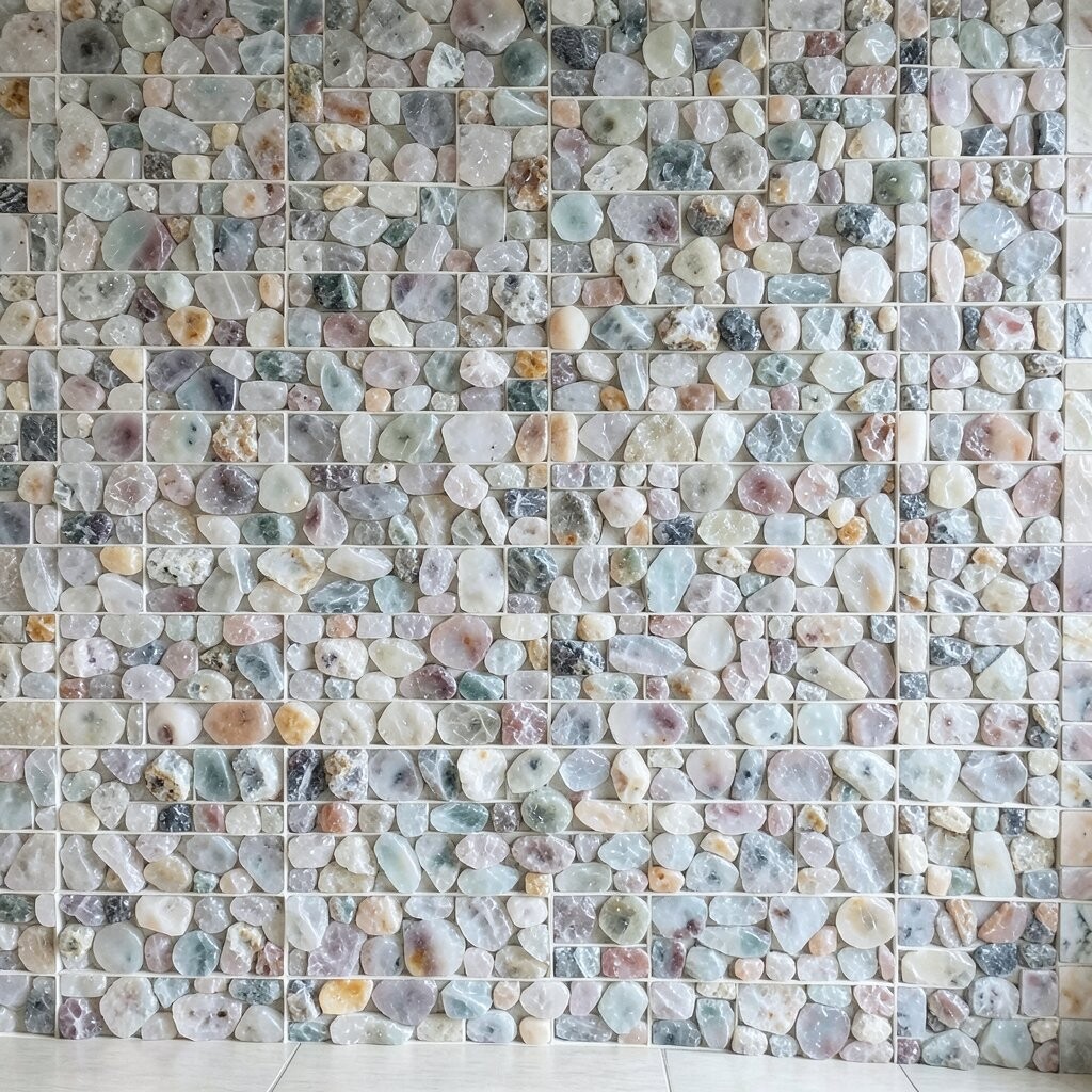
Geode mosaic walls can look like a slice of quartz catching daylight. The stacked crystal look brings bold sparkle, especially if you use translucent or glittery tile accents.
Start with a base layer in deep neutral tones, then build crystal shapes using lighter, marbled, or semi-translucent tiles. Add occasional “vein” pieces in white or light gray to mimic natural stone. For practical tips, use a grout color that supports the drama, often a warm gray works nicely for geode styles.
This approach feels unique because it mixes organic shapes with clean placement. It’s also a current favorite in creative homes where people want a focal wall that feels like art. To manage cost, you can keep the most expensive sparkle tiles limited to the best-lit center area and use simpler stones around the edges.
12. Scandinavian Herringbone in Soft Greys
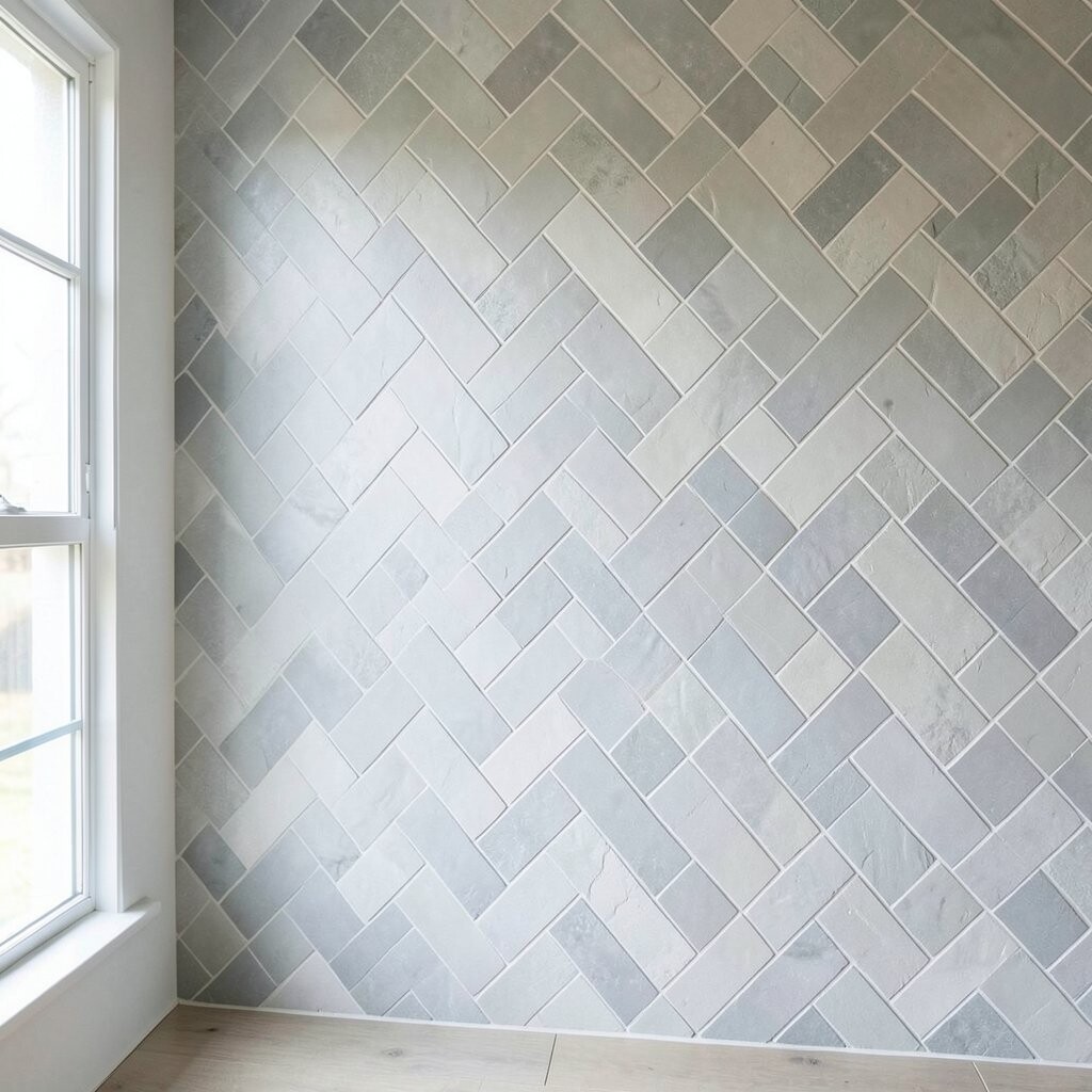
Herringbone mosaics bring a timeless, tailored pattern that looks good almost anywhere. In soft greys, it feels modern, calm, and easy to style with wood, black accents, or warm textiles.
Choose small mosaic tiles that can be arranged into a herringbone layout without awkward gaps. Use grout that matches the dominant tile shade so the pattern reads as one cohesive texture. If you want extra brightness, pick a tile with a gentle sheen instead of full matte.
13. Night Sky Constellation Dot Wall
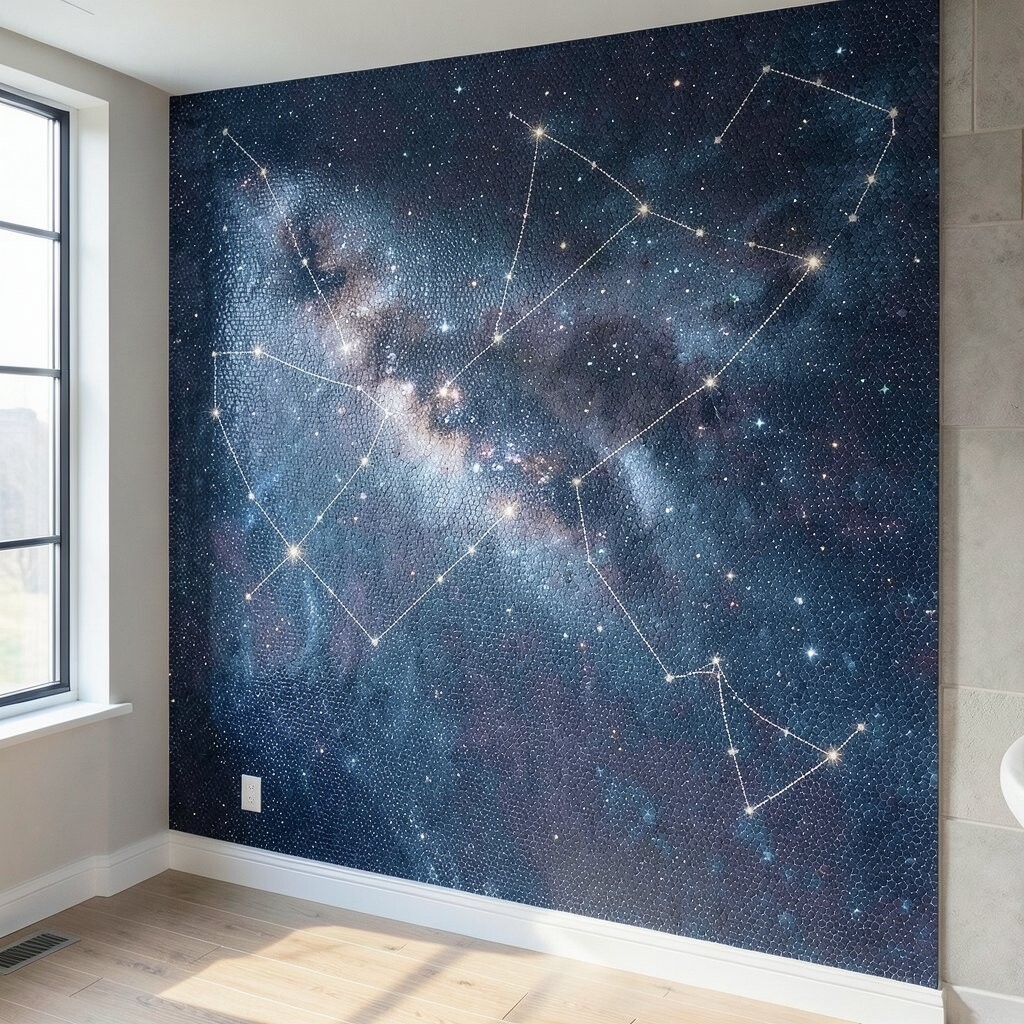
A constellation dot mosaic is subtle but magical, like tiny stars pinned across the wall. It’s especially charming in spaces where you want cozy atmosphere, such as a bedroom reading nook or a nursery corner.
Use mostly dark or deep navy tiles, then sprinkle small star points in lighter blues, silvers, and soft whites. Keep the spacing natural, like real constellations, rather than lining up dots evenly. For practical personalization, mirror the “map” style by placing your favorite pattern near a couch or bed head height.
This idea feels unique because it turns a flat wall into a living scene you notice more each day. It also matches current trend lines toward playful personalization, like custom murals but made with durable materials. Budget-wise, dot walls can be affordable because you only need small quantities of accent tiles for the star points.
14. Artisan Patchwork Random Squares
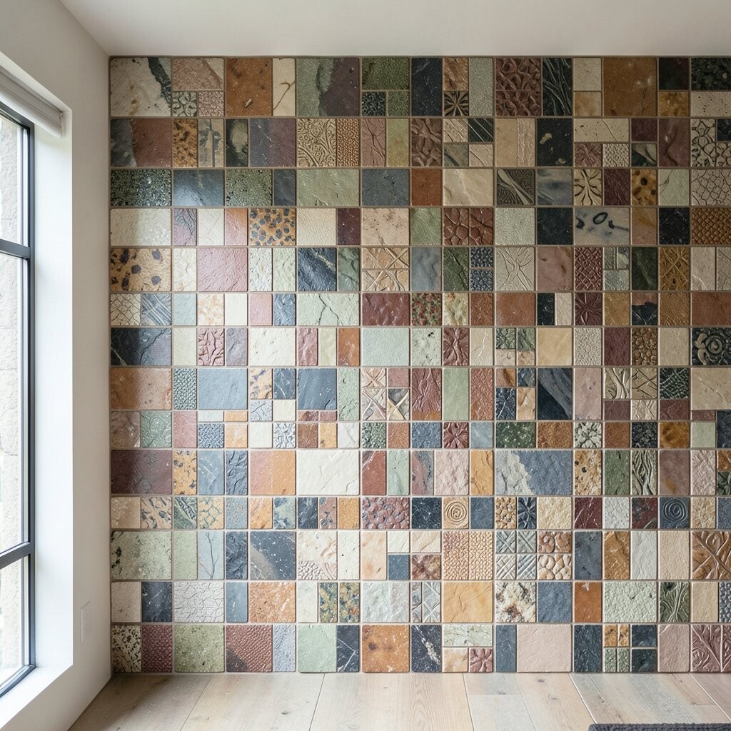
Patchwork mosaic walls mix different shapes, colors, and finishes into one cohesive “story.” When done well, it looks like handmade ceramics gathered together, not like random clutter.
Pick a limited palette, then choose tile variations within that palette so the wall stays calm. Try mixing small squares with a few narrow rectangles to add gentle variety. For a practical approach, buy enough tile sheets to cover the wall from one batch, or sort by shade differences before installation.
To personalize, include a “favorite color moment” where your best-loved shade appears more often. This style stays popular because it brings charm without needing elaborate drawings. Costs can be managed by mixing mid-range tiles with a few lower-cost solids, and saving specialty tiles for the most visible sections.
15. Minimalist Monochrome Border with Highlight Strip
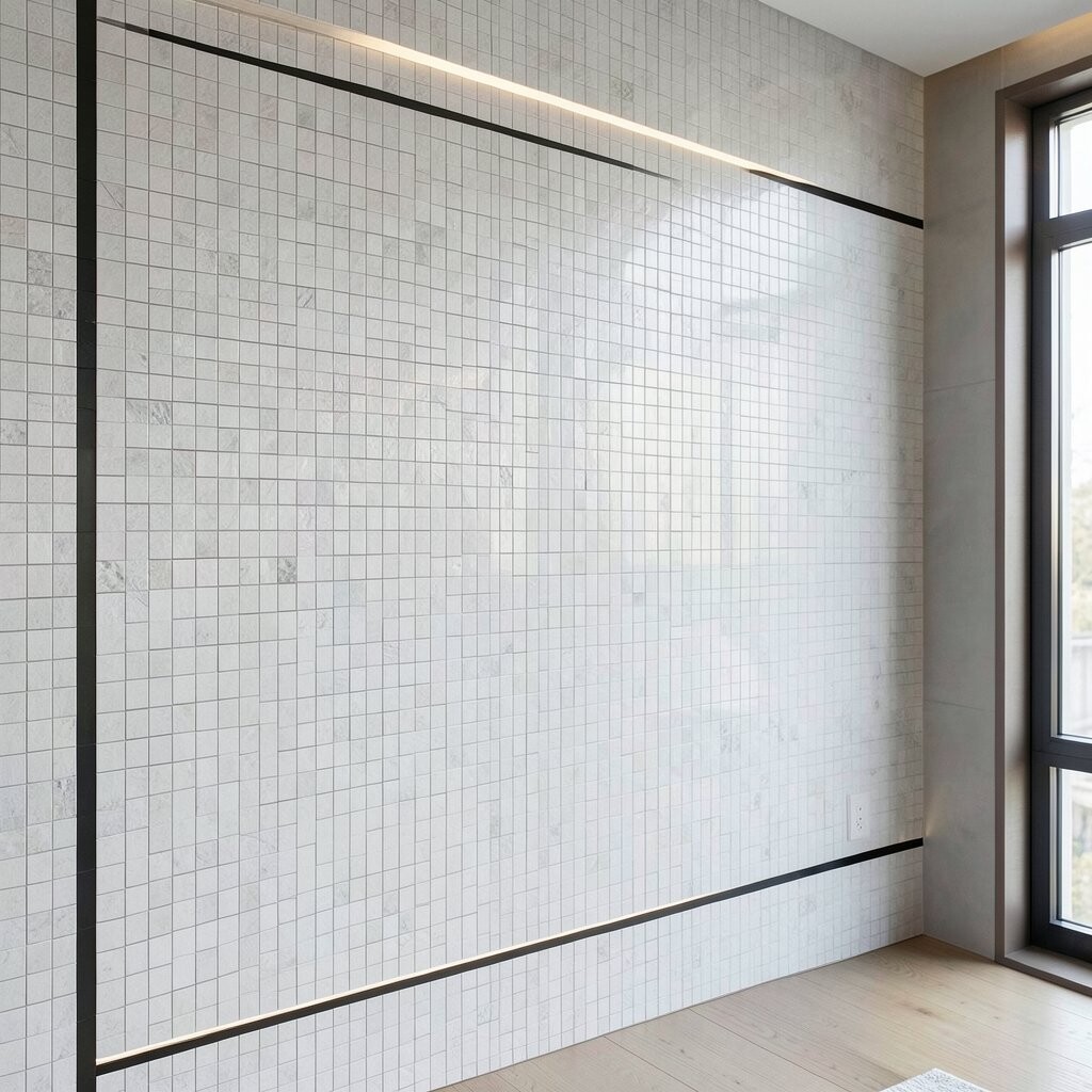
A minimalist mosaic design can be just as bright as a bold mural. By using a monochrome border and a slim highlight strip, you create a refined accent that elevates the room without clutter.
Choose one primary tile tone and one grout tone so the border lines look crisp. Place a thin “highlight strip” of glossy tiles across the center or along a window wall to catch light throughout the day. Personalize it by adjusting the placement, like higher for taller rooms or centered for a calm symmetrical feel.
This look is trending because it blends seamlessly with modern décor and works with almost any furniture style. For cost considerations, a border layout uses fewer tiles than full-wall mosaics, which can help keep the overall budget friendly. If you’re installing yourself, tape off the outline and use spacers for consistent grout lines, since minimal designs are more noticeable if alignment slips.