The right textile pattern can make a wall feel warm and finished. And you can do it without loud, bold prints taking over the room.
1. Woven Basket Weave Panels
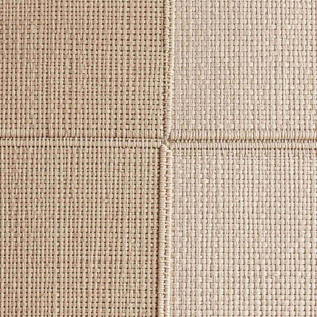
Basket weave textiles bring a calm, textured look that feels like a gentle hug for your wall. The pattern is easy to read from across the room, yet it never shouts.
Pick a neutral shade like oatmeal, sand, or light greige to keep the vibe airy. You can hang woven panels in a grid or one wide vertical strip for a tidy feel. If you choose a slightly textured fabric, it will catch daylight and make the wall look lively even on cloudy days.
2. Subtle Linen Stripes
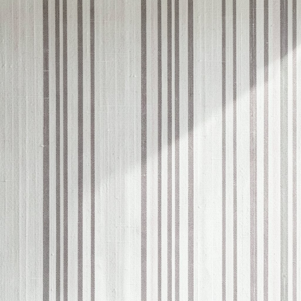
Thin linen stripes add structure without heavy contrast. Think of soft lines that move across the wall like quiet waves.
Choose stripes in two close tones, such as cream and pale tan, or gray and off-white. For a practical layout, center the longest textile on the most open wall and let the stripe direction guide the eye. This works especially well in small rooms because the pattern feels organized rather than busy.
To personalize, rotate the textile so the stripes run vertically for a taller feel, or horizontally to widen a narrow space. Pair it with simple frames or plain shelves, and the wall will look styled but not overwhelming. Linen stripes also hide minor wall imperfections better than very smooth prints, which can save you time when mounting.
3. Tonal Grid Weave
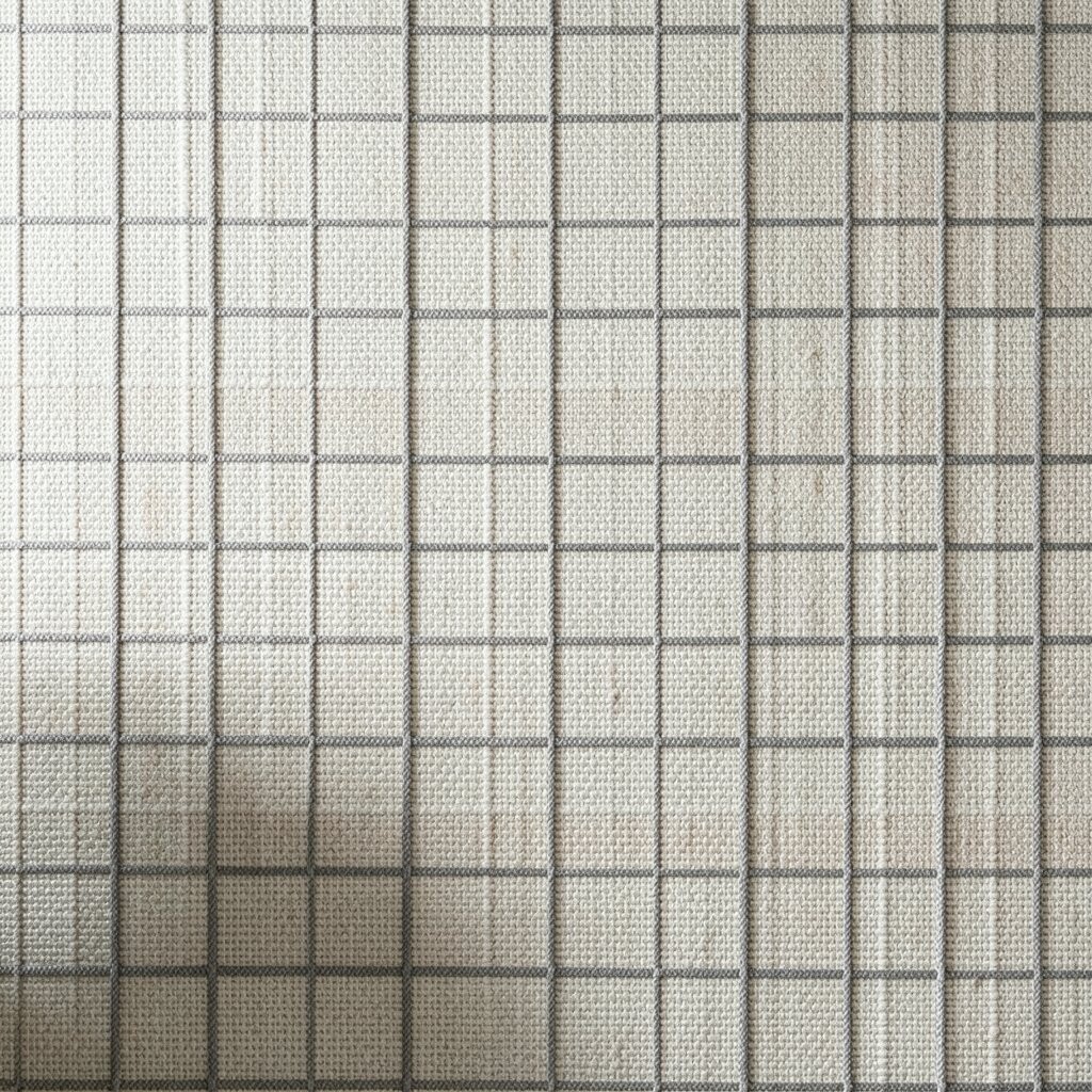
A tonal grid pattern looks modern but still cozy. It creates a neat “designed” feeling while staying gentle on the eyes.
Look for textiles where the grid lines are faint, like a pattern drawn with light pencil. Installing two or three matching pieces creates an even rhythm, and you can keep the rest of the room simple. Use a fabric with a bit of thickness so the lines feel crisp and premium.
For cost considerations, consider buying one larger piece instead of multiple small ones, since larger textiles often cost less per square inch. If you already have lightweight fabric, you can mount it on foam board for a cleaner finish. Personalize by choosing a grid color that echoes your room accents, such as a chair cushion or curtain tie.
4. Watercolor Ombre Blocks
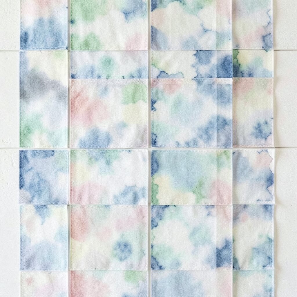
Ombre textile wall hangings can brighten a space without bold graphics. The color fades softly, creating a dreamy effect that looks artistic but still calm.
Pick a palette that matches your lighting, like warm peach to cream for a cozy look, or sage to ivory for a fresh feel. Hang one large piece above a sofa or bed so the fade becomes the room’s focal point. Because the pattern is smooth, it pairs well with solid furniture and helps the wall feel taller.
5. Micro-Dot Texture
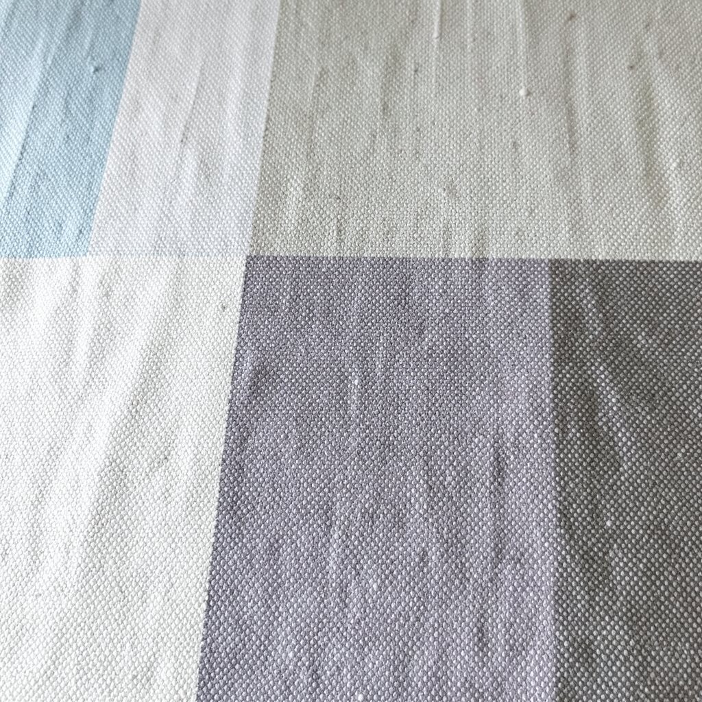
Micro-dot patterns add charm in a way that feels almost like fabric wallpaper. From up close, you notice the texture, and from far away it just looks softly patterned.
Choose dots that blend, such as tiny navy specks on a light background or charcoal dots on oatmeal. This keeps the look subtle while still giving your wall depth. If you want it to feel extra airy, use a lighter base color and let the dots create a gentle shadow effect.
Personalize by mixing dot textiles with plain woven ones for contrast in texture rather than contrast in color. This pattern is also friendly for renters because it can be mounted with removable hooks and taken down without stress. For budgeting, search for remnant yardage and stitch it to a backing so you get the look you want without paying for a full expensive panel.
6. Chevron Without High Contrast
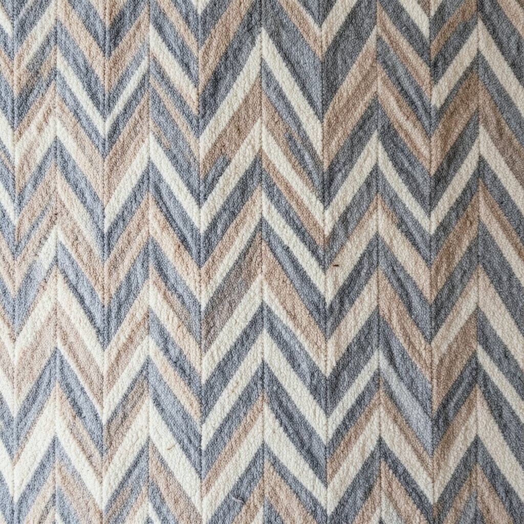
Chevron can feel energetic, but it doesn’t have to be bold. Softer chevron textiles use close colors and gentle spacing to create movement without the loud effect.
Look for chevron where the lines are in the same family, like pale taupe on cream or dusty blue on light gray. Hang it so the points aim toward the center of the room for a balanced, flattering look. If you have a piece of furniture under the wall textile, align the chevron center with it to keep everything feeling intentional.
To personalize, add a slim frame or a fabric border in one solid color. This also helps the chevron pattern look finished, like it belongs in a gallery. For practical tips, keep the surrounding decor simple so the wall pattern gets the spotlight without competing with prints on pillows or rugs.
7. Japanese Kasuri-Style Marbling
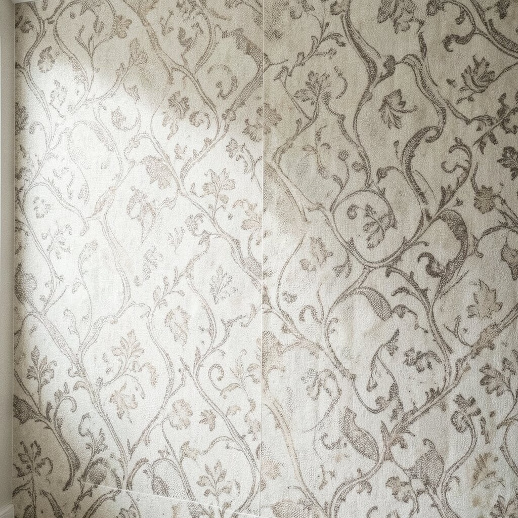
Kasuri-style marbling creates an organic, cloudlike effect that feels artistic and warm. It looks slightly irregular, which adds character without using loud shapes.
Choose textiles with small, layered color shifts rather than big blocky changes. Place it where light hits the fabric, because the marbled threads can glow gently when the sun moves. This pattern works beautifully in spaces that already have natural materials like wood, rattan, or linen.
For personalization, pair one marbled textile with solid ceramics or a simple plant stand. If you’re working with a limited budget, hunt for pre-made scarves or fabric lengths that you can mount on a frame. It’s a smart way to get that handcrafted vibe without buying a full-size designer wall hanging.
8. Embroidered Floral on Cream Ground
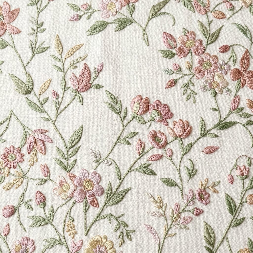
An embroidered floral pattern brings softness and a lived-in feel. Even when the motif is delicate, it can make a room feel more special and welcoming.
Keep the floral subtle by choosing muted tones, such as dusty rose on cream or sage green on ivory. Hang it behind a reading chair or above a console so it becomes a gentle background story. For practical tips, use a rod or tension-hanging clips so the fabric stays smooth and the stitching looks crisp.
9. Patchwork Strips With Matching Tones
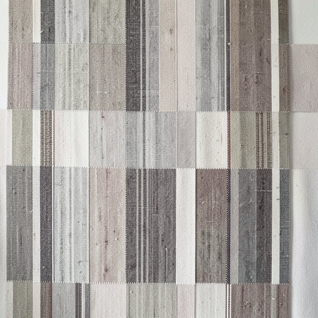
Patchwork strips look playful, but you can keep them grown-up with matching tones. Instead of loud contrast, choose fabrics that share the same warmth or coolness.
Pick a patchwork design made of narrow strips, like small rectangles or elongated panels, for a sleek look. Arrange the textile so the longest patches run vertically, which helps the wall feel taller. This style is great for adding interest when you want your space to feel cozy but not cluttered.
To personalize, pull one fabric shade from your room and repeat it in the patchwork by choosing matching patterns with the same color family. It’s also cost-friendly because you can use small pieces of fabric from your stash. If you’re planning to mount it, back it with a light canvas so the surface stays sturdy and wrinkle-free.
10. Soft Matelassé Quilt Texture
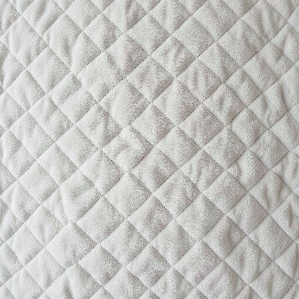
Matelassé textiles have raised stitching that creates a pattern through shadow. The best part is that you get visual interest without needing printed color.
Choose a quilt-like wall textile in cream, light sand, or pale blue for an easy, bright effect. Hang it with a simple dowel or frame, and it will look elegant even in minimal rooms. Because the texture catches light, it feels cozy during evenings and crisp during the day.
11. Geometric Lines in One Color Family
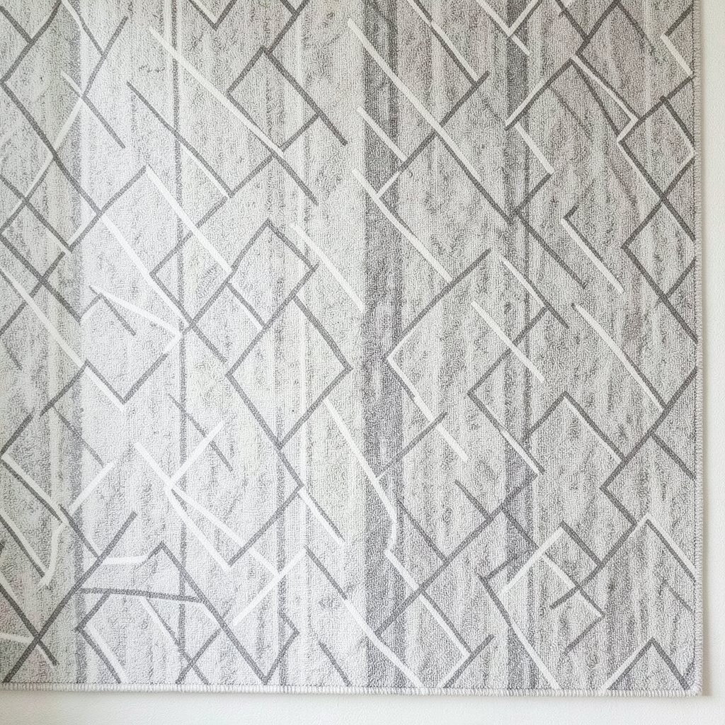
Geometric lines can be modern and soothing when they stay in one color family. The pattern feels neat, and the wall looks designed without heavy contrast.
Search for textiles with repeating line shapes in a single tone, like deep indigo lines on off-white or charcoal lines on gray. This keeps the geometry clean and makes the rest of your decor stand out. If you want a brighter space, choose a lighter base so the lines look airy rather than dark.
For practical tips, use a centered placement above a bed headboard or sofa back to make the geometry feel balanced. Personalize by matching the line tone to your artwork frames or metal finishes. If cost is a concern, consider buying two smaller pieces and arranging them side by side, since many makers price smaller sizes more accessibly.
12. Ikat-Inspired Blurry Color Fields
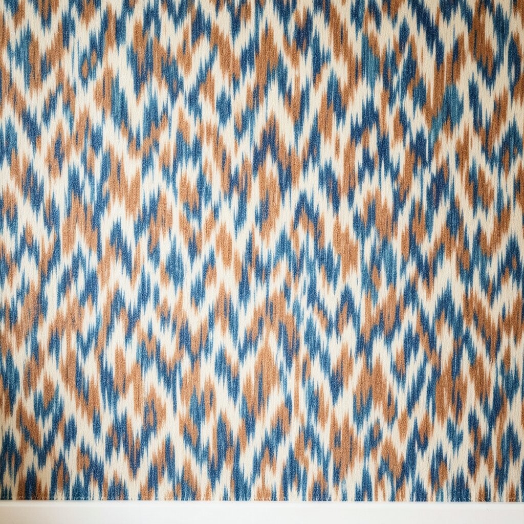
Ikat-inspired textiles create a soft, blurred pattern effect that feels rich and calm. It’s not about sharp edges, it’s about layered color that looks handcrafted.
Pick an ikat look with muted colors like clay, tan, or soft teal for a bright but grounded wall. The blurred edges make the pattern feel gentle, which is perfect if your room has a lot of solid furniture. Hang it so the color field sits at eye level, and your space will feel curated without feeling busy.
13. Scandi-Style Solid Blocks With Micro Patterns
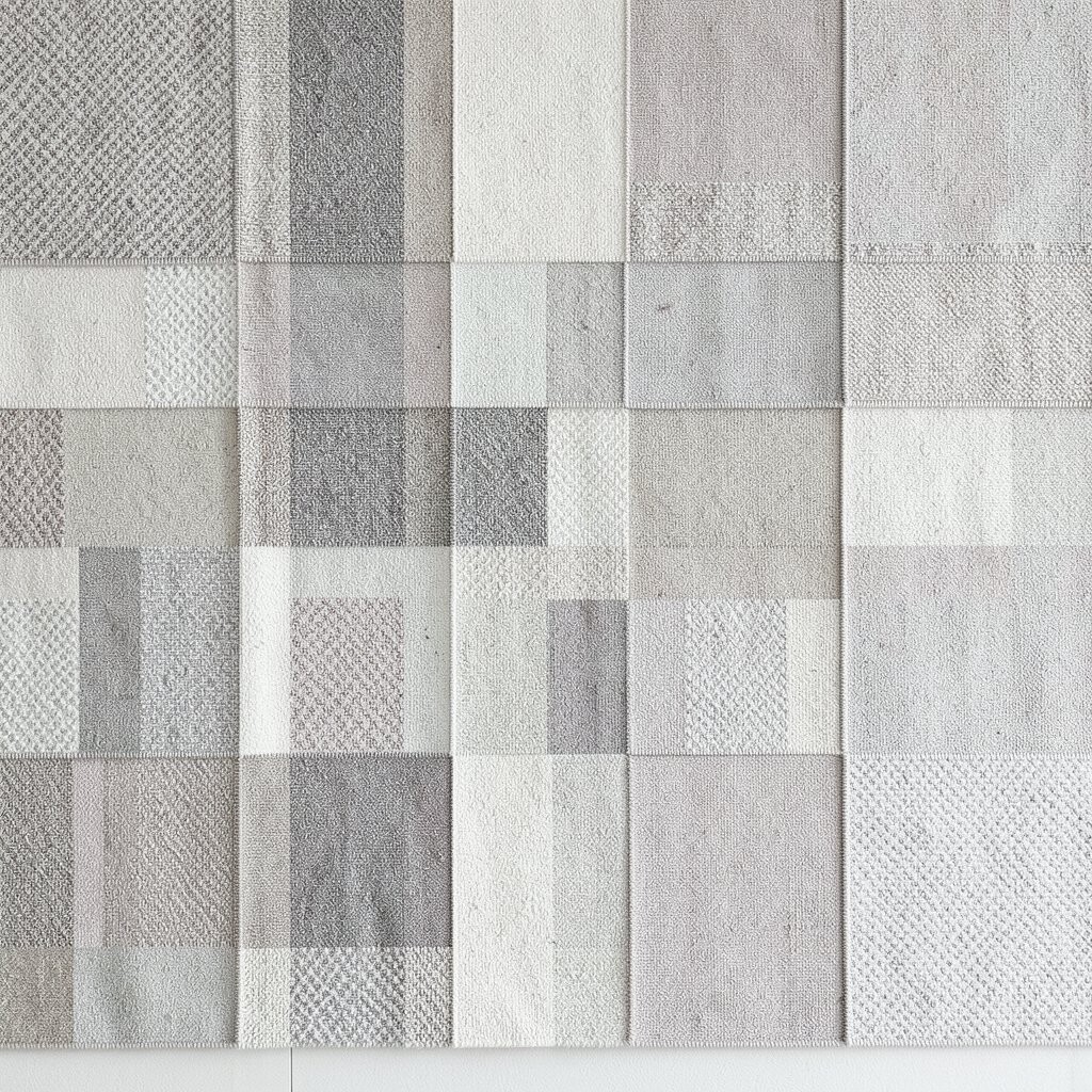
Scandi-inspired textiles can look bright by using simple blocks with tiny textures. Instead of bold prints, you get a mix of subtle weaves and faint patterns.
Choose block colors that work with your palette, like cream with small charcoal accents or light oak with pale gray. A practical layout is to hang it like art, centered and slightly above a console or bed. Micro patterns within the blocks keep it interesting up close, while the overall look stays calm from a distance.
To personalize, add a thin border color that matches a pillow or throw blanket. This trick makes the textile feel custom even if it’s store-bought. If you’re watching costs, look for textiles that include multiple textures in one piece, because you get variety without buying several separate hangings.
14. Floral Sprigs With Negative Space
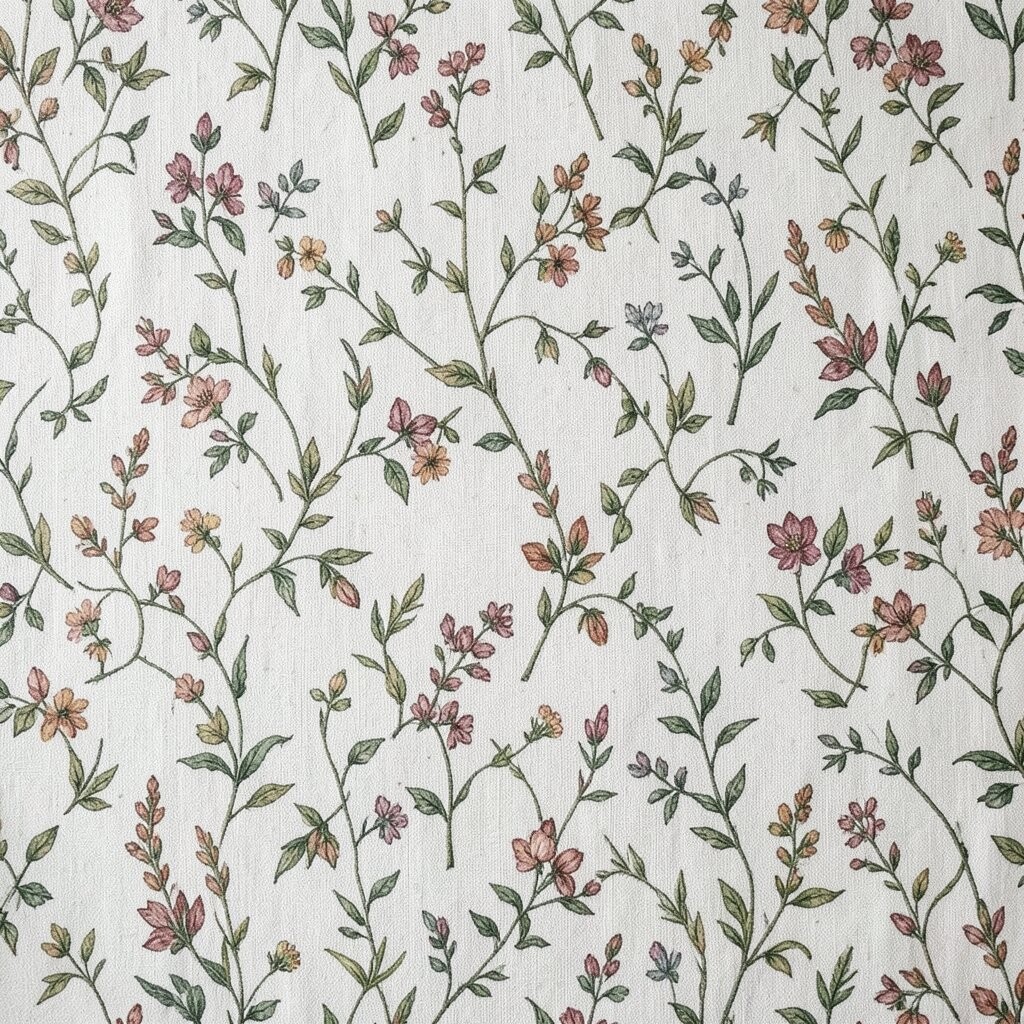
Sprig-style floral textiles use space around the flowers, which helps the wall stay light and open. The empty areas make the pattern feel airy instead of crowded.
Choose a sprig pattern where the flowers are spaced out and the background is bright, like white on pale blue or ivory on warm gray. This helps the room feel cleaner and makes small spaces look bigger. Hang it where you want softness, like in a hallway or a breakfast nook, so the wall feels welcoming.
15. Subtle Striped Seersucker Effects
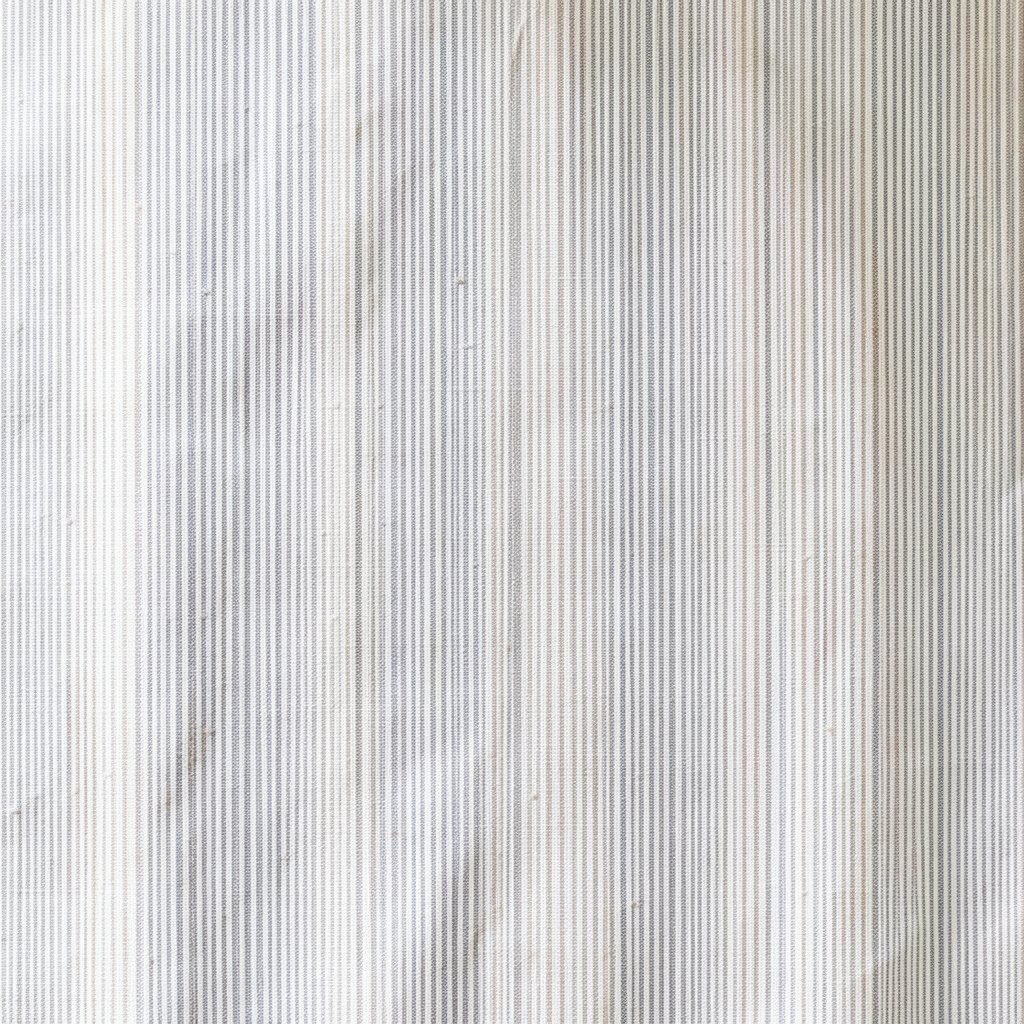
Seersucker-like stripes give a puckered texture that adds depth without loud printing. It’s a playful fabric look that still feels neat and cozy.
Look for tiny puckered stripes in soft tones, such as butter cream with light blue or oatmeal with pale gray. The texture does the work for you, so your color choices can stay simple. This is a great option if your room has plain walls and you want visual interest that won’t fight with other textiles.
For practical tips, smooth the textile gently before hanging so the puckering looks even. Personalize by pairing it with solid curtains, simple bedding, and a few natural accessories like a woven basket. If you’re cost-conscious, consider buying a smaller panel and using it as a centered accent rather than covering a full wall.
16. Tonal Damask in Modern Scale
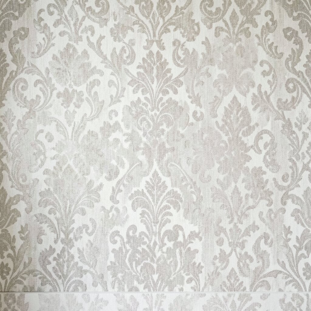
Tonal damask brings elegance through repetition and curve, not through loud color. When the pattern is subtle, it feels classic and fresh at the same time.
Choose damask where the pattern is only slightly darker than the background, like taupe on cream or slate on light gray. This keeps the design airy and allows your furniture and art to remain the main attraction. Hang it in a hallway, dining area, or bedroom where you want a soft sense of luxury without heavy drama.
To personalize, pair it with warm wood tones and brushed metal accents to match the damask’s refined feel. For a practical mounting idea, use a tension rod system or a lightweight frame so the pattern stays flat. If you need a budget-friendly approach, search for damask curtain panels or thrifted fabric you can mount, since damask fabric can often be reused beautifully.