The moment you add textiles to a wall, the whole room starts to feel warmer. Small pattern changes can make a space look brand-new without major work.
Let these wall moments guide your next upgrade, from cozy and classic to bold and modern.
1. Arched Stripe Gallery Wall With Soft Contrast
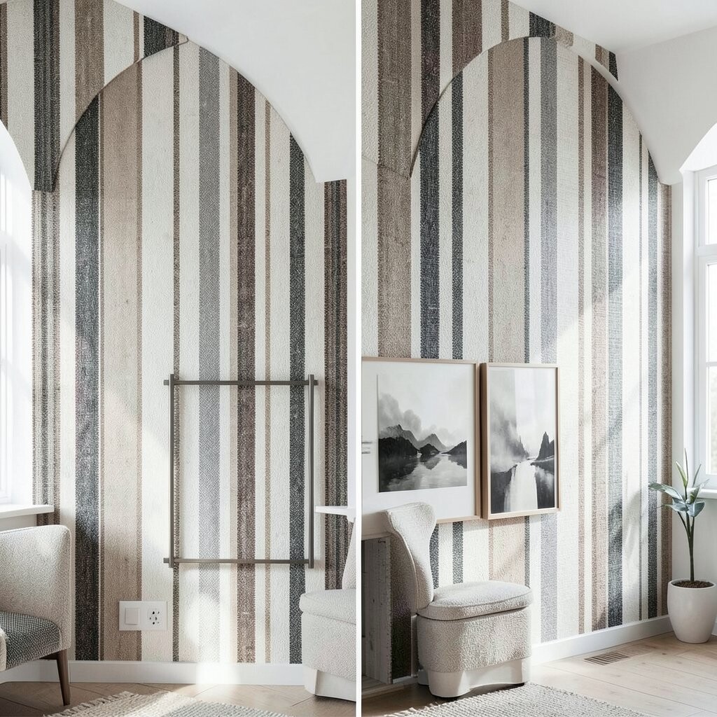
Picture a wall covered in arched stripes that curve like gentle waves. In a before room, the wall looks flat, while in an after room the arches guide your eye and create movement.
You can use a mix of medium and light tones so the stripes feel airy instead of heavy. Choose fabrics with a little texture, like woven cotton or linen blends, to keep the pattern looking rich up close. For a clean finish, measure your spacing carefully and keep the arches lined up so the design feels intentional.
Try keeping the color palette to two main shades, then add one accent color in a small amount, like mustard or terracotta. It usually costs less than custom wallpaper because you can source ready-made textile panels or fabric yardage and frame them yourself. This look is trending because it blends modern curves with traditional comfort, and it works in hallways, bedrooms, and even dining nooks.
2. Botanical Foliage Panels With “Living Room Calm”
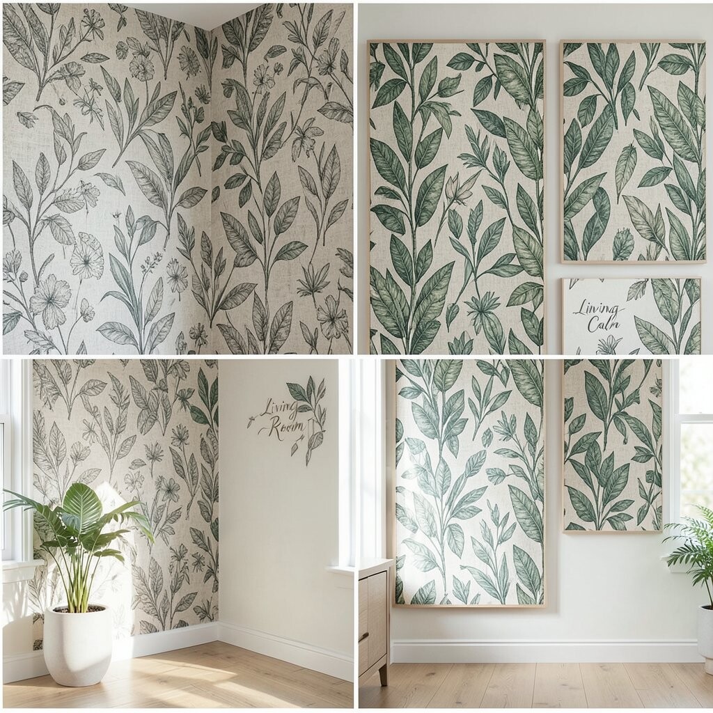
Imagine leafy botanical panels arranged as a staggered set across the wall. Before, the space might feel too neutral, and after, the room feels like it has fresh air and soft shade.
Foliage patterns bring instant relaxation, especially when you pick greens that lean toward sage or moss. For practical results, hang the panels slightly off-level only if you’re going for a casual gallery vibe. If you want a more polished effect, align edges with painter’s tape first and mark anchor points lightly.
To personalize, match leaf colors to your existing decor, like the undertone in your sofa or rug. Fabric choices matter too, because thicker prints hold their shape better, while lighter prints create a subtle, breezy look. Keeping the palette calm can also reduce cost since you won’t need to buy multiple bold accent fabrics for contrast.
3. Geometric Mudcloth Inspired Squares for Warm Character
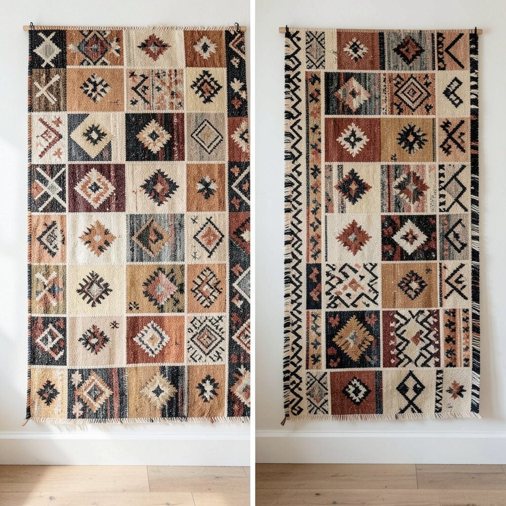
Think of a wall where earthy square motifs create a handmade, grounded feeling. In the before version, the wall may look plain, while in the after version the texture and pattern make it feel lived-in and stylish.
Mudcloth-inspired designs add uniqueness because they look like no two pieces are exactly the same. Look for patterns with small variations in line weight and spacing, because that small detail makes the wall look authentic. A practical tip is to center your main piece at eye height and let surrounding squares balance it.
If you’re worried about cost, start with fewer panels and add one larger focal textile first, then build out later. Pair the earthy pattern with plain frames or simple wooden dowels for a balanced look that still feels natural. This style also fits current trends toward tactile surfaces and cozy, earthy interiors that feel less “perfect” and more welcoming.
Personalize by choosing a color family you already love, like rust, cocoa, or oatmeal, and keep the rest of the room simple so the pattern can shine.
4. Classic Toile Scenes for Storybook Elegance
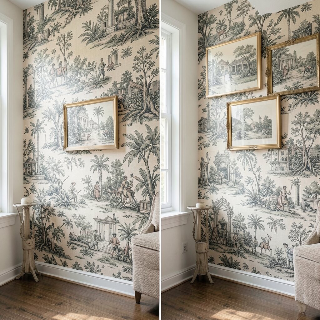
Picture a wall covered in toile-inspired fabric with delicate scenes repeating like a story. Before, your room may feel quiet in a boring way, and after, it gains charm and a sense of old-world grace.
Toile works beautifully because the pattern has both detail and rhythm, so it looks good even when you’re not staring at it. Hang it on a frame grid if you want crisp edges, or use a tension rod method for a softer drape. For practical tips, test the fabric length against your wall height so the repeating scene lands where it looks best.
To control cost, you can select a single wide textile piece as the anchor and then add smaller coordinating panels. Personalize by choosing toile colors that fit your home, like soft blue for calm or deep black for dramatic contrast. This pattern is also popular right now because many people want timeless character without committing to heavy wallpaper.
5. Bold Moroccan Trellis for High-Energy Style
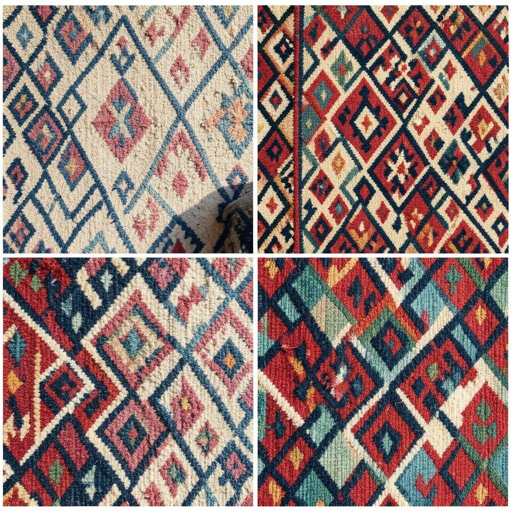
Imagine a wall where lattice lines stack into a Moroccan trellis pattern, crisp and confident. In a before setup, the room can feel too safe, and after, the trellis gives it energy and structure.
This pattern is unique because the design feels both traditional and graphic, making it perfect for modern homes too. Choose high-contrast colors like cream and charcoal for a strong look, or go softer with dusty rose and sand. A practical tip is to use a level and a ruler, because trellis lines look best when they feel square.
For personalization, match the trellis style to your existing tile or rug pattern colors so everything feels like it belongs together. It can be cost-friendly if you buy fabric by the yard and stretch it over inexpensive frames. Current trends favor bold geometry, and trellis textiles are an easy way to get that vibe without permanent changes.
6. Watercolor Ombre Draped Fabric for Soft Glow
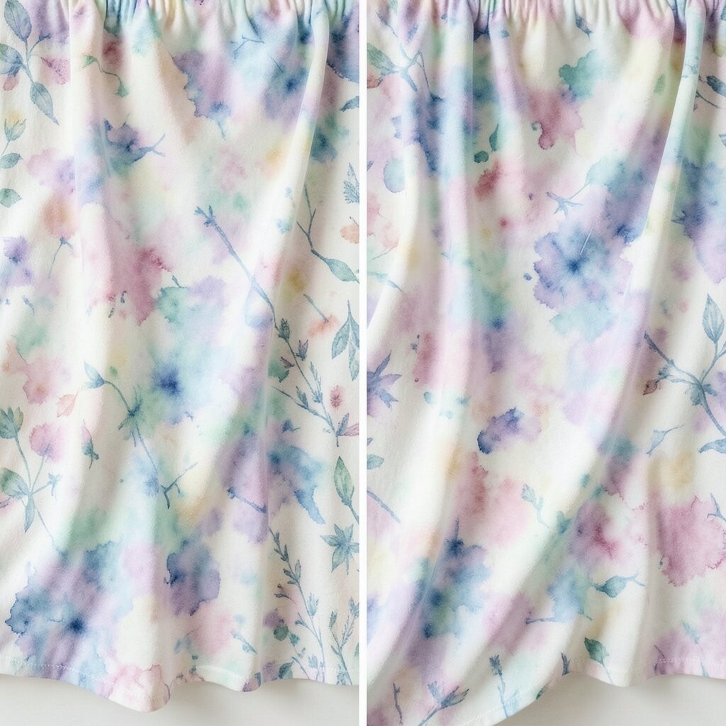
Picture fabric with an ombre gradient that fades like watercolor across the wall. Before, the wall might absorb light and feel flat, while after, the gradient makes the room feel brighter and gentler.
Ombre looks calming and helps soften hard corners, which is great in rooms with lots of straight-line furniture. Choose ombre tones that echo your paint color, then pick a fabric weight that hangs nicely without sagging. If you’re hanging multiple sections, overlap edges slightly so the fade looks continuous.
This textile pattern offers uniqueness because it doesn’t rely on sharp motifs; it relies on color mood. For personalization, try a sunrise fade with warm peach near the bottom, then keep the rest of the room neutral. Costs can stay reasonable because you can use a single wide fabric panel as the main feature and add small coordinating swatches only if needed.
As a practical tip, wash and iron the fabric first so the gradient lines stay smooth and even. People are also leaning into softer “art textiles” right now, and ombre is a top choice for that trend.
7. Traditional Ikat Ridges for Layered Texture
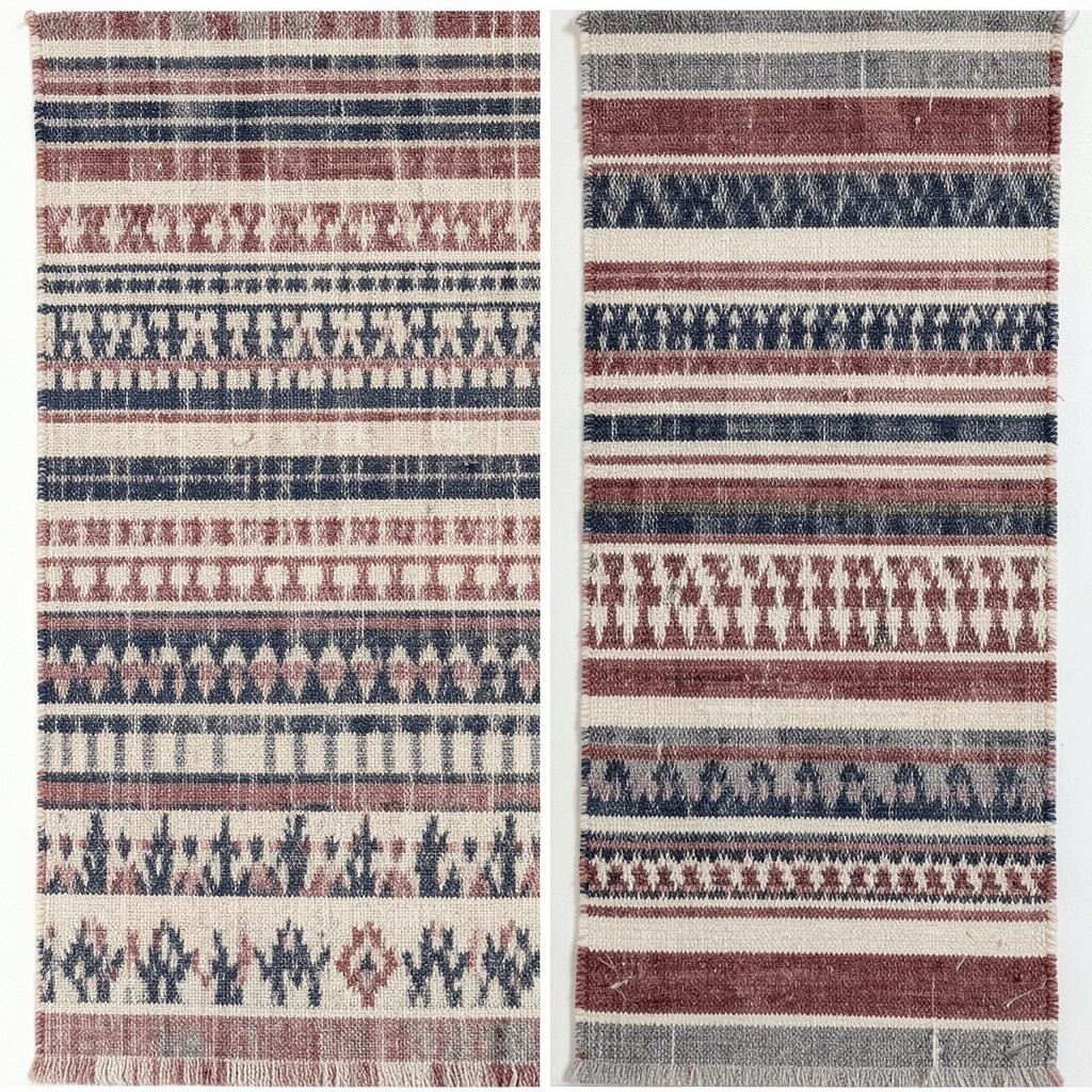
Imagine ikat ridges that look like woven waves, with color bands that shift subtly. In the before look, the wall may feel too uniform, but in the after look it feels full of depth and movement.
Ikat patterns stand out because the dye looks slightly imperfect, which gives your wall a handmade vibe. Pair ikat with plain frames or solid backing so the texture stays the star. A helpful tip is to choose one dominant color family and keep the surrounding decor simple so the wall doesn’t compete.
Personalize by matching the warm under tones to your wood finishes, like oak, walnut, or teak. You can also mix sizes of fabric panels, like a larger section in the center and smaller ones on the sides, for a custom layout. For cost considerations, consider using fewer panels if you find higher-end ikat fabric, since the pattern already looks rich.
This style fits current trends because many homes now mix global-inspired textiles with clean, modern shapes for contrast.
8. Minimal Line Pattern With Modern Frame Rhythm
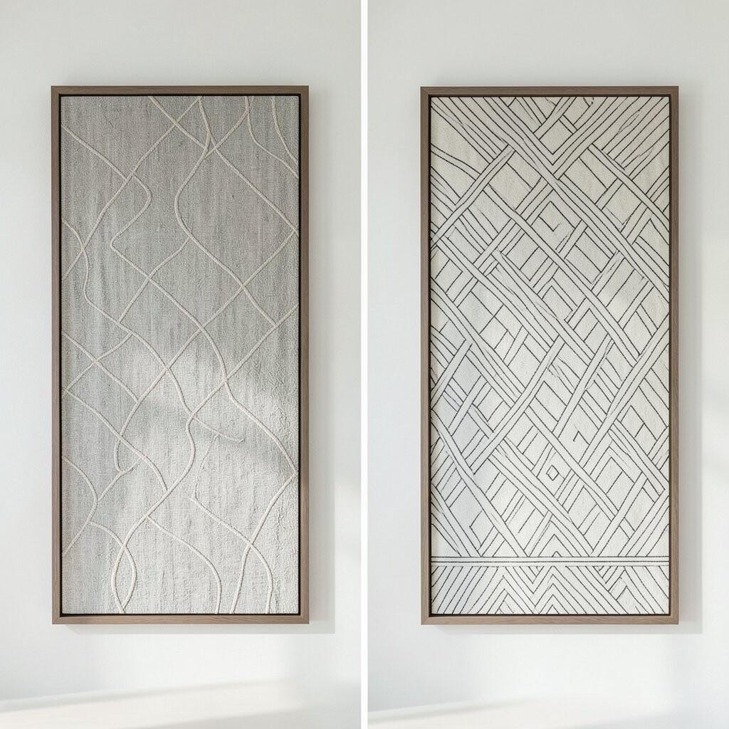
Picture a wall of simple line-pattern textiles arranged in tidy, repeating frames. Before, the wall might feel bare, while after, the clean lines give a modern rhythm without visual chaos.
Minimal line patterns are perfect if you want style but still crave calm. Keep colors close to your existing palette, like white-on-cream or navy-on-ivory, so the design blends smoothly. To get it right, plan your grid spacing, and use the same frame type for a consistent look.
This kind of pattern is unique because it offers impact through simplicity, not loud color. For practical personalization, you can swap one frame color or one textile shade to highlight a favorite artwork or shelf. If cost matters, minimal designs often come in easier-to-find fabric prints, so you can stretch your budget farther.
9. Vintage Floral Wallpaper Feel in Fabric Form
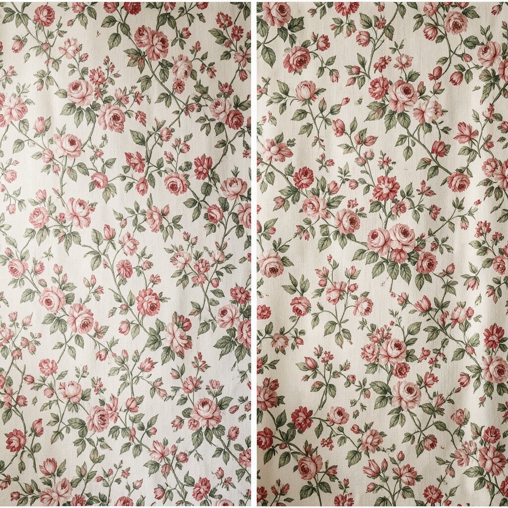
Imagine a wall that looks like vintage wallpaper, but it’s made from soft textile fabric. Before, the room may seem plain and modern, and after, the wall adds romance without the permanence of real wallpaper.
Floral textiles bring warmth and make even simple furniture feel more inviting. Choose a scale that matches the wall size, using larger motifs for wide walls and smaller repeats for compact spaces. For a practical tip, confirm the fabric repeat size so your pattern matches across panels or frames.
Personalize by selecting a bloom color that echoes your cushions, curtains, or rug accents. You can keep the budget in check by using a focal strip as the centerpiece and framing smaller sections around it. Right now, many people want “heritage charm” mixed with modern decor, and vintage floral fits that look perfectly.
The uniqueness is in the fabric texture, because textiles soften the pattern and make it feel more dimensional than paper.
10. Classic Checkboard Contrast for Cozy Farmhouse Energy
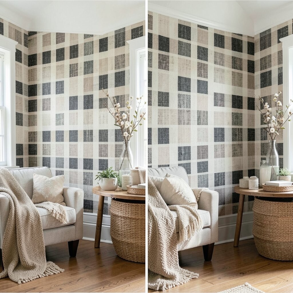
Picture a check pattern wall that feels crisp and cozy at the same time. Before, the room might feel unfinished, while after, the checks add structure and a friendly, homey vibe.
Checkboard designs are great because they work in many rooms and pair well with wood, leather, and simple textiles. Pick two shades that play nicely with your floor and furniture, like cream and brown or navy and off-white. For best results, keep the check scale consistent across pieces or deliberately vary sizes for a crafted look.
To personalize, add a narrower runner-like panel in the center, then surround it with larger check sections. That layout helps the wall feel balanced and keeps your design from looking scattered. Cost considerations are easy here since checks are widely available, and you can often find coordinating fabrics in a set.
This pattern is still trending because it hits the sweet spot between timeless and styled, especially when paired with natural materials and warm lighting.
11. Soft Shibori Tie-Dye Swirls for Artistic Calm
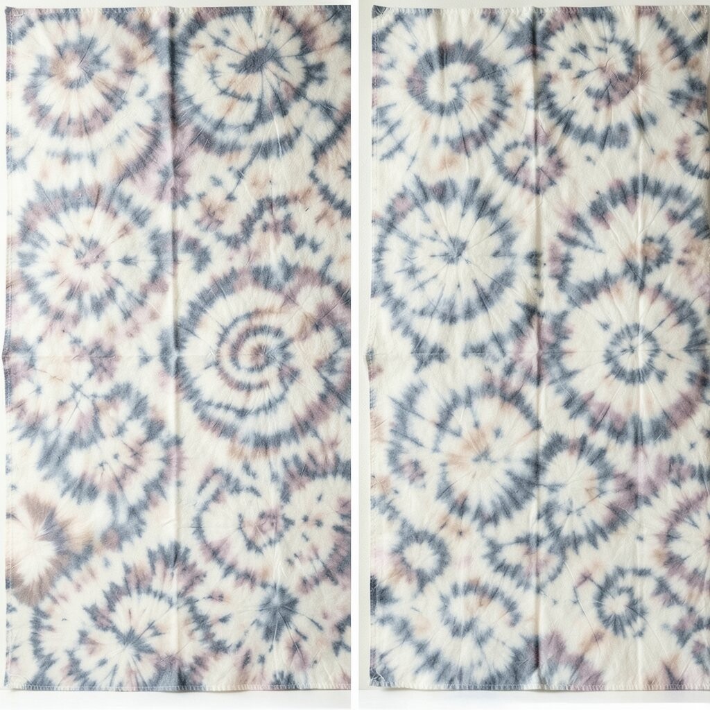
Imagine a wall of shibori-style swirls that look like tie-dye, but arranged with calm intention. Before, the wall may look flat, and after, it feels like an artwork that changes as the light shifts.
Shibori patterns are unique because they look handmade, with gentle variations that hide small imperfections. Choose cool, muted tones for a spa-like vibe or warm earth tones for a cozy, rustic mood. A practical tip is to keep each panel slightly spaced so the dye edges don’t blur together unless that’s the look you want.
Personalize by picking a color story that matches your bedding or shower curtain, since textiles in these rooms create a strong visual connection. This can be budget-friendly because some fabric options look expensive even when they’re reasonably priced. Current trends are leaning toward artsy, soft interiors, and shibori textures fit that demand beautifully.
Use simple hardware and neutral frames so the dye effect stays front and center.
12. Bold Floral Burst With Center Focal Placement
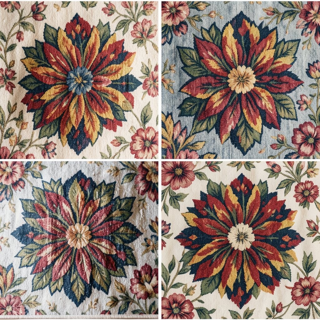
Picture a dramatic floral burst placed at the center of the wall, then echoed by smaller supporting textiles around it. Before, your wall may look like it’s waiting for something, and after, it becomes the main event that pulls the room together.
This approach is actionable because a clear focal point makes decorating easier. Choose one bold floral fabric as the anchor and then pick simpler coordinating patterns, like small dots or solid grounds, to keep everything balanced. For practical tips, measure so the floral center lands at eye level when you’re seated.
Uniqueness comes from how you stage the layout, not just from the fabric. You can personalize by rotating colors to match your accent pieces, like changing only the background shade from the same floral family. Cost considerations are usually manageable because you only need one high-impact fabric, while the rest can be more neutral and affordable.
This is trending because many interiors now favor statement textiles paired with calm surroundings for a high-low mix.
13. Striped Herringbone Texture for Tailored Warmth
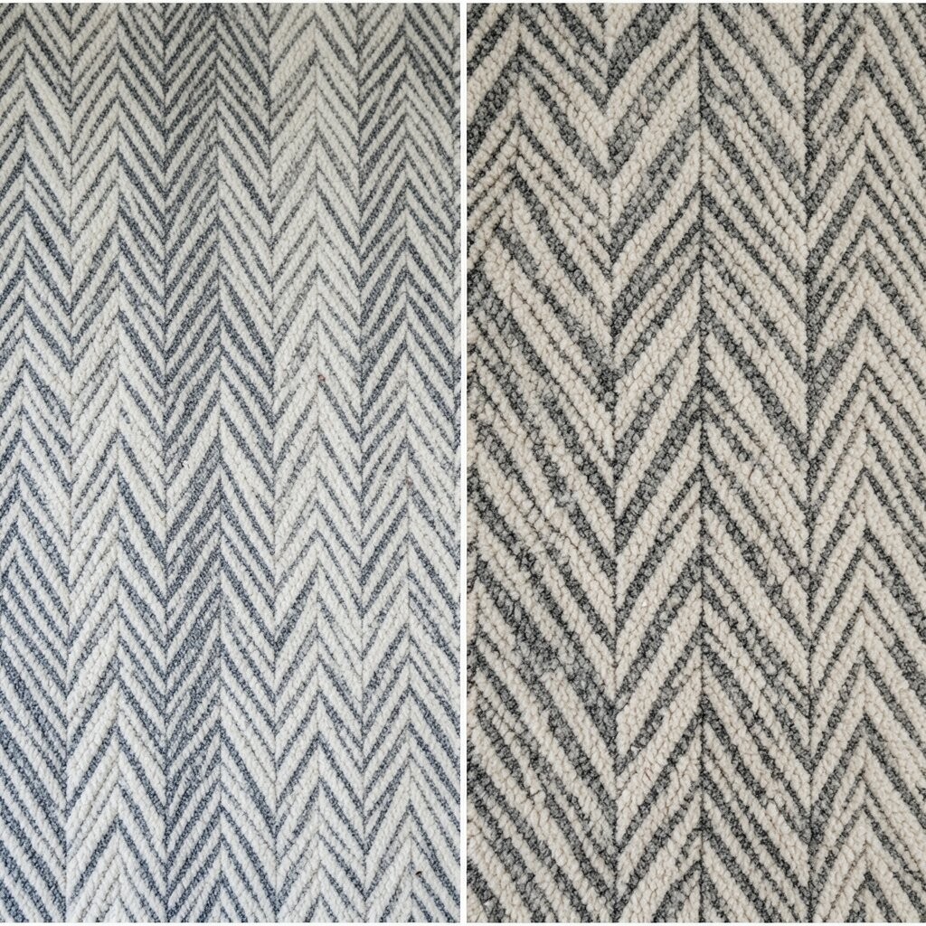
Imagine a textile wall that blends stripes and herringbone texture for a tailored, cozy look. Before, the wall might feel plain, and after, it gains warmth through pattern depth and subtle angles.
Herringbone styles feel unique because they add structure without the boldness of loud geometric prints. Choose a fabric with a slight weave, like cotton jacquard, to highlight the texture. A practical tip is to align your lines carefully so the angle rhythm looks intentional.
Personalize by pairing warm neutrals with one color stripe that appears in your pillows or artwork. If you’re working on cost, look for fabric blends on sale and stretch them over simple frames, since the texture helps the wall look high-end. Current trends often favor “quiet texture,” and herringbone fits perfectly in those spaces.
Keep the rest of the room simple so the pattern feels tailored instead of busy.
14. Playful Polka Dots for Lighthearted Style
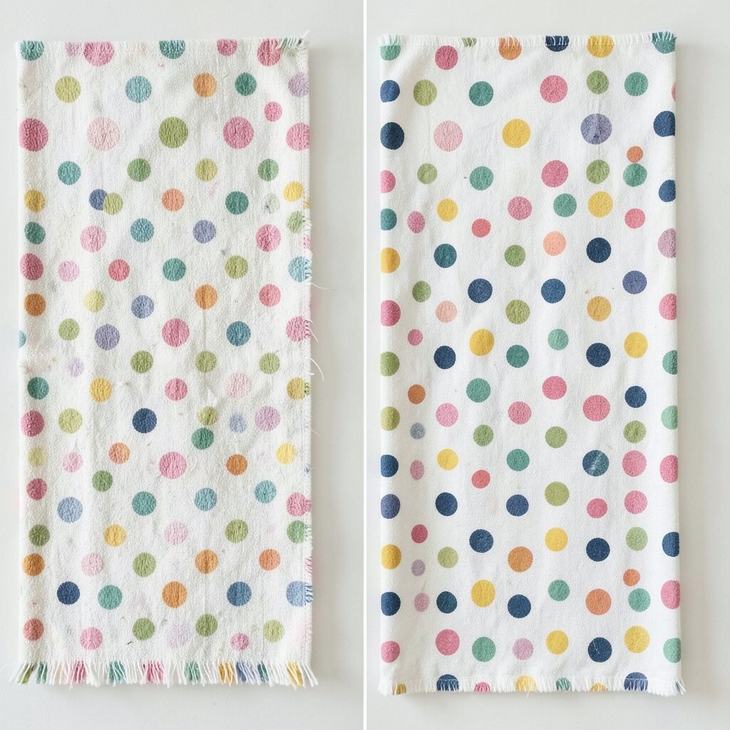
Picture a wall filled with polka dots that look playful but still neat. Before, the room may feel too serious, while after, the dots add bounce and a friendly mood.
Polka dots are benefits for busy homes because they’re easy to style and work with many colors. Pick a dot size that fits the wall distance, using larger dots for closer seating areas and smaller dots for wide rooms. For practical tips, test your fabric stretch so circles don’t warp on the frames.
Uniqueness comes from choosing dot color pairings, like black and cream for classic, or teal and coral for a fun twist. Personalize by repeating dot sizes in a rhythm, like large center panels with smaller dots around them. Cost considerations are usually favorable since dots are common prints and you can often find coordinated options.
This look also stays current because it brings personality without feeling overwhelming.
15. Art Deco Fan Shapes for Glam Structure
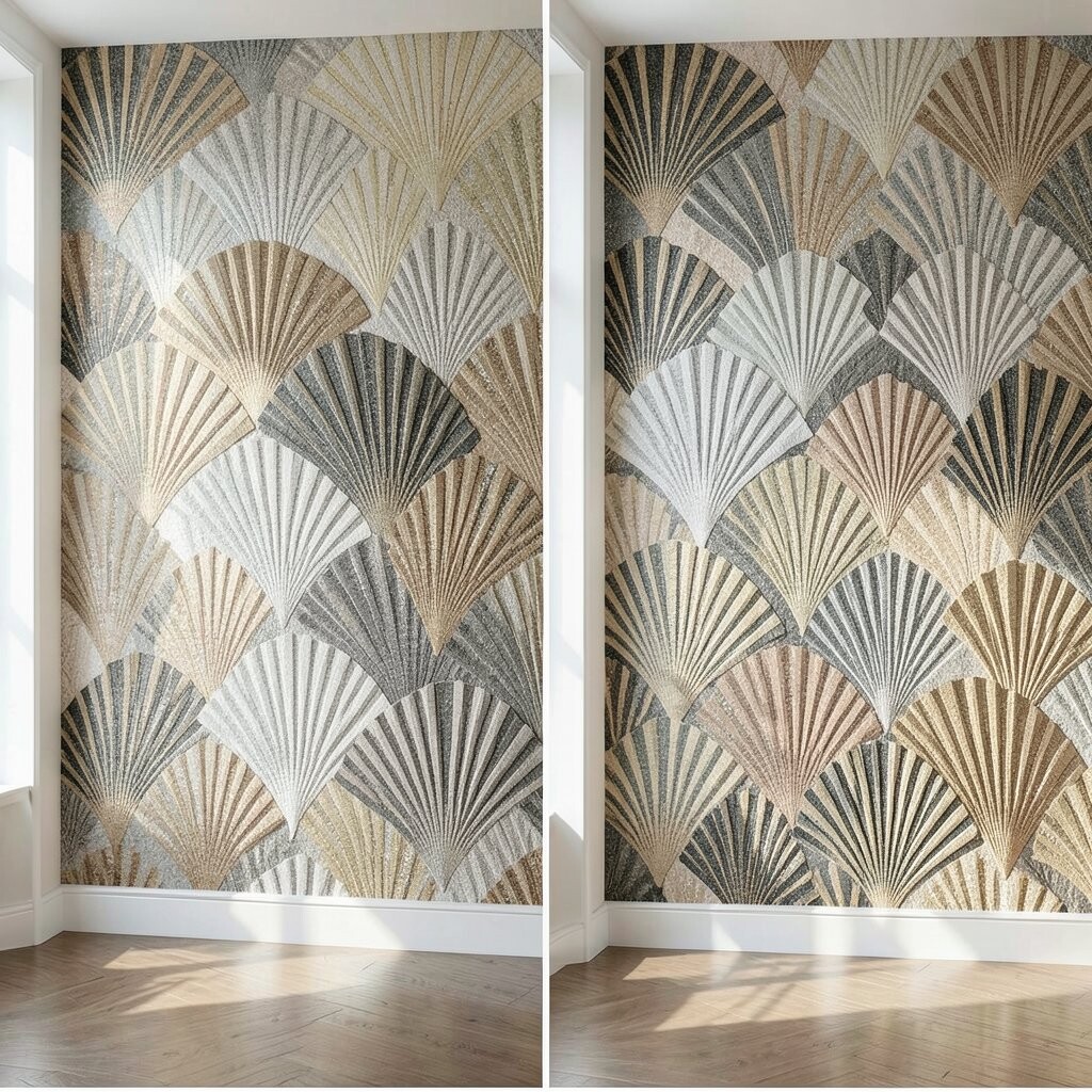
Imagine art deco fan shapes stacked like elegant screens across the wall. Before, the room may feel modern but unfinished, and after, it gains glamour and confident lines.
Art deco patterns are unique because they feel both vintage and architectural, giving your wall a sense of presence. Choose metallic-inspired tones like gold, bronze, or warm beige so the pattern glows when light hits it. A practical tip is to keep neighboring decor in simpler solids so the fan shapes don’t compete with busy furniture.
Personalize by selecting fabrics that match your hardware, such as brushed brass or matte black accents. Cost considerations can vary, but you can stay within budget by using one larger art deco textile panel and framing it with plain backing. Current trends show more interest in “statement patterns,” and art deco fans are a perfect choice for that moment.
For a polished before-and-after effect, use consistent frame sizes so the deco shapes feel aligned and intentional.
16. Serene Solid Panels With Subtle Pattern In One Corner
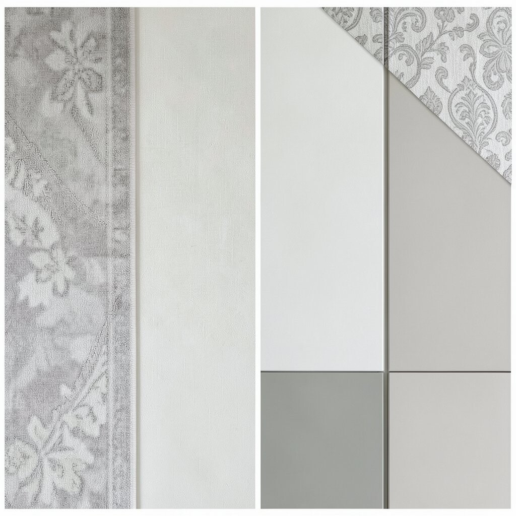
Picture a mostly solid textile wall with a single corner upgraded using a patterned fabric. Before, the wall feels too blank, and after, it feels designed because the corner pulls the eye like a secret detail.
This design method is actionable because it avoids pattern overload and still gives you a big visual change. Choose a solid fabric for the main area, then add one patterned textile block with a motif you love, like stripes, botanicals, or tiny checks. For practical tips, measure the patterned corner so it stays clear and tidy, and keep the solid fabric edges crisp.
Uniqueness happens because you’re using contrast intentionally, not because you’re covering everything in print. Personalize by matching the corner pattern to your smallest recurring accent color, so the whole room feels connected. Cost considerations can be friendly because you only need a smaller amount of the more expensive patterned textile.
This is trending among people who want modern calm with just enough detail, and it’s especially great for renters who want change without committing to full coverage.
Finish the look with simple trim or a matching rod so the corner feels intentional from every angle.