A room can feel sleepy until its textiles start doing the talking. Small pattern choices bring big personality with almost no effort.
1. Citrus Stripe Joy
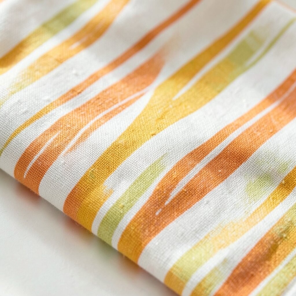
Bright stripes look like sunlight that learned to stand still. Picture a cushion with warm yellow and soft orange lines, sitting against a neutral sofa like a friendly wave.
Use this pattern to pull energy into everyday spaces without overwhelming them. Keep the rest of your textiles simple, and repeat the stripe color in one small item like a vase or tray for a cleaner, pulled-together look.
2. Coastal Wave Throw Charm
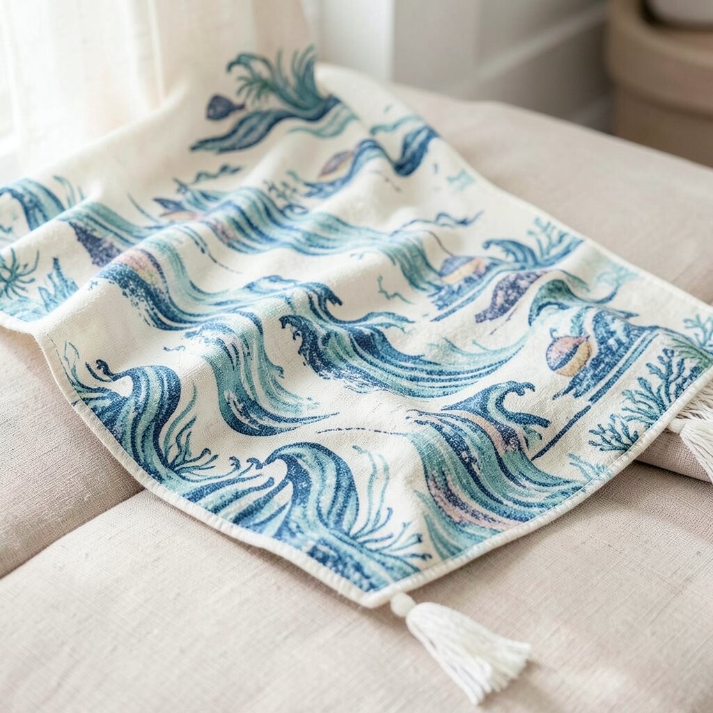
Wave patterns bring an easy, breezy feeling even in rooms far from the ocean. Imagine a throw with gentle blues and seafoam curves draped over a chair, making the whole corner feel calmer.
This textile works great for layering because the shapes guide your eye without shouting. Choose a soft fabric like cotton or a light knit so it feels inviting and looks good year-round.
To personalize it, match the wave colors to your wall paint undertones, such as cool grays or creamy whites. If you are working with a tighter budget, start with one throw or pillow rather than replacing everything at once.
3. Garden Floral That Feels Fresh
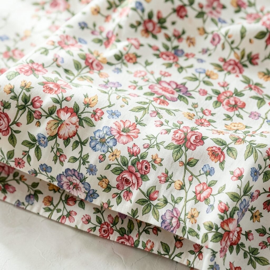
Floral patterns can look modern when the palette is bright and the scale feels intentional. Think of a pillow with small blossoms in coral, mint, and sunshine yellow that instantly lifts a reading nook.
Fresh florals add warmth and make a room feel lived-in, not staged. Pick one main color from the bloom and use it again somewhere else, like a curtain tieback or a painted picture frame.
If you want a unique look, mix a bold floral with solid textures that share the same color family. For practical styling, keep the background color consistent across items so your space stays cohesive.
When costs matter, look for fabric remnants or pillow covers first since they let you try the pattern without a big commitment.
4. Bold Geometric Pop
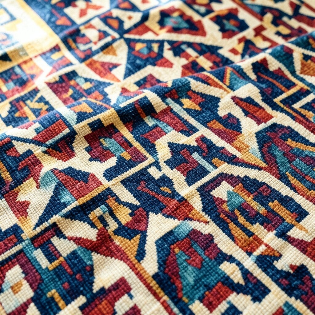
Geometric patterns deliver a clean burst of personality that looks great in both modern and eclectic rooms. Visualize a set of cushion covers with high-contrast triangles in black, teal, and white, giving your sofa a lively edge.
This design helps define zones, like making a small seating area feel intentional. Keep your shapes crisp by pairing them with solid fabrics and simple lines in your furniture.
5. Soft Polka Dot Play
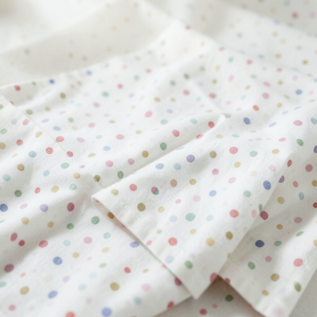
Polka dots are classic, but the right scale can make them feel brand-new. Imagine tiny dots in pale pink on a light background, creating a gentle sparkle whenever the light hits.
This pattern is great for adding charm without making your room feel busy. Choose it for curtains, a lamp shade cover, or a single accent pillow to keep the vibe light.
To personalize your look, match the dot color to your metal finishes, like warm brass or cool chrome. For cost-smart shopping, opt for removable covers that you can swap when trends or seasons change.
Current styles often favor softer colors and smaller dot sizes, which makes polka dots feel calm and current.
6. Moroccan Lattice Warmth
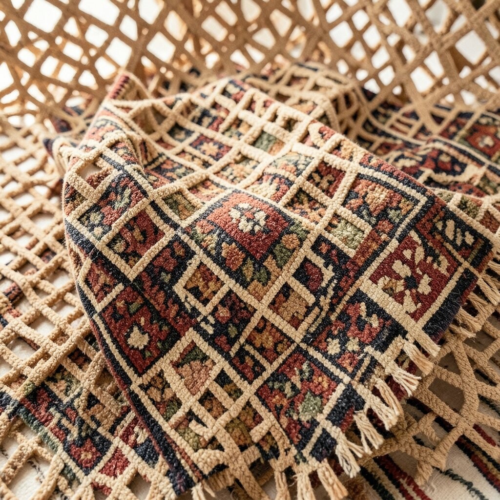
Lattice and trellis patterns add an elegant rhythm that feels both traditional and updated. Picture an accent rug or cushion cover with repeating diamond lines in terracotta, cream, and deep brown.
This pattern brings structure to a room and makes plain furniture look more styled. Pair it with natural materials like wood, rattan, or linen to enhance that cozy, handcrafted feeling.
For practical personalization, choose a lattice pattern with one dominant color so it is easier to match your existing decor. If you are mindful about cost, try a smaller item like a runner or decorative pillow before committing to a full rug.
7. Watercolor Ombre Texture
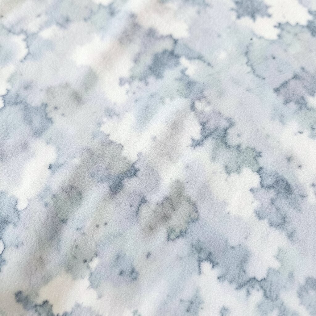
Ombre textiles look like color is melting softly across the fabric, which makes them feel artistic and easygoing. Imagine a gradient throw moving from dusty rose to peach to cream, draped over the foot of your bed.
This pattern is a great choice when you want brightness without sharp lines. Because the transition is gentle, you can pair it with many styles, from modern minimalist to boho layered looks.
8. Animal Print With a Modern Twist
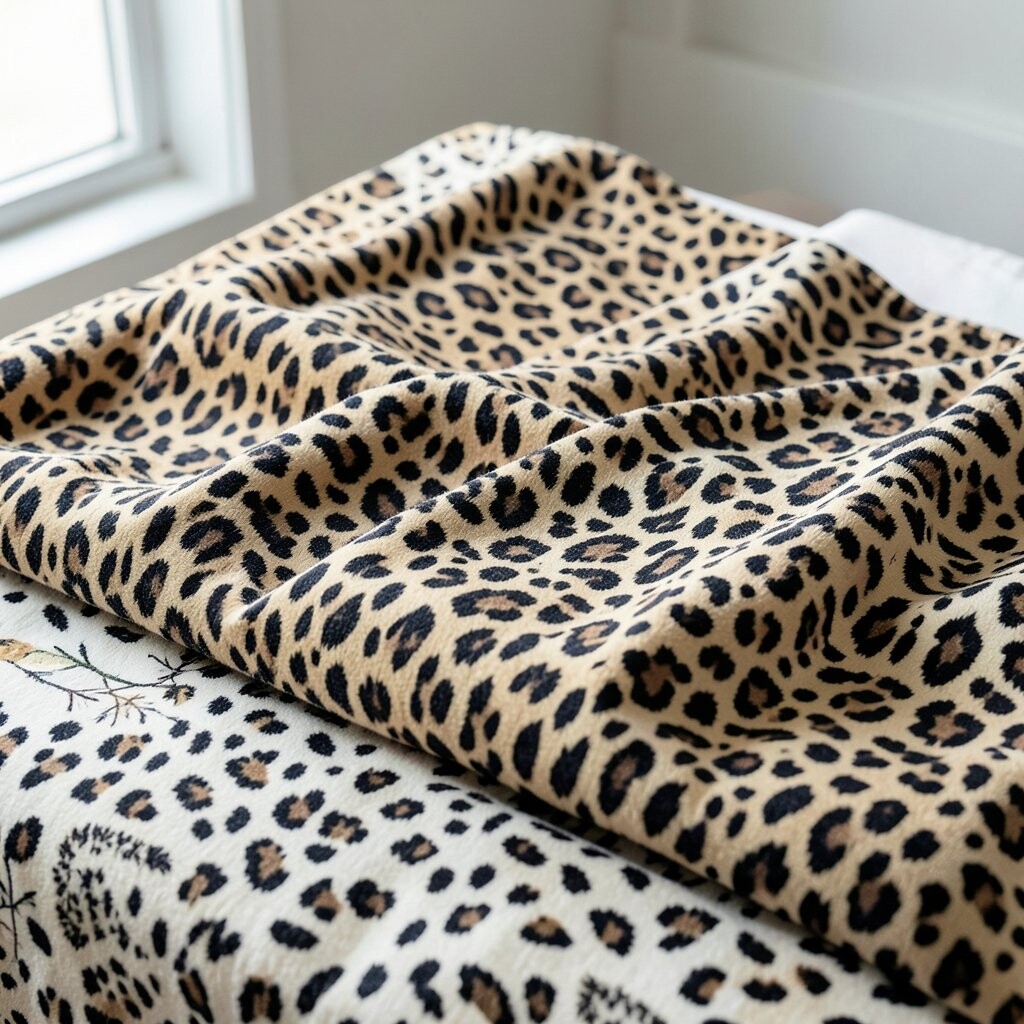
Animal patterns can feel bold, but you can make them feel bright and friendly with the right base color. Think of a zebra-striped pillow in soft taupe with a lighter highlight, placed on a chair with a light neutral cover.
This kind of pattern adds drama while still helping your room look grounded. Keep the rest of your textiles in smooth, solid fabrics so the print stays the star.
If you want uniqueness, look for prints that lean more abstract, like subtle spots or softened stripes. For cost considerations, buy one statement cover first, since it gives you the look without a full decor overhaul.
You can also coordinate with warm metals and natural textures to keep the vibe classy, not costume-like.
9. Retro Sunburst Spotlight

Sunburst patterns create an instant focal point, like a little burst of energy behind your seating area. Visualize a wall-hugging cushion with rays in golden yellow and bright white, making the corner feel like it is lit from within.
This pattern is perfect for adding brightness to darker rooms or spaces with limited natural light. Use it sparingly by pairing one sunburst pillow with solid cushions in matching colors.
To personalize the look, pull a secondary color from the rays and repeat it in a small accent, like a ceramic bowl or a picture frame. Trend-wise, retro-inspired shapes are showing up in home decor again, especially in warm, cheerful palettes.
10. Abstract Brushstroke Energy
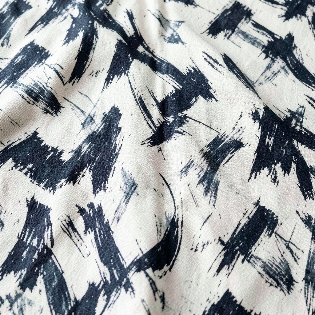
Brushstroke textiles bring a creative, painterly feel that makes a room look fresh. Imagine a cushion cover with sweeping strokes in teal, coral, and pale cream, like a modern art piece you can actually lean on.
This pattern adds movement and helps your space feel less formal. Keep other patterns minimal so the brushstroke design has room to breathe.
11. Classic Herringbone Upgrade
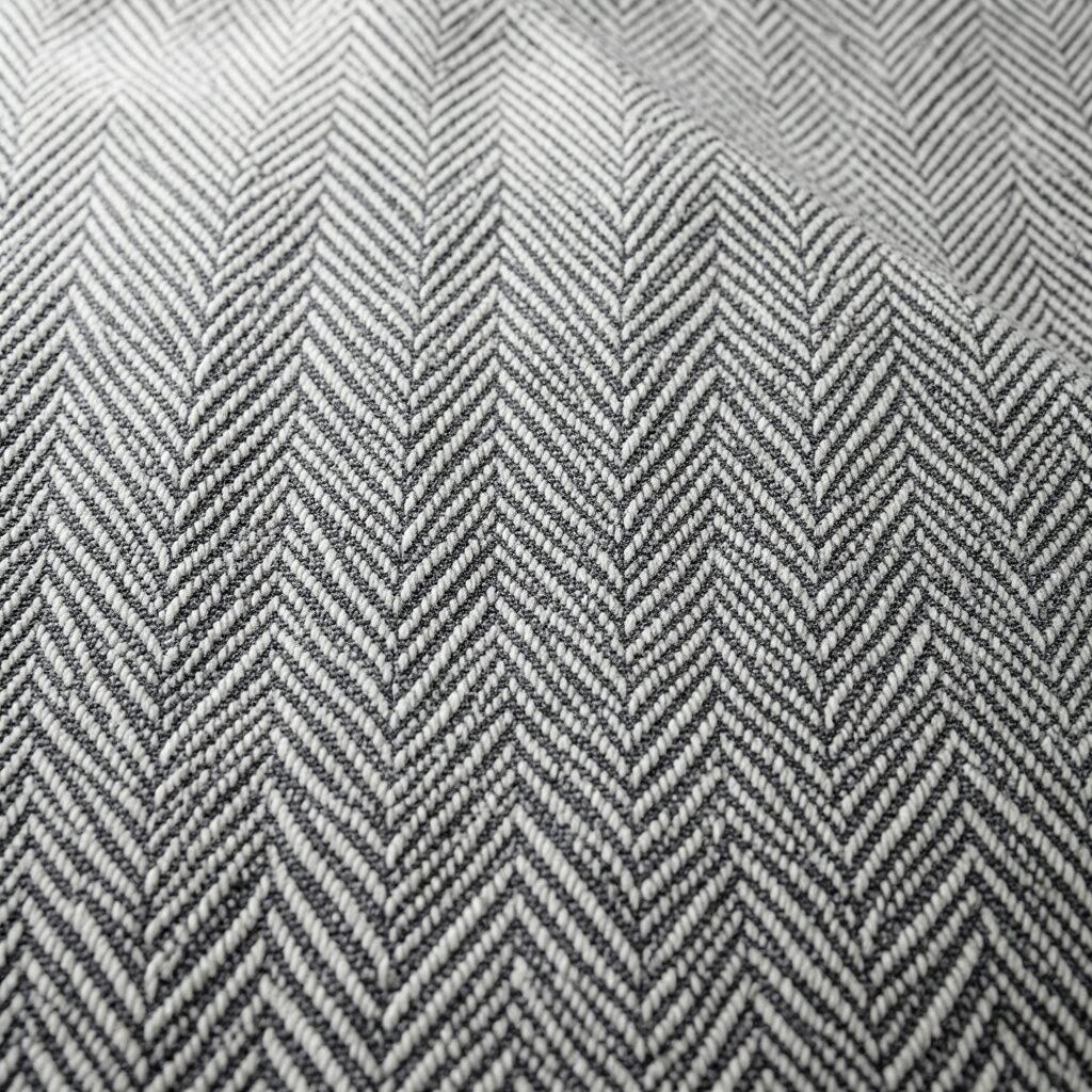
Herringbone is a pattern that feels timeless and also quietly stylish. Picture a throw blanket with a crisp diagonal weave in oatmeal and light gray, sitting over a chair like a tailored outfit.
This textile adds texture, which helps light bounce around your space. It also works well when you want brightness but do not want bold color, because the contrast in the weave still feels lively.
For practical personalization, pair herringbone with one bright accent color, such as a turquoise pillow or a sunflower-toned mug set. If your budget is tight, choose a smaller item like a cushion or blanket because texture still makes a big visual impact.
12. Ditsy Confetti Micro-Print
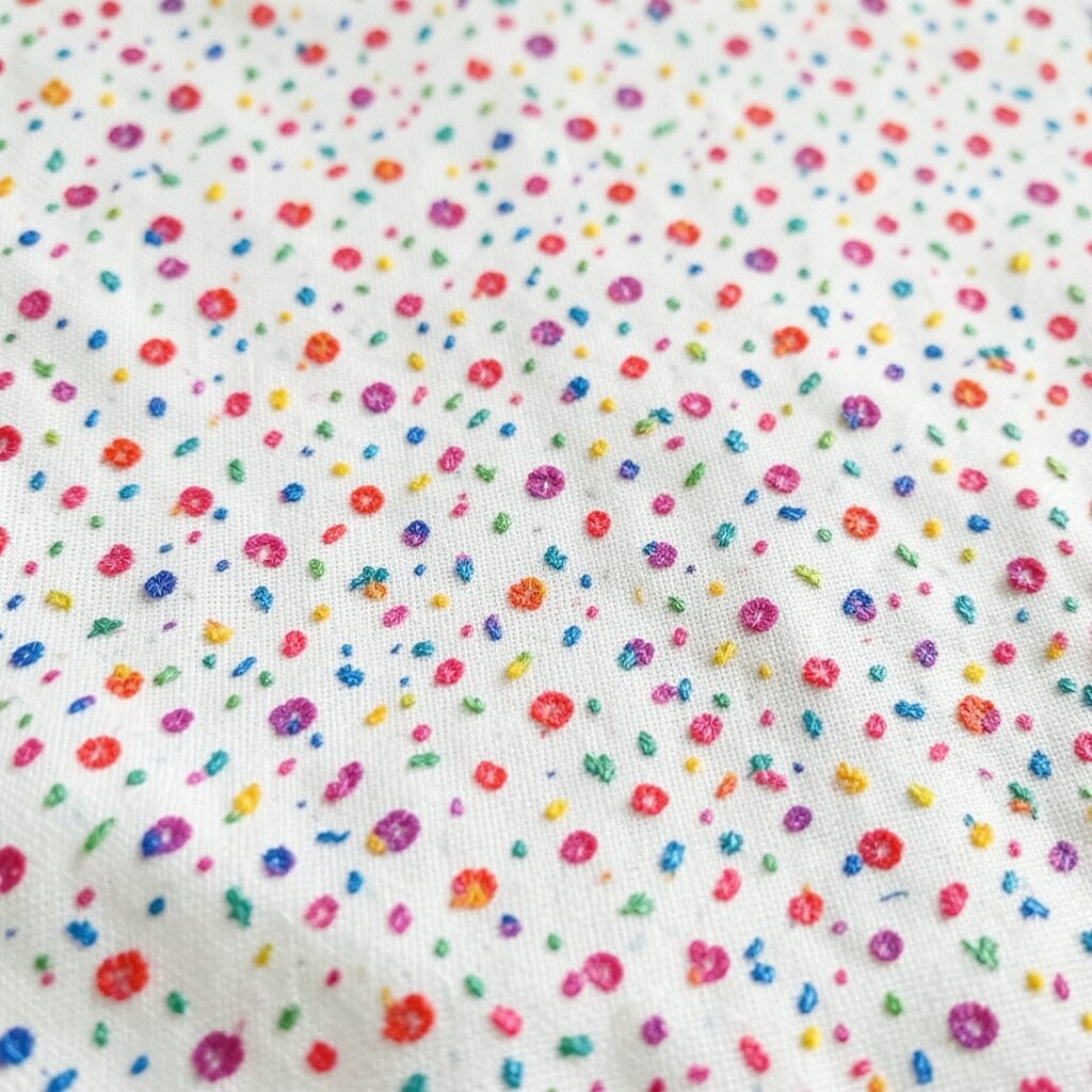
Micro prints, like ditsy confetti florals or tiny scatter patterns, make a space feel playful and detailed. Imagine a curtain panel with very small pink and blue flowers on a light background, softening the whole room.
This pattern is excellent for layering because it does not compete with bigger shapes. It also helps hide minor wear, since the tiny details make everyday scuffs less noticeable.
To personalize it, match your dominant color to your season, like cool blues for summer vibes or warm reds for cozy evenings. For cost considerations, consider one statement textile like curtains or a bed runner since they cover more area and can be found in many price ranges.
Current trends lean toward delicate prints that feel airy, so this choice often looks current without needing constant updates.
13. Striking Checkered Contrast
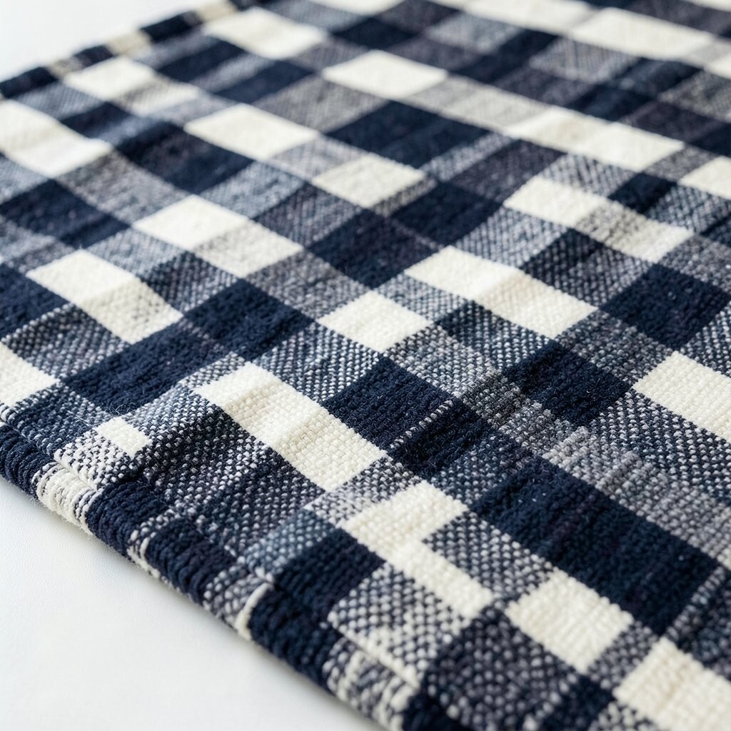
Checks and gingham patterns can make a room feel cheerful and well-balanced when the colors are bright. Picture a cushion set with small white squares and lively sky-blue edges, adding a crisp, happy rhythm to your seating area.
This pattern gives structure while still feeling light, especially when the background stays neutral. Pair it with solid fabrics and smooth textures so the check stays sharp and does not blend into the furniture.
To personalize, choose check sizes that match your scale, using smaller checks for compact spaces and larger checks for roomy areas. If you are budget-conscious, look for cotton blends and removable covers so you can refresh the look easily later.
As a practical finishing touch, repeat one of the check colors in a smaller decor item, like a book spine, candle, or ceramic accent.