The right stripe pattern can make a room feel more alive. With a few thoughtful choices, your space can look brighter, calmer, or more playful in a single move.
Stripes are one of those design tricks that never really go out of style. They add rhythm to walls, softness to fabrics, and a little energy to everyday corners.
1. Sunlit Cheer Stripes for Everyday Walls

Think of warm sunshine laid across your wall in neat, friendly bands. Light catches the edges of each stripe so the whole area feels more open and welcoming.
If you want a quick upgrade that still feels cozy, choose thinner stripes in bright whites and soft yellows. Keep the stripe direction horizontal if you want the room to feel wider, and choose vertical stripes if you want it to look taller.
To make it practical, paint a small test patch next to a window and observe it at morning and evening light. When you match the paint sheen to your room, you also help the stripes look smooth instead of patchy.
2. Modern High-Contrast Alternating Bands
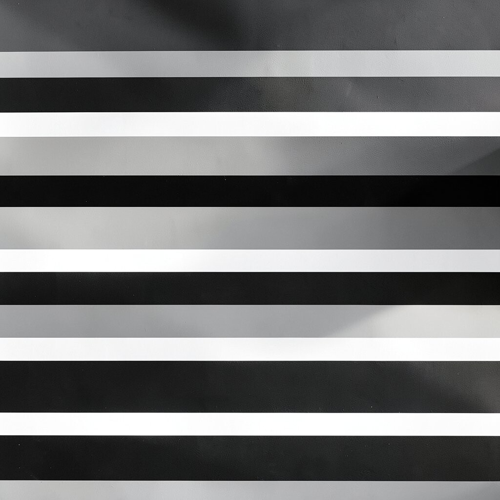
Picture bold black and crisp cream stripes that look sharp and clean. The contrast creates instant focus, like a stylish frame around the room.
This pattern works great in areas where you want a strong “hello” moment, such as a hallway or an entry wall. You can also use it behind a console table so everyday items look more organized.
If you prefer a softer look, swap the black for charcoal or deep navy while keeping the creamy base. For an easier budget, paint only one accent wall and keep the rest a solid, bright tone.
3. Soft Pastel Multi-Stripe for Calm Rooms

Imagine gentle pastel stripes in blush, mint, and pale sky, blending like a calm watercolor. The wall feels light and airy, and the room doesn’t get visually heavy.
This is an excellent choice for bedrooms, reading nooks, and any corner where you want your eyes to rest. Pastels also pair well with lots of natural textures like wood, rattan, and linen.
To keep it from feeling too “sweet,” mix in one slightly deeper pastel stripe, such as dusty rose or seafoam green. If you’re working with renters, consider removable wallpaper stripes or temporary wall decals that match the colors.
Choose a matte or eggshell finish so the pastel tones look soft instead of shiny. You’ll get a bright look that still feels relaxed and lived-in.
4. Nautical Navy and White for Coastal Energy

Picture crisp navy and white stripes that feel like sea breezes and sunny docks. The pattern brings a tidy, classic brightness that works in many styles.
Try this look in a bathroom, laundry room, or kitchen where you want freshness that never feels bland. Pair stripes with brushed metal fixtures, light wood shelves, and simple navy accents like towels or frames.
If you want a modern twist, use wider stripes and keep them spaced cleanly. You can also repeat the stripe idea in a rug so the whole space feels coordinated without being matchy.
5. Retro Candy Stripes on a Feature Wall

Think of playful candy stripes that look fun without feeling messy. The bold colors can make a room feel cheerful right away, like a pop of joy every time you walk in.
This works especially well for dining areas, playrooms, or a home office where you want creativity to feel easy. Use stripes to add character to a single wall, then keep furniture simple so the pattern stays the star.
For practical planning, pick colors you already own or plan to buy soon, such as a chair fabric or curtain color. If repainting feels like too much, try stripe wallpaper panels or even peel-and-stick stripes for a faster refresh.
6. Vertical Stripes That Make Ceilings Feel Higher

Vertical stripes create that classic “taller” effect that many rooms need. When the lines run up and down, your eye moves upward, and the space starts to feel less boxed in.
Try a slim stripe pattern in white plus one gentle color like light gray or soft sage. This combination keeps the brightness but avoids the harsh look that can happen with thick stripes.
To personalize it, match the stripe color to one other element, like a throw pillow or a painted cabinet. Choose a slightly lighter stripe shade than your walls for a subtle, modern finish that still feels noticeable.
7. Checker-Striped Fusion for a Fun Twist
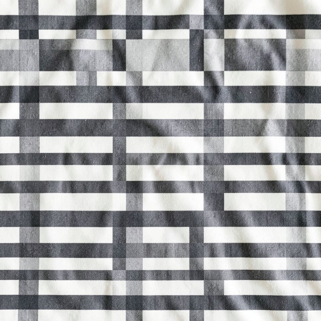
Imagine stripes mixed with a light checker rhythm, like a playful woven pattern. The visual texture feels lively, and it can make a room feel more “designed” even with simple furniture.
This style is great for kids’ rooms, casual dining areas, or a cozy entryway where you want warmth and energy. It also looks surprisingly good on storage doors, like a cabinet front or a closet organizer.
For practical results, use a limited color palette such as white, cream, and one accent color like teal. Use painter’s tape carefully, and consider practicing on cardboard first so your pattern lines stay crisp.
8. Diagonal Stripes for Movement and Drama
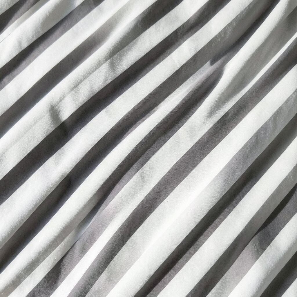
Diagonal stripes bring a sense of motion, like wind across a hillside. They can make even a simple room feel dynamic and more interesting from every angle.
This pattern shines on an accent wall, behind a desk, or around a window nook. If you want a bright look without too much intensity, choose diagonal stripes in lighter colors like eggshell plus warm gray.
To personalize, rotate the diagonal direction so it feels balanced with your furniture layout. If the room has strong sight lines, align the stripes so they guide attention toward the most-used area.
Budget-friendly options include stencil work or removable wallpaper, both of which can deliver the drama without a full renovation. Just be sure you smooth the surface first so the diagonal lines stay sharp.
9. Monochrome Stripe Wallpaper for Easy Styling
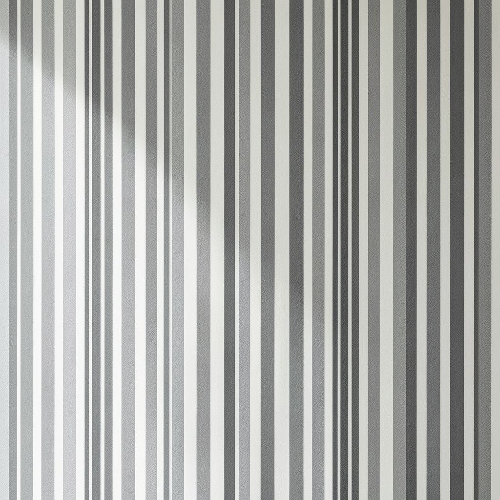
Monochrome stripes look sleek and stylish, especially when the shades stay close together. The room feels bright because the pattern reflects light without shouting.
Wallpaper stripes are also one of the easiest ways to get a high-end look. They can hide small wall imperfections because the pattern draws attention away from minor bumps.
For personalization, choose a stripe scale that fits your space, using narrower stripes for smaller rooms and wider stripes for larger walls. Pair the wallpaper with solid curtains and simple wall art so the design feels balanced, not crowded.
Keep cost in mind by measuring your wall carefully and choosing a pattern repeat that minimizes waste. Buying extra rolls only when needed helps your budget stay under control.
10. Stripes in Fabric for Soft Brightness
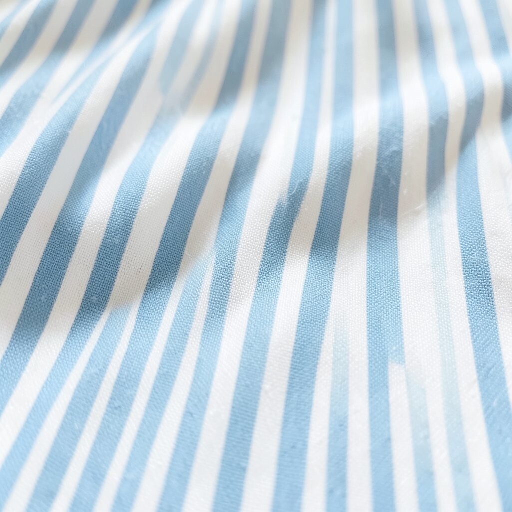
Stripes don’t have to live on walls to brighten a space. Curtains, bedding, and cushions with stripe patterns can add light energy while keeping the room flexible.
Choose stripe fabrics in airy blends like cotton, linen, or lightweight blends so the texture looks fresh. Horizontal stripes on curtains can make a wall feel wider, while vertical stripes can create a taller frame for the window.
For practical styling, match stripe colors to two main things already in the room, like a rug tone and a wood finish. This creates a cohesive look even when the stripe pattern is different in each fabric.
If you’re renting or want low effort changes, swap out textiles seasonally. That makes the bright stripe effect feel easy and budget-smart, because you’re not committing to permanent painting.
11. Striped Tiles for a Clean, Bright Accent

Stripes can look crisp and modern when they show up in tile. Even a small striped backsplash or narrow stripe border can brighten a kitchen or bathroom fast.
This idea works well in wet areas because tile is durable and easy to clean. A stripe detail adds interest without turning the whole room into a loud design statement.
Try thin tile stripes in glossy or satin finishes so they catch light and feel extra fresh. You can also blend striped tile with larger solid tiles to keep installation simpler and costs steadier.
For personalization, choose colors that match your fixtures, like warm whites for gold hardware or cool whites for chrome. A small striped section behind the sink or vanity can deliver a big visual payoff for the effort.
12. Layered Stripes with Furniture and Art

Instead of putting stripes in one place, try layering them across the room. A striped rug, a stripe-backed print, and a striped accent pillow can work together like a friendly pattern chorus.
This approach is unique because it lets you control the strength of the look. If you want brightness without overwhelm, choose one strong stripe element and keep the rest in smaller doses.
To personalize, repeat the same accent color across different stripe items, such as sky blue in a rug and a frame. You can also mix stripe directions carefully, like vertical stripes in one element and horizontal stripes in another, while keeping color consistency.
For practical budgeting, buy one main stripe piece first, then build around it with smaller items like cushions or frames. This is also a current trend in styling because it feels curated instead of overly matched.
13. Color-Blocked Stripes for a Bold Yet Balanced Look
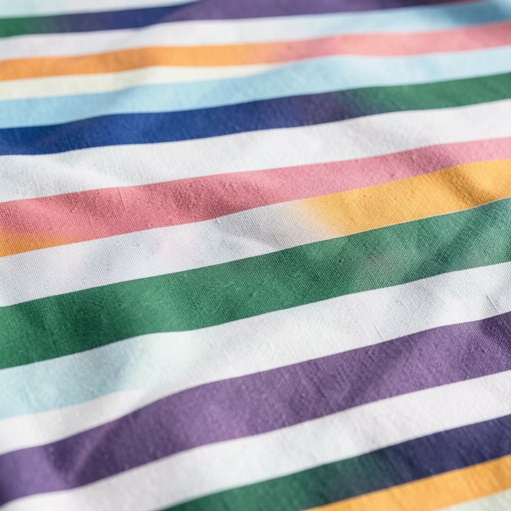
Color-blocked stripes mix solid color shapes with stripe lines, creating a bold but controlled design. The result feels modern, playful, and bright without needing a complicated pattern everywhere.
This is a great option for living rooms, studios, and creative spaces where you want personality. You can place stripes behind a sofa, around a fireplace, or along the side of a media console to create a clear focal zone.
To keep it balanced, choose a primary bright neutral base, then add two or three strong colors maximum. It helps to use painter’s tape or a stencil so the edges stay clean and the sections look intentional.
If painting feels too permanent, use removable wall panels or stripe decals for the color-block parts. That way you can adjust the layout later as your style changes, while still getting today’s bright stripe vibe.