Concrete look walls feel modern, calm, and a little bit bold. The right plaster finish can give you that sleek vibe without the heavy look of raw concrete.
From soft lime textures to smooth microcement style coats, these ideas help you plan a wall that looks good and feels right in everyday life.
1. Silky Microcement Over Plaster Base
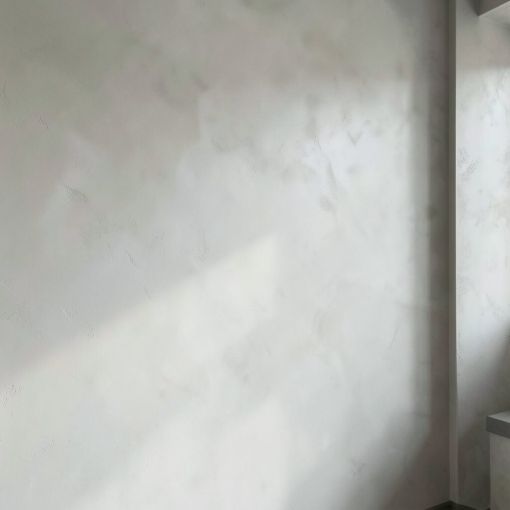
A smooth plaster system with microcement-like texture can mimic concrete while staying warm to the touch. You get that clean, urban look with fewer harsh visual edges.
Pick a matte or satin topcoat so light bounces softly across the surface. For best results, ask for thin coats applied in a consistent direction, then lightly level between layers. If you want personalization, mix a subtle pigment into the top coat to steer the wall toward cool gray, warm sand, or even a greige that matches your flooring.
2. Lime Plaster With a Modern Soft-Worn Finish
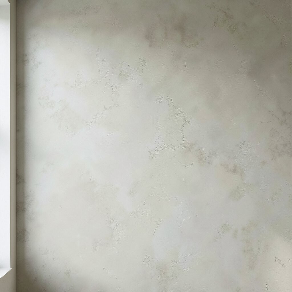
Lime plaster can create a naturally elegant “concrete-inspired” mood without looking flat or gray. It often shows gentle, cloudlike movement that feels handcrafted.
Choose a fine lime plaster for a sleeker finish, and keep the trowel work tight for fewer ridges. This finish helps regulate moisture in many homes, which can make spaces feel more comfortable over time.
To keep it practical, protect the wall in high-splash areas with a breathable sealer designed for lime. For personalization, add a tinted wash near the edges so corners look richer and deeper when the light changes during the day.
3. Smoothing the Trowel for a Concrete-Free Minimal Look
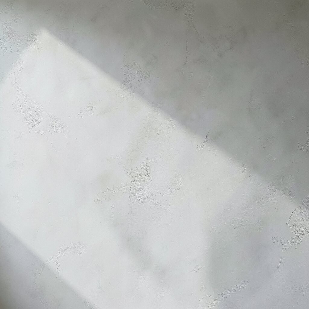
If you love the idea of concrete but want a softer, calmer wall, go for a deliberately smoothed trowel technique. You can still capture that sleek, architectural feeling with fewer visible textures.
Ask your plasterer to use multiple thin passes, then do a final smoothing pass right before the coat fully sets. The benefit is a surface that looks refined up close and stays easy to clean, especially when you choose a durable matte finish.
For personalization, pair this wall with crisp trim in the same color family, like a lighter shadow gap or a matching ceiling line. Cost can stay reasonable since you may not need heavy texture and can keep the system thin, depending on your wall condition.
4. Venetian-Style Plaster in Cool Gray Tones
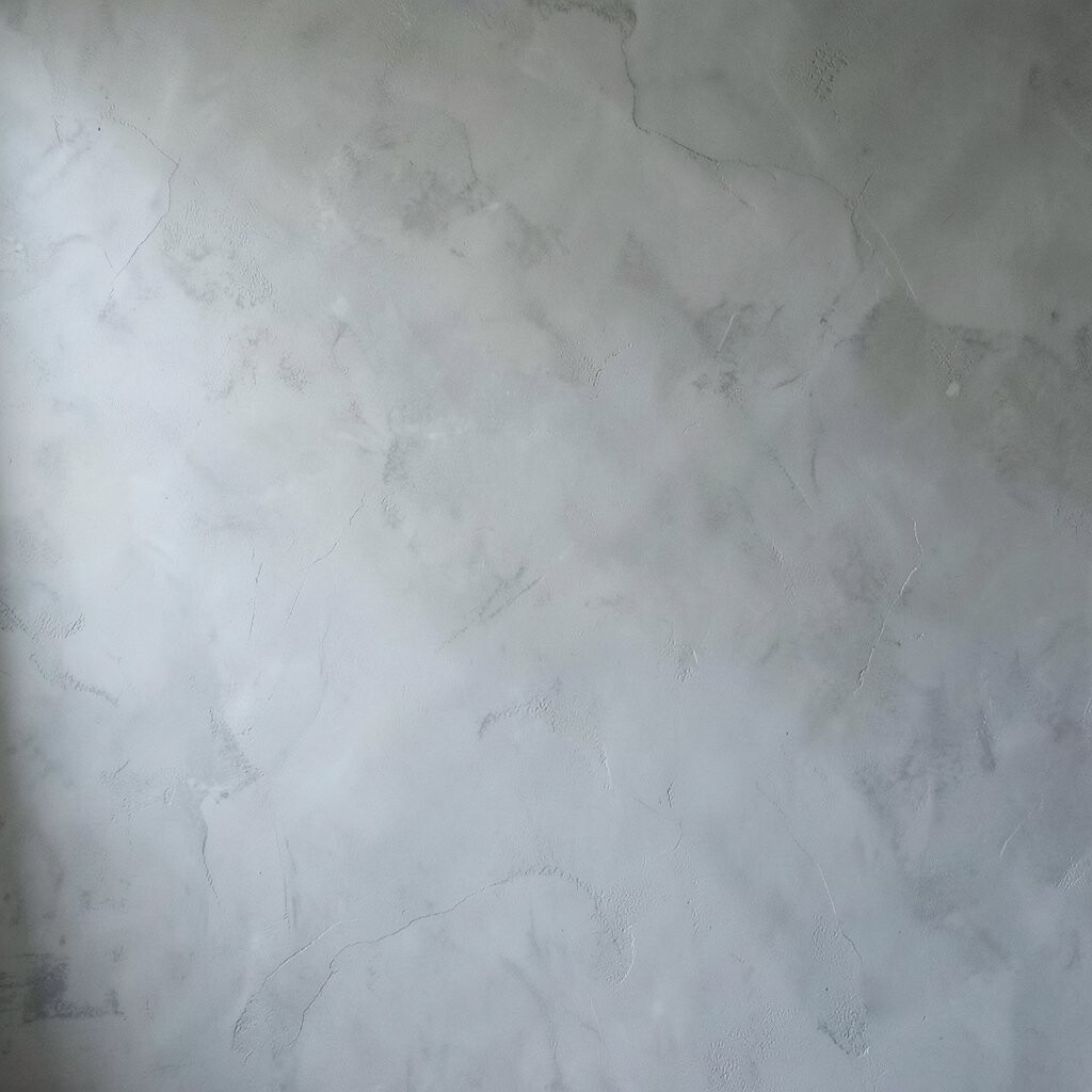
Venetian plaster gives you a polished, layered look that can still nod to concrete. The finish often reflects light like a soft stone, which helps a room feel brighter even with darker colors.
Choose a cool gray palette and keep undertones consistent so the wall doesn’t look patchy. You can also ask for a very light wax or seal that adds gentle depth without turning the wall glossy.
5. Tonal Ombre Plaster From Light to Deep
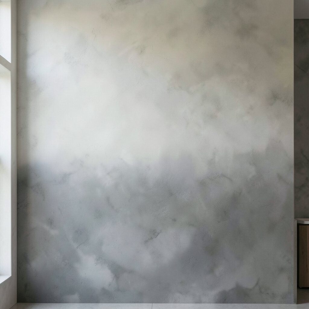
An ombre plaster effect can look like concrete settling into layers over time. You get drama without harsh lines, and it feels modern because the shift stays smooth.
Work with a tinting plan that moves gradually, like light near the floor and deeper at eye level. A practical way to keep it tidy is to mask clean edges with painter’s tape and remove it while the plaster is still workable.
If you want the look to feel personal, match the ombre to your room’s focal item, such as a sofa fabric or a countertop tone. Costs depend on how many passes you use, but gradual layering can be managed with careful scheduling and fewer waste materials.
6. Micro-Texture for a “Sanded Concrete” Look
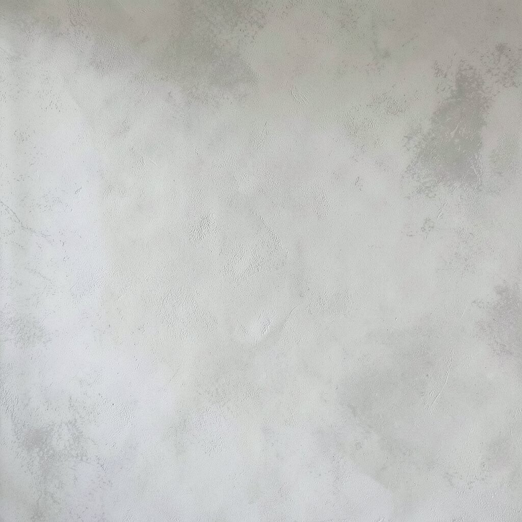
Sanded concrete often looks clean but not perfectly smooth, and plaster can mimic that vibe beautifully. A micro-texture finish adds subtle grip and hides tiny wall flaws.
Use a finish coat that’s designed to lock in a fine grain, then buff lightly for an even surface. This helps hide minor imperfections and makes touch-ups easier later because the texture blends naturally.
For personalization, choose a pigment that leans slightly green-gray or blue-gray to match modern metals and lighting. Budget-wise, you may spend a bit on the finish product, but you can save on repairs if the micro-texture covers wall variations.
7. Vertical Feathered Strokes for Concrete Motion
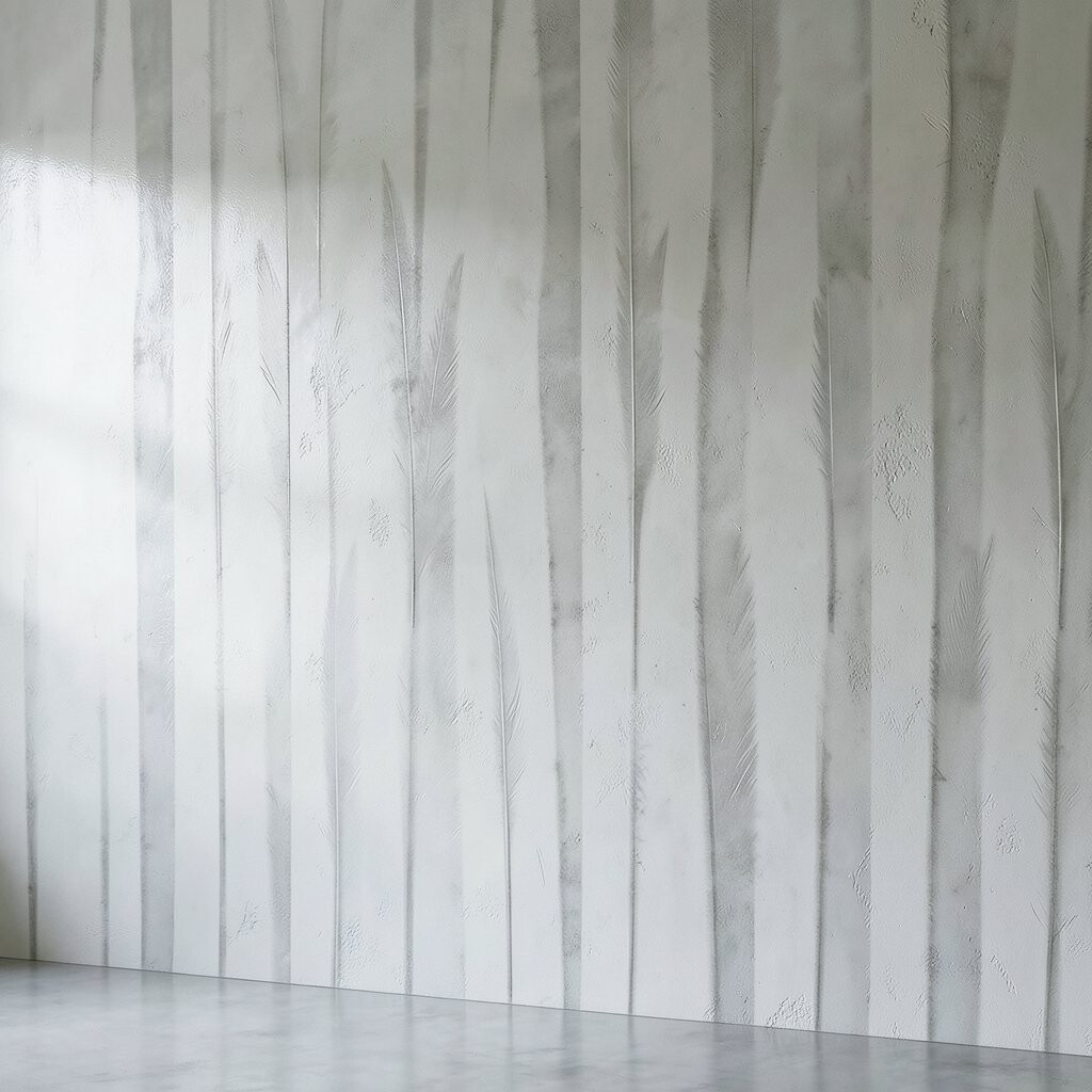
Vertical feathered strokes create a feeling of height, like tall concrete panels softened by plaster artistry. The movement looks sleek, yet it still has warmth and character.
Keep stroke size small and consistent so the wall stays “designed” instead of accidental. When you feather edges while the plaster is partially set, you can blend transitions so the wall feels seamless.
8. Board-Match Panels With Seamless Plaster Filling
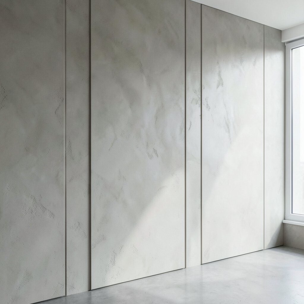
If you want a concrete panel look without the cold vibe, try plastered seams shaped like slim wall panels. This style gives structure and helps large rooms feel organized.
Use precise panel guides, then fill seams with a compatible plaster and smooth them until they disappear. The benefit is a crisp pattern that still reads soft because plaster doesn’t feel as rigid as raw paneling.
Personalize by choosing panel spacing that fits your artwork layout, like aligning with the center of frames or shelving. For cost control, use the pattern mainly where your eyes land, such as behind a media console or bed headboard, rather than across every wall.
9. Warm Greige Plaster With a Matte Sealer
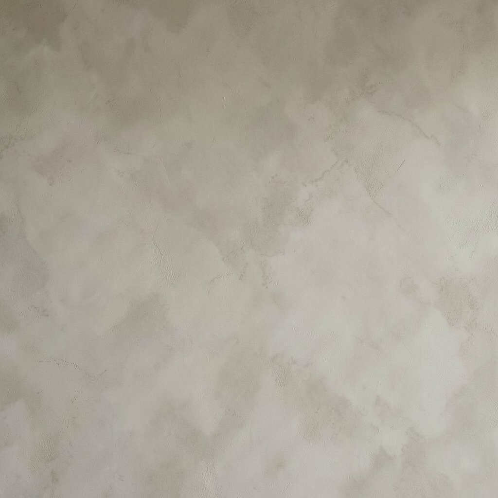
Greige is a sweet spot between gray and beige, and it can create the concrete look while staying cozy. A matte sealer keeps it modern and reduces glare from overhead lights.
Pick a greige with the right undertone so it works with your floors and wood trim. Matte finishes also help fingerprints and minor scuffs look less obvious, which makes daily living easier.
10. Soft Roughcast Texture for a Sculpted Concrete Feel
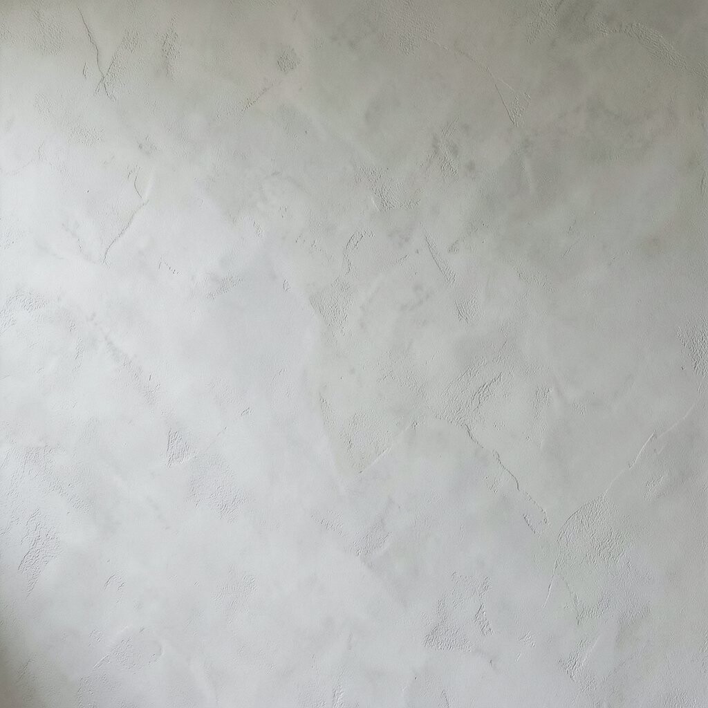
Roughcast plaster can bring a tactile, sculpted look that feels like concrete art. It’s not “smooth concrete,” but it delivers a bold, contemporary wall presence.
Choose a controlled rough texture so it stays comfortable and doesn’t feel too scratchy. You’ll get better results when coats are consistent and you keep the trowel pressure steady across the whole wall.
To personalize, experiment with a slightly darker base coat so the texture reads richer when sunlight hits. In terms of cost, this option can be efficient because it may require less finishing time than highly polished surfaces, but it depends on how sculpted you want it.
11. Concrete-Style Corner Frames With Plaster Reveal
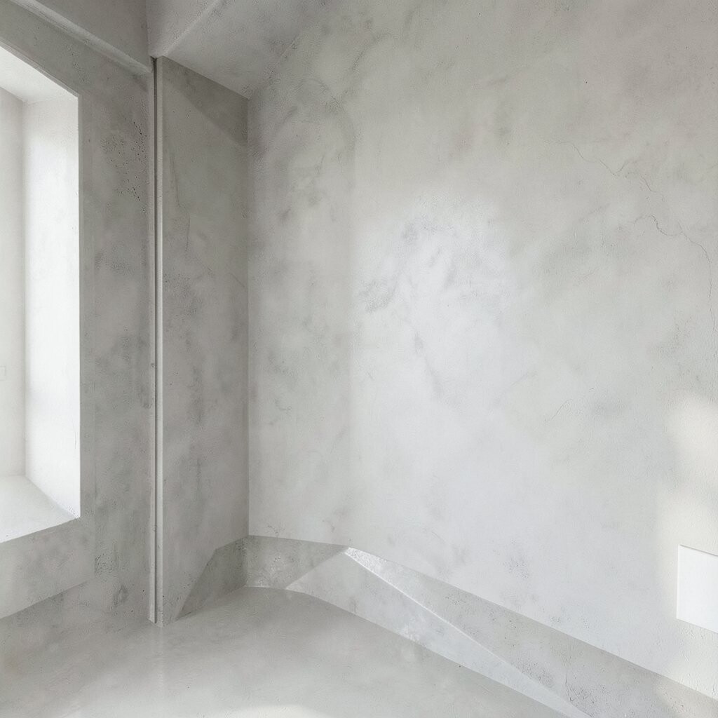
Crisp corners can make a plaster wall feel architectural, even when the surface is soft. A corner frame look adds definition, and it helps the concrete-inspired style feel intentional.
Create a reveal line by masking edges and applying an extra-fine finishing coat to the frame. This gives you a sharp boundary that looks clean in photos and makes the wall feel more “designed” in person.
12. Stain-Layer Finish for Depth Without Dark Paint
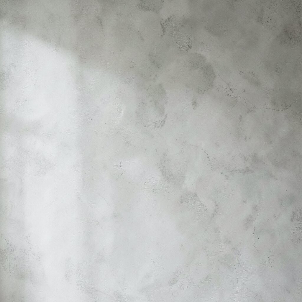
Layered stain effects can mimic the way concrete absorbs color over time. Instead of one flat shade, your wall shows depth that feels natural and premium.
Start with a light base plaster, then apply thin stain layers using a sponge or soft cloth so the tone moves slowly across the wall. The result is a balanced look that still feels modern, because the pattern stays subtle.
Personalize by choosing stains that echo your metals, like bronze-leaning undertones for warm spaces or cool gray-brown mixes for a sharper vibe. Cost can be manageable since stains can be applied over compatible plaster systems, but it’s worth budgeting time for careful drying between layers.
13. Smooth Plaster in Sunken Zones for a Gallery Wall Feel
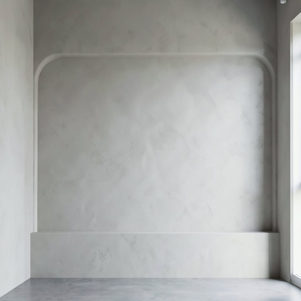
Sunken zones and recessed rectangles can turn a plaster wall into a quiet backdrop for art. You get a concrete-like grid effect, but the plaster keeps it softer than stone.
Plan the dimensions around your frames first, then build the zones so the spacing feels balanced. You’ll also want a consistent finishing strategy across flat areas and recessed sections so highlights don’t look uneven.
If you want it practical, keep the recesses shallow enough to avoid dust traps, and seal with a finish made for interior walls. For personalization, paint or tint the zones slightly darker than the flats so the gallery layout pops without needing extra décor.