Color blocking can make a kitchen feel crisp, modern, and totally you. The trick is choosing shades that work hard together, not just look good on day one.
When you plan with intention, the results feel intentional too. From cabinets to tiles, these ideas help you get that sleek look without turning your home into a design experiment.
1. Two-Tone Cabinet Calm With a Sharp Line
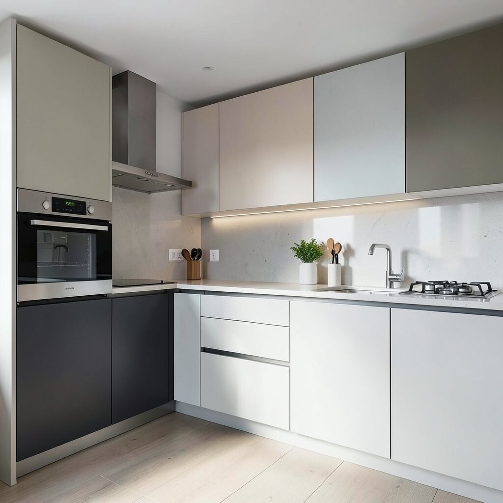
A clean split between two cabinet colors can look both sleek and inviting. Imagine matte white lowers paired with a muted sage upper set, separated by a crisp horizontal line.
This setup helps hide daily mess on the darker color while keeping the room bright. Use the lighter color near the window and the deeper tone along the main work zone for a natural balance. For practical results, keep the sheen consistent across both shades so doors look seamless in photos and in real life.
2. Bold Island Accent in a Confident Saturated Hue
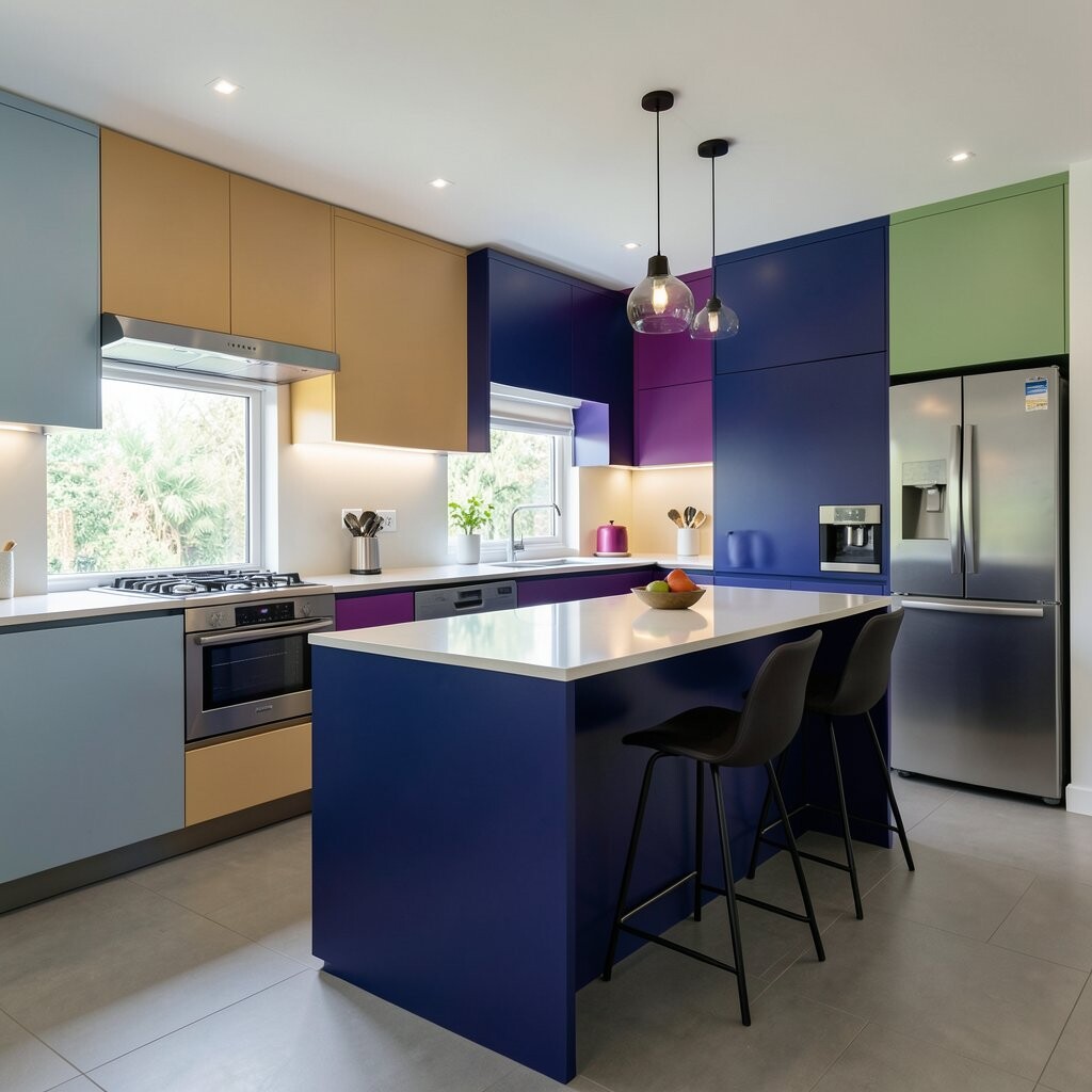
A color-blocked kitchen often starts with one heroic piece. Try painting only the island in a saturated navy or warm terracotta while the rest stays neutral.
The island becomes a focal point, so the whole room feels styled even when countertops stay simple. Keep hardware minimal and choose finishes like brushed nickel or black steel for a sharp modern touch.
If you want it to feel cohesive, match one smaller element to the island color, such as a vase, a drawer pull, or a single backsplash tile stripe. For cost, focus your budget on the island first since it delivers the biggest visual impact for the least overall change.
3. Half-Height Splashback With a Painted Color Band
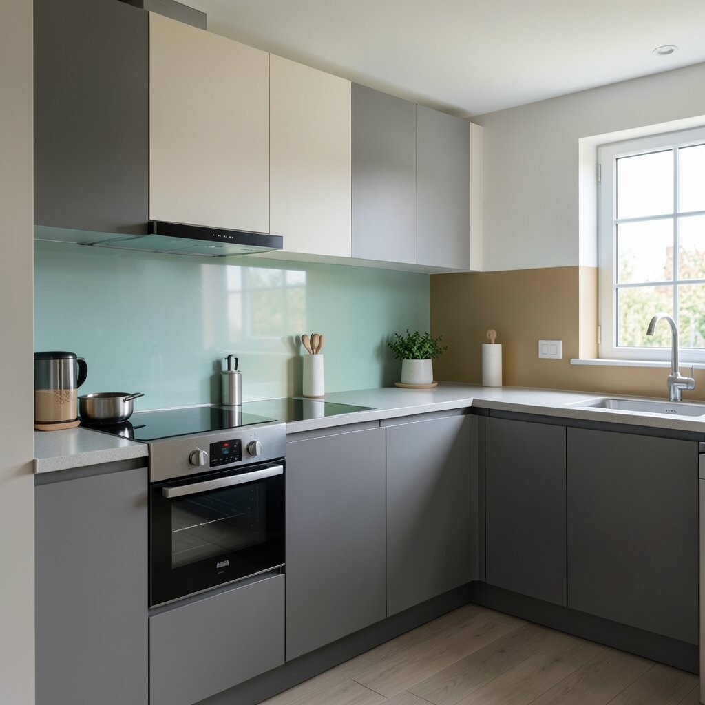
Color blocking can be subtle without being boring. Picture a half-height backsplash where the upper section uses a soft cream tile and the band below is painted a smooth charcoal.
You get a design moment right where splashes happen, which makes cleanup feel easier and more intentional. Choose a cabinet-safe, wipeable paint and seal it properly so steam and cooking splatter don’t dull the finish.
To personalize, extend the same color band into one drawer front panel or a nearby utensil wall. This approach keeps costs lower than full-wall tiling and works great in rentals because it’s often less invasive.
Current kitchens lean toward graphic lines and calm neutrals, so this look stays on-trend while still feeling warm. When you pick the band color, choose one that flatters your flooring and countertop undertones for a smoother match.
4. Color-Blocked Flooring With High-Contrast Tiles
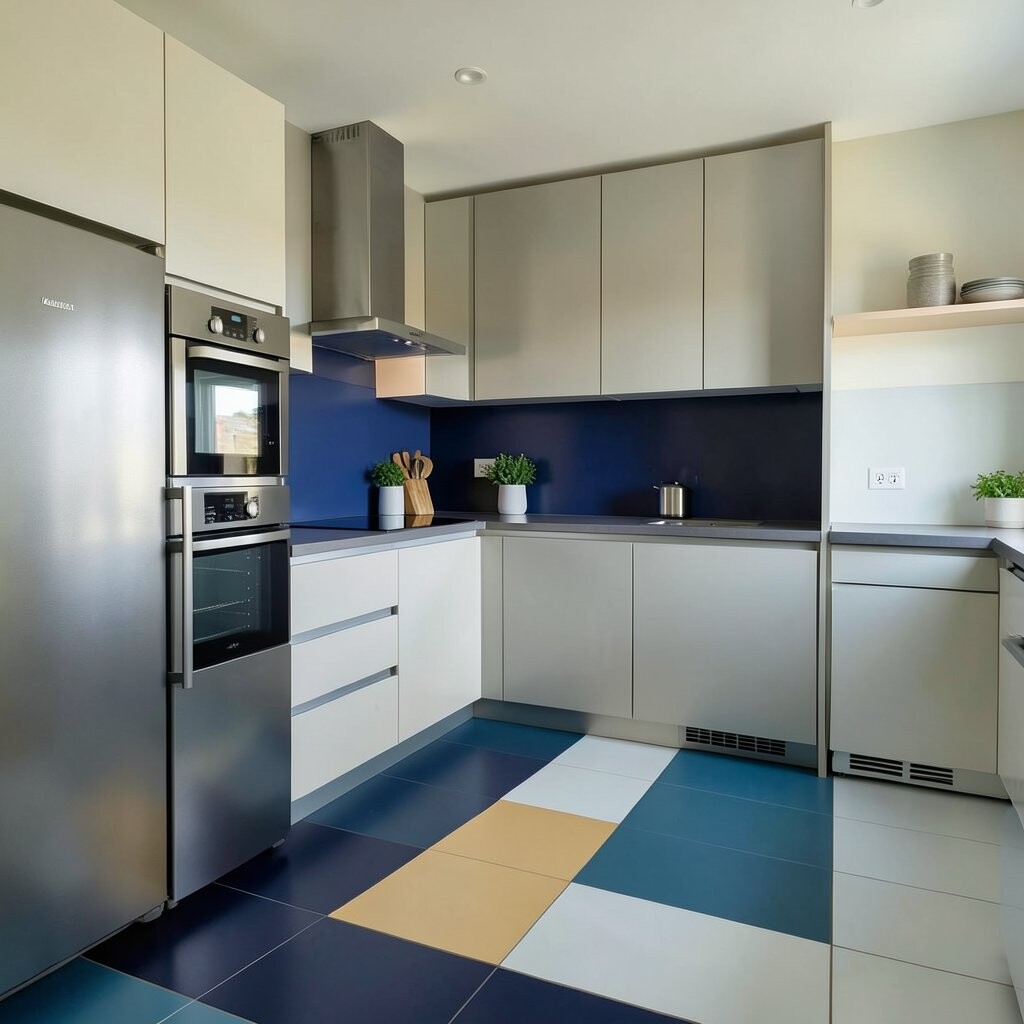
Flooring can play the boldest role, especially when you want a sleek graphic vibe. Use large-format tiles where one zone in the cooking area shifts to a darker block, while the dining path stays light.
This method frames your layout and makes the kitchen feel more organized. It also helps mark where spills are most likely, so you can select stain-resistant finishes for high-traffic spots. Make sure grout colors coordinate, because the grout can either sharpen the design line or blur it.
5. Pantry Wall Pop Using Sliding Door Color Contrast
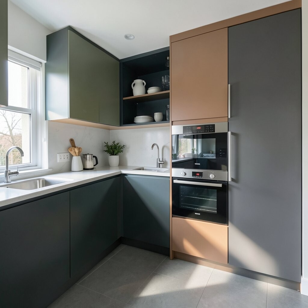
A pantry door is a perfect place to hide and style at the same time. Color block a sliding door in a crisp white track with a panel in deep green or a smoky gray.
This trick gives your kitchen personality without cluttering counters. It also makes the storage area look intentional, since doors become part of the design rather than an afterthought.
For personalization, match the door to a nearby chair color, a rug pattern, or even a kitchen appliance accent. If you want a budget-friendly option, consider contact paper designed for doors or a removable paint system before committing to full cabinet refinishing.
6. Monochrome With One Metallic Block for Instant Shine
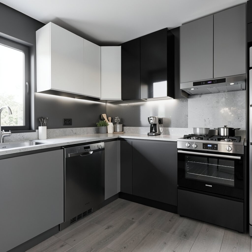
If you love sleek but worry about being too loud, go monochrome with one metallic color block. Think all cabinetry in soft gray, then add a thin metallic stripe through the backsplash or around a range hood.
The metallic element catches light as you move around the kitchen, making the space feel brighter. It also adds a premium vibe without requiring a complete palette overhaul.
To keep it practical, use easy-to-clean materials like metal-look tiles or a sealed backsplash panel. Pair the metallic block with matching faucets and drawer hardware so nothing feels random. This style fits current trends toward understated elegance and warm reflective details.
7. Upper Cabinets Dark, Lower Cabinets Light for a Lifted Look
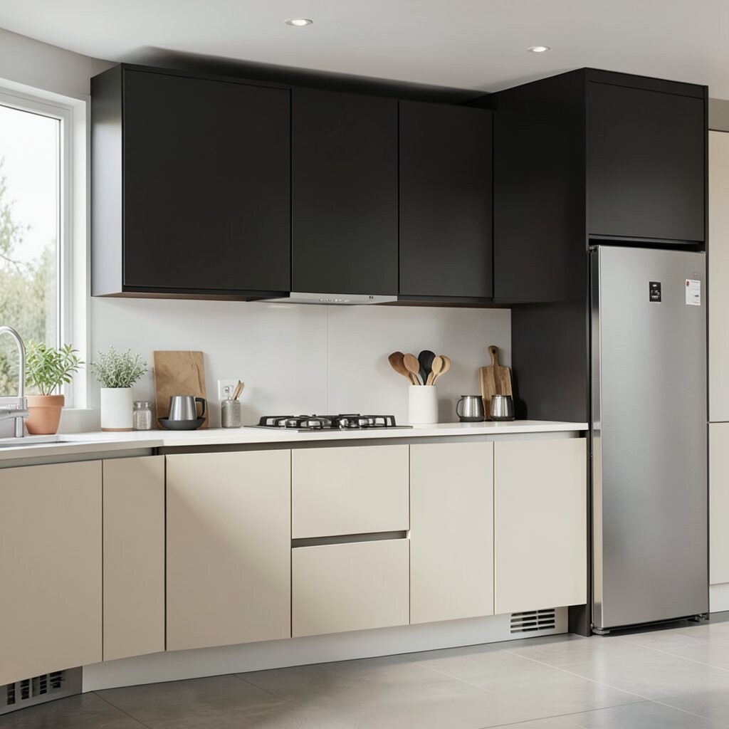
Reversing the usual cabinet idea can make the ceiling feel higher. Try darker uppers in blackened bronze or espresso, with light lowers in creamy off-white.
The contrast draws the eye upward and makes your kitchen look more structured. It also makes the cooking zone feel grounded since most daily actions happen at counter height and below.
For a more seamless look, align the color split with the cabinet reveal so the line feels intentional. If you’re cost-conscious, refinish only the doors first and keep frames or boxes intact. Add simple glass-front panels in a couple of upper spots to keep the room from feeling too heavy.
8. Geometric Backsplash With Three-Color Blocks
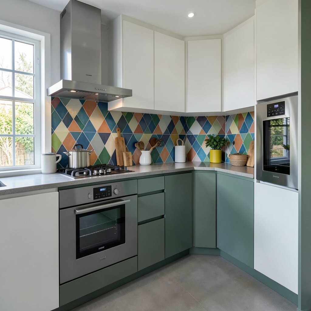
A geometric backsplash can make color blocking feel playful and modern. Choose a pattern that repeats clean triangles or rectangles using three coordinated shades like white, dusty blue, and soft sand.
The benefit is that it looks dynamic even when you keep everything else simple. Choose grout and trim that match the lightest tone so the design stays crisp instead of busy.
For personalization, echo one of the backsplash colors in your seat cushions or a single painting near the kitchen. If you’re worried about cost, focus on a backsplash section behind the sink and range first, where the visual payoff is greatest.
This look matches current kitchen trends that favor graphic, artsy patterns paired with calm surfaces. Keep countertop colors neutral so the backsplash stays the star.
9. Color-Blocked Counter Extension With a Matching Trim Line
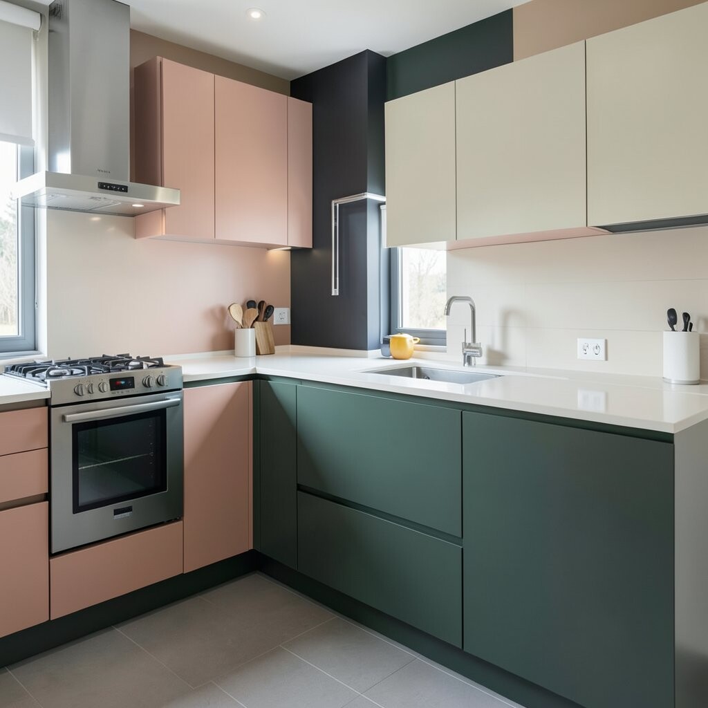
You can create a color block without painting a whole wall. Add a colored countertop extension or ledge detail, such as a warm oak trim line against a solid surface in white or cream.
This subtle boundary makes the kitchen feel custom and crisp. It also protects high-touch areas by adding an easy-to-clean edge where hands and tools rest.
To personalize, choose a wood tone that matches your dining set or floor undertone, then keep the rest of your palette calm. If you’re trying to stay within a budget, ask about pre-fabricated edge pieces instead of full countertop replacements.
10. Accent Wall Near Dining Nook in One Sharp Block
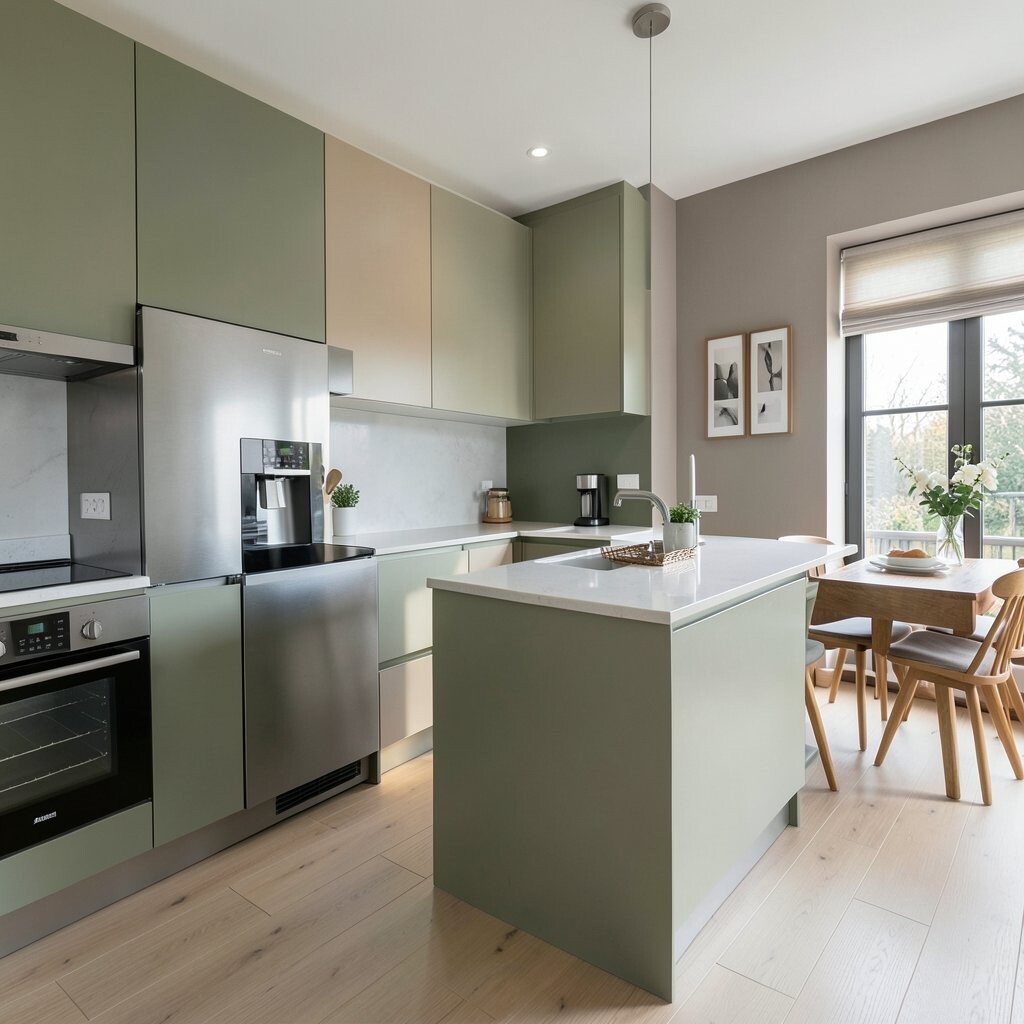
Sometimes one wall is all you need for a bold color-blocked moment. Paint the section of wall behind a small dining nook a deep color, while the rest of the kitchen stays light and airy.
The benefit is that it adds depth and makes the nook feel cozy without adding furniture clutter. Keep the block sized around the table area so it frames the space and looks intentional.
For practical tips, use a washable paint and seal it if the wall gets steam from nearby cooking. Personalize by choosing a shade that complements your lighting temperature so the wall color doesn’t look dull at night.
This idea feels current because many kitchens now mix clean minimal storage with one warm, graphic backdrop. It’s also a lower-cost option than changing floors or cabinets.
11. Range Hood Color Block With a Painted Surround
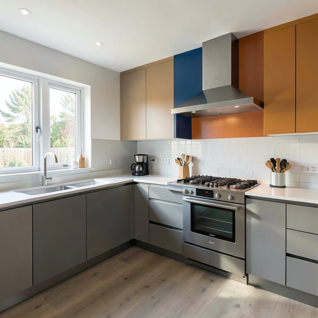
Your range hood is basically a built-in focal point, so it deserves a design upgrade. Paint the hood surround in one color, then keep the cabinets around it in a contrasting neutral.
The result looks sleek and deliberate, like a custom kitchen even when you didn’t redo everything. Choose a paint that handles grease and steam, and finish with a durable clear coat if your surface allows it.
To make it feel cohesive, repeat the hood color in a couple of small touches like outlet covers, a backsplash tile edge, or a set of matching canisters. For cost, painting the surround is often far cheaper than replacing the hood itself.
12. Two-Tone Pantry Shelf Styling in Matching Blocks
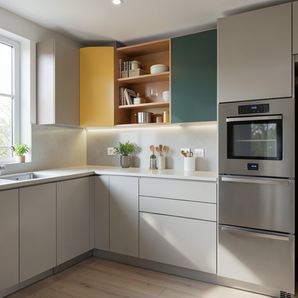
Color blocking isn’t only about walls and cabinets. Inside your pantry, arrange shelves so like items sit in grouped sections by color and height.
This makes grabbing ingredients feel smoother and keeps the whole room looking tidy even when it’s lived in. It also lets you personalize without changing anything structural.
Try a block approach using labeled jars, matching tins, and a few taller containers set at the same intervals. For practicality, choose containers that stack neatly and resist stains from oils and spices.
If you need a budget win, start with the items you use daily and build outward over time. Current kitchens love visible organization, and color-blocked shelves deliver that look in a friendly way.
13. Drawer Front Color Block With Narrow Vertical Panels
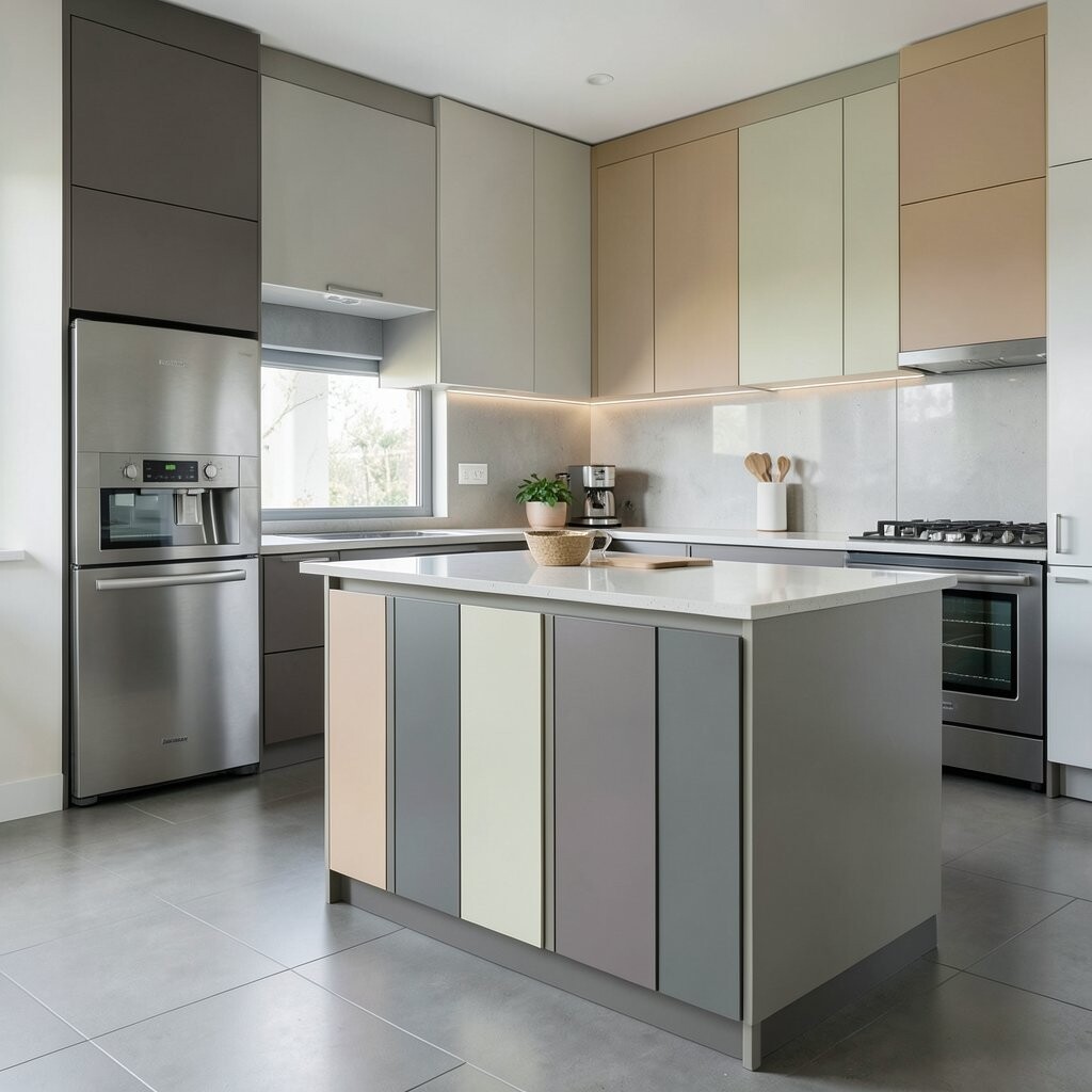
Want a sleek look that doesn’t feel too loud? Color block drawer fronts using narrow vertical panels where one drawer section is a different shade.
It gives a modern, tailored feel and keeps the kitchen from looking like it has random pops of color. Choose colors that share undertones, such as warm white with oat beige, or cool gray with muted blue.
For personalization, you can match one of the vertical drawer shades to your backsplash stripe or one cabinet color. Cost-wise, this can be less expensive than repainting entire cabinet faces because you can focus on select fronts or even swap hardware finishes to make the effect stronger.
14. Open Shelving in Color Blocks With a Uniform Backer
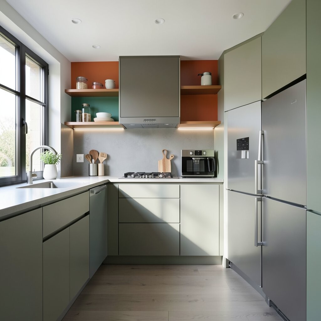
Open shelves can look sleek when the wall behind them is part of the design. Use a single color-blocked backer, like a tall stripe in charcoal behind the shelves, while the shelves themselves stay light and minimal.
This choice makes your items look curated, even with everyday jars and bowls. It also helps the kitchen avoid that “everything is on display” feeling by tying shelf clutter to a clear color theme.
To keep it practical, use shelf liners and wipeable paint or panels so splashes don’t stain. Personalize by mixing one textured material, such as a woven basket or a ceramic planter, within the color palette.
This trend matches what people want right now, which is styled storage that feels intentional but still usable. If you’re working with a tight budget, consider painting or applying panel backers instead of adding full tile walls.
15. Ceiling Line Color Block to Frame Light and Add Drama
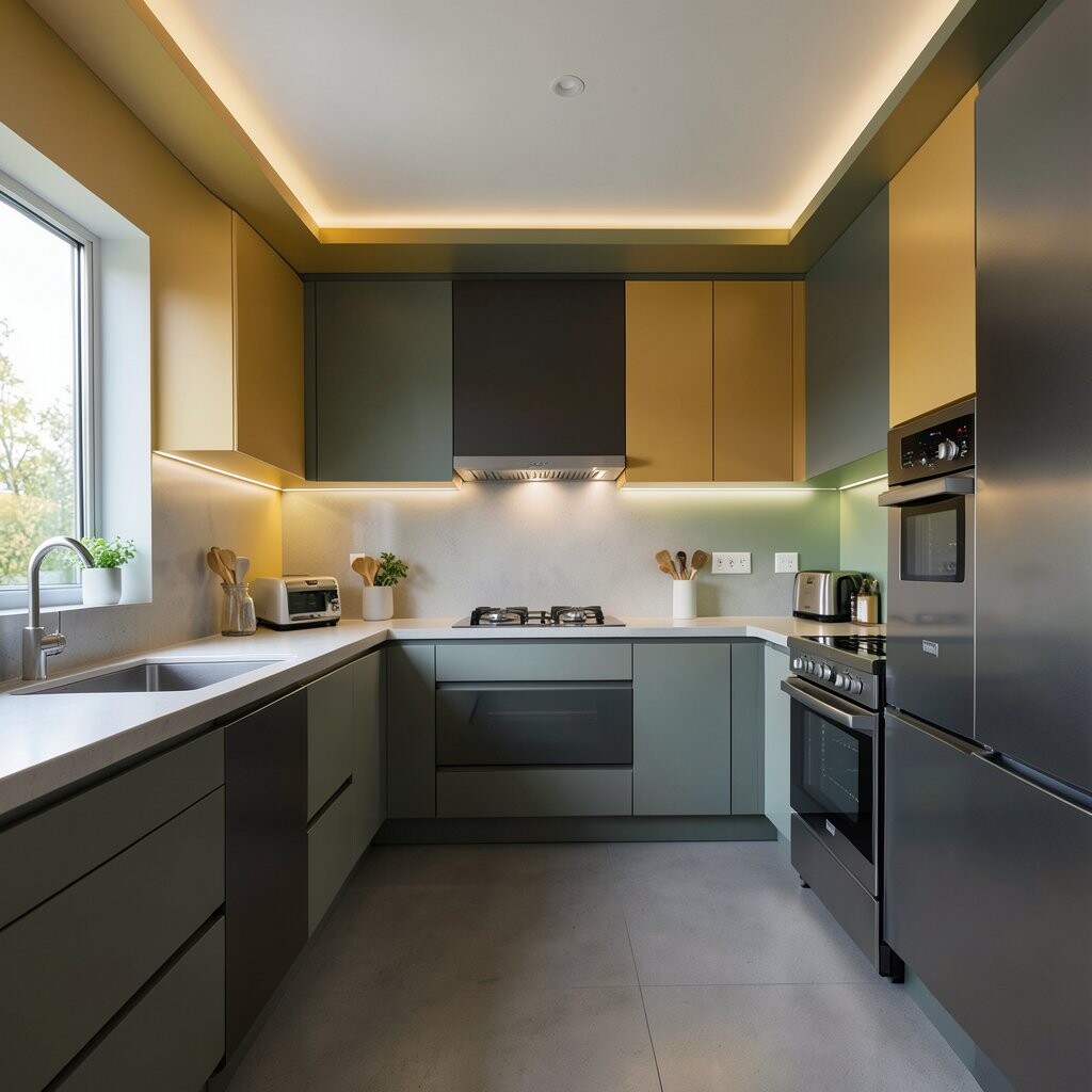
The ceiling can be part of the color-block story, and it’s surprisingly effective. Paint a crisp band along the ceiling perimeter in a dark color, then keep the center ceiling light and bright.
This frames your lighting and adds a clean, architectural feel. It also helps the kitchen feel more built-in, especially if you have open shelving or tall cabinets.
For practical tips, use ceiling-friendly paint and tape carefully so the line stays straight. Personalize the shade to your kitchen lighting, since warmer lights can make some dark colors look cozy while cooler lights can make them look crisp.
Cost considerations are usually manageable because you’re painting an area that’s smaller than full walls or cabinets. This look feels fresh and modern, and it’s a great way to make a sleek kitchen without touching every surface.