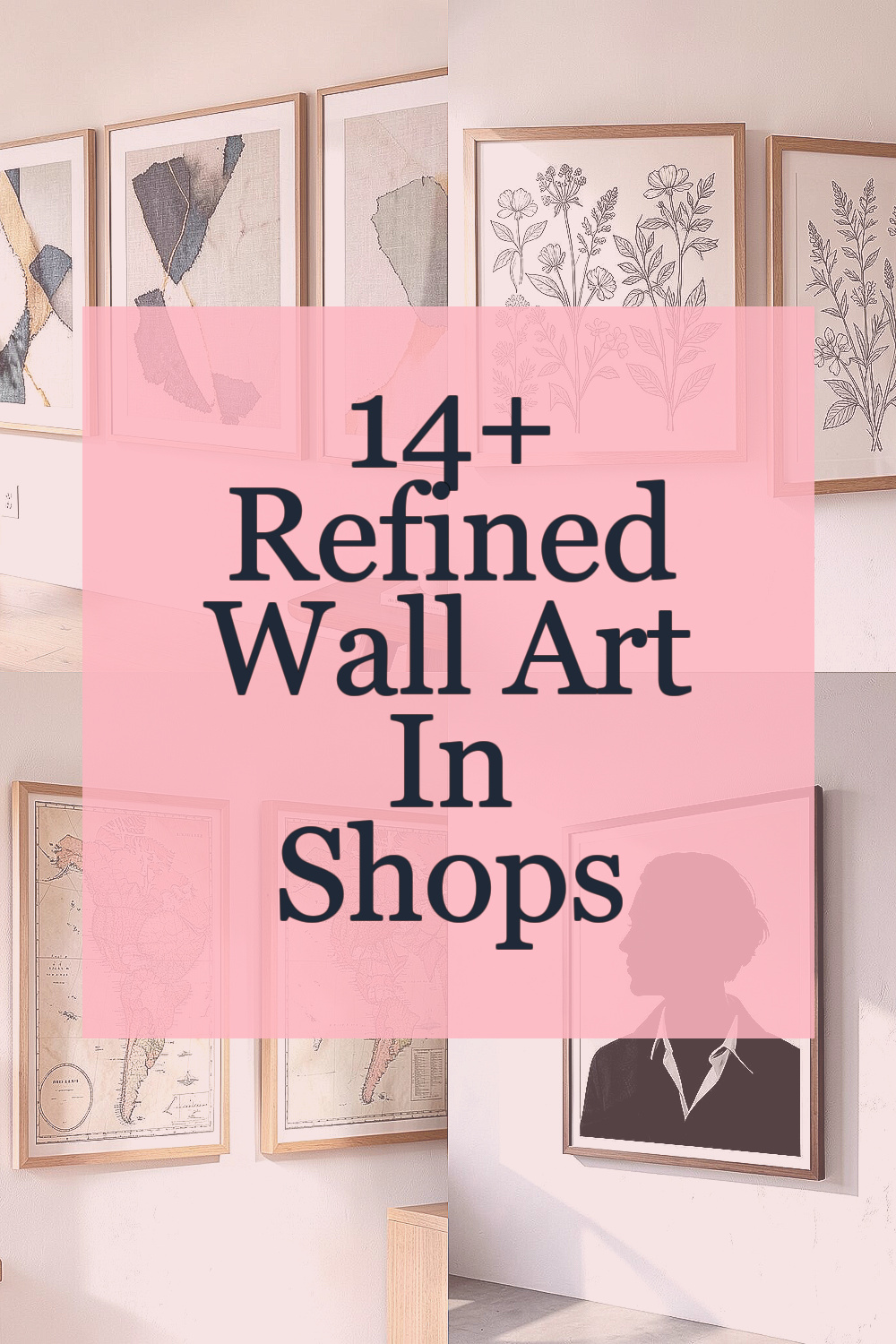
Wall art can make a room feel finished without much effort. The right pieces add color, comfort, and a little personality every time you walk in.
1. Linen-Textured Abstract Prints
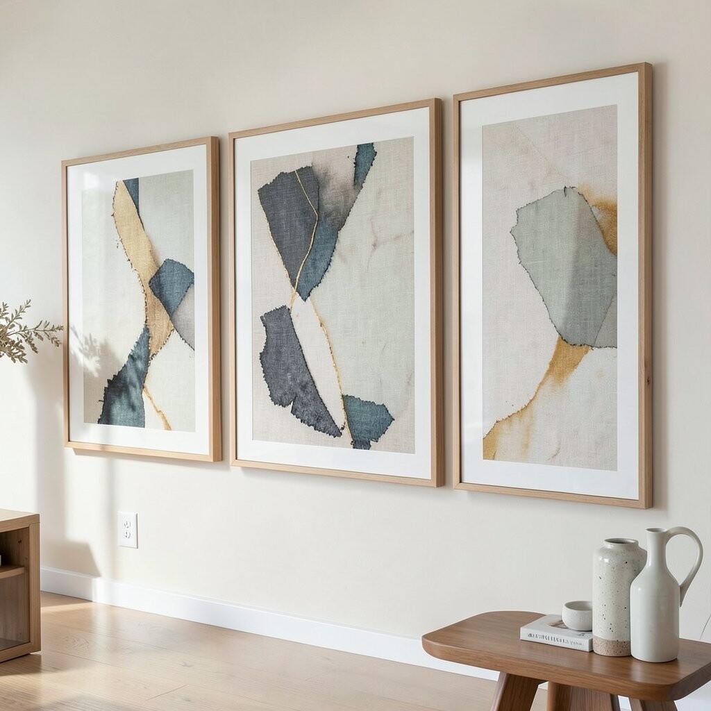
Picture an abstract design that looks like it was printed on soft linen, with gentle specks and calm movement. When light hits those fibers, the surface seems warm, even on quiet days.
These prints brighten a space by adding subtle color without shouting. They also work well in many rooms because the shapes feel modern but not cold.
Choose a frame in a neutral wood or a slim black profile so the print stays refined. If you want it to feel custom, match one small detail from the artwork to a throw pillow or curtain in the room, even if it is only a similar shade.
2. Framed Botanical Line Drawings
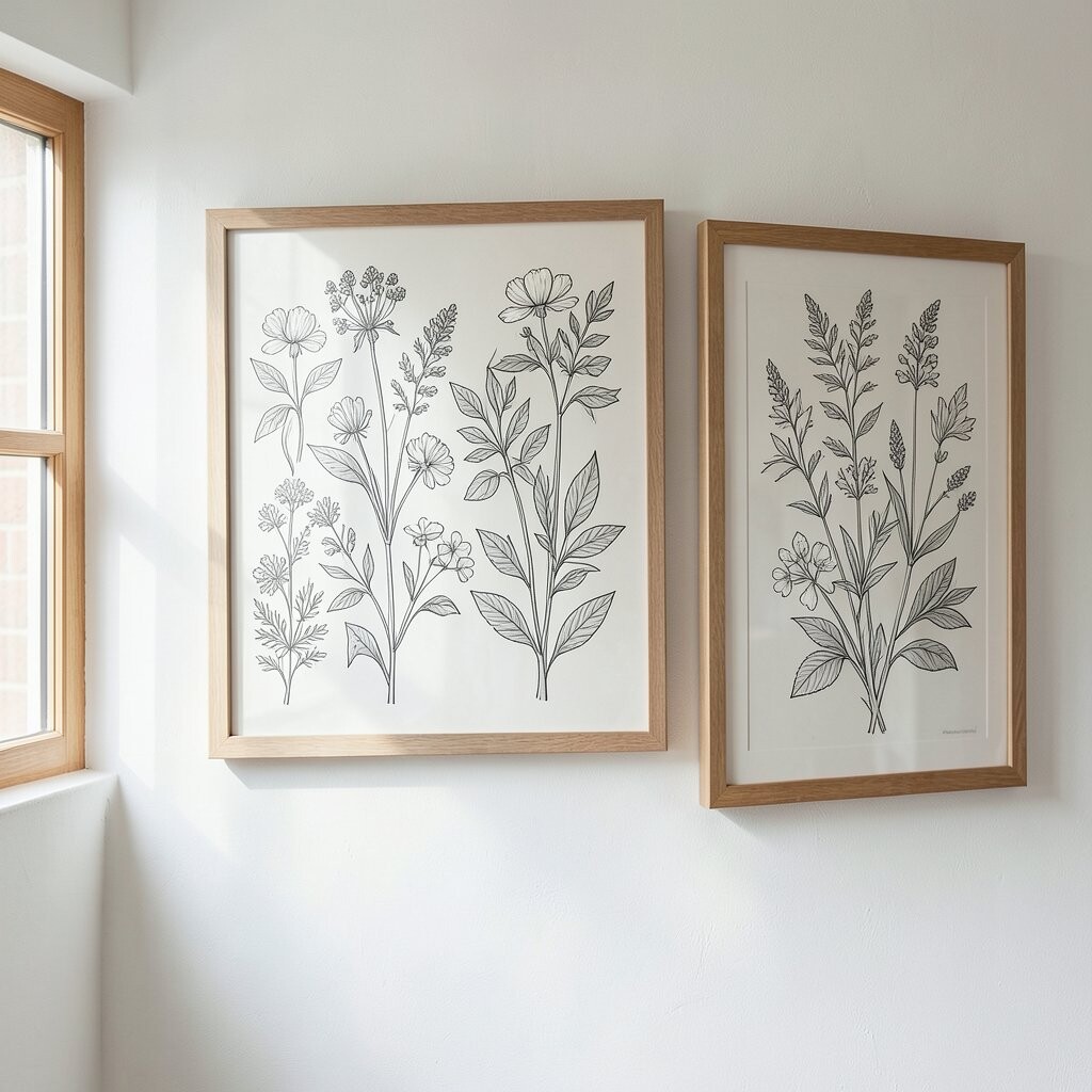
Think of delicate botanical lines, drawn with steady ink-like strokes that never feel messy. You might see leaves, stems, or tiny blossoms arranged like a calm garden plan.
Line drawings brighten homes because they bring in fresh shapes while keeping the palette light. They also help small rooms feel taller since the lines guide your eyes upward.
To keep the look tidy, pair your frame color with other accents such as a brass lamp or a matte gray shelf. If you are unsure about size, try one medium piece for a hallway, or group two similar prints with matching frames on the same wall for a cleaner style.
Many shops now offer higher-quality paper finishes that resist fading, which matters if your art sits near sunny windows. You can often find great options at different price points, so set a mood first, then pick the paper feel and frame finish that makes you smile.
3. Vintage-Inspired Maps with Soft Tones
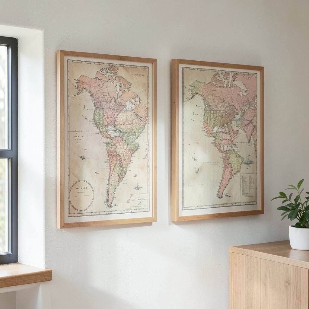
Close your eyes and imagine a map with gentle washes, slightly faded edges, and elegant typography. It gives a sense of history without looking heavy.
Map art brightens your space by adding warm layers and a little storytelling. It also makes everyday rooms feel more thoughtful, especially in home offices and entryways.
For practical styling, hang it where people naturally pause, like above a console table. If you want personalization, choose a location tied to your family, a favorite trip, or even your hometown, then match the frame to your existing hardware.
Cost-wise, vintage-look reproductions can give you the charm of older finds without the careful searching. Many current collections also use color gradients that look great in modern spaces, so you do not have to commit to a full classic theme.
4. High-Contrast Modern Silhouette Art
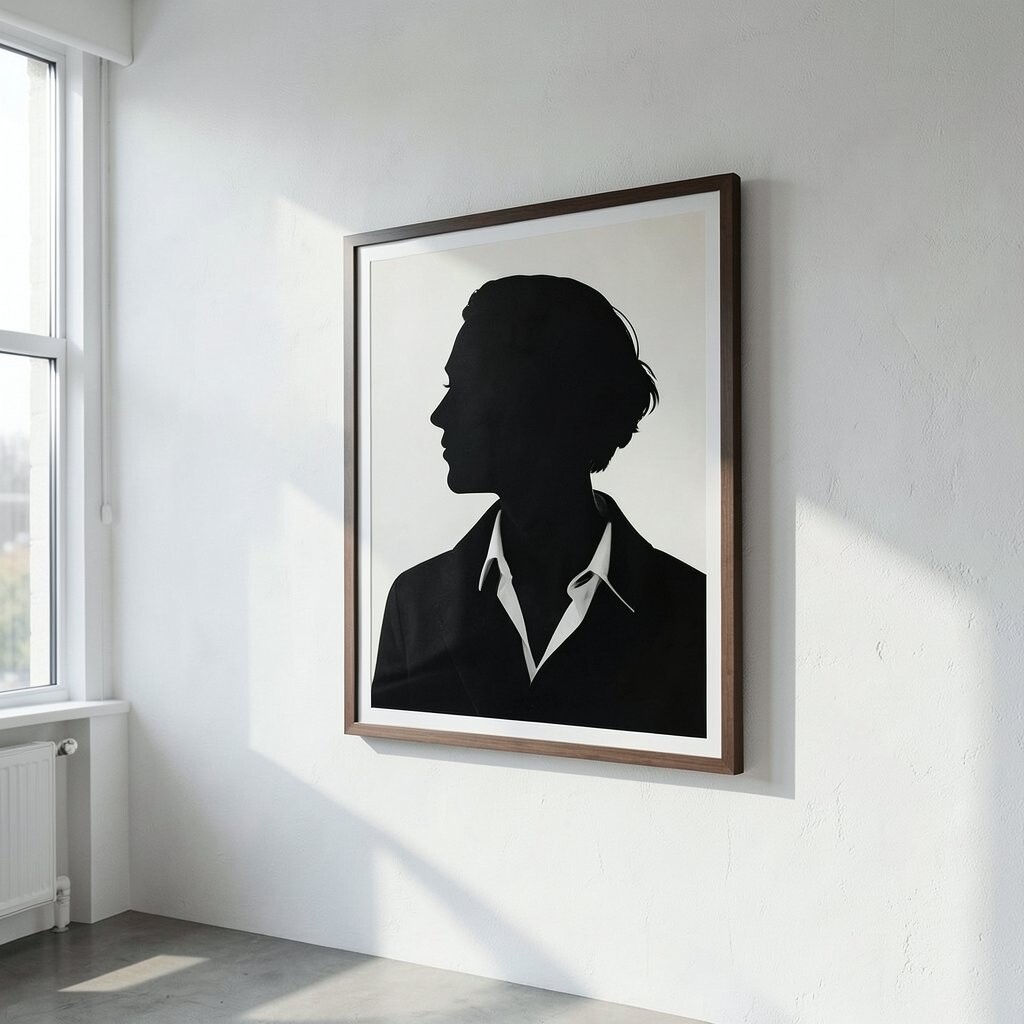
Imagine a bold silhouette cut from dark ink tones, set against a bright background with clean edges. The shapes feel graphic and stylish, like a minimal poster that got dressed up.
This type of wall art brightens by creating strong contrast that makes walls feel more alive. When you place it near a light source, the composition almost glows, giving your room a sharper look.
Keep it refined by choosing a simple frame, such as matte black or light oak. If you want it to feel personal, pick silhouettes that match your life, like a favorite animal, a city landmark, or a meaningful hobby scene rendered in modern shapes.
Some shops offer limited-run prints that look extra crisp, which helps if your budget allows for one statement piece. You can also find budget-friendly versions in the same style, then upgrade the frame later for a faster, smarter buy.
5. Watercolor Seascapes in Calm Gradients
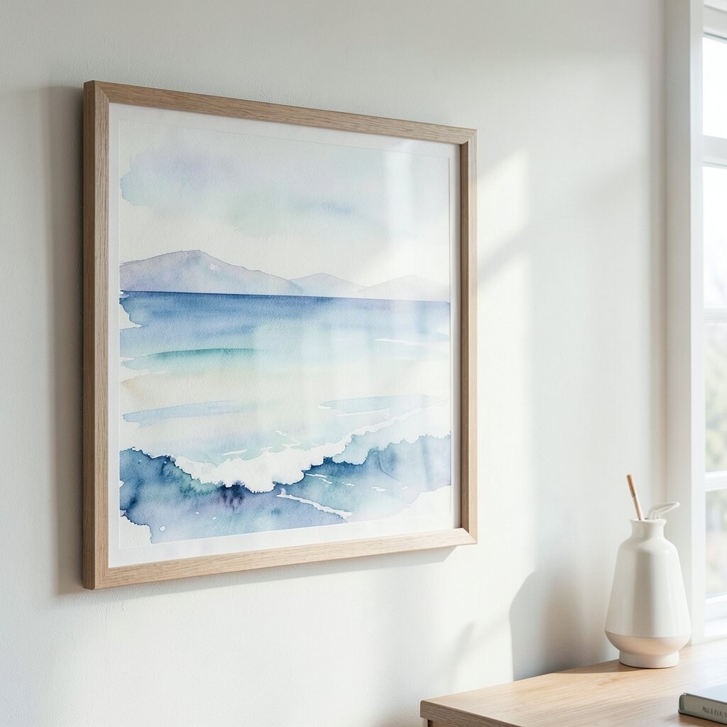
Picture a seascape painted in soft watercolors, with misty blues and airy hints of sand-colored warmth. The horizon line feels gentle, like a breath you can see.
These artworks brighten your home because the gradients lift the mood and add movement without clutter. They also bring a spa-like feel, which makes living rooms and bathrooms feel more relaxing.
To make it practical, choose a size that fits your wall’s main visual space, not the whole wall’s size. If the art includes a touch of green or beige, echo that tone in a plant pot or a woven basket so the room looks connected.
Many shops now carry watercolor styles that use archival inks, which is helpful for long-term color. Even when you choose a mid-range price, you can get impressive results if you pick the right paper texture and frame glass.
6. Textured Geometric Wall Hangings
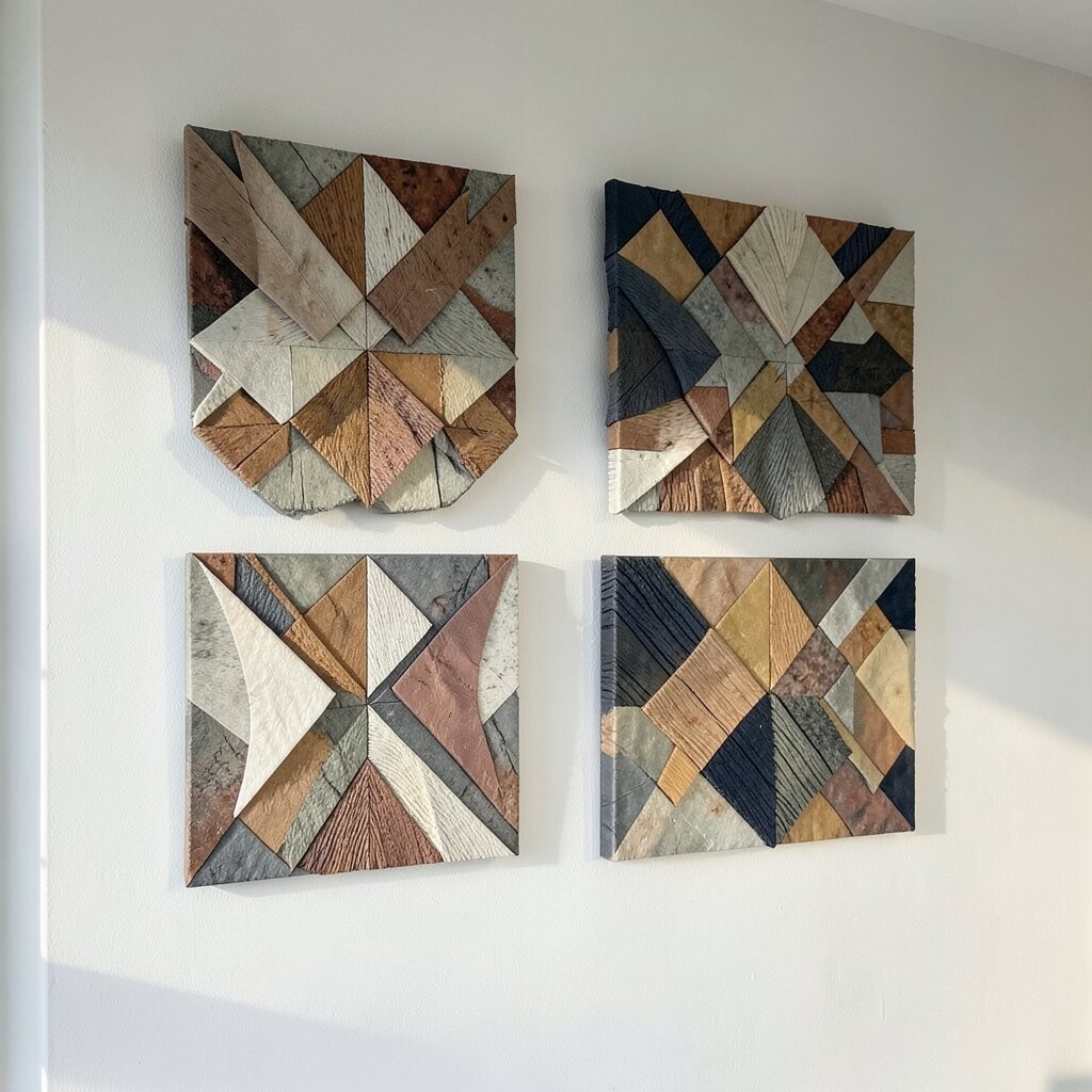
Think of geometric designs built from layered textures, like small relief shapes that cast tiny shadows. The lines stay neat, but the surface feels rich and tactile.
This kind of wall art brightens because it adds depth, so even plain lighting makes the wall interesting. It also helps rooms feel more “designed,” especially when you have simple furniture.
For a practical placement idea, hang it at eye level in a living area or above a console, where the shadows will show. If you want it more personal, choose colors that match your decor palette, then add one matching accent item like a vase or cushion.
Cost varies a lot because handmade pieces can use real materials, while print-based versions are more budget-friendly. If you want the look of premium texture, check for high-quality mounting and sturdy hardware in the listing.
Right now, many shops are leaning toward warm neutrals and earthy tones for geometric art, so it pairs nicely with modern, cozy homes. A textured piece in sand, clay, or sage can make your space feel bright without adding harsh colors.
7. Elegant Gold-Accented Typography Prints
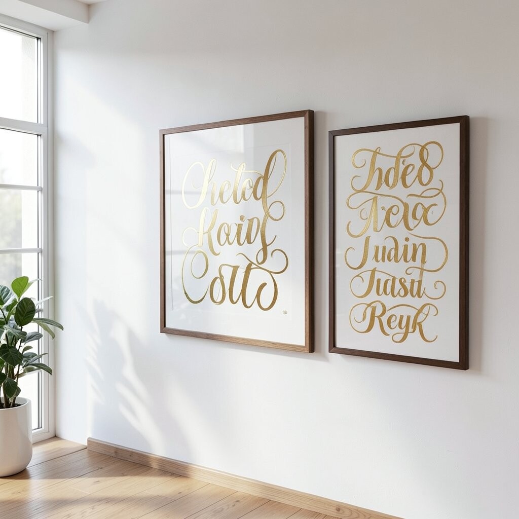
Imagine tasteful typography arranged with space around each letter, then finished with a soft gold accent. The design feels classy and never overly busy.
Typography art brightens because it adds structure and a clear focal point, which makes rooms look more intentional. When you place it beside natural light, the gold detail catches just enough to feel luxurious.
To keep it refined, choose a quote or word that fits your home’s mood, like calm, home, or a meaningful phrase. Personalize it further by selecting a font style that matches your other decor, such as modern sans-serif or softer serif curves.
For cost considerations, you may find that smaller sizes look elegant and cost less than large statement prints. If you want the gold to last, look for shops that mention archival inks or quality printing methods.
8. Sculptural Ceramic Plate Wall Art
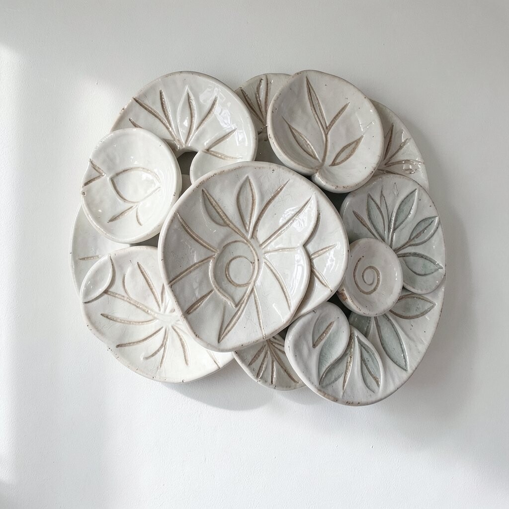
Picture decorative ceramic plates mounted on the wall, with glossy highlights and gentle patterns around the rim. Each plate reflects light in a different way, almost like tiny spotlights.
This wall art brightens your space by adding shine and color highlights, especially in dining rooms. It also creates a welcoming feeling because plates look familiar and warm.
For practical styling, keep plate sizes varied but not chaotic, like one larger piece plus two medium ones. If you want personalization, pick a color theme that matches your tableware, then keep the glaze finish consistent across the set.
In many shops, handmade plate sets can be surprisingly affordable, especially if you start with a small trio. Check that the mounting hardware fits your wall type, and remember that heavier pieces need sturdy anchors for safety.
Current trends favor earthy glazes and muted blues, so you can get a bright look without bold neon colors. Pair the plates with warm lighting to make the highlights feel extra flattering.
9. Framed Color-Blocked Still Life Art
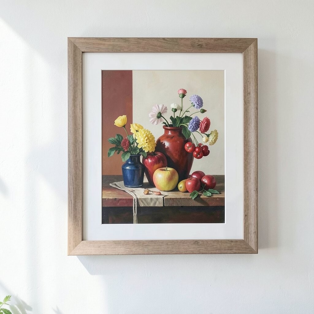
Imagine a still life where objects are simplified into clean shapes, painted in bold but balanced color blocks. A vase, fruit, or bottle might appear like it belongs to a modern poster.
This style brightens because it brings cheerful color and strong composition to a blank wall. It also makes your room feel creative, even if your furniture is simple.
Choose a frame that matches the color blocks, either by echoing a dominant shade or using a neutral frame that lets the art do the talking. For personalization, pick a still life theme linked to your routine, such as coffee cups for a kitchen nook or flowers for a dining space.
Cost can be reasonable, especially for print-based versions, while original paintings are the splurge. If you want a refined look on a budget, focus on crisp print quality and a frame that keeps the surface protected.
10. Monochrome Photo Collages with Soft Edges
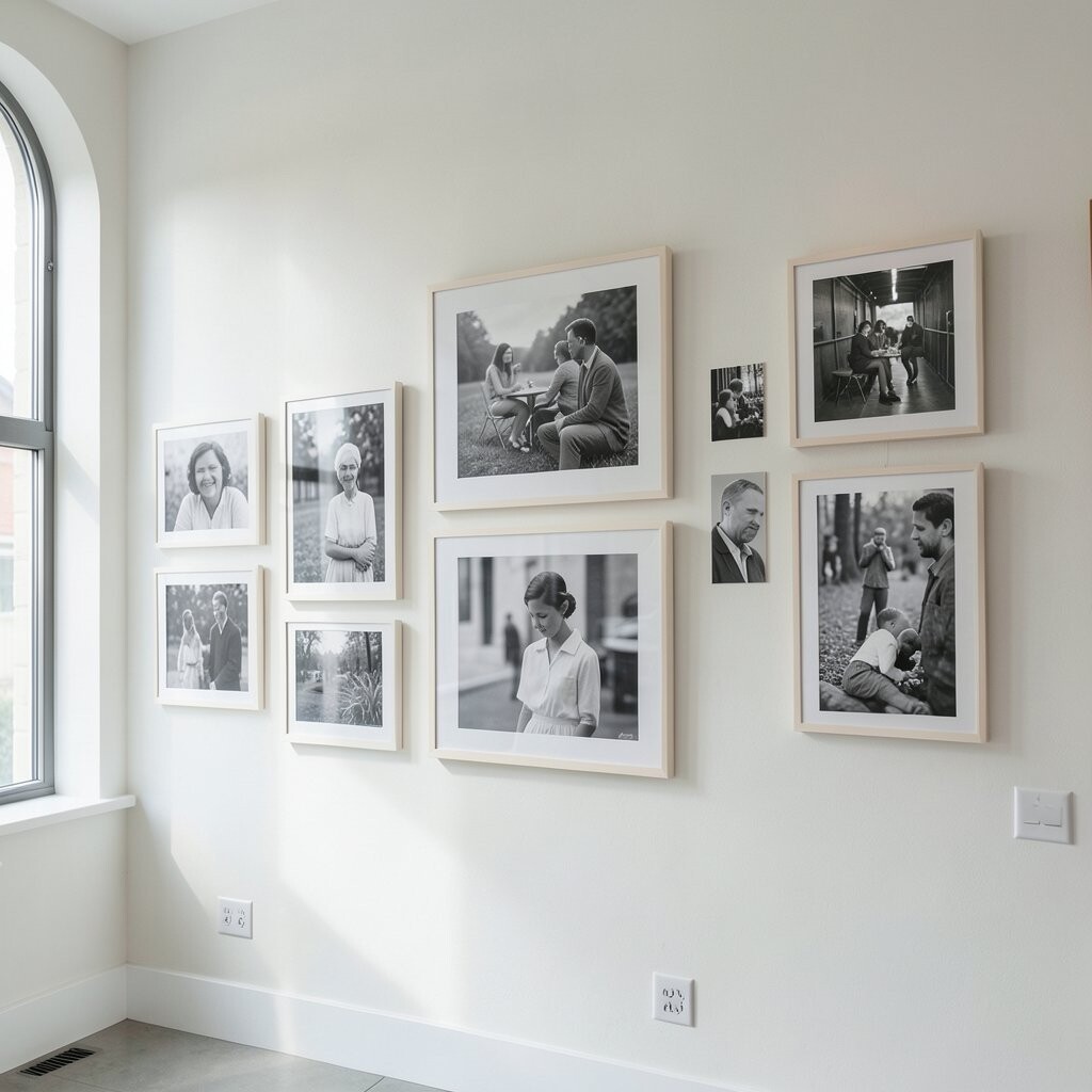
Think of a collage made from black-and-white photos, printed with gentle fades and soft borders. It feels nostalgic, but the layout can still look sleek.
Monochrome art brightens by adding contrast without using a loud palette. It also works beautifully with many decor styles, from modern to farmhouse.
For practical tips, choose photos with similar tones and lighting so the collage feels cohesive. If you want it personal, include images tied to your family, pets, or everyday moments, then arrange them with a consistent spacing so it looks intentional.
Shops often offer ready-to-hang collage sets, which can save time and lower cost. You can also find custom printing services that let you use your own images, so the final piece looks truly one-of-a-kind.
11. Botanical Shadowbox Arrangements
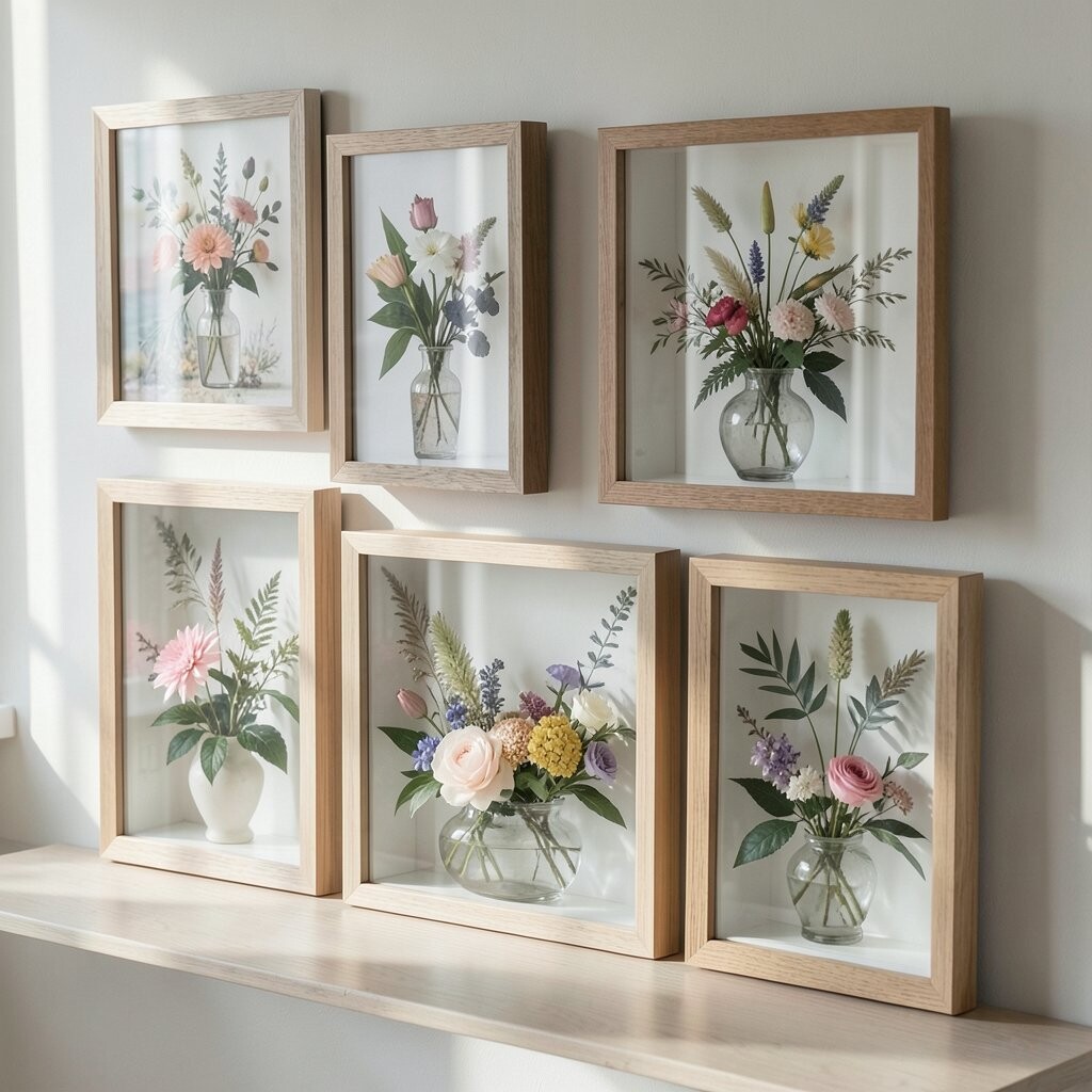
Imagine a shadowbox display with layered botanical elements, like dried leaves or pressed petals arranged behind clear glass. The depth makes the piece feel alive and three-dimensional.
Shadowbox art brightens by bringing natural texture into your home, even when the plants are not fresh anymore. It also adds a gentle, calming vibe that suits bedrooms and cozy reading corners.
Keep it practical by choosing a shadowbox with a backing that protects the materials from dust. For personalization, select botanicals that match your surroundings, like lavender tones for a bedroom or warmer leaf colors for a kitchen wall.
Cost can vary because handmade shadowboxes take time, but you can find smaller sizes that fit most budgets. A smaller piece can still look refined if it has quality glass and sturdy framing.
Current trends lean toward natural preservation, so botanical shadowboxes feel modern while still feeling grounded. Pair yours with warm, soft lighting so the textures stand out beautifully.
12. Framed Abstract Waterfall Color Fields
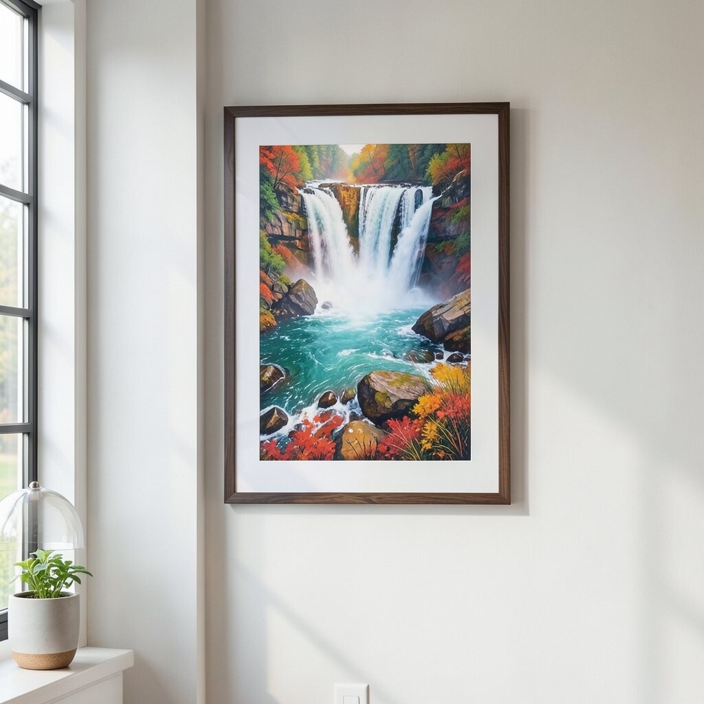
Picture abstract art with sweeping color bands that feel like a waterfall made of paint. The edges might blend like watercolor, giving a smooth, bright effect.
These pieces brighten your home because the flowing colors create energy without feeling chaotic. They also add visual rhythm, which helps rooms feel more balanced.
To style it well, hang it as a central focal point and keep nearby decor simpler. If you want personalization, match one of the dominant colors to something you already love, such as a rug color, a sofa fabric, or even a curtain stripe.
When thinking about cost, remember that larger format pieces often cost more, but they can replace multiple smaller decorations. Look for shops that show the artwork in different lighting, since color fields can shift beautifully depending on how your room is lit.
13. Vintage Lullaby-Style Music Sheet Artwork
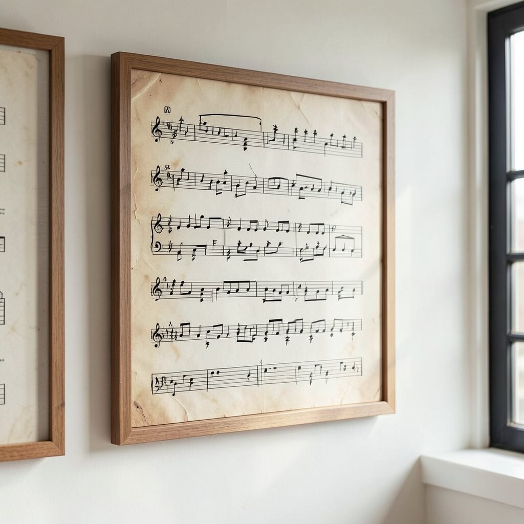
Imagine wall art made from music sheets styled with warm paper tones and gentle decorative borders. The notes may be subtle, like a memory you can almost hear.
This theme brightens your home by adding a soft vintage feeling with a creative edge. It also works well in spaces where you want calm focus, like bedrooms, studios, or hallways.
For practical personalization, choose a favorite song lyric or a date that matters to your family, then pick a print version that matches your frame style. You can even coordinate it with other music-themed decor like a small instrument shelf or a framed photo.
Cost considerations often depend on whether the shop offers licensing for the notes or uses original-inspired designs. Many current collections use modern typography and updated layouts, so it feels fresh rather than old-fashioned.
Try pairing music sheet art with soft lighting and warm wall paint for an extra inviting vibe. The combination makes the page tone feel brighter even in evenings.
14. Minimalist Landscape Panels in Neutral Tones
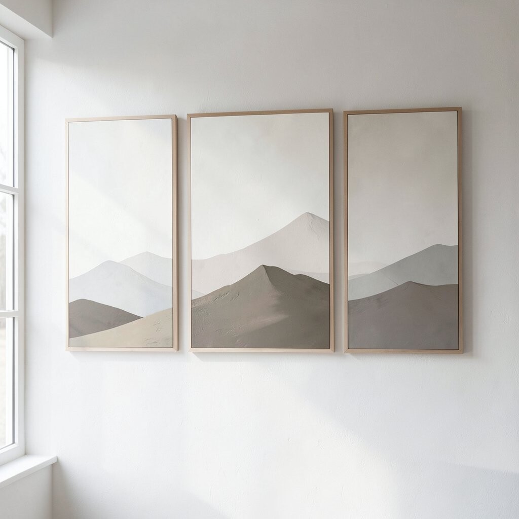
Picture minimalist landscape scenes, where mountains or trees appear with calm shapes and muted colors. The palette stays neutral, but the feeling is airy and open.
These panels brighten your home because they add depth without overwhelming the room. They are especially helpful for modern interiors where you want style but not extra noise.
For practical tips, use them to stretch space visually by placing two panels side by side with consistent spacing. Personalize the scene by choosing one that matches your preferred vibe, like coastal calm, forest quiet, or desert light.
Cost can be friendly because many shops offer sets that look high-end without heavy price tags. If you can spend a little more, prioritize the print quality and frame backing so everything stays straight and clean.
15. Premium Metal-Finish Abstract Wall Sculptures
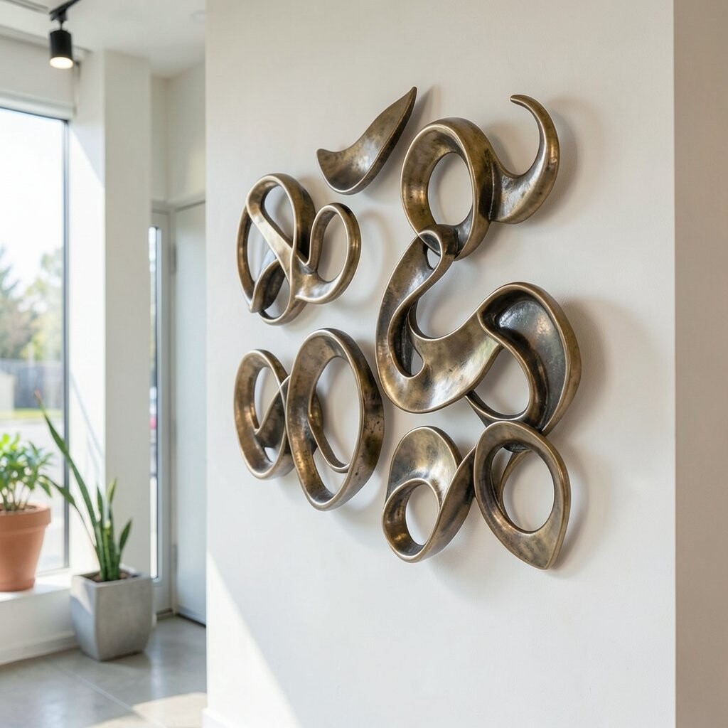
Imagine abstract shapes with a metal finish, like brushed copper or silvery tones, arranged so shadows dance on your wall. The surface catches light and makes the room feel more active.
Metal-finish wall sculptures brighten your space by reflecting ambient light and adding a premium look. They also give your wall a three-dimensional feel that prints and flat art cannot quite match.
For practical placement, hang them where lighting naturally hits, like near a window or a wall sconce. If you want personalization, choose a finish that matches your room’s hardware, like matching gold tones with brass details or selecting silver tones for cooler decor.
Cost considerations matter here because metal pieces can be pricier, but they also last longer and look elegant for years. If your budget is tighter, look for smaller sculptural wall art with sturdy construction, then build your collection slowly.
Current trends often favor warm metals and mixed materials, so pairing one sculpture with a textured print nearby can look designer. Keep the rest of the wall styling simple so the sculpture remains the star attraction.