The right wall art can make a room feel instantly alive. When it looks polished and personal, it also makes everyday moments feel special.
From soft, elegant textures to bold refined pieces, there are many ways to upgrade your space. You do not need a huge budget to get a brighter, more welcoming look.
1. Gallery Wall With a Calm Color Story
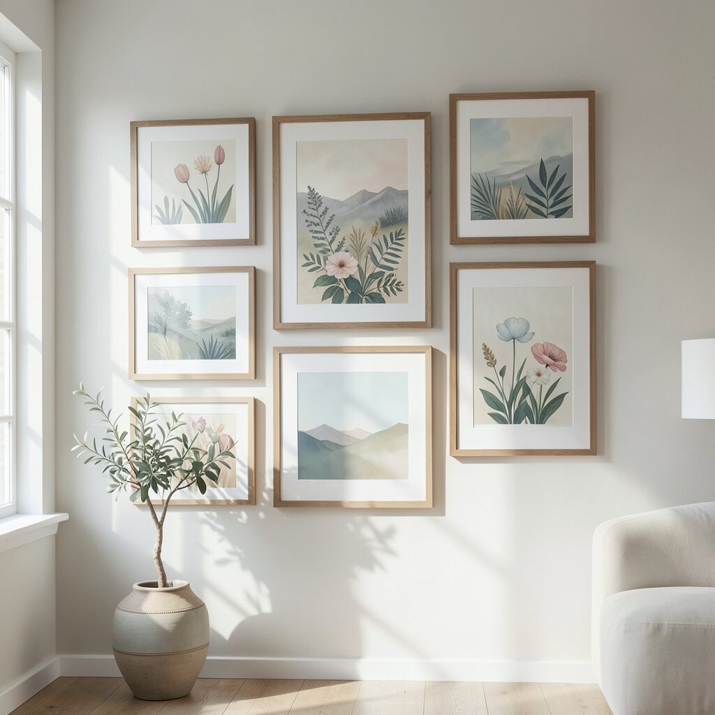
Start with framed pieces that all share one gentle color family, like warm cream, muted gray, or soft sage. Think of it like a matching outfit for your walls, where everything looks tidy and intentional.
Choose a layout that feels relaxed rather than crowded, spacing frames evenly so your eyes can rest. Include a mix of art types such as prints, photos, and a small mirror-backed piece for light reflection. For a practical setup, lay the frames out on the floor first, then measure the wall width so the final arrangement sits centered and level.
2. Oversized Line-Art Prints for Instant Clean Style
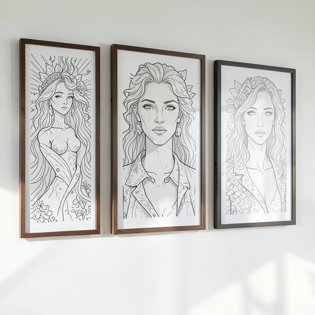
Pick an oversized print with thin line work, such as botanical vines, abstract flow lines, or simple city sketches. The delicate lines feel refined and airy, especially from a normal viewing distance.
When the art is large, it anchors the room and reduces visual noise from other decor. You can brighten the look by choosing a white or off-white background, then pairing it with a thin black or natural wood frame. If you want something easier to personalize, search for line-art versions of shapes you love, like your favorite flower or a meaningful landmark.
For cost, look for affordable print sets or local digital print options, since line-art usually reproduces beautifully. Keep the piece modern by sticking to two colors max, and let the frame do the rest of the styling.
3. Framed Fabric Panels That Add Soft Texture
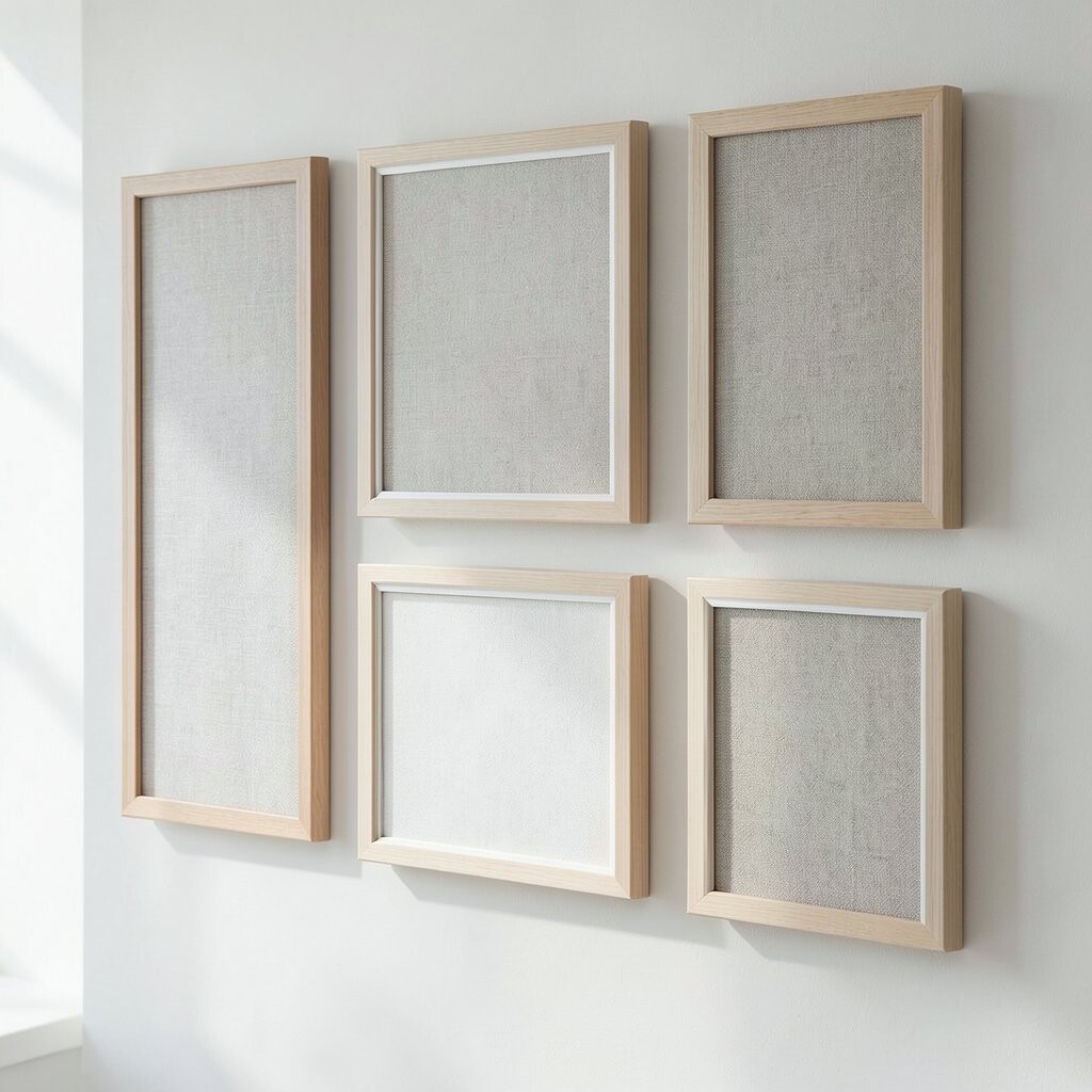
Choose framed textile art like linen, woven cotton, or subtle patterned fabric. The surface texture gives depth that flat prints cannot, and it softens hard edges in a room.
Hang fabric panels in a simple grid or as a single statement piece above a sofa. Use neutral tones for a classy look, or pick one accent color to match cushions or curtains. A great practical detail is to stretch the fabric tightly and keep the frame slim so the panel looks crisp and polished.
If you want uniqueness without spending a lot, use fabric you already love, like a remnant from a home store or a scarf with a meaningful pattern. This concept fits current trends toward tactile decor, where walls feel more comforting and less purely visual.
Consider lightweight frames so installation stays easy, and wipe the fabric gently with a soft cloth to keep it fresh.
4. Statement Mirror Gallery for Light and Elegance
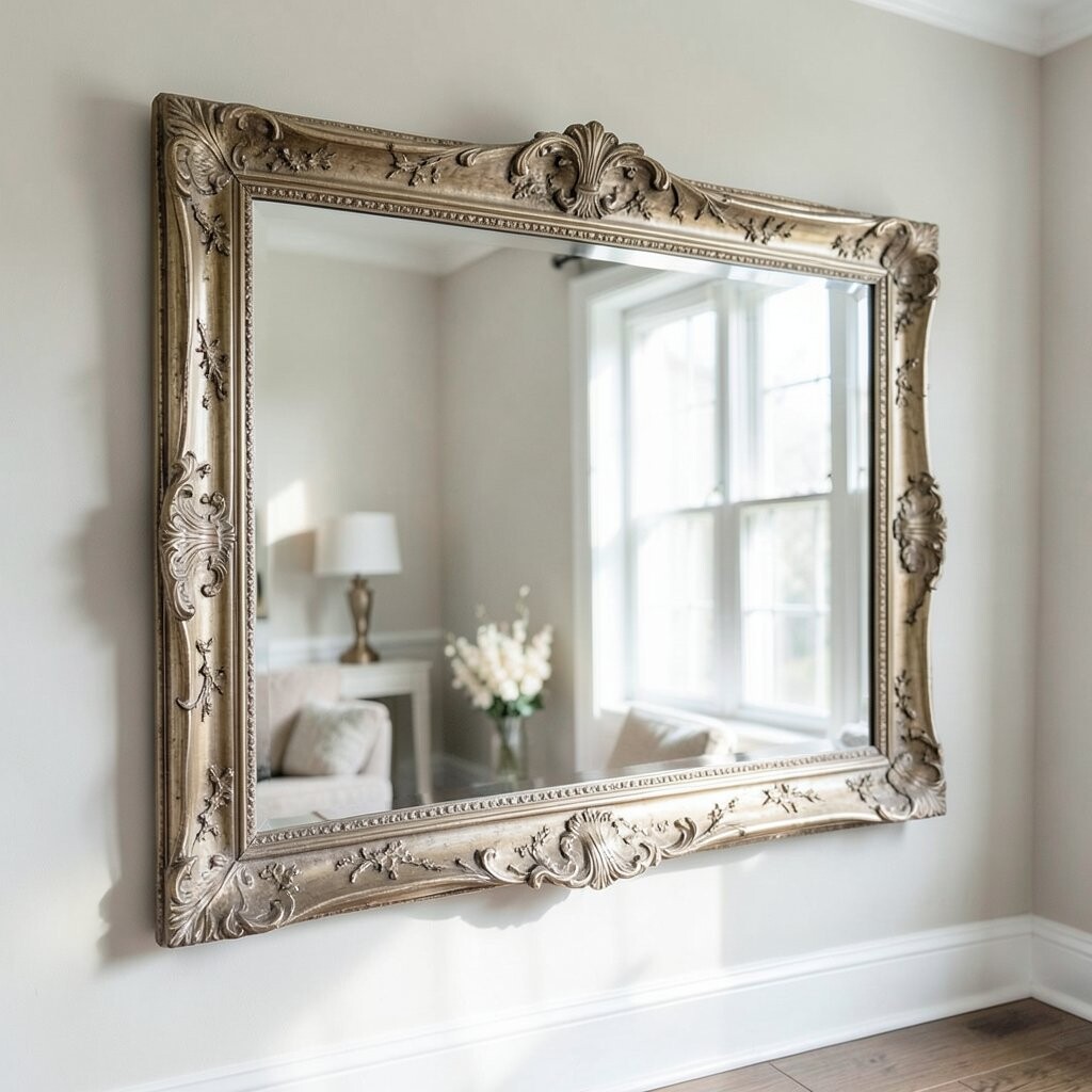
Combine refined wall art with mirrors by using a small cluster of arched or oval mirrors. The reflective surfaces bounce daylight around the room and make even a dim corner feel brighter.
To keep the look refined, choose matching finishes like brushed gold, matte black, or clear silver. Add one or two art pieces behind or beside the mirrors, such as a simple print with a calm palette, so the arrangement looks curated rather than random.
For personalization, engrave or add a thin vinyl quote to the glass that matches your style, such as a short phrase or a date in a minimalist font. Keep practical placement in mind by positioning mirrors across from a window so the light has something to bounce off.
5. Botanical Shadow Box Displays for a Fresh Feel
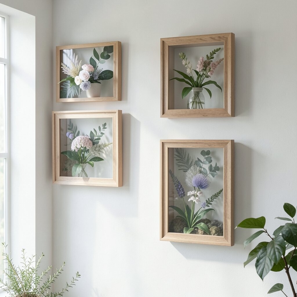
Create a refined wall moment using shadow boxes filled with dried plants, pressed leaves, or flat botanical elements. The glass front protects the pieces and makes the wall decor look polished.
Stick to one plant theme, like eucalyptus, lavender, or simple grasses, to keep everything cohesive. You will get a natural glow from the light hitting the glass, which adds brightness without changing your wall color.
For uniqueness, include one meaningful botanical you can source locally, such as leaves from a tree that reminds you of a trip. To keep cost low, press your own plants and use simple archival paper so the colors stay gentle longer.
When you arrange the contents, leave breathing room inside the box so the composition feels elegant instead of cluttered.
6. Geometric Framed Prints With Soft Gradients
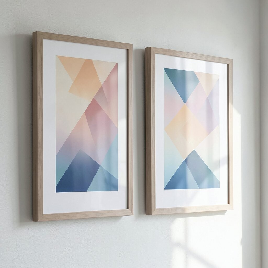
Geometric art can look refined when the shapes are neat and the colors are calm. Choose prints with soft gradients, like blush to cream or seafoam to pale gray, to avoid a harsh look.
Hang one large geometric print above a console or group smaller matching frames for a modern grid. This kind of wall art supports current trends toward clean lines, but it still feels warm because of the gentle color blend.
To personalize, pick patterns that match your personal style, such as repeating triangles for a playful vibe or circles for a softer feel. For a practical tip, keep the frame color consistent with your furniture accents, like matching black hardware or natural wood legs.
7. Monochrome Photo Strips With a Polished Border
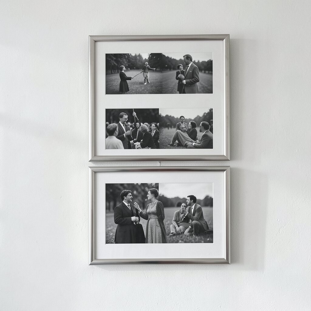
Use black-and-white or monochrome photos arranged in vertical strips for a sleek, timeless look. The result feels gallery-like and refined, even in a casual home.
Select images with similar tones, such as portraits, architecture, or nature scenes, so the wall feels cohesive. Leave consistent gaps between frames for an organized look, and choose a simple border color like white or charcoal.
This concept brightens the room because monochrome images often keep the wall visually light. For cost, print your own photos at a reasonable size, then use matching frames from a thrift store or discount home goods shop.
If you want a personal twist, include one photo with a handwritten date on the mat using a neat font style. Just keep the handwriting small so the wall still looks polished.
8. Watercolor Cityscapes for Subtle Movement
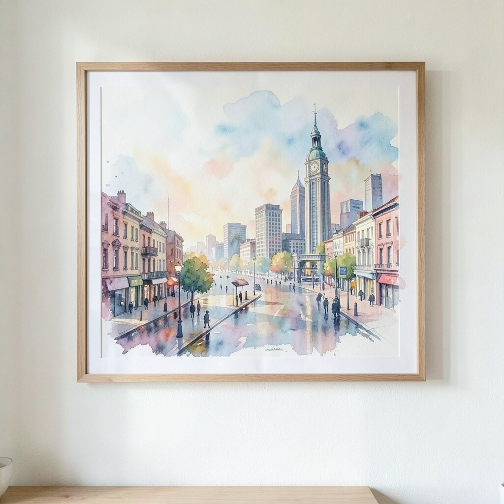
Watercolor cityscapes feel airy and elegant because they blur edges just enough to look soft. Choose scenes with light tones, such as early morning street views or riverside bridges with pale washes.
Hang the artwork at eye level, especially in a hallway, to guide the eye as you move through the home. For a practical tip, pick a frame with a mat border so the watercolor has room to breathe and looks crisp.
Uniqueness happens when you pick a place that matters to you, like your hometown street or a vacation memory. You can also personalize by printing your own photo reference, then using a watercolor-style filter if you love DIY.
Current trends show people leaning into “soft realism,” where art looks real but still gentle. This approach can brighten your space without making the room feel overly busy.
9. Textured Abstract Canvases in One Bold Hue
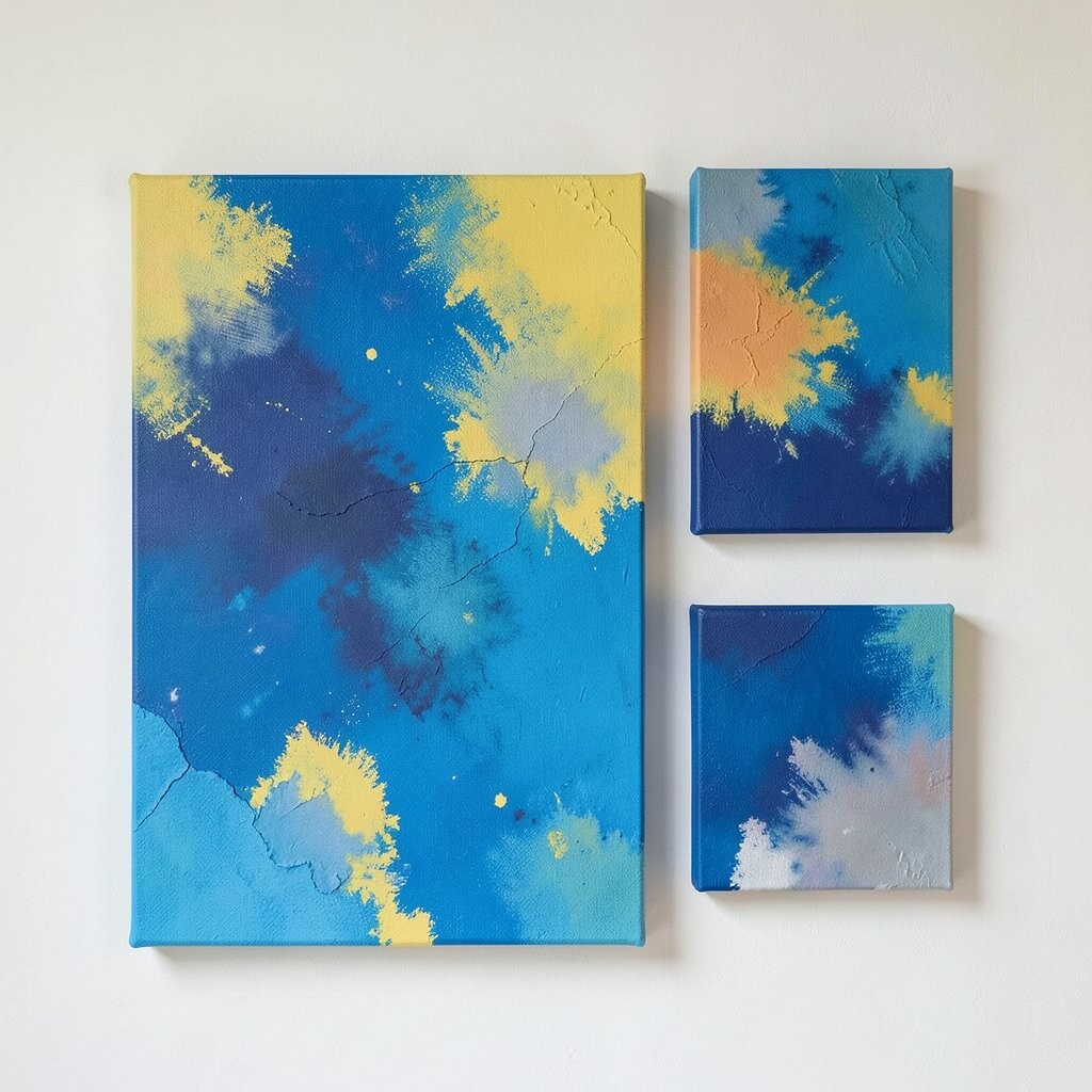
Choose an abstract canvas that uses texture, like thick paint swirls or layered paper collage. A single bold hue, such as deep teal or warm terracotta, gives the wall a refined pop while still staying elegant.
To brighten the space, pair the bold art with lighter surroundings, like a cream sofa, pale rug, or white curtains. The contrast helps the colors look richer, which makes the room feel lively.
For personalization, look for abstracts that echo your decor shapes, such as waves if you have coastal colors or curves if your furniture has round edges. If you want budget-friendly sourcing, consider prints of textured art or smaller canvases that can be grouped.
A practical installation tip is to check the canvas weight before buying a hook and to use a level so the art hangs straight and intentional.
10. Framed Typography Art With Meaningful Words
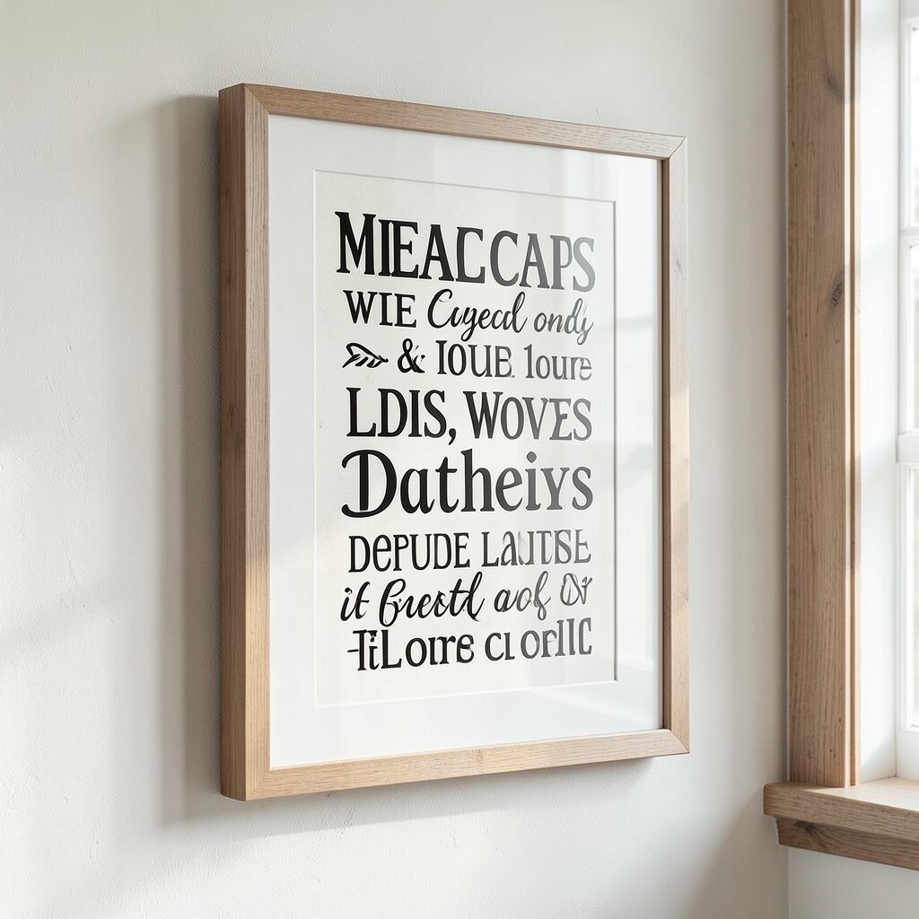
Typography wall art can look refined when you choose tasteful fonts and balanced spacing. Use a short word or phrase that fits your life, like “welcome,” “breathe,” or a family name.
Pick a style that matches your room, such as minimalist serif text for classic decor or clean sans-serif for modern spaces. Use matte paper and a simple frame to keep it looking upscale.
This concept brightens your walls because strong typography creates clear visual focus. It also helps you personalize without needing big art supplies, since you can print text at local copy shops.
To keep costs sensible, buy a single high-quality frame and update the print seasonally. You will get a refreshed look without replacing the hardware.
For uniqueness, choose a word that connects to something you do, like “steady” for a calm routine, then coordinate the color with a throw blanket or pillow.
11. Light-Toned Ceramic Wall Plates for a Classic Upgrade
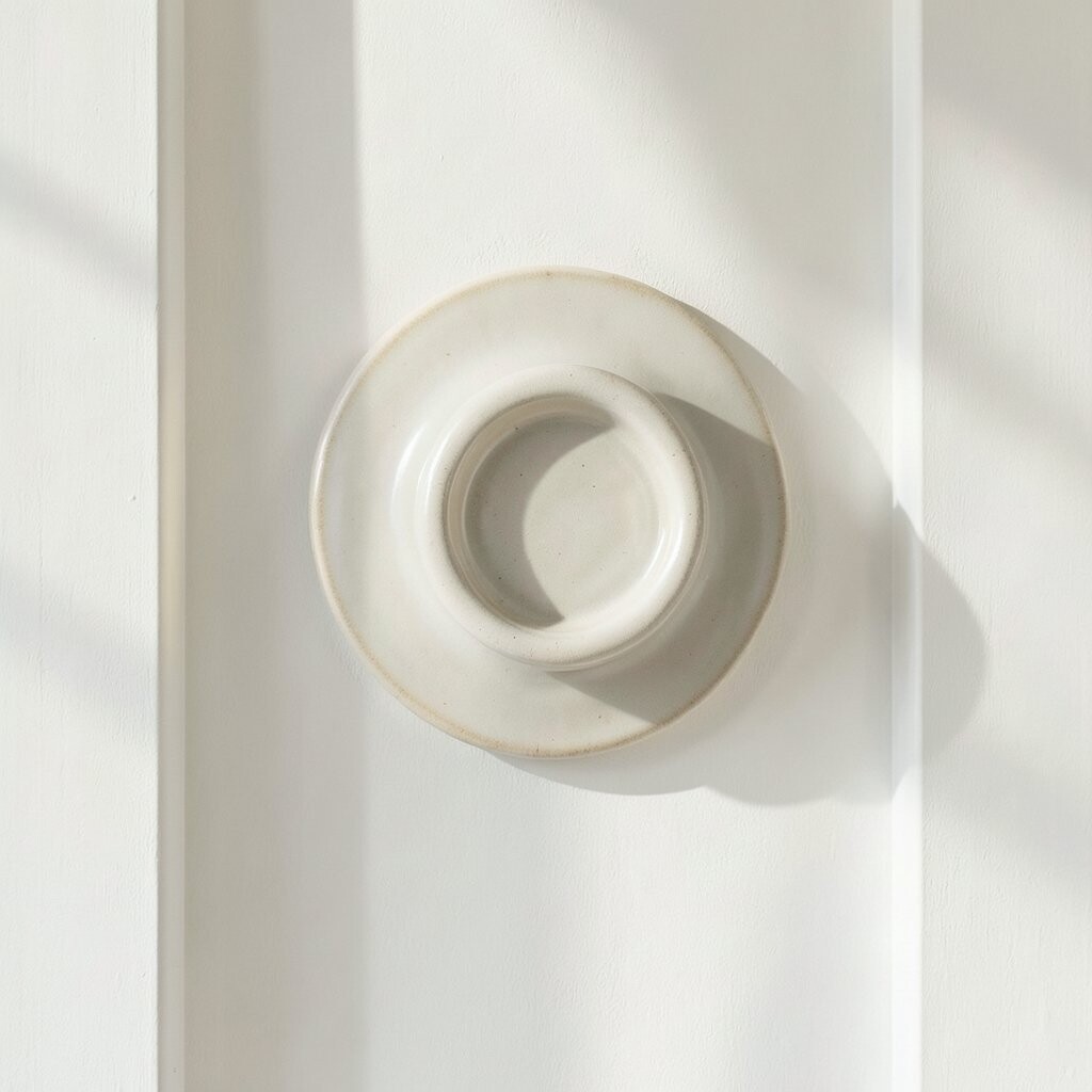
Decorative ceramic plates can look unexpectedly refined when you select the right glaze and spacing. Choose plates in light finishes such as ivory, pale blue, or soft beige with subtle patterns.
Hang plates in a staggered pattern so they feel curated rather than arranged like dinnerware. Add a larger center piece and smaller side plates to create a balanced composition that looks intentional.
The benefit is a gentle brightness, because light glazes reflect room light and add a calm shine. For practical tips, confirm you have proper mounting hardware for the plate weight and use a measuring tape to keep the cluster level.
For personalization, pick plates from travel memories or choose a set where one plate features a special motif. If you are shopping now, many stores offer modern ceramic plate decor that fits current trends of vintage-meets-modern styling.
12. Sculptural Wall Hangings With Natural Materials
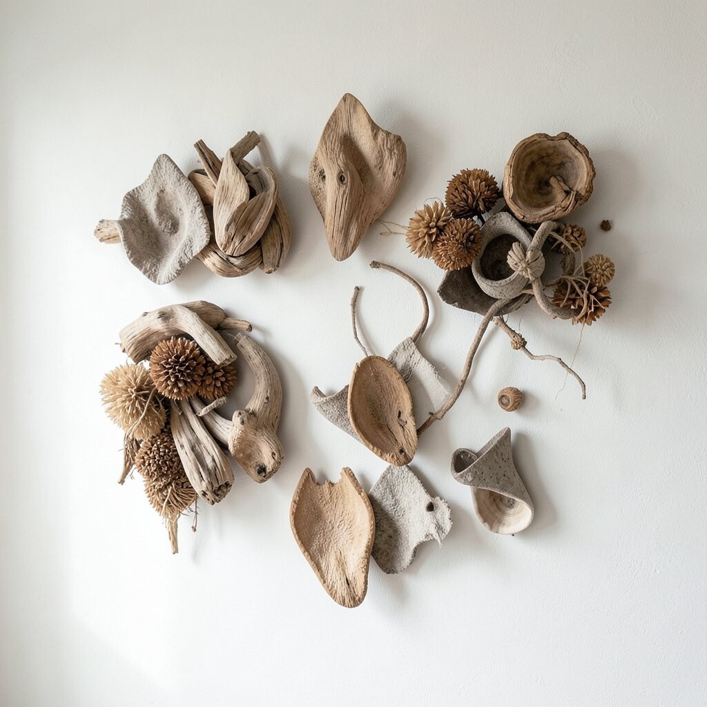
Try a refined wall hanging made from natural fibers or thin wood slats, such as macramé variations or woven baskets. The materials feel warm and handmade, which adds comfort and character.
Keep the look polished by choosing a piece with clean lines and a neutral palette. Hang it where it catches natural light, like near a window, so the fibers cast soft shadows and brighten the wall.
Uniqueness can come from your own palette choices, such as combining natural jute with a small accent thread in your favorite color. For practical tips, choose a hanging that includes an easy mount or a backing rail so installation is simple.
If cost matters, look for smaller wall hangings that still make an impact, then layer them with one simple print to stretch your budget. This concept pairs well with the current trend toward warm minimalism and cozy textures.
To personalize further, style the hanging with a single accent frame beside it to tie your whole wall story together.
13. Coastal Map Art With Clean Lines and Calm Tones
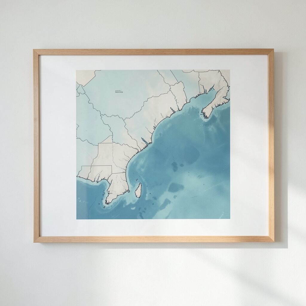
Coastal map prints look refined when they are simplified and use gentle colors. Choose a map style that highlights water outlines and major routes, then frame it in a slim wood or matte black border.
This kind of wall art brightens your space because maps often include negative space and airy backgrounds. You can add a personal touch by selecting a region meaningful to you, like where you honeymooned or a place you love visiting.
For practical tips, pick a print size that fits the wall without crowding other decor, especially if you already have shelves. Keep the palette light so it supports your room’s brightness rather than competing with it.
In terms of cost considerations, you can find affordable reproductions or print your own custom map from a digital source. Just make sure the resolution is high so the lines stay sharp and premium-looking.
If you want a modern twist, choose a map with a minimalist compass rose or clean coordinates design.
14. Layered Textures With Framed Paper Collage
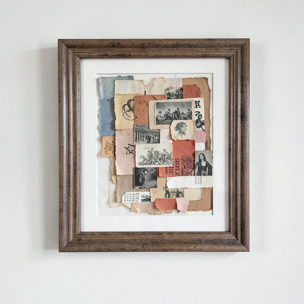
Create a refined layered look using framed paper collage art with overlapping shapes. Choose quality paper with subtle color variation, like warm off-white, sand, and muted charcoal, to keep the final result classy.
Arrange shapes in a balanced composition, leaving space between layers so the art feels airy. The benefit is that paper collage catches light along edges, adding brightness and depth as you move around the room.
For personalization, use paper cutouts that mean something to you, such as favorite patterns, old ticket stubs, book pages, or fabric-like textures. You can also match your home palette by blending tones from your rug and curtains.
Cost is often friendly because you need simple tools, paper, and a frame, and you can create multiple designs over time. For a practical tip, use archival glue and acid-free backing so your collage lasts and stays looking clean.
When you choose a frame, consider a mat border in a warm white for a gallery feel that looks polished in photos and in real life.