Patterns have a quiet way of making a room feel alive. With the right set, even plain walls start to look full of personality.
You can brighten a space without buying a whole new life for it. Use these pattern collections as small, fun upgrades you can actually style.
1. Cheerful Geometric Pops
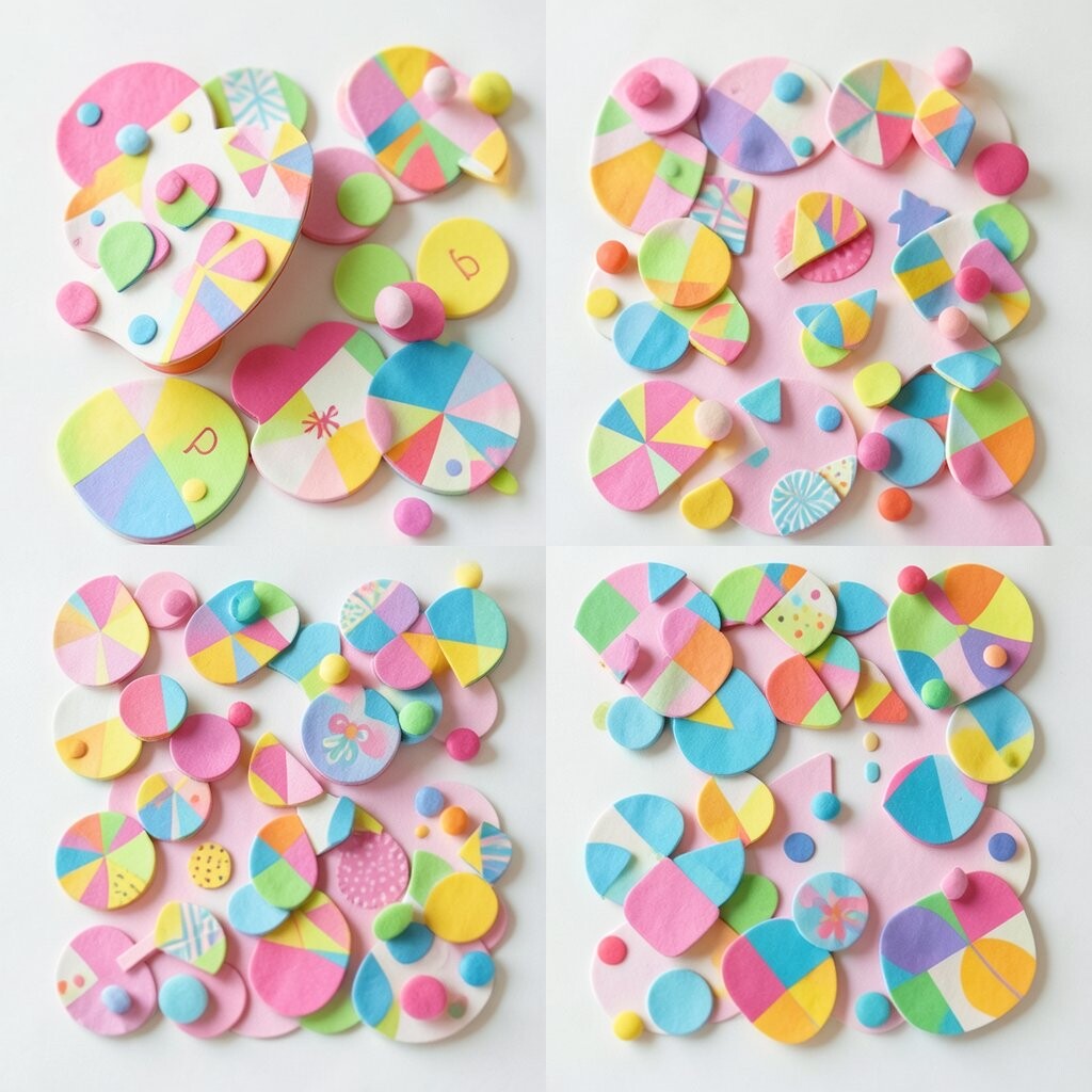
Think of crisp triangles, lively chevrons, and tiny repeats that look like they’re smiling. A bright geometric can make a hallway feel faster and a living room feel more awake.
To keep the look from feeling busy, choose one dominant shape and let the rest support it with softer tones. Pair the pattern with solid curtains or a plain rug so your eyes get a calm landing.
2. Soft Botanical Veins
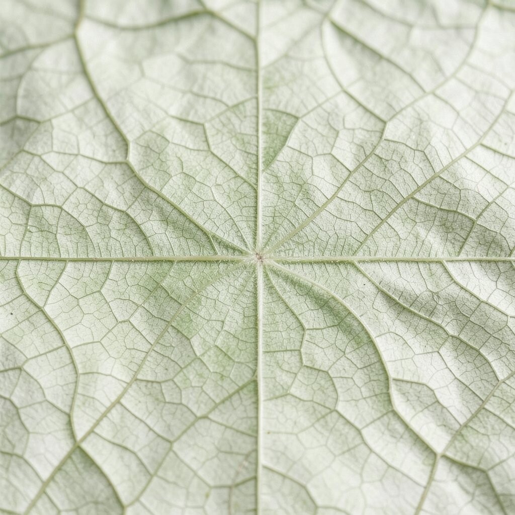
Imagine leafy vines drifting across fabric like a gentle breeze. Botanical patterns add freshness, especially when they mix greens, creams, and light blues.
This style makes your space feel cared for, not staged. It also works in many seasons because you can swap accessories from warm terracotta to cool sage without changing everything.
Use smaller botanical prints on pillow covers and larger ones on a single accent wall or piece of art. Keep the background light so the greens stay airy, and choose washable fabrics if your home is busy.
3. Sunburst Color Blocks
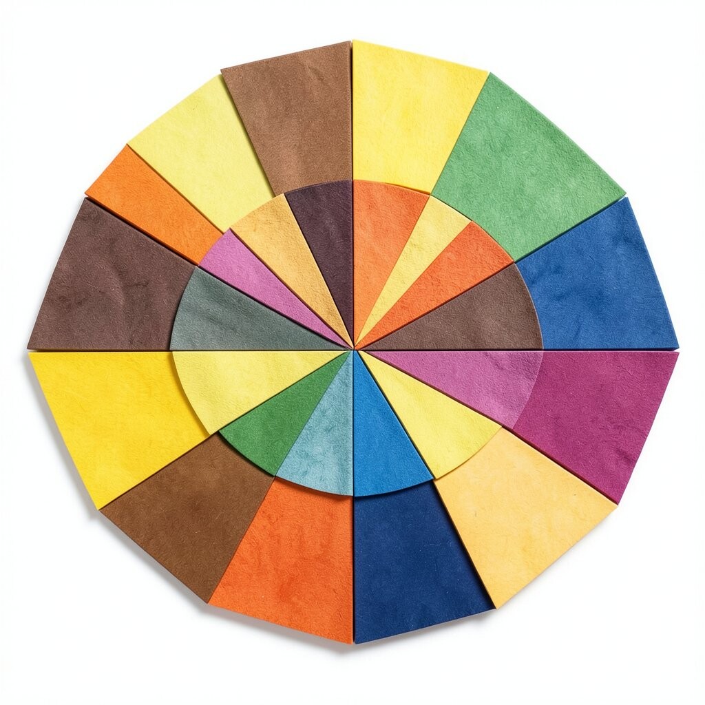
Picture radiating rays that look like golden light turning corners. Color-block sunburst patterns can pull energy into a room without needing extra clutter.
Choose colors that already exist in your space, like the tone of your sofa or the wood of your shelf. When you match the palette, the pattern feels intentional, and the room looks pulled together.
Try a bold sunburst for a statement piece such as a throw blanket, then balance it with neutral walls and simple lighting. If you want to go gradual, use the pattern in one small area like a side chair cushion and build from there.
4. Cozy Textured Stripes
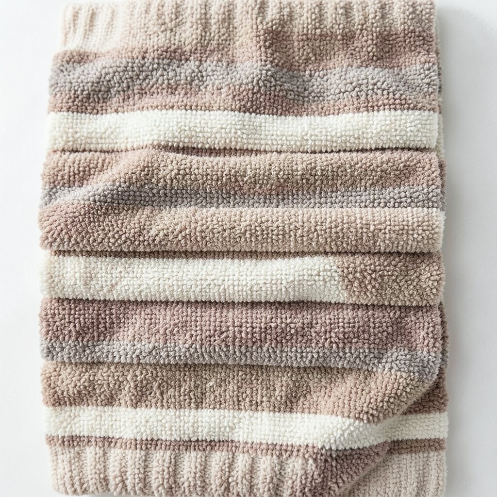
Stripes can be more than a look, they can be a vibe. When stripes feel soft and slightly textured, your space gets warmth without shouting.
Vertical stripes make ceilings feel taller, while horizontal stripes add a calm, grounded rhythm. Use this trick to make a room feel bigger, especially in smaller bedrooms or reading corners.
5. Artistic Abstract Swirls
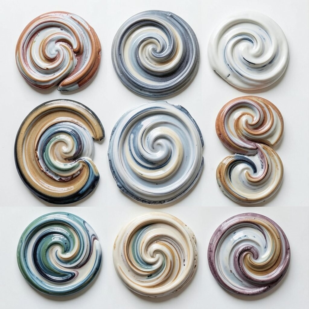
Abstract swirls feel like movement captured in paint. You’ll often see flowing lines that blend colors, which helps a room feel creative and relaxed.
Because abstracts rarely demand perfect matching, they’re great when your furniture pieces are different styles. You can tie them together by pulling one color from the pattern into a vase, lamp shade, or framed print.
Choose medium-scale swirls for spaces that need visual comfort, and use large-scale designs only when you have enough wall or fabric space to breathe. For a practical approach, start with art prints first, then swap in patterned textiles later.
6. Classic Polka Dot Charm
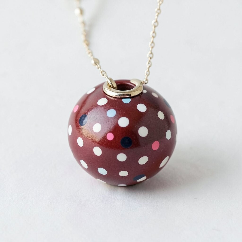
Polka dots are playful, but they can still look elegant when the colors are thoughtful. Imagine small dots repeating like a friendly countdown across a cushion or curtain.
Dots bring instant cheer and work well with both modern and traditional decor. They also help break up solid colors so your room feels less flat.
Try using larger dot patterns on a single item, like an ottoman cover, while keeping the rest of the textiles plain. If you love bold fun, mix dots with stripes in similar color families, but keep the scale different so it stays balanced.
For easy personalization, pick dot colors that match your favorite mugs or artwork. This tiny detail makes the room feel like it belongs to you, not a magazine.
7. Regal Medallion Centerpieces
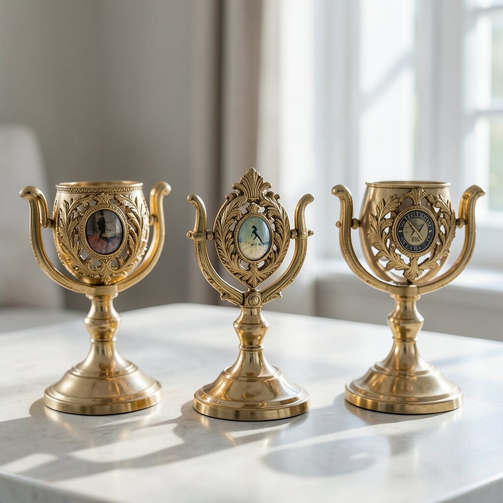
Medallion patterns feel like a focal point even when they’re only on one surface. Think of round motifs that frame the center of a rug, table cover, or decorative panel.
The benefit is focus, because your eyes naturally rest on the design and the room feels organized. It’s a smart choice for dining spaces where you want energy but not chaos.
8. Vintage Wash Plaid
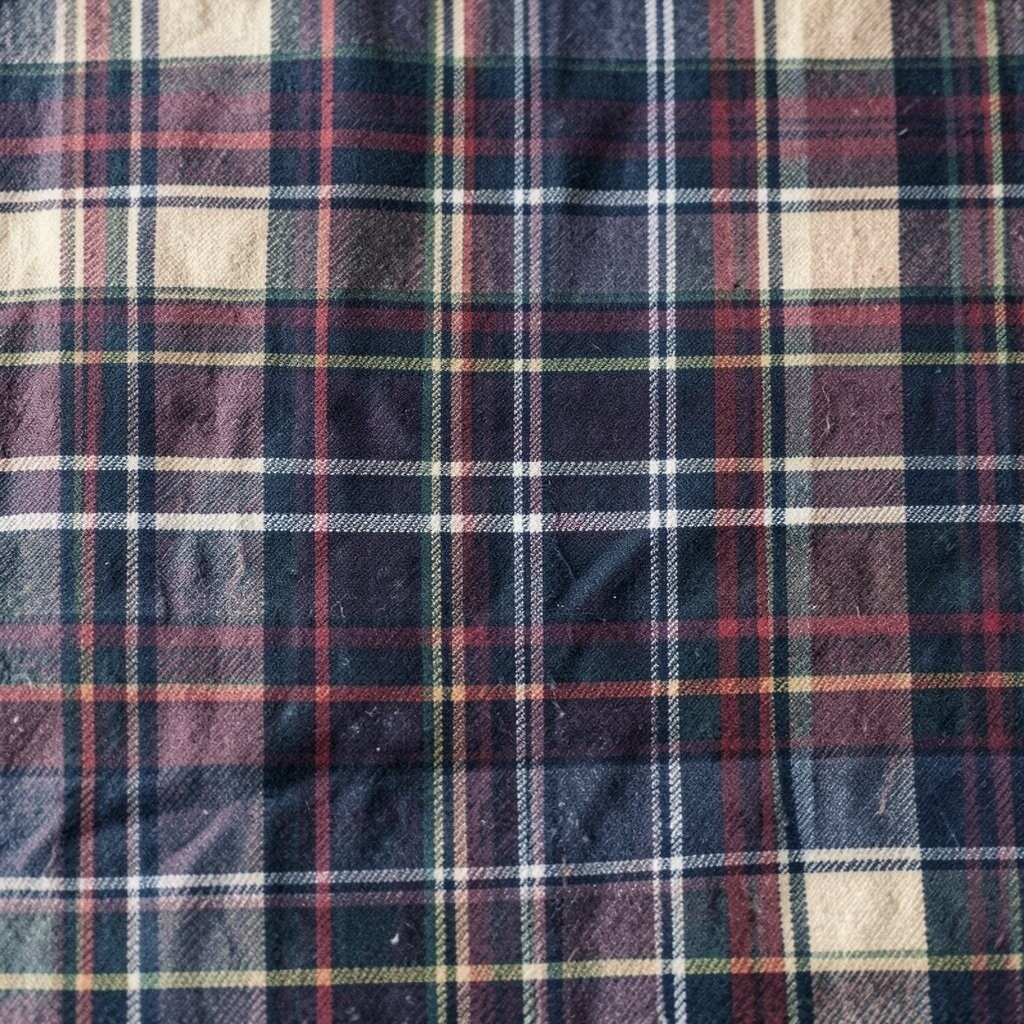
Plaid can feel timeless, especially when it’s softened with washed colors. Picture cozy checks in dusty rose, oatmeal, and muted blue that look lived in from day one.
Plenty of people use plaid for colder months, but it can brighten your space year-round when the tones are light. It also pairs well with wood textures and simple metal finishes.
Choose plaid for throws, curtains, or a single armchair slipcover to keep it controlled. To personalize, match one plaid color to a painting frame or book spine so everything feels connected.
If you want to watch cost, start with one affordable textile like pillow covers before investing in a larger rug. That way you can test how the pattern behaves in different lighting throughout the day.
9. Modern Watercolor Blends
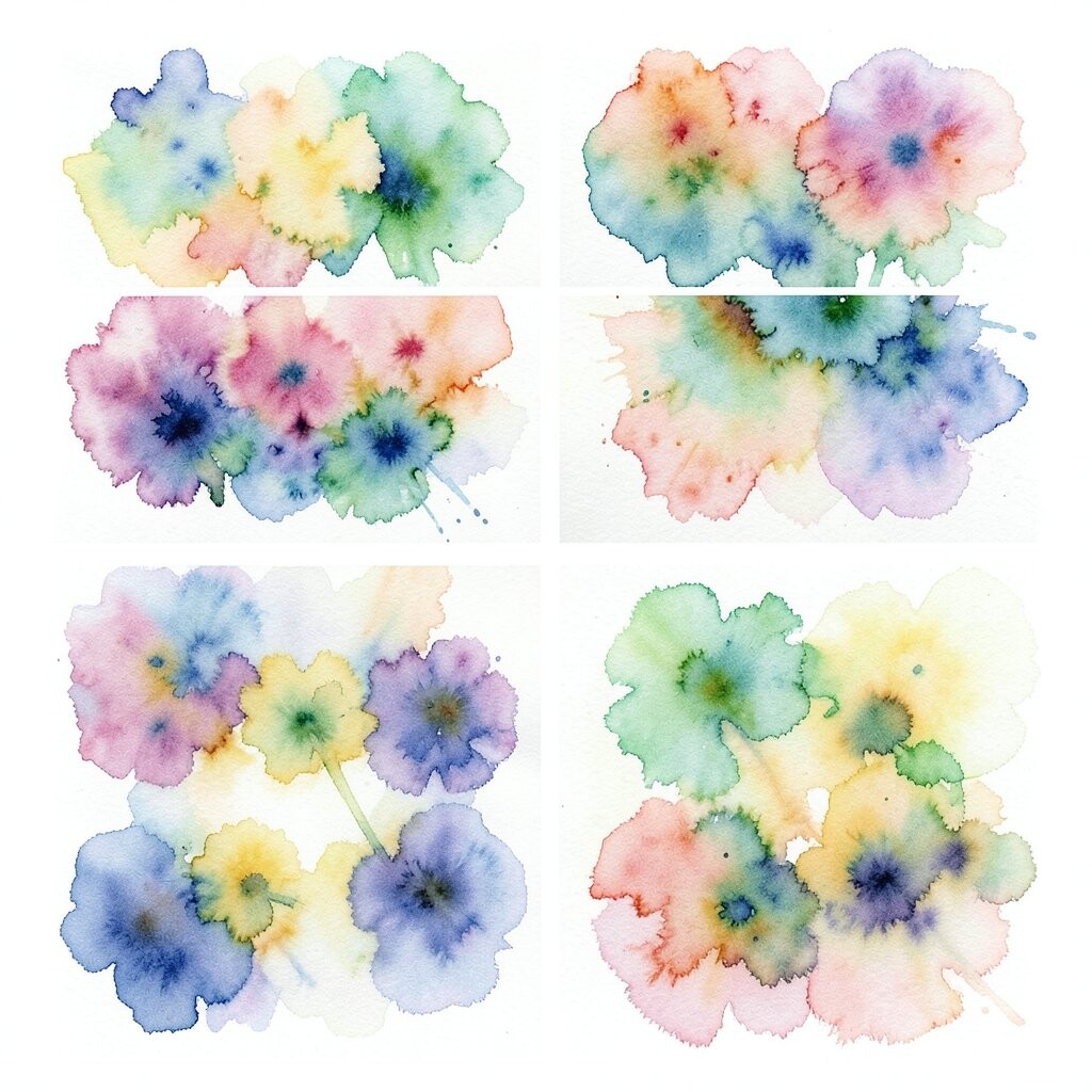
Watercolor patterns look like color that floated onto fabric by accident in the best way. You’ll see soft edges, layered hues, and gentle gradients that brighten a room without harsh lines.
This style helps rooms feel lighter, because the colors fade smoothly into each other. It’s a great match for airy curtains, linen bedding, and calm modern furniture.
Pick one watercolor print and build a palette using two of its shades for your other decor. For example, use one color in a vase and another in a lamp base so the room feels coordinated.
10. Bold Animal Print Accents
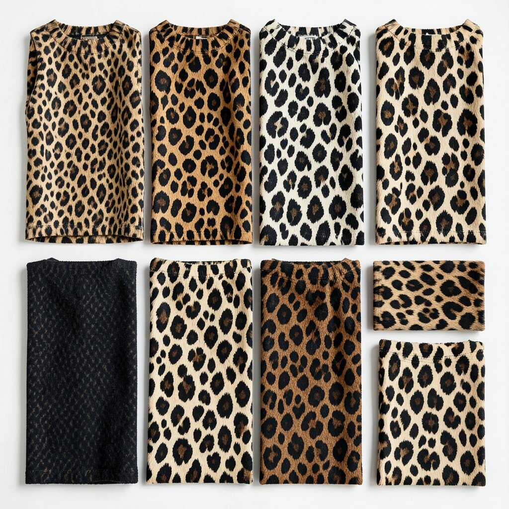
Animal prints can feel daring, but the trick is using them as accents instead of the whole outfit. Imagine a leopard-inspired cushion, a zebra-striped pouf, or a subtle giraffe pattern on a rug edge.
When you keep it to a small area, it adds warmth and personality. It also creates a focal point that makes solid furniture look more stylish.
Choose animal prints with a clear color base that matches your room, like tan, black, or deep green. Then balance it with smooth textures such as velvet, cotton, or boucle so the pattern feels rich rather than loud.
If you’re worried about cost, swap to small decor items like coasters, a lamp shade liner, or a single picture frame mat. You’ll get the look without committing to a full set.
11. Classic Herringbone Balance
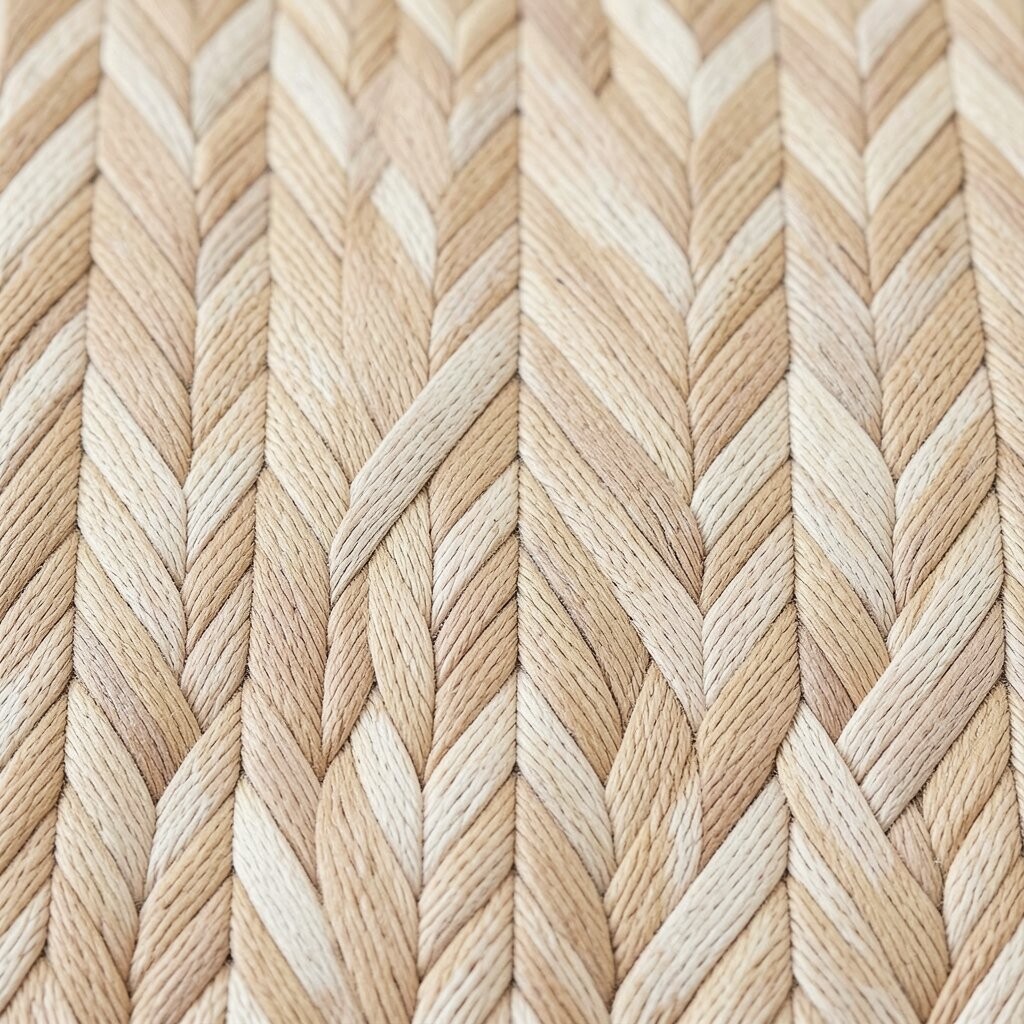
Herringbone feels structured but not stiff, like a neat design that still lets you breathe. You’ll often see it in blankets, rugs, and textured wall hangings that catch light from different angles.
This pattern adds sophistication and makes a room feel put together. It also works as a bridge between styles, because it can look modern in one lighting and cozy in another.
Use herringbone on larger surfaces like rugs or duvet covers when you want a steady visual rhythm. Pair it with simple stripes or plain solids so the pattern stays the hero instead of getting crowded.
For personalization, choose herringbone colors that echo your wood tones and metal finishes. Warm browns and creams look inviting, while cooler grays can feel crisp and clean.
12. Whimsical Starry Confetti
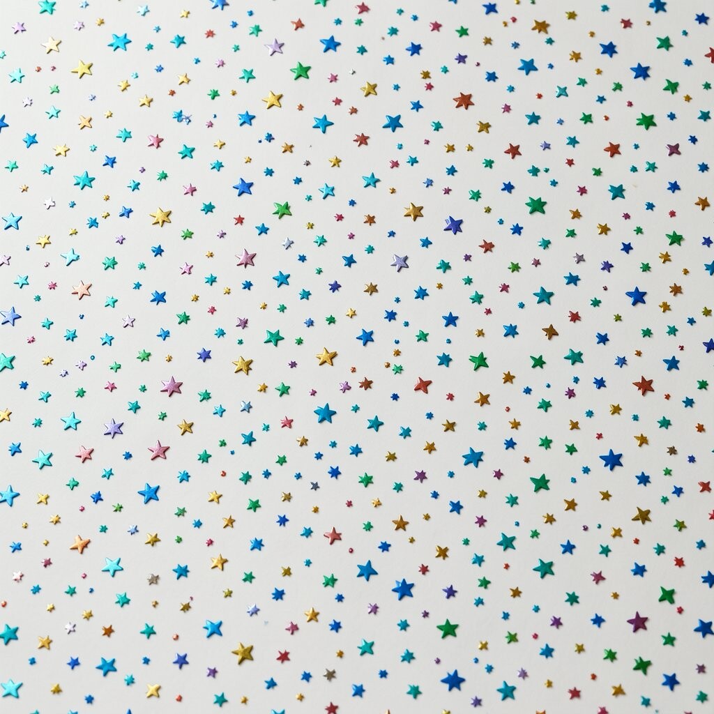
Stars and confetti patterns add a playful sparkle to your space. Picture tiny points of light scattered on fabric, wallpaper, or a gallery wall of prints.
Stars can make a room feel magical, especially in kids’ rooms, creative studios, or cozy corners. They also brighten visual mood because the pattern has lots of tiny contrast points.
To avoid looking cluttered, keep the rest of the decor minimal and let the star pattern do the work. Use solid bedding and plain frames so your eye isn’t bouncing all over at once.
13. Calming Moroccan Tile Motifs
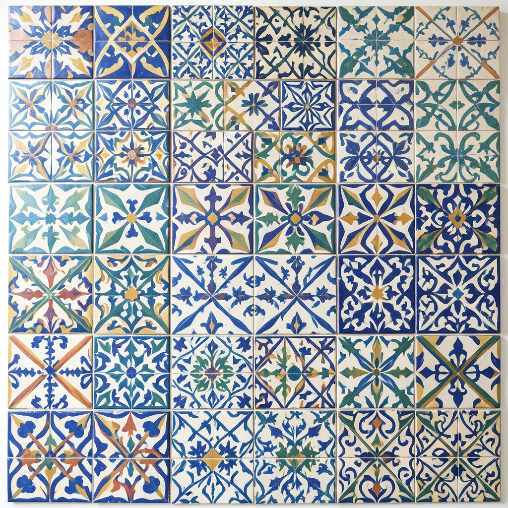
Moroccan-inspired patterns bring a mix of symmetry and personality. Imagine interlocking shapes that feel like tile work, often in warm whites, terracotta, and deep accents.
This kind of pattern can make a room look carefully designed even when the styling is simple. It also helps define zones, like turning a living area into a cozy destination.
Try a Moroccan tile pattern on a rug or a single wall hanging, then repeat one color in small items like candles or a bowl. The repetition keeps everything harmonious and makes the room feel less random.
If you’re setting a budget, consider removable options like peel-and-stick tiles for a small area. You’ll get the visual impact while keeping the cost under control.
14. Fresh Linen Weave Checks
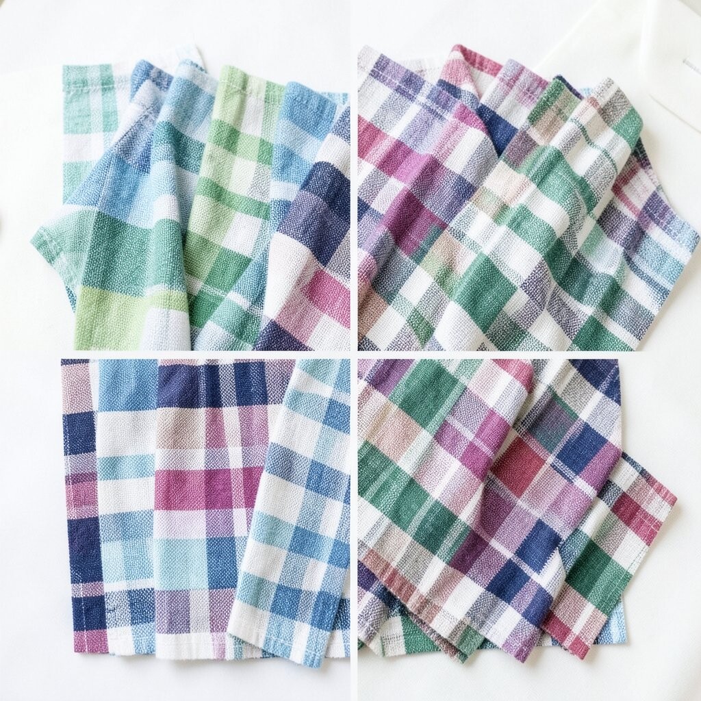
Checks can look surprisingly bright when they’re light and woven. Think of linen weave patterns in soft neutrals, subtle contrasts, and a relaxed texture you can almost feel through the fabric.
This pattern collection adds comfort, and it’s easy to style with almost anything. Because the colors are gentle, it won’t fight with your art, plants, or furniture.
Use check patterns on curtains or table textiles for everyday charm. For a practical approach, stick to smaller checks if you want the room to feel airy and larger if you want more drama.
Personalize by matching the check tones to your throw colors and your favorite blanket. When your textiles echo each other, your space feels calm and naturally curated.
15. Modern Grid Line Precision
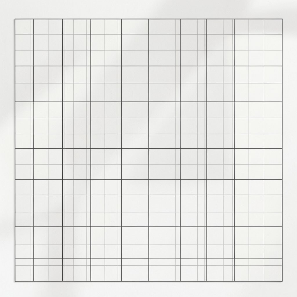
Grid patterns give a clean, organized feel that can still look warm. Picture neat lines and thoughtful spacing that make a wall or fabric surface feel intentional.
This style is especially good for offices and living rooms where you want visual order. It also helps your room look brighter because straight lines reflect light in a crisp way.
Choose a grid that fits your furniture scale, like a finer grid for small decor and a bolder grid for large walls. Pair it with soft curves in your accessories so the overall look stays inviting.
16. Trendy Retro Wave Repeats
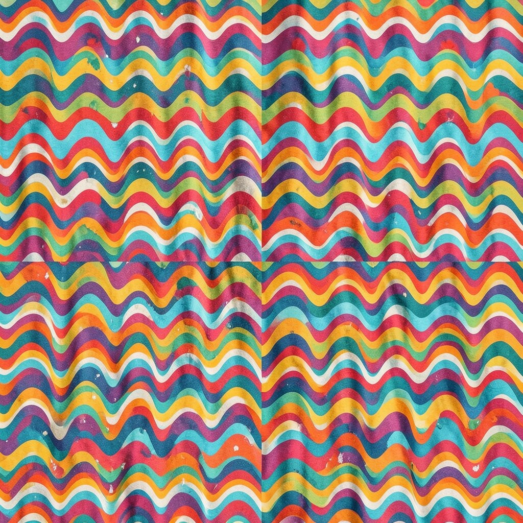
Retro wave patterns bring a playful rhythm that feels instantly current. Imagine flowing curves, stacked in layers, with colors that nod to past decades while still looking fresh.
Wave repeats can energize a room and add movement, which is why they’re popular in trend-focused decor right now. They also work beautifully with neutral furniture because the pattern becomes the star.
Style it by choosing one wave piece, such as a statement rug or a set of matching cushions, then keep the rest mostly solid. For personalization, repeat a single wave color in your artwork or a decorative tray so the room reads like one story.
On cost, consider using the wave pattern on removable items first, like pillow covers and wall art. That way you can enjoy the trend while you decide how far to go.