Hallways are the first thing you notice when you step inside, so they deserve a little visual care. Minimalist black and white art can make the space feel brighter without overwhelming it.
With the right pieces, your hallway can look neat, calm, and full of personality at the same time. The best part is how easy it is to mix styles and update the look over time.
1. Graphic Line Drawings in Simple Frames
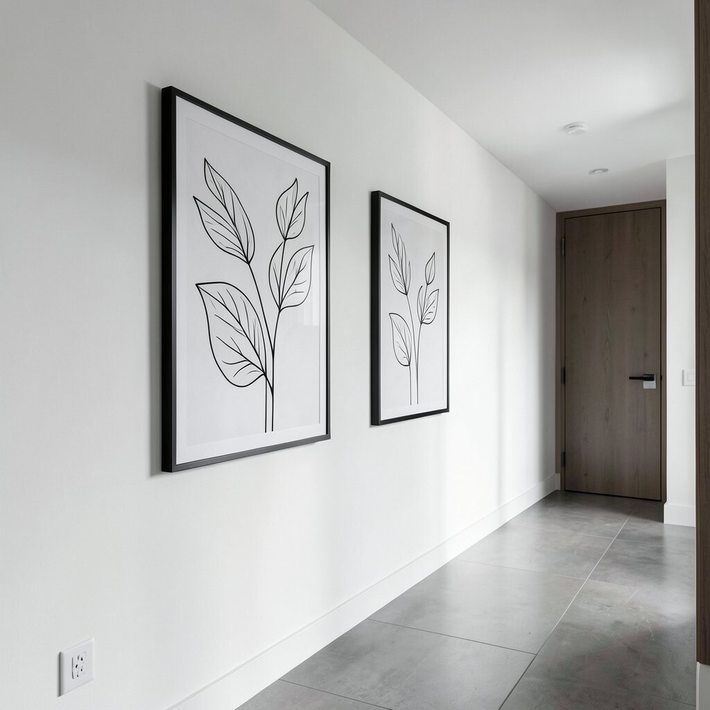
You can brighten your hallway with black and white line drawings that feel light and airy. Look for art that uses thin strokes, clean angles, and plenty of white space, so your walls still “breathe.”
Choose matching frames in matte black or warm wood with a black-and-white mat so everything looks intentional. Hang one larger piece at eye level, then add two smaller drawings side by side to balance the wall.
2. Oversized Typography That Feels Like Design
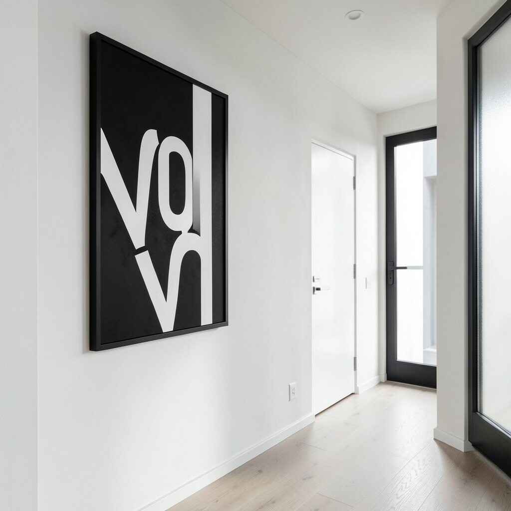
Bold typography can turn a narrow hallway into a modern gallery without adding clutter. Pick a single word or short phrase in a minimalist font, and keep the background bright and simple.
Position the typography piece near a doorway or above a slim console to guide the eye forward. If you want it to feel personal, use a family name, a favorite motto, or the year a place became “home.”
For a cost-friendly option, print your design on quality paper and use a store-bought frame. This is also a great way to follow current trends toward text-based wall styling and graphic clarity.
3. A Set of Mirrored Geometric Prints for Depth
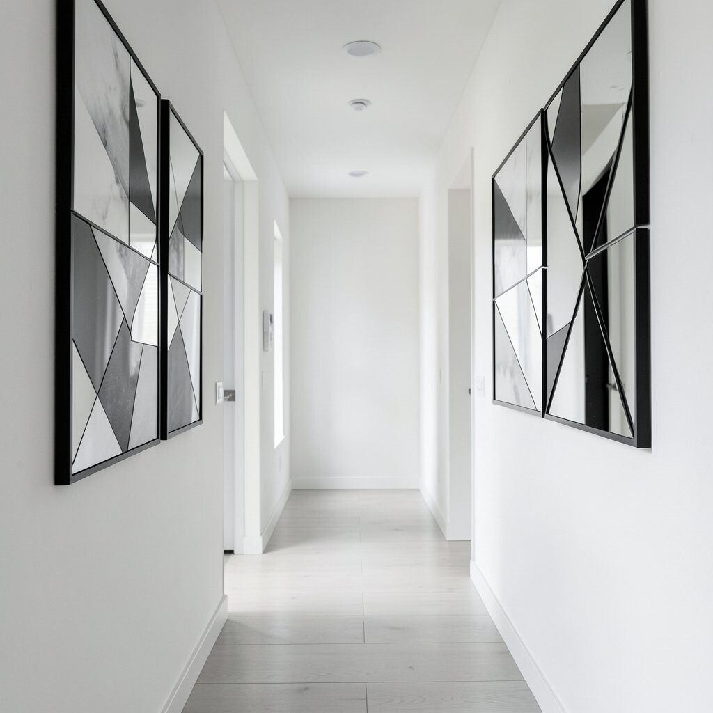
Geometric prints in black and white can make a hallway look deeper, even if it’s narrow. When you choose repeating shapes, like triangles or arcs, the pattern creates movement without visual noise.
Try grouping three or five prints with matching spacing so the layout feels clean. Use a mix of sizes, but keep the same style and line thickness for a unified look.
To personalize, pick a geometric theme that matches your life, such as music notes in angular form or mountain-inspired triangles. If you’re working on a budget, many artists sell digital print downloads that you can frame quickly.
For practical placement, measure the wall first and leave a small gap between pieces so the hallway stays easy to walk through. Keep the colors strictly black, white, and maybe one soft gray for a polished finish.
4. Minimal Portrait Silhouettes in Tall Format
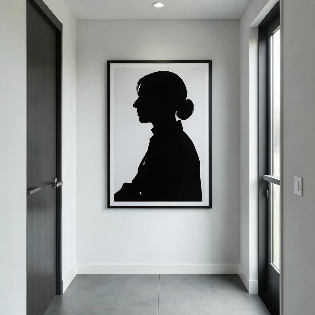
Single-subject silhouettes add personality while keeping the look quiet and elegant. A tall portrait in black on white can make a hallway feel more stately, especially when your ceiling is higher.
Choose a style that matches your home, from classic profile outlines to modern abstract figures. Hang it vertically near a mirror so the silhouette and reflection create a clean “double moment.”
If you want it to feel personal, use a silhouette of someone you love or a simple outline inspired by your favorite hobby. For cost control, look for vinyl wall decals or downloadable silhouette prints that you can frame later.
5. Monochrome Photo Strips with a Vintage Vibe
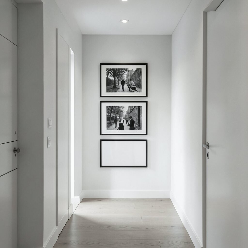
Black and white photo strips can brighten a hallway by adding warmth and memory. Even a simple row of small frames can look stylish when the photos share a similar tone.
Stick with a tight theme, like city scenes, old family snapshots, or nature close-ups, so the set looks cohesive. Leave a consistent gap between frames to keep the arrangement tidy.
For a unique touch, include one photo that’s slightly larger, such as a meaningful landmark or a favorite pet. If you’re trying to stay within a budget, print photos from your phone, then use thrifted frames after a quick paint refresh.
This approach also fits current trends in gallery-style walls that use mixed sizes but consistent color. As you update over time, you can swap in new photos without replacing everything.
6. Scandinavian-Inspired Posters with Plenty of White Space
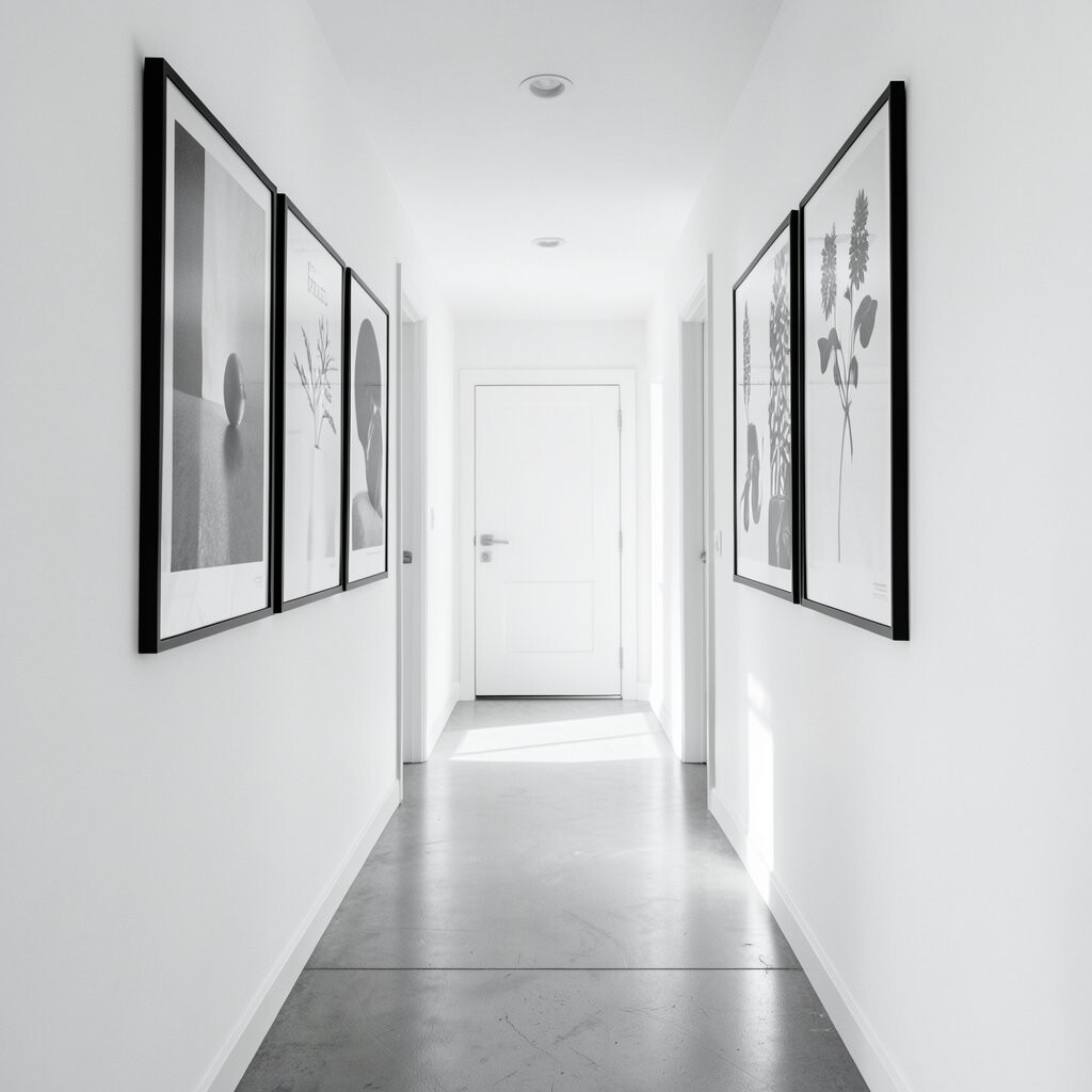
If you love calm interiors, Scandinavian-inspired posters are a great fit. They usually feature simple shapes, soft typography, or clean illustrations in black and white with lots of empty space.
Choose one statement poster and anchor it near eye level, then soften the look with a small frame on each side. This keeps the hallway bright because the artwork doesn’t crowd the wall.
To personalize, select prints related to your routine, like coffee culture, cozy sketches, or travel maps rendered in minimal lines. Many modern sellers offer these styles in budget-friendly sets, and you can often find sales during seasonal decor shifts.
For practical tips, avoid glossy finishes in a hallway with bright light, because glare can hide the details. Matte paper and simple frames usually look the cleanest.
7. A Single Large Abstract Ink Splash for Drama

Sometimes one piece is all you need to make a hallway feel instantly upgraded. A minimalist abstract ink splash in black and white adds energy while still staying monochrome.
Pick an artwork with clear edges or controlled splatter so it doesn’t feel chaotic. This lets the piece stay modern and intentional instead of messy.
Hang it above a console, bench, or narrow table so it feels like the room’s centerpiece. If your hallway gets a lot of light, use a frame with UV protection or keep the art slightly shaded by decor lighting.
To personalize, choose an abstract style that matches your taste, like bold strokes for a lively home or softer drips for a calmer mood. Many print studios offer different sizes, so you can go oversized without spending on original pieces.
8. Bathroom-Ready Black and White Patterns for Any Wall
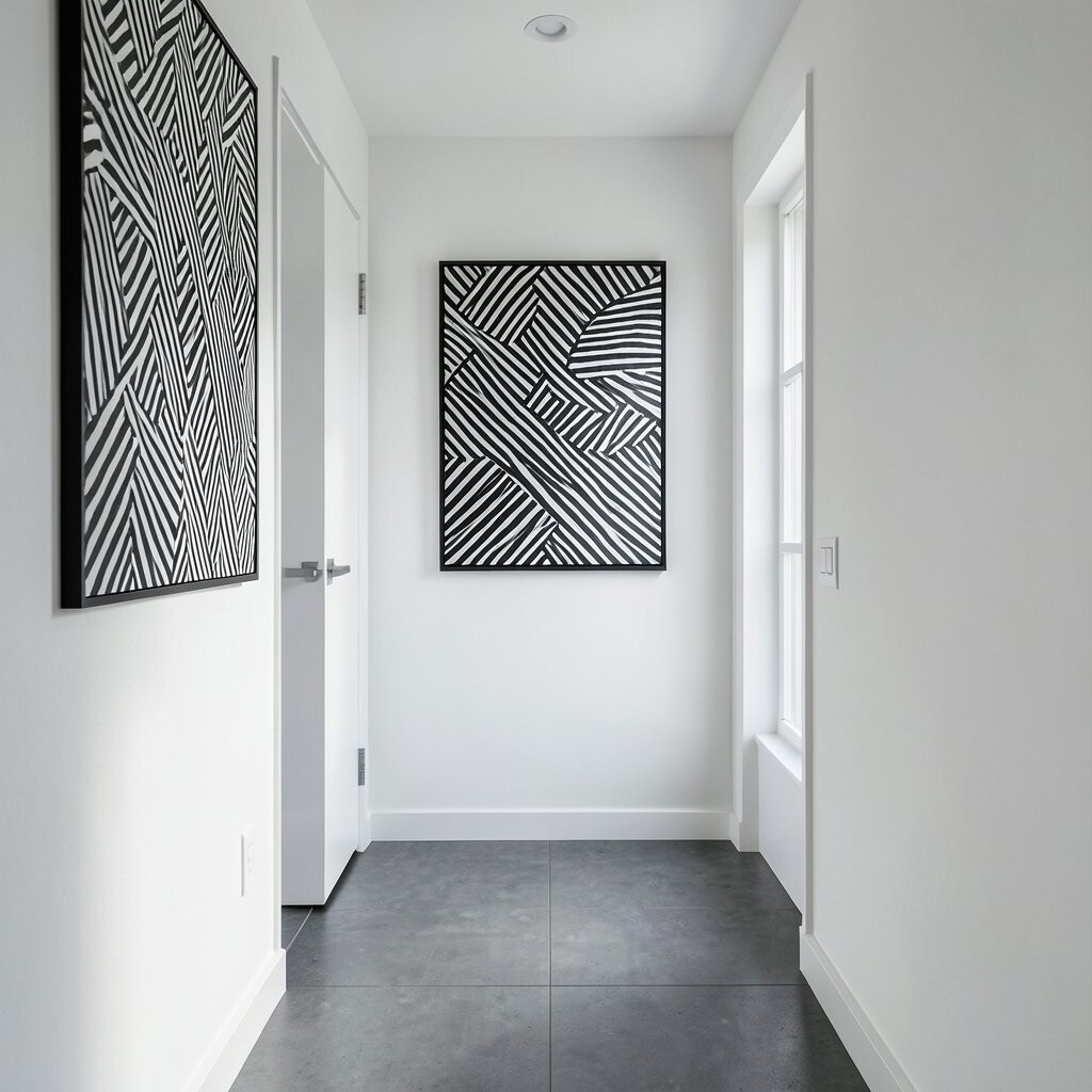
Even if your hallway connects to wet areas, patterned art can work beautifully when it stays minimalist. Think of subtle stripes, tiny crosshatches, or simple repeating motifs that feel crisp and clean.
Use a single pattern print in a thin black frame, or create a tidy grid with two to four matching pieces. A repeated motif brings structure, which helps smaller hallways feel more organized.
Personalization is easy because you can choose a pattern that reminds you of something, like music sheet lines or simple architectural grids. If you want a lower cost, look for fabric-like print designs that are sold as poster sets.
For practical placement, keep patterned pieces higher on the wall so the pattern supports the walk path. This helps the hallway feel taller and less cramped.
9. Floating Shelf with Rotating Black and White Art Cards
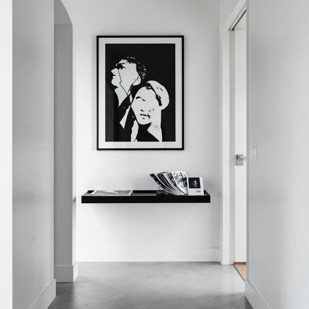
A floating shelf can brighten a hallway in a more flexible way than traditional wall art. Add a small line of black and white art cards, mini prints, or gallery cards, and swap them whenever you want a refresh.
The shelf approach also creates a layered look when you pair the cards with a few clean decor objects like a sculptural bookend. Keep everything monochrome so the shelf feels calm rather than busy.
To personalize, print your own cards using your favorite quotes, sketches, or tiny photos converted to black and white. This is a smart move for people who like to update decor with the seasons without buying brand new frames.
Budget wise, it’s usually cheaper than buying large pieces repeatedly. It also keeps you aligned with the current trend of rotating, mix-and-match mini displays.
10. Black and White “Target” Circles for a Clean Focal Point
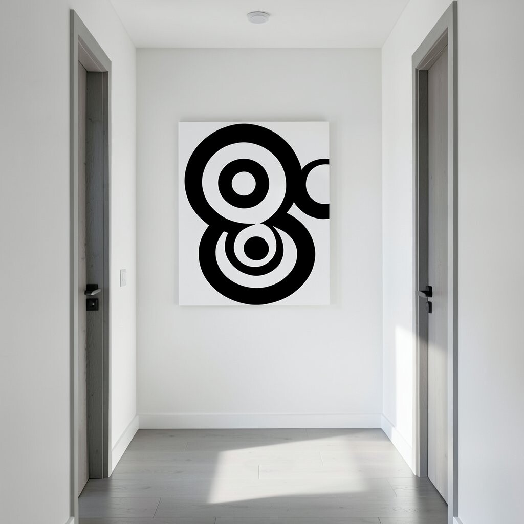
Circular designs can bring a friendly rhythm to a hallway because circles soften straight lines. A minimalist target pattern, made of thin rings, can feel modern and surprisingly calming.
Choose one centered print rather than many separate ones if your hallway wall is small. Center it on the wall or align it slightly above the console so the circles guide the eye forward.
For personalization, vary the ring spacing to match your home’s vibe, such as tight spacing for a sleek feel or wider spacing for a relaxed look. You can also mix one circle print with a line drawing in the same frame color for contrast.
Cost considerations are good here because many circle designs are available as affordable prints. If you want a premium look, spend a bit more on a thicker mat and a simple gallery frame.
11. Minimalist Map Prints in Monochrome Ink Style
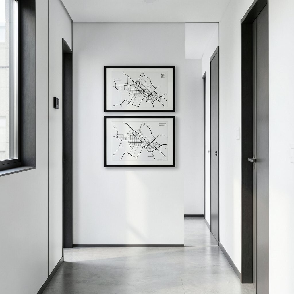
Map art is a sweet way to add meaning while keeping the look clean. In black and white, a simple map print can suggest travel memories, hometown pride, or a route you love.
Pick a small section map for subtlety, like a neighborhood or a key city landmark, instead of a full world map. This keeps the art from feeling overwhelming in a hallway.
Personalization is built in because you can choose a location tied to your story. For practical results, match the map’s style with other elements in the hallway, such as frame thickness and font size.
If you’re watching costs, consider printing a map version at home from an online template, then framing it in a standard size. It’s a trendy style right now because people love “meaningful minimalism” that feels both modern and sentimental.
12. High-Contrast Abstract Trees and Botanical Silhouettes
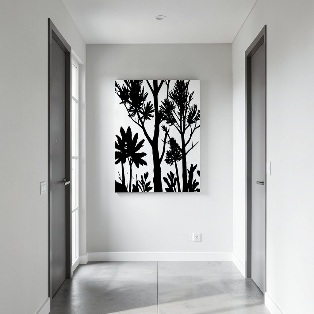
Botanical silhouettes can make a hallway feel fresh while staying minimalist. Choose tree branches, leaf shadows, or simple plant forms rendered in crisp black against a white background.
Place the artwork vertically to make your hallway seem taller, especially if you’re working with a long wall. The organic shapes also soften the feel of doors and corners.
To personalize, pick a plant that connects to your life, like a favorite garden flower or a symbol from your culture. You can find many prints with gentle linework that look expensive without needing a big budget.
For a practical tip, avoid artwork with too many tiny details if your hallway lighting is dim. Larger, bold silhouettes read well from the doorway and keep the space looking sharp.
13. Split-Image Pair Prints for a Modern Conversation
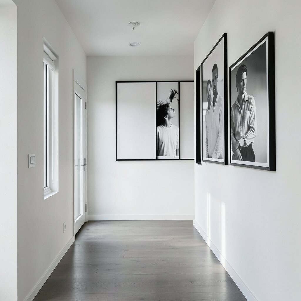
A split-image pair can make your hallway look designed, like two artworks “talking” to each other. Look for prints that share a theme, such as two halves of a landscape, two matching patterns, or complementary abstract shapes.
Hang them with perfect alignment so the center gap feels intentional. If you have a longer hallway, place the pair roughly where you’d stand for a quick look, then let the rest of the corridor support it.
Personalization can happen by choosing two prints that connect to your home, like a night view and a day view or two favorite artistic styles. You can also order custom prints if you want to include your own photos turned into minimalist black and white.
In terms of cost, paired prints are often sold as ready-to-frame sets. This helps you keep the spending predictable while still getting a high-impact look that feels current.
14. Monochrome Typographic Grids with a Clean Layout
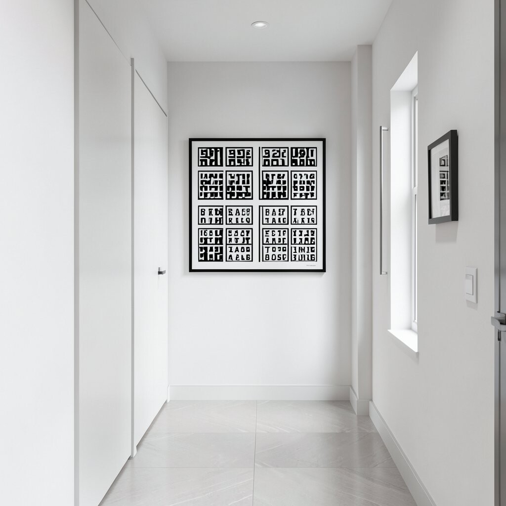
A typographic grid brings structure to a hallway and makes the space feel like a curated studio. Think of neat columns of short words, symbols, or small phrases all in black and white.
This style works especially well when your hallway has a plain wall and you want something that looks orderly. Keep the font consistent and choose a poster or print that uses a lot of negative space for a bright feel.
To personalize, use a grid that includes family initials, meaningful dates, or short values like “calm,” “home,” and “together.” You can even add a tiny row of words that match the names on your mailbox or door area.
For practical tips, measure the wall width so the grid doesn’t feel squeezed. If you’re keeping cost in mind, printable templates make it easy to create a tailored design without paying for a custom print every time.
Monochrome grids also match current design trends that favor minimal layout, crisp typography, and gallery-ready composition. With the right frame, this piece can look polished for years.