Your alcove can feel like a quiet stage waiting for a spotlight. The right patterned tile mosaic adds color, rhythm, and personality in a way paint simply can’t match.
1. Sunburst Micro-Mosaic in Warm Sand Tones
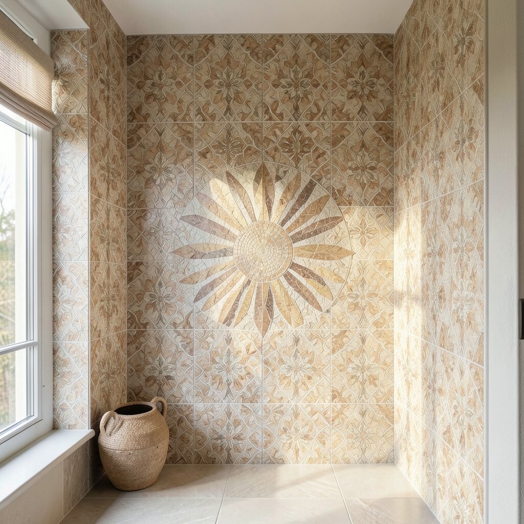
A sunburst motif radiating from the back wall can make a small alcove feel taller and brighter. Imagine tiny tiles forming crisp rays that catch light and give the space a gentle glow.
Pick a sand, cream, and honey palette so the pattern stays cozy instead of loud. Use grout in a similar warm shade to keep the rays clean and to help your design look tidy from every angle.
2. Moroccan Lattice with Teal and Terracotta Accents
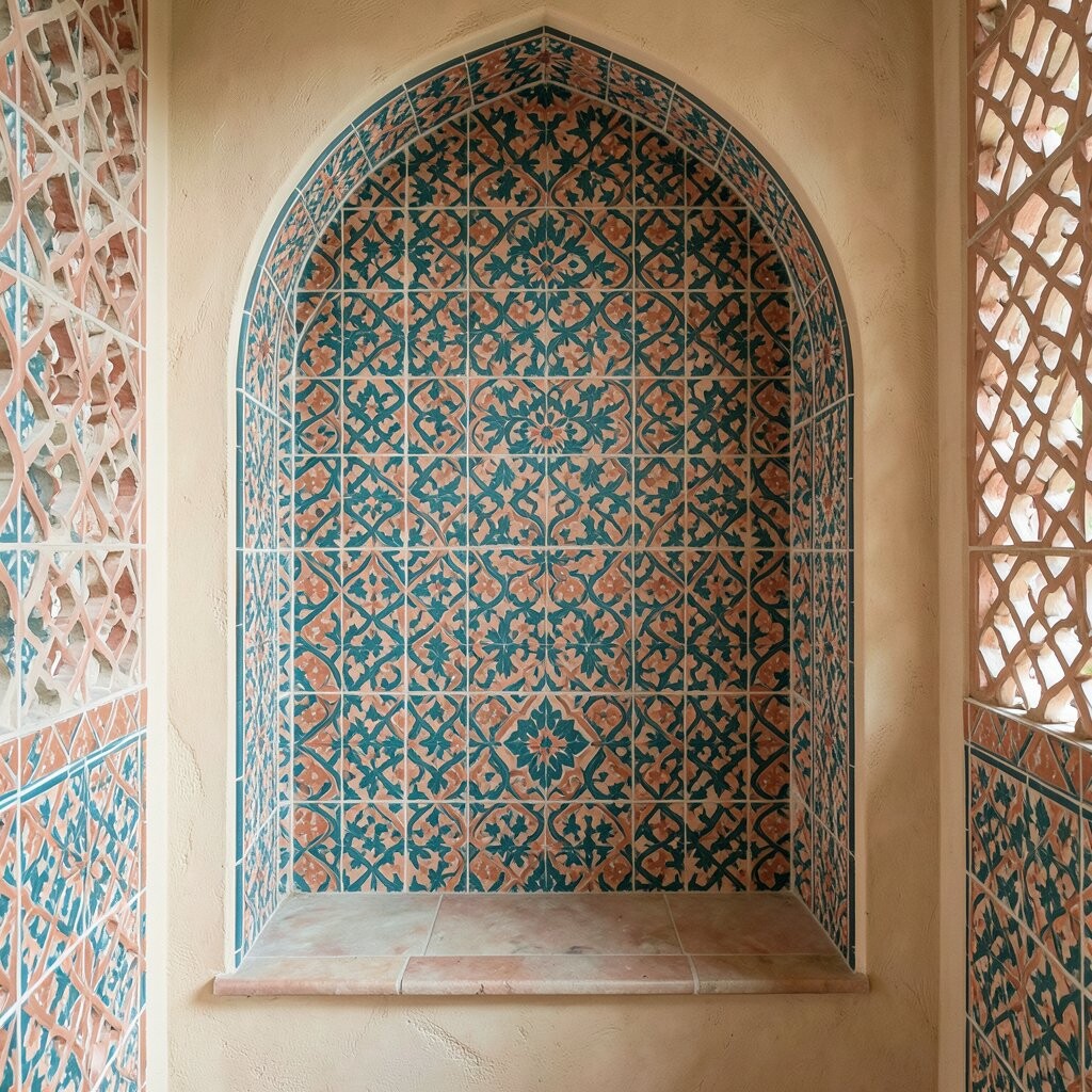
Moroccan-style lattice patterns bring an instantly charming feel, like a design you might find on a handmade ceramic plate. The grid-like lines frame the alcove so your eye moves across the wall and then rests comfortably.
Choose a base of warm terracotta tiles and add teal accents in the corners and key intersections. For practical results, install the pattern with pre-cut mesh sheets so the curves and angles stay consistent.
To keep costs under control, reserve the most expensive colored tiles for the focal lattice points and use simpler neutral tiles for the rest. If you want extra personalization, add a thin metallic-look tile border that mimics worn brass and makes the alcove feel more collected.
3. Arched Waterfall Mosaic with Soft Blues and Grays
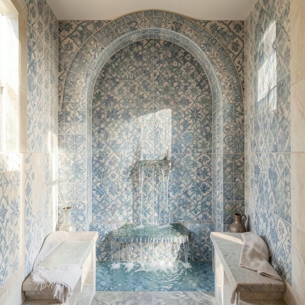
An arched “waterfall” pattern looks elegant and calming, almost like ripples frozen in time. Small tiles stacked in curved lines create motion, so the alcove feels alive even when nothing is on display.
Try a gradient from pale blue to slate gray to imitate shaded water and depth. Use a matte tile finish if you want the pattern to feel relaxed, while a lightly glossy tile can bounce light for a brighter effect.
Measure your alcove height and plan the arc so the curve hits the same visual point on both sides. If you’re working around a shelf ledge, keep the lower edge aligned with the ledge so the design looks intentional instead of cut off.
For a budget-friendly approach, use larger tiles for the field and smaller tiles only for the waterfall curve. That mix keeps the intricate look without turning every square inch into a premium material.
4. Geometric Confetti with Offbeat Shapes
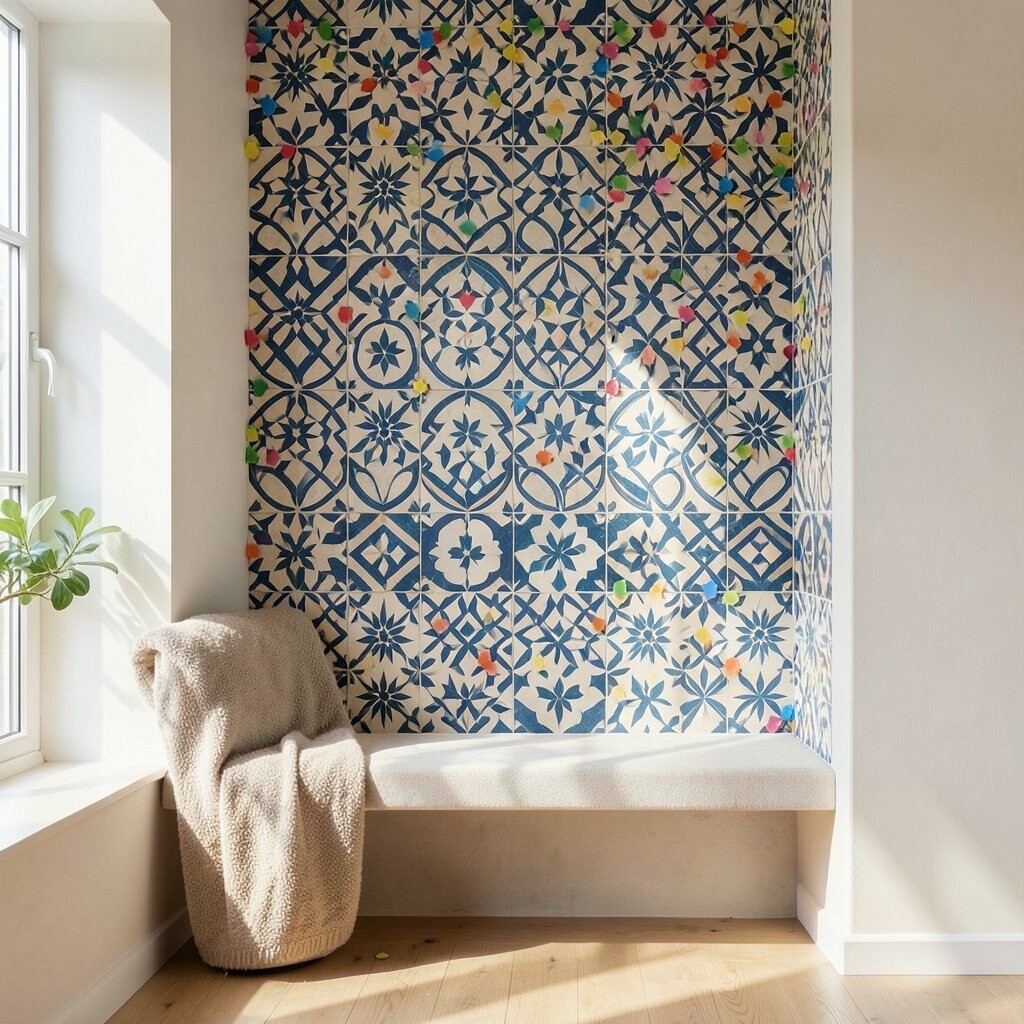
If you love playful design, scatter geometric “confetti” tiles across the back wall. Think of small triangles, tiny squares, and slivers arranged like a friendly burst of color.
Stick to a limited palette such as mustard, sage, and cream so it feels curated rather than chaotic. Use a grid layout and dry-fit your sheets first so you can adjust the spacing before anything sticks.
5. Classic Herringbone Frame Around a Quiet Center
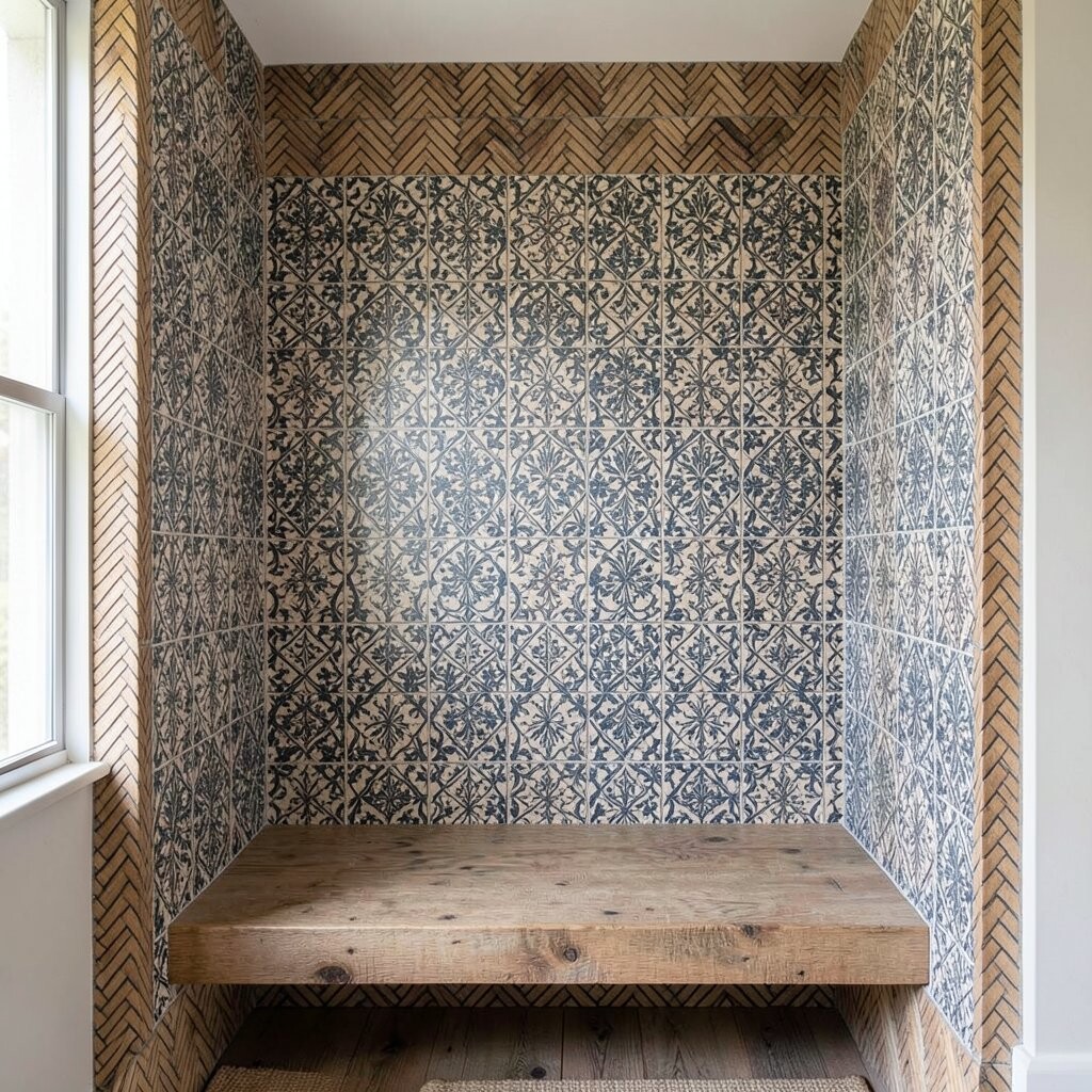
A herringbone frame gives your alcove structure, like a picture frame made from tile. When the herringbone runs along the edges and the center stays simpler, the whole space feels balanced and clean.
Choose a warm white or light stone tone for the center so your items on display look crisp. For the herringbone border, pick a slightly darker variation to create contrast without overwhelming the room.
To keep installation smoother, use herringbone sheets designed for walls and cut them only at the final corners. You can personalize by adding one narrow stripe of a brighter tile through the middle, like a subtle “signature” line.
6. Patchwork Botanicals with Leafy Micro-Details
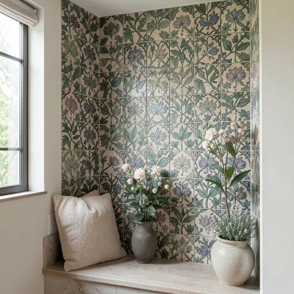
Botanical patchwork mosaics make an alcove feel fresh and welcoming. Leaf motifs can be subtle and repeating, or bold and clustered, depending on the mood you want.
Go with soft greens paired with warm neutral tiles so the pattern stays readable and calm. Include a few tiny accent tiles that resemble flowers, which adds charm without turning the wall into a busy collage.
When you choose grout, match it to the lightest tile so the leaf shapes stay crisp. If you want practical durability, opt for a tile system rated for moisture and washability, especially if the alcove sits near a kitchen or entry.
7. Art Deco Steps with Bold Lines and Brass-Like Highlights
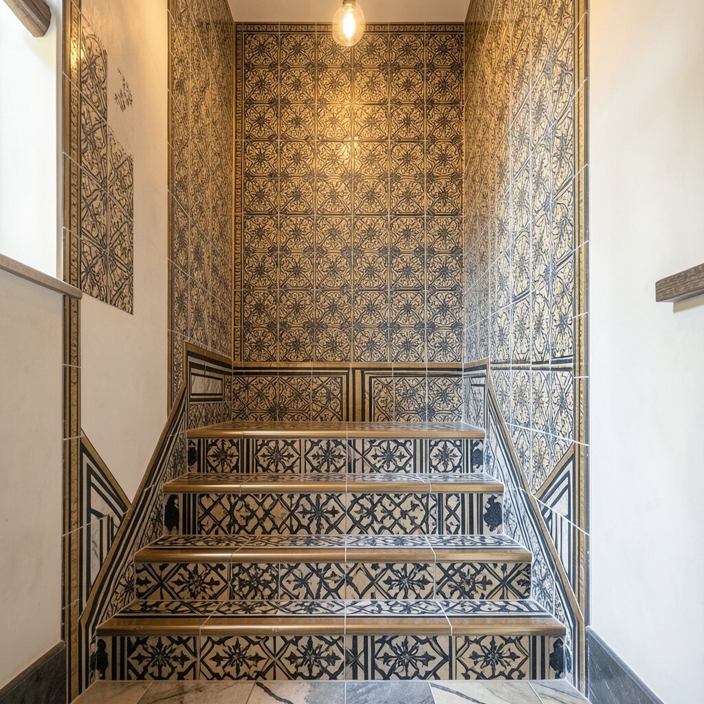
Art Deco tile patterns bring instant glamour with their stepped shapes and sharp lines. In an alcove, this style feels like a mini showpiece, especially when the pattern repeats symmetrically.
Use dark bases like charcoal or deep navy, then add lighter tiles in rhythmic bands. A thin strip of glossy, brass-look tile along the edges can mimic the shine of vintage hardware and elevates the whole design.
For a smoother build, keep the steps uniform in depth and spacing, then align them with the alcove’s center. If you’re working around lighting or shelving, plan the pattern so no step crosses awkward seams in a way that looks accidental.
To manage cost, use high-impact tiles only at the bands and keep the inner areas in simpler, less expensive shapes. That way you still get drama, but your materials budget stays grounded.
8. Coastal Wave Bands with Textured Seashell-Look Tiles
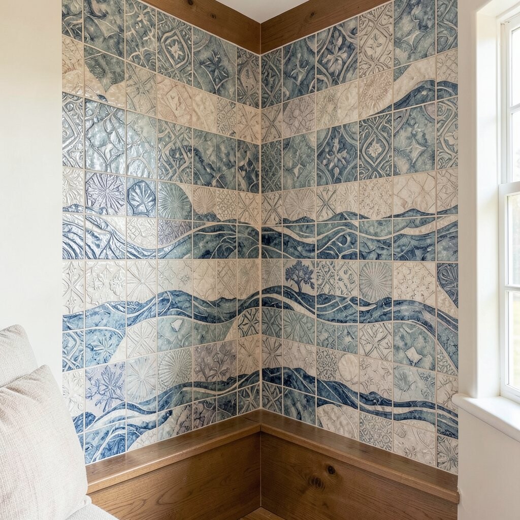
Coastal wave bands feel airy and inviting, like salty breeze in tile form. Textured tiles can add depth so the alcove looks dimensional, not flat.
Choose a blend of seafoam, pale aqua, and warm white to keep the colors bright. Use a darker grout for the wave lines so the pattern stays readable even from across the room.
Consider mixing smooth wave tiles with slightly raised tiles that resemble shells, but keep the texture consistent in any given band. That balance helps the alcove feel intentional and makes cleaning easier.
9. Oversized Medallion with a Detailed Inner Burst
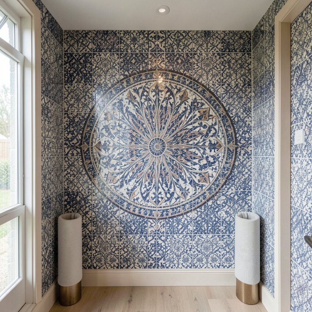
A medallion mosaic is a classic way to turn the back wall into a focal point. When you place it behind a small shelf or display, the design makes the alcove feel like it has a center stage.
Start with a large medallion shape and then add an inner burst pattern so the detail feels layered. Pick colors that match your room’s palette, such as warm creams with dusty rose, or cool grays with muted blue.
For personalization, use a color that appears in nearby decor, like a curtain tone or a plant pot finish. If you want extra character, include a few tiny “star” tiles in the inner circle to make the center sparkle.
Cost-wise, medallions can be pricey because detail tiles add up, but you can simplify the outer ring and reserve intricate micro-tiles for the inner burst. That keeps the look rich while controlling the overall spend.
10. Monochrome Marble-Look Mosaic for Quiet Luxury
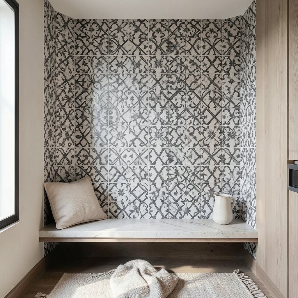
If you prefer a calm look, a monochrome marble-look mosaic gives a soft, expensive feel. The veining pattern can add movement without loud colors, which is great for modern or minimal rooms.
Pick one main tone, like soft gray or warm ivory, and allow the tile variation to do the design work. Keep grout either close in color or slightly darker to emphasize the tile seams.
This style is uniquely practical because it coordinates with many furnishings and doesn’t fight your decor. For a personalization twist, add a thin border of the same marble-look tile but with a different veining direction so the alcove still feels special.
11. Rainbow Gradient with Gentle Color Blocking
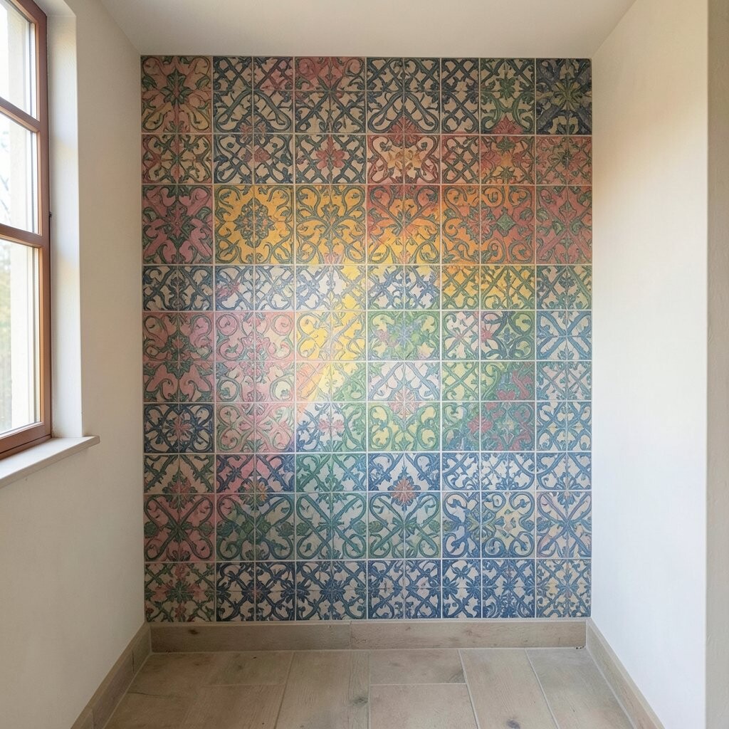
A rainbow gradient mosaic can brighten an alcove fast, especially in corners that tend to look dim. Color blocking makes it easier to plan than a full pattern, while still giving you that vivid, lively mood.
Use a smooth progression such as coral to peach to cream to sky blue, then repeat the gradient in narrower bands. Keep the shapes large enough that your eyes can enjoy the colors without feeling overwhelmed.
To make installation easier, you can use pre-cut strips or grouped tile sheets aligned in horizontal or vertical sections. Choose grout in a neutral cream to help the color blocks look clean and polished.
12. Celtic Knot Frame with Warm Earthy Greens
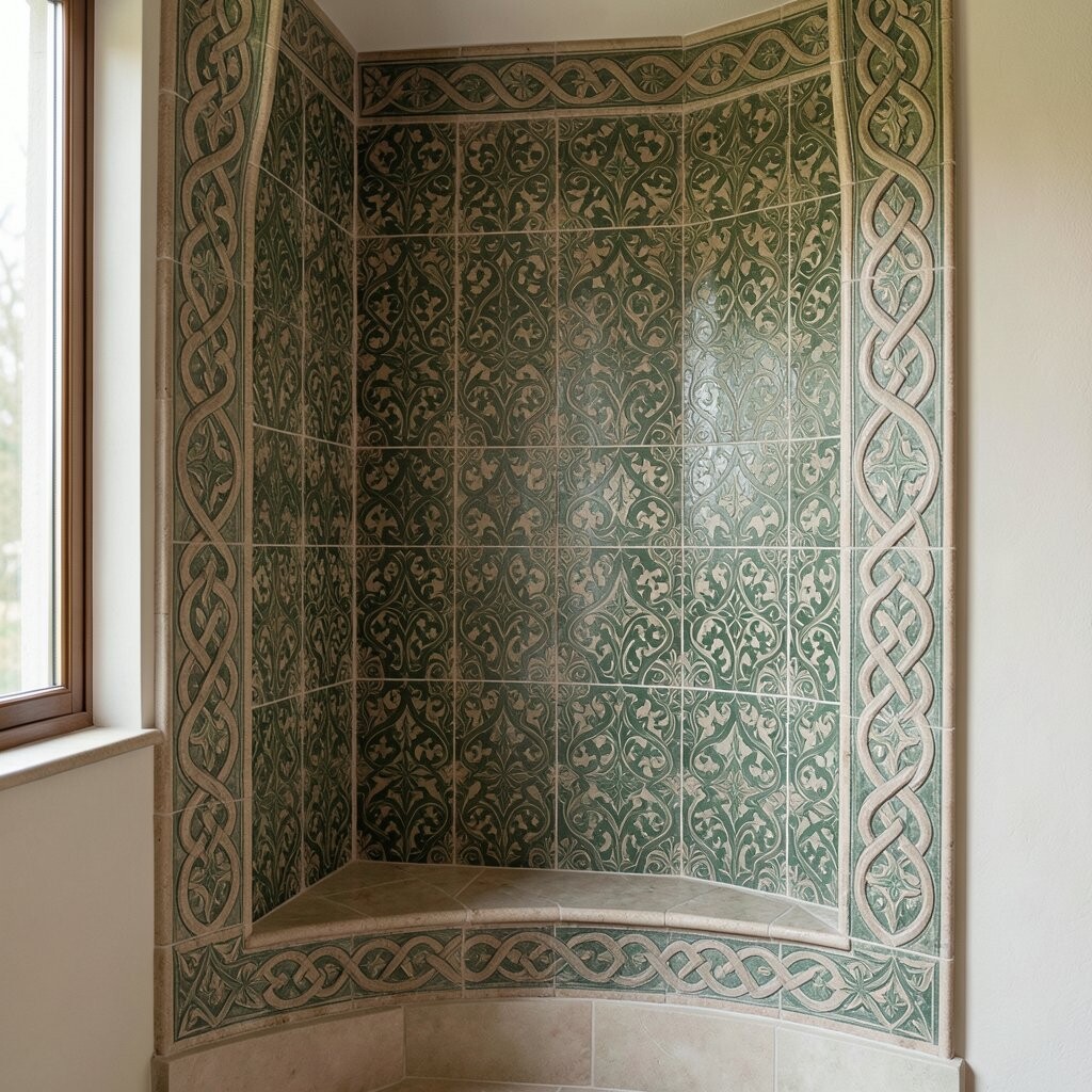
Celtic knot patterns bring timeless energy and a sense of weaving, which makes an alcove feel crafted. The looping lines create a visual flow that pairs well with plants, books, or framed art.
Use earthy green tones combined with tan and cream tiles for a grounded look. Add a deeper green accent at the knot intersections so the design reads clearly.
When you lay out the knots, keep the lines symmetrical so the pattern feels balanced. If your alcove has a shelf, plan the knot’s center so it sits above or behind the shelf opening, not half-hidden.
For cost considerations, you can use a standard green tile for the main field and reserve the most detailed knot tile pieces for the outer ring. That approach keeps the look intricate while cutting down on premium pieces.
13. Starry Night Sky Using Deep Indigo and Speckled Tiles
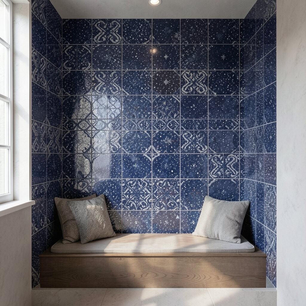
A starry night mosaic can turn an alcove into a cozy mood board. Deep indigo tiles set the scene, while speckled or glitter-look tiles scattered like stars make the wall feel magical.
Choose one or two star colors, such as silvery gray and pale blue, so the effect stays sophisticated. Mix in a few larger “constellation” tiles to help your eyes follow the pattern and avoid feeling like random dots.
For practical tips, use a grout color close to indigo so the gaps don’t look harsh. If the alcove is near a window, consider matte tiles to reduce glare and keep the “night sky” feeling soft.
To personalize, repeat a small symbol you love, like a gentle swirl or a minimal star shape, using a single accent tile. It’s a small detail that makes the design feel like it belongs to you.
14. Minimal Calm Squares with a Single Intricate Border
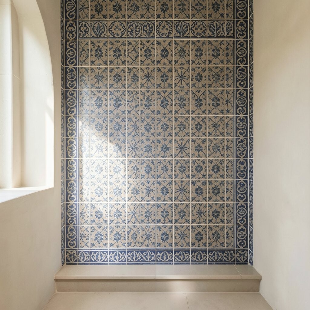
Sometimes the most striking mosaic idea is the one that saves detail for one perfect moment. A field of simple square tiles can let a single intricate border shine like jewelry around your alcove.
Pick a neutral base such as soft white or light stone, then add a border of micro-tiles in a contrasting color. You can choose a repeating motif such as tiny diamonds or a delicate geometric chain so the border feels crisp and intentional.
This setup is uniquely budget-smart because it limits the amount of detailed tile work while still giving you that wow factor. Personalize by matching the border color to a nearby accent, like a rug tone or a painted trim, so the alcove blends in beautifully.
When you plan the border thickness, keep it consistent on all sides and align it with the alcove edges for a clean finish. Use pre-matched tile sheets for the border if you want faster installation and fewer layout headaches.