Your walls can look calm, confident, and personal without feeling crowded. Small choices add up to artwork that feels finished, not accidental.
1. Start With One Clear Style Mood
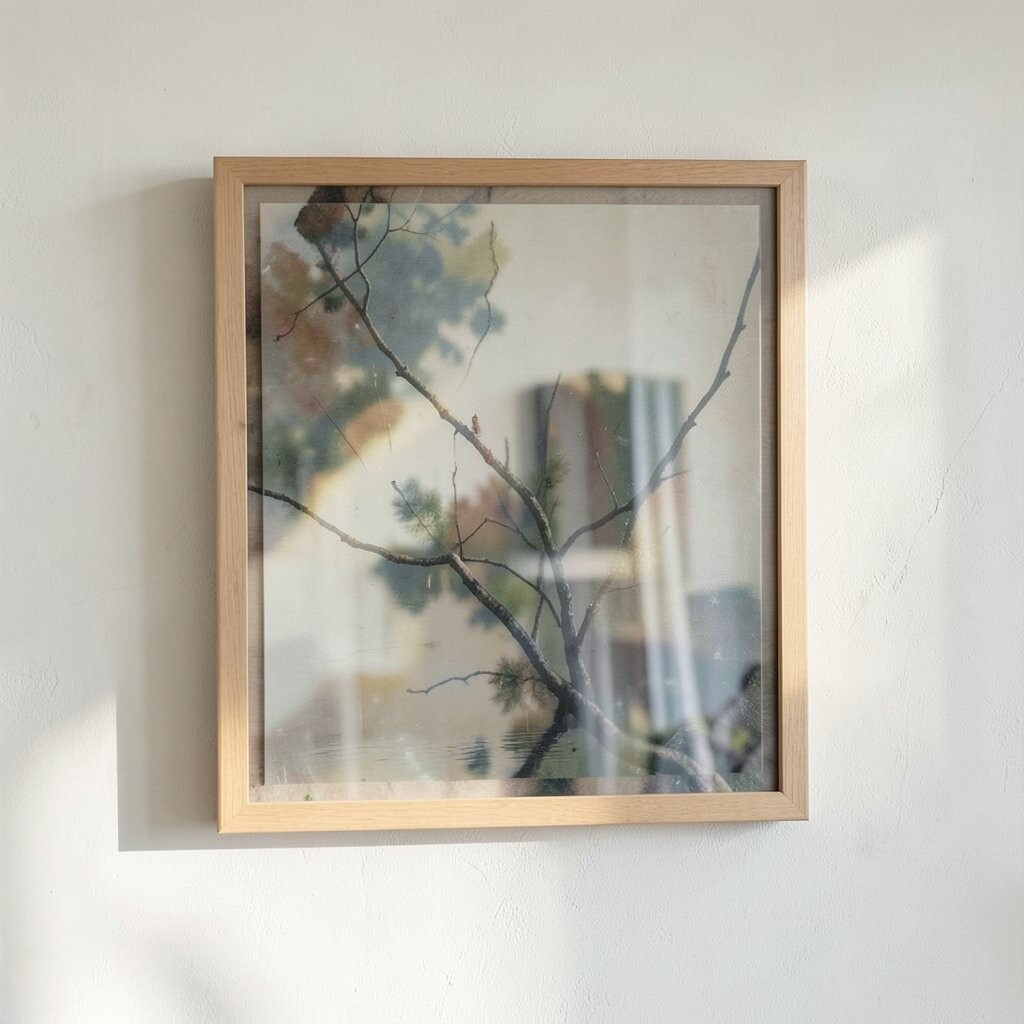
Choose a style mood before you buy supplies or print images. Pick words that match how you want the room to feel, such as airy, cozy, crisp, or warm.
Then narrow it down by looking at your space like it is a giant puzzle. Notice the biggest visual signals already in your home, like the wall color, your couch tone, and the metal finishes on lamps. When you match your art to those signals, your wall instantly looks more refined.
2. Use a Color Palette That Ties the Room Together
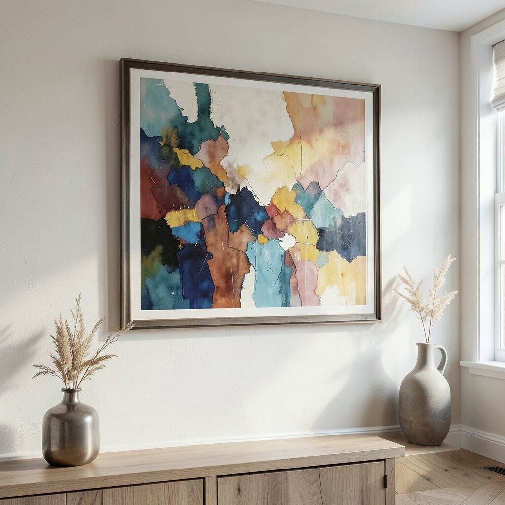
A refined wall art look often comes from a simple color plan. Choose a palette of a few colors and let them repeat across pieces.
Try pulling colors from everyday items you already own, like throw pillows, books, or a favorite mug. Limit bold colors to accents so the overall wall still feels balanced.
For example, if your room has soft neutrals, add artwork with muted blues, warm browns, or gentle greens. You will get a “put-together” feeling without spending a lot on new decor.
3. Pick the Right Scale for the Wall Space
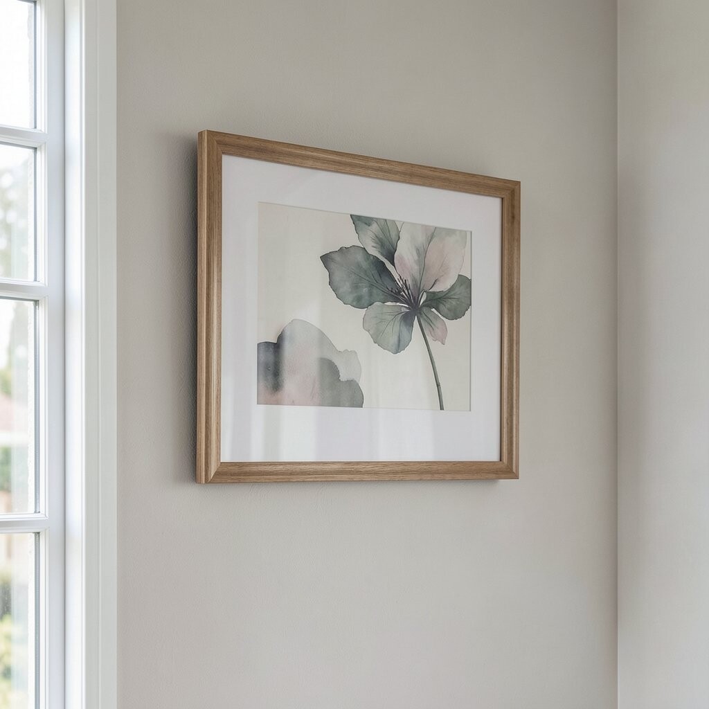
Artwork that is too small can feel like it is lost, even when it is pretty. Artwork that is too large can overpower the room and compete with furniture.
Measure your wall or at least compare the art size to nearby pieces. If you are placing art over a sofa, a general guide is to aim for a width that feels close to the furniture width.
When in doubt, choose one larger focal piece instead of many tiny ones. You can always add smaller pieces later once you know what your space needs.
4. Plan the Layout Before You Hang Anything
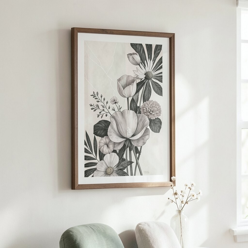
A neat layout is the hidden secret behind refined wall art. Before you nail anything, lay the pieces out on the floor or tape them to the wall.
Use masking tape to test spacing and alignment so you can adjust easily. Keep the visual flow steady, and try to create one clear center point in a gallery wall.
Pay attention to how your eyes move from piece to piece. If one item feels like it breaks the pattern, swap it out or resize it for better balance.
5. Choose Frames That Look Consistent
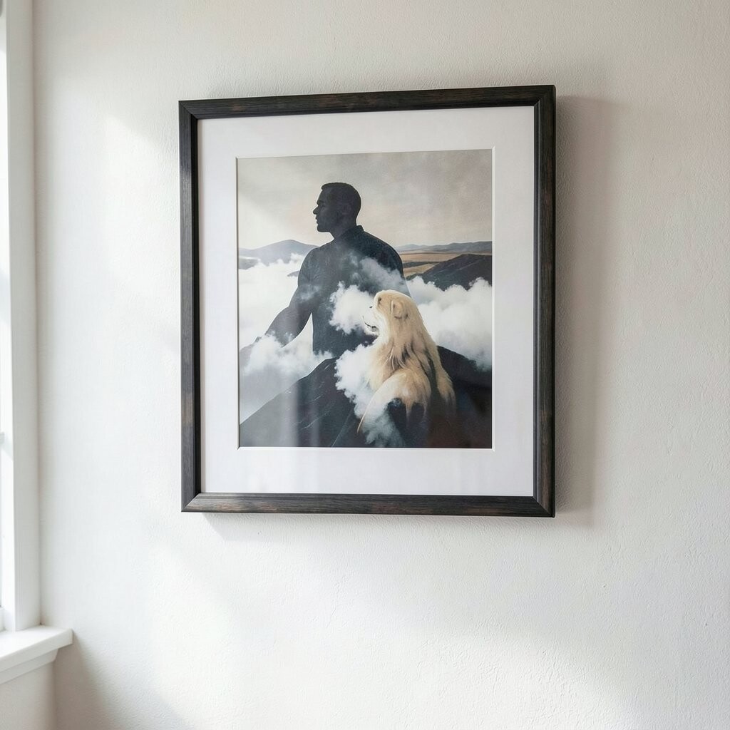
Frames can make inexpensive art look high-end when they match the room. Pick one frame color or finish and repeat it across all pieces where it makes sense.
Simple black, warm wood, or soft white frames often look refined with many styles. If your room has brass accents, consider frames with a gentle golden tone so everything feels linked.
You can also upgrade the look by choosing matte over glossy glass, since it reduces glare and keeps the art looking calm.
6. Let One Element Be the Star
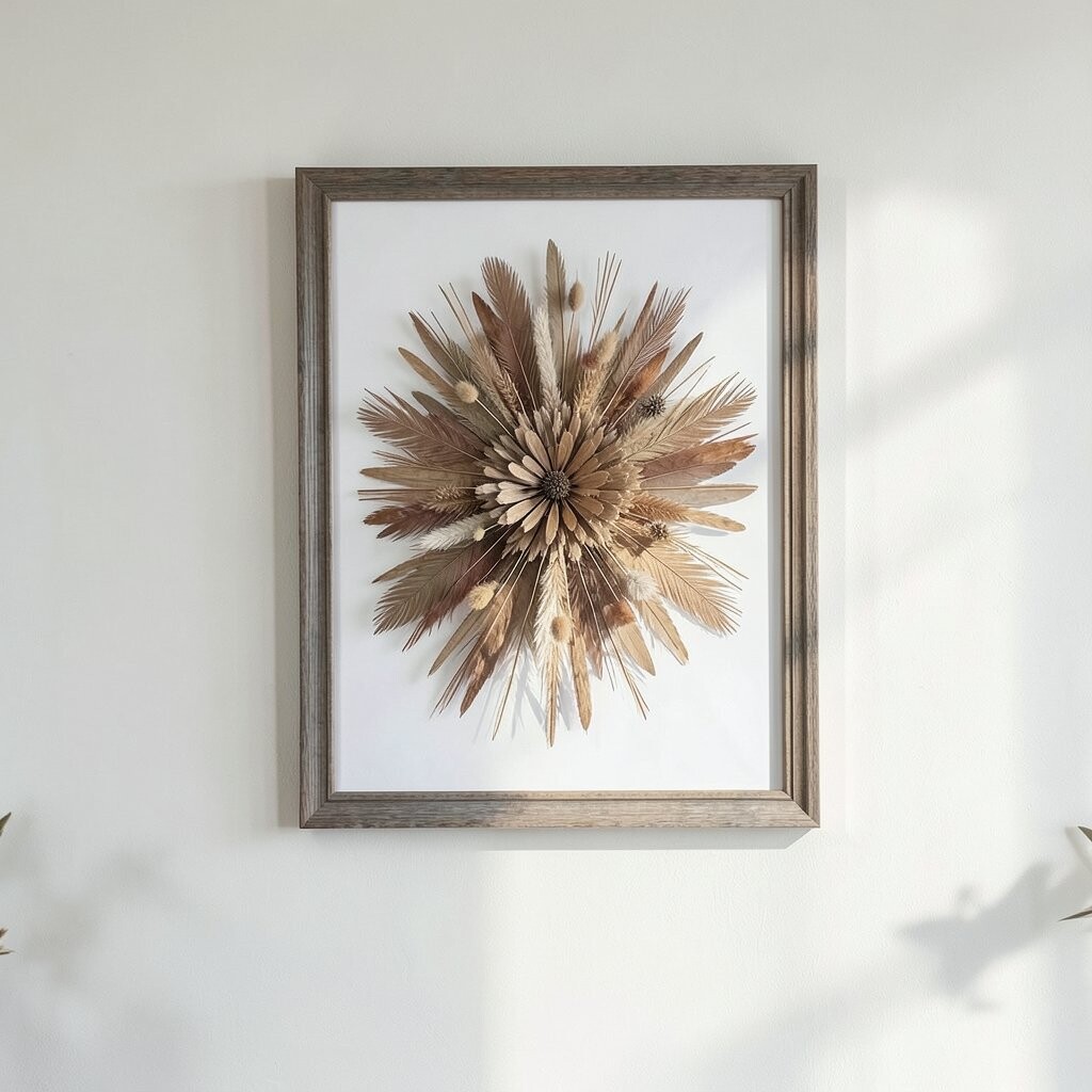
Refined wall art does not need to shout from every corner. When one element stands out, the rest of the design can support it quietly.
For a modern look, use a single bold shape, a strong photograph, or one line art print as the focal point. Then use smaller pieces to repeat the same theme or color tones.
This approach helps your wall look intentional instead of busy. It is also easier to assemble because you can build around the main piece.
7. Add Texture for Depth and Visual Warmth
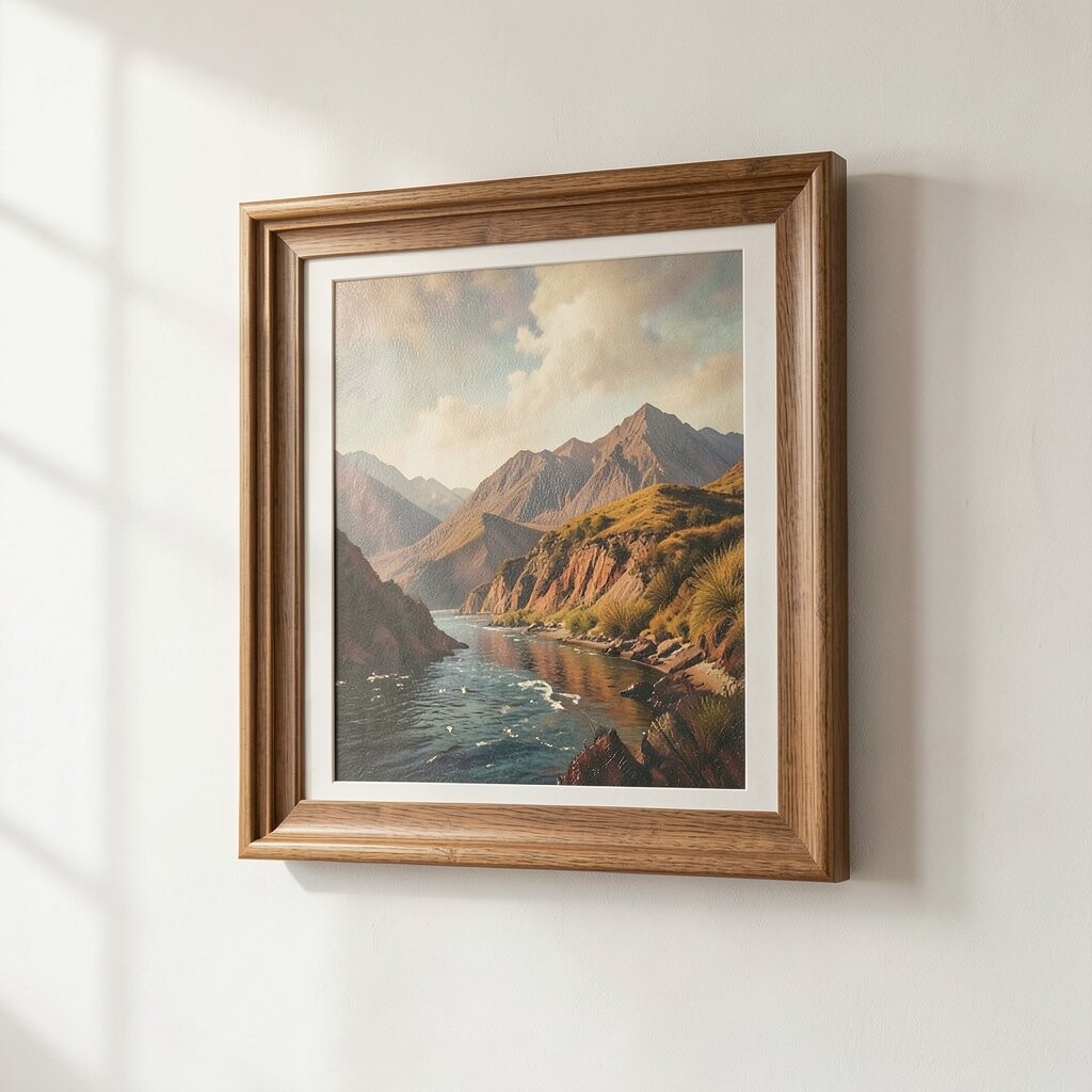
Texture makes wall art feel more “real” and inviting. Look for materials like linen paper, canvas, thick gallery paper, or mixed media elements.
Even small texture differences can create depth when light hits the wall. Try combining a smooth framed print with a piece that has subtle grain or raised details.
If you love the look of crafts but want it tidy, use a clean mounting board behind the art. Keeping edges neat makes handmade textures feel polished, not messy.
8. Use Negative Space Like It Matters
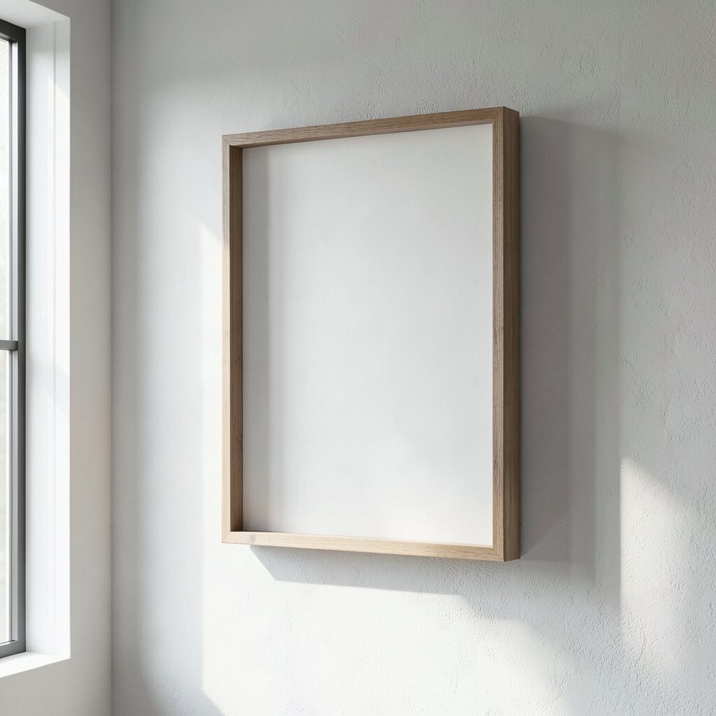
Refinement often means restraint. Designs with breathing room feel smoother and more balanced than designs packed with details.
When you print or choose artwork, leave some open areas so the overall piece does not fight for attention. In a gallery wall, consistent spacing between frames helps the negative space do its job.
9. Mix Art Types With a Shared Theme
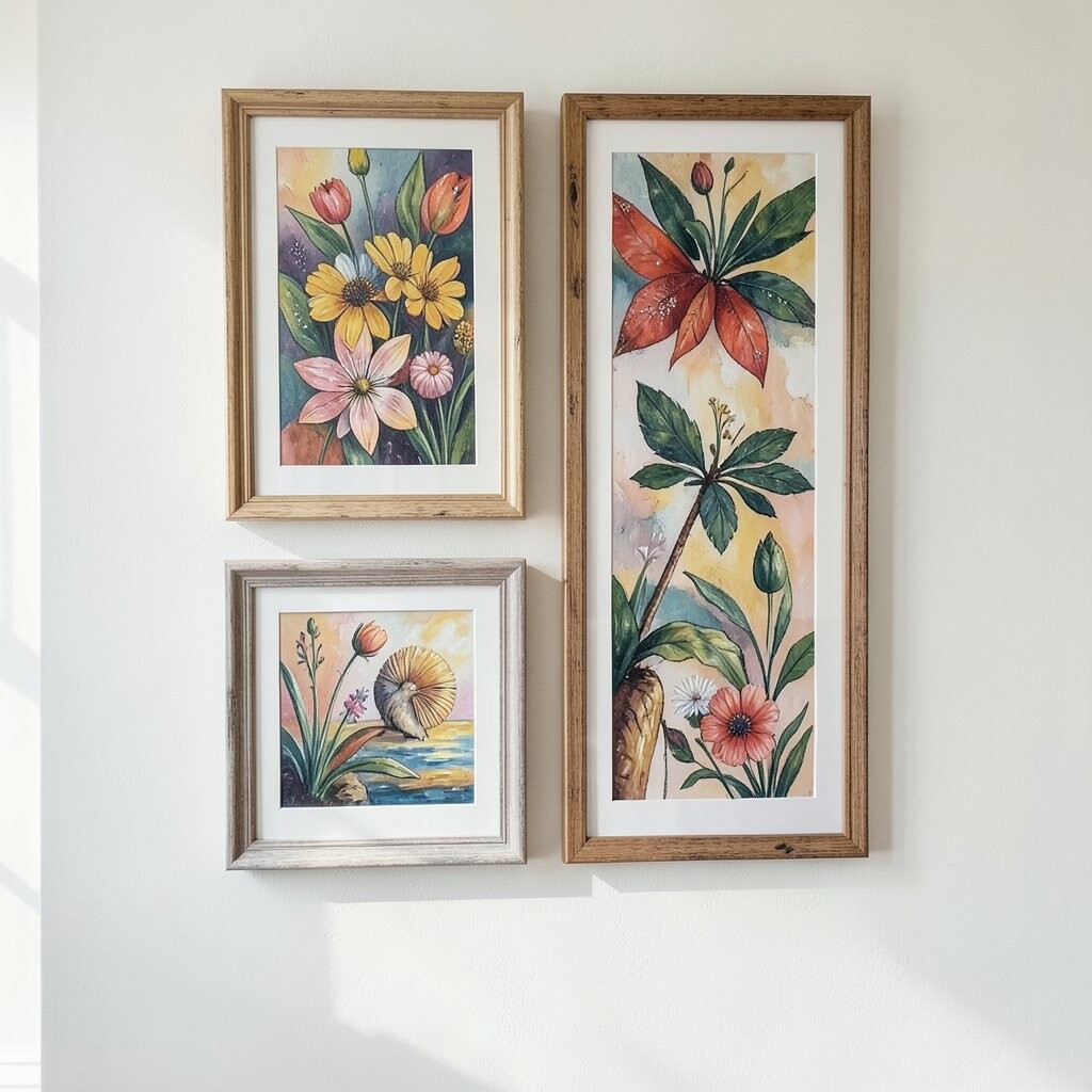
A gallery wall can feel refined even when it includes different formats. You can blend prints, photos, sketches, or typography as long as they share a theme.
Choose a theme like travel memories, plant life, ocean tones, or a family story. Then keep the style consistent by using similar color palettes, line thickness, or level of contrast.
This gives you uniqueness without confusion. It also makes it easier to personalize because you can include pieces that truly belong to you.
10. Personalize With Meaningful Mini Collections
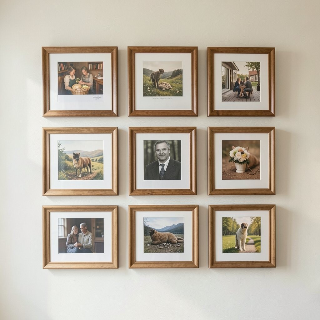
Personal wall art feels special when it includes your own memories and taste. Instead of generic designs, build a small mini collection that tells a story.
You might frame a few favorite photos with the same kind of look, then add one art print that matches the mood. Or you can gather postcards, ticket stubs, or handwritten notes and place them in simple frames.
Keep the display neat by using matching frame sizes where possible. When personalization is organized, it looks refined and not cluttered.
11. Keep Costs Smart With Thoughtful Upgrades
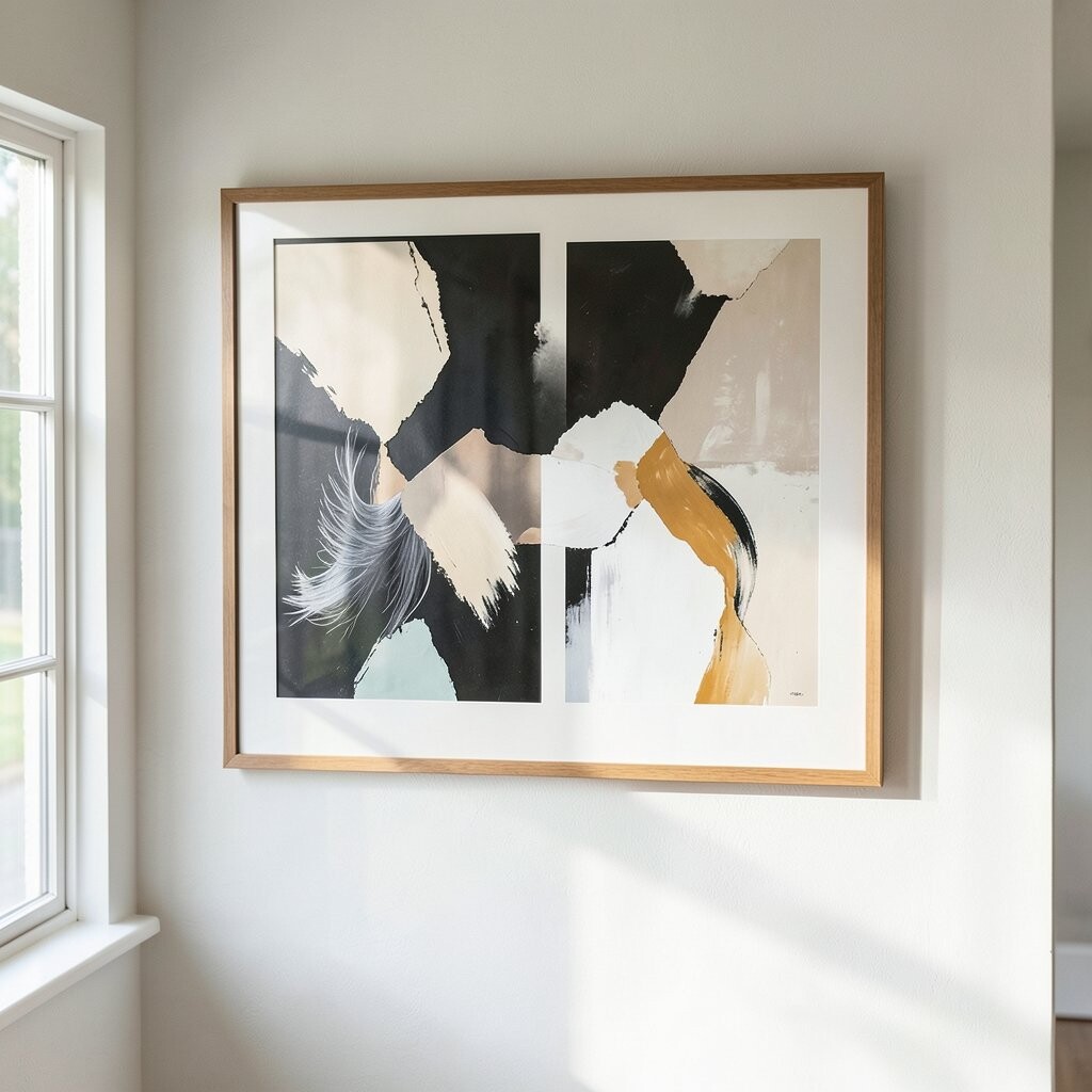
You do not need to spend a lot to create a refined wall. Focus your money on what the eye notices first, like frames, paper quality, and good sizing.
Printed art from reputable sellers can look elegant, especially when you choose thicker paper or higher resolution images. You can also get great results using budget-friendly frames and then upgrading the glass or using better backing materials if needed.
If you want a high-end look on a smaller budget, choose one “statement” piece and keep the rest simple. This gives you a polished feel without paying for a whole set of expensive items.
12. Follow Current Trends Without Losing Your Voice
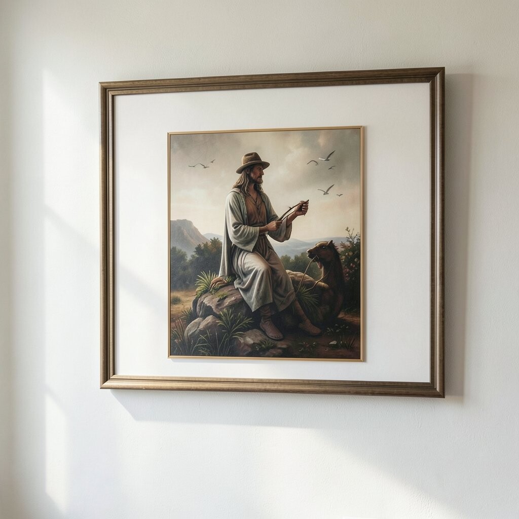
Trends can help you decide what feels modern, but you still want the wall to feel like you. Right now, calm palettes, natural materials, and clean lines are popular because they work in many homes.
Look for artwork with muted tones, soft gradients, and simple shapes that feel easy to live with. You can also notice that many people are using more texture and warmer neutrals instead of harsh high-contrast looks.
Use trends as a guide, then personalize through color, subject matter, or framing choices. When your personal favorites are included, the style stays fresh because it is not copied from a catalog.
13. Finish Like a Pro With Clean Hanging and Careful Spacing
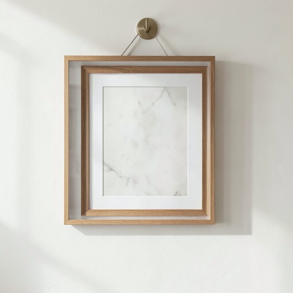
The final step is what turns good art into refined art. Take your time with measuring, leveling, and centering so the pieces hang straight and feel intentional.
Use a level and consider picture hanging strips when you are renting or when you want easy adjustments. Keep spacing consistent, and double-check how the layout looks from standing eye level.
Once everything is up, step back and look for balance. If one piece feels off, swap it or adjust the spacing, because small tweaks make a big difference.