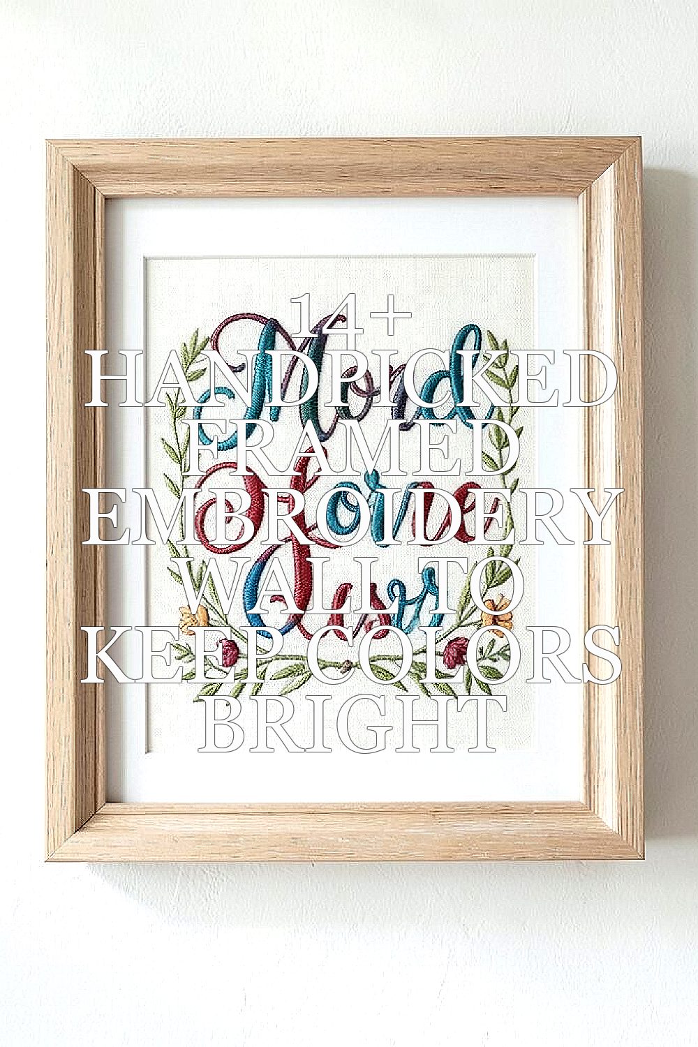
Bright colors can look even brighter when they’re stitched and framed with care. The trick is choosing pieces that stay crisp, feel personal, and fit your space.
1. Sunflower Swing: Cheerful Stitched Blooms in Warm Frames
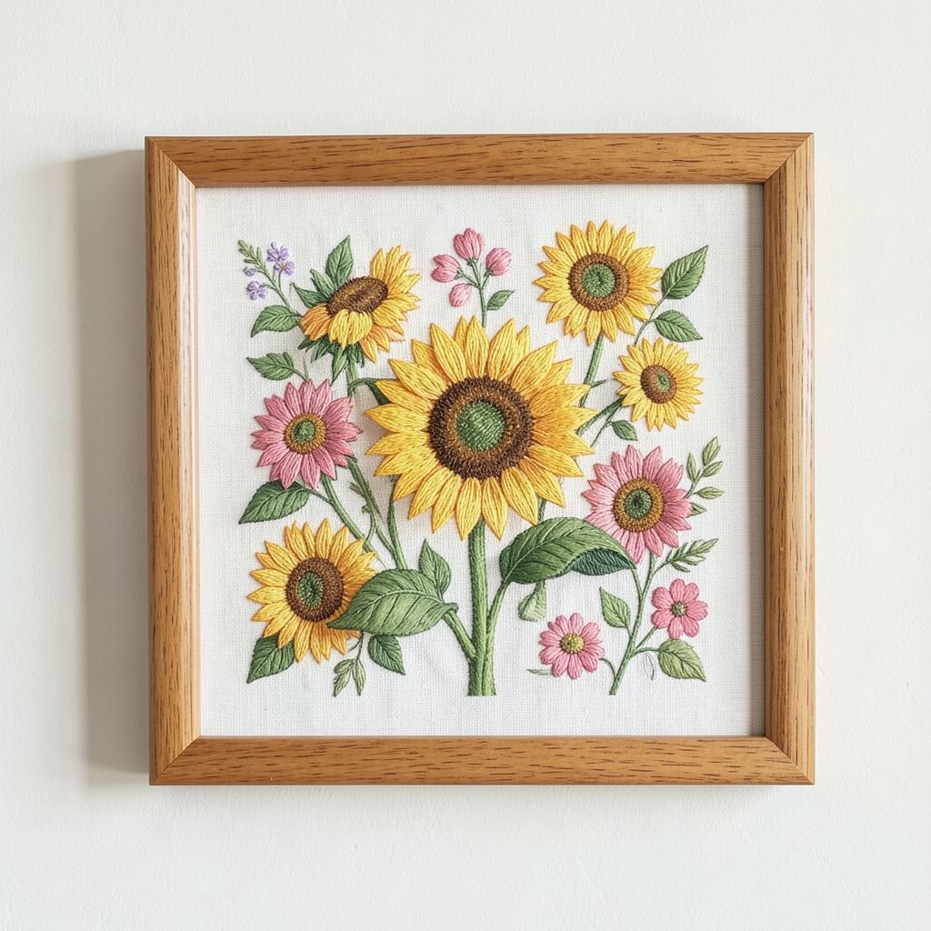
Picture a field of yellow that looks like it’s glowing, even on a gray day. The sunflower petals have neat texture, and the thread catches light as you walk past. Choose a frame with a warm undertone, like honey wood or a soft gold finish, so the color feels connected instead of floating.
To keep the colors bright, place this artwork away from direct sun and strong heat sources. Threaded flowers can fade faster when they receive harsh UV for long hours. A simple routine also helps since dusting lightly keeps the surface clear without rubbing the stitches too hard. Use a microfiber cloth and a gentle touch, then enjoy how the wall looks like it’s smiling.
2. Coastal Calm: Embroidered Waves with Crisp, Clean Borders
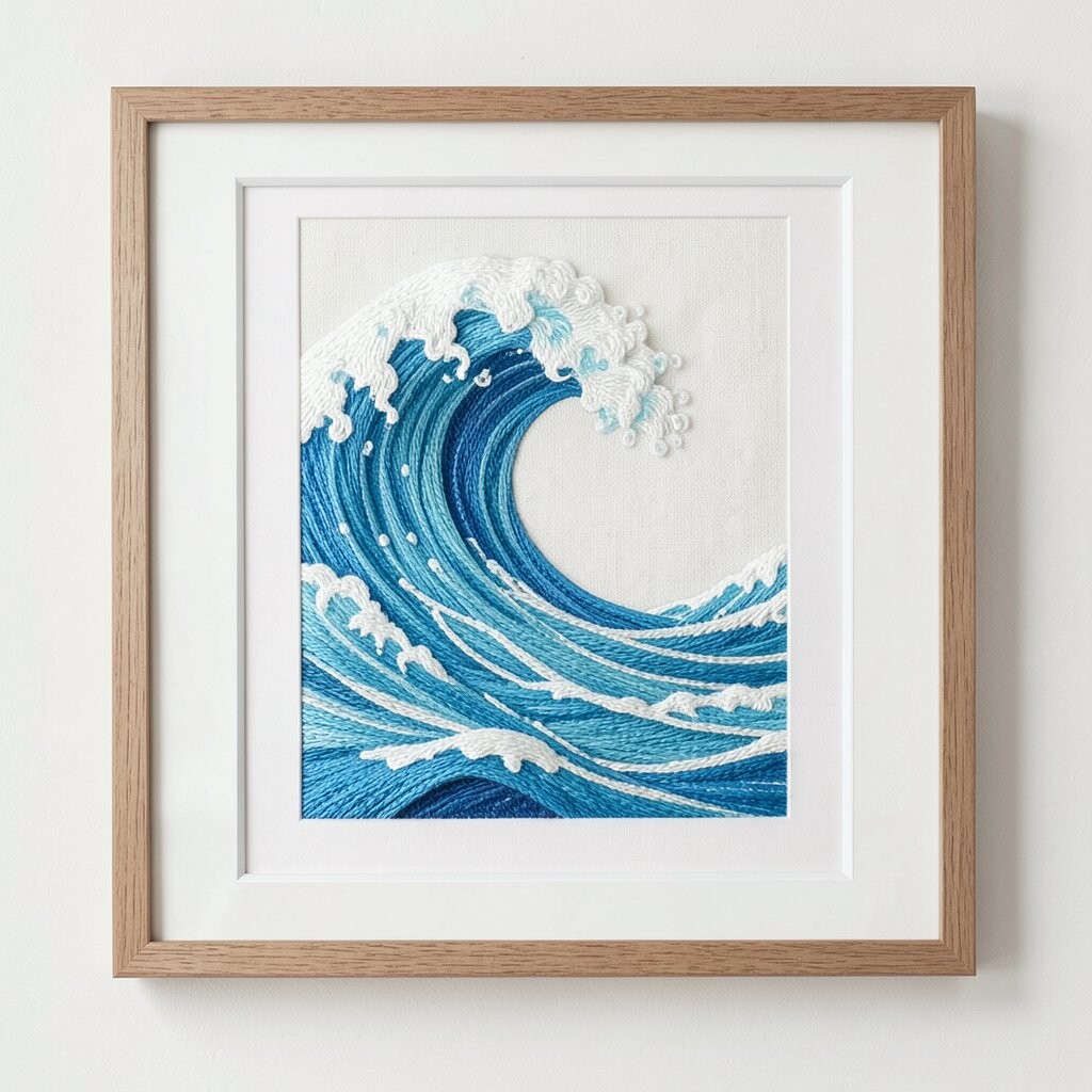
Imagine a sky-blue sea line that feels calm and steady, stitched in layers that you can almost feel. The waves look lively because the thread creates tiny depth, and the border makes everything feel neat and intentional. A light, cool-toned frame helps the blues look fresh and not dull.
For a practical layout, hang it at eye level so the texture shows when the room gets busy. If you have a bathroom, keep it well ventilated since humidity can affect fabrics over time. Use a level and wall anchors that match your wall type so the piece stays perfectly straight for years.
To make it feel more like you, pair the wave embroidery with one small shell-toned accessory on the same shelf. If you love matching sets, look for coordinating thread colors like seafoam and soft gray. This style fits current home trends that favor relaxed coastal palettes, and it usually costs less than large oil paintings while still looking high-end.
3. Garden Letters: Framed Monograms that Pop with Thread Color
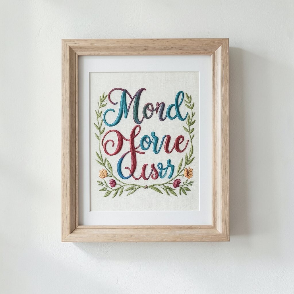
There’s something charming about seeing a letter stitched with bold thread, especially when it’s framed cleanly. A monogram can look elegant without being too formal, and the stitch texture gives the character extra warmth. Pick a letter size that fits your wall and doesn’t crowd the surrounding space.
To keep the colors bright, choose threads labeled as colorfast when possible, since they’re less likely to dull. Avoid glass coverings that press too tightly against uneven fabric, which can flatten the stitches over time. Use acid-free backing paper if you’re placing it in a frame with mounting materials, since it helps protect the fabric.
Personalize it by matching the thread colors to your room’s accents, like throw pillows or curtains. If your home uses earthy tones, try a terracotta or mossy green thread set for a grounded feel. Monogram embroidery remains a popular trend in cozy interiors because it blends sentiment with style.
When you’re budgeting, consider sizing wisely since smaller monograms often cost less but still make a strong statement. You can also choose a ready-made letter panel and swap threads if it’s designed for customization. The end result gives you a piece that looks meaningful and stays vivid.
4. Geometric Thread Maps: Modern Shapes with Bright Contrast
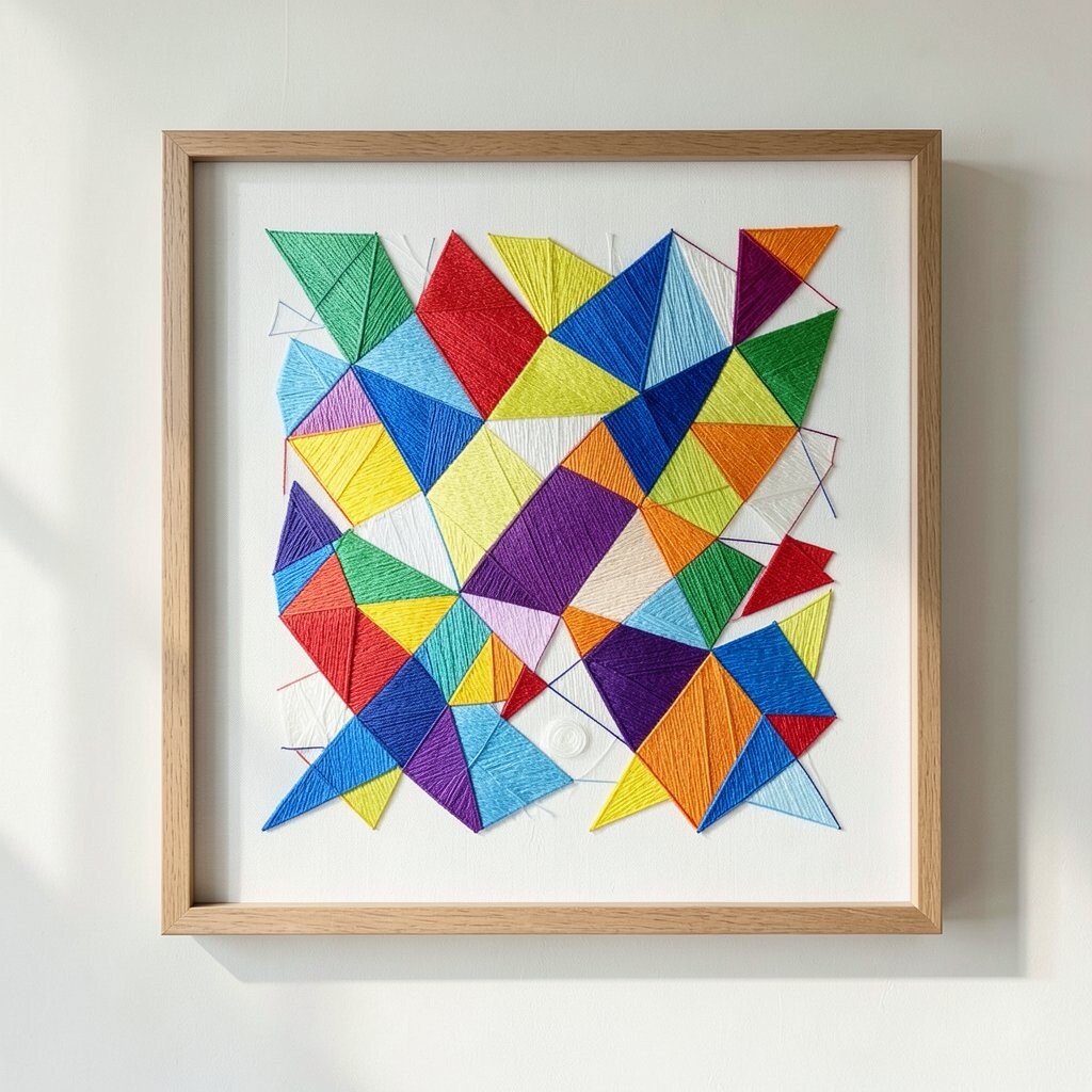
Sharp lines and bright threads can turn a plain wall into a gallery spot without any fuss. Look for geometric designs that use contrasting colors, like coral against cream or teal against pale stone. A simple thin frame keeps the focus on the stitching while adding a clean, modern edge.
For best color staying power, avoid placing the piece where light will blast directly across it. Use curtains or blinds to soften daylight, and the thread colors will keep their punch. If you want extra protection, consider UV-filtering glass, but make sure there’s a little space so the fabric doesn’t get squished.
5. Vintage Floral Collage: Layered Petals with Soft Antique Frames
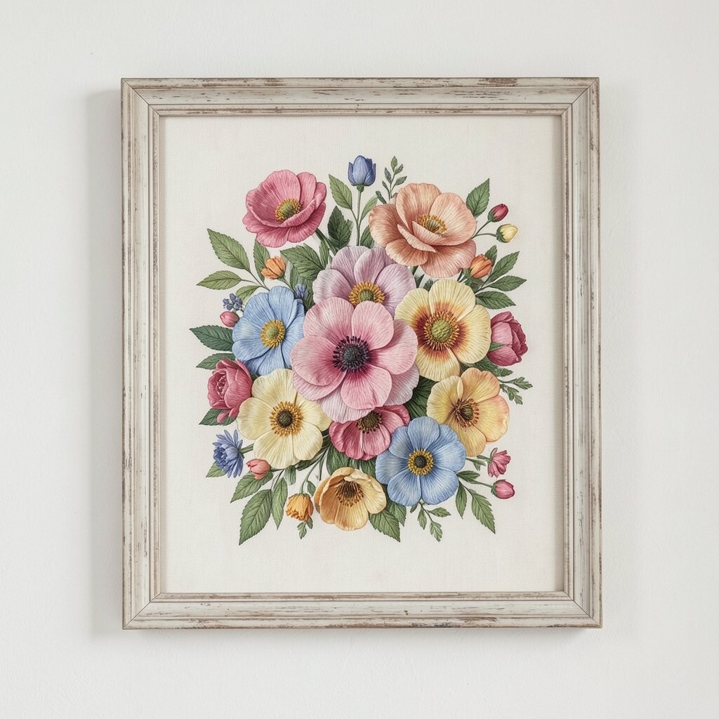
Think of a bouquet that looks gently romantic, with stitched layers that feel like fabric flowers. The threads create little shadows inside the petals, giving the whole piece a lived-in, vintage vibe. An antique-style frame, like distressed walnut or creamy off-white, makes the colors feel warm and settled.
To maintain brightness, treat this piece like a delicate textile. Dust around it first with a dry cloth, then clean only the frame surface unless the embroidery is designed for light cleaning. Keep it away from kitchens where cooking smoke can dull fibers. Rotate its placement if you can, so one side doesn’t fade before the other.
If you want personalization, choose one flower shade that matches your room’s main accent, like rose pink or deep plum. Many trends today pull from vintage details but keep them fresh with brighter, cleaner color choices. When you shop, compare thread weight and stitch density, since fuller stitching tends to look richer from across the room.
6. Citrus Pop Series: Framed Lemon and Orange Embroidery
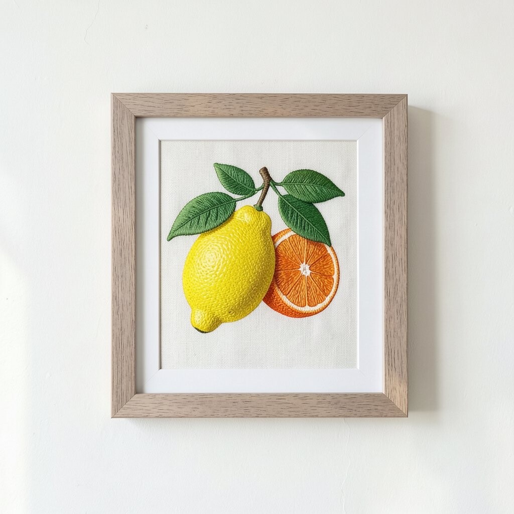
When life needs a little extra brightness, citrus embroidery does the job. The yellow thread looks sunny, and the tiny stitched segments give the fruit a playful, hand-crafted glow. Pair it with a crisp white or light beige frame for a clean, modern look.
Place it near a naturally lit area but out of direct rays, since citrus tones can soften if the sun hits too long. Use a washable, dust-friendly backing so the fibers stay happier over time. If your wall gets bright in the morning, adjust the hang slightly or use sheers to balance the light.
Personalization is easy here since you can pick the fruit colors that match your kitchen or dining theme. Consider adding matching coasters or a small cutting board nearby to make a colorful mini scene. Budget-wise, citrus designs are often available in multiple sizes, so you can choose a smaller set if you want several colors without overspending.
7. Deep Navy Night Sky: Star Embroidery with Glossy Thread Feel
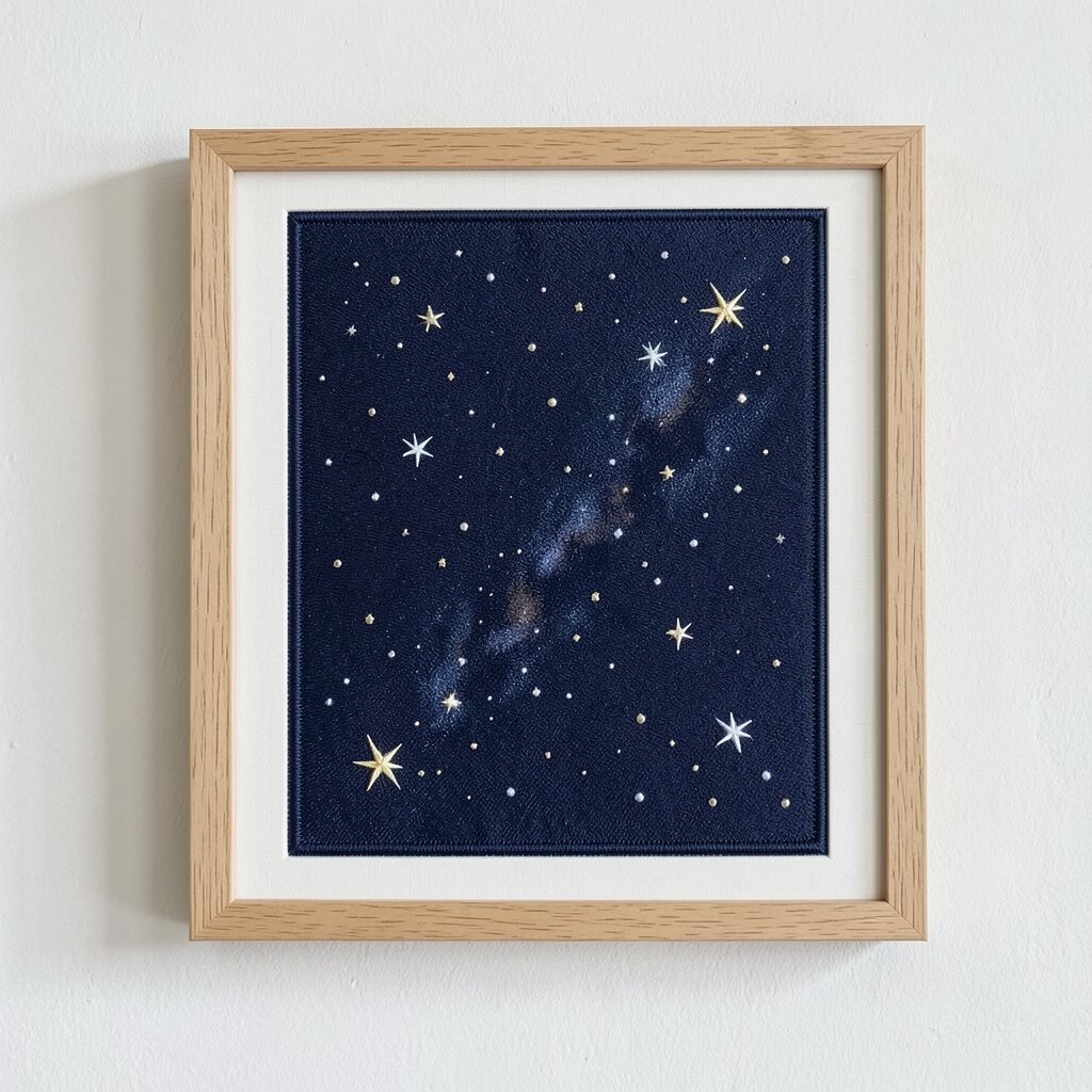
A navy night sky embroidery can look almost magical, especially when the stars shimmer. You’ll notice how the thread catches light, making the piece feel alive as shadows move. Choose a frame in black, dark gray, or deep wood to amplify the night feeling without washing it out.
For practical care, keep this artwork away from spots where heat vents blow air regularly. Dry air and repeated temperature swings can make fabrics seem dull over time. If you hang it near a window, consider curtains that diffuse light so the deep blues stay deep instead of faded.
This style is trending because it blends cozy and dreamy moods, perfect for bedrooms and reading nooks. If you want a personal touch, select star colors that match your bedding or your favorite wall paint tone. When shopping, check whether the “glow” effect comes from metallic thread, since that can vary in shine and cost.
8. Bold Bird Perches: Colorful Feathers in Strong, Simple Frames
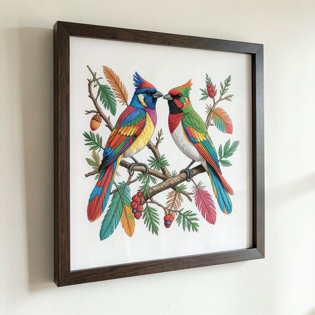
Bright birds stitched in vivid threads feel like a living moment caught in fabric. The feathers look detailed because the stitching follows gentle curves, creating a sense of motion. A sturdy, straightforward frame keeps the look confident and prevents the piece from feeling too busy.
To keep colors bright, avoid long exposure to direct sunlight and keep humidity stable. If you have kids or pets, hang the piece higher where accidental bumps are less likely. Consider adding a protective layer of glass or acrylic if the design is flat and framed properly.
9. Pastel Rainbow Strips: Soft Thread Bands for Calm Walls
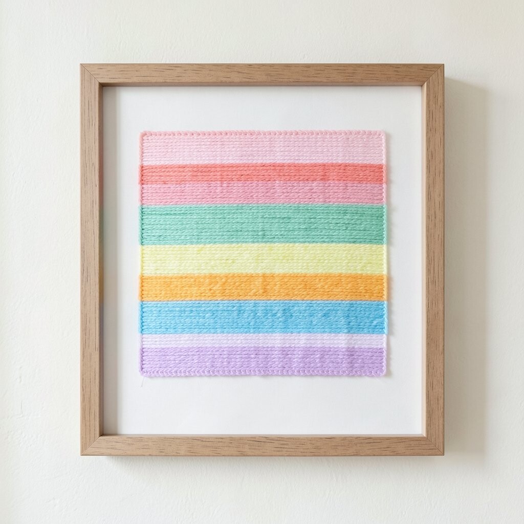
Pastel embroidery bands bring an airy, gentle look that still feels cheerful. Each stripe looks different because the thread thickness and stitch direction create subtle texture. Choose a light frame, like pale oak or soft white, to keep the palette feeling open and fresh.
For a practical setup, space it with breathing room so the colors have space to shine. If you’re placing it beside photos, align the top edges so the wall layout looks tidy. Dusting is simple here since the surface is easy to access, but do it gently to protect the raised stitches.
This is a great personalization option because you can match it to your favorite pastel set, such as mint, blush, and butter. Right now, soft color gradients and quiet textures are popular, and this design fits that mood perfectly. Budget-wise, a striped piece can be a smart choice since it may require less intricate detail than highly detailed scenes.
10. Botanical Linework: Fine Stems with Bright Green Thread Accents
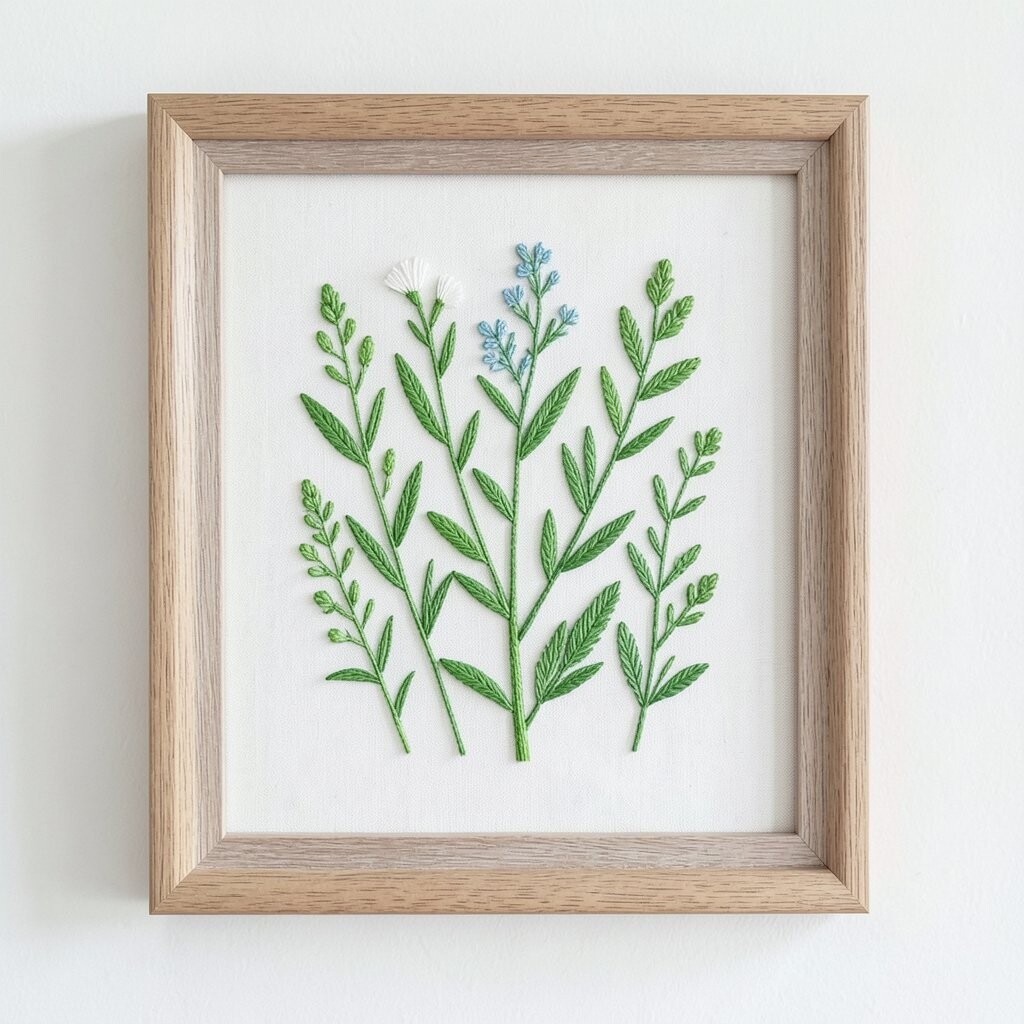
Linework embroidery can feel surprisingly bold, especially when the stems use vivid green. The leaves look crisp because the stitches trace edges and veins with careful control. A neutral frame, like natural wood or cream, helps the greens pop without overwhelming the room.
To keep the color lively, choose thread that resists fading, and keep the piece away from direct sun beams. If your wall is exposed to bright afternoon light, try positioning it so the light hits from the side rather than straight on. Also avoid placing it where it will rub against curtains or pillows, since friction dulls fibers over time.
Personalize the botanical vibe by mixing frame shapes, such as pairing a tall botanical panel with a small round embroidery. You can also coordinate with real plant decor, using a matching leaf color in planters or ceramics. This kind of botanical art fits current trends that favor natural textures and simple, airy compositions.
11. Berry Branches: Rich Reds and Plums in Elegant Frames
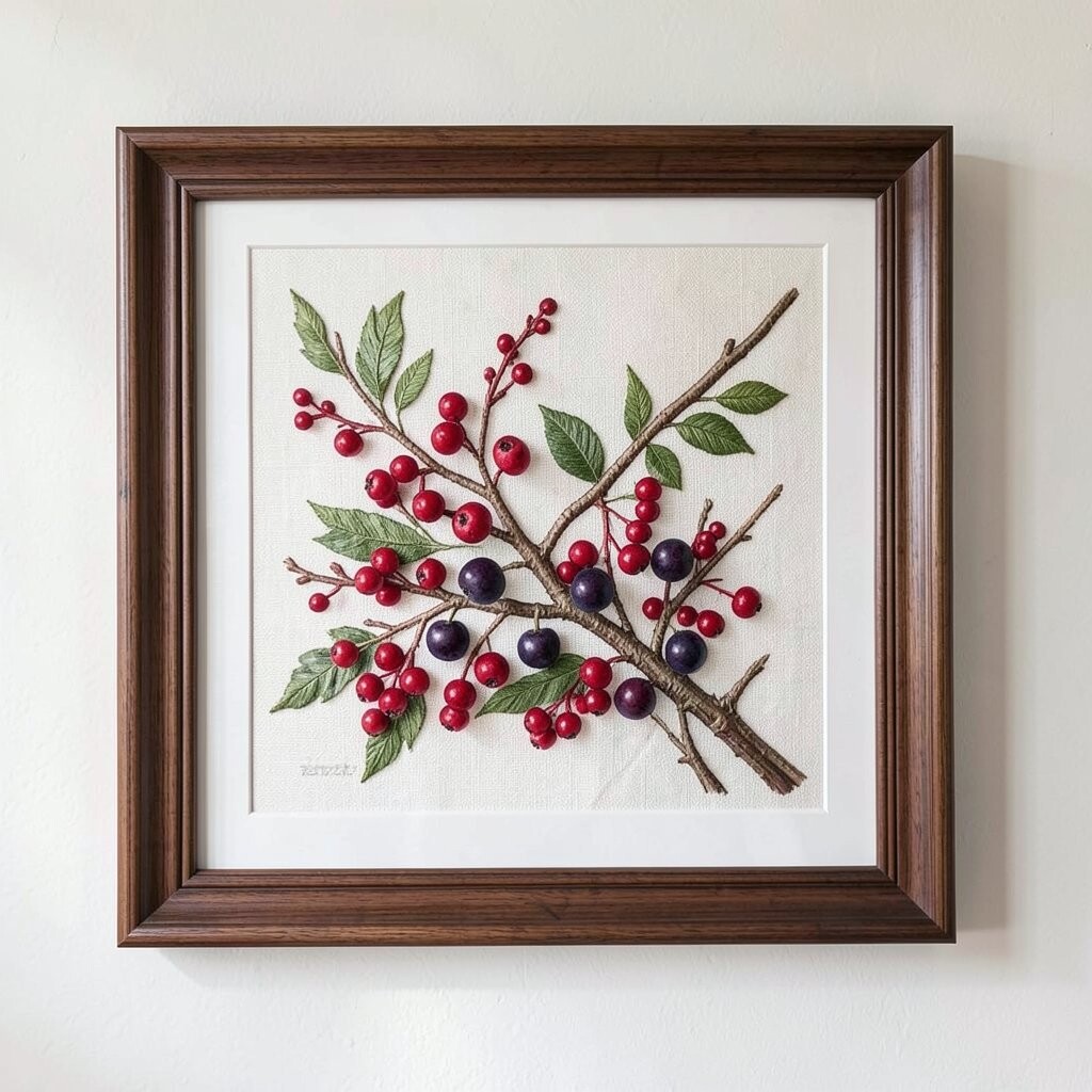
There’s a cozy drama in berry embroidery, where deep reds and plums look almost jewel-like. The stitched fruit texture makes the berries feel fuller, and the branch lines keep the piece grounded. Pick a frame in dark wood or warm black so the saturated colors feel intentional and rich.
To protect color, keep this artwork away from fireplaces, cooking heat, and strong window glare. If you’re hanging it in a dining area, wipe nearby splashes right away so dust and residue don’t settle into the fibers. When you dust, use a soft brush to lift particles gently without snagging stitches.
For personalization, match berry tones to your seasonal decor, like adding warm gold candles during cooler months. You can also create a matching trio by selecting different berries in similar thread families for a cohesive set. On the cost side, berry designs may run higher if they use multiple thread tones, but the visual payoff usually looks worth it.
If you want a more budget-friendly version, choose fewer berries with the same deep color scheme. It still gives that rich, bright character you want from framed embroidery.
12. Monochrome Chic: Single-Color Embroidery with High Contrast
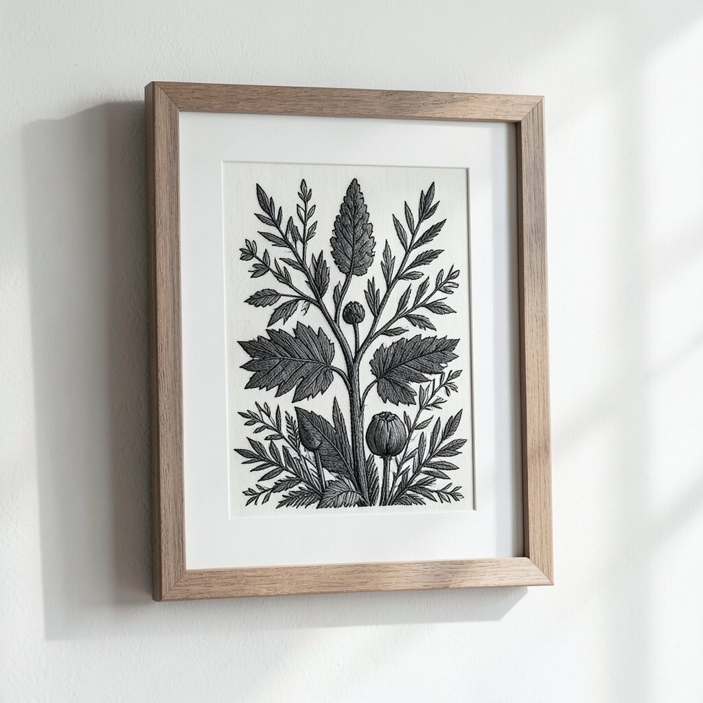
A single-color embroidery can look striking when the stitching is crisp and the framing is clean. Imagine charcoal thread forming delicate patterns, surrounded by a bright off-white mat or backing. This style keeps colors bright because it leans on strong contrast rather than many pigments.
To keep it looking sharp, use a frame that holds fabric flat and includes a mat if the piece allows it. Avoid tight creases that can distort the texture, since flattened stitches look dull. If you’re using direct sunlight, consider a room with softer, indirect light so the monochrome stays elegant and not faded.
13. Rainbow Quilt Borders: Stitchy Patterns with Playful Color Runs
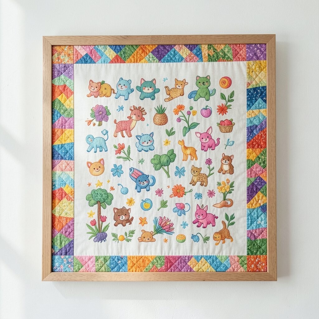
Quilt-like embroidery borders feel joyful because they mimic the rhythm of patchwork. You’ll notice how the thread creates small raised seams, which makes every color band feel tactile. A bright, simple frame like sunny tan or clean white helps the colors stay lively and not buried.
For practical placement, use this kind of piece in entryways or hallways where you’ll pass it often. That way the texture catches your attention, and the colors lift your mood every time you walk by. Try hanging it slightly higher than eye level in narrow spaces so it doesn’t get lost when doors open.
Personalization can happen by choosing a thread set that matches your rug or curtains. If you love seasonal updates, swap accessories around it instead of changing the embroidery itself. This style fits current craft trends that celebrate handmade texture while keeping the look organized and modern.
When budgeting, consider purchasing one border piece first, then add a second later if you want a stronger wall composition. Many brands offer matching widths, which can make shopping easier and keep your final look cohesive.
14. Metallic Edge Florals: Gold-Thread Details that Stay Luminous
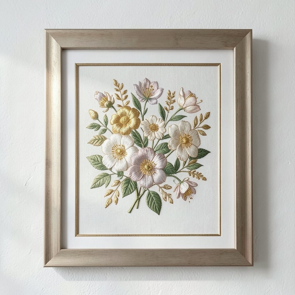
Metallic-thread florals have a special kind of glow, like tiny highlights stitched into petals. The gold edges can make greens and creams look brighter without adding loud new colors. Choose a frame that complements metallic tones, such as brushed brass or warm champagne wood.
To keep the effect looking fresh, keep the piece away from humid rooms that can dull metallic threads. Also avoid harsh cleaning chemicals, since those can affect both fabric and shimmer. Use gentle dusting and let air do the rest so you don’t accidentally dull the gold.
Personalize by selecting florals that match your preferred mood, like soft daisies for spring or deeper roses for fall. This style is popular right now because it blends handmade warmth with a polished finish that still feels casual. Cost considerations matter too, because metallic threads can be pricier, but even a small framed piece can look premium.
15. Family Heritage Stitch: Custom Names and Date Details in Bright Thread
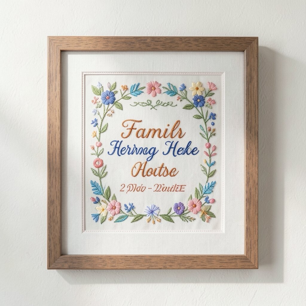
Nothing feels more personal than a framed embroidery that honors your story. You can choose a name, a meaningful word, or a date stitched in bright, colorfast thread so it stands out beautifully. A frame with a simple profile and a protective backing gives it a gallery-ready finish without taking away the handmade feel.
For practical tips, confirm the thread and fabric type before you buy, especially if you’re ordering custom work. If the piece includes multiple materials, ask about how it was stabilized so it holds its shape in the frame. Keep it away from direct sun and strong airflow to prevent uneven fading and drying.
Personalization is the whole point here, so coordinate the colors with your home’s current palette. You can pick one bright thread as the highlight color and keep the rest softer so the design looks balanced. Custom embroidery can cost more than ready-made art, but it’s often worth it because it becomes a keepsake you’ll enjoy for years.
If you want to control cost while staying meaningful, focus on one main line like a name in a bold color, then add smaller accents only if the budget allows. This trend of heartfelt, personalized textile art keeps growing because it feels warm, thoughtful, and real.