
Muted walls can still feel full of life when dried flowers are part of the plan. The right colors make every stem look intentional, cozy, and bright.
Instead of fighting your decor, these palettes help it work together in a soft, natural way. You’ll get visual warmth, easy styling habits, and plenty of room to make it yours.
1. Buttermilk Walls With Sun-Faded Marigolds
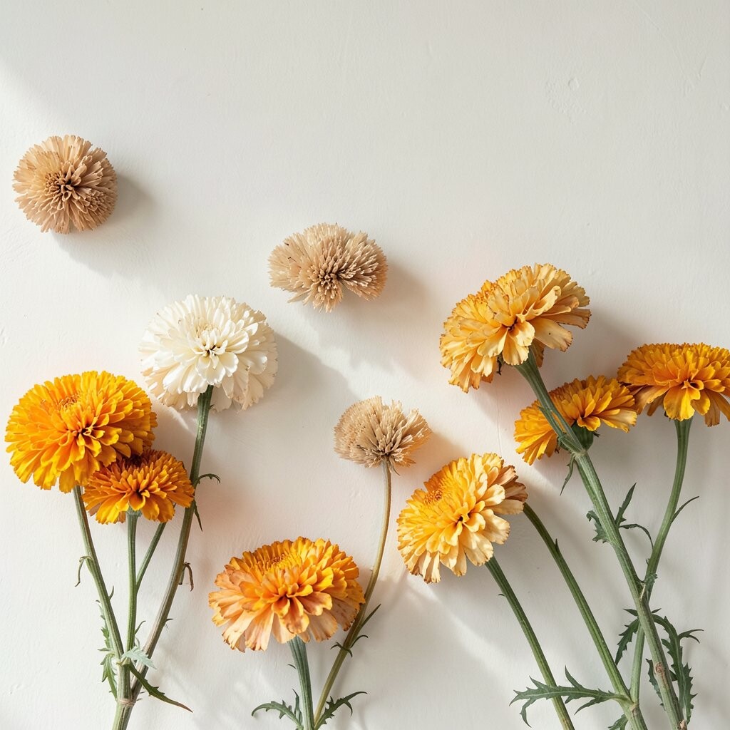
Think of creamy buttermilk paint with a gentle glow at the edges. Dried marigolds in honey and soft orange look like they’re catching light, even on a cloudy day.
Pair the color with warm white frames or a light wood shelf so the whole wall feels friendly. Keep stems airy by spacing them out rather than filling the entire arrangement, which helps the yellows stay bright instead of heavy.
2. Soft Sage Green With Lavender Bundles
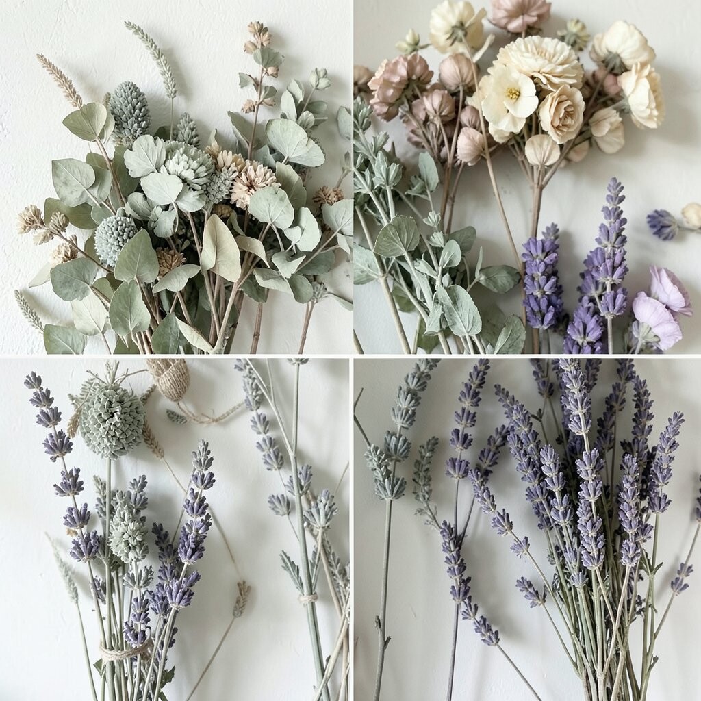
Picture a calm sage wall with muted lavender tones drifting across it. Dried lavender looks crisp against green, and it gives a clean, garden-like vibe.
Choose a sage that leans slightly gray if your room gets bright sun, because it will keep the purple from turning dull. For an easy personalization move, hang one larger dried bouquet near eye level and add a small matching sprig in a different texture.
If you’re trying to keep costs down, start with just one focal arrangement and let the rest of the wall stay simple. A thrifted frame or thrifted vase often works just as well as a pricey decor piece.
3. Blush Pink Walls With Rose-Toned Strawflowers

Blush walls bring a gentle warmth that feels flattering in almost any light. When strawflowers dry into dusty rose, they look romantic without trying too hard.
To make the palette feel cohesive, select wall art in the same blush family, such as blush prints or off-white mats. Use a slightly darker rose bouquet for depth so the lighter flowers don’t blend into the wall.
Consider the room’s mood before you paint a whole space, especially if you love your current color. A removable wall color sample and a short test on an area near your flowers can help you see how pink changes during the day.
For a quick DIY styling trick, mix different stem heights so the dried roses look like they’re waving. This creates movement and makes the whole setup feel brighter and more alive.
4. Warm Greige With Wheat-Dry Pampas Plumes
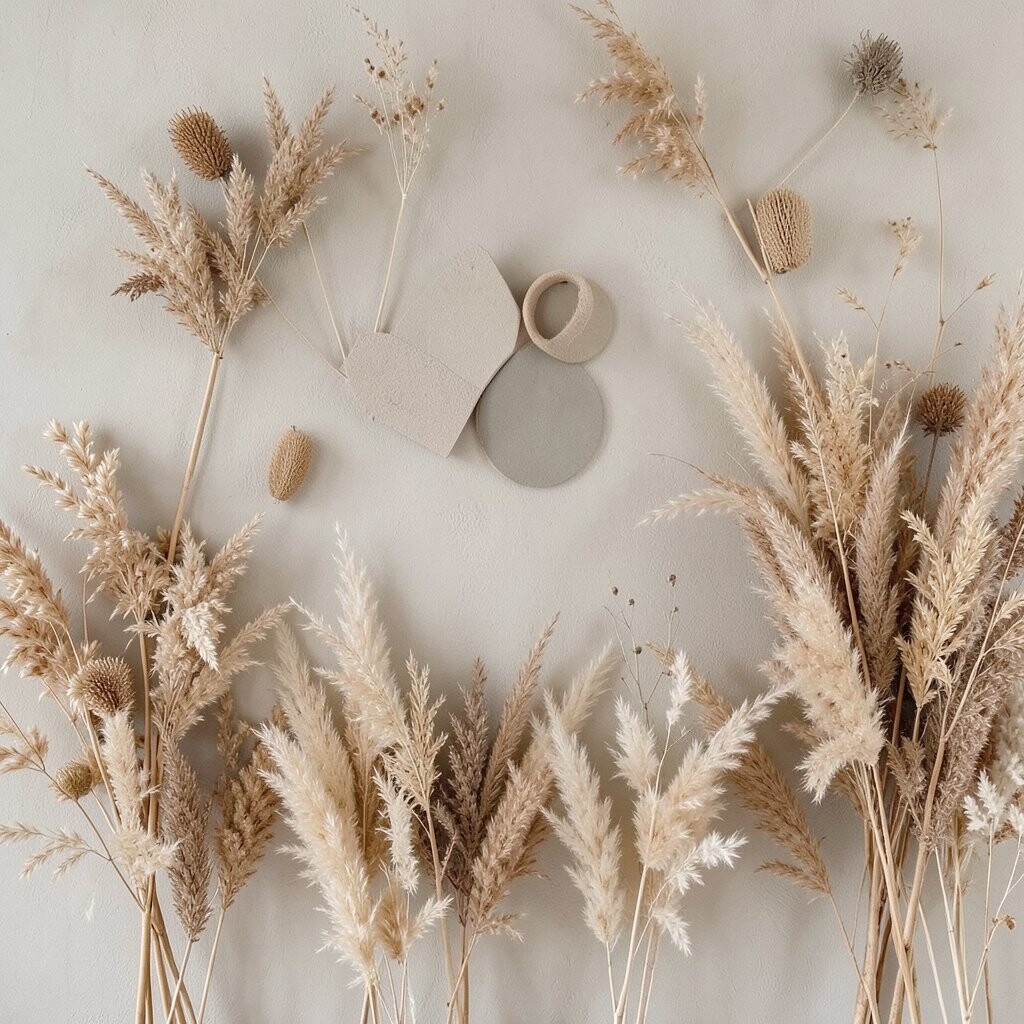
Warm greige feels like a calm background that never steals the show. Add airy pampas plumes in wheat and tan, and your wall instantly looks styled and sunlit.
The uniqueness here is the texture contrast: smooth paint meets fluffy, feathery stems. Try a narrow mirror or a slim console behind the arrangement to reflect light and make the plumes look extra soft.
5. Coastal Sea Glass With Dried Eucalyptus and Mint Tones

Imagine sea glass colors that sit between blue and green, cool and soothing. Eucalyptus browns as it dries, but it still keeps a fresh, leaf-like identity that pairs beautifully with this vibe.
Choose a muted sea glass shade rather than a bright turquoise so the room stays relaxed. For practical balance, keep the rest of your decor in light neutrals like linen, cream, and pale oak.
If you’re working with limited budget, skip painting by using removable wallpaper on one small section or behind your display. That one painted-style patch can make the dried eucalyptus feel more intentional.
6. Charcoal Gray With Crisp White Dried Statice
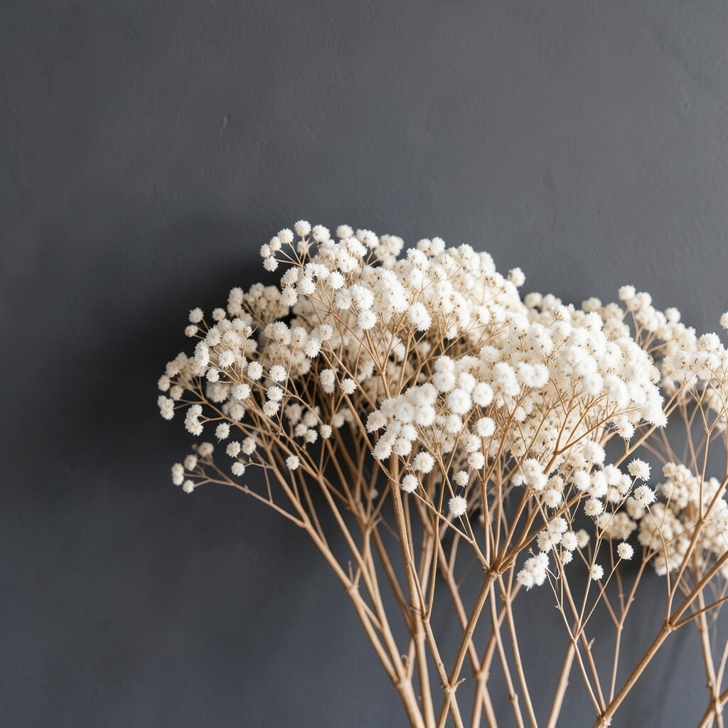
Dark walls can actually brighten a space when the contrast is right. Crisp white dried statice looks sharp and clean against charcoal gray, like winter light.
Because the background is strong, keep the flowers simple and not too many colors at once. A single elongated arrangement or a tight cluster can feel modern, and it keeps the look from getting cluttered.
To personalize, choose glass vases with subtle texture, like frosted or ribbed glass. Those details bounce light and make even simple dried stems feel special.
7. Natural Linen Beige With Honey Amber Preserved Flowers

Linen beige is warm, soft, and welcoming, like a favorite couch. When dried amber blooms sit against it, they glow with a golden calm.
Think about the undertone of your beige, because warmer tones make honey shades look richer. If your beige pulls too cool, the amber can look a little dull, so a small swatch test helps.
For an affordable approach, search for dried bouquets in resale shops or online bundles that already include complementary shades. Then separate the stems and re-style them into one cohesive wall arrangement to look custom.
Personalization can be as simple as tying a thin ribbon in a warm cream or soft gold color around the vase neck. That small detail makes the palette feel curated rather than random.
8. Deep Terracotta With Dusty Apricot Globe Flowers

Terracotta brings warmth and a grounded feeling, like sun-baked clay. Dried globe flowers in apricot and peachy tones look like little bursts of gentle energy.
To keep the room from feeling too heavy, mix in light-colored decor like off-white curtains or pale wood shelves. You can also choose terracotta with a slightly red-orange undertone, which pairs well with apricot tones.
9. Soft Navy With Indigo-Dyed Dried Hydrangeas
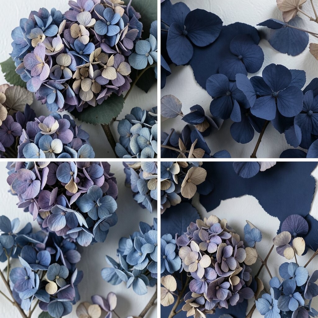
Navy walls can make dried florals feel dramatic in a good way. Indigo-dyed hydrangeas add depth and a cool, artistic mood that still feels cozy.
Try navy in a matte finish so the wall absorbs light and the flowers stand out. For a practical tip, keep the arrangement slightly off-center and let some stems “lean” toward the light source, which makes the whole display feel more natural.
Cost-wise, you can start small by framing a print that matches navy and then adding one larger bouquet. This gives the look of a full color plan without committing to major changes right away.
If you love trends, this deep-blue-and-floral combo fits well with modern gallery styling and moody interiors. Pair it with minimalist frames and simple vases to keep the look current.
10. Clear Ivory With Tan Dried Palm-Like Fronds
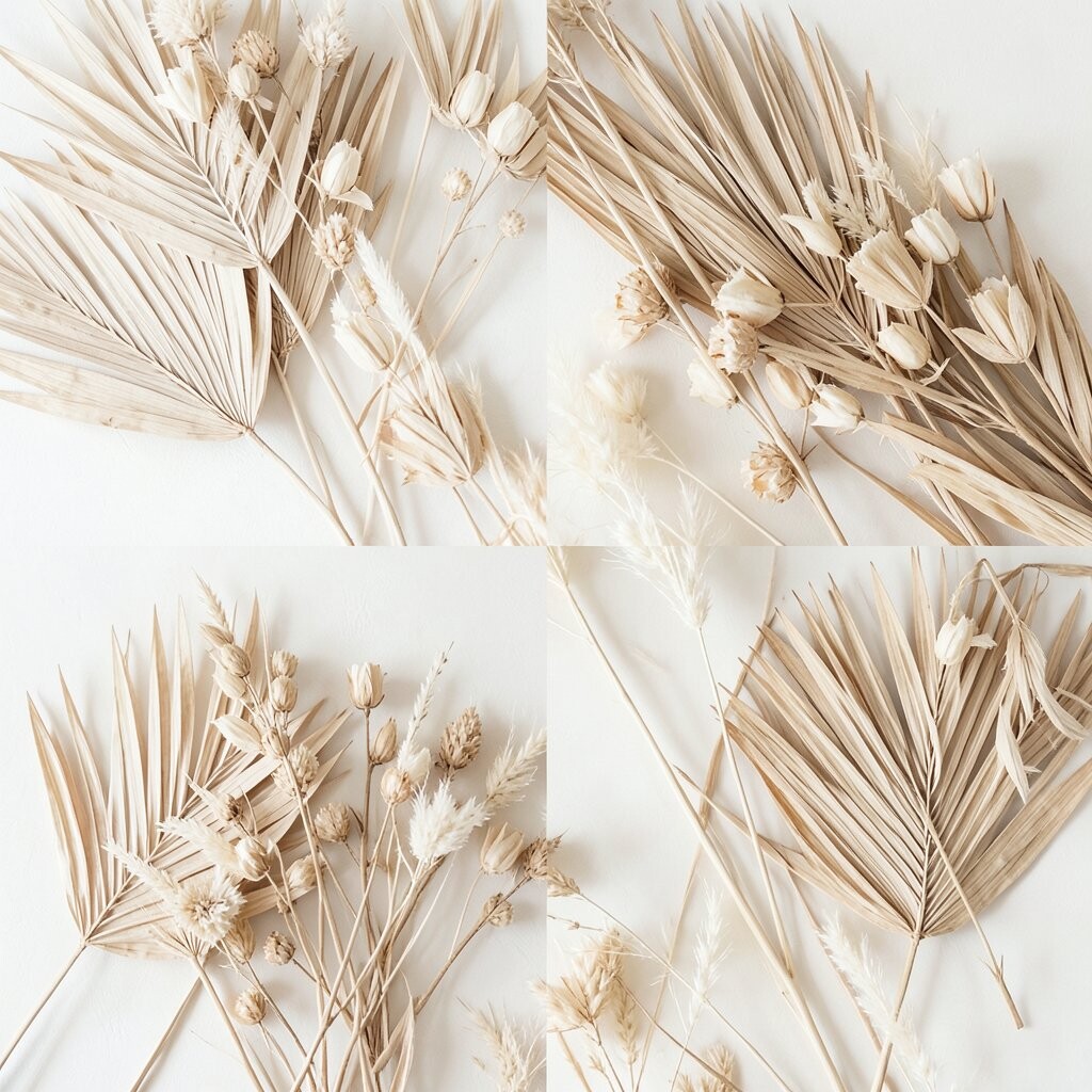
Ivory walls are like a clean canvas, and dried tan fronds look crisp and airy. The whole palette feels bright because the background reflects light softly.
Choose ivory with a warm undertone if you want your dried stems to look golden, not gray. For personalization, vary the container sizes so the fronds feel layered, not flat.
If you want an easy win, use a mix of textures, such as fronds and small dried filler flowers. That variety makes the wall art look richer even when you keep the color palette simple.
11. Olive Drab With Teal-Tinged Dried Leaves

Olive drab gives a grounded, earthy backdrop with a hint of mystery. When dried leaves show teal or blue-green tones, the contrast feels fresh and slightly unexpected.
To keep it balanced, use a matte wall finish so the olive stays calm and doesn’t feel shiny. Add a pale wood frame or light ceramic vase to keep the vibe from feeling too rugged.
For practical styling, keep one area of the arrangement lighter, like a few teal stems placed near the top. That way the colors read clearly from a distance.
Cost considerations are real here, because earthy palettes look best when the flowers match the undertone of the leaves. If you can’t find perfect teal, choose a close match and let the olive wall do the magic.
12. Golden Cream With Dried Sunflower Heads
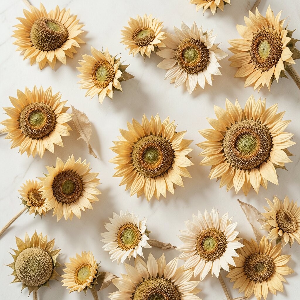
Golden cream walls bring brightness without feeling loud. Dried sunflower heads naturally match that warmth, and they make the wall look cheerful and welcoming.
Sunflowers work especially well when your room has natural light, because the warm palette feels like sunlight all day. If your space is darker, soften the contrast by using cream that’s slightly lighter than your flowers.
For personalization, consider a textured vase like woven wicker or a ceramic shape with small ridges. Those details amplify the sunflower’s rustic character.
To keep costs in check, buy one main sunflower arrangement and add small filler bundles in matching tones. Even a few sprigs can make the wall look fuller without spending much.
13. Powder Blue With Dried Cornflower-Style Blossoms

Powder blue feels light and airy, like the sky on a soft morning. Dried cornflower-style blooms, often in periwinkle and pale blue, look delicate and bright against it.
Choose a powder blue that isn’t too gray, because a slightly sunny undertone keeps the flowers looking happy. Keep other decor in white or very light wood so the whole wall stays fresh.
If you want to make it actionable, try arranging the dried flowers in a vertical line so the eye moves upward. That makes smaller rooms feel taller and more open.
14. Soft Olive-Gray With Dried Rosehips and Neutral Filler
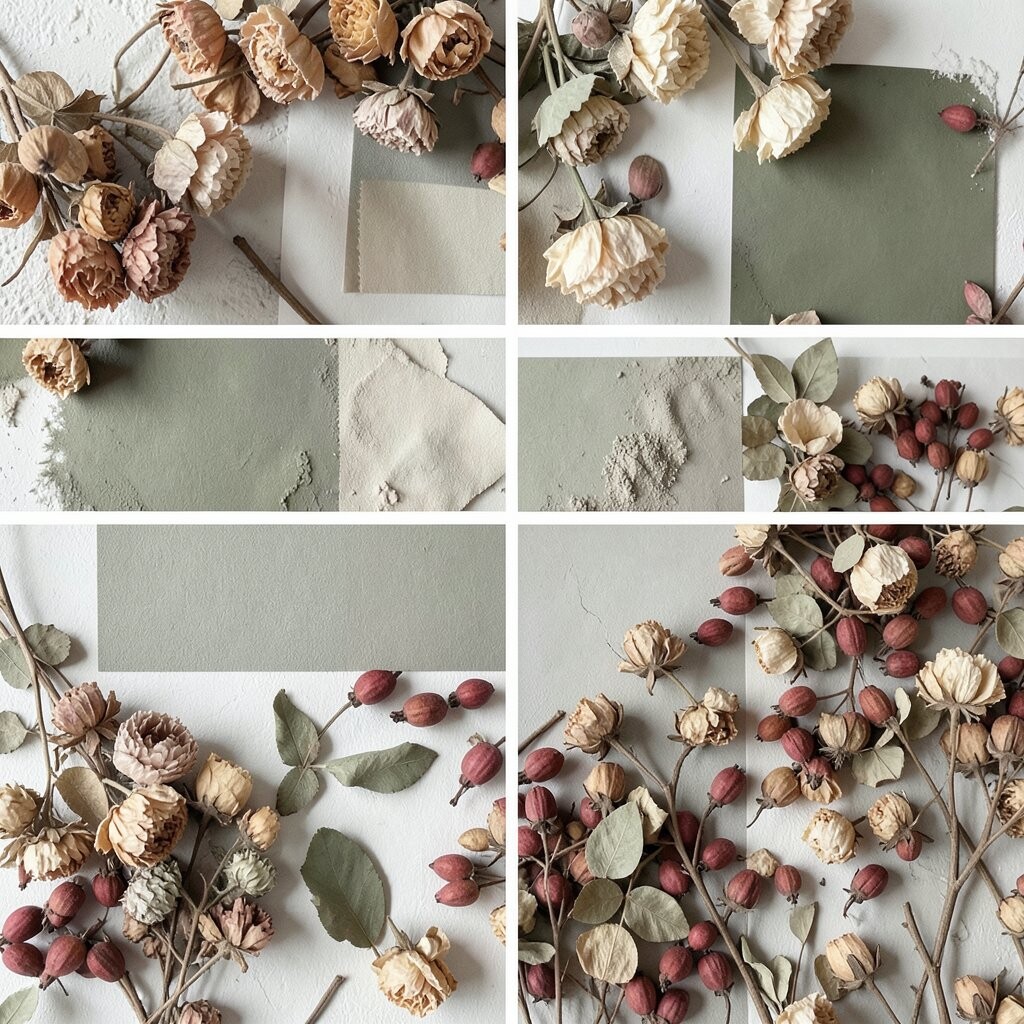
Olive-gray is like a refined neutral, calm but still interesting. Dried rosehips with earthy reds and warm neutrals create a natural, slightly vintage look.
This palette feels unique because the colors are subtle, yet the texture tells the story. Rosehips add small pops of color that look like tiny lanterns, and neutral filler keeps everything grounded.
For a practical approach, anchor the arrangement with a neutral base, then add rosehips sparingly where you want attention. That helps you avoid a “too busy” look while still getting color contrast.
Personalization can include mixing ribbon colors, like oat or muted rust, so the arrangement matches your existing textiles. The goal is for the dried flowers to feel like part of your home, not a separate project.
15. Warm White With Burgundy and Wine-Colored Dried Flowers

Warm white walls make burgundy and wine-colored dried flowers feel rich and elegant. The high contrast looks bold, but the warm white keeps it from feeling harsh.
To prevent the room from feeling too dark, add a bright element nearby, such as a light-colored rug or a mirror with a thin reflective frame. Dried flowers look extra luminous when paired with glossy highlights in decor.
Cost considerations can be flexible here, since a single striking burgundy arrangement can do the heavy lifting. If you already have neutral furniture, this palette can refresh your space without a full decor overhaul.
For personalization, choose a vase that matches the undertone of your wine flowers, like matte terracotta for a rustic feel or clear glass for a cleaner look.
16. Light Mushroom Beige With Pale Straw and Creamy Dried Flowers

Mushroom beige is gentle, cozy, and surprisingly modern. Pale straw tones and creamy dried flowers blend beautifully, creating a soft, barely-there glow.
What makes this palette stand out is its calm balance of warmth and neutrality. It gives your wall a quiet style that still feels joyful, especially in the evening when lamps add extra softness.
For practical tips, keep the arrangement loosely grouped and avoid overcrowding the stems. Light, airy spacing helps your dried flowers stay visible and keeps the wall from looking flat.
If you want a personalization idea, mix in one unexpected texture, like a small cluster of dried grasses. That tiny change makes the whole display feel curated and uniquely yours.
To manage costs, treat one wall like a focal feature rather than trying to decorate every corner at once. When the color palette is light, even a small arrangement can brighten the entire room.