The first brushstroke is exciting, until the wall starts arguing back. Small errors stack up fast, and your art ends up looking less like you and more like a rushed practice piece.
By spotting the usual trouble spots early, you can keep your canvas work fresh, smooth, and full of personality. The best part is that most fixes are simple, low cost, and surprisingly quick.
1. Skipping Proper Canvas Prep
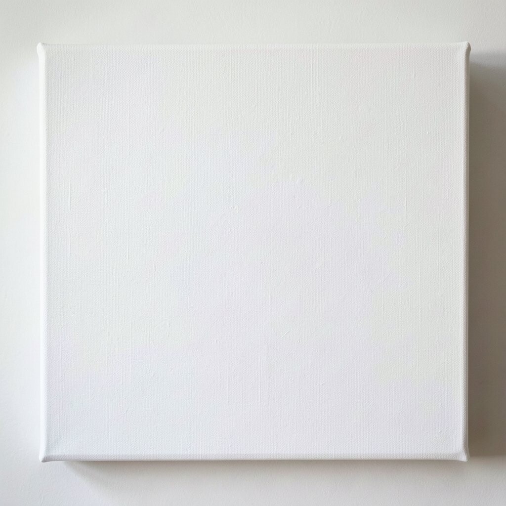
You can feel it when a canvas isn’t ready, because paint won’t behave the same way. Watch how the surface looks too slick or blotchy, and notice how colors may sink in unevenly.
Start by gently cleaning off dust and oils, then check the canvas for loose fibers. If you’re painting over an older surface, lightly sand so the next layer grips better. A little prep helps your brush glide, and it makes the final look cleaner and more professional.
2. Choosing the Wrong Paint Mix for Your Style
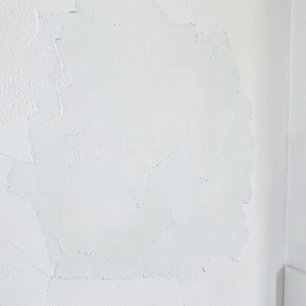
When your paint mix doesn’t match your goal, it shows in the texture. A glossy mix can cause glare and uneven drying, while a too-dry mix may leave a chalky surface.
Match your paint consistency to the way you paint, whether you like smooth blends or bold texture. Test a small corner first so you can see how the color dries and how it blends with your next layer. Taking a few minutes to test saves hours of repainting later.
If you love modern, airy color fields, keep mixes slightly lighter and transparent. If you enjoy thick, dramatic strokes, use a paint body that holds peaks without cracking. Budget-friendly craft acrylic can work, but higher quality paint usually covers better with fewer coats.
3. Pressing Too Hard and Losing the Drawing
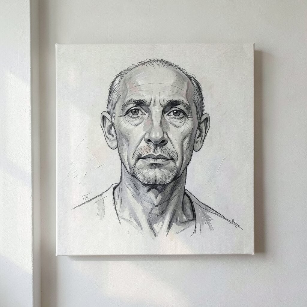
Heavy pressure can flatten lines and push pigment into the weave of the canvas. You may notice your early sketch looks smeared, and details in faces, hands, or small objects get lost fast.
Hold your brush more like a pen and let the tip do the work. Use light guiding strokes for outlines, then build color gradually. This keeps your edges crisp, and it makes the final image feel more intentional and unique.
Try switching to a smaller brush for key shapes, even if you normally paint fast. You can also pause to step back and check proportions in the mirror of your wall space. With calmer control, your art ends up looking thoughtful, not hurried.
4. Letting Colors Dry Before You Match Edges
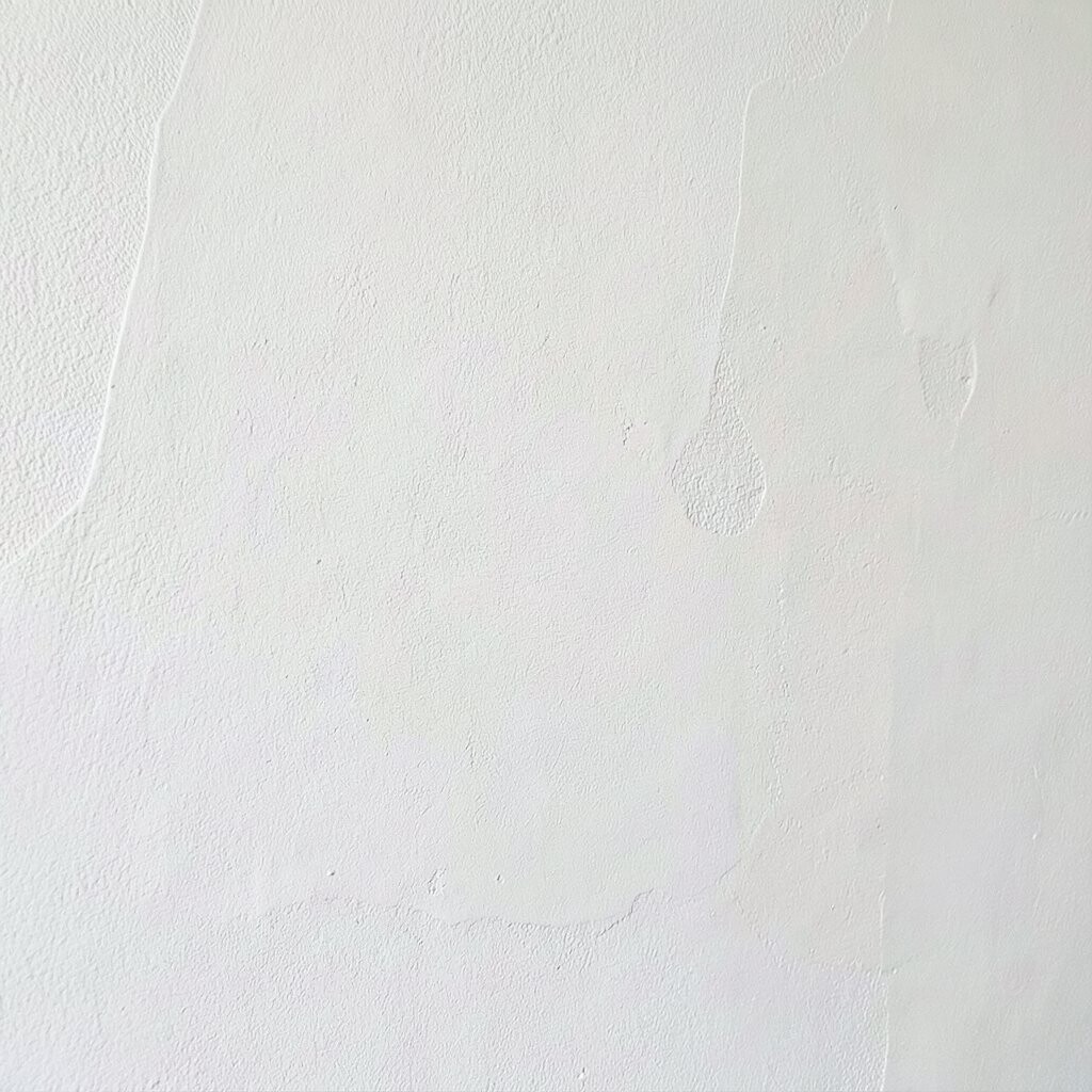
Sharp edges are powerful, but only when the timing is right. If one area dries too early, the boundary can turn into a harsh line that wasn’t part of your plan.
Work in small sections so you can blend neighboring shapes while they’re still responsive. Keep a damp palette or mist lightly so your colors stay workable a little longer. This makes transitions feel smooth, and it helps your image look brighter and fresher.
5. Ignoring Light and Color Temperature
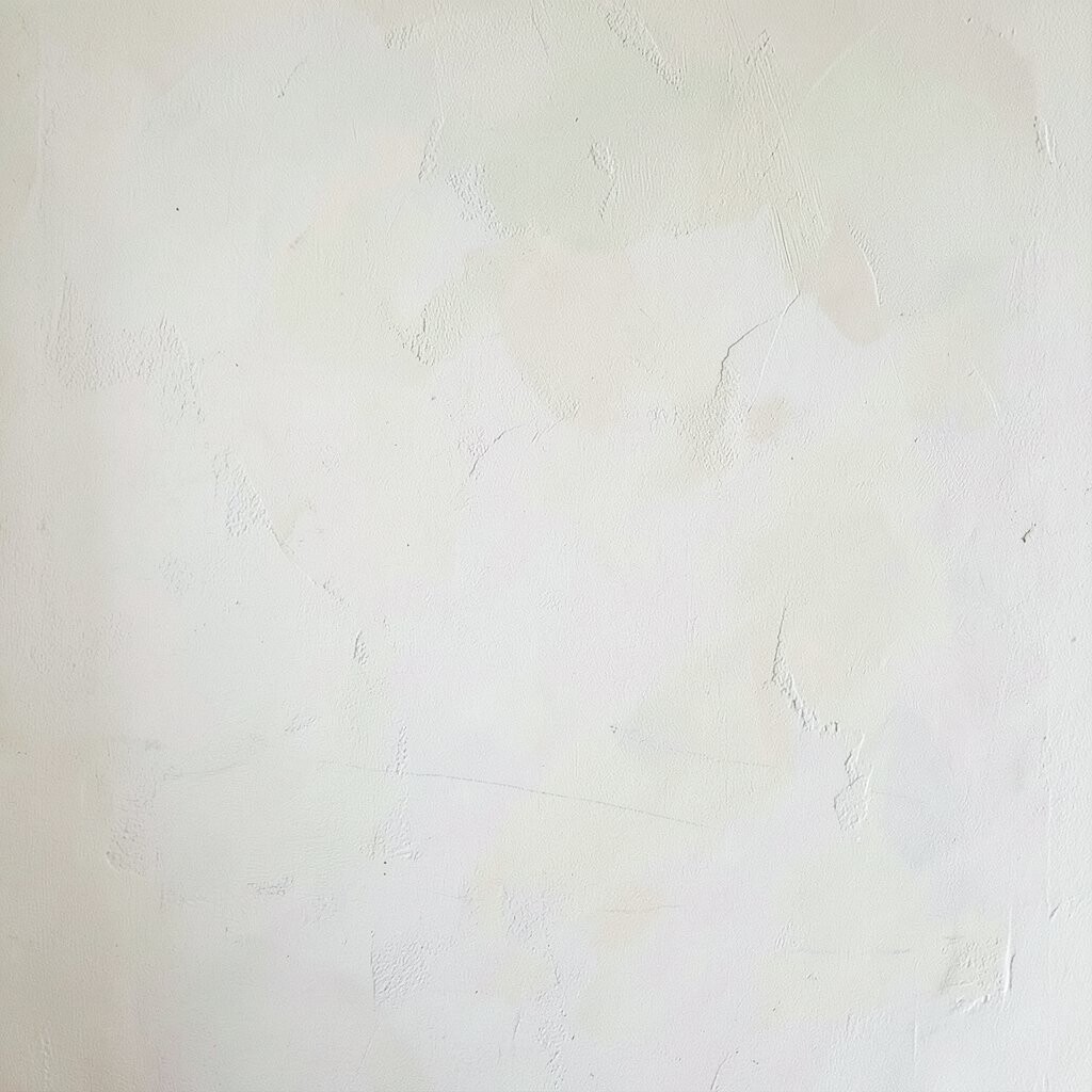
Your wall lighting changes everything, even if you think the canvas will stay the same. Warm bulbs can turn cool blues greenish, while daylight can make shadows look flat.
Pick a reference light source before you mix colors, then compare your painting to that real environment. Notice whether your shadows feel blue, purple, or brown, and adjust so they match the vibe you want. This simple check makes your colors feel believable, and it gives your art a stronger mood.
For a trendy look, many people are now leaning into soft color temperature shifts rather than strict black-and-white shadowing. If you’re working on a budget, mix small amounts at a time so you can correct without wasting paint. Personalize by choosing a “signature” temperature, like always leaning cool for evening scenes or warm for cozy spaces.
6. Using the Wrong Wall Placement During Painting
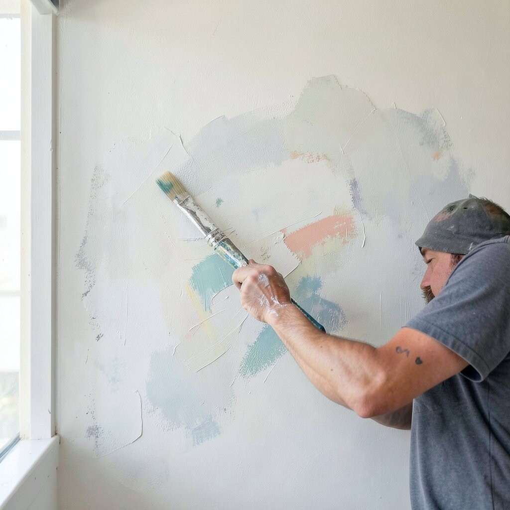
Painting near the final spot helps you, but guessing the distance can hurt you. If the canvas is too high or too far back, details can disappear and bold areas can overwhelm the room.
Stand at the spot where viewers will actually see your work, then compare the painting as you go. A quick step back can reveal that your highlight should be brighter or your shadow should be softer. This keeps your composition balanced, and it helps your wall art feel like it belongs.
7. Overworking Areas That Should Stay Simple
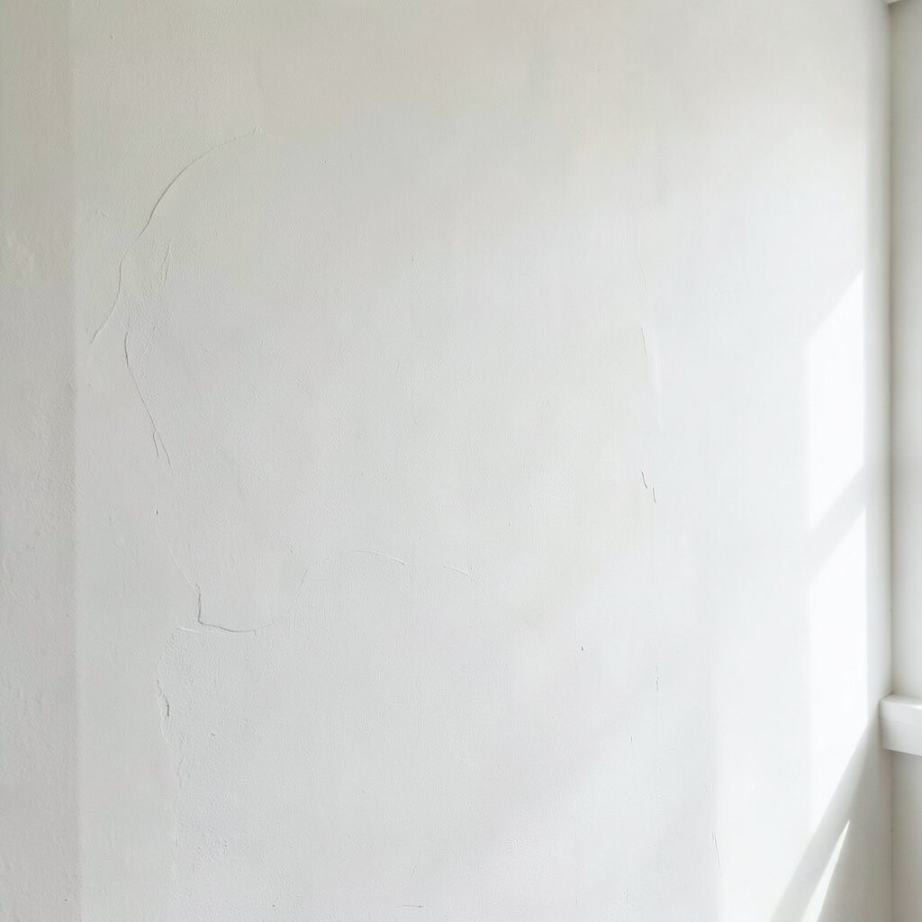
Sometimes the paint looks perfect at first, and then you keep fixing it. Overworking can turn smooth shading into muddy texture, and you may see a dull gray haze in places that should glow.
Give your layers a chance to set, then stop while the piece still feels fresh. If you need changes, adjust with thin layers instead of scrubbing the same area again and again. Your painting will look cleaner, and it will keep more of that original energy.
To stay in control, set small goals like one object, one shadow pass, or one background fade. This also helps you maintain a consistent style across the whole canvas. Unique art feels confident, and confidence often looks simpler.
8. Skipping Drying Time Between Layers
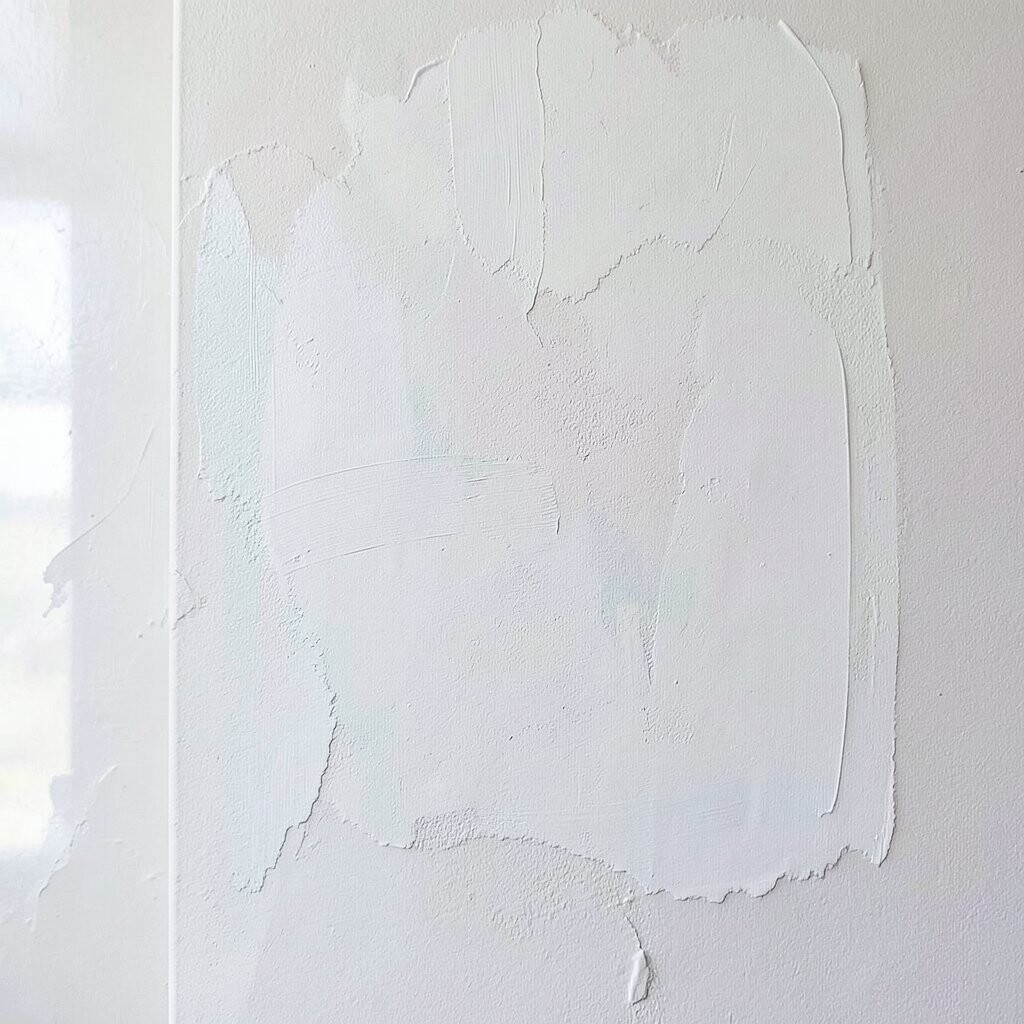
Rushing layers can smear edges and mix pigments in ways that don’t make sense. You might notice streaks that look like smoke, especially when you go from darks to lights too fast.
Let layers dry fully before adding the next one, and keep a consistent pace across the painting. Acrylic generally dries faster than many other media, but it still benefits from patience. When you wait, brushwork stays crisp, and your colors stay true instead of muddy.
9. Not Testing Paint and Varnish on Scrap First
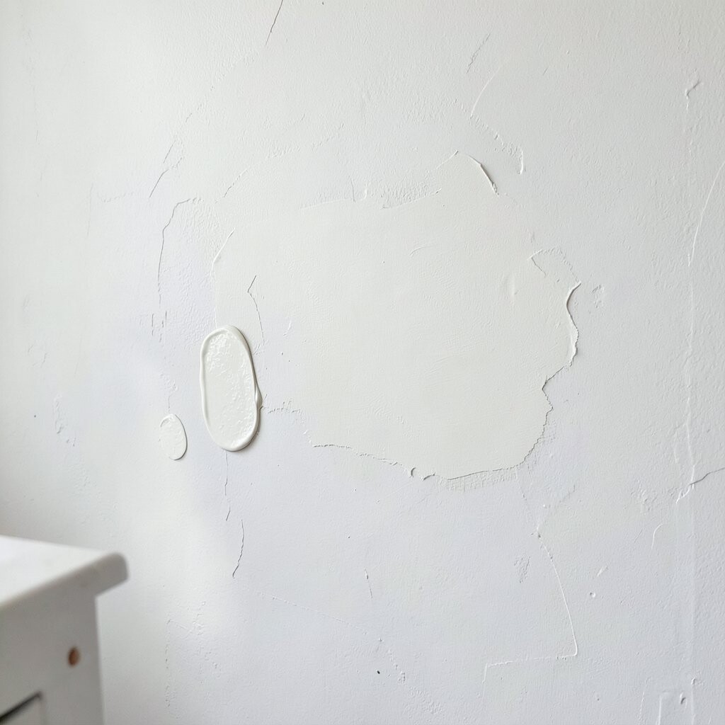
A color can look right while wet and then change when it dries. Varnish can also shift the surface, making it more glossy or more muted than you expected.
Test your exact paint, medium, and varnish combination on a scrap piece or an unused corner. Watch the dry color in the same lighting as your room so you can predict the final look. This reduces surprises and helps your finish match your vision.
If you want a current-style matte appearance, many artists prefer satin or matte varnish to reduce glare. If your room gets lots of sun, testing helps you avoid unwanted shine that can fade your mood. Even a small budget tester can prevent a full repaint, which is a smart money move.
10. Neglecting Brush Care and Clean Edges
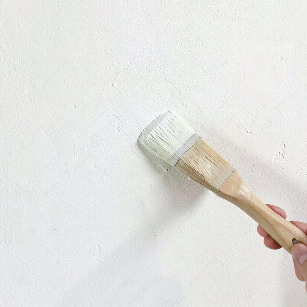
Dirty brushes can steal color from new areas and blur lines you worked hard to create. You might see dull undertones showing up where bright tones should be pure.
Rinse brushes often, blot them gently, and keep a separate brush for darks if possible. Use a soft towel to avoid damaging bristles, and reshape the bristles with light finger pressure. Clean tools make your strokes smoother and your details sharper.
11. Painting Without a Plan for Background Depth
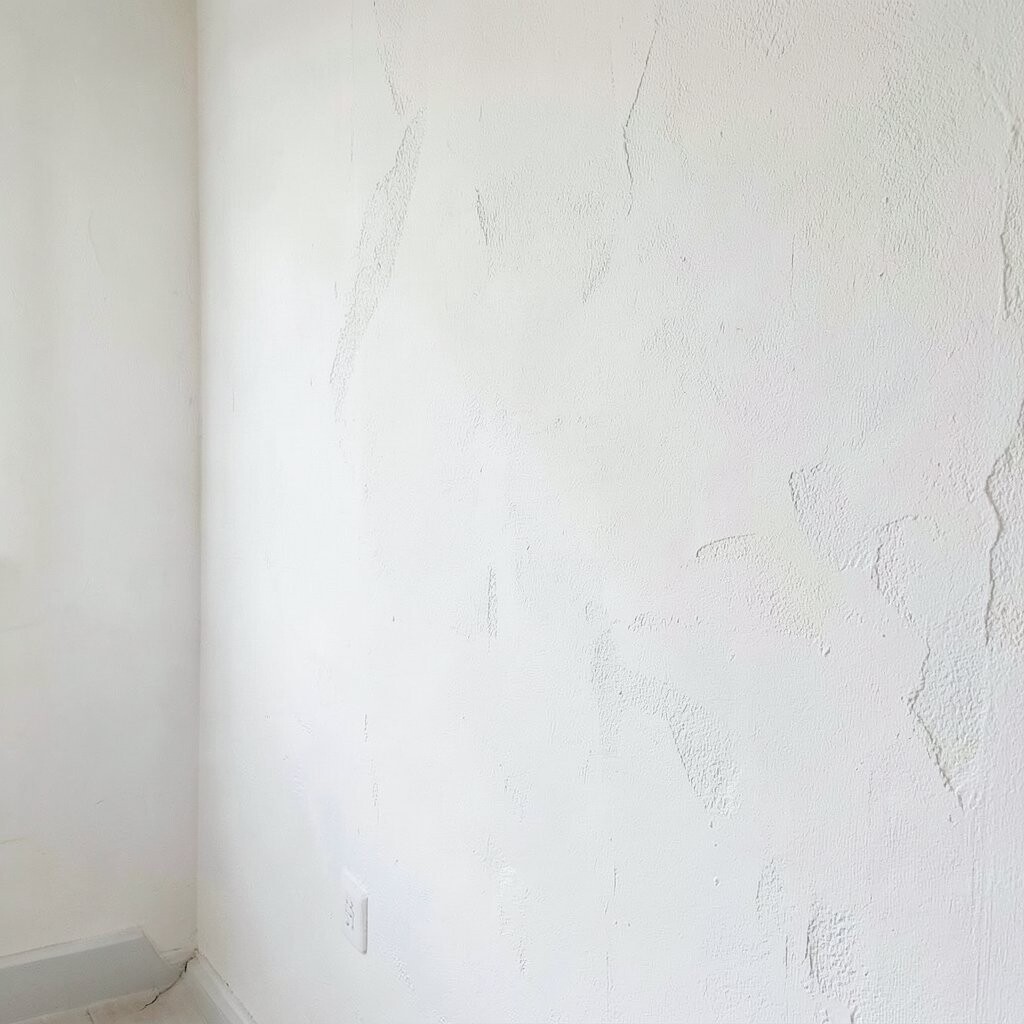
Backgrounds are where many wall paintings quietly lose their wow factor. If everything sits on the same visual level, the subject can feel flat, like a sticker instead of a scene.
Decide early how far back each area should feel, then adjust value and contrast. Backgrounds often look better with lighter values, softer edges, and fewer sharp details. This helps your main subject pop and keeps the whole piece feeling layered and real.
To make your background feel unique, add a subtle pattern or gentle gradient that matches your theme. For example, drifting shapes can echo plants, waves, or city lights without stealing attention from your focal point. Personalize it by using colors found in your room, like throw pillows or wood tones, so the art blends naturally.
12. Choosing Too Many Colors Too Soon
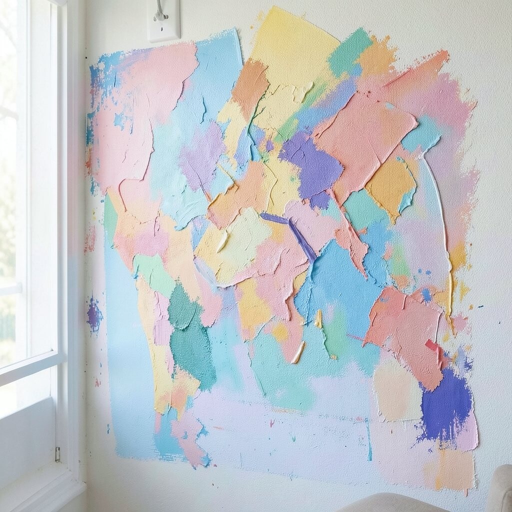
When you grab every color at once, your canvas can start looking chaotic. The paint may lose harmony, and your focal area won’t feel like the hero.
Limit your palette and build it step by step, so each color has a clear job. Mixing a few tones into a “family” creates harmony, even when your subject is bold. This makes your piece look intentional and increases the chance people feel something when they look at it.
If you want a modern vibe, many artists now lean into limited palettes with high contrast and gentle texture. Keep a small set of core colors and white, then add one accent color for energy. It’s budget-friendly too, because fewer tubes get opened and wasted. Unique style often comes from restraint, not from more paint.
13. Forgetting to Finish with a Consistent Frame and Surface Plan
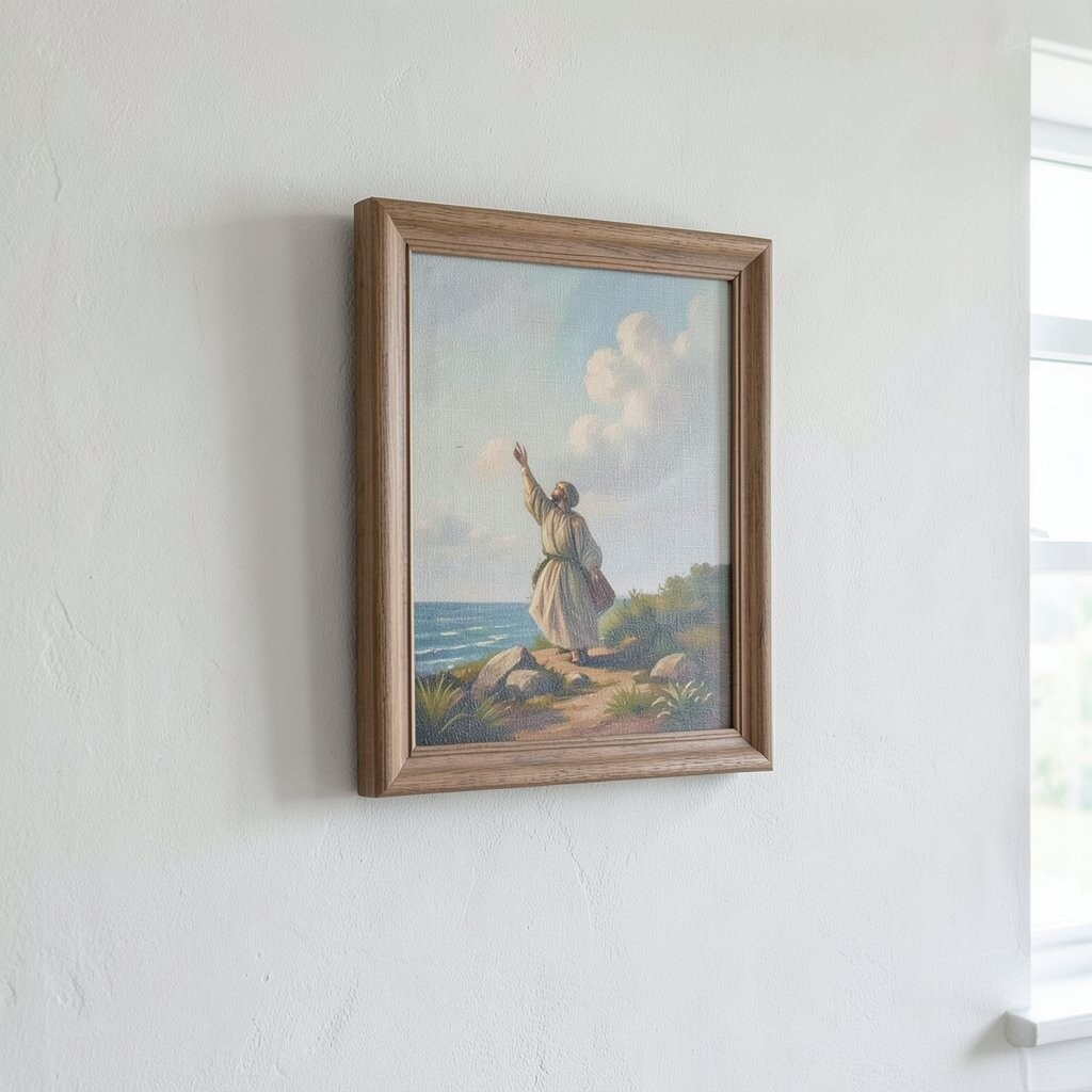
A painting can look amazing in the center and still feel unfinished at the edges. The sides might be bare, uneven, or distracting, especially when the canvas sits directly on a wall.
Decide how you will finish the edges, whether you continue the design around the sides or paint them in a clean solid. Choose a consistent surface finish for the whole canvas, like matte or satin, so light reflects evenly. This gives your artwork a polished look and helps it match today’s clean, gallery-style presentation.
For cost control, consider using simple, sturdy hardware for hanging and avoid expensive framing if your canvas finish already looks complete. You can also personalize with a signature corner mark or subtle title on the back. When the presentation feels intentional, your painting feels like it truly belongs in your space.