The right wall colors can change how a room feels in minutes. With bold blocks, you get big impact without complicated design rules.
1. Sunlit Accent Behind the Sofa
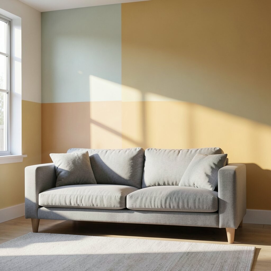
Pick two cheerful colors and place them in clean blocks behind your sofa. Imagine a warm golden strip beside a soft peach panel, like sunlight caught in paint.
Keep the shapes straight, and use painter’s tape to lock in crisp edges. This look brightens your living room because your eye lands on the color first, not on everyday clutter.
Use a satin or eggshell finish for easy wipe-downs, especially if your sofa sits close to the wall. For cost control, buy one main color in a larger size and treat the second color as a small accent.
2. Bold Entryway Ladder of Color

Your entryway can feel more welcoming with stacked blocks that rise toward the door. Think of a ladder effect, with teal steps and coral rungs that guide you in.
Use a level and mark light pencil lines so every band stays even. Color blocking in an entryway works because it creates instant focus at the spot where guests look first.
Try personal touches by matching one block to your favorite throw pillow color or a piece of art you already own. If you worry about going too bright, start with muted tones like dusty blue and soft paprika.
3. Geometric Half-Height Panels in the Hall

Turn a long hall into a calm, modern space using half-height color panels. Picture a sage green bottom band paired with a creamy white top, separated by a sharp line.
This approach helps your home feel taller and more organized, since the strong horizontal divider adds structure. It’s also easier to paint than full-wall designs because you only cover the areas you choose.
For practical setup, measure the wall from floor to chair-rail height and cut tape strips with care. If you rent or want flexibility, choose colors that can be painted over later with minimal effort.
Add uniqueness by switching the palette for each hallway section, like one wall in muted olive and another in warm terracotta. That subtle variation keeps the look lively without becoming overwhelming.
4. Kitchen Countertop Glow With Vertical Blocks
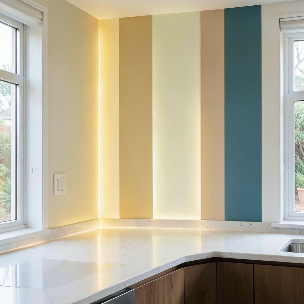
Your kitchen can feel brighter with vertical color blocks near the counters. Picture a sunny lemon stripe running upward next to a deep navy section like a calm night sky behind it.
Vertical shapes make ceilings feel higher, which is a bonus in many kitchens. They also help the wall coordinate with cabinets, since you can mirror warm or cool tones from your hardware.
Keep it practical by using a washable interior paint and sealing it lightly if your kitchen gets lots of splashes. A quick test patch behind the cabinet door area can help you see the real color in daylight.
To personalize, repeat the exact colors in small spots like a vase, dish towel, or backsplash accessories. That repetition makes the wall feel intentional, not random.
5. Dining Room Color Frames Over the Wall Art
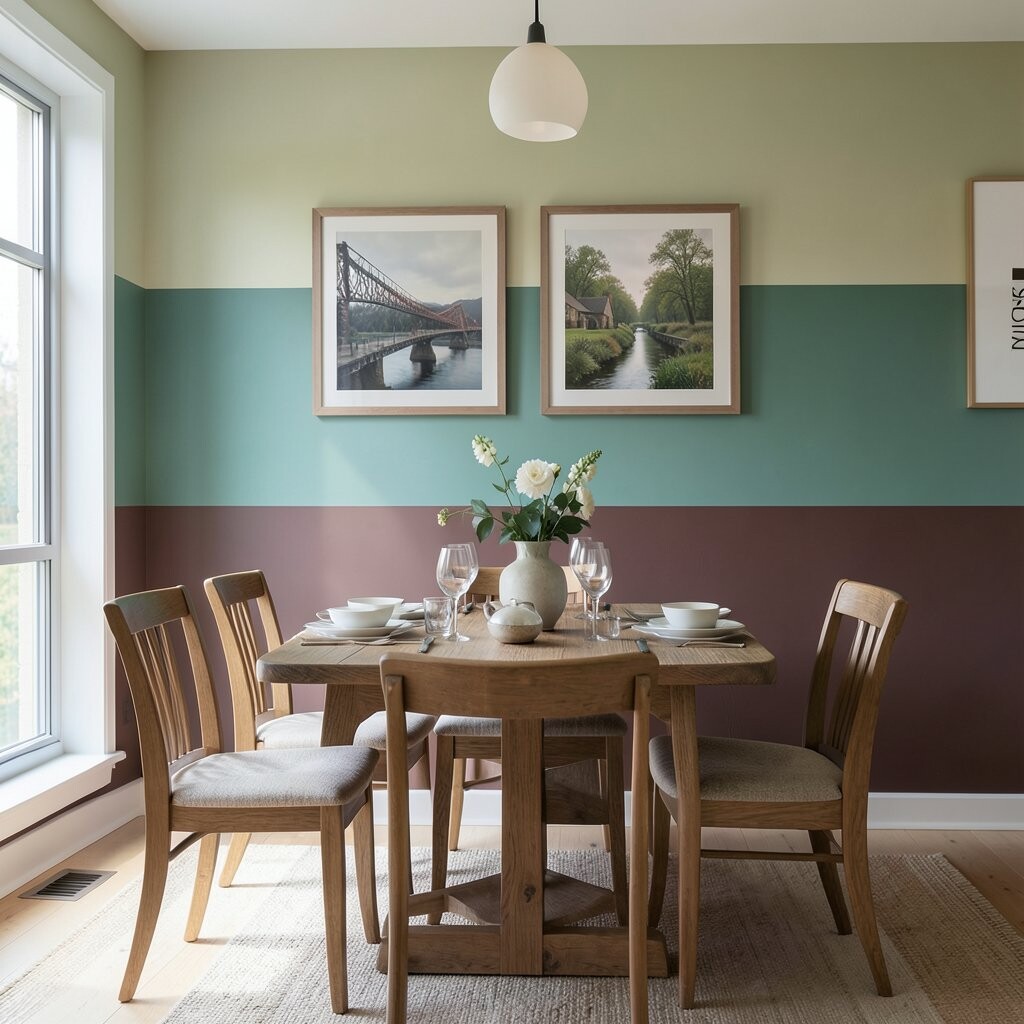
Make your wall art pop by painting bold frames around where art already hangs. Imagine a thick coral rectangle surrounding a gallery wall, with a cool gray border on the sides.
This gives your dining room a styled, curated look and adds warmth during meals. Color blocking also helps your artwork sit in the center visually, even if the pieces vary in size.
Use painter’s tape to build the frame and apply paint in thin coats for clean edges. If you want a budget-friendly version, paint only the top and side borders and leave the bottom open.
Uniqueness comes from choosing an offset frame, like a slightly taller top block or angled corner shapes. Current design trends often lean into confident color pairs, so consider mixing one bold hue with a neutral that feels grounded.
6. Bedroom Calm With a Two-Tone Headboard Wall

Create a cozy feel with blocks that mimic a modern headboard. Picture a muted clay block centered behind the bed, framed by a soft sky-blue panel on both sides.
Color blocking in a bedroom helps you relax because the shapes can feel balanced and intentional. It also makes your bed the focal point without needing extra furniture.
For practical results, paint the wall first, let it dry fully, and then seal with a low-sheen finish. If you paint near bedding, keep the edges crisp so the block lines look sharp in photos.
Personalize by using your favorite fabric color from the curtains or comforter as one of the paint shades. Budget-wise, one feature wall is usually easier on your wallet than painting the whole room.
7. Office Focus With a Corner Burst Design
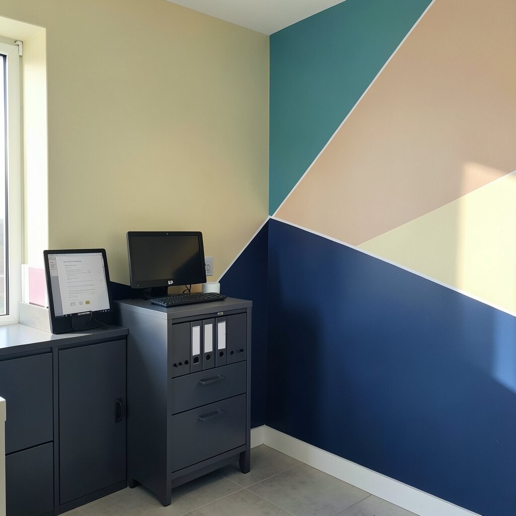
Turn your home office into a place you actually want to work in. Paint a diagonal corner burst using bright teal and warm orange so it feels like energy at the edges.
This design adds personality and helps your brain stay engaged because movement draws attention. It’s unique while still practical since you can keep the rest of the room simple.
Use tape to define triangles or angled blocks, then paint from the outer edge inward for neat lines. If you have a small office, brighter colors near the desk can reduce the “dim” feeling.
To keep it cost-smart, buy sample pots for the two main colors and pick the one pair that looks best in your lighting. Trends right now favor accent corners rather than full mural coverage, so this idea fits neatly.
8. Staircase Side Panels With a Candy Stripe Feel

If your staircase has visible wall sides, make them cheerful with alternating color blocks. Think of candy stripes, but built with larger panels so the design looks modern rather than busy.
This creates a playful welcome and makes daily movement through the home feel more fun. The block style also helps hide minor wall imperfections because the design splits the surface visually.
Before painting, check that you can reach and tape safely, especially around railings. A glossy or semi-gloss paint in high-traffic areas can be easier to clean when scuffs happen.
Personalize by matching one color to your front door or another consistent element in your home. If you’re worried about spending, limit the color change to a few key steps rather than every section.
For uniqueness, try a three-color mix but keep one color dominant so it doesn’t feel chaotic. When the blocks feel planned, the result looks high-end without heavy cost.
9. Living Room Wave Bands in Two Contrasting Hues

Bring softness to bold color blocking with gentle wave-like bands. Imagine a bright lime band curving across a neutral wall, paired with a calm aqua panel beneath it.
This kind of design feels energetic while still soothing, which is great for families. The curve also makes the wall look custom, even if you keep the palette simple.
Use a flexible strip of tape and lightly mark a curve with chalk before committing. Clean edges matter most around curves, so take your time and press the tape down firmly.
To personalize, choose colors that match your rug tones, then keep the rest of the room in simple whites or grays. Cost considerations are easier when you paint a single wall instead of repainting cabinets, trim, or furniture.
Current trends often mix a bright accent with a calming counterpart, so your aqua and lime idea fits right in. If you want less contrast, choose one vivid shade and one near-neutral color like warm sand.
10. Bathroom Spa Look With Water-Inspired Color Blocks

Make your bathroom feel like a mini spa with cool color panels that echo water. Picture soft mint and deep sea blue blocks around the upper half of the wall near the sink.
Color blocking helps break up tile-heavy spaces and adds warmth that tiles can lack. It also makes the bathroom feel more intentional and relaxing when you start your day.
Use paint labeled for bathrooms since moisture can be an issue. For clean lines near wet zones, keep blocks above splash areas and use caulk where needed around edges.
Personalize by pulling one shade from your towel colors or your shower curtain pattern. If you’re working on a budget, choose one main color and let white handle the rest for a simple, fresh look.
11. Laundry Room Refresh With Oversized Color Squares

Give your laundry room a cheerful makeover using oversized squares on one wall. Imagine crisp white walls with bright sunny blocks arranged like a playful grid of lime, coral, and cobalt.
This design makes chores feel less dull because the room becomes visually fun. It’s also unique because large shapes look bold even with limited colors.
Plan your square sizes ahead of time and keep margins consistent so it looks designed. Use a measuring tape and tape guides to avoid wonky lines that can be hard to fix later.
If you want a practical twist, keep the squares higher on the wall where you won’t bump laundry baskets. Cost-wise, it’s a great match for small rooms, since you only need paint for one feature wall.
To personalize, repeat one square color in small items like a hamper, label stickers, or storage bins. This creates a coordinated look without extra spending on new furniture.
12. Nursery Adventure With Soft Blocks and Rounded Corners

For a nursery, you can still use bold color blocking but keep it gentle. Picture pastel blocks in blush and sunny yellow with rounded edges, like a friendly playground wall.
Color blocking can support a calm visual rhythm, especially when you choose softer shades. It also helps the nursery feel lively without requiring a full mural or character prints.
Use a tape curve method to round corners, then paint in layers for smooth coverage. Consider choosing washable, low-VOC paint for everyday safety and comfort.
Personalize by matching block colors to your bedding and swaddle patterns so the room feels coordinated. If you worry about aging out of nursery colors, use neutral bases and change only the accents later with smaller touch-ups.
This look fits current trends that favor playful shapes with modern restraint. Rounded corners keep it sweet, while the bold color blocks keep it current.
13. Stair Hall Gallery Backdrop With Three-Color Layout

Turn your stair hall into a mini gallery with a three-color block backdrop behind frames. Imagine a warm taupe wall with two narrow bright bands and a larger muted panel to anchor the art.
This helps your photos and prints look more vivid because the background becomes a calm stage. The block layout also adds depth, making the hall feel more sophisticated.
Keep the palette balanced by choosing one dominant shade and two supporting colors. For practicality, paint the main background first, then tape the smaller bands once it’s fully dry.
Personalize the colors by pulling tones from your floor wood, railing finish, or even your existing rug. For cost, this design works well because you can use sample pots for two accents and a single larger can for the base.
Uniqueness comes from using asymmetry, like a wider accent near the landing and slimmer ones along the stairs. When the layout feels intentional, it looks like a custom design rather than a DIY afterthought.
14. Basement or Family Room Color Dots With Vertical Stripes

If your basement feels flat or dark, add brightness with vertical stripes and tiny dot accents. Picture thick charcoal stripes lined with bright white space, plus little dotted blocks in gold on the side edges.
This combo creates a lively pattern without taking over the entire room. The vertical stripes help the space feel taller, while the dots add a fun surprise.
Use a small roller for stripes and a sponge or stencil for dots to keep the work consistent. For practical cleanup, lay down drop cloths and keep a damp cloth nearby to wipe tape residue.
Personalize by choosing colors that match your family room items, like a gaming setup, bookshelves, or a bar cart. Cost considerations are easier when you paint only one wall and use simple geometric repeats rather than detailed murals.
Current trends show people enjoying patterned accents paired with bold but controlled color families. This approach gives you that trendy energy while still feeling cozy and livable.
15. Outdoor-Feeling Patio Wall With Sunset Blocks

Bring an outdoor vibe inside by painting sunset color blocks on a patio or sunroom wall. Picture a gradient-style look made from stacked blocks of coral, soft orange, and gentle cream that feel like late afternoon light.
This design makes the room feel warm and inviting, especially in the evening. Color blocking gives you the sunset look without the tricky smooth blending that can be hard for first-time painters.
Use tape to create each band, then slightly soften the transitions by painting one block while the previous coat is still tacky. That gives a natural glow effect while keeping edges mostly clean.
To personalize, match one stripe to a plant pot color or outdoor cushions you already love. For cost, consider using fewer colors and letting one neutral block give the design room to breathe.
Uniqueness comes from how you place the “sun” block slightly off-center, like it’s shining from a corner. This style is popular right now because it blends bright joy with a calm, grounded base, making your home feel like a vacation spot.