The right wall color can make a room feel brand-new without major work. Color blocking adds energy, clarity, and personality in a way paint alone can’t always match.
1. Sunburst Accent Stripe Behind Seating
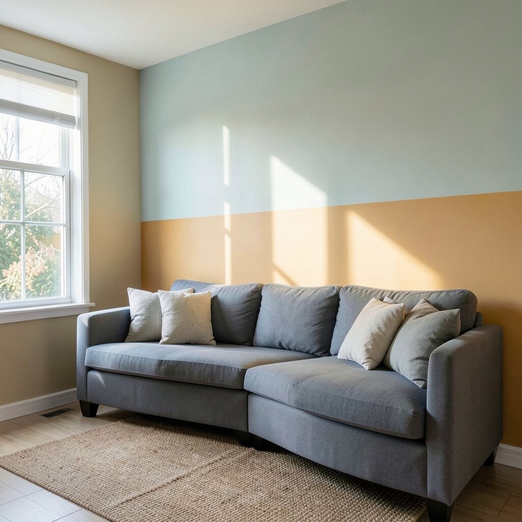
Pick a bold warm color and place it as a vertical or angled stripe behind a chair, sofa, or reading nook. When the stripe hits eye level, it creates a bright focal point and makes the space feel more inviting.
Choose two tones that relate to your decor, like mustard and soft cream, or coral and pale beige. Keep the stripe width consistent so the look feels neat, and use painter’s tape to mark clean edges before you roll. This idea works great in small rooms because it draws the eye upward and sideways, giving a sense of movement.
2. Pastel Block Grid In A Home Office
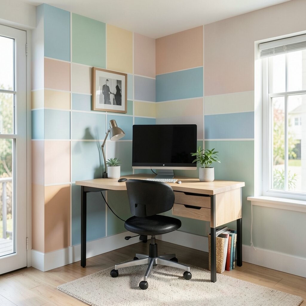
Turn your desk wall into a tidy grid using pastel blocks in three to five colors. The gentle shades feel calming, yet the organized pattern helps your brain stay focused.
Use a mix of matte paint and slightly chalky colors to reduce glare from overhead lighting. Start by measuring the wall area and sketching a simple grid so you don’t waste time fixing uneven lines.
For a modern office trend, keep one color lighter to mimic daylight and use one deeper shade for contrast. If you want a budget-friendly approach, buy sample-size paints and mix within the same family of colors so everything still feels coordinated.
3. Bold Two-Tone Horizontal Bands For Instant Height
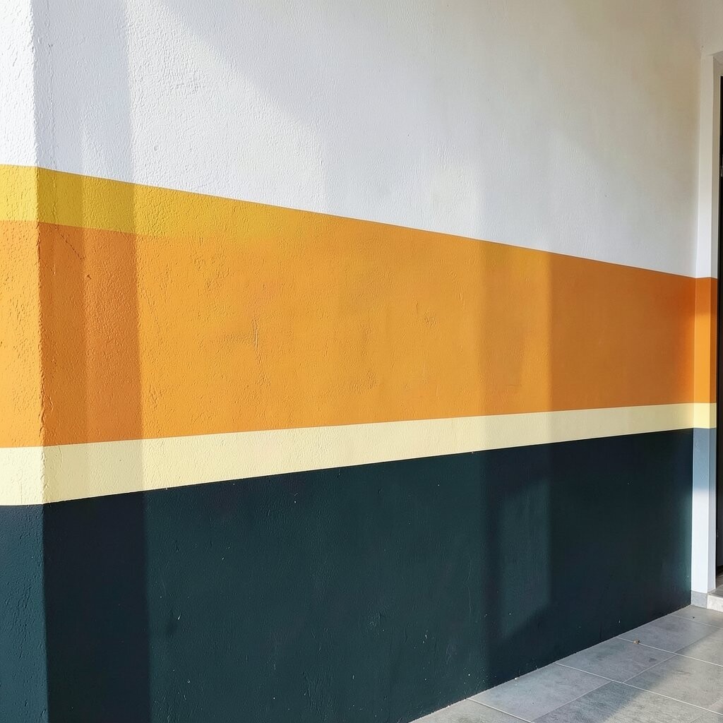
Create a dynamic look by painting two wide horizontal bands across the wall. A darker band near the floor can anchor the room, while a lighter band higher up can make ceilings feel taller.
Try pairing navy with warm white, or deep green with creamy off-white for a fresh and cozy mood. Use a level and tape to guide the top edge, because horizontal lines look crisp only when they’re straight.
To personalize it, match one band to a repeated color in your rug, curtains, or throw pillows. This style is a current go-to because it feels graphic like a design magazine spread, yet it’s easy to update later by repainting only one band.
4. Ombre Blocks With Hard Edges For A Soft Modern Look
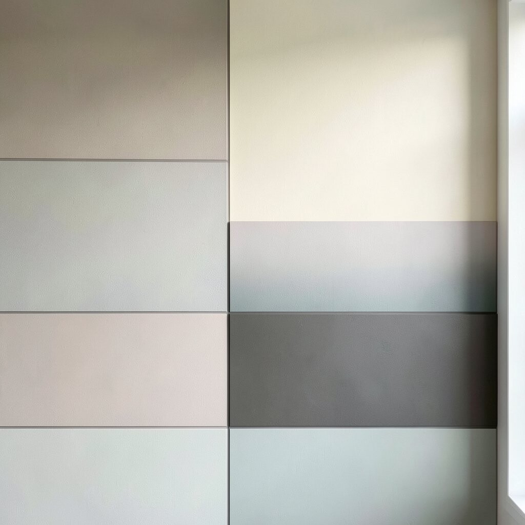
Combine color blocking with an ombre feel by stacking blocks that shift gradually in shade. You get the playful structure of blocks, with the gentle calm of fading color.
Pick one main color and create three or four variations, such as dusty teal to seafoam. Paint each block separately and blend at the border with a light touch, using a small foam roller to soften transitions while keeping the overall edges bold.
5. Geometric Corners Framing Your Favorite Decor
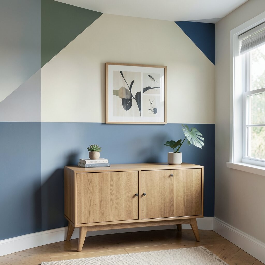
Paint two or three corner sections around a picture, mirror, or shelf for a crisp “framed” effect. The room instantly feels styled, even when the rest of the decor is simple.
Use contrasting colors like terracotta and light gray, or charcoal and butter yellow for a warm pop. Make the corner shapes consistent on both sides so the pattern looks intentional, not accidental.
For practical results, start with a rough layout using painter’s tape on the wall, then step back to check balance. This trend stays popular because it turns everyday wall art into a centerpiece.
6. Vertical Color Steps For A Taller, Airier Feel
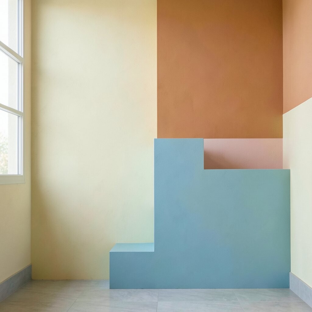
Instead of one big block, use stacked vertical rectangles that step up like stairs. This design can make a wall feel taller and give your room more visual rhythm.
Choose a tight color family for harmony, like three shades of blue, or mix warm and cool for a lively vibe. Keep the tallest block near the center and vary widths slowly so it stays balanced from floor to eye level.
If you have a budget limit, focus on the main wall area only and keep the pattern smaller than your whole wall. It’s also easy to personalize by repeating one of the colors in a nearby lamp, plant pot, or curtain.
7. Library-Look Wall With Deep Blocks And Warm Neutrals
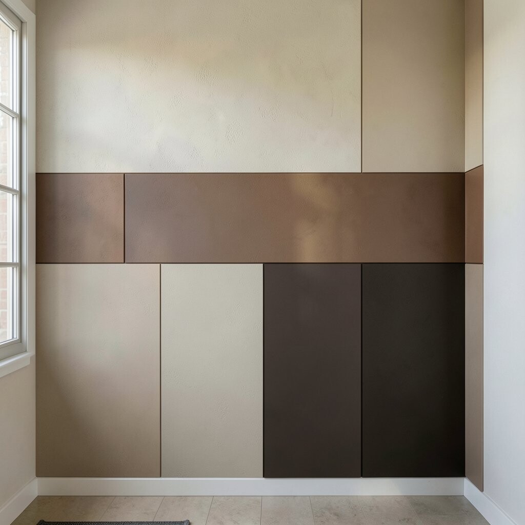
Give your space a cozy, grown-up feel by using deep colors in large blocks and soft neutrals as supporting tones. Think forest green paired with warm white, or espresso brown paired with cream.
When the wall is bold but not flashy, your furniture and artwork stand out more clearly. This approach also works well for rooms that don’t get tons of daylight, because the neutral sections keep everything from feeling heavy.
Try a matte finish on the deep color to reduce glare, and keep glossy paint only for small accents if you like a bit of shine. To personalize, match the deep tone to wood in your shelves or picture frames so the whole room looks connected.
8. Playful Checker Blocks In A Kids’ Room Or Guest Bath
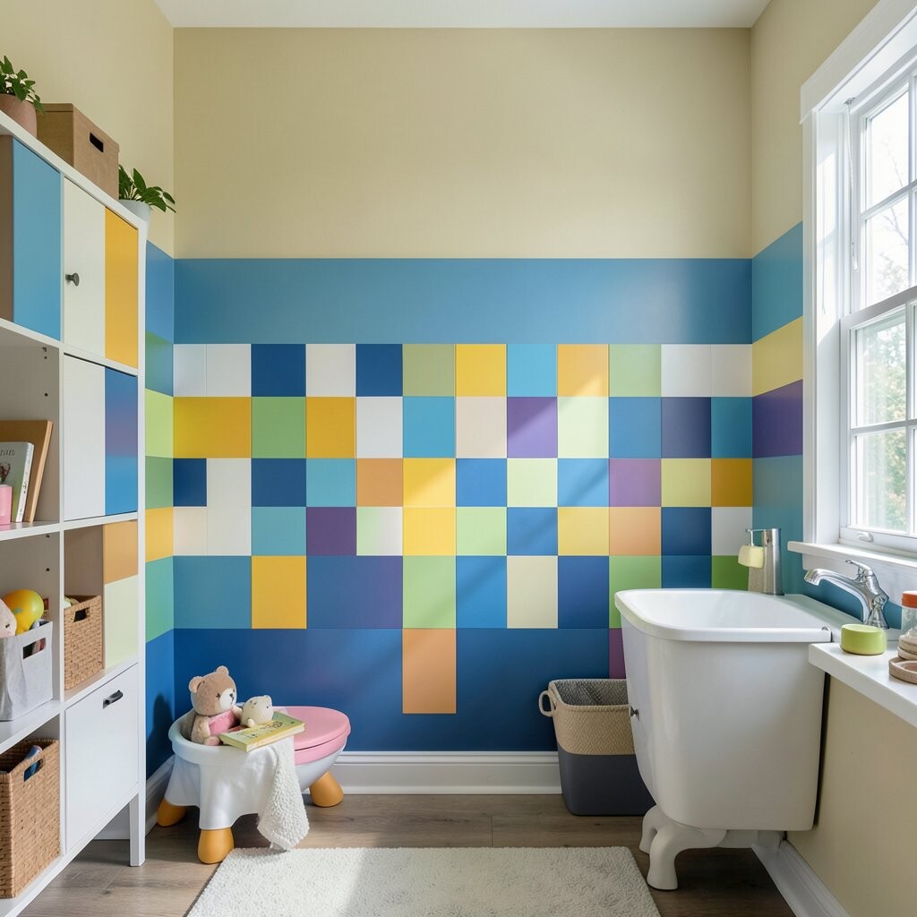
Use a checker-style pattern with two or three colors for a fun, energetic feel. Even simple furniture looks more cheerful when the wall has a lively repeating shape.
Pick wipeable, kid-friendly paint finishes for practicality, especially in high-touch spaces. For a modern look, choose colors like mint and soft gray rather than only bright primary colors.
9. Gallery Wall Backdrop With Color Bands Instead Of One Solid Hue
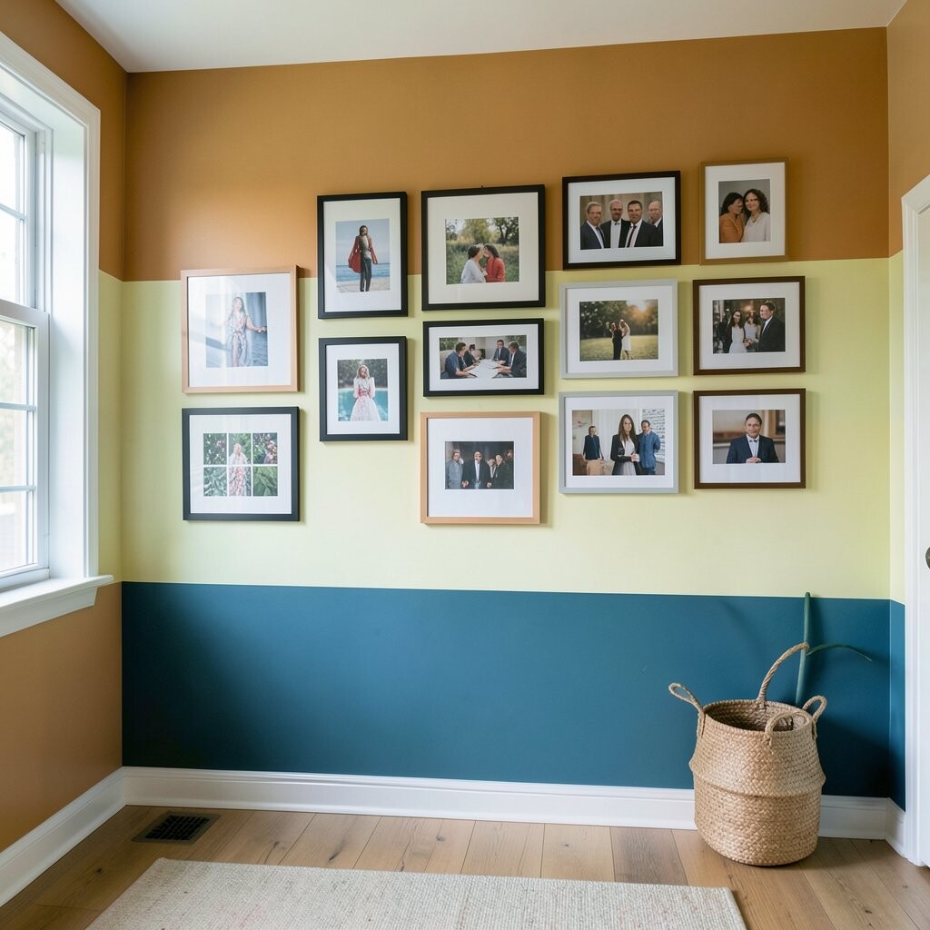
Create a strong backdrop behind your photo gallery by painting wide color bands across the wall. The art still becomes the main star, but the background adds depth and color without needing a full mural.
Use two colors that complement your frames, such as sage green and warm white, or light blue and sand. Plan the band widths so the bands sit where you want the eye to rest, not where they cut across the most important art.
For personalization, you can echo colors from your mats, frame finishes, or even a rug pattern. This is a current favorite because it looks styled, yet it still feels flexible since you can swap artwork later and keep the same backdrop.
10. Ceiling-To-Wall Color Block That Draws Light Upward
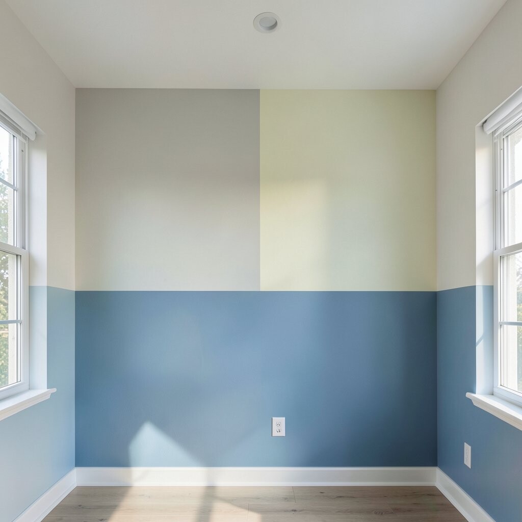
Paint a narrow vertical block that runs from near the ceiling down to the floor. The upward line helps the room feel taller and makes light feel more “caught” by the space.
Try a light color block like airy sky blue next to a neutral wall so it feels bright rather than heavy. If you want a bolder look, use a deep tone for the block and keep the surrounding wall light.
11. Warm Mediterranean Blocks With Terracotta And Clay Tones
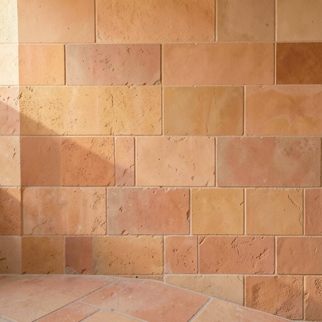
Bring a sunlit vibe with terracotta, clay, and soft cream blocks arranged in generous shapes. The colors feel earthy and welcoming, like late afternoon light.
Use a color plan based on the rest of your room, such as matching terracotta to woven baskets, pottery, or warm wood. Keep the edges crisp and the shapes simple so the wall feels modern, not busy.
To manage cost, buy only the main terracotta shade in a full size and choose smaller samples for secondary tones. Personalize it by adding a small accent block near a light switch cover so the pattern feels intentional.
12. Monochrome Blocks With One Surprise Accent Color
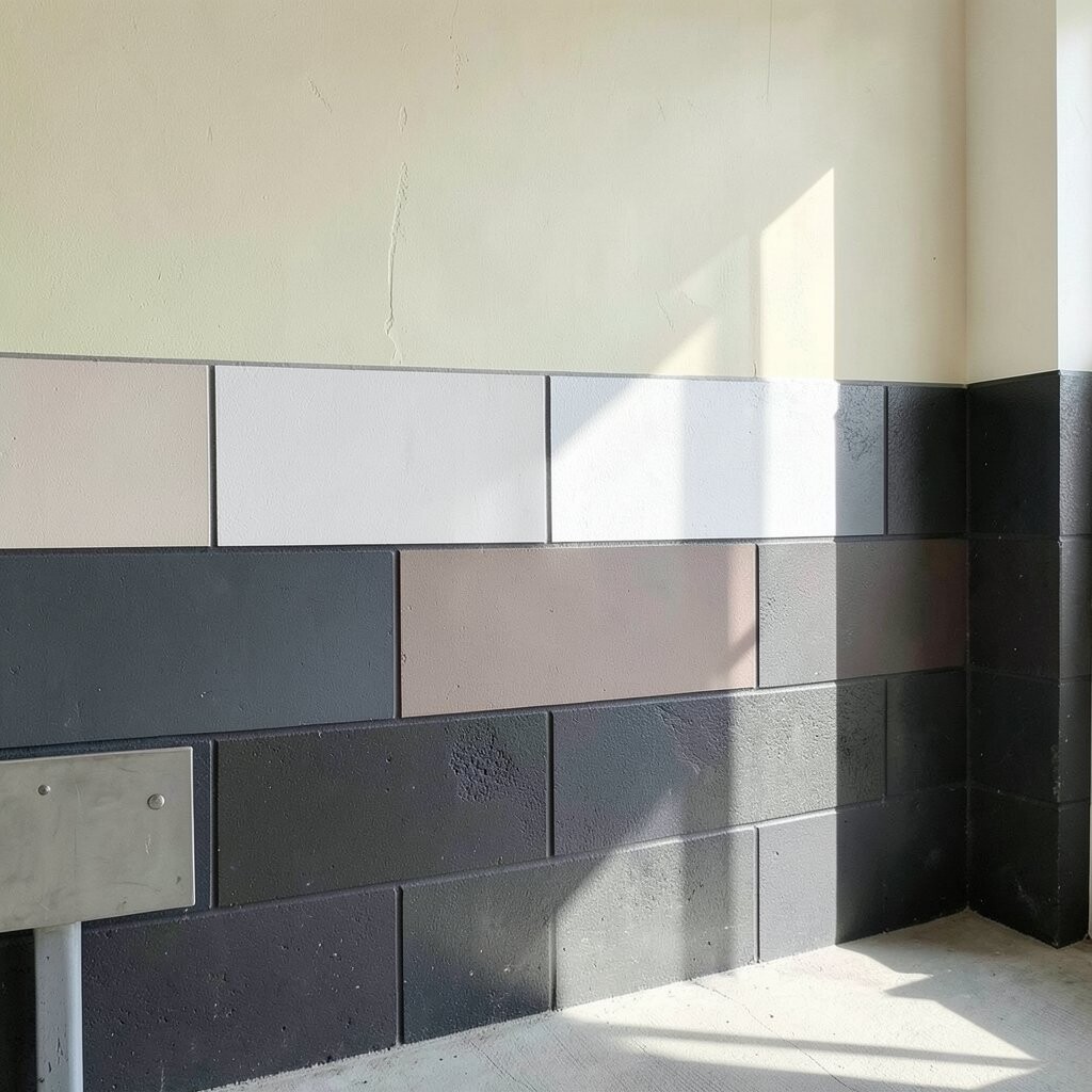
Start with a monochrome wall using two shades, then add one surprise block in a different color. The result feels calm and stylish, but you still get a playful “wow” moment.
Try gray-beige blocks with a single mustard accent, or deep charcoal with a small emerald patch. This method is great if you’re unsure about bright colors because you can control how much energy enters the room.
For a practical approach, limit the accent block to a place near your favorite chair or art. That way the color feels purposeful rather than random, and it’s easy to keep your decor coordinated.
13. Rented-Friendly Removable Look Using Magnet-Like Patterns
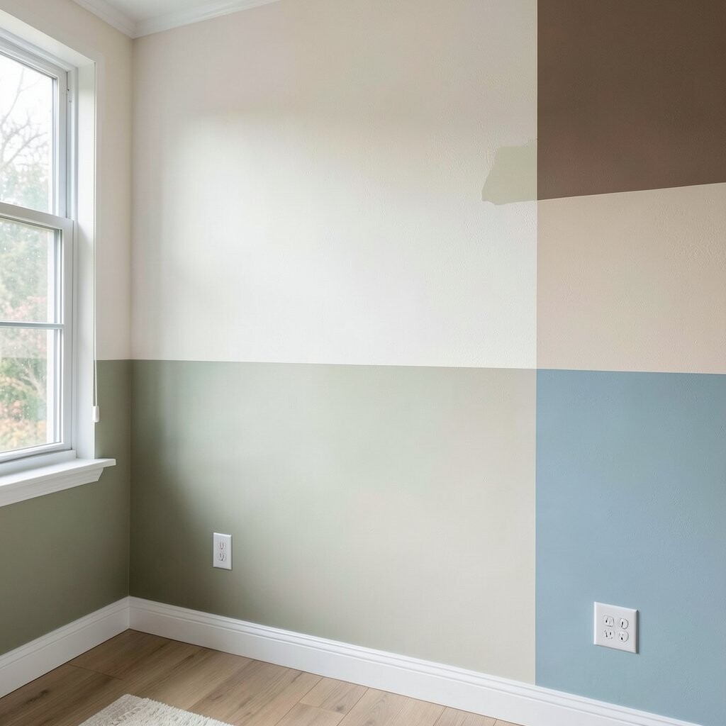
If you’re not sure you’ll stay in your home long, aim for a color-block feel that doesn’t require heavy changes. Use removable wallpaper or removable paint tape designs for a temporary style boost.
Stick to simple shapes like rectangles or thick stripes, since they’re easier to remove cleanly. Choose materials that follow your wall type and test a small area first so you don’t end up frustrated later.
To keep it looking current, pair one bold color with one soft neutral so the pattern stays modern. Personalize it with your favorite seasonal shade by swapping only one block area, keeping the rest of the wall calm.
14. Dining Room Citrus Blocks To Make Meals Feel Brighter
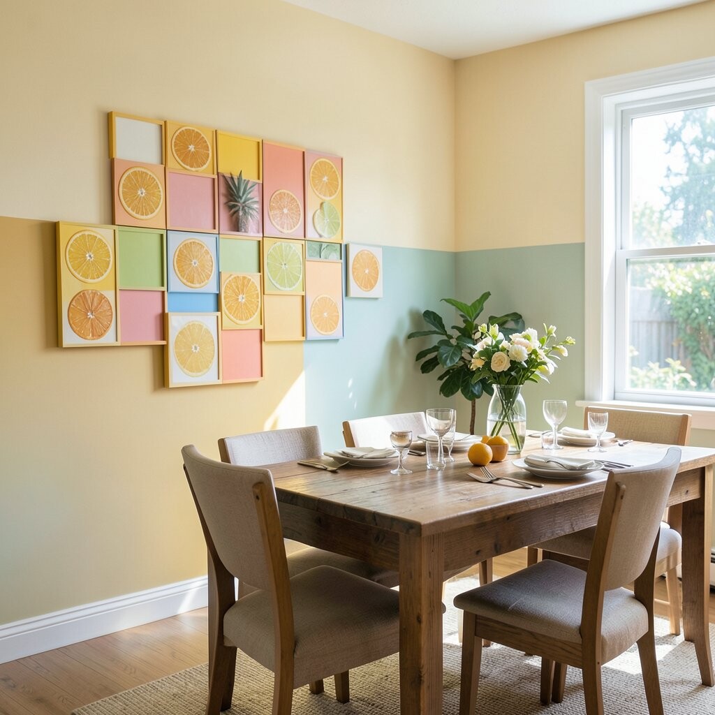
Paint citrus-inspired blocks to energize your dining space, such as lemon yellow and light olive green. This kind of color blocking adds warmth and makes everyday meals feel more special.
Use larger blocks behind the dining table so the color surrounds your space, not just sits on one corner. Matched with natural wood and simple lighting, the result feels fresh and inviting.
For practical lighting tips, consider warm bulbs since citrus colors look especially tasty under golden light. If you want to control cost, focus on the main wall behind the table and keep the rest neutral so you don’t overspend on paint.
15. Night Sky Blocks With Deep Blue And Starry Speckle Accents

Create a night-sky effect using dark blue blocks with a lighter accent panel for contrast. The wall feels cozy and dramatic, like a calm, creative corner after dark.
For a speckled touch, add tiny dots with a stiff brush or a small sponge around the lighter block. Keep the main blocks clean and graphic so the speckles feel like decoration rather than mess.
To personalize, pick a second accent color tied to your room theme, like silver-gray for a “star” vibe or muted teal for a cooler tone. This style is trending in bedrooms because it adds mood without needing complicated murals.
16. Entryway Block Path That Guides You In
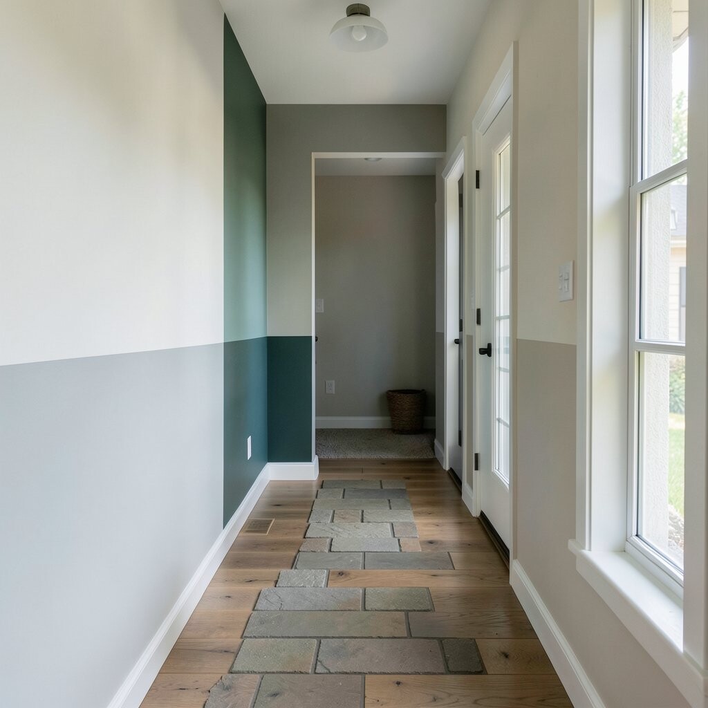
Design your entryway wall with color blocks that feel like a welcoming path. A vertical block near the door plus a horizontal stripe across the eye line can make the space feel organized and cheerful.
Choose colors that match what people see right away, like warm white with a bold welcoming shade such as burnt orange or sunflower yellow. Keep the pattern simple so coats, shoes, and baskets still stay the focus without visual clutter.
For practical upkeep, use a durable paint finish on the entryway wall since fingerprints and scuffs happen. Personalize by echoing the same colors in a doormat or a small shelf item, so the whole entry feels like one styled moment.