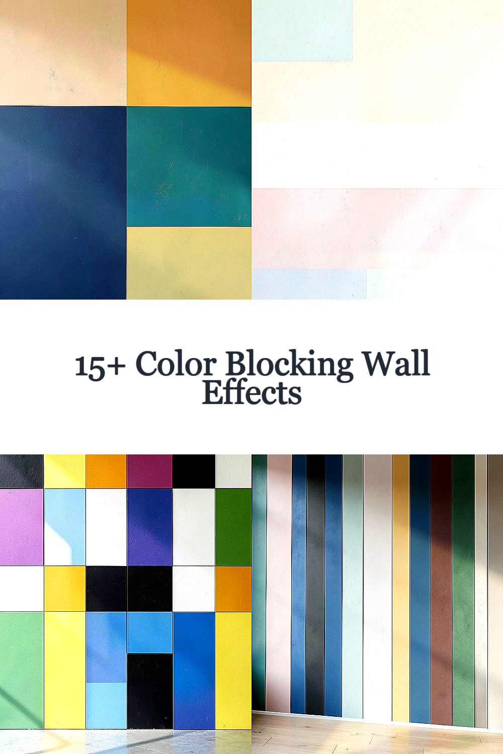
Color can turn a plain wall into a mood maker. With the right blocks, your space starts feeling new again.
1. Oversized Color Blocks That Feel Like Art
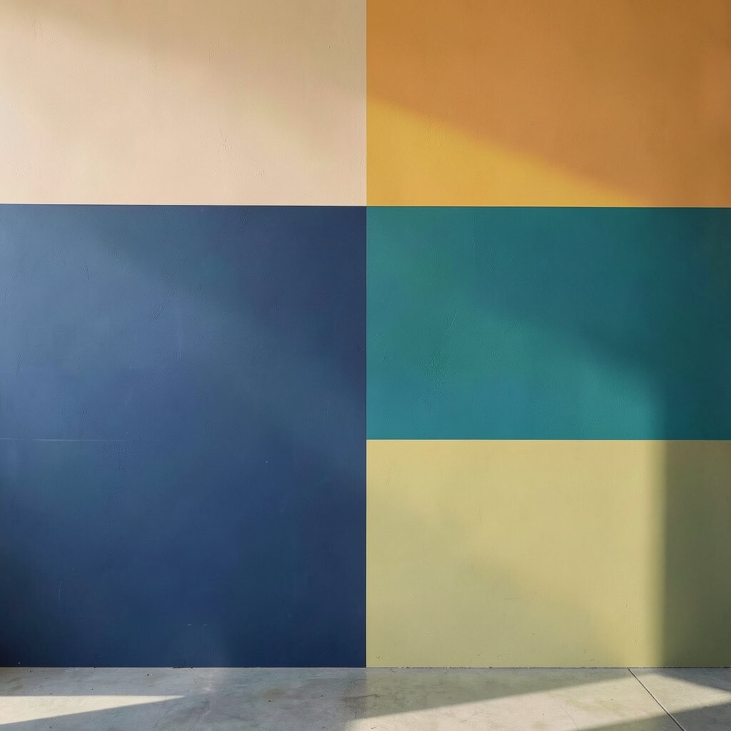
Pick one bold color and pair it with one calmer shade, then let the larger shapes do the talking. You can paint them in chunky rectangles or slightly imperfect blocks for a gallery-style look.
This effect instantly adds focus and makes even a small room feel designed. To keep it tidy, use painter’s tape for sharp edges and remove it while the paint is still slightly tacky.
2. Soft Pastel Bands for a Gentle, Airy Look
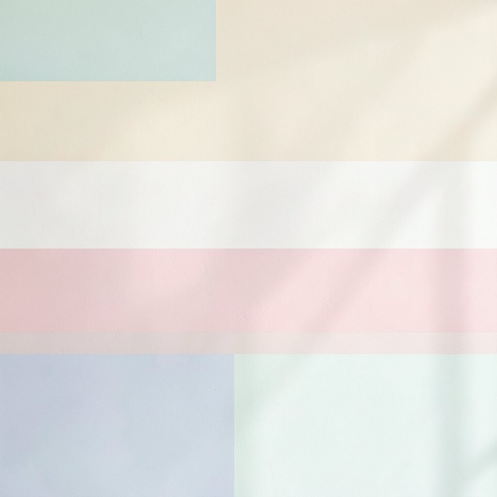
Try wide pastel stripes that wrap across the wall like a sunrise. Blush, mint, and light butter tones can brighten a room without feeling loud.
These bands help the space feel light and calm, especially in bedrooms or reading corners. Choose two or three pastel colors so the wall stays balanced, then paint the lighter colors first to avoid messy mixing.
For a personalized touch, add a thin darker line between two pastels to create a subtle contrast. If you want to keep costs down, use the same base wall color for the gaps and only paint the bands.
3. High-Contrast Checker Panels for Playful Energy
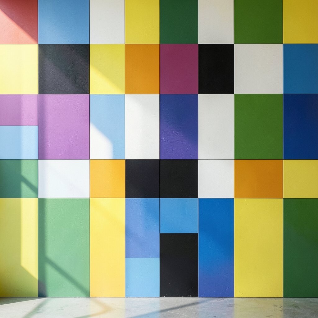
Create a checker pattern using two contrasting colors like navy and white or black and warm cream. The repeating rhythm brings fun to your wall and makes the room feel more alive.
It’s also great for entryways, kids’ rooms, or any space that needs a quick mood boost. Plan your grid ahead of time by measuring small squares and marking dots lightly with a pencil.
If you want sharp corners, press tape down firmly and paint in thin coats. For personalization, swap just one square color near a doorway or shelf to guide the eye where you want it to go.
Cost-wise, you may use more paint because the pattern covers more area, but it can still be budget-friendly with a small color set. Using leftover paint from previous projects is a clever way to keep expenses low.
4. Vertical Blocks That Make Ceilings Look Taller
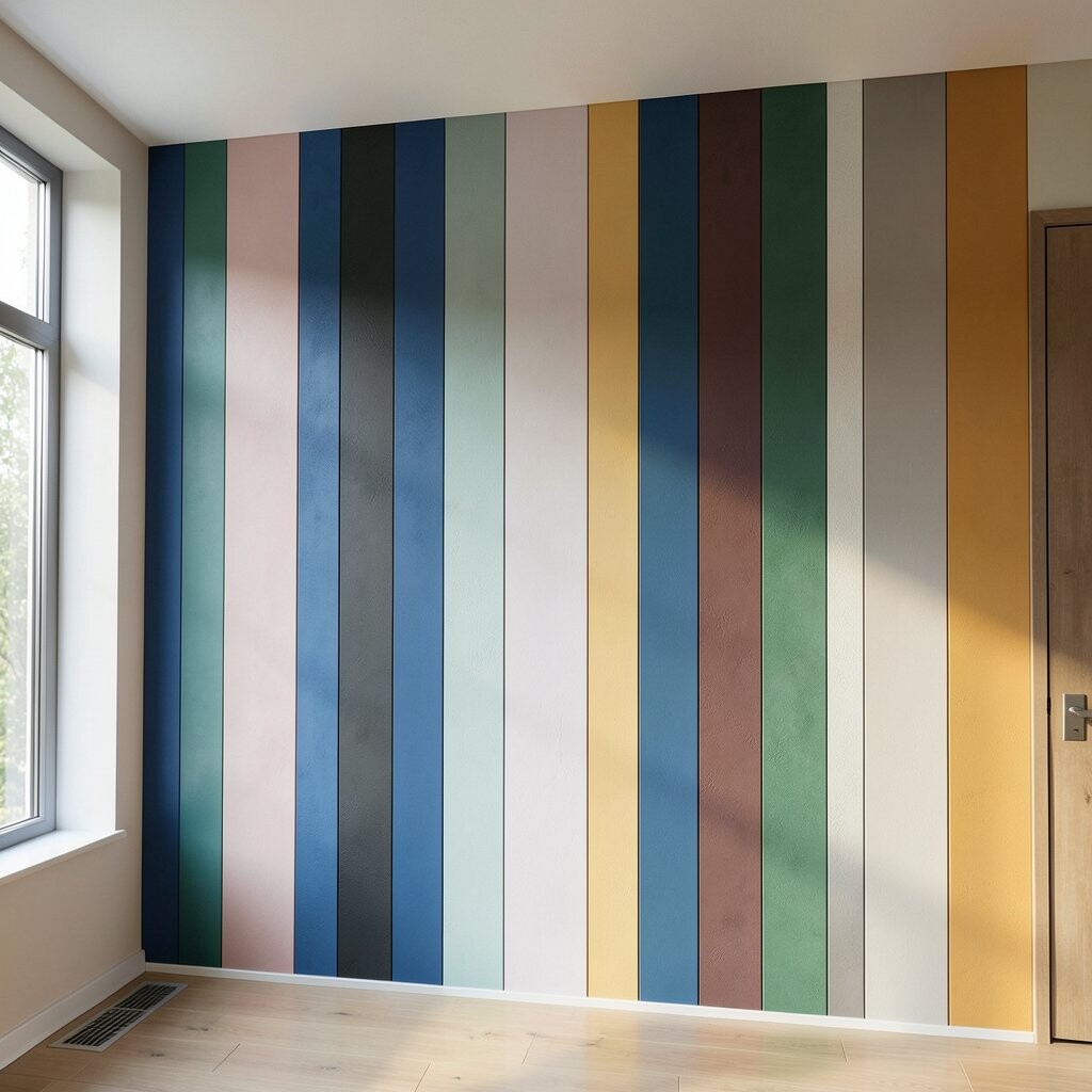
Painting vertical rectangles is a simple trick that visually stretches your walls upward. Choose colors with similar brightness so the change looks smooth, like terracotta with sand or teal with light gray.
This effect helps the room feel taller and more open. Use painter’s tape to create columns that line up with window trim or door frames for a clean, intentional look.
5. Horizontal Steps That Mimic Modern Paneling
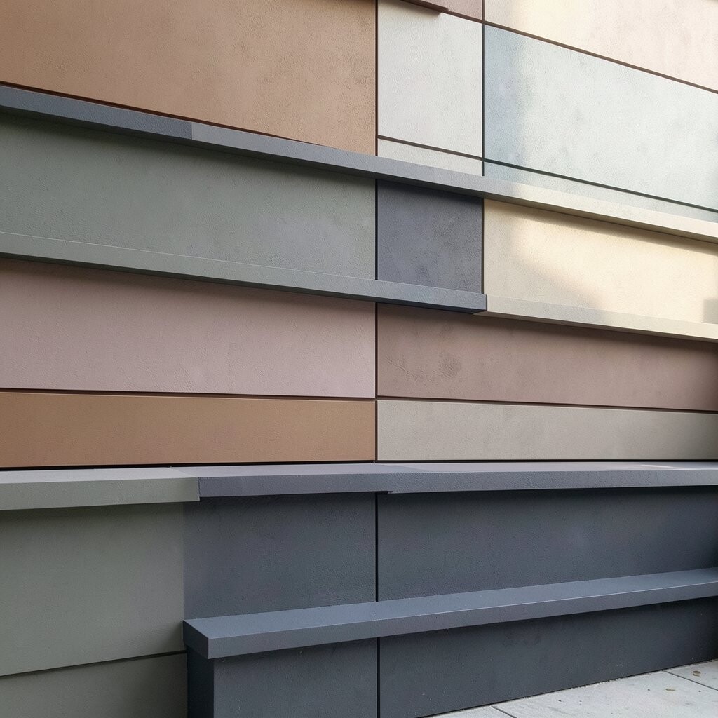
Horizontal color blocks can create a stepped, modern vibe that looks like custom paneling. Think of overlapping bands where each one is slightly different in size and shade.
This design adds depth even when your wall is flat. A practical approach is to start with the lightest band, then layer darker shades beneath it so the steps feel grounded.
To personalize it, match one block color to a sofa pillow or rug accent. You can keep costs in check by using the same two base colors across multiple blocks instead of buying many new shades.
6. Color-Blocked Corners That Frame the Room
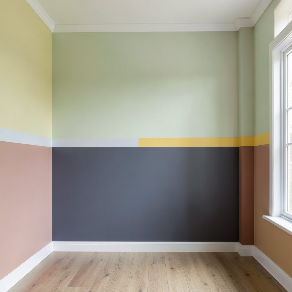
Give your space a built-in feel by painting blocks on the corners where two walls meet. Use a darker color in the corner triangles and keep the rest lighter for a framing effect.
This draws attention to the architecture and makes the room feel styled. For clean lines, tape along each edge carefully and paint the corner areas last so touch-ups blend.
7. Ombré Blocks That Blend Like Sunset Shades
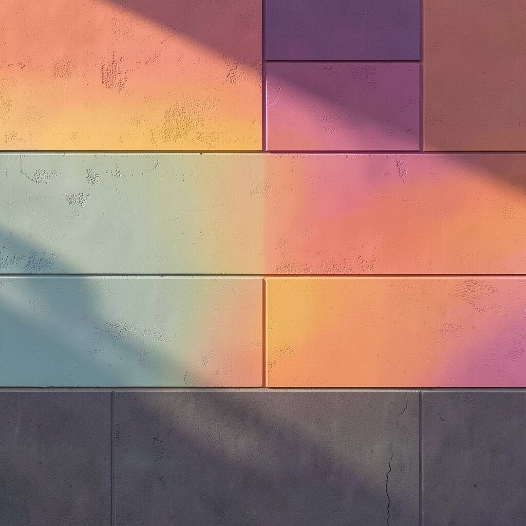
Instead of one solid block, try blending two colors within a block to create a sunset effect. You can paint a rectangle in one base color, then softly blend the second color at the edge using a sponge or dry brush.
The gradient inside the block adds softness and motion without needing a full mural. For best results, work in small sections and keep the blending moving so there’s no harsh line.
8. Geometric Tiles with Tape-Lined Precision
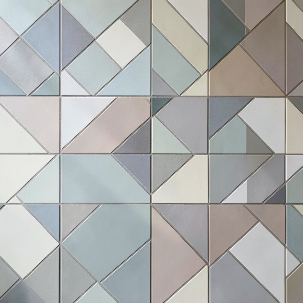
Geometric color blocking looks crisp when you treat your wall like a set of tiles. Use tape to create shapes like triangles, parallelograms, and angular frames, then fill each section with a different color.
This style feels modern and unique because the patterns can be tailored to any room size. Start by sketching one repeating motif, then scale it to fit around outlets and light switches.
To make it practical, choose colors from your existing palette so it feels cohesive. Budget-wise, fewer colors usually work best, and you can pick them from paint samples you already own.
9. Accent Block Behind a Mirror or Artwork
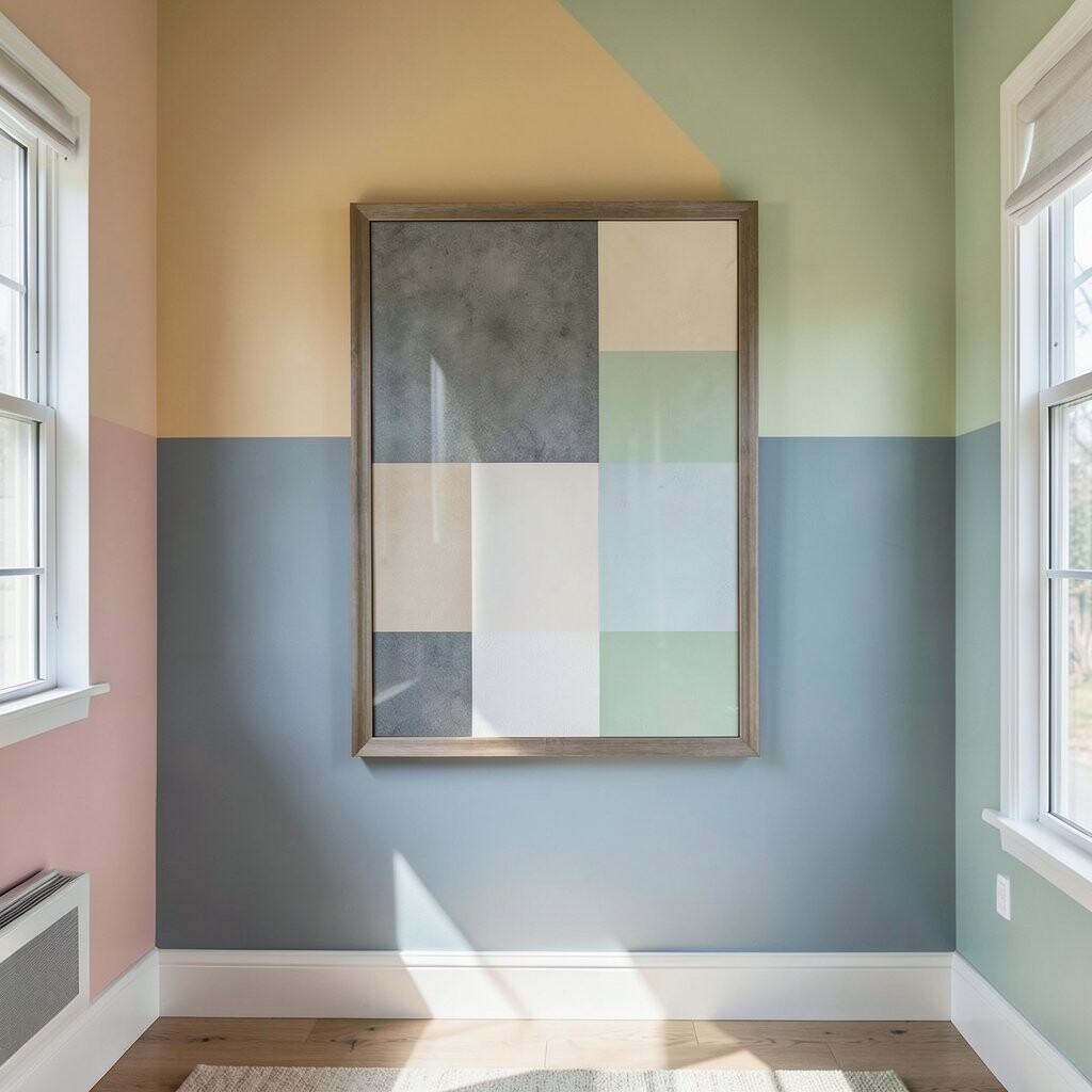
Put a color block behind a mirror, picture frame, or wall art to make it look like it’s floating. Choose a background color that contrasts with the frame and nearby furniture.
This effect instantly highlights your favorite piece and adds depth without covering the whole wall. Keep the block slightly larger than the art so edges show evenly.
For personalization, paint a narrow strip that matches your room’s hardware tone, like brushed brass or matte black. It’s often cost-friendly because you’re painting a smaller area with fewer coats.
10. Bold Arches That Add Soft Architecture
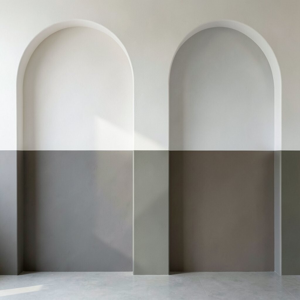
Curved blocks can bring warmth and charm to modern spaces. Paint arch shapes that span part of the wall, using one color for the curve and another for the surrounding field.
Arches create a gentle focal point and make a room feel welcoming. Use a flexible measuring tape to map the curve, then use a curved tape method or a steady freehand approach with light pencil guidelines.
11. Vertical Stripes with a Mixed-Width Twist
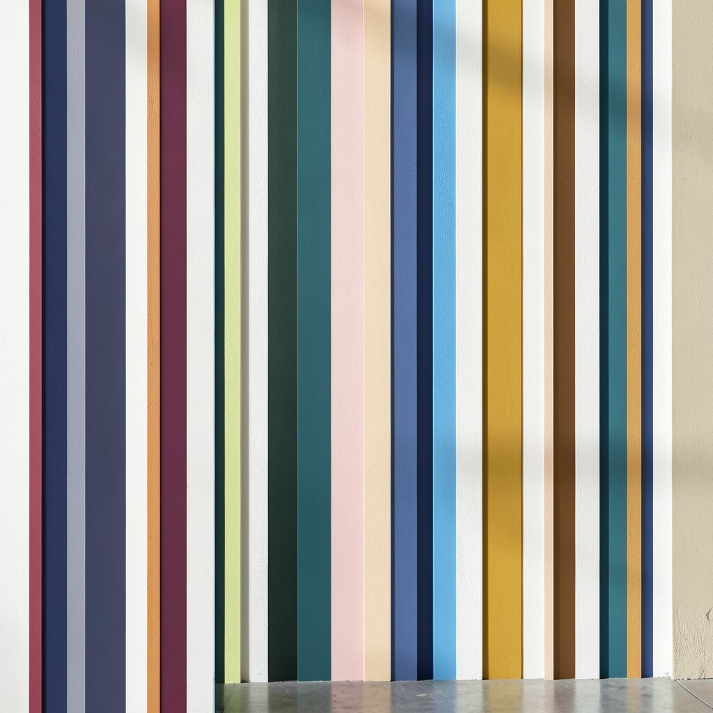
Instead of narrow stripes, try mixed widths so the rhythm feels playful but still neat. Combine one bright stripe with several neutral ones, or alternate two colors with varying stripe sizes.
This helps your wall look dynamic while keeping the design easy to maintain. To personalize, echo the stripe widths in your curtains or throw blanket pattern so the whole room feels coordinated.
If you’re thinking about cost, mixed-width stripes can reduce paint waste because you’ll cover fewer total stripes than a full checker pattern. Using a semi-gloss or satin finish on the bright stripes can also make colors look richer with fewer repaint cycles.
For trend energy, pair bold stripes with minimal decor so the wall becomes the star. That balance is very popular right now in clean-lined interiors.
12. Color Blocking Around Windows and Shelves
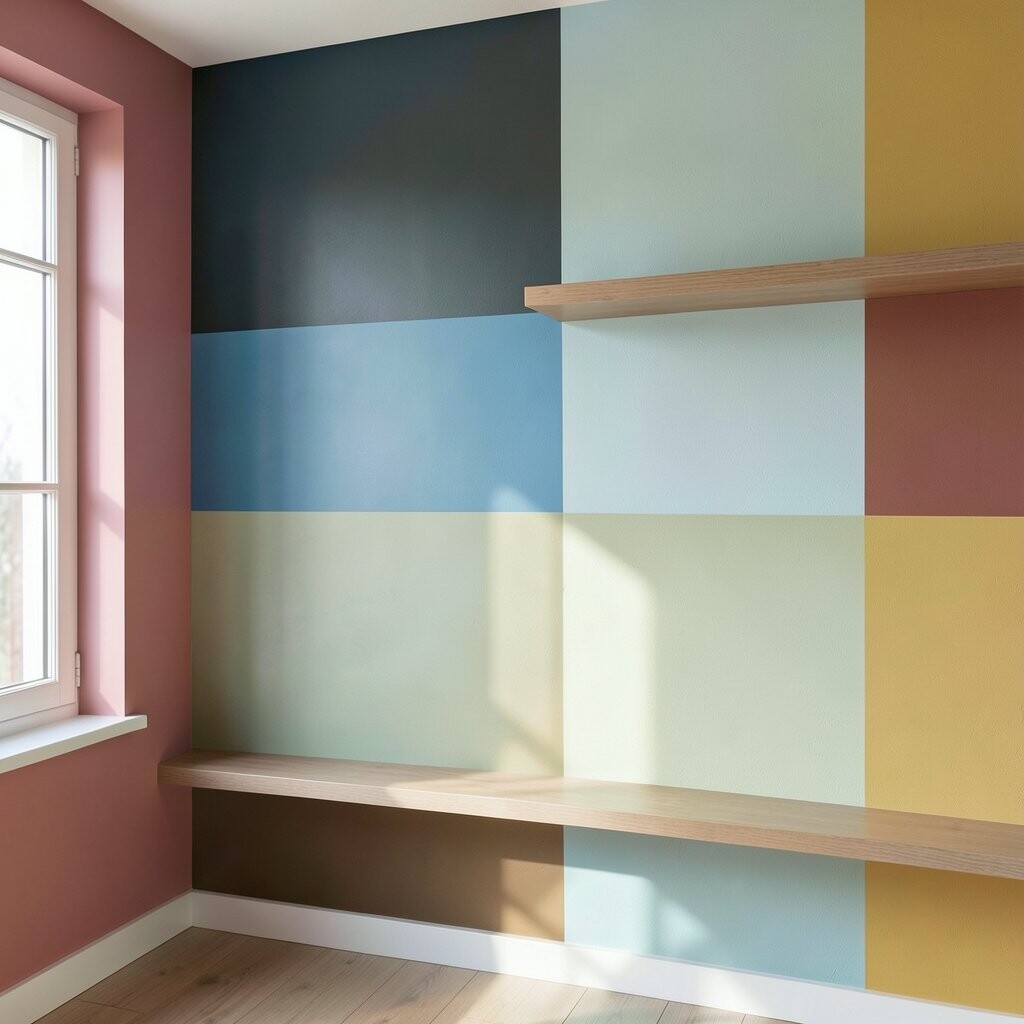
Treat built-ins like part of the design by framing them with colored blocks. Paint a band that runs behind a shelf unit, then break it up around shelves so it looks integrated instead of pasted on.
This effect makes storage feel intentional and can hide small wall imperfections. Use tape around shelf edges and keep the paint direction consistent to reduce streaky brush lines.
For personalization, match one block color to the wood tone of your shelves so it looks naturally blended. Cost can stay reasonable because you’re working within a defined area, and you can use a small roller for smooth coverage.
13. Blocked Frames That Look Like Faux Moldings
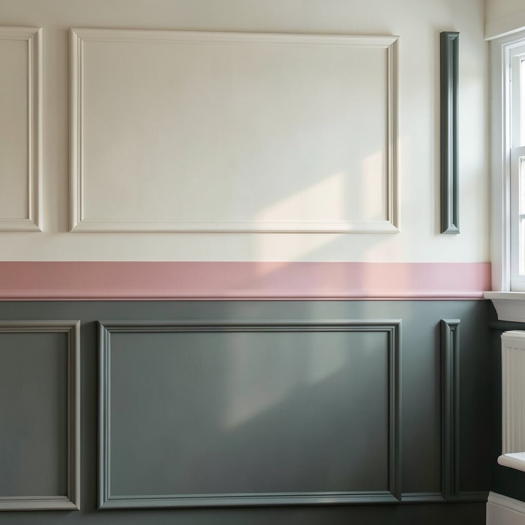
Create a custom look by painting frames within a wall, like oversized rectangles within a rectangle. Choose a slightly darker color for the outer frame and a lighter shade for the inner area.
This gives the room a classic feel with a modern color twist. To make it look professional, measure from the ceiling and floor so the inner frame sits centered.
For practical personalization, align the frame edges with furniture like a sofa back or dresser top. Using semi-matte paint can help these faux moldings look smooth and less shiny, which is great for everyday spaces.
14. Stacked Block Motifs for a Bold Accent Wall
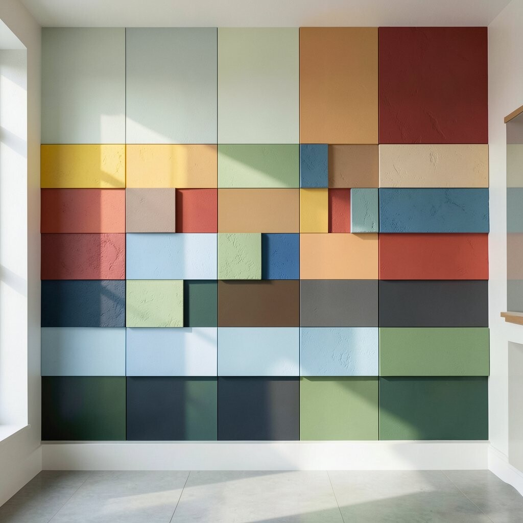
Try stacking rectangles like blocks that climb up the wall. Use a palette of three related colors so the stacked effect feels cohesive instead of chaotic.
This design creates a strong statement wall while still feeling organized. Plan your stack sizes before painting, and keep consistent spacing so the blocks don’t look accidental.
To personalize, make the top block a color you love most so your eye always lands there. Cost-wise, a three-color palette keeps buying simple, and you can use paint rollers for speed on large sections.
15. Mid-Century Style Blocks with Warm Neutrals
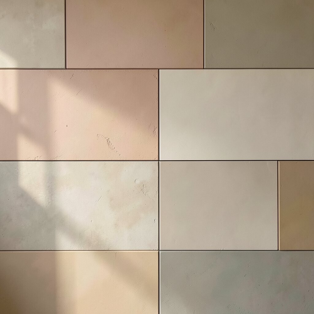
Mid-century inspired color blocking often uses warm neutrals paired with one or two bold accents. Think mustard, burnt orange, olive, or teal set against creamy beige or soft taupe.
This effect feels cozy and lived-in, which is perfect for living rooms and dining spaces. For a practical approach, choose a simple layout like a large rectangle plus two smaller blocks so you can nail the look without overplanning.
Personalization is easy here because you can match your accent color to a lamp shade, rug pattern, or art print. If you want to control cost, buy one high-quality accent paint and use more budget-friendly shades for the larger background blocks.
Current trend vibes lean toward warm earthy palettes, so this style fits right in with modern, comfortable interiors.
16. Removable Tape Block Effects for Renters and Quick Refreshes
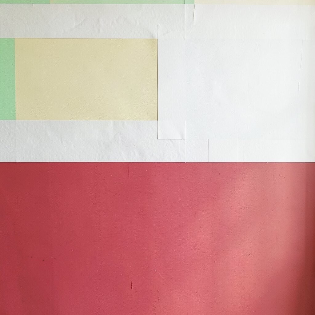
If you want a change without a long commitment, use removable painter’s tape to create temporary color blocks. Press tape down firmly, paint over it, and remove it after the paint cures so you get crisp lines.
This approach helps you brighten your space quickly and adjust your style later. For practical results, patch any tiny holes beforehand so the surface is smooth and tape sticks evenly.
To personalize, rotate the placement each season, like shifting block height above a console or changing colors based on holidays. Cost stays low because you only buy paint for the blocks you want right now, and tape can be reused if you’re careful.
It’s a smart trend for people who like flexibility, especially when you want a fresh look without permanent damage.