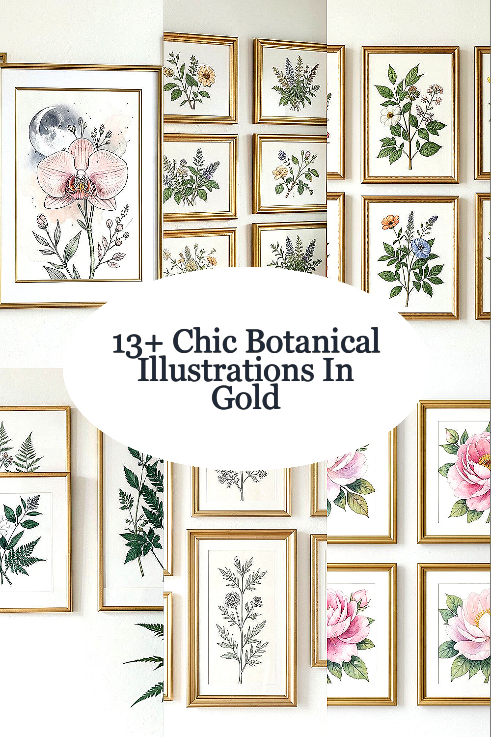
Botanical art has a quiet magic that makes any room feel more alive. When it’s drawn with care, it also becomes a personal kind of style.
1. Moonlit Orchid in Blush and Ink
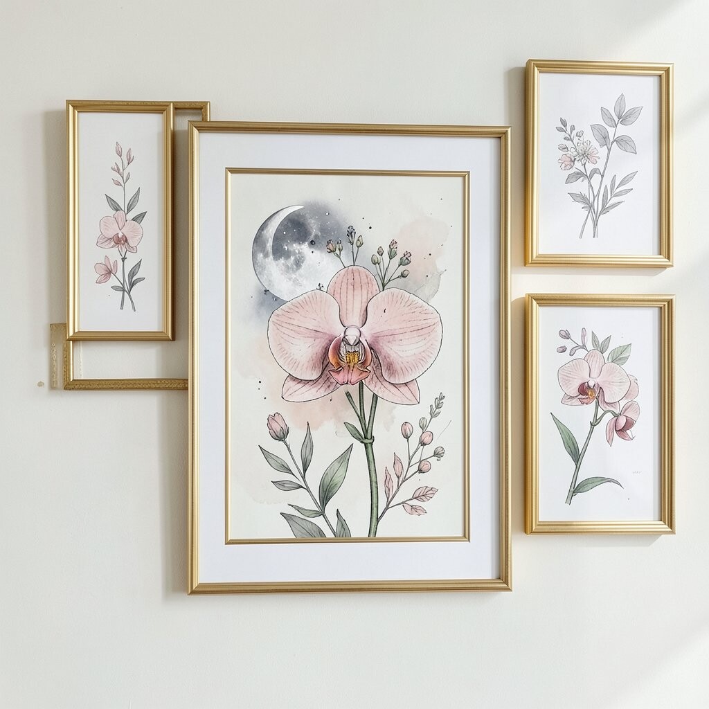
Moonlit petals curl like soft ribbons in a drawing that feels both delicate and confident. You’ll notice fine ink lines, then sudden blush washes that make the orchid look lit from within.
Framing this piece in gold adds warmth that balances the cool night tones. If your space is mostly neutral, this print can bring a gentle pop without shouting.
2. Vintage Herb Sprigs for the Kitchen Wall

Think of a kitchen scene where oregano, thyme, and sage appear as crisp little portraits. The composition often looks symmetrical, with stems that feel neat enough to organize your thoughts.
Gold frames work especially well because herbs look classic against warm metal. Choose a slightly lighter gold finish if you love airy colors, or a deeper gold if your cabinets are darker.
For personalization, place your go-to herb measurements or a tiny handwritten date on the back of the mat, so you remember why that print matters. This style stays practical because it pairs well with everyday cooking spaces and doesn’t demand fancy decor to feel at home.
3. Garden Botanicals With Wet-Leaf Realism
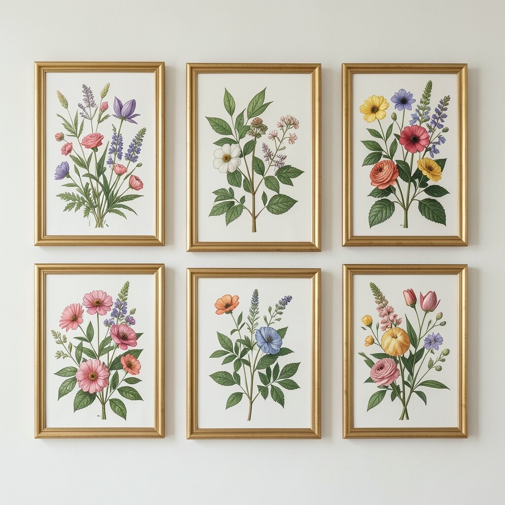
You’ll see leaves drawn with a fresh, shiny look, like they just drank a little rain. Veins show up clearly, and the edges feel touchable, even from across the room.
This kind of realism looks amazing in a thin gold frame that keeps the focus on texture. If you’ve got plants nearby, the matching leaf shapes create a calm visual loop around your home.
To make it yours, consider printing your own small label card in your handwriting style and placing it inside the frame mat backing. When you buy, compare paper quality and ink fade promises, since botanical details can look dull if the image isn’t properly archived.
4. Elegant Fern Fronds in Deep Emerald

Fern fronds sweep outward like fans, and the greens feel richer than a standard leaf palette. Many illustrations show layered fronds, so the drawing gains depth without getting cluttered.
Gold framing brings out emerald tones and makes the drawing look almost jewel-like. If you have a reading nook, this print is a lovely anchor that feels soothing yet stylish.
5. Botanical Line Art in Soft Ivory and Sage
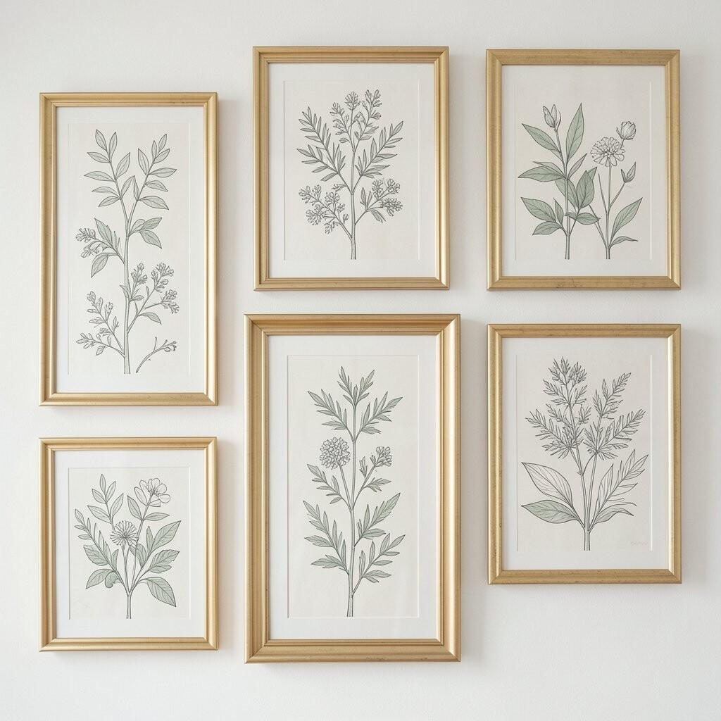
This style is all about clean shapes, light shading, and breathing room. You’ll spot thin stems and gentle curves that seem to float on a warm background.
Because the colors are so calm, a gold frame adds just enough polish without overpowering the simplicity. It also fits current trends toward minimal decor that still feels personal.
To keep it budget-friendly, look for prints on matte paper and smaller sizes that still show crisp lines. Personalize it by choosing a frame height that matches your shelf spacing, so it looks intentionally curated instead of accidental.
6. Watercolor Peonies With Buttercream Highlights
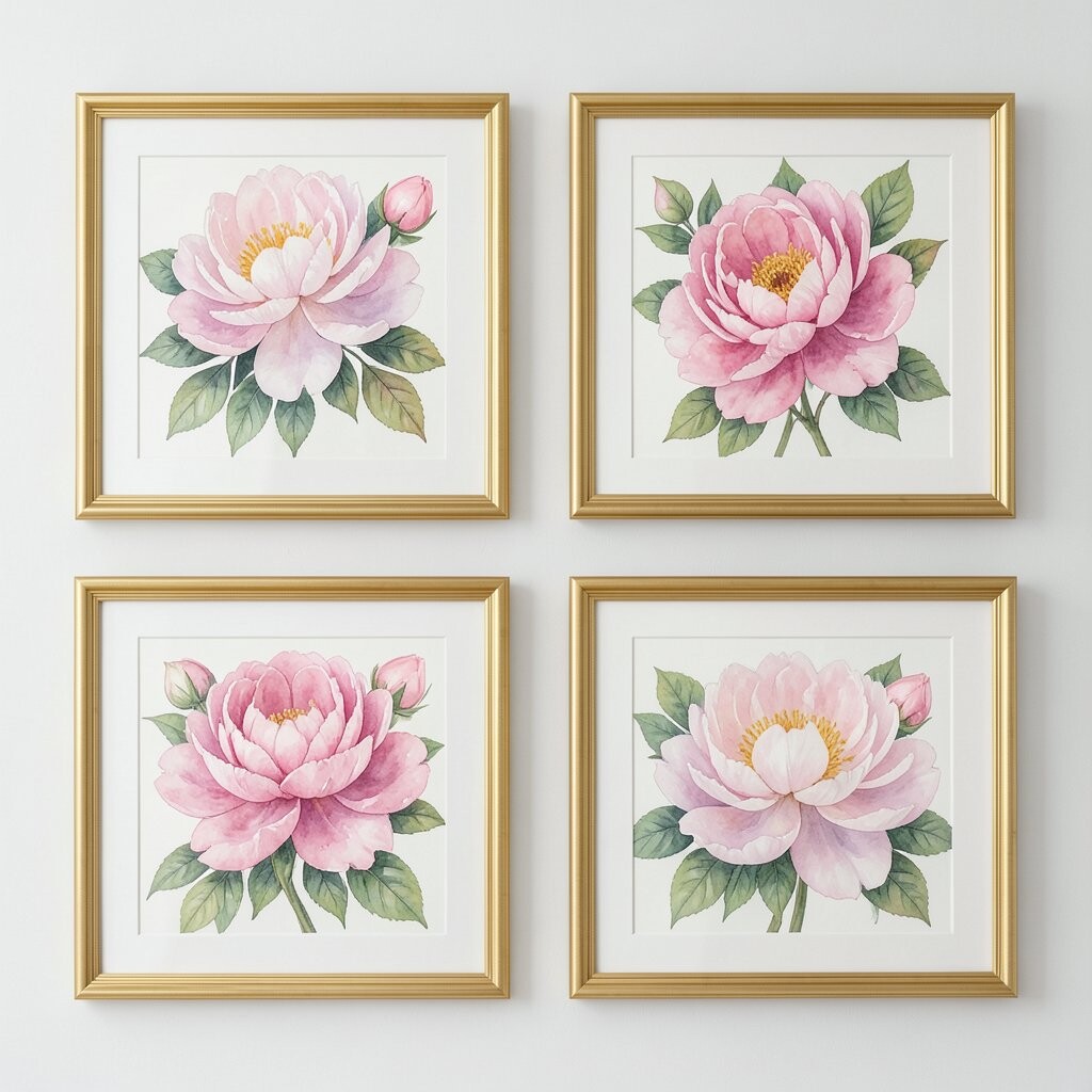
Peonies in watercolor often look like they’re made of cloud-soft layers and creamy highlights. You can almost see the pigment fade from petal edges toward center blooms.
Gold frames make the buttercream tones glow, especially if the gold is brushed rather than shiny. If your home leans romantic or cottage chic, this illustration instantly supports that mood.
For personalization, place the print near a small vase or tea tray so it feels like part of your daily ritual. When thinking about cost, remember that larger blooms usually cost more, so hunting for a slightly smaller version can still give you the same dreamy impact.
7. Ornate Citrus Blossoms With Gilded Glow
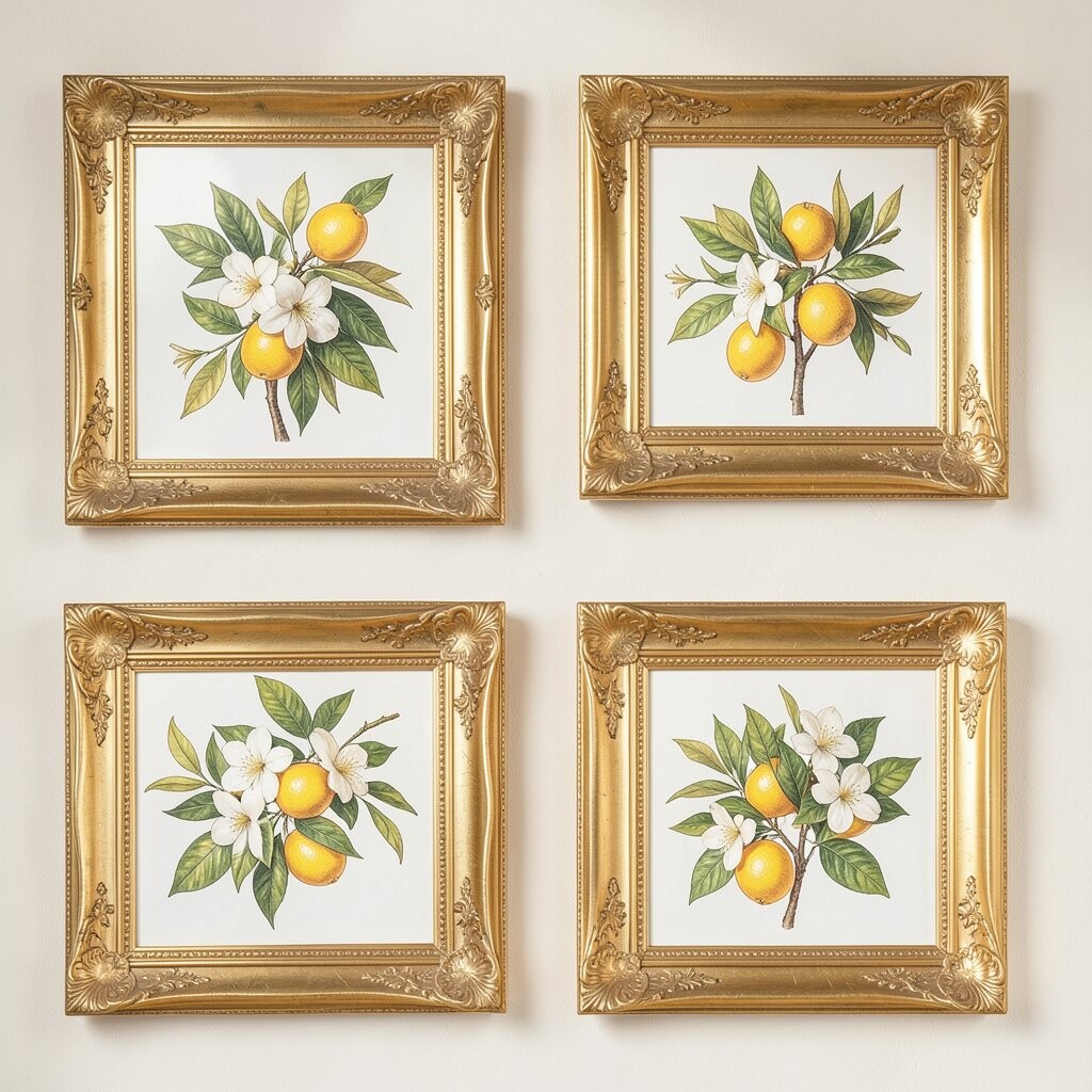
Citrus blossoms bring a sunny delicacy, with star-like petals and tiny hints of color. The leaves often curl in ways that look playful, like they’re dancing in a light breeze.
This is one of those prints that looks extra special behind gold glass, because the frame highlights the illustration’s natural sparkle. If your entryway feels plain, a citrus botanical can make even a simple hallway feel welcoming.
8. Classic Rose Studies on Creamy Paper
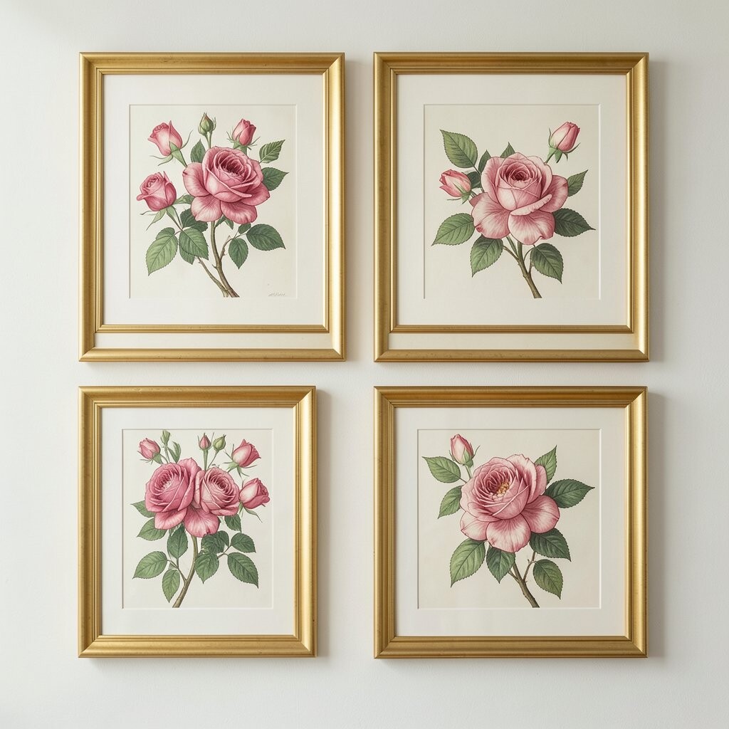
Rose studies often feel timeless, with careful petal structure and soft shadows. Even when the palette stays muted, the forms look strong and well balanced.
Gold frames pair beautifully with rose artwork because the warm metal echoes the romance inside the petals. For a practical placement idea, hang it at eye level in a dining area so it feels like part of the table setting.
Personalize your display by mixing frame widths, then keeping the gold tone consistent across pieces. If you’re shopping, pay attention to whether the print includes high-resolution detail, since rose petals can look fuzzy if the image is low quality.
9. Desert Botanicals With Sun-Dry Texture
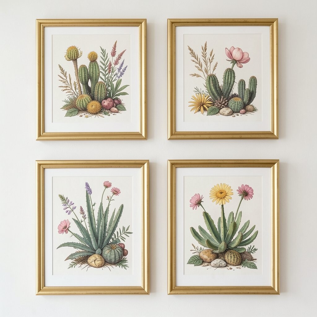
Desert plants can look surprisingly chic, with spiky edges and gentle curves that feel modern. Many illustrations use sandy washes, fine dots, and minimal lines that mimic dry air.
A gold frame adds a luxe contrast to the earthy palette, like jewelry against linen. This works well for current trends that favor warm neutrals, sculptural silhouettes, and artwork that looks good even from the doorway.
10. Botanical Map Style With Coordinates of Leaves

Some botanical illustrations are drawn like mini maps, with plants placed as if you’re reading a scientific atlas. You may notice little measurement marks or delicate lettering that gives it a playful brainy vibe.
Gold framing makes the map-like feel look intentional and upscale, especially when the mat is an off-white tone. If you love organization and neat design, this style feels satisfying while still being calm to look at.
To personalize it, choose a mat that matches the color of your favorite notebook or kitchen spice tin. For cost, consider swapping to a more affordable poster print size and using a higher-quality mat to make the final piece look premium.
11. Wildflower Meadows With Loose, Airy Strokes

Wildflower meadow prints look like they were sketched with optimism, showing stems that wander and blossoms that spill. The brushwork feels light, so the whole image looks bright even when colors stay gentle.
Gold frames keep the airy energy from floating too casually, giving structure while letting the artwork remain soft. If you have kids or busy life around you, this kind of print can still feel cheerful without requiring delicate care.
12. Tropical Leaves in Ink-Heavy Contrast
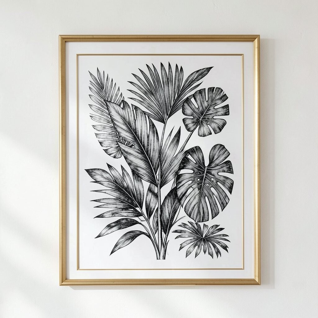
There’s a boldness in tropical botanical drawings that use deep black ink and layered silhouettes. Leaves can overlap, creating a graphic look that feels lively and a little artistic.
Gold framing adds contrast that makes the ink look sharper, like contrast settings turned up on a photo. For practical styling, pair this with a solid-colored wall and simple furniture so the leaves stand out in a clean way.
Personalize it by repeating the leaf motif in tiny ways, like a patterned pillow, a candle label, or a tray design. If you’re watching spending, look for prints with fewer color layers, since high-color tropical illustrations can push costs higher.
13. Pressed-Flower Plate Illustrations With Museum Calm
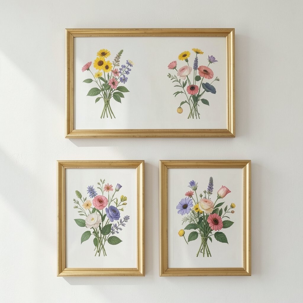
Pressed-flower plates feel like a quiet exhibit, with neatly arranged blooms and stems that look carefully pinned. The layout is often orderly, and the results look elegant and museum-like.
Gold frames give these plates a classic finish, turning your wall into a curated gallery corner. This is also a smart choice if you want something that won’t date quickly, because museum-style botanical art tends to stay in fashion.
14. Chinoiserie-Adjacent Botanicals With Patterned Edges
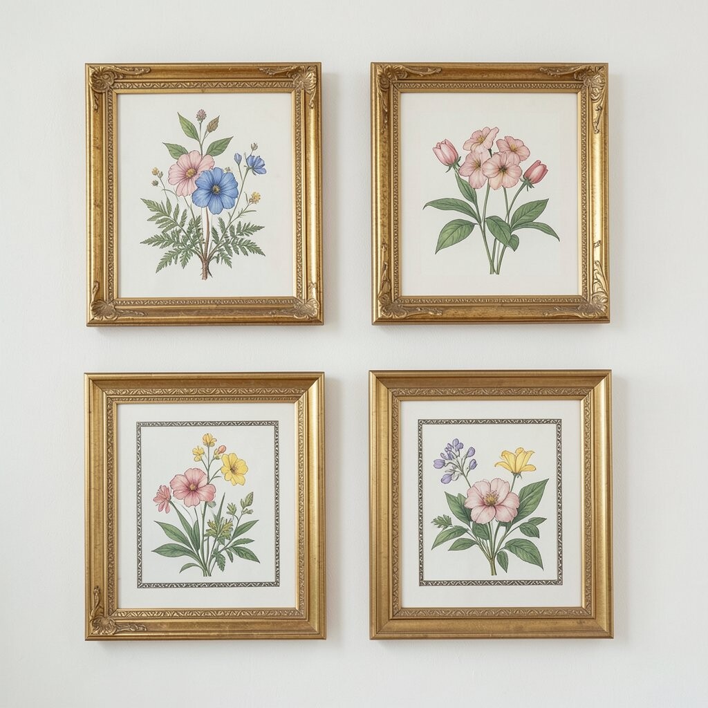
Some botanical illustrations bring patterned borders and decorative details that nod to chinoiserie without going overboard. You’ll see ornamental corners, repeating shapes, and leaves drawn in a way that feels both botanical and decorative.
Gold frames make the patterned edges look richer, especially when the frame has a slightly antique finish. If you like mixing styles, this print can bridge traditional and modern rooms with ease.
To personalize it, align the colors in the frame with a pillow or rug nearby, so the artwork feels like it belongs. When budgeting, compare shipping and frame costs together, since heavy frames can raise delivery fees even when the print itself is affordable.