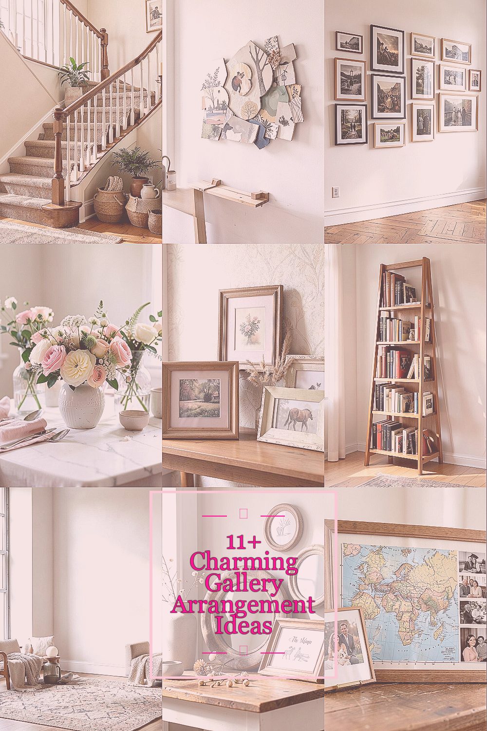
Walls can feel like blank pages waiting for personality. The right gallery arrangement makes every day look more thoughtful.
1. The Cozy Staircase Line
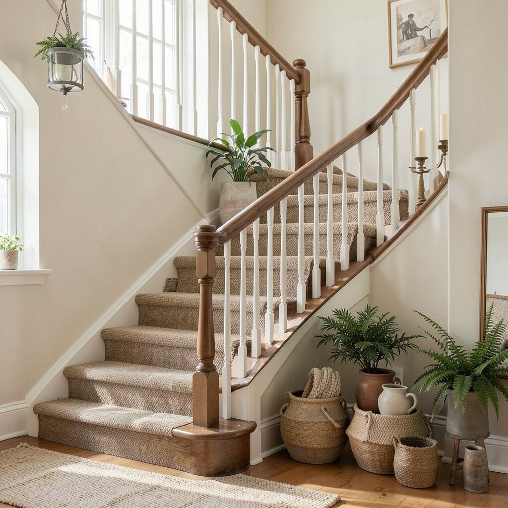
A staircase wall naturally guides the eye, so a neat row feels instantly inviting. Use a gentle curve of frames that follows the steps from top to bottom.
Pick frames in a similar color family, like warm wood or soft black, and keep mat colors consistent for calm. Mix photo sizes slowly by stepping up one or two larger pieces near eye level. Leave small gaps so each image gets breathing room and feels crisp.
2. The Mixed-Shape Floating Collage
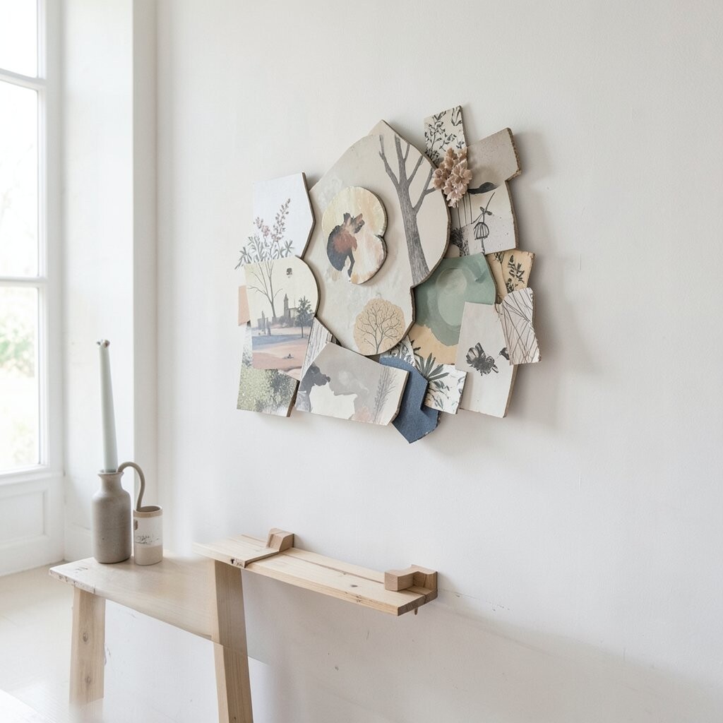
Try combining rectangles, squares, and one or two slim portrait frames to create a playful floating look. The wall will feel lively even when you use calm subjects like landscapes or botanical prints.
Keep the spacing even by laying frames out on the floor first and measuring the gap. Use a few pieces with similar colors, such as sage greens and cream tones, so the mix still feels united. If you prefer order, set one theme center at eye level, then arrange everything else around it.
Add a small set of personal images like kids’ drawings or vacation snapshots for charm that feels real. For a tighter budget, print a favorite photo set at standard sizes and use lightweight frames. Current trends lean toward mixed shapes with gentle color harmony, so this style looks fresh without being fussy.
3. The Single-Theme Museum Wall
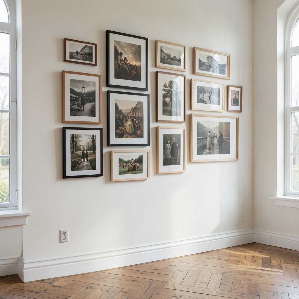
A museum-style wall feels calm, polished, and easy to update over time. Choose one theme such as black-and-white family photos, seaside prints, or modern line art.
Use matching frames and consistent spacing so the set looks curated rather than crowded. Place the largest piece in the center, then step outward with medium and small sizes like a timeline. You can even choose the same print type for all frames, such as framed illustrations, to keep things cohesive.
For practical placement, keep the center of the artwork around eye height so most people can enjoy it comfortably. If you love variety but want control, select one style and vary only the sizes. This arrangement also helps if you change photos often because the look stays stable.
If you’re watching costs, thrift frames with matching backs and swap in new prints. A quick way to personalize is to add one small “favorite moment” image inside the theme, like a birthday photo in monochrome.
4. The Heartfelt Centerpiece Moment
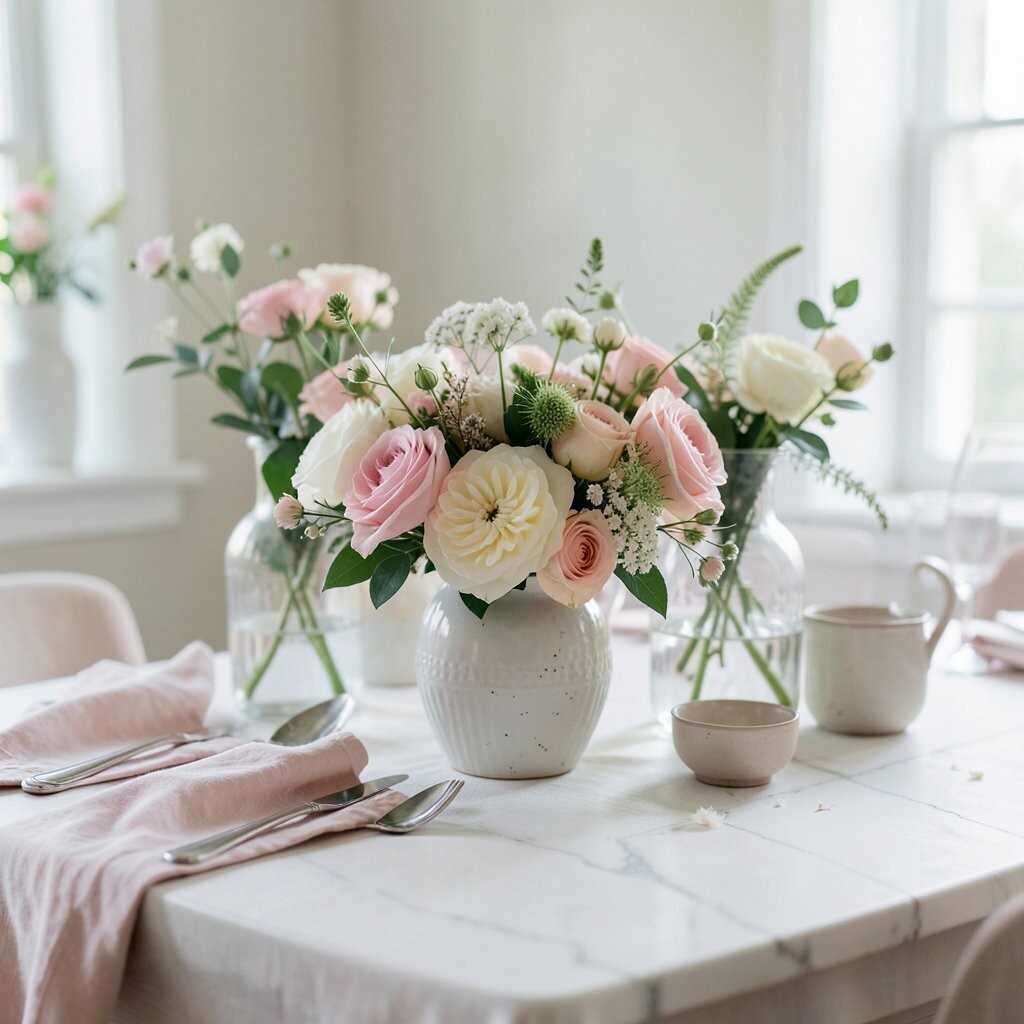
Start with one meaningful centerpiece, then surround it with supporting pieces that feel like supporting characters. This could be a family photo, a wedding print, or a piece of art you made yourself.
Choose two or three smaller frames that echo the same color tones, like picking colors from the centerpiece mat. Keep the rest simple with matching frame finishes so the center story stays clear. Slightly stagger heights to avoid a stiff grid and to create a natural, friendly rhythm.
5. The Wallpaper-Style Color Block Frames
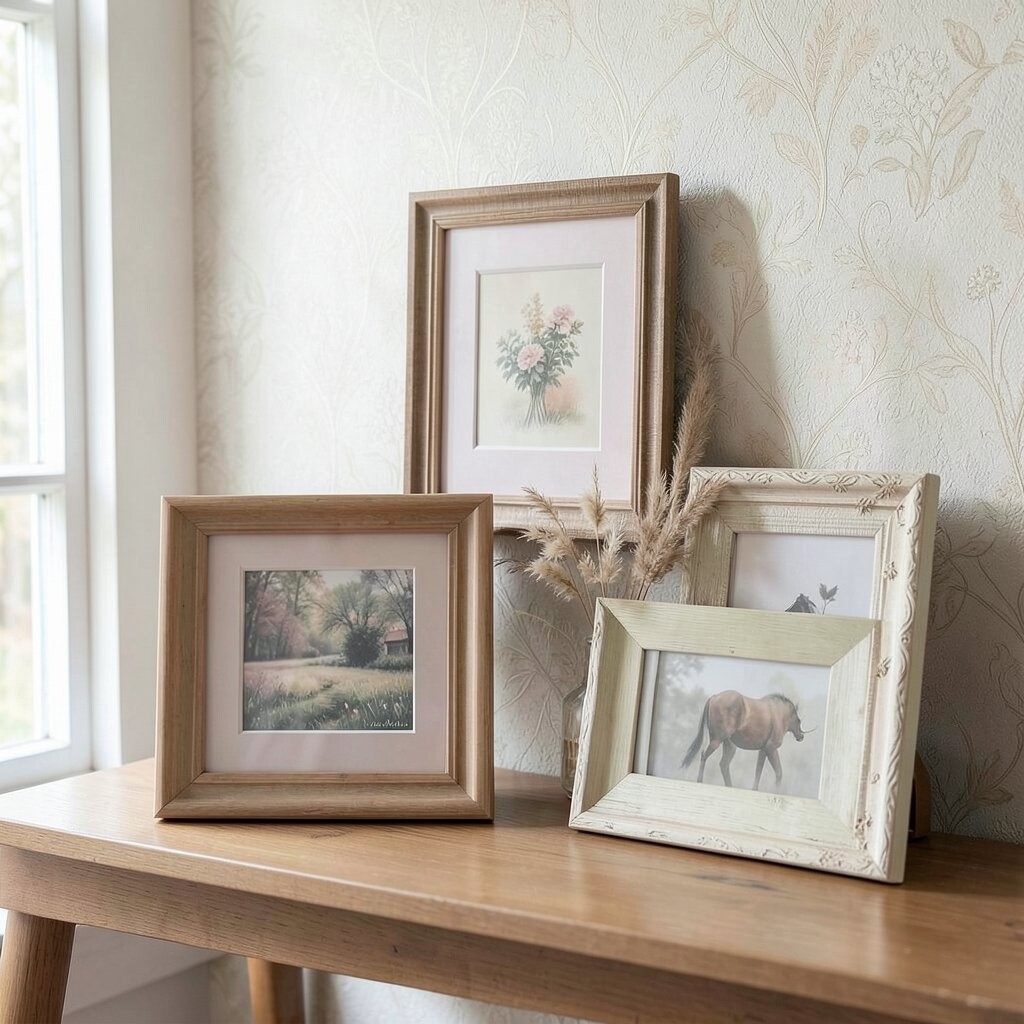
If your room needs warmth, use frames like wallpaper by repeating a few colors across the arrangement. Think of a soft palette such as blush, honey, and off-white, then use it in photos and prints too.
Make a plan by grouping frames into columns or rows that act like color blocks, even if the sizes vary. Leave consistent spacing and use mats to unify different artwork. This approach makes the wall feel designed, not accidental.
For practical results, measure your wall width and choose a layout that leaves a small margin on both sides. Personalize by swapping in seasonal prints, such as fall leaves or spring florals, while keeping the same palette. Costs stay manageable because you can mix affordable prints with a few nicer frames that anchor the look.
6. The Vertical Library Ladder
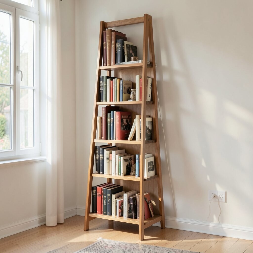
A vertical layout is great when your wall is narrow or when you want height without clutter. It also works beautifully in hallways, stair landings, and cozy reading corners.
Use frames of different heights aligned along a single vertical “spine,” and place the tallest piece at the top. Add smaller frames below with consistent spacing so the wall feels orderly. Choose art with similar visual weight, like framed book covers, typography prints, or tall photography crops.
For personalization, include one frame that shows a meaningful quote or the map of where your favorite trip happened. If you want the look to feel current, lean toward clean fonts and minimal line drawings. This style is budget friendly because you can reuse the same frame style and only change the print inside.
To make it easy, lay everything out on the floor and check how it looks from standing height. Adjust spacing until the vertical line feels smooth, not bumpy.
7. The Gallery With Intentional Empty Space
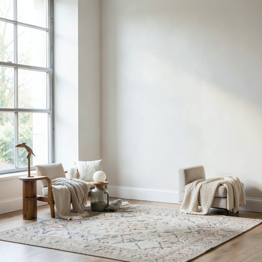
Charming walls don’t always need lots of frames. Leaving intentional empty space makes the arrangement breathe and helps each piece stand out.
Choose a few statement frames, then space them further apart than you think. Use larger mat openings or slightly larger frame spacing to keep the look airy. If your room already has patterns, this approach keeps the wall from competing with everything else.
8. The Round Frame Scattering
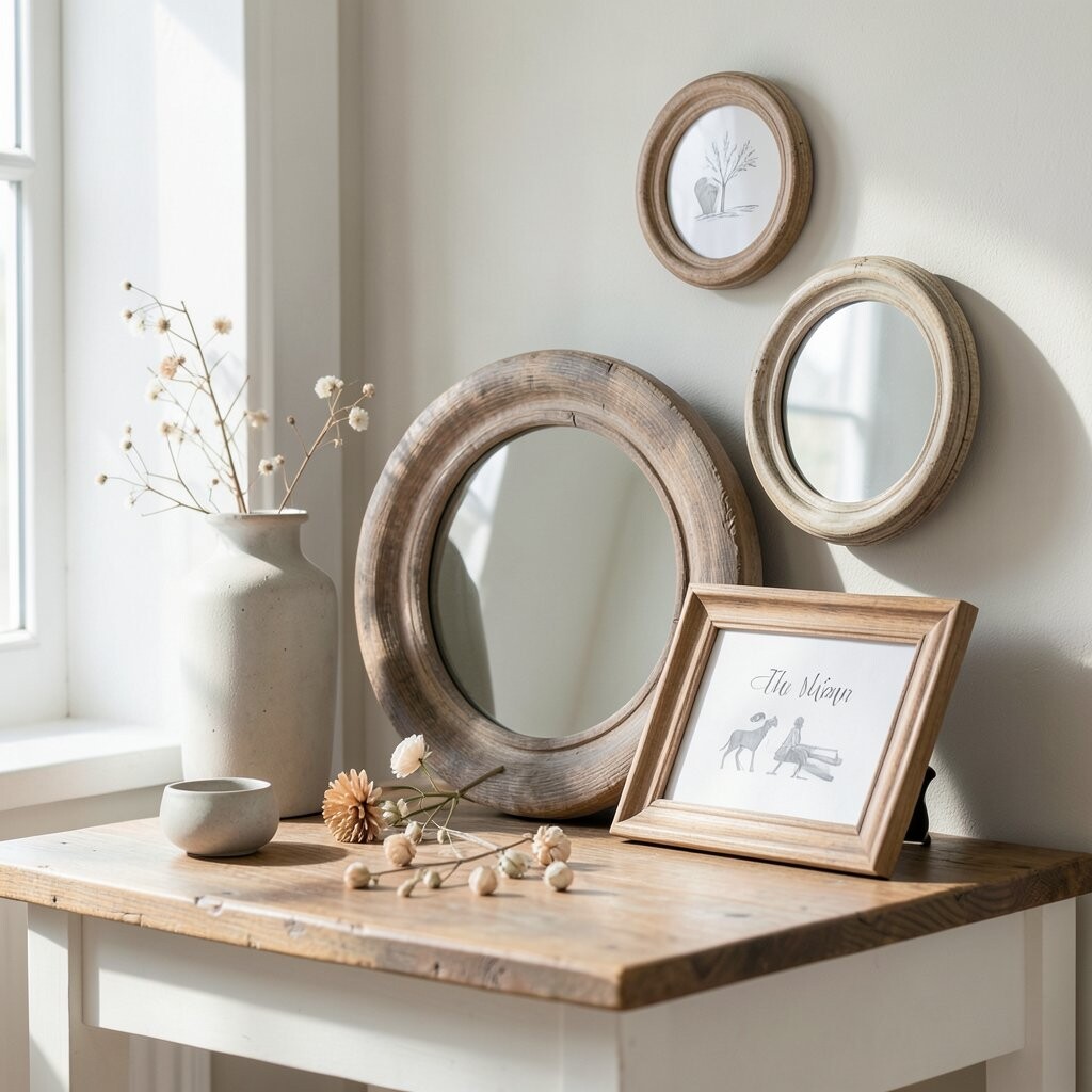
Round frames add softness and charm because they break up the straight lines in most rooms. They also feel playful when you scatter them across a wall with a gentle plan.
Pick one diameter for most circles, then vary slightly by using one larger and one smaller circle for balance. Use a soft mix of photos and art prints so the wall feels friendly, not stiff. For a trendy look, pair round frames with one or two rectangles that echo the same color palette.
To keep the arrangement practical, create a template by tracing frame sizes on paper and arranging the shapes before you hang anything. This is especially helpful if you’re borrowing frames from different sets or thrift hunting. Costs can be lower too, because circular frames can be less expensive at many stores than premium large rectangles.
9. The Travel Map With Then-And-Now Photos
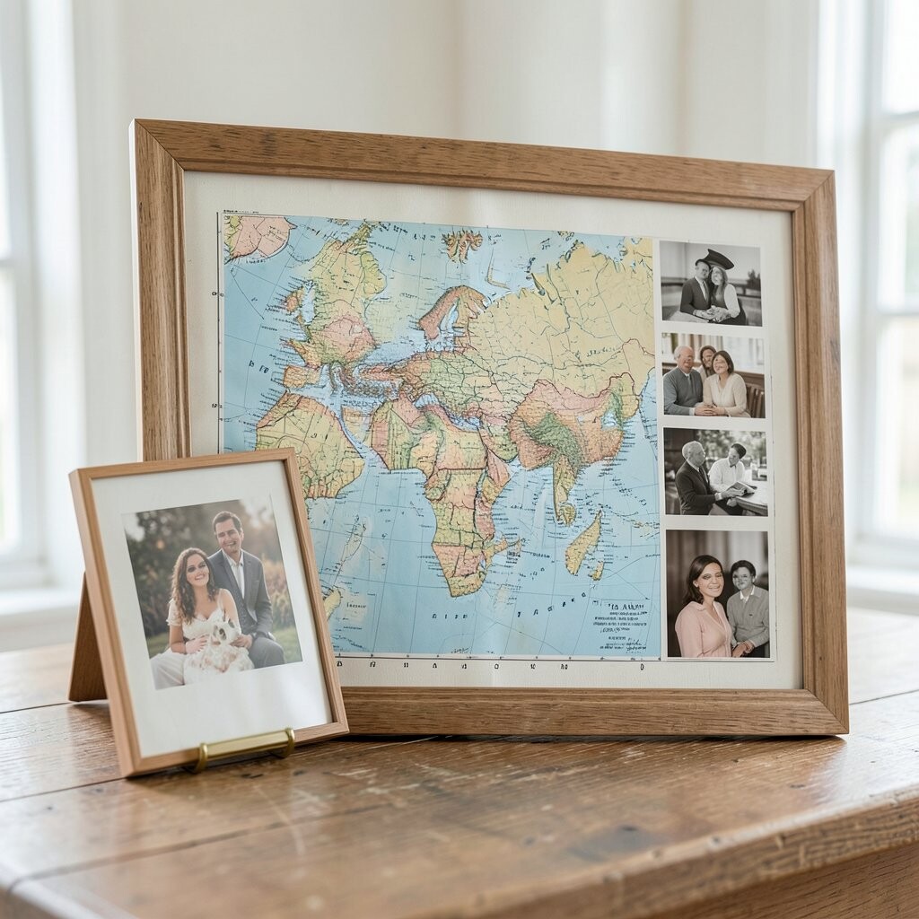
A travel map arrangement feels warm and story-driven because it shows places you care about. Add framed pins, coordinates, or a simple map print as the anchor piece.
Place “then” and “now” photos around the map to create a living timeline on the wall. Use matching frame colors so the map looks like the center of a set. This gives you a unique twist that feels personal and not like a generic collage.
For practical setup, keep the map print at the center and align the photo frames by eye height. Personalize by choosing frames that match your travel era, such as vintage paper textures or modern clean prints. If you want to manage cost, print smaller photos at home and upgrade only a few key frames for a standout look.
10. The Fabric-Texture Frame Layering
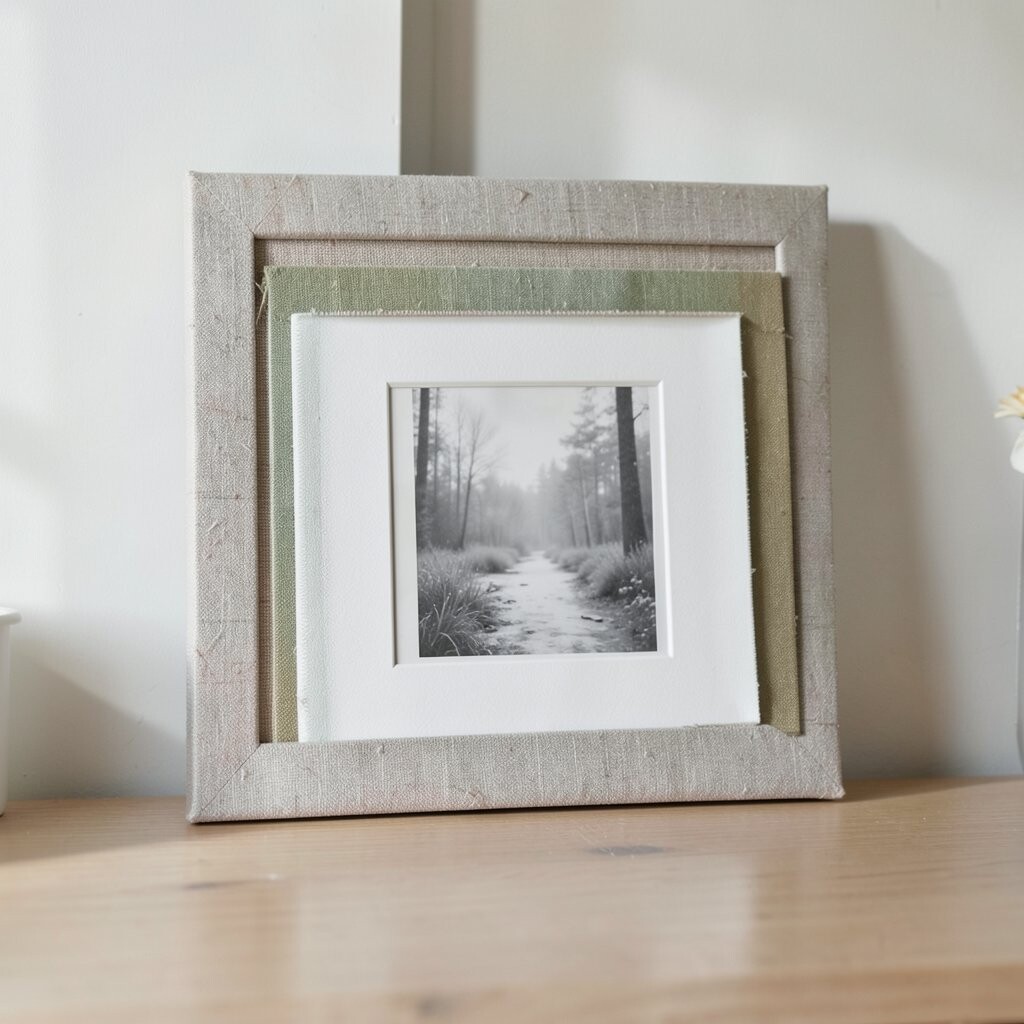
For a softer, cozier vibe, layer frames using fabric textures behind or around your artwork. You can place art on linen-like backgrounds, use framed textiles, or add stitched patches as part of the display.
This arrangement looks especially charming in bedrooms and living rooms because fabric adds warmth. Mix frame sizes slowly, but keep the same finish so the wall feels like one crafted piece. If your home has natural wood and warm lighting, this style will blend in beautifully.
To make it easy, start with one larger textile piece and then add smaller framed photos or mini prints around it. Personalize with handmade elements, like a small embroidery hoop, a vintage scarf, or fabric squares from a memorable event. Costs can stay reasonable if you use inexpensive frames and focus your spending on one or two fabric highlights that feel special.
Current trends lean toward tactile decor, so this choice feels modern while still being cozy and personal.
11. The Bathroom Spa Mirror Gallery
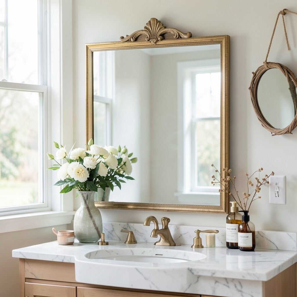
You can bring gallery charm to the bathroom without making it feel messy. Use frames designed for moisture or choose art prints behind protective glass for easy care.
Style the arrangement around mirrors by placing smaller frames near the sink and a taller piece near the mirror line. Choose calm artwork like botanical prints, soft abstracts, or sea-inspired photos to keep the mood relaxing. This helps the space feel like a spa retreat instead of just a functional room.
Practical placement matters here, so keep frames slightly away from direct water spray and use level marks for straight lines. For personalization, add a small frame with your family’s “morning routine” note or a simple monogram print. Budget friendly options include affordable prints in well-fitted frames, and you can swap them seasonally to keep the wall feeling fresh.
If you want a unique look, use a set of matching frames in a water-safe finish like matte black or satin white.
12. The Bold Color Accent Cascade
When you want instant charm, build your gallery around one bold color that matches your decor. Think of a deep teal accent wall, a terracotta sofa, or a bright mustard chair nearby.
Pick frames that support the accent color, then choose artwork that includes small pops of that shade inside the images. Arrange the frames in a cascade feel, with slightly descending sizes from top left to bottom right or along a gentle arc. This makes the wall feel dynamic and gives your room a designer touch.
Personalize by adding one frame that features something you love, like a favorite recipe card in a clean frame or a custom print with your pet’s portrait. For cost control, print two or three high-impact images larger and keep the rest smaller with budget frames. This arrangement fits current trends that favor bold color coordination and confident, curated layouts.
To keep it practical, tape a mock layout to the wall and step back often. Adjust until the cascade looks smooth, then hang one piece first and use it as your guide for the rest.