
The wall space in your home can feel like a living scrapbook. Bright family photos help it tell your story in colors you actually love.
With the right frames, even everyday moments start to look like cherished art.
1. Sunny Breakfast Smiles in a Vintage Yellow Frame
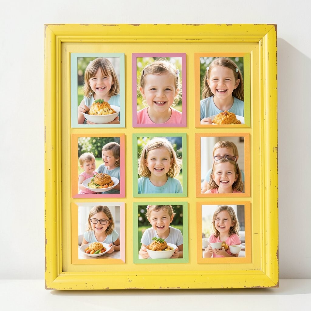
Picture a morning table lit by golden window light, with cereal bowls, sticky notes, and warm laughter frozen mid-conversation. Everyone leans in like the photo itself is saying, “Stay a little longer.”
Choose a vintage-style yellow frame to echo that sunrise feeling and make skin tones look extra lively. The benefit is simple: yellow adds cheer without overwhelming the room, so the whole corner feels more welcoming. To keep it practical, wipe the frame glass with a microfiber cloth and use acid-free mounting tape so your photo stays crisp. For personalization, match the mat color to a breakfast accent like strawberry pink or buttercream white, and consider a thin inner border so the smiles feel centered and clean.
2. Beach Day Handprints with a Sea-Glass Turquoise Border
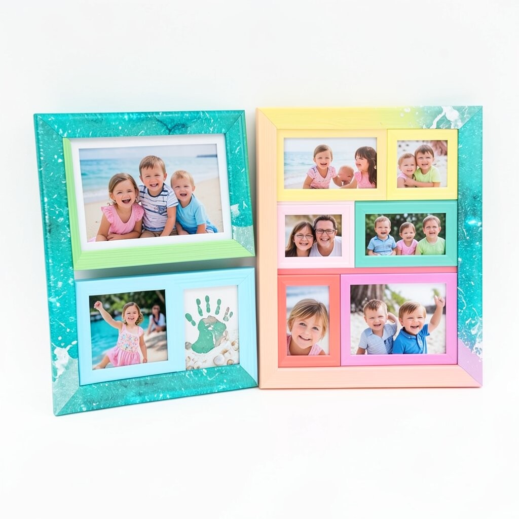
Imagine tiny handprints pressed into wet sand, then lifted off to leave a soft mark like a signature from the day. The ocean in the background looks textured, and the sky carries that pale-blue glow that only summer seems to manage.
Pick a sea-glass turquoise border that mirrors the calm parts of the water while making the sand tones pop. This kind of frame helps your photo look fresh and airy, even indoors where the air is still and dry. For a practical display, use a non-glare glass option if your wall gets daytime sun, because beach photos love light but hate glare.
To personalize, add a mat in sand beige and crop slightly closer so the handprints are the main focus, not the clutter of shoreline distractions. If you want a budget-friendly approach, hunt for turquoise-painted thrift frames, then seal the paint for durability. Current trends favor lighter, coastal colors and lots of negative space, so letting the photo breathe is a smart choice.
3. Rainbow Birthday Candles Styled in Bold Primary Frames
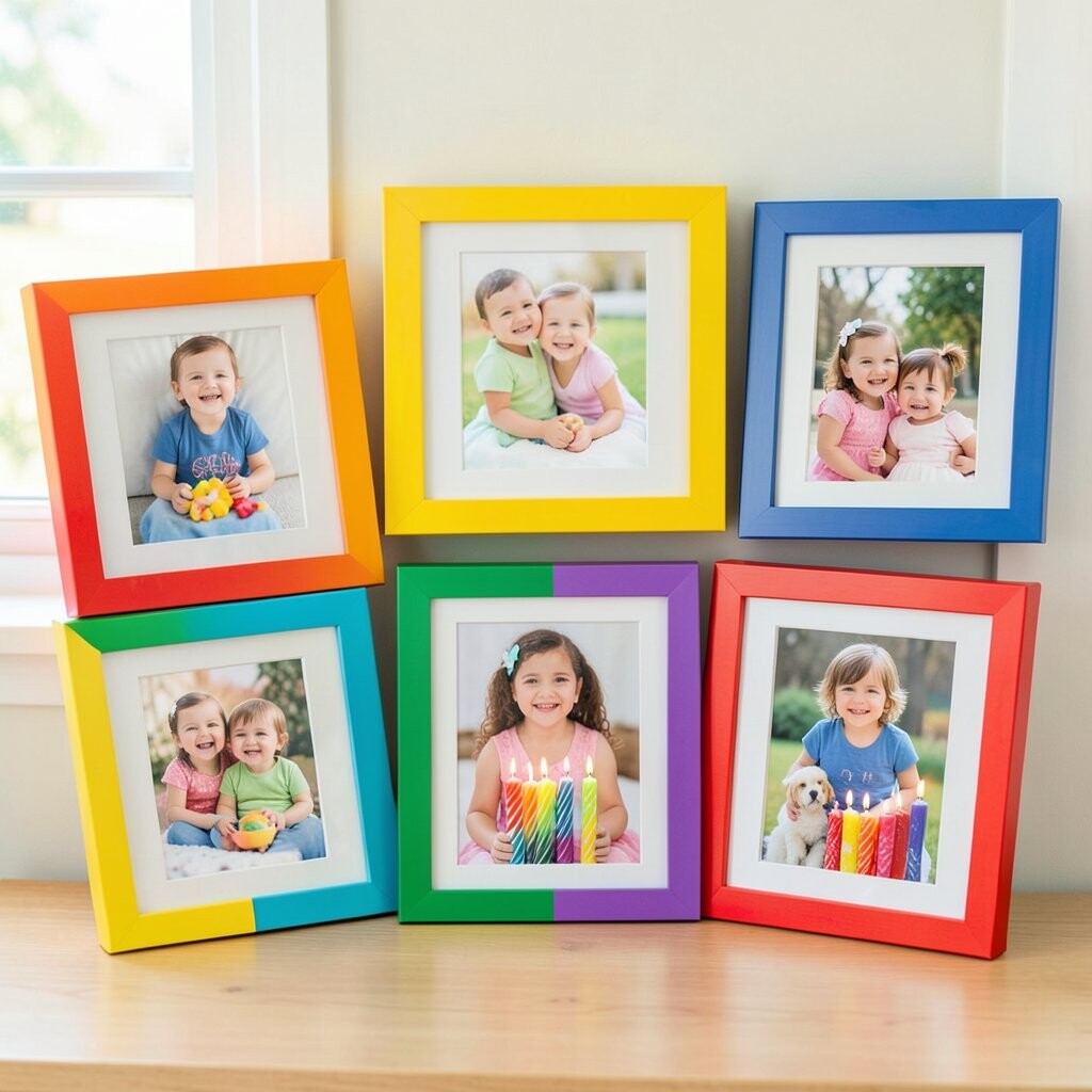
Think about the moment the candles are lit, with orange, red, and blue flames dancing above a cake. Your family gathers close, and the wrapping paper and balloons make a natural burst of color around the faces.
Bright primary frames give this photo a playful, confident look that matches the energy of celebration. It’s also helpful because the strong colors create a clear visual anchor, so the photo doesn’t get lost among other wall art. For practical installation, measure the photo opening first and use picture-hanging wire rated for the frame weight.
Uniqueness comes from leaning into the theme, like using a red mat for the cake photo or a blue mat that harmonizes with the background. If you’re keeping costs under control, look for simple, flat frames that you can upgrade with spray paint or a new border insert. This year’s gallery trend is bold color blocks mixed with simple layouts, so one standout birthday frame can set the tone for the rest of your wall.
To personalize further, include a small line of matching washi tape on the mat edge in a color that appears in the photo, so it feels curated rather than random.
4. Cozy Reading Night Captured in Warm Walnut Frames
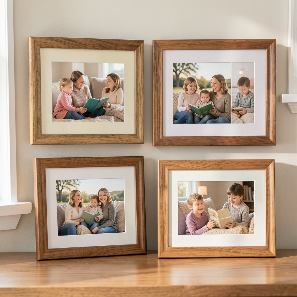
Picture a child curled up with a blanket, and the pages glowing like a tiny campfire. A parent sits nearby, warm light on their face, creating that safe, quiet feeling readers know.
Walnut frames bring warmth and calm, balancing the glow from the lamp so the photo feels gentle instead of too bright. The benefit is that walnut works with many home styles, from modern to classic, so your gallery stays cohesive. For practical tips, choose low-reflection glass and keep the frame depth consistent across your set so the wall looks planned.
For uniqueness, consider a slightly textured frame finish that mimics wood grain, which pairs nicely with the natural colors of books and blankets. Personalize with a cream mat that matches the light in the photo, and leave a slim border so the faces remain the center. If you want to keep costs reasonable, consider buying one quality walnut frame and repeating the look with similar color faux-wood frames for the other pictures.
5. Sports Team Cheer in Crisp White Frames with Colorful Mats
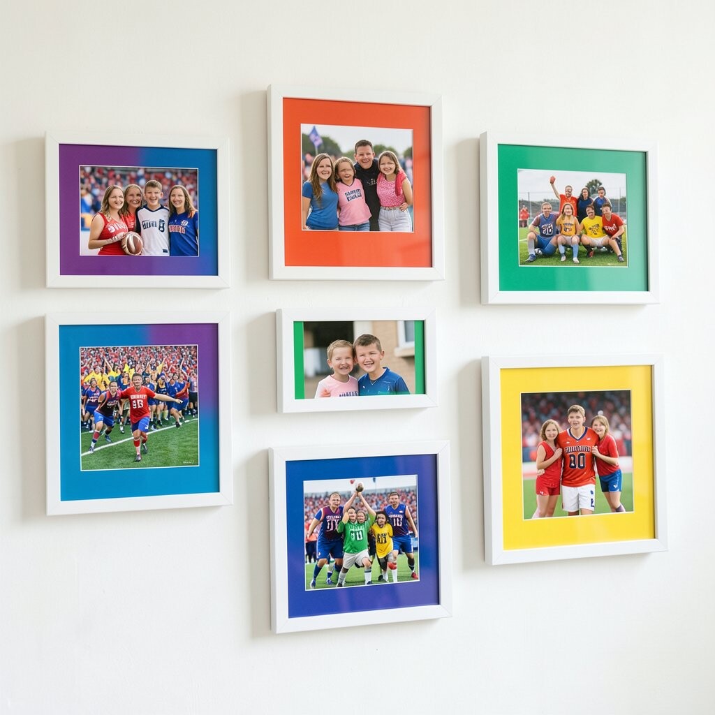
Imagine a group photo where everyone is mid-cheer, arms raised, jerseys bright, and the scoreboard lights in the background. The scene feels loud with energy, even though the camera only caught a single second.
White frames make the bright uniforms look even sharper, and crisp mats add structure that keeps the image tidy. This helps because action photos can be visually busy, so a clean frame gives your eyes a place to rest. For practical tips, use archival backing and avoid cheap magnets that can warp photos over time.
To personalize, try a mat color that appears in the team logo, like teal or gold, so the photo looks like it belongs together with your decor. Cost considerations matter here, since team shots often need multiple frames for the set, so look for multi-pack frames and swap only mats to create variety. A current trend you’ll see in many home galleries is mixing neutral frames with vivid mat colors, which makes your wall feel modern without needing expensive statement frames.
6. Kitchen Dance Moments in Cherry Red Frames
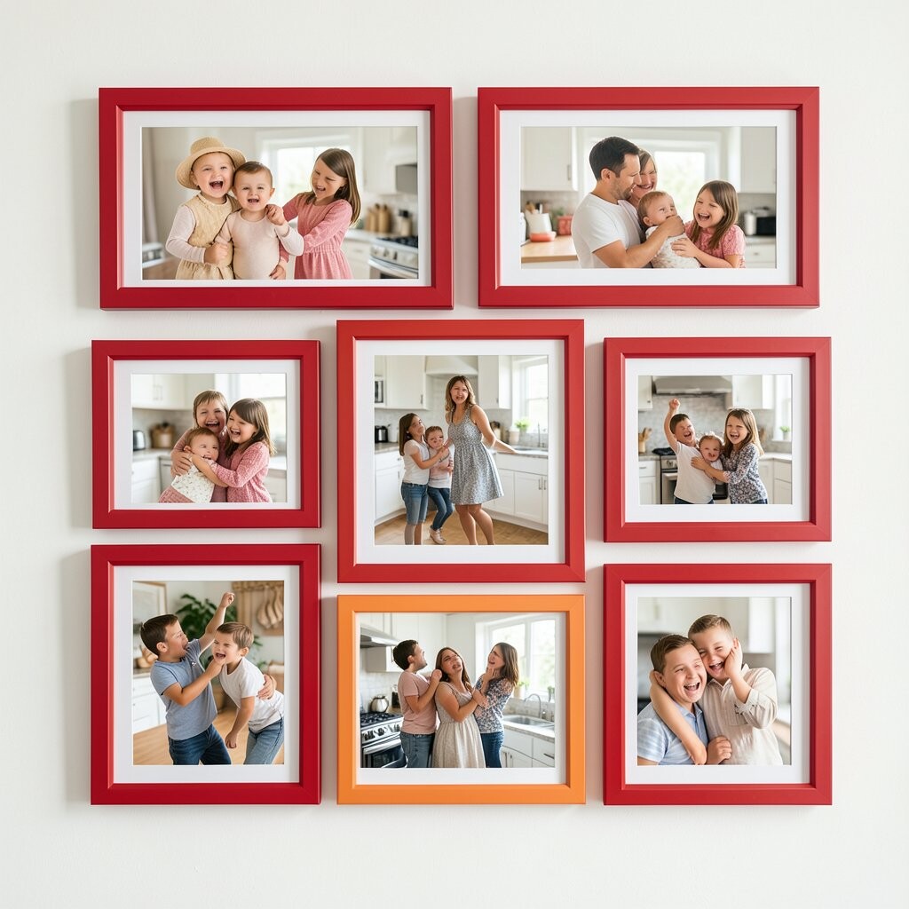
Picture your family dancing in socks around the kitchen, flour on the counter, and a grin that stretches wider than the camera can hold. The background is messy in the most lovable way, with bright magnets and bowls that look like they belong in a recipe show.
Cherry red frames bring a bold pop that matches the fun of kitchen chaos and makes the photo feel like a highlight reel. The benefit is emotional, too: red adds warmth and excitement, so the image lifts the mood every time you pass by. For practical tips, keep the photo level and center it so your eyes don’t fight tilted angles in a room that already feels energetic.
To personalize, choose a mat that softens the red, like warm cream, so the faces stay the focus. If you’re thinking about cost, consider using poster frames for larger photos, since they’re often cheaper while still looking polished. Many recent gallery styles lean into “one-color emphasis” where a frame color repeats across different photos, so repeating cherry red can make your whole wall feel like a set.
7. Grandparent Hug Portraits with Soft Sage Green Frames
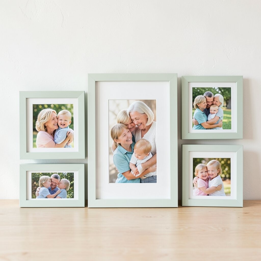
Imagine a close-up hug where the background fades into gentle blur, leaving only smiling eyes and comforting hands. The photo feels quiet and steady, like a warm story you can hold.
Sage green frames are a lovely choice for portraits because they look calm and slightly vintage at the same time. They also help the image feel restful, which is a nice break from hyper-bright photos on other parts of your wall. For practical considerations, use a mat that matches your room’s neutral tone so the green feels intentional and not random.
Uniqueness can come from choosing a lightly distressed frame finish that echoes the cozy, lived-in feeling of the moment. For personalization, add a subtle border pattern on the mat edge using a simple solid ribbon or a faint print of the same green. If budget is tight, try repainting an inexpensive frame with a satin sage color, then seal it so it stays smooth and easy to clean.
8. Fall Leaf Adventures in Gold Frames with Antler-Style Accents
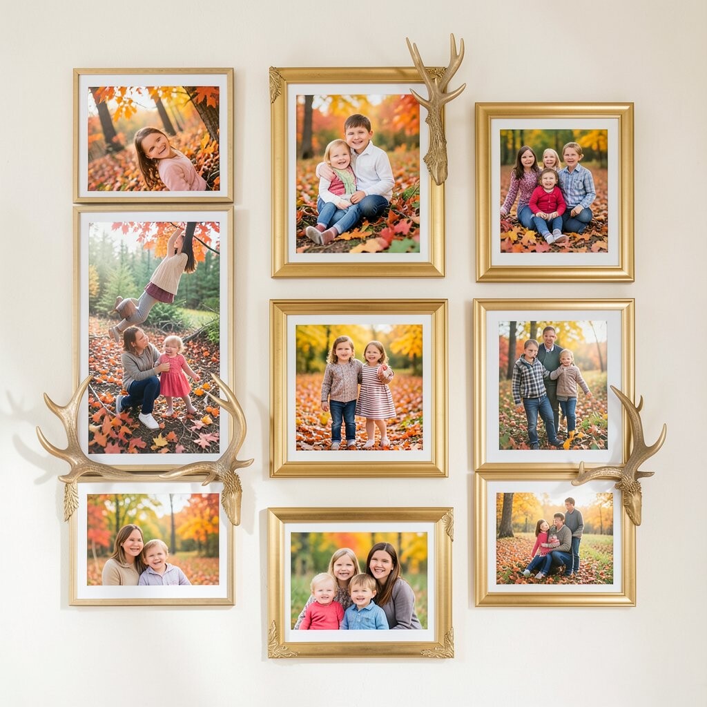
Picture your family walking through orange and rust leaves, with jackets like bright flags against the earth tones. In the photo, cheeks look rosy from the crisp air, and everyone’s laughter seems to bounce off the trees.
Gold frames give fall photos a richer glow, like the sunlight is trapped in the frame. The benefit is contrast: gold warms the scene while keeping the colors from turning dull. For a practical display, consider thicker frames for fall shots, since the color complexity pairs nicely with more visual weight.
To personalize, use a mat in deep cream and crop a touch tighter so the faces stay prominent against busy leaf backgrounds. Cost considerations are manageable if you buy a plain gold frame and add small decorative corner pieces that you can remove for future changes. Current trends often mix warm metals with nature colors, so a gold frame can help your gallery feel stylish and not just seasonal.
If you want extra uniqueness, choose one photo with a strong face and pair it with another that shows movement, then let the gold tie both together.
9. Little Art Projects Framed in Primary Swatches
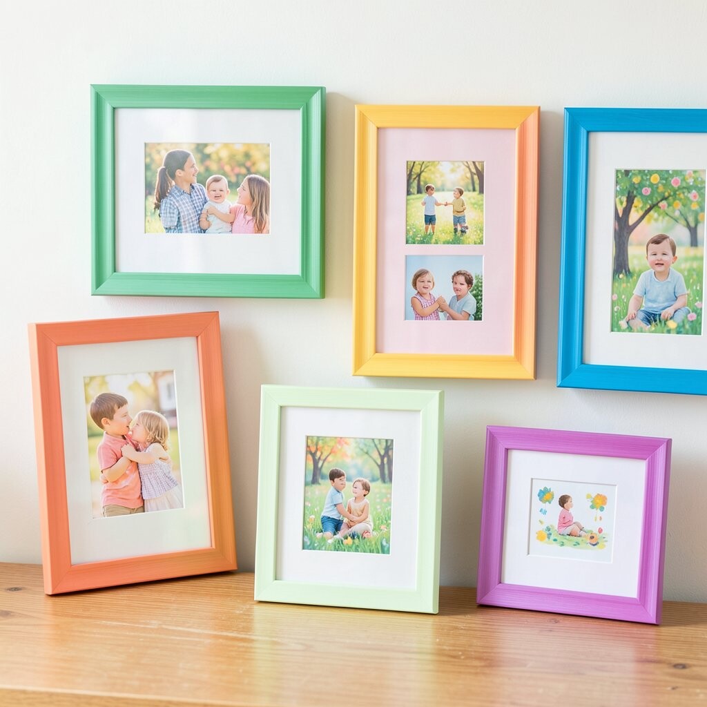
Imagine a photo of your child’s latest masterpiece held proudly, with crayon lines, paper textures, and bold scribbles. Even if the art is messy, it looks full of personality when captured in good light.
Using frames with primary swatches or multi-color inner borders turns the photo into a cheerful mini exhibition. The benefit is that it honors the creativity while also matching the childlike energy that makes the moment special. For practical tips, choose a frame with a protective cover if the room gets sun, since colorful photos can fade over time.
To personalize, align one swatch color with a dominant color from the artwork photo, like bright green or sunshine yellow. For cost, you can frame several photos using simple identical frames and vary only the mat color, which keeps your budget steady while still making each image feel unique. A current trend is playful gallery walls where the frames themselves act like part of the decoration, so this is a great way to lean into that style.
10. Cozy Movie Night with Black Frames and Electric Blue Mats
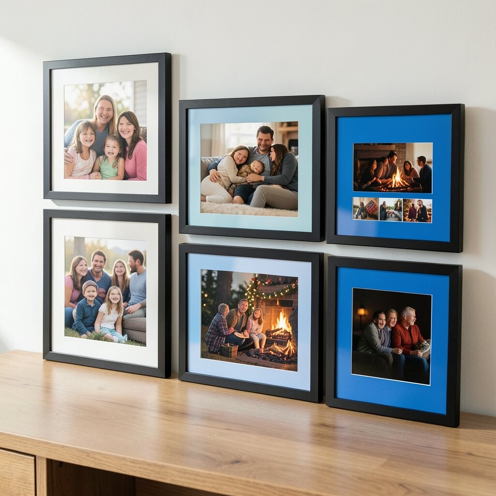
Picture everyone on the couch, blankets piled like clouds, and the TV glow lighting up faces in a cool, cinematic tone. The room feels like a secret hideout, and the expression on each person says, “We’re all together.”
Black frames add a modern edge, and electric blue mats create a pop that matches the screen glow without copying it exactly. This combination is beneficial because it makes the photo look intentional, like it belongs in a design magazine. For practical installation, use spacers or consistent hanging height so the blue mats line up across your gallery wall.
Uniqueness comes from pairing a dramatic frame color with softer photo content, which makes the moment feel both serious and sweet. Personalize by choosing a mat thickness that complements the frame width, and consider a matte finish for reduced glare. If you’re cost-conscious, black frames are often widely available in budget options, and you can invest more in mats for a cleaner, richer look.
This style also matches a current trend of “gallery contrast,” where dark frames and bold mats create visual drama without needing expensive art prints.
11. Family Picnic Laughs in Pastel Frames That Match the Blanket
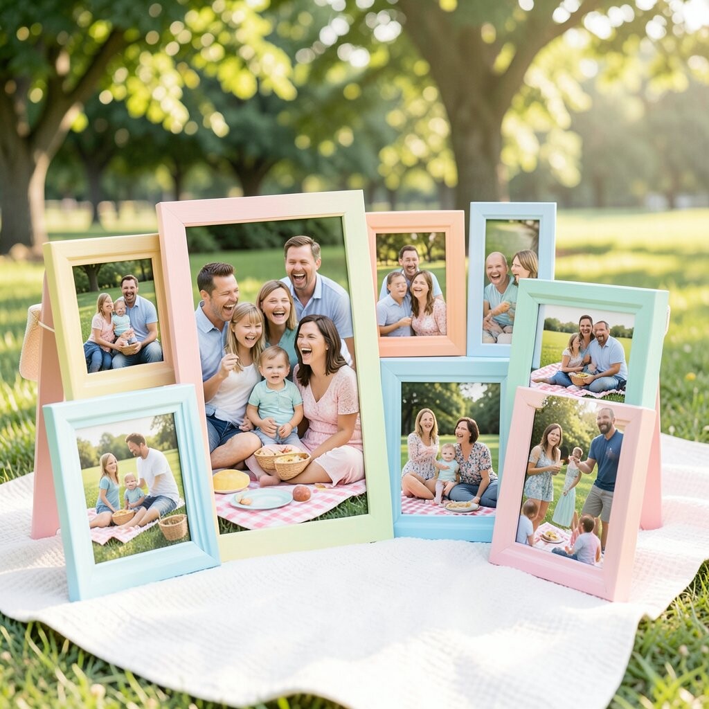
Imagine a spread of fruit, a striped blanket, and a family laughing while sticky fingers reach for snacks. The photo feels relaxed and casual, with colors that blend like a soft sunset.
Pastel frames help this kind of image stay dreamy and light, especially when the blanket colors are already soft. The benefit is that your wall won’t feel too harsh, which is perfect for living rooms and hallways where you want comfort. For practical tips, use a slightly textured mat or linen-style backing, because it adds a gentle design touch without costing much.
To personalize, match the frame color to one stripe from the blanket, or choose a pastel shade that appears in the fruit, like peach or berry pink. Cost considerations are easier here since pastel frames can be found in many budget lines, and you can mix them with one or two slightly pricier frames for variety. Current trends favor soft color palettes and “mix and match” galleries, so this picnic photo can be the anchor for a whole cluster of similar tones.
12. City Street Adventure with Color-Block Frames in Neon Accents
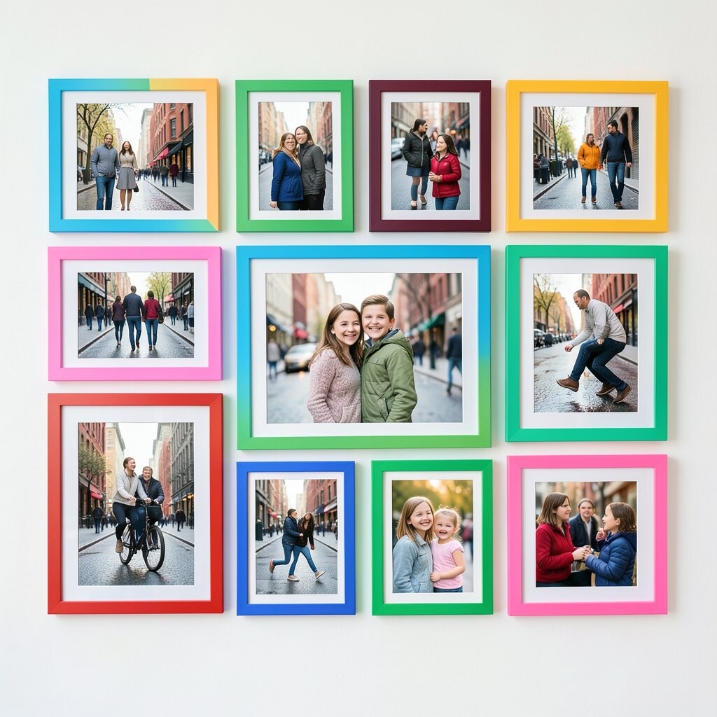
Picture your family walking down a bright street, with storefront signs and reflections in the windows behind you. Someone turned mid-step, laughter caught in motion, and the whole photo feels like a postcard from a life in progress.
Color-block frames with neon accents can make the energy feel bigger and more celebratory, especially when the background already has strong colors. The benefit is that it turns the photo into a focal point, so the rest of your decor becomes the supporting cast. For practical tips, keep the neon accents limited to a small portion of the frame design so your eyes aren’t overwhelmed every time you look.
Uniqueness shows up when you repeat a single neon shade across multiple photos, like lime green or hot pink, so your gallery feels like a connected collection. Personalize by selecting mats in neutral shades like light gray, which keeps the neon looking crisp rather than chaotic. Cost considerations can be handled by choosing simple frames and adding neon tape or edge paint for a custom look, which is often cheaper than buying specialty frames.
If you want it to feel current, pair one neon-accent photo with others in simpler frames, creating a rhythm that looks styled but still truly yours.